10,000 search results
(0.123 seconds)
- Movie Palace JNL by Jeff Levine,
$29.10 Decorative, Display, Headline, Sans Serif, 1930s, Hand Lettered, Monoline, Retro, Vintage, Nostalgic, Stylized, Elegant Some beautiful and stylized Art Deco hand lettering found in the Jan. 6, 1934 issue of the British movie fan publication Picturegoer Weekly inspired Movie Palace JNL, which is now available in both regular and oblique versions. This monoline design adds a touch of elegance to any retro projects.
 - Vinkel by Typolar,
$72.00 Composed, clean and slightly angular, as its name says. It's organic, warm and round in the right places too. A sanserif typeface family Vinkel is a handsome androgyne with an excellent balance of Neo-grotesque and Humanist DNA. Vinkel comes in eight weights from Thin to Extra Black, all with italics, small caps, several sets of numerals, arrows, alternate characters, and more.
 - Garp Miska by madeDeduk,
$11.00 Gary Miska is a cute font with two style neu and regular fun happiness look and will makes this font suitable for your any project design. Feature Uppercase & Lowercase Number & Symbol International Glyphs Multilingual support ligature Feel free to drop us a message any time and follow my shop for upcoming updates Shoot me on email at: dedukvic@gmail.com Hope you enjoy it.
 - Fragua Pro by deFharo,
$14.00 Fragua Pro is a family of 14 fonts (Latin Extended-A and the Cyrillic alphabet) Condensed Sans Serif of geometric construction inspired by the Russian constructivism of the mid-20th century; the typography has a rounded finish in all corners to avoid the coldness of the rectilinear fonts and providing warmth and docility, the ascending and descending short and a high height of the x make it very compact, all this results in a unique typeface with maximum readability due to the careful configuration of metrics and Kerning. The cursive styles have an inclination of 8 degrees and a narrower proportion than the regular ones, they also have their own letters and meticulous optical corrections to compensate for the deformations produced by the inclination. Fragua Sans has Advanced Open Type functions, several alternative letters, full support for numbers, monetary symbols and crypto currencies and more. 681 glyphs. This typography is specially designed for advertising and editorial composition, behaving correctly in both short and medium texts and headlines where horizontal space saving is needed, being an ideal typographic system for signage, editorial or corporate design. This typography is dedicated to the memory of my grandfather C·ndido (Pa), the blacksmith of my town. THE COMPLETE 14 FONTS PACKAGE INCLUDES THE REGULAR VERSION IN "VARIABLE FONT" FORMAT, compatible with Adobe CC 2018.
 - Limazah by Attype Studio,
$19.00 Limazah is an Arabic style font that is perfect for any Muslim project or product. This font has a beautiful, elegant design that is inspired by traditional Arabic calligraphy. It is perfect for use in Ramadan themed designs, as well as any other design that requires a touch of Arabic flair. This digital product font is easy to use in any design software. It is perfect for creating stunning, professional designs that will stand out and make a statement. Whether you are designing for a business or personal project, Limazah is a must-have font for any designer. Features : - Limazah Font - Ligatures - Multilingual, US Roman, Latin 1 Support --- This Font Support Language: Afrikaans, Albanian,Asu, Basque, Bemba, Bena, Breton, Catalan, Chiga, Cornish, Danish, Dutch, English, Estonian, Faroese, Filipino, Finnish, French, Friulian, Galician, German, Gusii, Indonesian, Irish, Italian, Kabuverdianu, Kalenjin, Kinyarwanda, Luo, Luxembourgish, Luyia, Machame, Makhuwa-Meetto, Makonde, Malagasy, ManxMorisyen, North Ndebele, Norwegian Bokmål, Norwegian Nynorsk, Nyankole, Oromo, Portuguese, Quechua, Romansh, Rombo, Rundi, Rwa, Samburu, Sango, Sangu, Scottish Gaelic, Sena, Shambala, Shona, Soga, Somali, Spanish, Swahili, Swedish, Swiss German, Taita, Teso, Uzbek (Latin), Volapük, Vunjo, Zulu, Thank you for purchasing premium fonts from Attype Studio. Follow and explore our work on Pinterest & Instagram. If you have any question, don’t hesitate to contact us. Hope you enjoy with our font! Attype Studio
 - Satimah by Attype Studio,
$13.00 Satimah is a stunning Arabic style typeface that brings an elegant and professional look to any design. With its simple yet refined design, this font is perfect for a wide range of projects, from branding to editorial and beyond. The font also comes with stylistic set 1 and 2, as well as stylistic alternates for some characters, giving you even more creative options. Satimah is particularly well-suited for Islamic design and Islamic theme events, thanks to its beautiful calligraphic flourishes and timeless elegance. With both regular and italic versions, this font is versatile enough to be used in a wide range of design applications. And with multilingual support, you can be sure that your message will be communicated clearly and effectively no matter where your audience is located. Features : - Satimah Family Font - Stylistic Alternates - Stylistic Set - Multilingual, US Roman, Latin 1 Support --- This Font Support Language: Afrikaans, Albanian,Asu, Basque, Bemba, Bena, Breton, Catalan, Chiga, Cornish, Danish, Dutch, English, Estonian, Faroese, Filipino, Finnish, French, Friulian, Galician, German, Gusii, Indonesian, Irish, Italian, Kabuverdianu, Kalenjin, Kinyarwanda, Luo, Luxembourgish, Luyia, Machame, Makhuwa-Meetto, Makonde, Malagasy, ManxMorisyen, North Ndebele, Norwegian Bokmål, Norwegian Nynorsk, Nyankole, Oromo, Portuguese, Quechua, Romansh, Rombo, Rundi, Rwa, Samburu, Sango, Sangu, Scottish Gaelic, Sena, Shambala, Shona, Soga, Somali, Spanish, Swahili, Swedish, Swiss German, Taita, Teso, Uzbek (Latin), Volapük, Vunjo, Zulu, Hope you enjoy with our font! Attype Studio
 - Pulse JP Arabic by jpFonts,
$29.95 النبض - the Pulse Pulse JP ME is a constructivist text and display font that differs from comparable fonts due to its special sharpness and harmonious balance. Its technical and constructed form creates a somewhat artificial impression of particular appeal. It is ideal for display on the screen and can be used in many projects. Pulse JP ME is a super family consisting of 48 fonts from compressed to expanded in six weights each. This opens up a wide designspace with the possibility of combining typefaces of the same character in a wide variety of variants and being able to adapt them to very different conditions. The details of the individual fonts are coordinated with each other with great precision and perfectly implemented in terms of craftsmanship. In all variants, this leads to a very balanced design with particular sharpness. The very extensive character set supports 120 Latin + 7 Arabic languages + Hebrew. The Arabic characters were designed in close collaboration with the Iranian designer Prof. Raafat Negarandeh. Here the constructivist approach is repeated within Arabic proportions. This leads to a very reduced and clear design with high legibility. Additional typographical adjustments can be made in the variable font, which is also available. There all variants are stored in a single font and can be continuously fine-tuned between them.
 - Parisine Std by Typofonderie,
$59.00 Ultra legible forceful sanserif in 32 fonts Parisine was born as official parisian métro signage typeface. This family of typefaces has become over years one of the symbols of Paris the Johnston for the London Underground or the Helvetica for the New York Subway. The Parisine was created to accompany travelers in their daily use: ultra-readable, friendly, human while the context is a priori hostile. Meanwhile, Parisine is now a workhorse and economical sanserif font family, highly legible, who can be considered as a more human alternative to the industrial-mechanical Din typeface family. More human, but not fancy: No strange “swashy” f, or cursive v, w etc. on the italics, to keep certain expected regularity, important for information design, signages, and any subjects where legibility, sobriety came first. Born as signage typeface family, the various widths and weights permit a wider range of applications. In editorial projects, the Compress version will enhances your headlines, banners, allowing ultra large settings on pages. The Narrow version will be useful as direct compagnon mixed to standard width version when the space is limited. The various Parisine typeface subfamilies Parisine is organised in various widths and subsets, from the original family Parisine, Parisine Gris featuring lighter versions of the usual weights and italics, Parisine Clair featuring extra light styles, to Parisine Sombre with his darker and extremly black weights as we can seen in Frutiger Black or Antique Olive Nord. Many years of adjustments were necessary to refine this complex family. Initially, Parisine was designed by Jean François Porchez in 1996 for Ratp to solely fulfil the unique needs of signage legibility. Parisine remain the official corporate typeface of the public transport in Paris, the worldwide capital for tourism, and now integral part of the French touch. Directly related, Parisine Office was initially created for Ratp’s internal and external communication, Parisine Office is available at Typofonderie too. Not connected with Ratp and public transports, Parisine Plus was created as an informal version of Parisine. Parisine: Introducing narrow and compressed families About Parisine Parisine helps Parisians catch the right bus Observateur du design star of 2007
 - Mintely by Din Studio,
$29.00 Mintely is a sophisticated and versatile serif font family designed to elevate your typography to new heights of elegance and legibility. With its 6 style variations and 8 weight options, this font offers an extensive array of choices to suit a wide range of design projects. This family combines classic and modern elements, resulting in a timeless design that can adapt to various design contexts. The 6 style variations in this serif provide you with a variety of typographic options, allowing you to experiment with different looks and moods. Whether you need a sleek and minimalistic appearance or a more decorative and ornate style, Mintely has you covered. Additionally, the 8 weight options in Mintely offer a wide range of possibilities in terms of contrast and emphasis. From thin and elegant weights to bold and impactful variations, this font family ensures that you can effortlessly find the perfect weight for your specific design needs. Because of its legibility you can use this font in a variation of text sizes. Enjoy the available features here. Features: Multilingual Supports PUA Encoded Numerals and Punctuations Mintely fits in headlines, logos, posters, flyers, invitations, branding materials, print media, editorial layouts, headers, and any many more. Find out more ways to use this font by taking a look at the font preview. Thanks for purchasing our fonts. Hopefully, you have a great time using our font. Feel free to contact us anytime for further information or when you have trouble with the font. Thanks a lot and happy designing.
 - Nostalgic Notes by Prestige Artsy Studio,
$14.99 Nostalgic Notes is a powerful handwritten and complex emotional font that associates your feelings with a longing for the past. Nostalgic Notes works and matches perfectly with Le Charisme or any thin modern serif. Nostalgic Notes is a powerful and complex emotional font that associates your feelings with a longing for the past. Nostalgic Notes is perfect for quotes, social media, logos, titles, magazines, packaging and much more.
 - Gold Standard by FontMesa,
$30.00 Gold Standard got its start from a few letters found on an old Gold Certificate from 1882. From those few letters spelling out the word GOLD, the rest of the alphabet was designed to match. The lowercase design was based on lettering found on an old silver certificate from approximately the same year.
 - AS Palmer by Andrey Sharonov,
$24.00 AS Palmer Script & Sans This pair was inspired by the spirit of the past, when manual labor was common, and technology was just beginning to develop. It was crafted by hand specially for traditional typography lovers and anyone who want to add natural handmade feeling in brand identity. It comes with Regular and Aged versions that expands its posibilities in use. Opentype features Script font has 151 stylistic alternates and 3 variations of end-swashes with about 10 lengths of each style. Stylistic Alternates. The easiest way to get alternate character is to add number for example 2, 3 or 4 after any Uppercase. Each of them has from two up to five alternates. This combination works with activated Standard Ligatures option in Opentype panel (Photoshop / Illustrator). End-swashes. AS Palmer Script has 3 variants of end-swashes and about 10 lengths of each style. It works like Stylistic Alternates with activated Standard Ligatures in Opentype panel. Just add special combination at the end of the word, to get needed swash element and its length. Underscore, double underscore or slash is swash style. Number is length. For example: _3, __5, /6. Just try, it's easy. AS Palmer Sans - different Double letters. This feature work automatically with activated Contextual Alternates in Opentype panel. Note, that this features are not available in Miscrosof Word. Palmer is very good looking in logo, labels, t-shirt prints, product packaging, invitations, advertising and others. I've designed some examples, so you can see how it can be used. Multilingual support (Western European characters). English, Danish, Dutch, Estonian, Faroese, Filipino, Finnish, French, German, Hungarian, Icelandic, Irish, Italian, Norwegian, Polish, Portuguese, Spanish, Swedish, Turkish.
 - Rivanna NF Pro by CheapProFonts,
$10.00 This font has a charming mix of the organic forms of the Art Nouveau style and the geometric forms of the Art Deco style - and it makes it work! Nick Curtis says: "A general-purpose Art Nouveau font that has been kicking around for a while under various names. As usual, redrawn for consistency and economy of line. Named, for no good reason, after the river that flows near Thomas Jefferson’s home, Monticello." ALL fonts from CheapProFonts have very extensive language support: They contain some unusual diacritic letters (some of which are contained in the Latin Extended-B Unicode block) supporting: Cornish, Filipino (Tagalog), Guarani, Luxembourgian, Malagasy, Romanian, Ulithian and Welsh. They also contain all glyphs in the Latin Extended-A Unicode block (which among others cover the Central European and Baltic areas) supporting: Afrikaans, Belarusian (Lacinka), Bosnian, Catalan, Chichewa, Croatian, Czech, Dutch, Esperanto, Greenlandic, Hungarian, Kashubian, Kurdish (Kurmanji), Latvian, Lithuanian, Maltese, Maori, Polish, Saami (Inari), Saami (North), Serbian (latin), Slovak(ian), Slovene, Sorbian (Lower), Sorbian (Upper), Turkish and Turkmen. And they of course contain all the usual "western" glyphs supporting: Albanian, Basque, Breton, Chamorro, Danish, Estonian, Faroese, Finnish, French, Frisian, Galican, German, Icelandic, Indonesian, Irish (Gaelic), Italian, Northern Sotho, Norwegian, Occitan, Portuguese, Rhaeto-Romance, Sami (Lule), Sami (South), Scots (Gaelic), Spanish, Swedish, Tswana, Walloon and Yapese.
 - Bilya Layered by Cerri Antonio,
$30.00 Since 2010 I started my research and experimentation in layered fonts, and I immediately understood that the future of creative graphic fonts is precisely the exploration of it. Over the years I have tried different expressions on the use of the layered system ... but I realized that my propensity to use colors in the font led me to the creation of BILYA. The real creative cue of BILYA is the wonderful childhood memories where nostalgia for them generated the creation of it, which I dedicate to all lovers of glass marbles classic game and beyond. BILYA Base, Outline, Color One, Two, Three, Four, Five and Color Six is a 8 font system that can be layered in different ways to create infinite title effects used commonly in poster and logo design, in flat gradient color style for spectacular 3D emboss styles or realistic 3D logos design projects. BILYA’s layer combinations give you complete control in producing styles like, modern, 3D, beveled. It can be used alone and/or in layered and allows you adjust leading and kerning. Each font contains the similar metrics, so when your title is set, copy and paste in same position to create different layers styles combinations to build out your desired effect. BILYA works great in any graphics application that allows you to utilize layers or 3D graphics effects.
 - Visitor BRK Ten Pro by CheapProFonts,
$10.00 This is the first true pixel-font released by CheapProFonts. It may not be the first font based on a 5x5 pixel grid, but it probably has the best language support. The glyphs have all been optimized for Flash (by making the pixel shapes slightly overlapping) and should render sharp and perfect when set in 10px size (or multitudes of 10). As with all pixelfonts: make sure to place the text at coordinates with whole numbers, and always use left (and NEVER centered) alignment. ALL fonts from CheapProFonts have very extensive language support: They contain some unusual diacritic letters (some of which are contained in the Latin Extended-B Unicode block) supporting: Cornish, Filipino (Tagalog), Guarani, Luxembourgian, Malagasy, Romanian, Ulithian and Welsh. They also contain all glyphs in the Latin Extended-A Unicode block (which among others cover the Central European and Baltic areas) supporting: Afrikaans, Belarusian (Lacinka), Bosnian, Catalan, Chichewa, Croatian, Czech, Dutch, Esperanto, Greenlandic, Hungarian, Kashubian, Kurdish (Kurmanji), Latvian, Lithuanian, Maltese, Maori, Polish, Saami (Inari), Saami (North), Serbian (latin), Slovak(ian), Slovene, Sorbian (Lower), Sorbian (Upper), Turkish and Turkmen. And they of course contain all the usual "western" glyphs supporting: Albanian, Basque, Breton, Chamorro, Danish, Estonian, Faroese, Finnish, French, Frisian, Galican, German, Icelandic, Indonesian, Irish (Gaelic), Italian, Northern Sotho, Norwegian, Occitan, Portuguese, Rhaeto-Romance, Sami (Lule), Sami (South), Scots (Gaelic), Spanish, Swedish, Tswana, Walloon and Yapese.
 - ITC Goudy Sans by ITC,
$29.99 Frederic W. Goudy designed three weights of this friendly-looking sans serif font from 1922-1929 for Lanston Monotype in the United States. Goudy was attempting to impart freedom and personality to the sans serif form at a time when geometric sans serifs, such as Futura, were gaining rapid world-wide popularity. To achieve this challenging goal, he looked to lapidary inscriptions and manuscript writing for inspiration. He included elements such as slight swellings of terminal strokes, slab serifs on a few of the caps, alternate uncial forms, and a few swash strokes. The result is uniquely Goudy: charming, instinctive, and just right for adding warmth to magazine or advertising layouts. The design staff at ITC updated and filled out the family for a total of eight styles in ITC Goudy Sans. ITC Goudy Sans® font field guide including best practices, font pairings and alternatives.
 - Starlight Lovers by Hanoded,
$15.00 I have always loved gazing at the stars. Too bad that you don’t get to see a true starry night these days - mostly because of light pollution. Starlight Lovers is a messy serif. It is hand painted, using a brush and Chinese ink, so the edges may be a bit rough. In my opinion, this adds to the font’s character! Starlight Lovers is an ideal font for (Christmas) cards, book covers, posters and product packaging. Comes with a milky way of diacritics as well!
 - Able by T-26,
$39.00The history of Able’s connection with the Harry Potter phenomenon is really up in the air. It’s a catch-22 in this business - you either promote your own work and negotiate expensive exclusive licenses, or you work with a promoter and sell your designs to anyone and everyone. It could have been an in-house designer at Rowling’s publisher, Scholastic, or a freelancer who proposed Able for the headings and such. The responsible party licensed it from T26, and JK Rowling’s storytelling made it a star. (I suppose it’s ironic that there’s a whole lot of unwritten history in the typography business.) Able’s rise to fame really is a classic love story between reading and type design. If the books weren’t so popular, Able might still be waiting for some Mexican fast food chain to pick it up for packaging design. The movie deal certainly made the font all the more recognizable, what with its merchandising campaign. Popularity can also cripple a great decorative face. It’s always being recognized as “The Harry Potter Font.” It might just have to wait a few decades for the Potter phenomenon to subside to be freed from the “Chamber of Pigeonholed Fonts.” In the meantime, I’m sure that a lot of fledgling graphic design apprentices are reading their new Potter books, being charmed by the idea of type design when they’re not turning the pages too fast to notice. - Lancelot Pro by Canada Type,
$39.95 When type historians look back on Jim Rimmer, they will consider him the last type designer who just couldn't let go of metal type, even though he was just as proficient in digital type. Lancelot is one definite case in point: A face designed and produced in digital as late in the game as 1999, only to spring onto the new millenium a couple of years later as a metal type cast in three sizes. That was Jim, a time traveler constantly reminding the craft of its origins. This particular time machine was originally designed as a simple set of attractive caps that emphasize the beauty of the variable conventional dialogue between the drawing tool and the intended final form, and the one exchanged within the totality of the forms themselves. Jim designed two weights, with contrast and counterspace being the main difference between them. In 2013, the Lancelot family was remastered and greatly expanded. Lancelot Pro is now a wonder of over 840 glyphs per font, including smaller versions of the caps in the minuscule slots, and alternates and ligatures that can transform the historic spirit of the original design into anything from half-uncial to outright gothic. Language support goes beyond the extended Latin stuff, to cover Cyrillic and Greek as well. 20% of the Lancelot Pro family's revenues will be donated to the Canada Type Scholarship Fund, supporting higher typography education in Canada.
 - Radona by insigne,
$29.00 Radona is a blast from the 80’s that's rader than rad. Radona is the typeface version of Synthwave, an electronic music subgenre that takes influence from the 1980s but builds on it, resulting in a construct that lives in the minds of both those who have experienced it and those who haven't. Radona expresses a nostalgia for 1980s culture, attempting to replicate and appreciate the era's vibe, but extends it further with something new. This sans family has plenty of 80's flavor, but with some fresh twists to push it to the limit. Radona is a geometric sans-serif typeface. Radona has a few quirky characteristics, but it has a generally neutral tone and structure that makes it ideal for usage in print, especially when a contemporary look is desired. It looks amazing in both body text and headlines. The geometric grotesques that were popular in the 1980s served as inspiration. It's a typeface that's been crafted for usage in a range of design fields, from branding to packaging, and it can be used in anything from interfaces to apps. Radona is an excellent typeface for use on websites and other digital applications. Radona comes with a wide variety of styles and a large selection of stylistic alternatives, ligatures, small caps and other special features. Along with parachute pants, synthesized guitar riffs, and VHS scanlines, Radona brings back the 1980’s.
 - Nimbus Sans by URW Type Foundry,
$35.00 The first versions of Nimbus Sans have been designed and digitized in the 1980s for the URW SIGNUS sign-making system. Highest precision of all characters (1/100 mm accuracy) as well as spacing and kerning were required because the fonts should be cut in any size in vinyl or other material used for sign-making. During this period three size ranges were created for text (T), the display (D) and poster (P) for small, medium and very large font sizes. In addition, we produced a so-called L-version that was compatible to Adobe’s PostScript version of Helvetica. Nimbus was also the product name of a URW-proprietary renderer for high quality and fast rasterization of outline fonts, a software provided to the developers of PostScript clone RIPs (Hyphen, Harlequin, etc.) back then. Also in the 80s, a new, improved version of the Nimbus Sans, namely Nimbus Sans Novus was designed. Nimbus Sans Novus was conceptually developed entirely with URW’s IKARUS system, i.e. all styles harmonize perfectly with each other in terms of line width, weight, proportions, etc. On top of that, Nimbus Sans Novus contains more styles than Nimbus Sans. Now, Nimbus Sans is also available as Round (like the popular URW fonts Futura Round and Eurostile Round). The Round versions are intended to facilitate the work of designers and typographers. The fonts can be used directly, without further preparatory work in graphic programs as finished, high-quality Rounds.
 - TessieMoreBirds by Ingrimayne Type,
$13.95 A tessellation is a shape that can be used to completely fill the plane. Simple examples are isosceles triangles, squares, and hexagons. Tessellation patterns are eye-catching and visually appealing, which is the reason that they have long been popular in a variety of decorative situations. These Tessie fonts have two family members, a solid style that must have different colors when used and an outline style. They can be used separately or they can be used in layers with the outline style on top of the solid style. For rows to align properly, leading must be the same as point size. To see how patterns can be constructed, see the “Samples” file here. Shapes that tessellate and also resemble real-world objects are often called Escher-like tessellations. This typeface contains Escher-like tessellations of birds. Quite a few of them resemble swimming birds, but there are also some that resemble flying birds or birds in other positions. Most or all of these shapes were discovered/created by the font designer during the past twenty years in the process of designing maze books, coloring books, and a book about tessellations. (Earlier tessellation fonts from IngrimayneType, the TessieDingies fonts, lack a black or filled version so cannot do colored patterns. The addition of a solid style that must be colored makes these new fonts a bit more difficult to use but offers far greater possibilities in getting visually interesting results.)
 - Rotis Sans Serif by Monotype,
$45.99 Rotis is a comprehensive family group with Sans Serif, Semi Sans, Serif, and Semi Serif styles, for a total of 17 weights including italics. The four families have similar weights, heights and proportions; though the Sans is primarily monotone, the Semi Sans has swelling strokes, the Semi Serif has just a few serifs, and the Serif has serifs and strokes with mostly vertical axes. Designed by Otl Aicher for Agfa in 1989, Rotis has become something of a European zeitgeist. This highly rationalized yet intriguing type is seen everywhere, from book text to billboards. The blending of sans with serif was almost revolutionary when Aicher first started working on the idea. Traditionalists felt that discarding serifs from some forms and giving unusual curves and edges to others might be something new, but not something better. But Rotis was based on those principles, and has proven itself not only highly legible, but also remarkably successful on a wide scale. Rotis is easily identifiable in all its styles by the cap C and lowercase c and e: note the hooked tops, serifless bottoms, and underslung body curves. Aicher is a long-time teacher of design and has many years of practical experience as a graphic designer. He named Rotis after the small village in southern German where he lives. Rotis is suitable for just about any use: book text, documentation, business reports, business correspondence, magazines, newspapers, posters, advertisements, multimedia, and corporate design.
 - Nimbus Sans Round by URW Type Foundry,
$35.99 The first versions of Nimbus Sans have been designed and digitized in the 1980s for the URW SIGNUS sign-making system. Highest precision of all characters (1/100 mm accuracy) as well as spacing and kerning were required because the fonts should be cut in any size in vinyl or other material used for sign-making. During this period three size ranges were created for text (T), the display (D) and poster (P) for small, medium and very large font sizes. In addition, we produced a so-called L-version that was compatible to Adobe’s PostScript version of Helvetica. Nimbus was also the product name of a URW-proprietary renderer for high quality and fast rasterization of outline fonts, a software provided to the developers of PostScript clone RIPs (Hyphen, Harlequin, etc.) back then. Also in the 80s, a new, improved version of the Nimbus Sans, namely Nimbus Sans Novus was designed. Nimbus Sans Novus was conceptually developed entirely with URW’s IKARUS system, i.e. all styles harmonize perfectly with each other in terms of line width, weight, proportions, etc. On top of that, Nimbus Sans Novus contains more styles than Nimbus Sans. Now, Nimbus Sans is also available as Round (like the popular URW fonts Futura Round and Eurostile Round). The Round versions are intended to facilitate the work of designers and typographers. The fonts can be used directly, without further preparatory work in graphic programs as finished, high-quality Rounds.
 - Compass TRF by TipografiaRamis,
$29.00 Compass TRF is a reevaluation of an existing Compass typeface dated 2002. Compass is a geometric contrast serif typeface - "contemporary Didone". New Compass consists of four styles—regular, italic, alternate and flourish initials with small caps. Compass TRF is recommended for use as display typeface. It is suggested that flourish initials font to be used for decorative purpose only, not basic typesetting. Compass TRF generated as OpenType single master format with Western CP1252 character set.
 - Balboa by Parkinson,
$20.00 Balboa is a display design combining elements of early sans serif and grotesque types with contemporary types. It evolved from ATF Headline Gothic, Banner (a headline typeface I drew for the San Francisco Chronicle), and Newsweek No.9, a Stephenson Blake-like grotesque I designed for Roger Black's 1980 redesign of Newsweek Magazine. There are nine styles, including the three new styles that have been added in 2014: Medium, Light and Ultra Light.
 - Ratherbe by Zane Studio,
$15.00 Ratherbe is a new modern brush font with an irregular baseline. A contemporary approach to design, natural handmade, suitable for use in designs for clothing, invitations, book titles, stationery designs, quotes, branding, logos, greeting cards, T-shirts, packaging designs, posters, and more. Complete with upper and lower case letters, and multi-language support, numbers, punctuation and several ligature. Thank you very much for searching and letting me know if you have questions.
 - Sanchez by Latinotype,
$- CHECK OUT Sánchez Niu (new, nova, neue, next) Sánchez, designed by Daniel Hernández, is a serif typeface belonging to the classification slab serif, or Egyptian, that bears a strong resemblance to the iconic Rockwell, but with rounded edges— offering contrast and balance to the square structure. Sánchez & Sánchez Condensed comprises 12 variants, ranging from extra light to black, each of the same x-height. Regular and Italic variants are available for free. Download specimen pdf
 - Geometra by T4 Foundry,
$21.00 Geometra is a new font family from Swedish type designer Bo Berndal and the T4 font foundry. Somewhere between a slab serif and a sans it has a crisp, geometric feel and is both 20’s retro and modern. Its soft curves and openness makes it very readable in smaller print. The powerful serifs give the font lots of character in larger sizes. Geometra comes in three weights, regular, semibold and bold.
 - Phosery by Genetype,
$14.00 Introducing Phoenix Display Serif Typeface: Elevate Elegance to New Heights Evoke a sense of regal charm with Phoenix Display Serif – a font that embodies luxury and grace in every serif. Crafted for the most sophisticated projects, from upscale branding to premium stationery, Phoenix Display Serif adds an aura of elegance to your designs. Illuminate your creativity with a touch of grandeur – experience Phoenix Display Serif and reignite the art of luxury typography.
 - Sempione by CAST,
$45.00 Sempione is a spanking new sanserif family suitable for publishing and advertising that looks great in small and large sizes. Its two main styles, Grotesk and Modern, are inspired by the early grots and 20th-century sanserifs. They come in seven weights with the matching italics, Grotesk Cursive and Modern Slanted. The considerable variety of letterforms and styles, along with some peculiar stylistic sets, will be appreciated by designers looking for more freedom of choice.
 - Luftayah by Popkern,
$20.00 Luftayah is a modern display typeface, designed by Anna Seslavinskaya in 2018. The typeface was inspired by the sociological concept of the “melting pot”, by a fusion of different cultures, isolated in a geometric form. Two traditions, Kufic script and German fraktur blend into a new symbiotic form. Luftayah adapt it for use in display contexts, as headings and book blurbs, through the use of a range of unusual combined characters and ligatures.
 - Hounslow by Device,
$29.00 Hounslow is closely related to Acton in structure, and takes the latter’s simple block construction into the third dimension. Three variants – open, solid and shadow – can be freely mixed in one setting for effect. Originally designed solely in the italic variant, an upright was added by request. A further unreleased set with a range of line weights was later commissioned by the New York Times magazine, and used extensively in their television supplement.
 - Nautica by Resistenza,
$59.00 Nautica is a new script typeface based on Copperplate’s ductus. High in contrast, it is a very original type with a strong character. With over 1000 glyphs and extensive language support, Nautica offers full professional typographic features. Ligatures and swashes are more inspired by brush pen strokes. Nautica provides three weights and one set of useful icons and knots to improve your graphics. Nautica works very well with Turquoise ; check it out.
 - Alea by astype,
$28.00 Alea is based on the drawings of Maria Balle. The floral, organic look of these bastard script initials will play well together with nearly all Didone designs and will give them a special note. Alea works perfectly with the Adana fonts also available from astype. The Opentype features Superior, Inferior & Numerator will activate the filling objects. Use these features on a new layer and choose your color to get up to three color layers.
 - Meduza Collection FJ by Frncojonastype,
$30.00 fj Meduza is a new typographical system designed by Franco Jonas Hernández, born as an exploring process from the classic model from —modern or didones style— typhography from XIX century. fj Meduza also explores the posibilities of Optical Adjustments —from 8 or 10 to 72 pts— offering a version to compose preferent reduced sizes —newspapers— and another version to titles with long-standing. Ideally for Branding, Headlines and especially complex editiorial contexts.
 - Aaron Script by Seniors Studio,
$23.00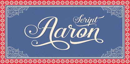 Aaron Script is highly legible Script typeface, a simply beautiful, classic, elegant and fun script font. With almost 400 glyphs and contain with opentype features. Stylistic alternates, Ornament, swash and more. Can be used for various purposes.such as logos, wedding invitation, t-shirt, letterhead, signage, news, posters, badges etc. To enable the OpenType Stylistic alternates, you need a program that supports OpenType features such as Adobe Illustrator CS, Adobe Indesign & CorelDraw X6-X7.
 - Australis Pro Swash by Latinotype,
$29.00 Australis Swash is a new variant that adds to the family of Australis Pro and it brings a touch of whimsy and mannerism to the shape of the cursive letters. Its purpose is purely playful because Australis Swash has some useful Opentype features as standard ligatures, discretionary ligatures and contextual alternates to use them in headlines or as a base for brands and lettering in general. Designed by Francisco Gálvez Pizarro in 2013.
 - BAR SADY by Borutta Group,
$- BAR SADY is a revival of a typeface based on famous lettering from "BAR SADY". The project was implemented as part of the Warsaw Participatory Budget 2023. Mateusz Machalski & Małgorzata Bartosik were responsible for the new digital version of the typeface. In the first phase, the original lettering was lifted, then extended to a full set of characters (A-Z). Finally, the bold style was created. The whole family is available under a free license.
 - Pisak by Cuda Wianki,
$20.00How many times have you been looking for a handwritten yet not childish font without result? We have a nice solution for you-our brand new PISAK! :) Thanks to extra thin condensed letters PISAK is easy readable and ideal for text writing. Its subtle irregularity makes it warm and friendly good for unoficial designs. If you like the shape of the letters but you need a more official and regular version see our Lalalo font.