10,000 search results
(0.067 seconds)
- Nautilus Text by Linotype,
$29.99Hellmut G. Bomm first released his Linotype Nautilus typeface in 1999. Ten years later, he updated and expanded the design. Now users have two additional families at their disposal: Nautilus Text and Nautilus Monoline. Nautilus Text bears more similarities to the original Linotype Nautilus. The letters shows a high degree of contrast in their stroke modulation. Bomm's intention was to create a clear, highly legible face. While the even strokes of most sans serif types eventually tire the eyes in long texts, the marked stroke contrast of Nautilus Text lends the face its legibility. The characters were drawn with a broad tipped pen. Like serif typefaces, the forms of Nautilus Text display a variety of elements. Its characters are narrow, with relatively large spaces between them. This helps create an overall open appearance, and allows a large quantity of text to fit into a small space. Nautilus Monoline's letters share the same overall proportions as Nautilus Text's. But as their name implies, they are monolinear. Their strokes do not have the calligraphic modulation that Nautilus Text features. This allows them to set another sort of headline, making Nautilus Monoline a refreshing display type choice to pair with body text set in Nautilus Text. - AZ Text by Artist of Design,
$20.00 AZ Text font was inspired from a need for a generic worn san serif text of letters that looks old. This font utilizes an "old look" to the line work which is designed to have a "worn feel" to it. Ideal for use as the body or text in your design.
 - Sabon Next by Linotype,
$57.99 The design of Sabon® Next by Jean François Porchez, a revival of a revival, was a double challenge: to try to discern Jan Tschichold´s own schema for the original Sabon, and to interpret the complexity of a design originally made in two versions for different typecasting systems. The first was designed for use on Linotype and Monotype machines, and the second for Stempel hand composition. Because the Stempel version does not have the constraints necessary for types intended for machine composition, it seems closer to a pure interpretation of its Garamond ancestor. Naturally Porchez based Sabon Next on this second version and also referred to original Garamond models, carefully improving the proportions of the existing digital Sabon while matching its alignments. The new family is large and versatile - with Roman and italic in 6 weights from regular to black. Most weights also have small caps, Old style Figures, alternates (swashes, ligatures, etc); and there is one ornament font with many lovely fleurons. The standard versions include revised lining figures that are intentionally designed to be a little smaller than capitals. Featured in: Best Fonts for Resumes, Best Fonts for Websites, Best Fonts for PowerPoints
 - Grange Text by Device,
$39.00 Grange Text is optimised for smaller text sizes, having more open character shapes and spacing. Use the non-text version of Grange for larger sizes and headlines, which has tighter spacing and detailing. Grange is the Device interpretation of the classic “Grot” thick/thin sans style. Unlike the traditional models on which it is based, Grange takes a rational, consistent approach across wide range of weights and widths for contemporary use. The font includes alternative curved and straighter versions of key characters, most obviously the lower-case ‘g' and capital ‘R', allowing the font to take on either a sharper or warmer, more playful appearance. These can be toggled on or off using the ‘Alts' feature in Illustrator, or ‘Stylistc Sets’ in Indesign. Contains proportional, lining and tabular numerals.
 - Cyntho Next by Mint Type,
$35.00 Cyntho Next is a totally reworked typeface based on our previous bestseller Cyntho Pro. It also has a slab-serif counterpart - Cyntho Next Slab. Cyntho Next is a modern geometric sans based on a hybrid waterdrop-like shape with eight weights varying from Thin to Black and featuring Cyrillic.
 - Urge Text by Eclectotype,
$30.00 It started with an italic, or to be more precise, half an italic. The slanted styles of Urge Text exhibit a certain bipolarity, the tops of glyphs having a standard italic form, the bottoms of glyphs being more Roman in their construction. This sturdy footing really locks the italics to the baseline, making them very legible while still being distinct from the uprights. The same bipolar approach didn't work very well in upright styles, so the Romans are more toned down. Ranging from the almost monoline, Egyptian style light weights to higher contrast ‘Modern’ bolds, there is much potential for use in typographically demanding scenarios. The family consists of six weights, normal and condensed widths, all with italics, making a total of 24 fonts; it’s a highly usable text typeface with an array of OpenType features. All styles include small caps, multiple figure styles (proportional- and tabular-, oldstyle and lining, small cap proportional figures, numerators, denominators, superscript and subscript), standard ligatures, alternate forms (stylistic sets), automatic fractions, case sensitive forms, and a handy (perhaps!) ‘percent off’ ligature in the discretionary ligatures feature.
 - Schotis Text by Huy!Fonts,
$35.00 Schotis Text is a workhorse typeface designed for perfect reading on running texts. Its design is based in Scotch Roman 19th-century style but designed from scratch, with a more contemporary and not nostalgic look. It has seven weights plus matching italics, with 1100 glyphs per font, with a very extended character set for Latin based languages as well as Vietnamese, and shows all its potential with OpenType-savvy applications. Every font includes small caps, ligatures, old-style, lining, proportional and tabular figures, superscript, subscript, numerators, denominators, and fractions. The Scotch Romans were one of the most used letters during the 19th and early 20th century, but they don’t have their own place in the main typographical classifications. They appeared at the beginning of the 19th century with Pica No. 2 in the catalog of William Miller (1813) and assumed the British route towards high contrast and vertical axis modern Romans. In fact, they were called just Modern. In opposition to the continental route of Fournier, Didot, and Bodoni, the English way opted for a wider, more legible letter also resistant to bad printing conditions. The name Schotis comes from the misspelling of Scottish that gave the name to a popular dance in Madrid in the 19th-century. It first was called Schotis and today is knows as Chotis.
 - Essay Text by TypeTogether,
$49.00 Essay is an elegant serif typeface intended for setting books, with many stylistic alternates and other typographic goodies, designed by Stefan Ellmer. It is a highly legible text face with a natural flow of reading. This is enhanced by a slight slant of the roman, the combination of open and closed apertures and the amalgamation of organic strokes and counters with a static, fully straight baseline. Essay Text Regular looks back to the spirit of the french Renaissance, when the roman typographic letterforms came to full emancipation. Departing from that historical reference, Essay Text gets rid of all sentimental antiquity and becomes a contemporary interpretation of the “archetypes” of that period. Essay Text Italic refers to that more vaguely, resulting in a formalised look with fairly upright and open shapes and little cursiveness. As in the Renaissance, before the mating of roman and italic, Essay Text Italic works as a separate text face and a perfect secondary type. The name Essay derives from the literary meaning of the word, attempt or trial. Therefore, the typeface Essay can be seen as an attempt to express an opinion about reading, the omnipresence of history, the importance of calligraphy and the importance to deviate from that calligraphic source; as well as an attempt to crystallise lettershapes in balance between convention and the designer’s personal idiom.
 - Ardina Text by DSType,
$50.00 Ardina was designed for the Portuguese newspaper Jornal de Notícias. Right after the exclusivity period, we decided it was a wonderful addition to our type library, therefore we redesigned it and included an extended set of characters. Ardina is a soft and warm news typeface, with five weights and matching italics, three grades (Display, Title, and Text), and slightly narrow proportions but with a very nice x-height. It’s the right typeface for a serious newspaper that intends to achieve a very contemporary feeling.
 - TXT Annesia by Illustration Ink,
$3.00Add a touch of flair with this one-of-a-kind TrueType font. It gives a handwritten appeal to scrapbook journaling, greeting cards, and creative publications. - Mellnik Text by ParaType,
$25.00Mellnik is a sans serif of humanist style (in a way) that was developed by Oleg Karpinsky and released by ParaType in 2006. The type family contains 9 styles with a number of alternate characters in each ones. For use as a text font in long text passages of advertising booklets, catalogues or magazines, as well as for accident setting. Mellnik may be also applied as a corporate typeface. Giant ink traps (or something like that) produce an original image of the family. Five condensed styles were added in 2007 by the same designer. Mellnik Text in 12 styles (added in 2008) has more narrow proportions and it is rather appropriate for text setting. - TXT Bethlehem by Illustration Ink,
$3.00 - Brandon Text by HVD Fonts,
$40.00 Brandon Text is the companion of the famous Brandon Grotesque type family. It has a higher x-height than the Grotesque version and is optimized for long texts, small sizes and screens. This sans serif type family of six weights plus matching italics was designed by Hannes von Döhren in 2012. Influenced by the geometric-style sans serif faces that were popular during the 1920s and 30s, the fonts are based on geometric forms that have been optically corrected for better legibility. Brandon Text has a functional look with a warm touch and works perfectly together with Brandon Grotesque . It is manually hinted and optimized for screens, so it will be a good choice for Websites, eBooks or Apps. The whole Brandon series is equipped for complex, professional typography with different sets of numbers, alternate letters, fractions and an extended character set to support Central and Eastern European as well as Western European Languages.
 - Modesto Text by Parkinson,
$25.00 The Modesto Text Family is text in name only. It’s called Text because it has a Lower Case, and also to distinguish it from the rest of the Modesto clan. Modesto is a loose-knit family based on a signpainters lettering style popular in the late-19th and early-20th centuries. It evolved from the lettering I used for the Ringling Bros. and Barnum & Baily Circus Logo. The Modesto family was not planned. It just happened, a few fonts at a time over about fifteen years. In 2014 seven new Italic fonts and two Chromatic families were added. There is a downloadable MODESTO USER MANUAL PDF in the Gallery section for this family.
 - Keiss Text by DSType,
$50.00 The Keiss type family is our interpretation of the popular nineteen century Scotch Roman typefaces. We intended to keep a very classic approach while introducing a couple of new elements that differentiate this type family from it’s ancestors. This design, with short descenders and ascenders, along with three very distinct optical sizes makes this type family well suited for contemporary newspapers. The Title and Big versions range from Thin to Heavy, with matching italics, in order to be used in big sizes and stand out in the design. The Text ranges from Thin to ExtraBold and is a standalone type family for text usage, with narrow proportions and wider and open italics for improved text setting. The Condensed versions, ranging from Thin to Bold, don’t have italics, although they can be matched with the italics of the Title and Big versions, due to the fact they are very condensed.
 - Nuber Next by The Northern Block,
$39.95 Nuber Next is a modern geometric sans influenced by the popular neo-grotesques of the 1950s including Helvetica and Univers. Carefully remastered from the original Nuber type family to improve letter shape, overall uniformity and introduce a flexible width system capable of handling a wider variety of typographic applications. Details include 750 characters per font, nine weights and five widths with matching italics. Opentype features include seven variations of numerals, fractions, case-sensitive forms, stylistic alternates, ligatures, extended monetary symbols and language support covering Cyrillic, Western, South and Central Europe.
 - Text Book by ParaType,
$30.00 Designed at Polygraphmash in 1958 by Elena Tsaregorodtseva; Latin characters and italic were added in 1987 by Emma Zakharova. An early sans serif ('Grotesque'), it was developed for primers and the first level school textbooks.
 - Quant Text by Hoftype,
$49.00 Quant Text is the optimized text version of the Quant family. It comes with a slightly greater width, stronger hairlines and stronger serifs which make it very stable for small text, but also gives it a forceful appearance when used for headlines. Quant is well-equipped for ambitious typography. The Quant family consists of 8 styles, comes in OpenType format with extended language support for more than 40 languages. All weights contain small caps, proportional lining figures, tabular lining figures, proportional old style figures, lining old style figures, matching currency symbols, fraction- and scientific numerals.
 - Alio Text by R9 Type+Design,
$35.00 Alio™ Text is the workhorse of the Alio family . It works beautifully as display type, body copy and anything in between. We redesigned Alio Text with taller x-height, more pronounced accents, and wider letter spacing than its siblings, Alio Pro. We also cut down from 6 weights/12 styles to 4 weights/8 styles. All of these is to ensure the legibility and readability and to maximize the weight contrast at small sizes. Whether your designs call for all caps, title case, sentence case or all lowercase, Alio Text has got you covered with the case-sensitive punctuations. No more baseline shift all your punctuations. Alio Text supports most Latin-based languages and even the Chinese Pin-Yin. This typeface also packs with Open-Type features similar to Alio Pro. For examples, both recognize fractions vs. dates; Both features several alternate positions for the legal symbols (3 in Alio Text; 5 in Alio Pro). If you’re looking for a go-to, versatile typeface for most occasions, Alio Text is for you. (4 weights/8 font styles, 500+ glyphs each).
 - Bergen Text by Mindburger Studio,
$40.00 Bergen Text is the younger twin and a lifetime companion of Bergen Sans with perfect legibility and adorable personality. It has been carefully crafted to improve readability experience particularly on small text sizes. Bergen Text is a family of of 6 fonts. While being a small font family it has plenty of Open Type features for highly professional use and Extended Latin, Cyrillic (including Bulgarian character set) and Greek language support.
 - Quase Text by DSType,
$40.00 Quase is a very free interpretation of the types found in the “Specimen of Printing Types” by William Caslon from 1785. We didn’t want to follow any of the models introduced in the Specimens, but rather gather a series of typographic aspects that we found useful and interesting from the several sizes and styles available and then give them consistency and new proportions so they could fit our very own purpose. We wanted to start with Caslon and then transform it into an editorial typeface, hence the increase of the x-height and the radical reduction of the ascenders and descenders. Despite the Display, Headline and Text fonts we also wanted to make a single weight Poster version with, inspired by the mechanical script introduced in the Double-Pica Script, to be used in magazines or as a complementary display typeface.
 - Narziss Text by Hubert Jocham Type,
$39.00 Narziss is a very popular display typeface. People really love the thin hairlines and the swirls. But the basic idea is so strong that I decided to create a text version. The swirls of the display do not work in small sizes but the alternative drops do. So for each weight of Narziss Text, there is a Regular, an Italic and a Drops version. Narziss Text is ideal for fashion magazines, Jewelry or perfumes and may be used in conjunction with Narziss.
 - Graphique Next by profonts,
$41.99 The original Graphique Pro was designed by the famous Swiss designer Hermann Eidenbenz in 1945 and included one outline shadow style. His idea of a very narrow, very economic headline font became increasingly more popular over the last decades and since the recent trend of layered fonts his idea is more up-to-date than ever. profonts studio now took the idea of the Graphique Pro to its next level: Graphique Pro Next. This layered type family consists of 8 styles which can be combined in plenty of ways to create unique designs. The fonts thereby preserve the outstanding and timeless drawings of the original Graphique Pro font and will add an aesthetic and fresh look to every project. Please have a look at the Graphique Pro Next Type Specimen for more details about the language support and font layer combinations.
 - Glosa Text by DSType,
$55.00Glosa is a type family designed for editorial purposes. Glosa is delicate and highly readable at very small sizes but reveals all its strength and personality when used at big sizes. The contrast of the sharped serifs and ball terminals provides a fresh and very contemporary look. Glosa Text is a bracketed serif, softer, smooth and less idiosyncratic, suitable for text settings. Both styles have four weights and italics in a workhorse typeface, full of OpenType features such as Small Caps, Tabular Figures, Central European characters and Historical Figures, among others. Glosa Headline is ideally suited for nameplates and headline typography, with four weights and with lowercase matching the small caps. In Glosa most of the diacritics were designed to fit the gap between the x-height and the caps height, avoiding some common problems with the accented characters. - Strangelove Next by FaceType,
$16.00 Strangelove Next is inspired by Stanley Kubrick’s movie “Dr. Strangelove”. The original titles were designed by Pablo Ferro, who is one of the most acclaimed film title designers, especially famous for his hand-drawn lettering. The Strangelove Next family contains the highly successfull narrow version, a new expanded version and finally a mix of the first two, which gives it a surprising and unpredictable look. All three styles have more glyphs than the original family. Looking for a serif version? Have a look at Strangelove NextSlab!
 - Matthew's Text by Matthias Luh,
$16.00 A very scary font. Good to do graffiti-like labels or scary text...
 - Abdo Text by Abdo Fonts,
$99.00 Abdo Text is an Arabic Naskh font for books and magazines discriminate accurately design and clarity of reading, it comes in one weight. Will later add mor weights and a copy of it to write the Koran Ottoman drawing. This is an OpenType Font supporting Arabic,and compatible with the various operation systems and modern software. This font also contains many of Stylistic Sets, Ligatures and Justification Alternatives - 775 glyphs.
 - Cristal Text by Johannes Krenner,
$5.00 »Cristal Text« has nice to read lower case letters. It contains 636 letters per font style and some Open Type features: Different stylistic alternates and different sets of numerals. It is not monospaced: Therefor it stays not true to an underlying grid like it’s bigger brother »Cristal True«. But this offers a better legibility. The basis of this font is a Union-Jack or sixteen-segment display (SISD). I have found myself in the need of a precise and well-made font, that simulates the look of such a LCD display. Also it should offer enough letters and language support for the whole European region as well as different font styles.
 - Cogenta Text by SRS Type,
$25.00 Cogenta Text is a geometric sans-serif typefaces. It showcases reduced contrast and a more neutral appearance compared to the lowercase joint of Cogenta. Its low cap height makes it an ideal choice for mobile and web applications. Precise kerning enhances readability, ensuring a satisfying user experience. Cogenta Text effortlessly complements diverse design applications, including logos, branding, posters, editorial design, websites, and more, consistently delivering exceptional quality results.
 - TXT Personality by Illustration Ink,
$3.00You'll find this the best font to inspire your creativity. It's simple and clever, with tons of personality. It's a good choice for school newsletters, kids' party invitations, and scrapbook pages emphasizing your children's great accomplishments. - Degrading Morals - Unknown license

- KT Nirma by Kotivoro Lab,
$14.00 KT Nirma Sans Nirma is a typeface with 9 Weight Sans Serif from thin to Black, inspired by Founders Grotesk, This project start from April 2022 and start from the stretch until shaped the solid character to represent the Dynamic Sans Serif. Nirma has total 462 glyph and 218 Support language. Nirma support Latin Basic, Latin-1 Supplement, Latin Extended A-B, Spacing Modifier Letters, and Combining Diacritical Marks. The Solid Character has multi function Display Sans & Body text based on Display Grotesk. Especially in te Thin to Regular is more legible for body text and the black one good for Display Sans, with dinamyc shape and more wide.
 - Nomad SS by Sensatype Studio,
$15.00 NOMAD is a vintage vibes font are produced with modern style and ready for historical projects. Based on our experience as a graphic designer who works for a lot of companies, we often are requested to design a graphic with a vintage feels and modern style. So, we try to brainstorming and create this font to make the idea is going out. This is perfect for show off in historical style and vintage vibes. You will get vintage, modern, and certainly unique style with this font. NOMAD font is also included full set of: All Uppercase letters Multilingual characters Numerals Punctuations Wish you enjoy our font. :)
 - RMU Koralle by RMU,
$25.00 Koralle was an abundant family of grotesque font styles which had been released by Schelter & Giesecke in the first quarter of the previous century. Out of this family four of the most impressive styles were revived, whereby I stuck as close to the original as possible. All styles contain even the weird-looking capitalized German double-s of which I am a strong opponent.
 - Coral Blush by Set Sail Studios,
$16.00 Explore a stunning typography pairing with Coral Blush; a carefully crafted and perfectly balanced set of elegant serif and realistic script typefaces. Here’s what’s included; Coral Blush Serif • An all-caps Serif font containing uppercase, all punctuation & numerals. Coral Blush Script • A thin and realistic textured handwriting font, hand-drawn with a real fine-tip pen. Contains, lowercase, uppercase, all punctuation & numerals. Also includes 88 built-in ligatures. Coral Blush Script Alt • This is a second version of Montrose Script, with a completely new set of upper & lowercase characters. 88 Script Ligatures • Coral Blush Script fonts contain 88 ligatures (double letter glyphs) to help your text flow more naturally and recreate authentic, handwritten text. Many programs will automatically have this feature switched on for you, but if you need any help accessing them, please feel free to drop me a message. Language Support; English, French, Italian, Spanish, Portuguese, German, Swedish, Norwegian, Danish, Dutch, Finnish, Indonesian, Malay, Hungarian, Polish, Turkish, Slovenian
 - TT Corals by TypeType,
$29.00 TT Corals useful links: Graphic presentation | Customization options TT Corals is a modern humanist sans-serif which has many typical traits of the beginning of the 20th century. For increased functionality, we created 6 styles of various weights: thin, light, regular, bold, extrabold and black. Its distinctive smooth lines and separate elements allow TT Corals to be used for a variety of design applications. It fits classical literature or music perfectly, and is appropriate for any creative or innovative content. TT Corals inspires new ideas for your creativity and art with its freshness and novelty. FOLLOW US: Instagram | Facebook | Website TT Corals language support: Acehnese, Afar, Albanian, Alsatian, Aragonese, Arumanian, Asu, Aymara, Banjar, Basque, Belarusian (cyr), Bemba, Bena, Betawi, Bislama, Boholano, Bosnian (cyr), Bosnian (lat), Breton, Bulgarian (cyr), Cebuano, Chamorro, Chiga, Colognian, Cornish, Corsican, Cree, Croatian, Czech, Danish, Embu, English, Erzya, Estonian, Faroese, Fijian, Filipino, Finnish, French, Friulian, Gaelic, Gagauz (lat), Galician, German, Gusii, Haitian Creole, Hawaiian, Hiri Motu, Hungarian, Icelandic, Ilocano, Indonesian, Innu-aimun, Interlingua, Irish, Italian, Javanese, Judaeo-Spanish, Judaeo-Spanish, Kalenjin, Karachay-Balkar (lat), Karaim (lat), Karakalpak (lat), Kashubian, Khasi, Khvarshi, Kinyarwanda, Kirundi, Kongo, Kumyk, Kurdish (lat), Ladin, Latvian, Laz, Leonese, Lithuanian, Luganda, Luo, Luxembourgish, Luyia, Macedonian, Machame, Makhuwa-Meetto, Makonde, Malay, Manx, Maori, Mauritian Creole, Minangkabau, Moldavian (lat), Montenegrin (lat), Mordvin-moksha, Morisyen, Nahuatl, Nauruan, Ndebele, Nias, Nogai, Norwegian, Nyankole, Occitan, Oromo, Palauan, Polish, Portuguese, Quechua, Rheto-Romance, Rohingya, Romanian, Romansh, Rombo, Rundi, Russian, Rusyn, Rwa, Salar, Samburu, Samoan, Sango, Sangu, Scots, Sena, Serbian (cyr), Serbian (lat), Seychellois Creole, Shambala, Shona, Slovak, Slovenian, Soga, Somali, Sorbian, Sotho, Spanish, Sundanese, Swahili, Swazi, Swedish, Swiss German, Swiss German, Tagalog, Tahitian, Taita, Tatar, Tetum, Tok Pisin, Tongan, Tsonga, Tswana, Turkish, Turkmen (lat), Ukrainian, Uyghur, Vepsian, Volapük, Võro, Vunjo, Xhosa, Zaza, Zulu.
 - Coral Pen by Khurasan,
$6.00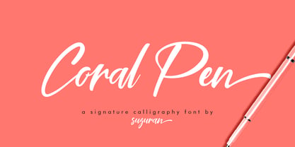 Introducing the Coral Pen script, a font that is very fresh and unique, handmade style. Coral Pen script is perfectly suited for logos, signatures, stationery, posters, apparel, branding, wedding invitations, cards, taglines, layout designs, and much more.
 - OK Moral by Tour De Force,
$25.00 Glyphfight at the OK Moral – single weight Western style typeface. High inverted contrast, generous width, decorative serifs, extended Latin support. It is our 103rd release.
 - Coral Reef by Vozzy,
$10.00 Introducing a clean script font named Coral Reef. This smooth font is perfect for lettering with alternates for small letters (for the last letter for example) and multilingual support.
 - Koralle NF by Nick's Fonts,
$10.00This typeface made its first appearance in Schelter & Giesecke's 1915 specimen book. It exhibits the cleanness and crispness one might expect in a sans-serif face, along with a few unexpected grace notes that make it warm and friendly, as well. Both versions of this font include the complete Unicode Latin 1252, Central European 1250 and Turkish 1254 character sets.
