10,000 search results
(0.035 seconds)
- Scratchers by PizzaDude.dk,
$15.00 Scratch me here and scratch me there - use my font to get some atmosphere. A quirky sans with scratchy lines, with contextual alternates in 4 different versions of each lowercase letter and multilingual support. Enjoy Scratchers.
 - Maraschino by Device,
$29.00 DF Maraschino Black - A sleek, sophisticated swash capital font with elegant thick and thin weight distribution. Bold yet poised, direct yet refined. The swash capitals are intended for use at the beginnings of words only - best not to set this in ALL CAPS. Use at larger sizes. Also includes stylistic decorative alternates for certain characters that can be toggled on and off in the Opentype panel.
 - Airy by ParaType,
$25.00Airy is in fact a very light-minded summer font without any serious design concept. It is a collection of hand-drawn letters that with the help of OpenType features allow you to get a lace texture with mutable structure. Together with the font you also get a bonus — a set of naive pictures that you normally draw on the margins of your sketchbook. - Oaken Bucket NF by Nick's Fonts,
$10.00A Victorian face named Oakwood provided the pattern for this decorative little number, with its swirls and curls guaranteed to delight boys and girls, saints and churls, and dogs and squirrels…well, maybe not the last pair, but you get the idea. All versions of this font include the Unicode 1250 Central European character set in addition to the standard Unicode 1252 Latin set. - Pinky Sunday by Attype Studio,
$15.00 Pinky Sunday is a Script Vintage font with stylistic set and alternates. Combine Pinky Sunday stylistic set to get amazing letterform! Fall in love with its incredibly versatile style and use it to create spectacular designs! Pinky Sunday is perfect for branding, logo, invitation, quotes, apparel design, product packaging, merchandise, game titles, cute style design, Book/Cover Title and more. What's Included : - Beginning & Ending Swash - Multilingual Support
 - Mr Eaves Modern by Emigre,
$59.00 Mr Eaves is the often requested and finally finished sans-serif companion to Mrs Eaves, one of Emigre’s classic typeface designs. Created by Zuzana Licko, this 2009 addition to the Emigre Type Library expands the versatility of the original Mrs Eaves with two complimentary families: Mr Eaves Sans and Mr Eaves Modern. Mr Eaves was based on the proportions of Mrs Eaves, but Licko took some liberty with its design. One of the main concerns was to avoid creating a typeface that looked like it simply had its serifs cut off. And while it matches Mrs Eaves in weight, color, and armature, Mr Eaves stands as its own typeface with many unique characteristics. The Sans version relates most directly to the original serif version, noticeably in the roman lower case letters a, e, and g, as well as in subtle details such as the angled lead in strokes, the counter forms of the b, d, p, and q, and the flared leg of the capital R, the tail of the Q. The distinctly loose-fitting letter spacing of Mrs Eaves was applied also to the Sans version. This, together with generous built-in line spacing due to a small x-height and extended ascenders and descenders, renders the same kind of lightness and airiness when setting text that is so characteristic of Mrs Eaves. Deviations from the original Mrs Eaves are evident in the overall decrease of contrast, as well as in details such as the flag and tail of the f and j, and the finial of the t, which were shortened to maintain a cleaner, sans serif look. And the lower case c had to be balanced out differently after it lost its top ball terminal. And with the loss of serifs, Mr Eaves set width is slightly narrower. Mr Eaves Italic also carries over many forms from its Mrs Eaves model, most notably the v, w, and z, which are unusually flamboyant for a sans italic design. It also utilizes lead in and terminal tails that are reminiscent of the serif italic. The biggest departure here is the width of the characters. The extra narrow gauge and delicate features seemed more appropriate for the Serif than the Sans. To allow for a comfortable fit, Mr Eaves Italic has a more robust design and wider character width. Meanwhile, the Modern family provides an overall less humanistic look, with simpler and more geometric-looking shapes, most noticeably in the squared-off terminals and symmetric lower case counters. This family has moved furthest from its roots, yet still contains some of Mrs Eaves’ DNA. The Modern Italic is free of tails, and overall the Modern exhibits more repetition of forms, projecting a cleaner look. This provides stronger differentiation from the serif version whenever a more contrasting look is desired. Each version (Sans and Modern) contains its own set of alternates providing unique options for applications such as headlines, word logos, letterheads, pull quotes, and other short text settings. Both the Sans and Modern come in six weights. The simpler forms of a sans-serif provide the opportunity of more weights than do serif letter forms, which are more complex in structure, making it difficult to accommodate additional weight without distortions. Regular and Bold match the original Mrs Eaves weights, while the Heavy provides an additional weight for extra emphasis.
 - Mr Eaves Sans by Emigre,
$59.00 Mr Eaves is the sans-serif companion to Mrs Eaves, one of Emigre’s classic typeface designs. Created by Zuzana Licko, this 2009 addition to the Emigre Type Library expands the versatility of the original Mrs Eaves with two complementary families: Mr Eaves Sans and Mr Eaves Modern. Mr Eaves was based on the proportions of Mrs Eaves, but Licko took some liberty with its design. One of the main concerns was to avoid creating a typeface that looked like it simply had its serifs cut off. And while it matches Mrs Eaves in weight, color, and armature, Mr Eaves stands as its own typeface with many unique characteristics. The Sans version relates most directly to the original serif version, noticeably in the roman lower case letters a, e, and g, as well as in subtle details such as the angled lead in strokes, the counter forms of the b, d, p, and q, and the flared leg of the capital R, the tail of the Q. The distinctly loose-fitting letter spacing of Mrs Eaves was applied also to the Sans version. This, together with generous built-in line spacing due to a small x-height and extended ascenders and descenders, renders the same kind of lightness and airiness when setting text that is so characteristic of Mrs Eaves. Deviations from the original Mrs Eaves are evident in the overall decrease of contrast, as well as in details such as the flag and tail of the f and j, and the finial of the t, which were shortened to maintain a cleaner, sans serif look. And the lower case c had to be balanced out differently after it lost its top ball terminal. And with the loss of serifs, Mr Eaves set width is slightly narrower. Mr Eaves Italic also carries over many forms from its Mrs Eaves model, most notably the v, w, and z, which are unusually flamboyant for a sans italic design. It also utilizes lead in and terminal tails that are reminiscent of the serif italic. The biggest departure here is the width of the characters. The extra narrow gauge and delicate features seemed more appropriate for the Serif than the Sans. To allow for a comfortable fit, Mr Eaves Italic has a more robust design and wider character width. Meanwhile, the Modern family provides an overall less humanistic look, with simpler and more geometric-looking shapes, most noticeably in the squared-off terminals and symmetric lower case counters. This family has moved furthest from its roots, yet still contains some of Mrs Eaves' DNA. The Modern Italic is free of tails, and overall the Modern exhibits more repetition of forms, projecting a cleaner look. This provides stronger differentiation from the serif version whenever a more contrasting look is desired. Each version (Sans and Modern) contains its own set of alternates providing unique options for applications such as headlines, word logos, letterheads, pull quotes, and other short text settings. Both the Sans and Modern come in three weights. The simpler forms of a sans-serif provide the opportunity of more weights than do serif letter forms, which are more complex in structure, making it difficult to accommodate additional weight without distortions. Regular and Bold match the original Mrs Eaves weights, while the Heavy provides an additional weight for extra emphasis.
 - White Rabbit - Unknown license

- Dutch Brigade by Typefactory,
$14.00 Brickson is a distinct, elegant serif that blends traditional influences into a contemporary aesthetic. Elegantly crafted and easily be matched to an incredibly large set of projects. Use Brickson to achieve an exquisite, yet subtle look and maximum versatility.
 - Ughten by Dieza Design,
$10.00 Meet Ughten - a script with a huge personality. Warm, amiable and organic, yet elegant, Ughten is perfect if you want to convey individuality and style. Ughten works easily together to create visually appealing logos, packaging, presentations, headlines or editorials.
 - Brickson by Typefactory,
$14.00 Brickson is a distinct, elegant serif that blends traditional influences into a contemporary aesthetic. Elegantly crafted and easily be matched to an incredibly large set of projects. Use Brickson to achieve an exquisite, yet subtle look and maximum versatility.
 - Glade by Dear Alison,
$24.00 My latest typeface is a formal, copperplate script named Glade. Beginning as a project for a client who wanted several widths of a formal script style, the project never saw fruition. However, it did get me excited about the idea of a width family of steel nib scripts, ranging from extra narrow to extra wide, and the result is the Glade family. To give Glade a minor modern makeover from the original intent, the lowercase has been scaled up, and the Capitals scaled down for a more friendly personality. The character set has been expanded, and OpenType support has been added for unlimited fractions, ordinals, superiors and inferiors. So if you have the need for a formal connecting script, but are short on space, try Glade Narrow or Glade Extra Narrow. If space is not an issue, then the Regular, Wide or the generously gracious Extra Wide should do nicely. And if you get the whole family, well then you are set for anything that comes your way.
 - Shire Script by Bean & Morris,
$35.00 Shire Script includes alternate characters and discretionary ligatures to help you create settings when informality is called for. Variety in the lowercase x heights and connectors give an overall effect of handwritten headings and text. However, by considered drawing, legibility is not compromised.
 - Vivala Sans by Johannes Hoffmann,
$15.00 The character of Vivala Sans Round is modern and stylish with elegant squarish shapes. The family includes five weights. A large x-height is ideal for titles and body text. The extended character set supports languages like Western, Central European, and Eastern European.
 - Hopeful Giraffe by JBFoundry,
$18.00 Long legs, long neck, low x-height, it’s Hopeful giraffe. Each of both styles of this family of font contains two stylistic sets. With its ornamental capitals and its varied numerals, you can modulate the aspect of your texts as you want it.
 - Simeon by astype,
$40.00 Simeon is well suited for setting an short and medium amount of text with an historic impression. OpenType features: - over 650 glyphs - Central European faces - stylistic alternates and historical forms - ornaments, signs, zodiac, symbols - proportional & mediaeval numerals - numerators, denominators and fractions - Roman numerals
 - Levnam by ParaType,
$30.00 Levnam is a sans-serif family with quite wide proportions, slightly thickened terminals and wide sidebearings. The font is well suitable for setting text in small point sizes, similar to Bell Centennial or Verdana. Designed by Manvel Shmavonyan. Released by ParaType in 2015.
 - Krom Mono by ATK Studio,
$15.00 Krom Mono is a modular monospaced font built with pixel shapes. Designed for headlines, posters, and small size body text. This family consist of 9 weights from thin to black plus variable font with a character set that covers over 90 languages.
 - Brandegoris by Scriptorium,
$12.00Brandegoris is a set of traditional split-pen capitals with two forms for most of the letters. It is excellent for headers and titles, especially on web pages and also works well as initial characters in combination with a serif text face. - Diaper Money by Fonthead Design,
$19.00On October 15, 2006 we became proud parents of three babies. To commemorate (and help pay for diapers) I decided to release this baby-themed dingbat set. All proceeds for the next few years goes to pay for lots and lots of diapers. - Brooklyn Samuels by Samuelstype,
$30.00 Brooklyn Samuels is a sans-serif family of fonts designed by Hans Samuelson. Based on geometrical shapes it is primarily intended for headline use but also offers excellent legibility in small sizes. Stylistic sets offer a more text-friendly alternative for some letters.
 - Performance by ParaType,
$25.00 Performance is a set of perforated plates that appear to be characters. The construction of characters is described by sequences of holes whose shape and placement define the appearance and mood of font styles. An interesting feature of the design is an absence of side bearings and leading. Due to this feature a text article set by Performance forms a perforated coherent surface similar to postage stamp block.
 - Karol Sans by Type-Ø-Tones,
$60.00 Karol Sans is the perfect companion for Karol, without being a literal translation of it. It has its own personality and offers a wider range of six weights and their italics which gives it added versatility. It has all the indispensable OpenType features for a text typeface like Small Capitals, different sets of figures, fractions and many others. The character set supports Latin, Central European, Baltic and Turkish languages.
 - Crime Inc by Scholtz Fonts,
$19.95Crime Inc. is a grungy, sans serif font, that features smudged fingerprints in the design of its uppercase characters. The font has a full set of alternative uppercase characters, for simpler text. Use Crime Inc. for crime novel covers, movie posters, TV series graphics, "murder party" invitations, etc. The font has all the features usually included in a fully professional font. Language support includes all European character sets. - Sandwich Marker Pro by pictomato,
$24.00 Sandwich Marker Pro is a handwritten uppercase font with more than 500 glyphs. Each glyph has at least three stylistic alternate sets, designed for an authentic expression of handwritten text without boring, recurring glyphs. Play easily with stylistic sets in any Open Type savvy program by clicking the options or selecting specific glyphs manually from the glyph palette. Use bonus characters to add special personality to your designs.
 - Be Cool by Ana's Fonts,
$12.00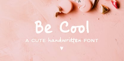 Be Cool is a cute handwritten font with an alternate character set (A-Z, a-z) and an extra set of swashes and ornaments to help decorate your text. This font includes: - A-Z, a-z, numbers and punctuation - Multilingual support - Dozens of ligatures that give it a true handwritten feel Use Be Cool in any design that needs a handwritten feel, such as signatures, notes and quotes, logos and branding.
 - Happy Hour Doodles by Outside the Line,
$19.00 A collection of 30 retro illustrations of cocktails, drinks, beer, champagne, appetizers, canapés, candy, corkscrew, ice bucket, decanters, and 5 background graphics. Perfect for your next party flyer or invitation. Inspiration for the font came from a set of illustrations created for a Cocktail themed fabric contest on spoonflower.com. I also made a postcard for my etsy store. Then I expanded the set and make Happy Hour Doodles.
 - Display Black Serif Rough by Gerald Gallo,
$20.00 Display Black Serif Rough is a rough version of my font Display Black Serif . It is a display font not intended for text use. It was designed specifically for display, headline, logotype, branding, and similar applications. Display Black Serif Rough has an uppercase alphabet located under the character + shift keys and a complete set of alternate uppercase characters located under the character set keys. It also has numbers and punctuation.
 - Lehmann Egyptian by ParaType,
$30.00 Lehmann Egyptian is a font of three styles, based on the pre-revolutionary hand set fonts by Berthold and Lehmann type foundries in St. Petersburg. Designed mainly for display typography, the font works well in small texts too. There's also a quite useful bonus — a stylistic set of historical forms. Lehmann Egyptian was designed by Albert Kapitonov in cooperation with Dmitry Kirsanov and released by ParaType in 2018.
 - Blauth by Latinotype,
$29.00 Blauth—a versatile and contemporary sans serif typeface—comes in 8 weights, ranging from Thin to Black, with matching italics and contains a set of alternate characters. Its small x-height gives it an elegant feel that reminds us of classic typefaces. Blauth is well-suited to continuous text and its uppercase set is ideal for high-impact headlines while its softened corners give your designs a warm and contemporary look.
 - Angro by Linotype,
$29.99 The sans serif Angro was designed in the weights light and bold by Erwin Koch. The figures are based on the form of a rectangle which along with the high xheight and short ascenders and descenders gives the forms a static character. Lines of text in Angro are very compact and close set. Due to the reserved ascenders and descenders Angro can be set with very close line spacing.
 - VeraCruz BT by Bitstream,
$50.99Introducing VeraCruz BT, a fanciful display typeface by Ray Cruz. A tasteful, flair serif design, VeraCruz BT is available as an OpenType font. By selecting the Contextual Alternates feature in OT savvy applications, many of the cap and lowercase characters will change automatically as you type to give the text an informal, animated look. There are also tabular and proportional figure sets, and the extended glyph set supports Central Europe. - Bradrock by Arterfak Project,
$19.00 Introducing Bradrock, a vintage slab serif typeface. Inspired by old-school cowboy design, and circus-style. Bradrock has a more decorative typeface by adding bold bifurcated serif on the letterforms. This font is a perfect choice for vintage or old-school themes. Bradrock is an all-caps font, which represented strength, confidence, and an old-school aesthetic. You can use this font for many purposes such as vintage logos, mugs, embroidery, prints, display, short text, packaging, cards, emblem, signage, and many more! Equipped with special characters to get your design more powerful. TTF & OTF in a zip file including : Uppercase Small-caps Numbers & punctuation Accented characters Stylistic alternates Stylistic set 01-03 That's all, folks! Thank you for visiting.
 - Hirace by Din Studio,
$29.00 Do you want your designs to have strong characters? Hirace is a display font in capital letters perfectly created to meet your needs. A racing theme sticks in its display, which is a brilliant idea. This font, in accordance with its theme, shows a strong brave character to use anytime designers need a large-sized text. Other incredible features are also available to maximize the design projects. Features: Multilingual Supports PUA Encoded Numerals and Punctuation Apply this font for any design projects such as posters, banners, logos, book covers, headings, printed products, merchandise, social media, and so on. Find out more ways to use this font by taking a look at the font preview. Get it now. Happy designing.
 - Onward by David Engelby Foundry,
$25.00 Looking for a sans serif that is ready to work hard for you? Meet Onward; simple and elegant in all sizes as well as legible in small sizes. Explore and write some sample texts here on the website and see all the fine distinctions between weights and styles regular, italic, bold and bold italic. Onward also offers many ligatures, arrows, alternatives, small caps, special numerals for capital letters/small caps/regular respectively ... and more! Onward is a natural choice for a corporate font, for logos, for brochures and a whole range of other purposes in relation to creating a strong visual and modern identity. Keep the family together and get a discount: $55.
 - Portlin by Designova,
$20.00 Portlin is a modern display typeface perfect for headlines, big text, branding, logotypes & graphic design purposes such as posters, flyers and advertisements. This font can be an excellent choice for creating outstanding logos, promotional content, and marketing presentations that can bring uniqueness and freshness at its level best. The font is very flexible in terms of your creativity, you can adjust the letterspacing to design unique textual presentations, especially for creating amazing logotypes and branding designs. Please see the examples shown above to get an idea of the capability of this typeface. Portlin comes with extended language support including Western European, Central European, and South-Eastern European character sets (a total of 231 glyphs).
 - Kardia by Rodrigo Fuenzalida,
$50.00 Kardia is a versatile type family that lets you compose a wide range of texts, from extensive reading materials to striking, eye-catching headlines and titles. Features include ample proportions that have been revised to maintain similar line performance across all its weights. It also has an elevated x-height which facilitates reading in small bodies, in addition to help building solid headlines. Inspired by brush lettering, it takes many features from calligraphic strokes and the foundational style, adapted to a contemporary typographic language. It has 4 weights, all of them including their corresponding italics, small caps and character set that supports Central, Western and South Eastern European, Afrikaans and many more.
 - Bumpy Ride by Hanoded,
$16.00 I live in a small hamlet near the Rhine river. It is a sleepy little town and it doesn’t have any facilities. For groceries I need to go to the next town. The only road leading to that town has been closed for half a year, because of ‘maintenance’, so doing groceries got a lot trickier. The fastest way to travel is through yet another hamlet in the forest, on a very narrow road with extremely bumpy shoulders. Yes, you’ve guessed it: it is a Bumpy Ride. Bumpy Ride was made using a so called Brush Pen. It comes with all the accents and a sweet set of alternates for the lower case letters.
 - Palagio by Din Studio,
$25.00 The art of accumulation. If we can give you many options then why not? Palagio is a sans serif font package that will delight you. A font family that projects simple, warm, yet modern style. Palagio comes with 7 different weights. It is versatile enough to be used as title, body or button text. Features: Multilingual Supports Numerals and Punctuations PUA Encoded It is perfectly used for branding, logos, social media quotes, stickers, posters, vintage designs, wall art, merchandise, social media, and many more. Get more inspiration by seeing the preview. Thank you for purchasing premium fonts from Din Studio. If you have any further questions, don't hesitate to contact us. Happy Designing.
 - Crisis by SIAS,
$29.90 Crisis is a child of the dictatorship of economics. Since time is money the time budget of its production has been rigidly limited. Crisis was designed and generated completely on one single day. The target was to make a useful font while investing nothing more than absolutely indispensable. The component-based glyph construction scheme of another font has been utilized, further detailing work has been strictly limited. Due to those restrictions some letters have rather unusual shapes. This straightforward and contemporary sans (320 glyphs) is of compact proportions and very legible even when set in small sizes. In printing you get more text on one page and thus save up to 30% of paper.
