10,000 search results
(0.056 seconds)
- CA Texteron by Cape Arcona Type Foundry,
$40.00 CA Texteron is a modern text font family to cover the most common typographical needs with a minimum of weights. It is aiming for a serious but unconventional look, which is achieved by combining round and edgy forms in the same font, often in the same glyph, and by using Humanist and modern form-principles at the same time. It merges classical type-design with an experimental spirit. CA Texteron combines elements of the dynamic renaissance principle with the static neo-classic style, which makes it hard to classify. The result is a post-modern hybridization. The Regular weight works best in text size, and with more letter-space also for footnotes. The low contrast makes it robust and legible even in very small sizes. Bold, Italic and Small Caps are intended for emphasis. Bold, Bold Italic and Heavy make good headlines, that reveal the unconventional details. The Italic is not just a slanted version of the Regular weight but has individual forms and typical italic characteristics.
 - Scala Pro by Martin Majoor,
$49.00 The award-winning Scala family (1990-1993) is a worldwide bestseller and has established itself as a ‘classic’ among digital fonts. It was one of the first serious digital text fonts to support small caps, ligatures and different set of numbers. In fact Scala and Scala Sans (1990-1993) are two different typefaces sharing a common form principle: the skeletons of both Scala and Scala Sans are identical. Scala’s dark colour and low contrast works to prevent the thin parts from breaking up. The generous length of Scala italic’s serifs gives it a strong rhythm. The bold weight has the same character widths as the normal weight, so changing a text from normal into bold does not affect the set width. Another part of Scala is very popular among its users: Scala Hands, containing more than one hundred decorative hands and pointers, is a free bonus. Scala Jewels is a set of four highly decorative typefaces, based on the bold capitals of Scala.
 - Chalga VP by VP Creative Shop,
$20.00 Introducing Chalga Serif Typeface - 3 weighs - Latin and Cyrillic support Chalga is elegant, vintage typeface that contains 3 weights to enchant your next project. They have basic latin, advanced latin, basic Cyrillic and advanced Cyrillic character sets. Very versatile fonts that works great in large and small sizes. Its a Caps only fonts. Chalga is perfect for branding projects, home-ware designs, product packaging, magazine headers - or simply as a stylish text overlay to any background image. Uppercase, numeral, punctuation & Symbol Light Regular Bold Basic and advanced latin character sets Basic and advanced Cyrillic character sets Alternate Glyphs Ligature Glyphs Feel free to contact me if you have any questions! Mock ups and backgrounds used are not included. Thank you! Enjoy!
 - Modern Cowboys by Gassstype,
$25.00 Here comes a New font, Modern Cowboys is a Cartoonist Western Typeface Vintage Serif Display font this is strong vintage Typeface western-looking display font. This font is great for your next creative project such as logos, printed quotes, invitations, cards, product packaging, headers, Logotype, Letterhead, Poster, Label, and etc. That is why Modern Cowboys has Stylish and unique characteristic more natural look to your text with a more modern look to your text.
 - Myhota by Ingrimayne Type,
$7.00Myhota is a condensed sans-serif face that has a bit of rawness to it. It is condensed and has a very high x-height, so it more useful for display than text. Myhota-Bold and Myhota-Light were designed in 1990 and the other seven weights were added in 2021 as were the italic and backslanted styles. There is rarely a use for backslanted type, but when it is needed, Myhota provides an option. Myhota-Hatched was an attempt to see if a readable text font could be hatched out of Myhota by lowering the x-height and widening the letters. The result is a face with rather squarish letters. The regular and bold were original styles with the medium and italic styles added in 2021. - Myhota Hatched by Ingrimayne Type,
$7.00 Myhota is a condensed sans-serif face that has a bit of rawness to it. It is condensed and has a very high x-height, so it more useful for display than text. Myhota-Bold and Myhota-Light were designed in 1990 and the other seven weights were added in 2021 as were the italic and backslanted styles. There is rarely a use for backslanted type, but when it is needed, Myhota provides an option. Myhota-Hatched was an attempt to see if a readable text font could be hatched out of Myhota by lowering the x-height and widening the letters. The result is a face with rather squarish letters. The regular and bold were original styles with the medium and italic styles added in 2021.
 - Mantika News by Linotype,
$67.99 Mantika News™, from German designer Jürgen Weltin, was designed to expand the Mantika super family with text and display typefaces for setting newspapers and periodicals. The suite of typefaces is comprised of regular and bold designs, with italic counterparts, for setting continuous text, and light and extra bold versions for setting larger sizes in headlines, sub heads, pull quotes and decks. The typefaces intended for text copy were designed with shared character widths, so that changes can be made in typeface choice without disrupting line endings or column length. The display designs have a slightly smaller x-height and shorter ascenders creating a more elegant demeanor while ensuring compact multi-line display copy. In addition, fonts of Mantika News have a large Monotype W1G (World Glyph Set 1) character set enabling the setting of Greek, Cyrillic and over 20 Eastern and Western European Latin-based languages. Proportional figures are available, in the OpenType® fonts, as an alternative to the tabular designs.
 - Churchward Newstype by BluHead Studio,
$20.00 Originally released in 2008, Churchward Newstype is a workhorse text family, designed by the late Joseph Churchward back in the early 2000’s. If you’re familiar with Churchward’s typefaces, you might know that he always brought a little something quirky to his designs. Churchward Newstype doesn’t disappoint. The exaggerated concave serifs make a statement that is subtle, yet gives the typeface a unique flavor. The proportions and scale of the letters lend themselves to very good legibility in text applications, and the Bold weights are strong enough for headlines. Churchward Newstype is good for text copy, and headlines, and at giant point sizes, great for adding emphasis to posters! The Churchward Newstype family has four weights, Light to Bold, with 13 degree slanted italics. Each font has a second set of tabular figures. In this updated release, each weight now has an extended character set that supports most Western and Eastern European languages.
 - Kungfoo Fighter by IKIIKOWRK,
$15.00 Introducing Kungfoo Fighter typeface, created by ikiiko. This typeface is inspired by the asian character brush strokes. This font has a bold & bold character, with flexible curves. This typeface is perfect for poster design, food & beverages, asian stuff, community logo, magazine, quotes, or simply as a stylish text overlay to any background image. What's included? 2 Weights : Regular & Oblique Uppercase & Lowercase Number & Punctuation Multilingual Support Enjoy our font and if you have any questions, you can contact us by email : ikiikowrk@gmail.com
 - School by Monotype,
$39.00The School font family is a popular design based on a grade school alphabet. The School fonts allow teachers to create custom hand-lettered exercise sheets and classroom signage. Five variations are available. The plain style and its corresponding bold will create hand-lettered stand-alone text. The lined style and its corresponding bold superimposes a set of three guidelines on the plain style. A dashed style is also provided in case a teacher prefers the centerline to be dashed instead of solid. - VVDS Benigne Sans by Vintage Voyage Design Supply,
$14.00 VVDS Benigne Sans is geometric font family consisting of 8 weights ranging from Thin to Ultra Bold with matching italics. Balanced and gently Thin or fat and heavy Ultra Bold, good wide range of widths, which allow use this font not only as a Headers, also as sub-headers or block texts. Also, I love how it looks in infographics. VVDS Benigne Sans is latin-based multilingual and contains all mathematics symbols. OpenTypeFeatures Ligatures, alternates, old style numerals and fractions. Enjoy! VVDS
 - GHEA Samo by Edik Ghabuzyan,
$30.00 GHEA News is a super family font. It has 8 upright weights and their Italics and supports Latin, Armenian and Cyrillic alphabet systems. The weights from Regular to Bold and their Italics can be used as text fonts. The weights thicker than Bold can be used as Display fonts. It is an easily readable two side serif font and the eyes don't get tired while reading. GHEA News has a contrast style and at the same time is quite bright and clear.
 - GHEA News by Edik Ghabuzyan,
$40.00 GHEA News is a super family font. It has 8 upright weights and their Italics and supports Latin, Armenian and Cyrillic alphabet systems. The weights from Regular to Bold and their Italics can be used as text fonts. The weights thicker than Bold can be used as Display fonts. It is an easily readable two side serif font and the eyes don't get tired while reading. GHEA News has a contrast style and at the same time is quite bright and clear.
 - Road Picture JNL by Jeff Levine,
$29.00 Road Picture JNL was modeled after the hand lettered title and credits for the 1940 Bob Hope-Bing Crosby semi-musical comedy “Road to Singapore”, and is available in both regular and oblique versions. Although the lettering design doesn’t resemble anything that was probably used in Singapore at the time, its faux “exotic” look still makes for an interesting revival. Bob Hope and Bing Crosby made a total of seven “road” pictures, hence the homage in the name of this type font.
 - Heroliga by Yahya Type,
$18.00 Heroliga is an elegant & modern sans serif font with special alternative letters and with multilingual support. Heroliga is perfect for logo design, magazine headers, product packaging, branding projects, clothing or simply as a stylish text overlay to any images or websites. WHAT’S INCLUDED? • Comes with regular, italic, bold and bold italic font styles. • Uppercase & lowercase letters. • Numbers, punctuation. • Ligature & Huge Stylistic alternate. • Multilingual support. Still got a question? Send me a message and I’ll be happy to answer! qura.yahya@gmail.com
 - TF Nukes by Teenage Foundry,
$19.00 Introducing TF Nukes – the boldest display style font that will capture the attention of your audience and make your message stand out! This bold, strong font is perfect for headlines, titles, and any other text that needs to make a statement. A bold and striking font style will make your message impossible to ignore, while the bonus illustrations will add an extra layer of creativity to your design. Features: Uppercase, Lowercase, Numeral, Punctuation, Multilingual & Alternates. For any questions please contact me 🙂 Thanks!
 - Sabon Paneuropean by Linotype,
$45.99Jan Tschichold designed Sabon in 1964, and it was produced jointly by three foundries: D. Stempel AG, Linotype and Monotype. This was in response to a request from German master printers to make a font family that was the same design for the three metal type technologies of the time: foundry type for hand composition, linecasting, and single-type machine composition. Tschichold turned to the sixteenth century for inspiration, and the story has a complicated family thread that connects his Sabon design to the Garamond lineage. Jakob Sabon, who the type is named for, was a student of the great French punchcutter Claude Garamond. He completed a set of his teacher's punches after Garamond's death in 1561. Sabon became owner of a German foundry when he married the granddaughter of the Frankfurt printer, Christian Egenolff. Sabon died in 1580, and his widow married Konrad Berner, who took over the foundry. Tschichold loosely based his design on types from the 1592 specimen sheet issued by the Egenolff-Berner foundry: a 14-point roman attributed to Claude Garamond, and an italic attributed to Robert Granjon. Sabon was the typeface name chosen for this twentieth century revival and joint venture in production; this name avoided confusion with other fonts connected with the names of Garamond and Granjon. Classic, elegant, and extremely legible, Sabon is one of the most beautiful Garamond variations. Always a good choice for book typography, the Sabon family is also particularly good for text and headlines in magazines, advertisements, documentation, business reports, corporate design, multimedia, and correspondence. Sabon combines well with: Sans serif fonts such as Frutiger, Syntax. Slab serif fonts such as PMN Caecilia, Clairvaux. Fun fonts such as Grafilone, Animalia, Araby Rafique. See also the new revised version Sabon Next from the Platinum Collection." - Eden Mills - Unknown license

- Goodfish - Unknown license

- Vibrocentric - Unknown license

- Mosquich by FallenGraphic,
$15.00 Mosquich is a modern and minimalistic sans serif condensed font. It has a bold and strong character, making it suitable for use in title text, logos, posters, flyers, and social media. Mosquich has wide and thick strokes, which give a strong and bold impression. It also has a compact and dense character, making it suitable for use in limited space. Mosquich is available in various sizes, from standard to custom sizes. It is also available in various styles, including Reguler, Bold, and italic. Mosquich is a versatile font that can be used for a variety of purposes. It is suitable for designers looking for a modern, minimalistic, and strong font.
 - Cannon by W Type Foundry,
$20.00 The Cannon family is the result of combining the clean aesthetics from a classic sans neo-grotesque with a touch of a geometric design. The result is a simple but dynamic typeface with retro and technological airs. Cannon is ideal for robust advertising, bold brand identities and packaging, also suitable for high impact headlines and short texts. This type family consists of 36 variants and 9 weights (thin, extra light, light, regular, book, medium, bold, extra bold, black), matching italics for all weights and widths, matching small caps for all weights and widths, alternate characters and extended language support. We are proud to introduce: Cannon.
 - High Crush by Namara Creative Studio,
$20.00 A visual reflection of progress and dynamism, Elevate your design projects to the next level with our cutting-edge bold techno display fonts. Suitable for a wide range of applications. Whether you’re designing sports event posters, tech product labels, or esports team branding, these fonts will make your content stand out. Features : Bold, Strong & Techno Display Typeface Versatile & Unique Design Alternates, Ligatures & Multilingual Support with PUA Encoded Capture attention, and make a bold impression with these fonts. Start creating the future today! Note : To be able to access ligatures and the alternate letters, please make sure the software you are using can support opentype features.
 - Peroba Rosa by Yahya Type,
$16.00 Peroba rosa is a modern sans serif type family featuring a blend of modern, classical, and playful characteristics. The simple, clean forms and classically inspired proportions give it a timeless quality and interesting visual rhythm. Peroba rosa is perfect for logo design, magazine headers, product packaging, branding projects, clothing or simply as a stylish text overlay to any images or websites. WHAT’S INCLUDED? • Comes with regular, thin, light, italic, bold, thin italic, light italic, bold italic and bold italic font styles. Uppercase & lowercase letters. numbers. punctuation Ligature & Huge Stylistic alternate. Multilingual support. Still got a question? Send me a message and I’ll be happy to answer! qura.yahya@gmail.com
 - Mateo by Linotype,
$29.99 Linotype Mateo is part of the Take Type Library, which features the winners of Linotype’s International Digital Type Design Contest from 1994 to 1997. Jürgen Ellenberger included three styles in his font, roman, bold and outline. The characters of Mateo consist exclusively of lines, giving the font an extremely angular look. However, Mateo retains a certain handwritten style somewhat reminiscent of the graffiti left on wooden grade school desks by previous classes. The bold and outline styles have emphasized stroke contrasts but keep the angular, consciously irregular look. The roman style is best for smaller texts and the bold and outlines styles for headlines.
 - SF Big Whiskey SC - Unknown license

- Liliane Classe by Brenners Template,
$25.00 This is a challenge for elegant but radical typography layouts. Standard styles include classic and sophisticated serifs, while italic styles are designed with more adventurous handwritten touches. This serif font family included a total of 14 styles, including 7 weights and separately created italics. It can be the best choice for a unique and meaningful logo and branding design, and it will maintain a refined sense of unity. You need to understand OpenType Features to use these fonts well. Please check first whether the your apps plan to use supports these OpenType Features. Thanks. OpenType Features Discretionary Ligatures : ac, ad, ai, ak, ar, ay, az, ce, ci, ck, co, de, do, dr, er, ft, he, ho, ng, ro, se, sp, te, to, tr Standard Ligatures : fi, fl Alternates : a, d, h, i, k, n, u, z Oldstyle Figures Tabular Figures Fractions
 - 1534 Fraktur by GLC,
$38.00 This family was inspired by the early Fraktur style font used circa 1530 by Jacob Otther, printer in Strasbourg (Alsace-France) for German language printed books. Although it is an early Fraktur pattern, it is easy to see the characteristic differences with the Schwabacher style (look at 1538 Schwabacher), like in the small d, o or y... and the capitals (look at the H, K, T...). Frequently, Schwabacher and Fraktur were used together in the same book : Fraktur style for the main and Schwabacher for marginalia and comments. This font contains standard ligatures and German historical ligatures (German double s, long s, ts...) and diacritics (special ummlaut "e superscript" and "∞" instead of dieresis with letters a, o and u,) naturally, we have added numerous letters lacking in the original to permit a contemporary use of the font.
 - Broadway Poster by GroupType,
$15.00 Originally designed by Morris Fuller Benton in 1925, FontHaus's 1995 revival is based on a design named "Novelty Broadway". Characters were referenced from "Commercial Art of Show Card Lettering" by James Eisenberg, published by D. Van Nostrand Company in 1945. This Broadway is classic Broadway but with some charming differences such as a slanted lower case "f" a remarkable lower case "g" and a high-waisted upper case case "R", as only a few examples. It was named "Novelty" because the alphabet incorporated a concave design feature in the tops and bottoms of each letter. These differences allow this version to possess much more personality than that of all other Broadway designs on the market. It looks almost hand brushed, has soft edges and is no where near as sterile looking as all the other digital versions. It feels very 1925!
 - Genau by Aronetiv,
$9.99 The Genau family is a geometric sans serif designed under the influence of the constructivist schools of Vkhutemas and Bauhaus. Despite the traditional shapes, the family has characteristic features in the modern outline. The sharp junction of round and straight strokes repeats the sharp tails in “a” “d” “n” “u” and other. The family has an even, smooth texture. The family has been developed to advert materials for architecture, design, education, modern art. The family has high readability in a small size, and doesn't lose aesthetic qualities when enlarged. The font family contains 8 styles The font is equipped with a Variable file with two axes (weight and slope) Supports languages of central Europe and some languages of eastern Europe Contains small uppercase letters Contains tabular figures There are several alternates in the font The font has more than 1700 kerning pairs
 - Stencil Label JNL by Jeff Levine,
$29.00 In the 1943 Three Stooges comedy short “Higher than a Kite”, Curly reaches into a box with the label “hand grenades” painted on its side and pulls out one of the devices. The bold, squared stencil hand lettering on that prop inspired Stencil Label JNL, which is available in both regular and oblique versions.
 - Favourite by Fidan Fonts,
$18.60 Favourite is a hand-lettered font. Mix it up with uppercase and lowercase and you'll get a different vibes from it. It's works perfectly for headlines, pull quotes, wordmark logos, posters and many more. Latin-based Language Support (You can check your language typing characters in text box below). Happy creating!
 - Cavalier by Erik Bertell,
$19.95 Cavalier is a bold and extravagant headline typeface. Drawing inspiration from the iconic Lubalin classic, ITC Serif, Cavalier maintains in its design an approach more geometric and slightly cleaner. Equipped with plenty over 100 discretionary ligatures, Cavalier makes for a striking headline font, yet capable of legibility even in longer texts.
 - Texas Moliqu by Evo Studio,
$15.00 Texas Moliqu is a retro and western-looking display font. This bold, and vintage font can easily become your favorite. It can be used for books, magazine covers, social media posts, invitations, and so much more! So add this to your creations and take your designs to the next level!
 - ITC Barcelona by ITC,
$40.99 ITC Barcelona was designed by Ed Benguiat, a serif typeface with almost decorative details. The bold and heavy weights include some unique twists to a number of characters and numerals which are slightly rounder than those of the other weights. The flexible ITC Barcelona can be used in text or displays.
 - Etalene by Muksal Creatives,
$15.00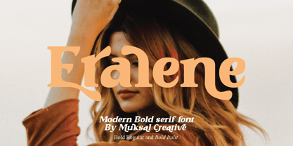 Etalene Modern Bold serif Font typeface with beautiful Ligature, special glyphs, ornament and multilingual support. It's a very versatile font that works great in large and small sizes. Perfect for editorial projects, Logo design, Clothing Branding, product packaging, magazine headers, or simply as a stylish text overlay to any background image.
 - Nicko by Zealab Fonts Division,
$14.00 Nicko is a bold and friendly typeface. Nicko has a unique style with stylistic, alternates, ligatures and supports multilingual languages. Create unique & beautiful logotype, use it as an elegant solution for your next magazine layout, or choose Nicko for any graphics that require a sleek look with a elegant flair.
 - farloni by Justi,
$15.00 farloni is a monospaced monoline typeface family that can be used in a variety of typographic environments. it comes in four weights, from light to bold. the typeface is intended for use in display sizes, but looks quite legible in text and it works well for editorial and brand design.
 - Flowchart by Muksal Creatives,
$15.00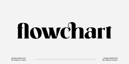 Flowchart Modern Bold serif Font typeface with beautiful Ligature, special glyphs, ornament and multilingual support. It's a very versatile font that works great in large and small sizes. Perfect for editorial projects, Logo design, Clothing Branding, product packaging, magazine headers, or simply as a stylish text overlay to any background image.
 - Minomu by Owl king project,
$37.00 Minomu consists of twenty sans serif font families, With a thicker weight, Minomu can be applied as an attractive and bold appearance for title letters, not only that, but Minomu's family with lowercase letters can also be used in designs with use as body text, to create more detailed descriptions.


