6,760 search results
(0.035 seconds)
- Potato Sans by 4RM Font,
$9.00 Made with a cute shape, making this font suitable for use in graphic designs related to unique things. This font is available in 2 styles namely bold and black.
 - Butcher by RodrigoTypo,
$25.00 Butcher is a Rough font with 2 styles, a medium and a black to play with the weights, it contains the Greek and Cyrillic alphabet, special for action titles
 - Sketchetik Fill by Hiekka Graphics,
$19.00 Sketchetik Fill – brother of famous Sketchetik – is a hand-drawn font in four styles: Light, Regular, Bold and Black. Sketchetik Fill is recommended for use as a display typeface.
 - Walkway Black is a distinctive and modern font that offers a fresh and engaging appeal for various design applications. As a member of the Walkway font family, designed by Graham Meade, Walkway Black...
- Austin Pen by Three Islands Press,
$29.00 Empresario Stephen F. Austin (1793-1836) is considered by many the “Father of Texas” for leading the first Anglo-American colony into the then-Mexican territory back in the 1820s. A few years later, while on a diplomatic mission to Mexico City, Austin was arrested on suspicion of plotting Texas independence and imprisoned for virtually all of 1834. During this time he kept a secret diary of his thoughts and musings—much of it written in Spanish. Austin Pen is my interpretation of Austin’s scribblings in this miniature prison journal (now in the collection of the wonderful Dolph Briscoe Center for American History, in the Texas city that bears his name). The little leather-bound book is filled with notes in ink and pencil—some of the faded penciled pages traced in ink years later by Austin’s nephew Moses Bryan. A genuine replication of 19th century cursive, Austin Pen has two styles: a fine regular weight, along with a bold style that replicates passages written with an over-inked pen. Each is legible and evocative of commonplace American penmanship of two centuries ago.
 - Robofan by César Puertas,
$12.00 Robofan is a vintage Open Type font based on the logo of reconfigurable robots (toys and characters) from the mid 1980s. The typeface was conceived when looking at the author’s own collection of Transformers, he noticed many basic drawing and spacing problems, missing characters, incorrect accent shapes and a lack of proper rhythm in the typeface used in the newest toy’s packaging, mistakes that didn't happen in the toys back in the 80s. These mistakes were so evident that the author decided to look back at the original lettering from the 80s to capture the original spirit of the Transformers. Robofan contains true small caps and has full support for Cyrillic scripts and Central European languages. The full character set consists of more than 700 glyphs. Robofan is ideal for computer & video games, merchandising and all kinds of products related to science fiction, robots, cyborgs, aliens and everything else.
 - Aspire Narrow SmallCaps by Grype,
$18.00 While the Aspire SmallCaps family finds its roots of inspiration in the ACURA automotive company logo, with its wider base, the Aspire Narrow SmallCaps family condenses those styles into something more suitable for larger bodies of text in a more standardized width. Aspire Narrow SmallCaps is perhaps the most true to form tribute to the original all capitals inspiration logotype. It maintains all capital forms (whether standard or smallcaps) and yet is still strikingly powerful in its presence and readability including numerals, and a comprehensive range of weights, creating a straightforward, uncompromising collection of typefaces that lend a solid foundation and a broad range of expression for designers. Here's what's included with the Aspire Narrow SmallCaps Family bundle: - 430 glyphs per style - including Capitals, Small Caps, Numerals, Punctuation and an extensive character set that covers multilingual support of latin based languages. (see the 6th graphic for a preview of the characters included) - Stylistic Alternates - alternate characters that remove the angled stencil cuts for a more standardized text look. - 3 weights in the family: Light, Regular, & Black. - 3 obliques in the family, one for each weight: Light, Regular, & Black. - Fonts are provided in TTF & OTF formats. The TTF format is the standard go to for most users, although the OTF and TTF function exactly the same. Here's why the Aspire Narrow SmallCaps Family is for you: - You're in need of automotive sans font family with a range of weights and obliques - You're love that ACURA letter styling, and want to design anything within that genre - You're looking for an alternative to Eurostile with more stylized letterforms. - You're looking for a battle-tech typeface for your futuristic war chest labelling. - You just like to collect quality fonts to add to your design arsenal
 - Aspire Narrow by Grype,
$18.00 While the Aspire family finds its roots of inspiration in the ACURA automotive company logo, with its wider base, the Aspire Narrow family condenses those styles into something more suitable for larger bodies of text in a more standardized width. Aspire pays homage the techno display styling of the inspiration logotype, further evolving beyond its brand inspired origin to give birth to a font family that pulls on modern and historical styles. It adopts a sturdy yet approachable style with its uniform stroke forms and curves, and goes on to include a lowercase, numerals, and a comprehensive range of weights, creating a straightforward, uncompromising collection of typefaces that lend a solid foundation and a broad range of expression for designers. Here’s what’s included with the Aspire Narrow Family bundle: 477 glyphs per style - including Capitals, Lowercase, Numerals, Punctuation and an extensive character set that covers multilingual support of latin based languages. (see the 6th graphic for a preview of the characters included) Stylistic Alternates - alternate characters that remove the angled stencil cuts for a more standardized text look. 3 weights in the family: Light, Regular, & Black. 3 obliques in the family, one for each weight: Light, Regular, & Black. Fonts are available in TTF & OTF formats. The TTF format is the standard go to for most users, although the OTF and TTF function exactly the same. Here’s why the Aspire Narrow Family is for you: - You’re in need of a narrow automotive sans font family with a range of weights and obliques. - You’re love that ACURA letter styling, and want to design with a narrow font within that genre. - You’re looking for an alternative to Eurostile with more stylized letterforms. - You’re looking for a clean techno typeface for your starship console labelling. - You just like to collect quality fonts to add to your design arsenal.
 - Gator by Canada Type,
$24.95 Cooper Black's second coming to American design in the mid-sixties, after almost four decades of slumber, can arguably be credited with (or, depending on design ideology, blamed for) the domino effect that triggered the whole art nouveau pop poster jam of the 1960s and 1970s. By the early 1970s, though Cooper Black still held its popular status (and, for better or for worse, still does), countless so-called hippie and funk faces were competing for packaging and paper space. The American evolution of the genre would trip deeper into psychedelia, drawing on a rich history of flared, flourished and rounded design until it all dwindled and came to a halt a few years into the 1980s. But the European (particularly German) response to that whole display type trend remained for the most part cool and reserved, drawing more on traditional art nouveau and art deco sources rather than the bottomless jug of new ideas being poured on the other side of the pond. One of the humorous responses to the "hamburgering" of typography was Friedrich Poppl's Poppl Heavy, done in 1972, when Cooper Black was celebrating its 50th anniversary. It is presented here in a fresh digitization under the name Gator (a tongue-in-cheek reference to Ray Kroc, the father of the fast food chain). To borrow the title of a classic rock album, Gator is meaty, beaty, big and bouncy. It is one of the finest examples of how expressively animated a thick brush can be, and one of the better substitutes to the much overused Cooper Black. Gator comes in all popular font formats, and sports an extended character set covering the majority of Latin-based languages. Many alternates and ligatures are included in the font.
 - Defense by Reserves,
$49.00 Defense is an unyielding rectangular slab-serif stencil face designed with consistently balanced letterforms and a refined finish. It’s extremely angular geometric form commands attention in display settings, yet is also legible in short text blocks. The stencil mark width varies accordingly with each weight, helping to further define each style. Numerous alternate character sets allow room for customization, while the expanded ligatures push letter combinations to the limit. Stylistically, Defense’s almost crude, sharp-cornered construction is balanced by it’s sophisticated finish and attention to detail, often unrealized in similar faces of this genre. The upright weights are complimented by pairings of true italics, completely rebuilt, slightly narrower in width with modified letterforms, increasing their contrast and flow. Features include: Precision kerning Standard Ligatures set including 'f' ligatures (fi, fl, ff, fh, fj, ffl, ffi, ffj) Discretionary Ligatures set including (ft, rt, ae, oe, st, ft, ct, oc, oo, ry, AE, OE, AL, TH, HE, AK, AN, TT, HD, AM, AP, AR, NF, NE, NH, NL, NB, FL, ND, FE, AB, OB, OD, OF, OG, OH, OK, OL, OM, ON, OO, OP, OQ, OR, OU, AH, UE, UF, UB, UD, UH, UK, UL, UM, UN, UP, UR, UU, MP, XY, YX, KY, WY, VY, AF, FF, FI) Alternate characters (O, o, S, s, a, h circumflex, @, ®, ™, ¶, $, &, _, and various ligature alternates) Case forms (shifts various punctuation marks up to a position that works better with all-capital sequences) Capital Spacing (globally adjusts inter-glyph spacing for all-capital text) Slashed zero Full set of numerators/denominators Automatic fraction feature (supports any fraction combination) Extended language support (Latin-1 and Latin Extended-A) *Requires an application with OpenType and/or Unicode support.
 - HVD Peace - Unknown license

- Cooper BT by Bitstream,
$34.99 Cooper Black, commissioned by Barnhart Brothers & Spindler, is the best known of Oswald Cooper’s typefaces. Bitstream has expanded the 1921 original into a complete series of round-edged text faces.
 - Sauna Pro by Underware,
$50.00 This sauna is as hot as you make it! Sauna Pro family comes for all sizes and ages, containing Regular, Bold and Black weights. Regular and Bold can be used together in various sizes in texts and headlines. Regular weight is supported with Small caps. Three Black styles are individual and specially made for display use (from magazine headlines to billboards). For every weight there are two italics. Basic Italic is formal and stable, Italic Swash is happy and fancy. Dingbats give a little extra next to the typographics. Dingbat fonts include 26 illustrations which can be used as plain black and white illustrations, or as multi-coloured illustrations. This style palette offers a flexible range for a wide variety of text and display typography. Sauna Pro has Underware’s world-dominating Latin Plus character set, supporting a total of 219 languages.
 - Lagos by Scholtz Fonts,
$19.00 Lagos was created because of the lack of African-inspired fonts that are truly modern without being partly art-deco in origin. I wanted to make a vigorous, sharp-edged font that reflects the energy and dynamism of modern Africa. The lines of the font combine the sharp angularity of African rocks and mountains with the smooth fluidity of Africa's snake-black rivers. The font is supplied in two styles, Lagos Regular and Lagos Light. Lagos Light is not a simple, mechanical modification of Lagos Regular. The outlines and proportions have been subtly modified to accommodate the lighter weight. Lagos contains a full 256 character set (upper and lower case, punctuation, diacritical characters, special symbols and numerals), in which all characters have been fully kerned and letter-spaced.
 - Dead Face by Eotype,
$12.00 Dead Face is an experimental black letter font that has a strong, abstract and segmentive appearance. Dead Face is a black letter font with unique fractures, where each fracture tends to be soft in synergy with thin strokes. Each glyph is crafted originally, so it can stand alone which can be used for logos or clothing designs. This font is also suitable for banners and posters. This font has alternate features and ligatures that are packaged in otf format. Have fun being creative using this font!
 - Demotte by Ingrimayne Type,
$7.95 Demotte is a display face constructed from triangular blocks (wedges) and some circles. It comes in two styles. In one style the triangular blocks point up so that the letters are bottom heavy, and in the other the blocks point down so that the letters are top heavy. Also included in the family is a distorted version of the design.
 - Wonky by Ana's Fonts,
$16.00 The Wonky Font family is a set of 3 handmade fonts, made using three different materials: a pencil, a thin fineliner and a bold marker. Each font includes 3 variations for each letter and number, accessible through contextual alternates, for extra realism and fun. The pencil font is a SVG font, which allows for the texture of the pencil to be captured in a more authentic way, and is complemented with an extra doodles font. Wonky Font looks good at small sizes and will also look great in all caps texts. Use Wonky Font in designs such as postcards and notes, posters, logotypes, social media posts, branding and packaging. This font includes: a Wonky Pencil SVG font, with a vector alternative that preserves the texture a Wonky Thin font a Wonky Bold font a Wonky SVG Extras font, with 26 pencil doodles Software requirements for the SVG font: Photoshop CC2017+ // Illustrator CC2018+
 - Heretic by Device,
$39.00 Heretic surrounds itself with an atmosphere of evil, carnival freakshow and no-nonsense thuggery. Mix the black and condensed weights of this octagonal blackletter together for more interesting, yet disconcerting results.
 - Flat10 Art Deco by Dharma Type,
$14.99 This 8-bit pixel font is designed with respect for 80s game designers and the pixel font pioneers in middle 90s. Use at size 10 pixels or multiples of 10 and anti-alias off is recommended. List of our Pixel Font Project. ·Flat10 Antique ·Flat10 Artdeco ·Flat10 Arts&Crafts ·Flat10 fraktur ·Flat10 Holy ·Flat10 Holly ·Flat10 Segments ·Flat10 Stencil ·Flat20 Gothic ·Flat20 Headline ·Flat20 Hippies ·Flat20 Streamer ·Behrensmeyer Vigesimals ·Civilite Vigesimals
 - Suburban Collier by Paula Minelgaite,
$80.00 Suburban Collier is a dreamy, humanist demi-serif sister of Romford Stencil typeface. It was created during the COVID-19 pandemic and its name is inspired by Collier Row, a suburban area of Romford, East London (UK). Suburban Collier features subtle ligatures, an alternative ‘a’ and supports Western, Central, Southern, and Eastern European as well as Pinyin. Use it to add character to your body copy or as fancy display text.
 - Flat20 Streamer by Dharma Type,
$1.00 This 8-bit pixel font is designed with respect for 80s game designers and the pixel font pioneers in middle 90s. Use at size 10 pixels or multiples of 10 and anti-alias off is recommended. List of our Pixel Font Project. ·Flat10 Antique ·Flat10 Artdeco ·Flat10 Arts&Crafts ·Flat10 fraktur ·Flat10 Holy ·Flat10 Holly ·Flat10 Segments ·Flat10 Stencil ·Flat20 Gothic ·Flat20 Headline ·Flat20 Hippies ·Flat20 Streamer ·Behrensmeyer Vigesimals ·Civilite Vigesimals
 - Flat10 Antique by Dharma Type,
$9.99 This 8-bit pixel font is designed with respect for 80s game designers and the pixel font pioneers in middle 90s. Use at size 10 pixels or multiples of 10 with anti-alias off is recommended. List of our Pixel Font Project. ·Flat10 Antique ·Flat10 Artdeco ·Flat10 Arts&Crafts ·Flat10 fraktur ·Flat10 Holy ·Flat10 Holly ·Flat10 Segments ·Flat10 Stencil ·Flat20 Gothic ·Flat20 Headline ·Flat20 Hippies ·Flat20 Streamer ·Behrensmeyer Vigesimals ·Civilite Vigesimals
 - Tannen by Rafael Jordan,
$30.00 Tannen is an interpretation of the Emil Meyer’s Tannenberg, the result is a fun and cool blackletter display built without curves and casual look with a lot of personality and expressivity. It has 3 independent styles (regular, inline and shadow) that can be combined with each other, plus a stencil style. Tannen counts with 3 weights per style, OpenType features (ligatures, alternates, fractions and more) and supports dozens of latin languages.
 - Loading Dock NF by Nick's Fonts,
$10.00This typeface is patterned after the lettering produced by the Marsh Stencil Making Machine, which was an indispensable part of industrial shipping departments in the mid-twentieth century. The font is unicase, but includes a “this side up” pointing hand at the section mark position, and a recycle symbol at the German double-s position. Both versions of the font include 1252 Latin, 1250 CE (with localization for Romanian and Moldovan). - Flat20 Hippies by Dharma Type,
$14.99 This 8-bit pixel font is designed with respect for 80’s game designers and the pixel font pioneers in middle 90’s. Recommended use at 20 pixels or multiples of 20 and anti-alias off. List of our Pixel Font Project. ·Flat10 Antique ·Flat10 Artdeco ·Flat10 Arts&Crafts ·Flat10 fraktur ·Flat10 Holy ·Flat10 Holly ·Flat10 Segments ·Flat10 Stencil ·Flat20 Gothic ·Flat20 Headline ·Flat20 Hippies ·Flat20 Streamer ·Behrensmeyer Vigesimals ·Civilite Vigesimals
 - Valibuk by Juraj Chrastina,
$39.00 Valibuk is a compact clean typeface for headlines and short text. No details are small and it’s a bunch of details that make Valibuk as it is. It’s a heavy, condensed face with a high x-height and tight spacing and that’s why Valibuk can write loud. The quality of the spacing and kerning is ensured by Igino Marini. Lomidrevo is a grunge stencil family derived from Valibuk.
 - Flat10 Arts And Crafts by Dharma Type,
$9.99 This 8-bit pixel font is designed with respect for 80s game designers and the pixel font pioneers in middle 90s. Use at size 10 pixels or multiples of 10 and anti-alias off is recommended. List of our Pixel Font Project. ·Flat10 Antique ·Flat10 Artdeco ·Flat10 Arts&Crafts ·Flat10 fraktur ·Flat10 Holy ·Flat10 Holly ·Flat10 Segments ·Flat10 Stencil ·Flat20 Gothic ·Flat20 Headline ·Flat20 Hippies ·Flat20 Streamer ·Behrensmeyer Vigesimals ·Civilite Vigesimals
 - Northash by Arterfak Project,
$17.00 Introducing Northas the vintage stencil font inspired by the old-school signage and military design. This font has a bit condensed letterform that gives a strong look and dignified. Perfect for many themes such as sports, military, urban, wildlife, vintage, and more! Fonts featured : Uppercase Small caps Numbers Symbols & punctuation Accented characters Alternates Catchwords: in, out, the, with, de, of, at, and, etc. Thank you for your support and happy designing!
 - Brave Brigade by Invasi Studio,
$17.00 The Brave Brigade font is inspired by military uniforms and badges. It is suitable for use as a display font for display purposes. We desire to provide military fonts that have a variety of styles not just based on military themes. It is available in three styles: regular, halftone, and military stencil. There are tons of uses for it, including branding projects, posters, packaging, magazine covers, and more.
 - Basik by Superfried,
$32.50 As the name suggests, Basik is a simple, clean and versatile sans-serif typeface designed by Superfried. It is equally apt in both body and display scenarios. There are already numerous san-serif fonts available which is why we have tried to create some unique styles and cuts throughout the typeface. Basik has been featured on the Behance curated typography gallery TypographyServed.com. It is available in two styles, book and stencil.
 - Flat20 Headline by Dharma Type,
$1.00 This 8-bit pixel font is designed with respect for 80’s game designers and the pixel font pioneers in middle 90’s. Recommended use at 20 pixels or multiples of 20 and anti-alias off. List of our Pixel Font Project. ·Flat10 Antique ·Flat10 Artdeco ·Flat10 Arts&Crafts ·Flat10 fraktur ·Flat10 Holy ·Flat10 Holly ·Flat10 Segments ·Flat10 Stencil ·Flat20 Gothic ·Flat20 Headline ·Flat20 Hippies ·Flat20 Streamer ·Behrensmeyer Vigesimals ·Civilite Vigesimals
 - Eckhardt Poster Board JNL by Jeff Levine,
$29.00 Eckhardt Poster Board JNL further continues Jeff Levine's series of sign painter-oriented fonts, named in honor of his good friend Albert Eckhardt, Jr. (who ran Allied signs in Miami, Florida from 1959 until his passing). The typeface is a casual brush style, modeled from an image of a do-it-yourself sign making kit comprised of stencils, paint and brush spotted for sale through an online auction.
 - Infantry by Gassstype,
$25.00 INFANTRY - Modern Army Typeface Military Serif Font, first conceptualize was inspired by the classic vintage military stencil design . I wanted a typeface that could be a solid base for any military inspired project INFANTRY Fonts can be used for wallpaper, pattern fills, web page background, surface textures. Perfect for making army posters , scrapbooking,invitation cards, stationary, gift wrap, packaging, buttons, pendants, holiday gifts, print on fabrics and so much more.
 - Flat20 Gothic by Dharma Type,
$14.99 This 8-bit pixel font is designed with respect for 80s game designers and the pixel font pioneers in middle 90s. Use at size 20 pixels or multiples of 20 with anti-alias off is recommended. List of our Pixel Font Project. ·Flat10 Antique ·Flat10 Artdeco ·Flat10 Arts&Crafts ·Flat10 fraktur ·Flat10 Holy ·Flat10 Holly ·Flat10 Segments ·Flat10 Stencil ·Flat20 Gothic ·Flat20 Headline ·Flat20 Hippies ·Flat20 Streamer ·Behrensmeyer Vigesimals ·Civilite Vigesimals
 - Air Factory by Khaito Gengo,
$22.00 Air Factory was originally designed for a merchandise company, and ordered to design iconic but plain forms. Air Factory is a very simple and modern sans-serif font inspired by early 1900’s typefaces, like Futura, and consisting of 5 weights and stencil type(free). This contemporary typeface would be good used for restaurant, retail, book, poster etc. Air Factory also features various ligatures, stylistic alternates, fractions, and languages as well.
 - Galivanted by UICreative,
$23.00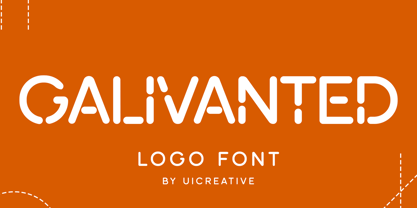 Introducing our new product the name Galivanted Logo Stencil Sans Serif Font. Modern Sans Serif font that feels beautiful classy, elegant, and modern. This font is perfectly suited for a wide variety of projects, such as signature, stationery, logo, wedding, typography quotes, magazine or book covers, website headers, clothing, branding, packaging design, and more. Also for fashion-related branding or editorial design and displays both masculine and feminine qualities.
 - Kenwyn by Talbot Type,
$19.50 Kenwyn is a bold, geometric, Egyptian style slab-serif display font. It comes in two variations — Single Dot and Double Dot — each with an accompanying Stencil variation. Essentially a blend of circles and squares, Single Dot features a circular counter at the centre of each character, while Double Dot uses a lower and upper circle. Although the two variations are similar in principle, the results are visually quite different.
 - Goth Stencil Premium, the brainchild of the talented designer Juan Casco, is a font that marries the essence of gothic design elements with the practical utility of stencil typefaces. At its core, Go...
- ION A by Setup,
$19.95 ION A is a part of the ION superfamily, which consists of 3 families: condensed (ION A), normal (ION B) and wide (ION C), each having a compelling range of 10 weights. Styles Thin to Black have 436 glyphs supporting more than 70 Latin-based languages and the three heaviest weights, named U1, U2 and U3 have 94 basic glyphs. ION glyphs are based on the classic 7-segment display, but for readability and aesthetic reasons, some alphabetic characters don't follow this matrix strictly. In case you like things in order, don't worry, there's a stylistic set that replaces all characters with their strict alternatives. The special characters, such as #, @ or % are composed of special segments, but are designed to fit seamlessly within the whole character set. ION was designed with the needs of contemporary graphic design in mind. There are alternative characters, discretionary ligatures, slashed zero, superior & inferior numbers, fractions, ordinals and three handy stylistic sets. The ten styles of ION A are accompanied with a special 11th style called Cells, allowing you to design a special underlying layer of black or outlined cells. This way you can create various containers and boxes for your text, highlight what's important or go wild and draw a space invader, using the cells as building blocks. Learn more about the OpenType features and Cells at www.urtd.net/ion.
 - ION C by Setup,
$19.95 ION C is a part of the ION superfamily, which consists of 3 families: condensed (ION A), normal (ION B) and wide (ION C), each having a compelling range of 10 weights. Styles Thin to Black have 436 glyphs supporting more than 70 Latin-based languages and the three heaviest weights, named U1, U2 and U3 have 94 basic glyphs. ION glyphs are based on the classic 7-segment display, but for readability and aesthetic reasons, some alphabetic characters don't follow this matrix strictly. In case you like things in order, don't worry, there's a stylistic set that replaces all characters with their strict alternatives. The special characters, such as #, @ or % are composed of special segments, but are designed to fit seamlessly within the whole character set. ION was designed with the needs of contemporary graphic design in mind. There are alternative characters, discretionary ligatures, slashed zero, superior & inferior numbers, fractions, ordinals and three handy stylistic sets. The ten styles of ION C are accompanied with a special 11th style called Cells, allowing you to design a special underlying layer of black or outlined cells. This way you can create various containers and boxes for your text, highlight what's important or go wild and draw a space invader, using the cells as building blocks. Learn more about the OpenType features and Cells at www.urtd.net/ion.
