10,000 search results
(0.029 seconds)
- Quercus 10 by Storm Type Foundry,
$69.00 Quercus is characterised by open, yet a little bit condensed drawing with sufficient spacing so that the neighbouring letters never touch. It has eight interpolated weights with respective italics. Their fine gradation allows to find an exact valeur for any kind of design, especially on the web. Quercus serif styles took inspiration from classicistic typefaces with vertical shadows, ball terminals and thin serifs. The italics have the same width proportion as upright styles. This “modern” attitude is applied to both families and calls for use on the same page, e g in dictionaries and cultural programmes. Serif styles marked by “10” are dedicated to textual point sizes and long reading. The sans-serif principle is rather minimalistic, with subtle shadows and thinned joints between curved shapes and stems. Quercus family comprises of the usual functionality such as Small Caps, Cyrillics, diacritics, ligatures, scientific and aesthetic variants, swashes, and other bells & whistles. It excels in informational and magazine design, corporate identity and branding, but it’s very well suited for book covers, catalogues and posters as well. When choosing a name for this typeface I've been staring out from my studio window, thinking helplessly without any idea in sight. Suddenly I realised that all I can see is a spectacular alley of oaks (Quercus in Latin) surrounding my house. These oaks were planted by the builders of local ponds under the leadership of Jakub Krčín in the fifteenth century.
 - Quercus Whiteline by Storm Type Foundry,
$69.00 Quercus is characterised by open, yet a little bit condensed drawing with sufficient spacing so that the neighbouring letters never touch. It has eight interpolated weights with respective italics. Their fine gradation allows to find an exact valeur for any kind of design, especially on the web. Quercus serif styles took inspiration from classicistic typefaces with vertical shadows, ball terminals and thin serifs. The italics have the same width proportion as upright styles. This “modern” attitude is applied to both families and calls for use on the same page, e g in dictionaries and cultural programmes. Serif styles marked by “10” are dedicated to textual point sizes and long reading. The sans-serif principle is rather minimalistic, with subtle shadows and thinned joints between curved shapes and stems. Quercus family comprises of the usual functionality such as Small Caps, Cyrillics, diacritics, ligatures, scientific and aesthetic variants, swashes, and other bells & whistles. It excels in informational and magazine design, corporate identity and branding, but it’s very well suited for book covers, catalogues and posters as well. When choosing a name for this typeface I've been staring out from my studio window, thinking helplessly without any idea in sight. Suddenly I realised that all I can see is a spectacular alley of oaks (Quercus in Latin) surrounding my house. These oaks were planted by the builders of local ponds under the leadership of Jakub Krčín in the fifteenth century.
 - Benguiat Caslon by House Industries,
$33.00 Designed to be set in big, large and huge sizes in classic TNT (tight-not-touching) style, Benguiat Caslon is dynamite for a wide range of display demands. We also included outline and drop-shadow versions as well as numerous swash caps, ligatures, contextual alternates and automatically-shifting punctuation. Ed Benguiat originally designed this alphabet for the Photo-Lettering library during his tenure as the legendary type house’s art director. When we purchased Photo-Lettering in 2003, one of the first things we did was start picking some of our favorite films to digitize as fonts. Photo-Lettering partner Christian Schwartz chose this expressive serif specimen for its high contrast strokes that stand up to the most vigorous display typography demands without withering against pesky design limitations like screen resolution, ink spread and dot gain. FEATURES: Alternate characters, ligatures and contextual substitutions add an unexpected flair to words and phrases. We also provided a drop shadow to add depth and dimension. Shifting punctuation marks take care of those optical tricks so you don't have to. A delicately expressive outline version adds color even in black and white. BENGUIAT CASLON CREDITS: Typeface Design: Ed Benguiat Typeface Digitization: Christian Schwartz, Bas Smidt Typeface Production: Ben Kiel, Jason Campbell Like all good subversives, House Industries hides in plain sight while amplifying the look, feel and style of the world’s most interesting brands, products and people. Based in Delaware, visually influencing the world.
 - DynaGrotesk by Storm Type Foundry,
$55.00 The most exciting new feature of DynaGotesk is the Vintage Italics stylistic set, which activates the decorative forms. It includes the looped "w", curved ascenders and descenders of many lowercase letters. These can significantly change the feel of a poster or invitation. DynaGrotesk may look like a revival of an old typeface, but it is not. It uses only some historical reminiscences, sharp edges and curved shapes, but it’s completely original design aimed at ease of use. The bigger the size, the more evident and pronounced are the spicy details. In smaller and even smallest sizes it’s appearance is qieter, very well suited even for long portions of text. DynaGrotesk was created in 1995 with the use of Multiple Master interpolation. But the MM fonts never achieved the desired application in industry, so designers returned back to single fonts. Over the following decades, the font was modified several times as an old house, and the present re-animation includes the Variable font format. Since its first release in the mid-nineties, it is widely used in all areas of graphic industry from small publishing to international corporate identity. The warm character of DynaGrotesk derives from early sans-serif typefaces, those which appeared before Helvetica. All 60 styles contain common OTF features like Small Caps, various sorts of figures, ligatures, Cyrillics, Greek, and full Latin diacritics. Perfect for branding systems and corporate identities, lettering, as well as cultural posters and catalogs.
 - Lincoln Electric by Canada Type,
$30.00 Lincoln Electric started its life as an in-house experimental film type Thomas Lincoln drew shortly after concluding his work as part of Herb Lubalin’s famed crew in the late 1960s,. The master alphabet was drawn on illustration boards using pen and ink and press-type lines. The typeface was initially made for use in the branding and promotional material of Lincoln’s new design outfit. This alphabet’s forms are a spin on Bifur, the all-cap deco face designed by Adolphe Mouron (known as Cassandre) in 1929, and published by the Deberny & Peignot foundry in France. Lincoln Electric evolves Cassandre’s idea further by constructing new shapes more in line with minimalist principles rather than art deco geometry — something clearly evident in Lincoln’s minuscules, which exhibit a clear connection to Bauhaus ideas More than 50 years after the typeface’s design, Thomas Lincoln found the original film alphabet tucked away in his archives and brought it over to Canada Type for digital retooling. The result is a modern and thoroughly elaborate set of fonts that belonging prominently in a 21st century designer’s toolbox. The following features are included in Lincoln Electric: • Three fonts for chromatic layering. • More than 1900 glyphs in each font. • Expanded Latin and Cyrillic character sets. • Small caps and Caps-to-small-caps. • Six different sets of stylistic alternates. • Ordinals and case-sensitive forms. For a showing of the stylistic set variations and a sample of demonstration of chromatic layering, please consult this PDF.
 - Ghost Sign JNL by Jeff Levine,
$29.00 Ghost Sign JNL is a spurred serif type design based on the faded lettering of an antique brick wall sign for Homer Hardware [located in Homer, NY] and is available in both regular and oblique versions. From Wikipedia: “A ghost sign is an old hand-painted advertising sign that has been preserved on a building for an extended period of time. The sign may be kept for its nostalgic appeal, or simply indifference by the owner. Ghost signs are found across the world with the United States, the United Kingdom, France and Canada having many surviving examples. Ghost signs are also called fading ads or brickads. In many cases these are advertisements painted on brick that remained over time. Old painted advertisements are occasionally discovered upon demolition of later-built adjoining structures. Throughout rural areas, old barn advertisements continue to promote defunct brands and quaint roadside attractions. Many ghost signs from the 1890s to 1960s are still visible. Such signs were most commonly used in the decades before the Great Depression. Ghost signs were originally painted with oil-based house paints. The paint that has survived the test of time most likely contains lead, which keeps it strongly adhered to the masonry surface. Ghost signs were often preserved through repainting the entire sign since the colors often fade over time. When ownership changed, a new sign would be painted over the old one.”
 - Quercus Serif by Storm Type Foundry,
$69.00 Quercus is characterised by open, yet a little bit condensed drawing with sufficient spacing so that the neighbouring letters never touch. It has eight interpolated weights with respective italics. Their fine gradation allows to find an exact valeur for any kind of design, especially on the web. Quercus serif styles took inspiration from classicistic typefaces with vertical shadows, ball terminals and thin serifs. The italics have the same width proportion as upright styles. This “modern” attitude is applied to both families and calls for use on the same page, e g in dictionaries and cultural programmes. Serif styles marked by “10” are dedicated to textual point sizes and long reading. The sans-serif principle is rather minimalistic, with subtle shadows and thinned joints between curved shapes and stems. Quercus family comprises of the usual functionality such as Small Caps, Cyrillics, diacritics, ligatures, scientific and aesthetic variants, swashes, and other bells & whistles. It excels in informational and magazine design, corporate identity and branding, but it’s very well suited for book covers, catalogues and posters as well. When choosing a name for this typeface I've been staring out from my studio window, thinking helplessly without any idea in sight. Suddenly I realised that all I can see is a spectacular alley of oaks (Quercus in Latin) surrounding my house. These oaks were planted by the builders of local ponds under the leadership of Jakub Krčín in the fifteenth century.
 - Totemic by Canada Type,
$29.95 Jim Rimmer’s first typeface was originally published in 1970 as a basic film type alphabet through a small, independent type house in central California. Its sources of influence (now calligraphic type standards by Dair, Goudy and Zapf) are ones that remained with Jim for the rest of his career. If you squint at Totemic in just the right way, you can see some recognizable themes Jim would later flesh out and make his own in later works throughout his career as a type designer and printer. Totemic is now available for the first time as a digital font, of the refined and expanded kind now expected from Canada Type. It comes with quite a few standard advanced typography features: Small caps, caps-to-small-caps, automatic fractions and standard ligatures, stylistic alternate sets, six kinds of figures, case-sensitive forms, and extended Latin language support. It also comes with a very unique and unprecedented feature: Variably stackable totem poles. Simply enable the discretionary ligatures feature, type any unique three-digit combination using numbers between 1 and 4, and watch the magic happens. With a name like Totemic, we just couldn't help ourselves. Many thanks to Andrew Steeves of Gaspereau Press for finding Jim’s lost gem in a most unexpected place, and for helping us bring it back to life 45 years after its analog birth. 20% of Totemic’s revenues will be donated to the Canada Type Scholarship Fund, supporting higher typography education in Canada.
 - Black Scream by Ditatype,
$29.00 Black Scream is a spine-chilling serif display font designed to send shivers down your spine. Set in uppercase, each letter is meticulously crafted with a haunting ink dripping effect, adding an eerie and nightmarish vibe to your horror-themed designs. The letters of this font exude an unsettling aura, as if they were dipped in darkness and let ink slowly bleed down the page. The ink dripping effect adds a touch of realism and dread to the font, as if it were forged from the depths of a chilling nightmare. On the other side, the serif details of Black Scream add a sense of elegance to the font, contrasting with its nightmarish appearance. The fine lines and precise curves create a mesmerizing yet unsettling effect, making it a unique and captivating choice for horror-themed designs. For the best legibility you can use this font in the bigger text sizes. Enjoy the available features here. Features: Multilingual Supports PUA Encoded Numerals and Punctuations Black Scream fits in headlines, logos, horror movie posters, haunted house flyers, Halloween party invitations, any spine-tingling project, branding materials, print media, editorial layouts, website headers, and many more. Find out more ways to use this font by taking a look at the font preview. Thanks for purchasing our fonts. Hopefully, you have a great time using our font. Feel free to contact us anytime for further information or when you have trouble with the font. Thanks a lot and happy designing.
 - Quercus Sans by Storm Type Foundry,
$69.00 “Quercus” is characterised by open, yet a little bit condensed drawing with sufficient spacing so that the neighbouring letters never touch. It has eight interpolated weights with respective italics. Their fine gradation allows to find an exact valeur for any kind of design, especially on the web. Quercus serif styles took inspiration from classicistic typefaces with vertical shadows, ball terminals and thin serifs. The italics have the same width proportion as upright styles. This “modern” attitude is applied to both families and calls for use on the same page, e g in dictionaries and cultural programmes. Serif styles marked by “10” are dedicated to textual point sizes and long reading. The sans-serif principle is rather minimalistic, with subtle shadows and thinned joints between curved shapes and stems. Quercus family comprises of the usual functionality such as Small Caps, Cyrillics, diacritics, ligatures, scientific and aesthetic variants, swashes, and other bells & whistles. It excels in informational and magazine design, corporate identity and branding, but it’s very well suited for book covers, catalogues and posters as well. When choosing a name for this typeface I've been staring out from my studio window, thinking helplessly without any idea in sight. Suddenly I realised that all I can see is a spectacular alley of oaks (Quercus in Latin) surrounding my house. These oaks were planted by the builders of local ponds under the leadership of Jakub Krčín in the fifteenth century.
 - Adelle Sans by TypeTogether,
$45.00 The Adelle Sans font family by José Scaglione and Veronika Burian provides a more clean and spirited take on the traditional grotesque sans. As is typical with TypeTogether typefaces, the most demanding editorial design problems were taken into consideration during its creation. The combination of lively character and unobtrusive appearance inherent to grotesque sans serifs make it an utterly versatile tool for every imaginable situation. Whether for global branding, screens, signage and advertising, or UI, the keyword behind Adelle Sans’s use is flexibility. To save space and keep legibility high, Adelle Sans is available in eight weights with matching italics and includes a condensed width of seven weights with their matching italics. Each of these 30 styles hits the perfect tone as a headline punch or subdued background hum, and the condensed widths are adept at setting short texts while retaining the expected personality. Rooted in the belief that broad language support is crucial to modern global type design, the Latin-matching variants are yet another push in TypeTogether’s ongoing multilingual efforts. The Latin script may have been first, but Adelle Sans has thus far been expanded into an exhaustive nine script family with extensive language support. Careful research and close collaboration with type experts yielded typographic consistency, legibility, and cultural awareness among all scripts, as well as filling the need for quality editorial typefaces in Arabic, Armenian, Chinese, Cyrillic, Devanagari, Latin Extended, Greek, and Thai, with more planned for the future. In addition to the 30 Latin styles, all other scripts have between seven and fourteen styles, each of which has been engineered to optically match the proportions of its counterparts. And each script comes bundled with the Latin script to ensure an harmonious fit amongst any two or more Adelle Sans families in the same block of text. The full Adelle Sans family delivers consistent, flexible, and personable results in multilingual documents, in apps, and multicultural branding worldwide. Its wide character set includes typographic niceties, small caps, several sets of figures, icons, and support for over 245 Latin-based languages. Be sure to check out the companions for Adelle Sans: Adelle, for a versatile and authoritative slab serif with no shortage of personality; and Adelle Mono, a two-width family flexible enough for developers and graphic designers alike.
 - Sk8ordye, a font created by the talented designer known as PizzaDude, captures the raw energy and rebellious spirit of the skateboarding culture. It's a design that immediately transports you to the ...
- James Paul by Fajardo,
$9.00James Paul is a versatile display font based on the designer's handwriting. The letterforms are legible even at small sizes. When set bigger, this bold script reveals hairline ink trails that add rhythm to its lively forms. James Paul contains alternate glyphs and ligatures. - Heylands by Namara Creative Studio,
$16.00 A monoline handwritten script gives a clean and modern look with a natural & stylish flow. an incredible addition to your font library. This font is perfect for creating branding logos, typography quotes, greeting cards, wedding invitations, and more. Thanks and have a wonderful day.
 - Badeta by Cocodesign,
$10.00 Honey badeta font duo Script is a modern calligraphy design, including Regular. This font is casual and beautiful with swash. Can be used for various purposes. such as logos, product packaging, wedding invitations, branding, headlines, signage, labels, signatures, book covers, posters, quotes, and more.
 - Mayestica by Stringlabs Creative Studio,
$29.00 Mayestica is a luxurious script font with a sophisticated style. Use it to turn any design project into a true standout! The Mayestica font is a great choice to increase the prominence in your project. Although the typography is traditional, the basic elements are great.
 - Hidden Beauty by Timurtype,
$14.00 Introducing by Timur type Proudly Present, Hidden Beauty Hidden Beauty A Modern Script Font Hidden Beauty is perfect for product packaging, branding project, megazine, social media, wedding, or just used to express words above the background. Hidden Beauty also multilingual support. Enjoy the font.Thank you!
 - Shepila by Motokiwo,
$15.00 Shepila is a beautiful, modern and elegant calligraphy script. And is perfect for weddings, fashion, brands, blogs, boutiques or any business that wants to appear upscale and pretty. Features: Uppercase & Lowercase Standard Ligatures Contextual Alternates Numerals & Punctuations (OpenType Standard) Multilingual characters (AÀÁÂÃÄÅÇEÈÉÊËIÌÍÎÏNÑOØÒÓÔÕÖUÙÜÚÛÝŸÆŒß) PUA Encoded
 - AS Nerd by Ten Waffle Studio,
$6.00 AS Nerd is a contemporary brush script. AS Nerd is a beautiful typeface that mimics true handwriting closely. Use AS Nerd, and your documents will look stunningly beautiful from now on. Perfect for printing your personal thoughts be they silly, pensive or absolutely nonsense!
 - Brittensy by Attract Studio,
$12.00 Introducing the latest styles Brittensy script is a modern calligraphy design, including Regular. This font is enough with a sweep. Can be used for various purposes. such as logos, product packaging, wedding invitations, brand imagery, titles, signs, labels, signatures, book covers, posters, quotes, and more.
 - Wonder Stark by Letterhend,
$14.00 Wonder Stark, a script typeface that has strong and bold characteristic. This font is perfect to use in logotypes, badges, sign boards, posters, headline texts, apparel, wedding invitations, and more. It has many OpenType features like ligature, stylistic alternate, contextual alternate, swash, and support multilingual.
 - Great Banana by Aestherica Studio,
$5.00 This font duo with modern handwritten look design styles, available on regular and script typeface. Great Banana is perfect for branding projects, logos, wedding designs, social media posts, advertisements, product packaging, product designs, label, photography, watermark, invitation, stationery, and any projects that need handwriting taste.
 - Marceta by Fine Fonts,
$29.00 Marceta is based upon the uncial & half-uncial scripts of the fourth to eighth centuries. The font has been designed with different capital and lowercase characters which can be intermixed to give variation to the text and to enable pleasing word patterns to be created.
 - Kingdrops by Letterhend,
$19.00 Kingdrops is a cool script typeface. This font perfectly made to be applied especially in logo, and the other various formal forms such as invitations, labels, logos, magazines, books, greeting / wedding cards, packaging, fashion, make up, stationery, novels, labels or any type of advertising purpose.
 - Mrs Berry by Hipopotam Studio,
$30.00 Mrs Berry is a hand drawn typeface designed for one of our books. You can use it as a regular monochrome typeface or layer different styles to achieve colorful combinations. Mrs Berry has upper and lowercase characters and supports both Latin and Cyrillic scripts.
 - Bright Love by Sakha Design,
$14.00 Bright Love is a modern script font created especially for Valentine’s Day. Also, with this font you can make your writing and branding look elegant and beautiful. This font is PUA encoded which means you can access all of the glyphs and swashes with ease!
 - Animal Chariot by Timurtype,
$14.00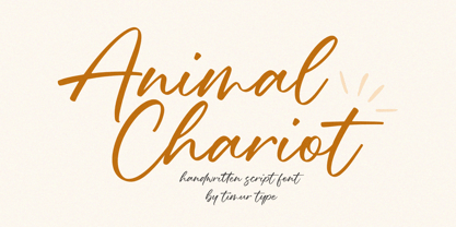 Animal Chariot A Handwritten Script Font Animal Chariot is perfect for product packaging, branding project, megazine, social media, wedding, or just used to express words above the background. Animal Chariot also multilingual support. Embelish your designs with our original fonts.Enjoy the font,Thank you!
 - Bow Tie by Pedro Teixeira,
$16.00 Bow Tie, a slight textured, organic and elegant signature. This modern, stylish but legible script is handy for logo, poster, headlines, invitations, cards and all display needs. The OpenType Features are: stylistic alternates that cover all latin language and cyrillic, ligatures and discretionary ligatures.
 - Veronica by Miller Type Foundry,
$29.00 Veronica is a fun and playful script font with matching caps. Perfect for headlines, logos or display purposes; Veronica is sure to put a smile on the face of everyone who sees it. Veronica comes with opentype features like oldstyle figures, ligatures and stylistic alternates.
 - Swiftel by Seventh Imperium,
$25.00 Swiftel is a Layered Script font. Brings an unusual Modern feeling. You can play the Base layer as a Regular then you can add depth font by using Shine, fill and outline layers and shadow solo. Of course the fonts is Equipped with opentype features.
 - Alisson by Fana Studio,
$19.00 Alisson is a stylish script font. It has a modern and classy look which can be used to add an amazing personal touch to your designs. Alisson can be used for logos, branding, invitations, stationary, wedding designs, social media, advertisements, labels, watermarks, and much more!
 - Going South by Sakha Design,
$10.00 Going South is a modern and attractive script font! Featuring clean lines and a contemporary feel, each letter is carefully crafted with a bold yet graceful stroke. Perfect for adding a touch of sophistication to any project, from logos and branding to invitations and more.
 - Beristan by Balevgraph Studio,
$12.00 Beristan is a thin lettered and graceful script font. Fall for its ravishing style and use it to create gorgeous wedding invitations, beautiful stationary art, eye-catching social media posts, and much more! What's Included? Uppercase & Lowercase, Numbers, Punctuation Ligatures & Swashes Multilingual support PUA Encoded
 - ITC Kick by ITC,
$29.99ITC Kick is the work of California designer Patty King, a bold and energetic brush script. The marked contrast of stroke weight lends the forms dynamism. ITC Kick is a stylish, graceful calligraphy font which will lend headlines a sense of modernity and sophistication. - My Dear Watson NF by Nick's Fonts,
$10.00This simple, charming script is based on the handlettering of Carl Holmes, from Walter T. Foster art book entitled ABC of Lettering. Elementary! Both versions of this font include the complete Latin 1252 and CE 1250 character sets, with localization for Romanian and Moldovan. - Andy by Monotype,
$40.99This childish script by Monotype designer Steve Matteson strikes a great balance between informality and legibility. The TrueType versions have been extensively tuned (hinted) for high legibility at small sizes on screen at a quality level termed ESQ (enhanced screen quality) by the foundry. - Hinelka by Awan Senja,
$14.00 Introducing our newest cute serif typeface, Hinelka Unique Script. This font perfectly made to be in poster funny, and the other various formal forms such as invitations, labels, logos, magazines, books, packaging, fashion, make up, stationery, novels, labels or any type of advertising purpose.
 - Zalcony by HandletterYean,
$16.00 Introducing Zalcony, a captivating handmade font exuding a simple yet alluringly distorted brush aesthetic. Every letter and character carries its own unique size, beautifully showcasing the authentic, natural flow of handwritten script. With Zalcony, add a touch of genuine, personalized charm to your designs.
 - VVDS Pacifica by Vintage Voyage Design Supply,
$18.00 Pacifica – hand lettered elegant bold script for decorative typography inspired by American branding typography from end of XX century. Comes with different variates – filled, highlighted or pressed. Perfectly for headers, signs, logos, prints, etc. Comes with ending and some middle alternates and some standard ligatures.
 - Austhind by Stringlabs Creative Studio,
$25.00 Austhind is a script font with stylish hand brush style. The Austhind font made with digital brush pen strokes that making this font look authentic and unique concept. This font is perfect for fashion brand, wedding invitation, business card, logo brand, signature, and then calligraphy.