10,000 search results
(0.024 seconds)
- Apéro by Resistenza,
$39.00 A cheerful handwritten font family composed by 8 fonts. 5 slab weights, 2 slab effects and a sans serif. Handmade, friendly and classy, this family is inspired in one of our favorite traditions in Torino, “ L'Aperitivo ”. The social event every afternoon! Before dinner friends meet in the local bar and spend the time together eating, drinking, talking, laughing and eating and drinking again. Handwritten to get a friendly and human feeling. Letterforms specially designed to take the charming mood of this event. The sans serif has been inspired in some letterings found in old local liquor labels. Check out also ‘Modern Love Slanted’ Turquoise Nautica
 - Grid Hero by PizzaDude.dk,
$16.00 100.000 years ago years ago, a group of mad scientists from the far away planet ZyrXX, encountered the earth and just waited to conquer the planet. Their masterplan was to use electronic brain waves to manipulate our minds. Sounds cheesy and comic, right? Well, that is the true story about this font. The font was built using a grid (hence the name!) and all I had in mind, was a mixture of old sci-fi movies and computer graphics from the 80ies. I did my best to recall and re-create this - I will let you be the judge to decide whether I succeeded! :)
 - Liza Pro by Underware,
$50.00 Lettres d’amour! Flirting, fashionable, provocative, emotional, casual, moderate, extremely sensible & beautiful - Liza Pro covers it all. Liza Pro, Underware’s dear creation, is a live-script typeface. Thanks to its extremely intelligent OpenType architecture, she approaches human hand lettering as closely as technically possible. Liza Pro deeply analyzes the text. Out of a stock of 4000 hand crafted characters, Liza creates the most optimal combination. All of this works automatically. All you need to do is start typing your lettres d’amour, and Liza makes the text always look different. She gives your creative piece the impression par excellence. Erotique mais intelligent. She is as clever as we could imagine. She kept all folks at Underware busy for a couple of years. It all started one rainy night back in May 2004 but quickly changed into a fatal affair exceptionnelle. But now, 5 years later we are quite sure: this is something serious. Yes, we are talking about real love. L’amour pour la vie. Liza Pro has Underware’s world-dominating Latin Plus character set, supporting a total of 219 languages (Latin 1 + 2 and beyond). Liza Pro is a package of 4 fonts which work together. Liza Display Pro rocks the script lettering to the max. The build-in Out-of-ink feature, LetterSwapper and Protoshaper makes this font a realtime-digital-calligrapher. She’ll swash up your text drastically, giving long strokes, loops and swashes to letters if their context allows. Liza Text Pro has a more silent, moderate character - she’s well behaving sister of Liza Display Pro, designed to walk long pieces of text in a lively script style. Liza Caps Pro adds more possibilities and functionality to these two script fonts. It bridges the gap in case running script lettering doesn’t do the job, but it also works perfectly on its own. Every capital letter appears in various shapes to obtain the manual lettering feeling. Liza Ornaments Pro is for extra delicatesse et est plus charme. Four heart winning fonts, pour la langue l’amour!
 - Droog by Device,
$39.00 Droog is an unusual rounded font pierced with circular holes, some of which are used in lieu of counters. Used to best effect in shorter settings and at larger sizes. Suitable for science fiction posters, sweet wrappers, hipster bars, noodle joints, pet shops and native Nadsat speakers.
 - Toronto Gothic by E-phemera,
$12.00Toronto Gothic was developed from a headline in a 1920s issue of the Toronto Star. In a previous life, it was probably Condensed Titling Gothic #11, but in this form its rounded corners and irregular lines are meant to make it look worn from years of use. - The Pablo Meganta Signature by Letterena Studios,
$10.00 The Pablo Meganta consists of two fonts designed to complement each other perfectly. Together or apart, these fonts are ideal for adding a chic and cheery touch to your crafts. This font is PUA encoded which means you can access all glyphs and swashes with ease!
 - Ardegan by Muksal Creatives,
$15.00 Ardegan is a vintage and elegant serif font. Looks cool on various designs that require style such as wedding invitations, greeting cards, logos, fashion, photography, and so on. Ardegan The scenes are PUA coded which means you can access all the glyphs and sweeps with ease!
 - Fleurons Six by Wiescher Design,
$39.50 Fleurons are embellishments and this is my sixth and so far most beautiful round. I again found some nice old ones and made them completely new. These go well with many Copperplate scripts and especially with my scripts Nadine and Ellida. Your very elaborate, Gert Wiescher
 - Recreation JNL by Jeff Levine,
$29.00 Recreation JNL is Jeff Levine's own take on a popular vintage typeface from the late 50s or early 60s that's seen a resurgence in recent years. While the basic alphabet is somewhat modeled from the classic design, all the other characters in the font are original.
 - Smart Bars12 by Postage Saver Software,
$15.00 This is a special font for use creating US Postal Service "Intelligent Mail" barcodes. Those are the barcodes you see on most cards and envelopes. Commercial mailers get the best pricing by printing barcodes when they address the mail, saving the Postal Service a step. The barcodes are also used on reply mail and Share mail, and for "Informed Visibility" tracking. Software to create these barcodes, including the USPS Intelligent Mail Small Business (IMsB) tool, typically provide an output of 65 characters, each character being an A, D, T or F, corresponding to each of the styles of bar. SmartBars 12 replaces those characters with the corresponding bar. When doing a mail merge to print addresses, the user would set the barcode field on their merge template to be printed using SmartBars 12, at 12 point, regular, and the barcode will print with the correct bars and at the required size to meet USPS requirements.
 - Lust Script by Positype,
$49.00 Boom. You asked for more, um, well just ‘more’—more swashes, more options, more weights, more of everything. I cannot give you more weights. The design just won’t allow it and anything else would be a compromise or a bastardization of the exemplars just to make money that I am unwilling to do. But, I did give you an overly indulgent, 90% cacao bar and espresso, Lust Script Fine. The ending strokes on these glyphs will literally draw blood. Enjoy it as much as I have. The Lust Collection is the culmination of 5 years of exploration and development, and I am very excited to share it with everyone. When the original Lust was first conceived in 2010 and released a year and half later, I had planned for a Script and a Sans to accompany it. The Script was released about a year later, but I paused the Sans. The primary reason was the amount of feedback and requests I was receiving for alternate versions, expansions, and ‘hey, have you considered making?’ and so on. I listen to my customers and what they are needing… and besides, I was stalling with the Sans. Like Optima and other earlier high-contrast sans, they are difficult to deliver responsibly without suffering from ill-conceived excess or timidity. The new Lust Collection aggregates all of that past customer feedback and distills it into 6 separate families, each adhering to the original Lust precept of exercises in indulgence and each based in large part on the original 2010 exemplars produced for Lust. I just hate that it took so long to deliver, but better right, than rushed, I imagine.
 - New Aster LT by Linotype,
$29.99This book and newspaper font was designed by Francesco Simoncini in 1958. After the Second World War brought type design to a standstill, the years of reconstruction meant a reconsideration of old values in the typographical world as well as in Europe in general. Aster is the result of this movement, displaying instead of Modern Face influence, a tendency toward Transitional characteristics and giving text a light feel. - Hemera II by Konstantine Studio,
$18.00 To celebrate the milestone of our all time bestseller font called Hemera, After four years now we're ready to the next level of it. Please welcome Hemera II. A sophisticated vintage victorian era fonts, inspired from the old advertising and classic sign back in circa 1800 - 1900s. Perfectly fit for your vintage vibes and classic touch on any branding works. Logo, badges, label, headline, retro decoration, you name it.
 - Horror Korpus by Mans Greback,
$69.00 Horror Korpus is an artistic rebellion, a statement against the clean and the pristine, evoking the gritty scenes of a horror movie into your design. With flames burning in its strokes and a wild, untamed demeanor, this rough font wears a garment of distress, with eroded and destroyed textures that screams an extreme temperament. It stands defiant, bearing a resemblance to edgy tattoo designs that adorn the bravest of souls.
 - Incarceration JNL by Jeff Levine,
$29.00 The hand lettered Art Deco title on the cover of the sheet music for “There Must be A Bright Tomorrow (for Each Yesterday of Tears)” inspired the font Incarceration JNL, which is available in both regular and oblique versions. Incarceration JNL earns its dubious name from the fact the song was written by Prisoner No. 3223 (Wallace Wysocki) who was held in the Marquette State Prison, Marquette, Michigan (1931)
 - Module 4-4 by Sébastien Truchet,
$40.00 Sébastien Truchet designed a modular typographic system during his last year in the School of Fine Arts of Besançon. The system is made of a unique grid and 6 modules which are the components to build several typefaces. The most radical is the "2-2". The last one is the "10-12". This is the 4-4. It is built into a square grid. Four modules in width and in height. This font proposes to you two appearances : the caps are blackest and the small letters are more open.
 - Piccadilly by ITC,
$29.99Christopher Matthews originally drew Piccadilly for Letraset in 1973. Piccadilly is a decorative, all caps display typeface with a high degree of stroke contrast. All of Piccadilly's letterforms are made up of a single, curvy line. The thick" elements of each letter are five lives, while thin elements are made from one or two. In order for all of this detail to be clear, Piccadilly should be used in large point sizes, i.e., from 36-point on upward. Piccadilly's style is reminiscent of both the Art Deco and Disco eras." - WT Hilton Script by Winston Type Co.,
$19.00 WT Hilton is a font family of royal script that inspired from the Spencerian era in 1840. The strokes are graceful and rhythmic, and letterforms are characterized by flowing loops and flourishes. WT Hilton consists of four styles that variables from the Monoline to the thicker one called Hilton Fancy, each style are stands on its own character. With 100+ language support, WT Hilton is well-suited for any project such as prints, branding, magazine, headline, poster, packaging, weddings, headline, movie, title, logos, branding, invitations, quotes, social media, websites, magazine and so much more.
 - PAG Trust by Prop-a-ganda,
$19.99Prop-a-ganda offers retro-flavored fonts inspired by lettering on retro propaganda posters, retro advertising posters, retro packages all the world over. This is perfect font for your retrospective project. Almost all the letters of PAG Trust are drawn by bold line, but some bars are very thin line and counters are extremely small. With this font, regular typed text transformed into unique typography. We can’t decide the impression of PAG Trust, depending on how to use it, it can be cute package, retro book cover or propaganda poster of Cuba. - Kingsmead Script by Hanoded,
$15.00 Last year I spent some time exploring the city of Bath in England. Its claim to fame are the Roman Baths in the city center, which are well worth a visit. Kingsmead is an electoral ward within Bath and I thought it was an apt name for this rather stylish - if old fashioned - font. Kingsmead Script is a handmade font. It comes with diacritics and some discretionary ligatures for double lower case letter combinations.
 - Union Station by Matteson Typographics,
$19.95 Union Station is based on the transit scroll lettering displayed in Denver’s Union Station. The letter shapes are reminiscent of grotesque sans serif typefaces of the same era with quirky details left by the artist’s brush. The typeface gives a sense of rugged Americana and a handcrafted spirit.
 - Shadowland JNL by Jeff Levine,
$29.00 Shadowland JNL is a simple titling font with a limited character set. Comprised of just A-Z with basic punctuation, the design is based on a set of wood type of a more modern era. The outer lines are crisp and sharp, while the interior letters have rounded ends.
 - Mascleta by Letter INC.,
$25.00 Mascleta is a Mexican font inspired by street lettering. The 450 blackletter characters in Mascleta are ideal for logos, posters, album covers, advertising and wallpapers, both printed and digital. You can use it for Halloween, but it will stay with you all year long! Published by Letter INC.
 - Obsession by Autographis,
$39.50Obsession has taken me completely in its spell. I could go on forever creating new forms for this script. But I have other fonts to do, so this is as far as my obsession goes for the moment. There are six different cuts and all letters can be mixed. - TessieMiscellaneous by Ingrimayne Type,
$13.95 A tessellation is a shape that can be used to completely fill the plane—simple examples are isosceles triangles, squares, and hexagons. Tessellation patterns are eye-catching and visually appealing, which is the reason that they have long been popular in a variety of decorative situations. These Tessie fonts have two family members, a solid style that must have different colors when used and an outline style. They can be used separately or they can be used in layers with the outline style on top of the solid style. For rows to align properly, leading must be the same as point size. To see how patterns can be constructed, see the “Samples” file here. Shapes that tessellate and also resemble real-world objects are often called Escher-like tessellations. Most of the shapes contained in TessieMiscellaneous are Escher-like tessellations. Most or all of these shapes were discovered/created by the font designer during the past twenty years in the process of designing maze books, colorings books, and a book about tessellations. (Earlier tessellation fonts from IngrimayneType, the TessieDingies fonts, lack a black or filled version so cannot do colored patterns. The addition of a solid style that must be colored makes these new fonts a bit more difficult to use but offers far greater possibilities in getting visually interesting results.)
 - Bouncer by Ingrimayne Type,
$6.95 The letters in Bouncer are round because they all begin as a ball and then have parts of the ball cut away. Bouncer was one of the earliest typefaces from Ingrimayne Type. Lower-case letters are smaller versions of the upper-case letters. BouncerTwo, designed twenty years after the original Bouncer, continues playing with the idea of making letters by cutting out parts of a circle, but in this case the circles are interlocking. All letters are upper-case but some of those on the lower-case keys differ from those on the upper-case keys. BouncerTwo is eye-catching but not highly legible.
 - Imogen Agnes by Set Sail Studios,
$12.00 Imogen Agnes is a hand-made, signature-style font designed to create personal, stylish lettering quickly & easily. A bit of background; During my years as a freelance designer, I had always been a huge fan of signature-style fonts but frustratingly found them few and far between. Now don't get me wrong - some of them are visually stunning. But I found them almost too perfect, or too digitised, to make you think that someone had quickly scribbled it down on paper. So that's why I created Imogen Agnes. It works great for personal logos, but also makes for a strong standalone script font with a bit of a retro vibe to it. It comes with upper & lowercase characters, numerals, punctuation and supports international languages. It also comes with a bonus set of 15 swashes just to add that extra touch of finesse to your text. Stylistic alternates for several key lower case characters are also available, accessible in the Adobe Illustrator Glyphs panel, or under Stylistic Alternates in the Adobe Photoshop OpenType menu.
 - Herschel by Tried & True Supply Co.,
$30.00 Herschel ventures into the elaborate world of late 19th-century typography to bring its winsome charm and compelling aesthetics into modernity. Staying true to the spirit of its historical era of inspiration, Herschel was designed with extreme attention to detail. Although its aesthetic roots are firmly planted in the treasury of Gilded Age typography, it has been technically constructed to withstand all the rigorous demands that modern technology places on type today. Herschel’s nostalgic, flared, and gently bifurcated serifs shine brightest when employed as display type, but are suited well for any application where inimitable character is needed. Named after designer Brian Brubaker’s maternal grandfather, a retired dairy farmer of more than 60 years, Herschel is available in six delectable weights: Skim, One Percent, Two Percent, Whole, Creamline, and Butter. Features overview: • 800+ glyphs per weight • 120+ stylistic alternates • Upper and lower case • Titling/Drop capitals with multiple and contextual ligatures • Lining, oldstyle, proportional, and tabular figures • Standard and discretionary ligatures • Unique dingbats and special characters • International language support for 200+ latin-based languages, including Vietnamese
 - Tabwa by Scholtz Fonts,
$19.00The design of the Tabwa font was inspired by the font Neuland designed by Rudolf Koch in 1923. Rather than attempting to re-create his font in a digital form as so many others have done, I have tried to capture the "spirit" of his font and merge this with the spirit of Africa. As a result the characters differ markedly from Koch's original styles and have much less of an "Art Deco" look to them. To further modernize the font I have included all the characters missing in Koch's original (a full lower case, as well as all punctuation, diacritics, special characters etc). The result is a thoroughly modern re-interpretation of the original "Neuland". The numbers (0 to 9) bear no relation to Koch's originals but, I believe, are far more in keeping with the alphabetic characters in the font. The triangles that decorate the characters of this African font are typical of the patterns found in the Tabwa culture of central and west Africa (in the Congo region). - Marian Churchland by Comicraft,
$39.00 Tall, thin and elegant, Marian Churchland’s fonts are very much like her.. and now available from those awfully nice chaps at Comicraft to allow you to pretend that you are too! Marian Churchland was born in Canada in 1982, and was raised on a strict diet of fine literature and epic fantasy video games. She has a BA in Interdisciplinary Studies (English Literature and Visual Arts) from the University of British Columbia, and has been doing professional illustration work, including book covers and magazine articles, since she was 17. Last year, she became the first woman to solo-illustrate a CONAN story, and this year she’s illustrating three issues of ELEPHANTMEN for Image Comics. See the families related to Marian Churchland: Marian Churchland Journal.
 - AJ Quadrata by Adam Jagosz,
$25.00 Once, Blackletter was a calligraphy style. Full of ligatures, with letters bumping into each other to create an unapologetic picket-fence pattern. Some even claimed that the regularity improved legibility! But then Blackletter was cast into metal, and only a handful of established ligatures survived, while most interletter connections were disentangled. Everyone since followed suit, and hundreds of years later, digital Blackletter fonts were modelled mostly on the metal fonts that prevailed rather than the original handwriting. Up until now! AJ Quadrata is an authentic revival of the textura quadrata hand, and its major inspiration is a 15th-century Latin manuscript of the Bible from Zwolle, the Netherlands. The typeface is delivered in two flavors. The default cut is a modern take on textura quadrata that can be useful for today and tomorrow. The standard ligatures feature employs nearly all letters. The tittle of i retains its original, hasty squiggle form (except for the Turkish localization). Discretionary ligatures include medieval ligatures da, de, do, pa, pe, po (and their mixed-case counterparts!). Stylistic sets allow to use historic letter variants such as long s and rotunda r, closed-counter a, and alternate capitals. AJ Quadrata Medieval is perfect for setting Latin. Default forms of capital F, H and O are swapped with the alternates. The squiggles above i only appear for disamibiguation nearby m, n or u, as in original manuscripts. Discretionary ligatures and historic variants are promoted to the standard ligatures feature to make room in the discretionary ligatures feature for a variety of scribal abbreviations. Dedicated stylistic sets include medieval punctuation and justification alternates — glyphs with elongated terminals used for lengthening lines that end up too short. The Rubrum styles can be layered and colored to create the illuminated effect on the capital letters. Besides a faithful rendition of extended Latin including Vietnamese, numerous synthetic additions are included: polytonic Greek, Armenian, and Cyrillic (with Bulgarian and Serbian/Macedonian localizations). Both flavors of the typeface can be considered a starting point that can be further customized using OpenType features, including Stylistic Sets (some features differ between AJ Quadrata and AJ Quadrata Medieval): ss01 Alt E ss02 Descending F / Roman F ss03 Uncial H / Roman H ss04 Angular O / Round O ss05 Contextual closed-counter a ss06 Diamond-dot i j / Always dotted i, j ss07 Contextual rotunda r / No r rotunda ss08 Contextual long s / No long s ss09 Dotless y ss10 Serbian Cyrillic ss11 Alt Cyrillic de ss12 Alt Cyrillic zhe ss13 Alt Cyrillic sha ss14-ss17 [reserved for future use] ss18 Scribal punctuation ss19 Alt linking hyphen ss20 Justification alternates
 - Paralucent by Device,
$39.00 Paralucent is versatile all-purpose modern sans. Available in seven weights, from Thin to Heavy, and in two widths each with corresponding italics, it avoids some of the more eccentric calligraphic quirks of Akzidenz or Helvetica or the cool precision of Univers for an elegant, functional, yet warm design. There are two additions to the core 28-weight family: a three-weight stencil set, and a four weight text family. The text weights have been adjusted for use at small point sizes, and feature more open character shapes, looser inter-letter spacing for improved readability, and lining numerals for use in listings and tables. Several core ideas inform Paralucent’s design. Prime attention has given to the negative space between characters, giving a more even “colour”, especially in text. For example, the J, L and T have shorter arms than comparable sans typefaces, while the M and W are wider. The A has a lower bar, opening up the interior counter. An unusually high lower-case x-height again helps to give a more even colour and improve legibility. Care has been taken to rationalise repeated elements like the tails on lower-case letters, or the Q and the “ear” of the g. Typographic design solutions that are consistent across all these features add more stylistic cohesion. ‘Ink traps’ are exaggerated incisions used to open up a letter's narrower internal angles, which can become clogged with ink, especially in small point sizes. Now largely redundant due to the high quality of modern print, they are still sometimes used as a stylistic quirk or design feature. Now that digital fonts are often reversed or outlined, or enlarged to enormous sizes, these can also lead to unexpected or obtrusive results. Paralucent takes these inevitable digital manipulations into account, and adds optical corrections without resort to ink traps. The family has been picked up by many UK and US publishers, featuring heavily in magazines like Loaded, Heat and TV Quick, as well as high-end coffee-table photography books and gallery websites. A perennial Device bestseller.
 - The Blowar by Alit Design,
$15.00 Presenting ⚔️The Blowar Typeface⚔️ by alitdesign. The Blowar font is inspired by action movie posters with the theme of war or knights in the Roman era. The bold and bold character of The Blowar font is perfect for making hero movie titles, game titles, logotypes, t-shirt designs and so on with heroic themes. Apart from the regular font, the Blowar also has an italic style which makes the design more dynamic and cool. The Blowar font has alternatives that you can combine between swashes and symbols that have the theme of heroes and war. Besides that this font is very easy to use both in design and non-design programs because everything changes and glyphs are supported by Unicode (PUA). The Blowar Typeface has a total of 706 glyphs including symbol, multilingual. Language Support : Latin, Basic, Western European, Central European, South European,Vietnamese. In order to use the beautiful swashes, you need a program that supports OpenType features such as Adobe Illustrator CS, Adobe Photoshop CC, Adobe Indesign and Corel Draw. but if your software doesn't have Glyphs panel, you can install additional swashes font files.
 - The KR Chinese Zodiac font by Kat Rakos is a captivating and expressive display font that captures the essence of the Chinese Zodiac's symbolism through its intricate designs. Each character within t...
- Bugenvil by Dansdesign,
$20.00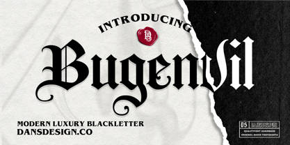 Bugenvil is a distinct, highly detailed and chic blackletter font. It is PUA encoded which means you can access all of the glyphs and swashes with ease! Bugenvil are great and usefull for product logo, poster title, headline, packaging, badge, packaging logo , clothing brand logo, Vintage design and much more
 - P22 Sting by IHOF,
$24.95 Sting is a hybrid of Blackletter lowercase with Roman Capitals. This style drawn by Michael Clark in pen and ink evolved over several years and is now avaiable in font form. 12 alternate lowercase characters are included. Great for historical and official document titling as well as many decorative uses.
 - Linotype Dinosaures by Linotype,
$29.99This font is a must for dinosaur lovers, as it brings back to life a variety of these huge reptiles. Besides figures of complete dinosaurs there are also a number of 'portraits' and poses. A creative combination of dinosaur figures allows the depiction of various situations, fighting, eating, etc. Have fun! - Lindisfarne Nova BT by Bitstream,
$50.99 Lindisfarne Nova is an uncial-like design based on the script found in the Lindisfarne Gospels. Created by Harry Pears and Margaret Layson, it is available in two weights, regular and bold. Lindisfarne Nova is Harry’s first completed font. There are also two companion styles, Lindisfarne Nova Incised and Lindisfarne Runes.
 - Balistine by Owl king project,
$39.00 The Balistine font, a combination of modern and slightly taking elements of 80s era in some lowercase curves such as "a b d q w and there are several alternative letters found in Balistine. By carrying a weight of 20 Balistine can easily be used for wider exploration. Let's start design.
 - Syondola by Greater Albion Typefounders,
$12.95 Syondola is Greater Albion's venture into the Wild-West. Need something to evoke saloon bars, or the OK Corral, or river Paddleboats? Syondola is it! Two styles are offered, Regular with clean and precise outlines, and Rustic, which has a deliberately slightly eroded look, for that old and timeworn feel.