10,000 search results
(0.044 seconds)
- Love West by Sulthan Studio,
$14.00 Love West is a sweet and delicate handwritten font. Dainty and joyful, this font will be ideal for writing wedding invitations, cards, or any other design that may need a romantic, personalized touch! This font is PUA encoded which means you can access all the glyphs and ligatures with ease!
 - Easter Nice by Sakha Design,
$14.00 Easter Nice is a sweet and delicate handwritten font. Dainty and joyful, this font will be ideal for writing wedding invitations, cards or any other design that may need a romantic, personalized touch! This font is PUA encoded which means you can access all of the glyphs and swashes with ease!
 - Gorgeous Angels by ErlosDesign,
$19.00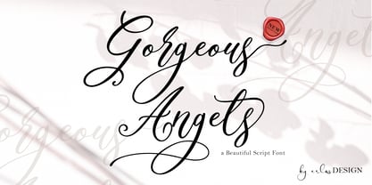 Gorgeous Angels - A Beautiful Script Font by erlosDESIGN Gorgeous Angels is a beautiful and magical modern calligraphy font, with characters that dance along the baseline. It has a casual, yet elegant touch. This font is PUA encoded which means you can access all of the glyphs and swashes with ease!
 - Rathya by Andrey Font Design,
$14.00 Rathya is a sweet and delicate handwritten font. Dainty and joyful, this font will be ideal for writing wedding invitations, cards or any other design that may need a romantic, personalized touch! This font is PUA encoded which means you can access all of the glyphs and swashes with ease!
 - Valentine Soul by Sakha Design,
$14.00 Valentine Soul is a romantic and delicate handwritten font. Dainty and joyful, this font will be ideal for writing wedding invitations, cards or any other design that may need a dreamy, personalized touch! This font is PUA encoded which means you can access all of the glyphs and swashes with ease!
 - Catchy Bellonia by Fargun Studio,
$12.00 Catchy Bellonia is a relaxed and cursive script font. Not too thin and not too thick, balanced and varied, this font was designed to enhance the beauty of your projects. Included Mono-line version. This font is PUA encoded which means you can access all of the glyphs with ease!
 - Youth Line by Sakha Design,
$14.00 Youth Line is a sweet and delicate handwritten font. Dainty and joyful, this font will be ideal for writing wedding invitations, cards, or any other design that may need a romantic, personalized touch! This font is PUA encoded which means you can access all of the glyphs and swashes with ease!
 - Scary Blood by Sakha Design,
$12.00 Scary Blood is a spooky and assertive decorative font. No matter the topic, this font will be an incredibly asset to your fonts’ library, as it has the potential to elevate any creation. Scary Blood is PUA encoded which means you can access all of the glyphs and swashes with ease!
 - Michaello by Letterara,
$14.00 Michaello is a casual natural handwritten font with an incredibly friendly feel and a stunning brush texture with a bold vibe. It is the perfect font for making original and outstanding designs. This font is PUA encoded which means you can access all of the glyphs and swashes with ease!
 - Bownjax by BonjourType,
$15.00 Bownjax is a modern, handwritten, brush script font that is both versatile and unique! This font is perfect for modern projects, headings, blogs, logos, branding, business cards, websites, invitations, shirts, mugs, and more. This font is PUA encoded which means you can access the available glyphs and swashes with ease!
 - Milk Drops by Duck Soup Design,
$12.00 Milk Drops is a semi-casual-feeling cross between a didone and slab serif display font. Elegant, flourishy, whimsical and bold, as much as one font can be any or all of those things! It has highly contrasting weights, but not so much to take itself too seriously or risk legibility. Playfully, it entertains the teardrop motif wherever it can – in expected areas like the descender of a "y" and the ascender of an "f", but also in some whimsical flourishes. Many of the uses of the teardrop motif are implemented on the terminals and ears where many old prints may have suffered from bleed of ink – answering a "what if" question like "what if those accidental bleeds were designed on purpose?" or "what if a font were designed as though it was already seen through blurry eyes?" Milk Drops also features stencil-like open counters and lots of ligatures (32). Note also, it has some super-nerdy additions like symbols for Bitcoin, Pilcrow, Interrobang and Irony Mark. Language Support Milk Drops is highly versatile – with an impressive count of 470 glyphs, it can accommodate up to 78 latin-based languages.
 - Classic Grotesque by Monotype,
$40.99 Classic Grotesque by Rod McDonald: a traditional font with a modern face. The growing popularity of grotesque typefaces meant that many new sans serif analogues were published in the early 20th century. Setting machines were not compatible with each other but all foundries wanted to offer up-to-date fonts, and as a result numerous different typeface families appeared that seem almost identical at first glance and yet go their separate ways with regard to details. One of the first fonts created with automatic typesetting in mind was Monotype Grotesque®. Although this typeface that was designed and published by Frank Hinman Pierpont in 1926 has since been digitalised, it has never achieved the status of other grotesque fonts of this period. But Monotype Grotesque was always one of designer Rod McDonald’s favourites, and he was overjoyed when he finally got the go-ahead from Monotype in 2008 to update this “hidden treasure”. The design process lasted four years, with regular interruptions due to the need to complete projects for other clients. In retrospect, McDonald admits that he had no idea at the beginning of just how challenging and complex a task it would be to create Classic Grotesque™. It took him considerable time before he found the right approach. In his initial drafts, he tried to develop Monotype Grotesque only to find that the result was almost identical with Arial®, a typeface that is also derived in many respects from Monotype Grotesque. It was only when he went back a stage, and incorporated elements of Bauer Font’s Venus™ and Ideal Grotesk by the Julius Klinkhardt foundry into the design process, that he found the way forward. Both these typefaces had served as the original inspiration for Monotype Grotesque. The name says it all: Classic Grotesque has all the attributes of the early grotesque fonts of the 20th century: The slightly artificial nature gives the characters a formal appearance. There are very few and only minor variations in line width. The tittles of the ‘i’ and ‘j’, the umlaut diacritic and other diacritic marks are rectangular. Interestingly, it is among the uppercase letters that certain variations from the standard pattern can be found, and it is these that enliven the typeface. Hence the horizontal bars of the “E”, “F” and “L” have bevelled terminals. The chamfered terminal of the bow of the “J” has a particular flamboyance, while the slightly curved descender of the “Q” provides for additional dynamism. The character alternatives available through the OpenType option provide the designer with a wealth of opportunities. These include a closed “a”, a double-counter “g” and an “e” in which the transverse bar deviates slightly from the horizontal. The seven different weights also extend the scope of uses of Classic Grotesque. These range from the delicate Light to the super thick Extrabold. There are genuine italic versions of each weight; these are not only slightly narrower than their counterparts, but also have variant shapes. The “a” is closed, the “f” has a semi-descender while the “e” is rounded. Its neutral appearance and excellent features mean that Classic Grotesque is suitable for use in nearly all imaginable applications. Even during the design phase, McDonald used his new font to set books and in promotional projects. However, he would be pleased to learn of possible applications that he himself has not yet considered. Classic Grotesque, which has its own individual character despite its neutral and restrained appearance, is the ideal partner for your print and web project.
 - Vernacular Sans by jpFonts,
$19.95 The Vernacular trilogy was designed by Swiss designer Hans-Jürg Hunziker, who had worked for Adrian Frutiger in Paris for many years. Based on the concept of a transitional Linear Antiqua, he has developed a colorful bouquet of typefaces that contain the entire spectrum of typefaces for book design and corporate identity. Thanks to his "Swiss school" and his outstanding skills, he has succeeded in giving the typefaces a particularly noble and sympathetic expression. In addition to the Sans family, there is a Serif family and a Clarendon family, each of which, including the separately drawn italics, is equipped with 12 font weights that are finely tuned to one another. Each of the 3 font styles develops its own character, but thanks to a concept that brings the different font styles closer together, they also work well together and complement each other perfectly. Sans and Clarendon have a vertical axis and similar endings in contrast to the Serif, which has a traditional diagonal axis and horizontal endings. The straight stems and the proportions are used as an element to stress the closeness of the typeface-trilogy. They thus share a comon feature. All fonts contain tabular and proportional figures as well as old style figures. Small caps and small cap figures are also available in all fonts. In addition, some fonts have alternative characters available via style set, such as «g», which can be used to further vary the typeface. Vernacular offers all the options for well-kept typesetting for print and web - for small and large orders.
 - Vernacular Serif by jpFonts,
$19.95 The Vernacular trilogy was designed by Swiss designer Hans-Jürg Hunziker, who had worked for Adrian Frutiger in Paris for many years. Based on the concept of a transitional Linear Antiqua, he has developed a colorful bouquet of typefaces that contain the entire spectrum of typefaces for book design and corporate identity. Thanks to his "Swiss school" and his outstanding skills, he has succeeded in giving the typefaces a particularly noble and sympathetic expression. In addition to the Sans family, there is a Serif family and a Clarendon family, each of which, including the separately drawn italics, is equipped with 12 font weights that are finely tuned to one another. Each of the 3 font styles develops its own character, but thanks to a concept that brings the different font styles closer together, they also work well together and complement each other perfectly. Sans and Clarendon have a vertical axis and similar endings in contrast to the Serif, which has a traditional diagonal axis and horizontal endings. The straight stems and the proportions are used as an element to stress the closeness of the typeface-trilogy. They thus share a comon feature. All fonts contain tabular and proportional figures as well as old style figures. Small caps and small cap figures are also available in all fonts. In addition, some fonts have alternative characters available via style set, such as «g», which can be used to further vary the typeface. Vernacular offers all the options for well-kept typesetting for print and web - for small and large orders.
 - Vernacular Clarendon by jpFonts,
$19.95 The Vernacular trilogy was designed by Swiss designer Hans-Jürg Hunziker, who had worked for Adrian Frutiger in Paris for many years. Based on the concept of a transitional Linear Antiqua, he has developed a colorful bouquet of typefaces that contain the entire spectrum of typefaces for book design and corporate identity. Thanks to his "Swiss school" and his outstanding skills, he has succeeded in giving the typefaces a particularly noble and sympathetic expression. In addition to the Sans family, there is a Serif family and a Clarendon family, each of which, including the separately drawn italics, is equipped with 12 font weights that are finely tuned to one another. Each of the 3 font styles develops its own character, but thanks to a concept that brings the different font styles closer together, they also work well together and complement each other perfectly. Sans and Clarendon have a vertical axis and similar endings in contrast to the Serif, which has a traditional diagonal axis and horizontal endings. The straight stems and the proportions are used as an element to stress the closeness of the typeface-trilogy. They thus share a comon feature. All fonts contain tabular and proportional figures as well as old style figures. Small caps and small cap figures are also available in all fonts. In addition, some fonts have alternative characters available via style set, such as «g», which can be used to further vary the typeface. Vernacular offers all the options for well-kept typesetting for print and web - for small and large orders.
 - Fresno by Parkinson,
$15.00 Fresno is a two-font family. Fresno Inline and Fresno Black. Fresno Black is a recent addition. It can be used alone, and it is carefully tailored to fit behind the Inline font to add color to the inline. There are alternate characters: A, M & N in the caps and lowercase key positions. Fresno is a square gothic style typical of Mid-20th Century Showcard Lettering. A lettering genre known as “Gaspipe.” Signage samples similar to this still exist on buildings in my home town, Oakland, California. I have designed over a half dozen variations of this form over the years. Including Amboy. Golden Gate Initials, Matinee, Motel, and Hotel. Designed in 2001 by Jim Parkinson, Fresno has recently been refreshed, enhanced, and re-released.
 - Amboy by Parkinson,
$20.00 Amboy is a two-font family. Amboy Inline and Amboy Black. Amboy Black is a recent addition. It can be used alone, but it is carefully tailored to fit behind the Inline font to add color to the inline. There are alternate characters: A, M & N in the caps and lowercase key positions. Amboy is a square gothic style typical of Mid-20th Century Showcard Lettering. A lettering genre known as “Gaspipe.” Signage samples similar to this still exist on buildings in my home town, Oakland, California. I have designed over a half dozen variations of this form over the years. Including Golden Gate Initials, Matinee, Motel, Hotel and Fresno. Designed in 2001 by Jim Parkinson, Amboy has been refreshed, enhanced, and re-released.
 - JWX Western by Janworx,
$19.95 The term Old West conjures up memories of vintage movies and TV shows featuring saloons and dancehall girls. Old wanted posters and cowboys. Rowdy prospectors in the Goldrush, mountains and lots of wide open space. Many of the lettering styles of those days are still in use, reflecting the past, present, and probably the future here. Western style fonts appear in the signage of bars, restaurants, casinos and ski areas. It's a style that speaks of the way it once was in a nostalgic way. This family of three fonts pays tribute to the Old West and its colorful history, with a semi-plain style, a decorated style, and a really lively rendition of our gaudy and raucous history from a century or more ago.
 - Honesty Sans by Océane Moutot,
$32.90 Honesty was the first font published by the Studio in 2020. It was a typeface with flared stems. 2 years later, we are now publishing Honesty Sans. It is inspired by the original design but is revisited as a sans serif this time. Honesty Sans keeps the inspiration from the incise genre and font such as Albertus or the Trajan but with softness, thanks to its low contrast and smooth curves. Honesty Sans is highly lisible, which offers a variety for use, from titles, edition of texts, branding, magazines and so on. Its large variety of glyphs, including accents, old-style numbers and ligatures will give uniqueness to your designs. Honesty Sans is available in 16 styles, from thin to heavy in roman and italic.
 - Bender Script by Dear Alison,
$29.00 Would you hire one of the top hand lettering artists that worked for companies like Max Factor for your designs? Of course you would! Chas Bluemlein passed away many years back, and you couldn't have afforded his services anyway, but his lettering prowess which graced many advertisements, primarily cosmetic ads, has been pulled together from numerous samples to make this font. Bender Script comes with BONUS Swash alternates to mix up the flavor a bit, and exudes passion and confidence! Now you can own not only a piece of his lettering legacy, but you can also put it to work for you! This beauty is a sure fit into any font collection, so what are you waiting for, buy it today!
 - Arthur Cabinet by SIAS,
$49.90 The Arthur Cabinet font family offers a most particular range of seven fancy ornamental fonts in the spirit of the Art Deco era. These fonts celebrate the age of elegance, stylishness and refinement to its very best. They give you a unique tool for exquisite designs. The fonts of this family are derivatives from the Arthur Sans series, which you may also want to have a look at. Use this unique typefaces for distinctive personal stationary, outstanding headlines, captivating brochures and invitations; for marvellous logotypes, wonderful menus, hotel leaflets, exciting ads … for brillant designs. Each Arthur Cabinet font features the same comprehensive Euro-Latin encoding for full language support. Additionally, every font includes a small supplementary set of fine ornaments. – For an even more comprehensive range of Arthur embellishments check out the font Arthur Sans Regular or Arthur Ornaments! Have also a look at the sister fonts of the gorgeous Arthur Sans Family, which will offer you yet another wonderful scope of fascinating typographic possibilities. ________________________________________________________________________________ Tip: Set Sample text (see below) manually to [ABCDE…] to view effectively the fonts most relevant parts! ________________________________________________________________________________
 - Amphibia by Storm Type Foundry,
$53.00 On a sans-serif basis it contains trapezoid ascenders, balls & rounded ears, which may resemble the serif feel in smaller sizes, thus long reading is surprisingly easy. Amphibia is suitable for everything from contemporary poetry to branding and informational systems.
 - Espresso by Calligraphics,
$30.00The two font families, DemiTasse and Espresso, are designed to work together. Espresso is related to DemiTasse in that it is an italic font. They are both based on my own calligraphy and were used as such both separately and together. - Nerut by Ergibi Studio,
$16.00 "SULTAN" is a serif font. It has a vintage form with the addition of modern decorative and minimalist shape. Fonts consist of special uppercase letters and alternate characters. fonts are multilingual support and are perfect for logos, branding, mockups, t-shirts, branding, and various needs that want this vintage form I hope you like our font Ergibi Studio
 - Biblia Serif by Hackberry Font Foundry,
$24.95 This all started with a love for Minister. This is a font designed by Carl Albert Fahrenwaldt in 1929. In the specimen booklet there’s a scan from Linotype’s page many years ago. They no longer carry the font. I’ve gone quite a ways from the original. It was dark and a bit heavy. But I loved the look and the readability. This came to a head when I started my first book on all-digital printing written from 1994-1995, and published early in 1996. I needed fonts to show the typography I was talking about. At that point oldstyle figures, true small caps, and discretionary ligatures were rare. More than that text fonts for book design had lining OR oldstyle figures, lowercase OR small caps—never both. So, I designed the Diaconia family using the Greek word for minister. It was fairly rough. I knew very little. I later redesigned and updated Diaconia into Bergsland Pro—released in 2004. It was still rough (though I impressed myself). Now, with 4-font Biblia Serif family 13 years later, I’ve cleaned up, made the fonts more consistent internally, added more functional OpenType features, and brought the fonts into the 21st century. I used the 2017 set of features: small caps, small cap figures, oldstyle figures, fractions, lining figures, ligatures and discretionary ligatures. These are fonts designed for book production and work well for text or heads. Finally, in 2021, I went over the fonts entirely and remade them in Glyphs.
 - Baby Eskimo Kisses - Personal use only

- Parkitecture JNL by Jeff Levine,
$29.00Parkitecture JNL is the latest font to embrace the angles and lines of the Art Deco era. Bold and solid in look and feel, it gives nostalgic headlines a "solid" retro appearance. - Psychoart by Nirmana Visual,
$19.00 Psychoart Typeface , contemporary of Psychedelic Serif font, inspired by 1970’s era. Psychoart offers beautiful typographic harmony for a diversity of design projects, including logos & branding, social media posts, advertisements & product designs.
 - Maya Month Glyphs by Deniart Systems,
$15.00 Contains the 19 months of the Maya solar year (in outline and silhouette mode) as well as the 19 Maya numerals. NOTE: this font comes with an interpretation guide in pdf format.
 - Bird Script by Lián Types,
$24.95 Characterized by quickness, lightness, and ease of movement, Bird Script is a font which challenges many aspects of type-design: every single stroke, comes directly from the author’s hand and tries to reflect not only the tool used, but also his feelings at the moment of writing. Bird Script is a font filled up with the energic gestures of what it’s called gestural calligraphy, a not very explored field in typography, where hardly ever a letter comes the same way two times: When manipulating the pen, the letterer seeks for the beauty of the differences and the grace of a confident execution. Originally done with a flat speedball pen nib nº5 and retouched with pencil for the bolder elements, it turned into a very pleasant to the eyes font which dances between the formal rules of typography and the artistic look of calligraphy. Bird Script Pro and Bird Script Light Pro come with many ligatures, alternates and ornaments. Into the standard ligatures we find lots of pairs of two and three ligated letters so when they are activated the font seems alive. However if none of them are activated, the font gives a really particular text pattern, specially in smaller sizes. Get Bird Script, add rhythm to your work.
 - Severe by Gerald Gallo,
$20.00 Severe is a clean, contemporary, condensed, geometric font family. There are 2 fonts in the Severe family, Severe Lower Case and Severe Small Caps. The small caps versions has small caps in place of the lower case alphabet. The lower case and small caps versions have the same uppercase alphabet, numbers, punctuation, symbols and miscellaneous characters. In addition to the cap height numbers there are small cap height numbers in each. The Severe fonts are ideal for headlines, titles, branding, small blocks of text or wherever a fresh, contemporary, condensed font is desirable. Severe Lower Case and Severe Small Caps are sold only as a set priced at $20.
 - Ongunkan France Glozel Runic by Runic World Tamgacı,
$100.00 In March 2010, Émile Fradin, a modest peasant farmer from central France, died at the age of 103. To his grave he took the secret behind one of the most controversial archaeological discoveries of the 20th century. A discovery which put into question the very origins of the written word and the paternity of European culture. It was the uncovering of peculiar artefacts would come to be known as the Glozel runes. The discovery of the Glozel runes On the first day of March 1924, a not yet 18-year-old Fradin was ploughing his family’s field in the hamlet of Glozel, when his cow stumbled into a hole. When he and his grandfather, Claude, looked closer, they discovered a mass of broken stone, under which lay an underground chamber. Within, they discovered pottery fragments, carved bones, and a peculiar clay tablet covered in bizarre characters that neither of the two could decipher. The family requested a subsidy for excavation works to be carried out, but were refused by the regional authority. With that disappointment, it seemed as though the discovery would fade into obscurity. However, the following year, news of Fradin’s unusual clay tablet reached the ears of the physician and amateur archeologist, Antonin Morlet. By the end of May 1925, Morlet began the first of his excavations.4 Within the first two years alone, he had amassed some 3,000 finds.
 - Night Scream by Ditatype,
$29.00 Night Scream is a spine-chilling display font that brings a horrifying twist to your designs. With its big letters and bold weight, this font commands attention and instills fear. The details of the letters are carefully crafted to resemble menacing plant roots, adding a nightmarish and eerie touch to the font. Each letter in this font is bold and impactful, demanding to be noticed. The large size of the letters adds to the font's imposing presence. The root-like details in Night Scream give the font an organic and otherworldly appearance, reminiscent of sinister, twisted plant life. These details add an element of the unknown and create an atmosphere of dread, immersing the viewer into a world of dark and chilling horrors. For the best legibility you can use this font in the bigger text sizes. Enjoy the available features here. Features: Multilingual Supports PUA Encoded Numerals and Punctuations Night Scream fits in headlines, logos, movie posters, flyers, invitations, branding materials, print media, editorial layouts, headers, and any project that requires a terrifying touch. Find out more ways to use this font by taking a look at the font preview. Thanks for purchasing our fonts. Hopefully, you have a great time using our font. Feel free to contact us anytime for further information or when you have trouble with the font. Thanks a lot and happy designing.
 - FlagDay by Ingrimayne Type,
$8.00 These four variations on letters designed as flags are almost unreadable, but may be of some use as a patriotic display font. The four are all transformations of fonts from the FourJuly group. The solid and outline styles can be layered with the main fonts to easily create multiple-colored letters.
 - Period Piece JNL by Jeff Levine,
$29.00 A period piece is something of or pertaining to a specific era or time. Anything evoking a knowledge or feeling of an era can be labeled as such. The aptly named type font Period Piece JNL reflects the hand lettering found on the cover of early 20th century vintage sheet music entitled "My Baby's Arms" (from the stage production of "Ziegfeld Follies of 1919"). Although strongly akin to the coming Art Deco movement in its lettering style, Period Piece JNL still contains a strong influence of the Art Nouveau era of the 1900s through the 1920s.
 - Ghost Zone by Sakha Design,
$12.00 Ghost Zone Is a fun, quirky, and spooky decorative font. This font is PUA encoded which means you can access all of the glyphs and swashes with ease! Add it confidently to your favorite creations and let yourself be amazed by the outcome generated.
 - Ladylord by Stefani Letter,
$12.00 Ladylord is a beautiful professional handwritten font that exudes elegance and class which looks stunning. It will add a luxury spark to any design project! This font is PUA encoded which means you can access all of the amazing glyphs and ligatures with ease!
 - Angela by Sealoung,
$25.00 Angela is a modern, bold and highly detailed serif font. This font is PUA encoded which means you can access all of the amazing glyphs and ligatures with ease! Add it confidently to your favorite creations and let yourself be amazed by the outcome generated.
 - Janetanice by Essentials Studio,
$16.00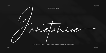 Janetanice Is a Luxury Signature Font Janetanice is perfect for product packaging, branding project, magazines, social media, weddings, or just used to express words above the background. This font is PUA encoded, which means you can access all of the glyphs and swashes with ease!
 - Christhine by Letterafandi Studio,
$14.00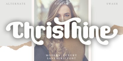 Christhine is a cool and interestingly designed display font. It will elevate a wide range of crafting ideas, from cards, to branding, labels and much more. This font is PUA encoded which means you can access all of the glyphs and swashes with ease!
