10,000 search results
(0.032 seconds)
- Benstam by Brand Type,
$24.00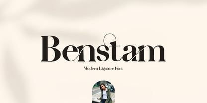 Benstam - Modern Ligature. Benstam is a stylish font that is chic, elegant and unique font that uses ligatures to smoothly link letters. Perfect for branding, logos, invitation, masterheads and more. Benstam is also included full set of : Uppercase and Lowercase Letters Multilingual Symbols Numerals Punctuation Ligatures Wish you enjoy our font and if you have a question, don't hesitate to drop message & I'm happy to help :)
 - M Felt Pen PRC by Monotype HK,
$523.99 To blend a handwritten style with a graphical aesthetic, Monotype designers paid attention to the balance between the two, hence harmoniously combine their qualities like a mix of tradition and modern. M Felt Pen references the unified stroke thickness and rounded terminals of rounded Heiti typefaces, imitating the fluidity of marker writing. The linked strokes are vivid and suggest the presence of the human hand.
 - M Felt Pen HK by Monotype HK,
$523.99 To blend a handwritten style with a graphical aesthetic, Monotype designers paid attention to the balance between the two, hence harmoniously combine their qualities like a mix of tradition and modern. M Felt Pen references the unified stroke thickness and rounded terminals of rounded Heiti typefaces, imitating the fluidity of marker writing. The linked strokes are vivid and suggest the presence of the human hand.
 - Skriva by Letradora,
$16.00 Skriva is the handwriting we'd all like to have: neat and legible, still natural looking. It as a super complete character set with support for over 200 latin languages. It includes advanced OpenType features, such as random alternate characters, to make it look even more natural. Skriva has 4 variants: light, regular, bold & inky. Use Skriva wherever you need a personal touch on your texts.
 - HighJinkies by Comicraft,
$19.00 It’s jaunty and flaunty and up to no good! It’s a child born of fairly odd parents and always looking for the good kind of trouble. It'll get you out of the red and into the pink like a panther pawning diamonds! Comicraft’s John Roshell has slipped his hands into the gloves of the Phantom Font Finagler and there’s HighJinks ahead to be sure!
 - Tavern by FontMesa,
$25.00 Tavern is a super font family based on our Algerian Mesa design, with Tavern we've greatly expanded the usability by creating light and bold weights plus all new for 2020 with the introduction of extra bold and black weights Tavern is now a five weight family. The addition of the bold weight made it possible to go further with the design by adding open faced shadowed, outline and fill versions. Please note, the fill fonts are aligned to go with the open faced versions, they may work with the outline versions, however you will have to apply them one letter at a time. The Tavern Fill fonts may also be used a stand alone font, however, the spacing is much wider than the regular solid black weights of Tavern. In the old days of printing, fill fonts rarely lined up perfect with the open or outline font, this created a misprinted look that's much in style today. To create that misprinted look using two different colors, try layering the outline fonts offset over the top of the solid black versions. Next we come to the small caps and X versions, for a font that's mostly seen used in all caps we felt a small caps would come in handy. The X in Tavern X stands for higher X-height, we've taken our standard lowercase and raised it for greater visibility in small text and for signage where you want the look of a lowercase but it needs to be readable from the street. In August of 2016 I started the project of expanding this font into more weights after seeing the font in use where someone tried creating a bold version by adding a stroke fill around the letters. The result didn't look very good, the stroke fill also caused the shadow line to merge with the serifs on some letters. This lead me to experiment to see if a new bold weight was possible for this font and I'm pleased to say that it was. After the bold weight was finished I decided to type the regular and bold weights together in a first word thin second word bold combination, however the weight difference between the two wasn't enough contrast. This lead me to wonder if a lighter weight was possible for this font, as you can see yes it was, so now for the first time in the history of this old 1908 type design you can type a first word thin second word bold combination. So why the name change from Algerian to Tavern? Since the original font was designed in England by the Stephenson Blake type foundry I decided to give this font a name that reminded you of the country it came from, however, there were other more technical reasons. During the creation of the bold weight the engraved shadow line was sticking out too far horizontally on the bottom right of the serifs dramatically throwing the whole font off balance. The original font encountered this problem on the uppercase E, L and Z, their solution was a diagonal cut corner which was now needed across any glyph in the new bold weight with a serif on the bottom right side. In order to make the light and regular weights blend well with the bold weight diagonal cut offs were needed and added as well. This changed the look of the font from the original and why I decided to change the name, additional concerns were, if you're designing a period piece where the font needs to be authentic then this font would be too new. Regular vs. Alt version? The alternate version came about after seeing the regular version used as a logo and secondary text on a major product label. I felt that some of the features of the regular version didn't look good as smaller secondary text, this gave me the idea to create an alternate version that would work well for secondary text in an advertising layout. But don't stop there, the alternate version can be used as a logo too and feel free to exchange letters between both regular and alternate versions. Where are the original alternates from Algerian? Original alternates from Algerian are built into the regular versions of Tavern plus new alternates have been created. We're excited to introduce, for the first time, all new swash capitals for this classic font, you're going to love the way they look in your ad layout, sign or logo. The best way to access alternate letters in Tavern is with the glyph map in Adobe Illustrator and Adobe InDesign products, from Adobe Illustrator you can copy and paste into Photoshop as a smart object and take advantage of all the text layer style features Photoshop has to offer. There may be third party character maps available for accessing alternate glyphs but we can't advise you in that area. I know what you're thinking, will there be a Tavern Condensed? It takes a lot of hours to produce a large font family such as this, a future condensed version will depend on how popular this standard version is. If you love Tavern we're happy to introduce the first weathered edge version of this font called Bay Tavern available in February 2020.
 - Gothikka - Unknown license

- Shilia by Linotype,
$103.99 SHILIA – AN ARABIC FONT THAT LIVES HAND IN HAND WITH LATIN TEXT CHARACTERS A special design principle underlies the Arabic font Shilia created by Mamoun Sakkal: the form of the characters means that they harmonise happily with sans serif Latin fonts, such as Univers. Because of this, Shilia is the ideal choice for any bilingual project and for use in international corporate branding. Shilia™ had its beginnings in the 1970s. Taking one of the oldest variants of Arabic script, the minimalist Kufic, as his inspiration, Mamoun Sakkal fashioned simple stroke shapes that are combined according to a geometric grid. Shilia is at home in both worlds, that of the East and that of the West. And although Shilia has been primarily designed to be used as a display font, it is also ideal for setting shorter texts. Before being published by Linotype, Shilia underwent major adaptation and updating, and is now available in the modern OpenType format. Mamoun Sakkal increased the characters available per individual typeface variant to over 1,800, and his daughter, Aida Sakkal, worked on programming the extensive OpenType features for the font. There are numerous ligatures that can be used to provide suitable variation and avoid repetition within a given context, and many special features such as the dots under the initial and final segments of words being automatically centralised. Shilia not only supports Arabic, but also Persian and Urdu. Special character combinations for setting texts in these languages, particularly Urdu, are provided through OpenType. And there are a total of 19 stylistic sets with additional character variants available to the user. An example of Urdu text Shilia is available in eight weights, from UltraLight to Black. The corresponding condensed versions are in the course of preparation. Along with the Arabic characters, all of the typeface versions include matching Latin alphabet letters of Adrian Frutiger’s Linotype Univers® family, making Shilia intrinsically suitable for setting bilingual texts. A set of ornaments carefully designed to allow for numerous compositions of bands and decorative patterns rounds off the range of characters on offer. With its 21 weights, Shilia is one of the most extensive of Arabic typeface families that is currently on the market. Its clear and well-balanced forms emphasise the linear nature of the font without allowing it to appear sterile or artificial. Shilia not only cuts a good figure as a display font for signage or in artistic projects, thanks to its substantial range of features, the font family can also be used to set texts, such as corporate and administrative documents. In addition, but the full compatibility between the Arabic and Latin characters makes Shilia the perfect choice for international and multilingual design projects.
 - H-AND-S by AND,
$89.00 A common creation: (to pass from one hand to the other): For the first time, various hand-signs from diverse sources are unified into one single visual style. This compendium is the result of 15 years of incubation and 7 years of creation. In his travels throughout the world, graphic designer Jean-Benoit Levy, principal of the visual studio AND, has collected pictures of multiple hand signage. Uncertain what to do with those signs, he kept them year after year until the idea came to unify almost 200 handsigns into one single family. In accordance with this entire collection, the name of the typeface is a mix: "h-and-s". A global collection: (To put in good hands): We all have one thing in common: Hand-signs are an international language, they are meant to be understood by all of us. Each of us regularly comes in contact with modern hieroglyphs such as the hand-sign-codes that are so prevalent in our daily life. This way of communication belongs to no one in particular and to all of us in general. Even if the sense of certain signs varies from one culture to the other, there is a common hand-sign language. We are surrounded by this language of handsigns each time we step in a store, we eat, open a container of milk, we clean up, use package of wash-powder, by shaving, when we work, use tools, at home, by tearing the envelope of a condom, by traveling, etc. When we encounter these signs, we all understand them easily. A visual connection: (To go hand in hand): This typeface is a global visual statement. Collecting, ordering, redrawing, unifying. Reconstructed and assembled into one original alphabet, H-AND-S is a unique and complex signs program. Our choice is based on daily gestures and global hand-codes. Logically this typeface starts with the "American Sign Language" and expands on two type-variations, each on two levels of keyboard. The international team of H-AND-S would like to send his special thanks to all of the anonymous graphic designers throughout the world who designed different hand-signage and who influenced and inspired to create such a sign collection into one unified family. We, the global nomad team of AND, hope that you will enjoy our H-AND-S. Additional Credits Production: Studio AND. www.and.ch. Concept, Idea & Creative Direction: Jean-Benoît Lévy, Switzerland / USA. Research & Sketches: Eva Schubert, Germany. Illustration, Graphic Design & Visual Fusion: Diana Stoen, USA. Transfer, Adaptation & Refining: Moonkyung Choi, Korea. Finalization & Checking: Sylvestre Lucia, Switzerland. Coaching & Technical Advice: Mike Kohnke, USA. Creative Energy & Implementation: Joachim Müller-Lancé, Germany / USA.
 - Piel Script by Sudtipos,
$89.00 Over the past couple of years I received quite a number of unusual and surprising requests to modify my type designs to suit projects of personal nature, but none top the ones that asked me to typeset and modify tattoos using Burgues Script or Adios. At first the whole idea was amusing to me, kind of like an inside joke. I had worked in corporate branding for a few years before becoming a type designer, and suddenly I was being asked to get involved in personal branding, as literally “personal” and “branding” as the expression can get. After a few such requests I began pondering the whole thing from a professional perspective. It was typography, after all, no matter how unusual the method or medium. A very personal kind of typography, too. The messages being typeset were commemorating friends, family, births, deaths, loves, principles, and things that influenced people in a deep and direct way, so much so that they chose to etch that influence on their bodies and wear it forever. And when you decide to wear something forever, style is of the essence. After digging into the tattooing scene, I have a whole new respect for tattoo artists. Wielding that machine is not easy, and driving pigment into people’s skin is an enormous responsibility. Not to mention that they're some of the very few who still use a crafty, hands-on process that is all but obsolete in other ornamentation methods. Some artists go the extra mile and take the time to develop their own lettering for tattooing purposes, and some are inventive enough to create letters based on the tattoo’s concept. But they are not the norm. Generally speaking, most tattoo artists use generic type designs to typeset words. Even the popular blackletter designs have become quite generic over the past few decades. I still cringe when I see something like Bank Script embedded into people’s skin, turning them into breathing, walking shareholder invitations or government bonds. There’s been quite a few attempts at making fonts out of whatever original tattoo designer typefaces can be found out there - wavy pseudo-comical letters, or rough thick brush scripts, but as far as I could tell a stylish skin script was never attempted in the digital age. And that’s why I decided to design Piel Script. Piel is Spanish for skin. In a way, Piel Script is a removed cousin of Burgues Script. Although the initial sketches were infused with some 1930s showcard lettering ideas (particularly those of B. Boley, whose amazing work was shown in Sign of the Times magazine), most of the important decisions about letter shapes and connectivity were reached by observing whatever strengths and weaknesses can be seen in tattoos using Burgues. Tattoos using Adios also provided some minor input. In retrospect, I suppose Affair exercised some influence as well, albeit in a minor way. I guess what I'm trying to say is there is as much of me in Piel Script as there is in any of the other major scripts I designed, even though the driving vision for it is entirely different from anything else I have ever done. I hope you like Piel Script. If you decide it to use it on your skin, I'll be very flattered. If you decide to use it on your skateboard or book cover, I'll be just as happy. Scripts can't get any more personal than this. Piel Script received the Letter2 award, where they selected the best 53 typefaces of the last decade, organised by ATypI.
 - Tecna Dark Up Triangle BNF by Descarflex,
$30.00 The Tecn@ Dark&Light Triangle Background Nomenclature Font family is differentiated by the direction of the triangle tip in the 4 cardinal points. The family were designed to head, enumerate, indicate or highlight writings or design plans, for this reason, the characters are available only in capital letters and some signs or symbols that can serve such purposes. A triangle or empty character is included so that the user can use it overlaying any character of his choice or to be used alone. What is Lorem Ipsum? Lorem Ipsum is simply dummy text of the printing and typesetting industry. Lorem Ipsum has been the industry's standard dummy text ever since the 1500s, when an unknown printer took a galley of type and scrambled it to make a type specimen book. It has survived not only five centuries, but also the leap into electronic typesetting, remaining essentially unchanged. It was popularised in the 1960s with the release of Letraset sheets containing Lorem Ipsum passages, and more recently with desktop publishing software like Aldus PageMaker including versions of Lorem Ipsum. Why do we use it? It is a long established fact that a reader will be distracted by the readable content of a page when looking at its layout. The point of using Lorem Ipsum is that it has a more-or-less normal distribution of letters, as opposed to using 'Content here, content here', making it look like readable English. Many desktop publishing packages and web page editors now use Lorem Ipsum as their default model text, and a search for 'lorem ipsum' will uncover many web sites still in their infancy. Various versions have evolved over the years, sometimes by accident, sometimes on purpose (injected humour and the like). Where does it come from? Contrary to popular belief, Lorem Ipsum is not simply random text. It has roots in a piece of classical Latin literature from 45 BC, making it over 2000 years old. Richard McClintock, a Latin professor at Hampden-Sydney College in Virginia, looked up one of the more obscure Latin words, consectetur, from a Lorem Ipsum passage, and going through the cites of the word in classical literature, discovered the undoubtable source. Lorem Ipsum comes from sections 1.10.32 and 1.10.33 of "de Finibus Bonorum et Malorum" (The Extremes of Good and Evil) by Cicero, written in 45 BC. This book is a treatise on the theory of ethics, very popular during the Renaissance. The first line of Lorem Ipsum, "Lorem ipsum dolor sit amet..", comes from a line in section 1.10.32. The standard chunk of Lorem Ipsum used since the 1500s is reproduced below for those interested. Sections 1.10.32 and 1.10.33 from "de Finibus Bonorum et Malorum" by Cicero are also reproduced in their exact original form, accompanied by English versions from the 1914 translation by H. Rackham. Where can I get some? There are many variations of passages of Lorem Ipsum available, but the majority have suffered alteration in some form, by injected humour, or randomised words which don't look even slightly believable. If you are going to use a passage of Lorem Ipsum, you need to be sure there isn't anything embarrassing hidden in the middle of text. All the Lorem Ipsum generators on the Internet tend to repeat predefined chunks as necessary, making this the first true generator on the Internet. It uses a dictionary of over 200 Latin words, combined with a handful of model sentence structures, to generate Lorem Ipsum which looks reasonable. The generated Lorem Ipsum is therefore always free from repetition, injected humour, or non-characteristic words etc.
 - Generic by More Etc,
$15.00 The Generic Typeface Collection is a series of sans-serif typefaces inspired by the craftsmanship of graphic design, typesetting, and printing in the analogue era – before Adobe, Macintosh computers and desktop publishing – when dinosaurs ruled the earth. With the use of various typesetting apparatuses or dry transfer type, photo copiers, and shooting layouts and paste-ups to film, the printed results was not as exact, precise and predictable as it is today. When examining old prints, it is difficult not to like the way that characters in over- or underexposed film have a special type of vibe to them that is often sadly lost in today’s pursuit of total perfection. Encouraged by this, I saw a need for a collection of typefaces that are non-clinical and non-conformist, and some that are coarse, rough and distorted – errors that might come from poor exposure when put on film, enlargements from small point texts, or maybe quality loss from successive generations of photocopies. Or all of the above. This is an attempt to incorporate spirit and personality into a set of typefaces without losing distinction. You might call it a homage to non-perfection. I call it human. The Generic Typeface Collection consists of 11 fonts divided into four series. The three standard series – the Formal Release series, the Coarse Copy series, and the Rough Display series – all contain three fonts each. The Extra Splendor series contains a couple of shadow fonts for that little extra sparkle. Formal Release – Handcrafted & Clean The Formal Release series features sans-serif typefaces for everyday use. They are handcrafted and clean, human and uncomplicated. The Formal Release series contains three typefaces that add tons of personality to any text. G10 FR ‘Slim’ – a slightly under-exposed and clean typeface in a regular weight (228 glyphs - 1 alternate) G20 FR ‘Classic’ – a properly exposed clean typeface in a bold weight (228 glyphs - 1 alternate) G30 FR ‘Bulky’ – a heavily over-exposed clean typeface in an ultra weight (228 glyphs - 1 alternate) Coarse Copy – Dirty & Rough The Coarse Copy series features non-conformist typefaces that are worn and rough, maybe after going through that bad copier a few times too much. The Coarse Copy series contains three sans-serif typefaces that add tons of spirit to any text without compromising too much on legibility. Try them on in poster-sizes and everyone will know that you mean business. G40 CC ‘Slender’ – an under-exposed coarse typeface in a regular weight (228 glyphs - 1 alternate) G50 CC ‘Typic’ – a properly exposed coarse typeface in a bold weight (228 glyphs - 1 alternate) G60 CC ‘Huge’ – a heavily over-exposed coarse typeface in an ultra weight (228 glyphs - 1 alternate) Rough Display – Faded & Decorative The Rough Display series features attention-seeking decorative typefaces in three feature-packed fonts. Faded and gritty like the image distortion and degradation from successive generations of photocopies, they are eye-catching typefaces intended to stand out in bigger point sizes. Use these typefaces for signage, headlines and similar situations were a strong typographic statement is desired. We have packed no less than 1,334 alternate characters and 212 discretionary ligatures into this series for a greater chance of not having characters that look exactly the same more than once. G70 RD ‘Slinky’ – an under-exposed rough and decorative typeface in a regular weight (741 glyphs – 448 alternates – 66 discretionary ligatures) G80 RD ‘Standard’ – a properly-exposed rough and decorative typeface in a bold weight (748 glyphs – 448 alternates – 73 discretionary ligatures) G90 RD ‘Swollen’ – a heavily over-exposed rough and decorative typeface in an ultra weight (748 glyphs – 448 alternates – 73 discretionary ligatures) Extra Splendor – Sparkling & Extraordinary The Extra Splendor series features two shadow typefaces for that little extra sparkle. One clean shadow to be used with G20 FR ‘Classic’, and one rough shadow to be used with G80 RD ‘Standard’. Having the shadows separate from the main typeface adds another layer of expressiveness in that you can try out color combinations for that extra splendor. Tips for matching (applies to both the base font and the shadow font): Set the kerning to Metric, not optical. Increase tracking to accommodate for the shadows extra width. G25 ES ‘Classic Shadow’ – a clean shadow to be used with G20 FR ‘Classic’ (228 glyphs – 1 alternate) G85 ES ‘Standard Shadow’ – a rough shadow to be used with 80 RD ‘Standard’ (227 glyphs) OpenType features – alternate characters and discretionary ligatures – can be accessed by using OpenType friendly professional design applications, such as Adobe Illustrator, Adobe InDesign, and Adobe Photoshop.
 - Orbitron - 100% free

- LYSSA DEMO VERSION - Unknown license

- Rufa - Personal use only

- Rogers2 - Unknown license

- Graced Script by Mans Greback,
$59.00 Graced Script is a calligraphic brush font in high quality, with a full alternate alphabet. Turn on contextual alternates to get natural letter variations.
 - Milko by Jesse Tilley,
$12.00 670 Characters in this tiny font. It's small, it's clean and there are no gimmicks. This is as simple as a bitmap font gets.
 - Stenciled Message JNL by Jeff Levine,
$29.00 Inspired by an old retail stencil lettering guide, Stenciled Message JNL is a bold Roman serif typeface available in both regular and oblique versions.
 - Buree Chalk by Nurf Designs,
$16.00 Buree Chalk is a unique handwritten font with a chalk texture. Fall in love with it and bring your projects to the highest levels!
 - Gallatin Light by Wooden Type Fonts,
$15.00 A light weight slab serif font, useful for posters and large ads, based as it is on wooden fonts designed in the 19th century.
 - DR Krokodila by Dmitry Rastvortsev,
$30.00 Type DR Krokodila was awarded an Honor Diploma for Excellence in Type Design at the International Type Design Competition Modern Cyrillic 2009 (Moscow, 2009).
 - Exphany by Danil Reyman,
$12.00 The font is made in the direction of Tribal aesthetics. He is restrained, but at the same time very cityistic, has an aggressive mood.
 - Artz by Hackberry Font Foundry,
$24.95Artz is a highly stylized sans serif with a Deco look in Narrow, Plain and Wide. It has oldstyle numbers and many special characters. - Oksana Text Narrow by AndrijType,
$33.00 Oksana Text Narrow is Oksana Text, narrower by 25%. Cyrillic and Latin, with real italics and swashed initials in six weights, is always slender.
 - Febsta by Vishnu Sathyan,
$12.00 Presenting a font with the tallest x-height in the world. Febsta. Comes only with caps for now. Support me to create small letters.
 - Oksana Text by AndrijType,
$33.00 Oksana Text Narrow is Oksana Text, narrower by 25%. Cyrillic and Latin, with real italics and swashed initials in six weights, is always slender.
 - Savu by Hiekka Graphics,
$18.00 Savu is a hand-lettering font in four styles: regular, bold, condensed and condensed bold. It is recommended for use as a display typeface.
 - pencilPete by JOEBOB graphics,
$19.00 Just a straight and simple font with a character of its own: written with a HB pencil which is very recognizable in its appearance.
 - HALLOWEEN Horror by WAP Type,
$15.00 handloween was inspired from gothic, scary, protest, and horror nuance. Features: Uppercase, Lowercase Punctuation & Number, Support in Mac and Windows OS Multilingual Support ÀÁÂÃÄÅÆÇÈÉÊËÌÍÎÏÐÑÒÓÔÕÖØÙÚÛÜÝ
 - Linotype Aroma No. 2 by Linotype,
$40.99 Linotype Aroma No.2 appears straightforward in form, completely sans serif, yet with a trace of humanistic features that gives it that extra edge.
 - Galpon Pro by RodrigoTypo,
$25.00 Galpon Pro, is an improved version of Galpon, this time it contains Lowercase, Signs and also is in different weights, ideal for entertaining titles!
 - Ashby by Corien’s Handwritingfonts,
$24.00 Ashby is a Spencerian based handwritten script, with elegant capital letters. Written with a flexible nib, which results in some beautiful line width variation.
 - Company by Martin Wait Type,
$26.00I made Company into a font after several inquiries from designers in America. I always liked Company and was quite happy to digitize it. - Case Closed JNL by Jeff Levine,
$29.00 Case Closed JNL is a bold, slab serif stencil font inspired by a set of brass stencils spotted for sale in an internet auction.
 - Shatter by ITC,
$40.99 A basic sans serif letterform was used to create the impression of broken glass in this unique typeface. Created by talented designer Vic Carless.
 - Glitterati by Device,
$29.00 Glitterati is Disko 2005. This font contains alternative versions that enable customisation of headlines and are intended to be freely mixed in one setting.
 - Butti by RMU,
$25.00 In 1951 Alessandro Butti cut a fontfamily for Nebiolo which he called Fluidum. Both weights, light and bold, were now revived and named Butti.
 - Changaa by Fonts of Chaos,
$10.00 Changaa is the name of a beer in Africa, the local people call them "drink of the dead". UPPERCASE lowercase Numerals Punctuation 154 characters
 - PR Arco by PR Fonts,
$10.00 Arcs for framing curved lines of text, in a style common on Victorian posters and almanac covers, and still seen on modern food packaging.


