5,514 search results
(0.018 seconds)
- Mouncella by Muksal Creatives,
$10.00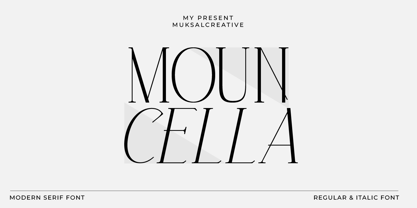 Mouncella Modern serif Font typeface with beautiful alternate, special glyphs, ornament and multilingual support. It's a very versatile font that works great in large and small sizes. Perfect for editorial projects, Logo design, Clothing Branding, product packaging, magazine headers, or simply as a stylish text overlay to any background image.
 - Rosegar by Muksal Creatives,
$15.00 Rosegar Modern sans serif typeface with beautiful alternete, special glyphs, ornament and multilingual support. It's a very versatile font that works great in large and small sizes. Perfect for editorial projects, Logo design, Clothing Branding, product packaging, magazine headers, or simply as a stylish text overlay to any background image.
 - Magioline by Muksal Creatives,
$10.00 Magioline Modern serif Font typeface with beautiful alternate, special glyphs, ornament and multilingual support. It's a very versatile font that works great in large and small sizes. Perfect for editorial projects, Logo design, Clothing Branding, product packaging, magazine headers, or simply as a stylish text overlay to any background image.
 - The Bentley by Bosstypestudio,
$14.00 The Bentley Script in a beautiful handwritten style. Equipped with 350 glyphs. The Bentley Script is perfect for branding projects, home appliance design, product packaging, use in business cards, invitation cards, etc. Simply as a stylish text overlay onto a background image or anything that requires a touch of elegance.
 - Perfect Moment by Muksal Creatives,
$10.00 Perfect Moment Modern serif Font typeface with beautiful alternate, special glyphs, ornament and multilingual support. It's a very versatile font that works great in large and small sizes. Perfect for editorial projects, Logo design, Clothing Branding, product packaging, magazine headers, or simply as a stylish text overlay to any background image.
 - RMU Bowery by RMU,
$30.00 In the last decade of the 19th century, Bruce Type Founders, New York - among others - released this shaded typeface which they named Bowery. Carefully redrawn and digitized, RMU Bowery breathes fresh life into this great design.
 - Scrolls A by Wiescher Design,
$39.50 Scrolls A are a set of pictorial scrolls like signs of the zodiac, animals, dishes, flowers, symbols, decorative and Americana. They are beginning of last century American. Your I-found-them-somewhere type-designer, Gert Wiescher
 - Medinah by Trustha,
$15.00 Medinah is a stunning and bold script, completely suitable for a large number of designs. This font will leave you breathless, and give all your designs the impact they need to stand out from the crowd.
 - Critter by Adobe,
$29.00Originally created by Craig Frazier, San Francisco designer and illustrator, for The Alphabet Critter Playbook, the clever creatures of Critter tell you their names by the letter they represent. A helpful hint: x" is for xenopus." - Rough Bluff by PizzaDude.dk,
$18.00 Rough Bluff is all about making a statement with rough and uneven strokes. I've added 7 different versions of each letter, and they automatically changes as you type - or you can choose your favourite ones manually.
 - Palma by FaceType,
$10.00 Handwriting fonts have a great disadvantage when it comes to double letters: they look fake. With Palma come loads of ligatures for double letters to make your design look authentic (as shown on the image above).
 - Sticky Shoes by Bogstav,
$15.00 Sticky Shoes was inspired by a sign at a local flea market. The artist behind the sign obviously didn’t care much about painting the letters “in the right way” - leaving a slobby and uneven impression. And what is wrong with that? Nothing, if you ask me. I tried my best to capture the charm and innocence behind that sign in Sticky Shoes. I even made the paint version go outside the outline in the Regular version! I added 6 different versions of each letter, and they automatically changes as you type. That goes for all 4 versions, and they even mix very nicely!
 - Jesper by Linotype,
$29.993 robbers is not a typeface family, only a collective name for three typefaces with the looks of handtexted characters: Kasper, Jesper and Jonatan. There are some common traits between them, but they are three individuals. As the three terrible" robbers in the Swedish writer Lennart Hellsing's Kamomillastad - the ones who borrowed their names to the typefaces - are three individuals. They always appear in the same order: first Kasper, then Jesper and last Jonatan. Swedish children love to sing about them and are not at all scared of them. All three robbers were released in 1995. - Linotype MhaiThaipe by Linotype,
$29.99Linotype Mhai Thaipe is part of the Take Type Library, chosen from the entries of the Linotype-sponsored International Digital Type Design Contests of 1994 and 1997. The work of German designer Markus Remscheid, the name is not hard to recognize as an English-Asian play on my type and describes its general character. The small circles which ornament the alphabet and the unusual flowing forms which look like a mixture of Arabic and Sanskrit combine to give the typeface an ornamental, exotic look. Linotype Mhai Thaipe is best used for headlines with point sizes of 12 or larger. - Povetarac Didone by Tour De Force,
$25.00 Povetarac Didone font family is part of Povetarac Superfamily together with Povetarac Sans and Povetarac Display. Available in 6 weights with matching italics, Povetarac Didone relays on lively uppercase proportions that took inspiration from vintage typefaces. It is well balanced family, elegant and fully recognizable. One of its characteristics are straight and wide terminals without usual serifs for this kind of typefaces. Playful and harmonic italics are one more uniqueness of Povetarac Didone. They were gently crafted to fulfil they role not just for editorial use, but as display typeface as well. Comes with Fractions and extended Latin character map.
 - Jonatan by Linotype,
$29.993 robbers is not a typeface family, only a collective name for three typefaces with the looks of handtexted characters: Kasper, Jesper and Jonatan. There are some common traits between them, but they are three individuals. As the three terrible" robbers in the Swedish writer Lennart Hellsing's Kamomillastad - the ones who borrowed their names to the typefaces - are three individuals. They always appear in the same order: first Kasper, then Jesper and last Jonatan. Swedish children love to sing about them and are not at all scared of them. All three robbers were released in 1995. - Remora Camilla by Grezline Studio,
$20.00 Remora Camilla is a display script and unique sans font pair with a charming retro personality. They also have strong and bold characteristics. This font will be an appealing asset to your fonts’ library, as they have the potential to enhance any design project. Remora Camilla is perfect for headings, covers, posters, logos, quotes, product packaging, merchandise, social media and much more! Combine them to make your creation more spectacular! Feature : - A lot of Alternates ( With a Total of 700+ Glyphs ) - Multilingual Language - Works on PC & Mac - Simple installations - Accessible in the Adobe Illustrator, Adobe Photoshop, Adobe InDesign, even works on Microsoft Word.
 - Linked Now by Jehoo Creative,
$16.00 Linked Now is so named because this Typeface has Multiple Discreationary Ligatures that unite two different letters to make a striking shape. Is a powerful grotesque typeface designed to be versatile in a wide range of contexts. Having more than 50 stylish Dsicreationary Ligatures on Uppercase letters and unique Alternate on certain letters makes it seem like they have various shapes, so they are great to use as display fonts. To complete it, Linked Now typeface is equipped with 8 weights from Extralight to black and each includes italic. More than 485 glyphs on each and support most European languages .
 - Fast Hand by Gerald Gallo,
$20.00 The Fast Hand set was inspired by casual, neat hand lettering. They are casual and informal and ideal for use in conveying these qualities. They are excellent for casual text and at large sizes an effective casual display font. Both fonts have the same uppercase alphabet, numbers, punctuation, accented characters, symbols, and miscellaneous characters. As their names imply Fast Hand Lower Case has a lowercase alphabet while Fast Hand Small Caps has small caps in place of the lowercase alphabet. Fast Hand Lower Case and Fast Hand Small Caps are sold as a set priced at $20.
 - Uncia Black by Greater Albion Typefounders,
$12.00 Greater Albion Has been toying with thoughts of a “unicase” typeface for a while. On the other hand we’ve always wondered just what practical use they are. It is also a while since we’ve introduced a ‘handwritten’ design. Therefore, It struck us that one answer was something ‘hand-lettered’. These days many people do write in a sort of informal unicase don’t they? But, at the same time, we wanted it to have a little character. So here it is, a bit calligraphic, with a touch of black-letter and a cunning mix of upper- and lower-case forms Uncia Black!
 - Linotype Laika by Linotype,
$29.99Linotype Laika is part of the Take Type Library, chosen from the entries of the Linotype-sponsored International Digital Type Design Contests of 1994 and 1997. This fun font was created by Dutch designer Mark van Wageningen, who based its forms on those of a sans serif font but gave them wavy, irregular contours. They look almost as though they lie just under the surface of a pool and the movement of the water gives them their undulating appearance. The dynamic Linotype Laika is especially good for headlines in larger point sizes or shorter texts in point sizes of 14 or larger. - LoveYaHoney by Typadelic,
$14.95 Aw, aren't they sweet? This lettering is based on a 1950s note a husband wrote to his wife shortly after they were married. His beautifully controlled and strong handwriting knows no lowercase characters; he gets his point across in uppercase only. In today's world of email and internet writings, we know that uppercase means shouting and is considered quite rude, but he didn't know that when he wrote this letter to his lovely wife! Love Ya Honey is very legible and looks beautiful when used for headlines, titling or even long expanses of body copy. Perfect for scrapbooking too!
 - High Table by SAMUEL DESIGN,
$39.00 The key words for this font are taste, elegance, storytelling, and a little bit of dynamism. HIGH TABLE family have exquisite details and great quality. We believe that only high quality and unique details can move people more than exaggerated shapes. Fonts are so powerful, they tell a moving story. The PACE typeface was chosen to tell a story quietly but with dynamism. Readers are delighted and relaxed when they see this font family, and colleagues read the story with respect. A brand needs a story, and a brand’s story needs the most appropriate font to carry it.
 - Sondela by Scholtz Fonts,
$19.00Sondela is a gently rounded, informal font, whose name means "welcome" or "come closer". It echoes the openhearted tradition of the Zulu people, where all who come are welcome. The font is available in regular and display (Pizazz) versions. Sondela Pizazz incorporates the zig-zag pattern that has been used in traditional Zulu beadwork for generations. It is highly effective when used in conjunction with the unadorned Sondela regular. The numerals are mono-spaced so that they will line up correctly in columns of figures. The letters of the alphabet are correctly kerned so that they appear correctly in text. - Organic Thinker by Bogstav,
$19.00 Monospaced fonts can be so dull...they are often only suitable for something like programming and other places where you need the text lined up perfectly. Well, that is not the case with Organic Thinker! Yes, it is monospaced, but it is also handmade and full of vibrant and organic life! Each letter has 5 slightly different versions, and they automatically changes as you type - makes you forget everything about programming, kerning and other dull things! :) Well...you are more than welcome to use Organic Thinker for your next Turbo Pascal text, actually I'd fancy that! :)
 - Anthracite by Fabulous Rice,
$15.00 A title is something strong. Something that leaves its mark through time, in the memories and in the hearts. A title tells things about the content, its purpose, its meaning, its point. For your needs in strong titlecase letters comes Anthracite. Looking almost like they were carved out of raw wood in the 1820s, the letters of Anthracite will not only imprint well but they will also impress. Its carving gives a feeling of relief, or shades, of textures that will be unique every time you use it. The perfect font if you want to stand out and be read.
 - Eveningnews by Wiescher Design,
$39.50 Since many years I live in Munich and read the daily newspaper Abendzeitung. One morning they had redesigned the paper, using Eric Gill's Joanna for the body copy and a tweaked version of Franklin Gothic for the headlines. Since both typefaces are my all-time favorites, I was very pleased. The old hand-lettered title lettering designed by in-house designer Ernst Friedrich Adler around 1947 or 48 was untouched as it always was. Adler had worked for the newspaper an incredible 47 years! Ernst Friedrich Adler celebrated his 100th birthday in the summer of 2007 looking very healthy. But someone had adapted his title lettering for use in the chapter headings, and I did not like the way that was done. Every morning I saw those letters and thought "one day I have to clean that up". About 15 years later I finally did it! Being at it, I designed the whole typeface and added a second fancy cut. And, what do you know, the people at the Abendzeitung called me up and said they liked what I did and started using it. So since that day in 2005 I can read my morning paper without having to wonder about the chapter headings. Well maybe one day they will do another redesign and maybe they will use another one of my fonts. Your editorial typeface designer, Gert
 - Danube Pro by CheapProFonts,
$10.00 This cool techno font is easily recognizable with its quite unique stroke endings. I have increased the ascenders and descenders slightly (so they would work better with the new diacritic letters) and introduced a few alternate letterforms in addition to generally expanding the character set. A totally enjoyable reworking of an original design. Now also with a Bold and a brand new Light variant! Please note that these variants are made by adding/removing from the regular shape, so the letters no longer sits on the baseline. ALL fonts from CheapProFonts have very extensive language support: They contain some unusual diacritic letters (some of which are contained in the Latin Extended-B Unicode block) supporting: Cornish, Filipino (Tagalog), Guarani, Luxembourgian, Malagasy, Romanian, Ulithian and Welsh. They also contain all glyphs in the Latin Extended-A Unicode block (which among others cover the Central European and Baltic areas) supporting: Afrikaans, Belarusian (Lacinka), Bosnian, Catalan, Chichewa, Croatian, Czech, Dutch, Esperanto, Greenlandic, Hungarian, Kashubian, Kurdish (Kurmanji), Latvian, Lithuanian, Maltese, Maori, Polish, Saami (Inari), Saami (North), Serbian (latin), Slovak(ian), Slovene, Sorbian (Lower), Sorbian (Upper), Turkish and Turkmen. And they of course contain all the usual "western" glyphs supporting: Albanian, Basque, Breton, Chamorro, Danish, Estonian, Faroese, Finnish, French, Frisian, Galican, German, Icelandic, Indonesian, Irish (Gaelic), Italian, Northern Sotho, Norwegian, Occitan, Portuguese, Rhaeto-Romance, Sami (Lule), Sami (South), Scots (Gaelic), Spanish, Swedish, Tswana, Walloon and Yapese.
 - PF DIN Serif by Parachute,
$36.00 DIN Serif: Specimen Manual PDF The DIN Type System: A Comparison Table This is the first ever release of a true serif companion for the popular DIN typeface. DIN Serif originated in a custom project for a watchmaking journal which required a modern serif to work in unison and match the inherent simplicity of DIN. As a result, a solid, confident and well-balanced typeface was developed which is simple and neutral enough when set at small sizes, but sturdy and powerful when set at heavier weights and bigger sizes. It utilizes the skeleton of the original DIN and retains its basic proportions such as x-height, caps height and descenders, whereas ascenders were slightly increased. DIN Serif makes no attempt to impress with ephemeral nifty details on individual letters, but instead it concentrates on a few modern, functional and everlasting novelties which express an overall distinct quality on the page and set it apart from most classic romans. This is a low contrast typeface with vertical axis and squarish form which brings out a balance between simplicity and legibility. Its narrow proportions offer economy of space which is critical for newspaper body text and headlines. At small sizes the text has an even texture, it is comfortable and highly readable. The serifs are narrow at heavy weights and when tight typesetting is applied at large sizes, the heavier weights become ideal for headlines. DIN Serif was inspired by late 19th century Egyptian and earlier transitional roman faces. Bracketed serifs were placed on the upper part of the letterforms (this is where we mostly concentrate our attention when we read) whereas small clean square serifs were placed on and under the baseline to simplify the letterforms. In order to reduce visual tension at the joins and make reading smooth and comfortable, a slight hint of bracketed serif was added at the joins in the form of a subtle angular tapered serif, which softens the harsh angularity. These angular tapered serifs tend to disappear at smaller sizes (or smooth out the joins) but stand out at bigger sizes exuding a strong, modern and energetic personality. What started out as a custom 2 weight family, it has developed into a full scale superfamily with 10 styles from Regular to ExtraBlack along with their italics. Additional features were added such as small caps, alternate letters and numbers as well as numerous symbols for branding, signage and publishing. All weights were meticulously hinted for excellent display performance on the web. Finally, DIN Serif supports more that 100 languages such as those based on the Latin, Greek and Cyrillic alphabet.
 - Saturdays Girl - 100% free

- Meet John Henry - Unknown license

- Ordinary Guy by PizzaDude.dk,
$15.00 Just another ordinary brushfont? No! There is more to the picture than meets the eye! Ordinary Guy has 8 different versions of each letter! Just like magic, they cycle as you type! Included is multiple language support!
 - Floralissimo by Wiescher Design,
$39.50 Floralissimo are flowery embellishments that I found in several old publishing books dating back over a hundred years. I thought they might be useful for some of you, so I digitized them. Your digitizing typedesigner, Gert Wiescher
 - Spatchers by PizzaDude.dk,
$16.00 Spatchers is obviously a comic font - very useful when you need a fresh and legible look to whatever you design. I've made 4 slightly different versions of each lowercase letter - and they automatically cycle as you type.
 - Fleurons One by Wiescher Design,
$39.50 Fleurons are embellishments and this is my first fleurons font. I looked at some old ones and made some new ones. They should go very well with my script Nadine!!! Yours in a beautiful mood Gert Wiescher
 - Rayna by melifonts,
$5.00 Rayna is a simply beautiful handwritten font that is suitable for scrapbooking, notes to friends, and stylish logos. It is both elegant and versatile, including both Latin and Cyrillic alphabets with support for most European languages. This delicate typeface's swooping curls and sweet lines are the perfect addition to your handwritten font collection!
 - Andesta by IM Studio,
$19.00 Andesta in a beautiful handwritten style with a touch of love style. Equipped with 391 glyphs Andesta is perfect for branding projects, home appliance design, product packaging, use in business cards, invitation cards, etc. Simply as a stylish text overlay onto a background image or anything else that needs a touch of elegance.
 - Spectre by Letteralle,
$23.00 Spectre is an allcaps display font. With bold and sharp shapes, this font is able to bring a fierce and bold impression to your designs. Spectre is perfect for editorial projects, Logo design, Music Album, Clothing Branding, product packaging, magazine headers, or simply as a stylish text overlay to any background image.
 - Daragie by Muksal Creatives,
$12.00 Daragie is a feminine vintage typeface with beautiful alternete, tons of special , ornament and multilingual support. It's a very versatile font that works great in large and small sizes. Perfect for editorial projects, Logo design, Clothing Branding, product packaging, magazine headers, or simply as a stylish text overlay to any background image.
 - Kofi by Canada Type,
$24.95Just when you thought every possible fat alphabet has already been done, Kofi shows you that there still are plenty of good ideas left in the genre! Kofi is simply fat, fun letters that scream for attention and promise delight. This package ships with two fonts, the second constituting a busload of alternates.

