5,514 search results
(0.094 seconds)
- Retrade by Muksal Creatives,
$14.00 Retrade is a unique and modern family of Sans serif fonts. Simply Conception has 9 families Regular font, starting from the small thin to the largest Black. This typeface is versatile and can be used successfully in magazines, posters, branding, websites.
 - Falbench by Realtype,
$17.00 Falbench is a manual written font to get the best texture for each letter. Each letter character will make your design strong and dazzling, while challenging the eyes. Each letter and symbol is simply painted using the best brushes and ink.
 - Johnson Rock by Letterara,
$13.00 Johnson Rock is cool handwritten font with a personal charm. With quick dry strokes and a signature style, Johnson Rock is perfect for branding projects, homeware designs, product packaging - or simply as a stylish text overlay to any background image.
 - TXT Scribbletti by Illustration Ink,
$3.00Add character to your paper crafts. Download this unique "Scribbletti" font to create lettering with a scratchy, handwritten look. Design titles, captions, and journaling for scrapbook pages and greeting cards, or simply give your publication an off-beat, handwritten appeal. - Letoys by Zamjump,
$19.00 Letoys are inspired by 70s typography with a touch of psychedelic and retro vibes. This type is perfect for creating posters, magazine layouts, brand logos, sleeve covers, party flyers, quotes, or simply as a stylish text overlay on any background image.
 - Neckless Starways by Ronny Studio,
$19.00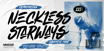 Neckless Starways is distinctive handwriting and encapsulates the essence of street style. This typeface is perfect for an poster event, movie title, streetwear stuff, magazine layout, fashion brand, quotes, or simply as a stylish text overlay to any background image.
 - Magefin by Muksal Creatives,
$10.00 Magefin is a unique and modern family of serif fonts. Simply Conception has 9 families Regular font, starting from the small thin to the largest Black. This typeface is versatile and can be used successfully in magazines, posters, branding, websites.
 - Flavellya by Stringlabs Creative Studio,
$25.00 Flavellya is luxurious, fun and elegant. This script is simply the ideal font for any branding project! The Flavellya font is a great choice to increase the prominence in your project. Although the typography is traditional, the basic elements are great.
 - Avegra by Letteralle,
$24.00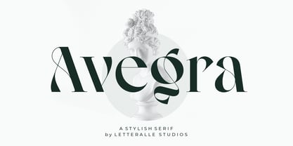 Avegra is stylish modern serif font. Contains uppercase & lowercase characters, all punctuation & numerals. Diaspora is absolutely perfect for editorial projects, Logo design, Wedding, Clothing Branding, product packaging, magazine headers, or simply as a stylish text overlay to any background image.
 - Heylabs Stroyed by Ronny Studio,
$19.00 Heylabs Stroyed is distinctive handwriting and encapsulates the essence of street style. This typeface is perfect for an poster event, movie title, streetwear stuff, magazine layout, fashion brand, quotes, or simply as a stylish text overlay to any background image.
 - Naville by Letterhend,
$16.00 Introducing, Naville Sans, the all caps font family. This family has 6 weights - extra light, light, reguler, medium, semibold and bold. The clean and simplicity look of the font suitable for wide range of graphic needs especially for headline, title, sign board, information board, billboard and for UI/UX design.
 - Impressive by Ghuroba Studio,
$11.00 Impressive is a light and charming handwritten font with incredible style, and comes in two styles: Regular and Italic. Get inspired by its modern simplicity. It's perfect for logos, branding, photography, invitations, watermarks, advertisements, product designs, stationery, labels, product packaging, special events or anything that need a hand-written style.
 - Baltore by 160 Std,
$5.00 Introducing BALTORE - Your Go-To Simple and Modern Typeface! Elevate your design projects with BALTORE, a versatile font seamlessly transitioning between simplicity and unique complexity, offering an array of alternate characters. Perfect for headlines, logo branding, quotes, posters, products, and more, BALTORE brings a touch of modernity to your creative ventures.
 - Taiama by Tanya Savchenko,
$13.00 TAIAMA - modern elegant sans-serif font, 2022 release. The font has a set of Latin and Cyrillic. When designing the font, I took into account it’s simplicity and intelligibility. Even a large amount of text looks stylish and modern, and most importantly, readable. Why not use this font for everything?
 - Breaknight by Zamjump,
$19.00 Breaknight is a bold, italic style display font, with a futuristic twist keeping the simplicity and unique shape. Breaknight can be used in various projects, such as product branding, logos, apparel greeting cards, sneakers, billboards, video graph, magazines, sports, and many others. give it a try you will definitely find more,....
 - Begiko 17 by Begiko,
$10.00 Begiko17 is a monoline typeface family which was designed to be a font of ease lecture with features in the rhythm and proportions of school writing. In addition to the standard characters, Begiko17 includes several useful mathematical characters. Its strength relies in the clarity, simplicity and harmony of its traces.
 - EB Corp by Eko Bimantara,
$21.00 EB Corp designed to be fit for corporate nuances. its letterforms shaped in tune with technological feels. Its shown simplicity, minimal stroke contrast, moderate spacing. Its consist of 18 styles from Thin to Black, contain 470+ glyphs that support broad latin language, contain variation of linning figures, and some alternates glyphs.
 - Compton by Greater Albion Typefounders,
$10.00 Compton is a clean modern slab serif face that emphasises simplicity of line and legibility. It's offered in three weights: regular, bold and light. Compton brings the spirit of the 60s and 70s to the present day. It is ideal for clear, simple graphic design that makes an immediate impact.
 - Heart Strings by Seemly Fonts,
$12.00 Heart Strings, a charming and warm handwritten font, brings a delightful touch to designs centered around Valentine's Day. Its simplicity and distinctive style make it a perfect match for a wide range of creative projects. Let your imagination run wild—there's no limit to the sweetness this font can add! Uppercase
 - Civilian - Unknown license

- Ticketbook by Suomi,
$20.00 Univers and Helvetica Compressed are most often used for movie posters, but they lack variants. Therefore I made a compressed family with seven weights for more versatility.
 - Bloxed Rounded by Fontmill Foundry,
$20.00Bloxed Rounded was originally designed for a new Manchester band called Datadiva. Unfortunately they split up before the face was completed. Well, their loss is your gain. - Erghon by Rotterlab Studio,
$17.00 Erghon is a handwritten font with quick dry strokes and a signature style. It's perfect for branding projects, homeware designs, product packaging or simply as a stylish text overlay to any background image or posters. Erghon has an entire alternate glyph set. This is accessible simply by their own separate font file - just install this as normal and select 'Erghon Swash' , ‘Erghon' or ‘Erghon’ in your text-tool. Erghon includes 2 Font files: 1. Erghon Regular - A handwritten script font containing upper & lowercase characters, numerals and a large range of punctuation. 2. Erghon Swash - A set of 26 hand-drawn swashes, with cool touch to underline your text set in Erghon.
 - Lido STF by Storm Type Foundry,
$39.00Times with a Human Face: In my article of the same name which appeared in the magazine Font, volume 2000 I described the long and trying story of an order for a typeface for the Czech periodical Lidové noviny (People’s Newspaper). My task was to design a modification of the existing Times. The work, however, finally resulted in the complete re-drawing of the typeface. The assignment, which was on the whole wisely formulated, was to design a typeface which would enable “a smooth flow of information in the reader’s eye”, therefore a typeface without any artistic ambitions, from which everything which obstructs legibility would be eliminated. A year later Lidové noviny had a different manager who in the spring of 2001 decided to resume the cooperation. The typeface itself definitely profited from this; I simplified everything which could be simplified, but it still was not “it”, because the other, and obviously more important, requirement of the investor held: “the typeface must look like Times”. And that is why the above-mentioned daily will continue to be printed by a system version of Times, negligently adjusted to local conditions, which is unfortunately a far cry from the original Times New Roman of Stanley Morison. When I was designing Lido, the cooperation with the head of production of Lidové noviny was of great use to me. Many tests were carried out directly on the newspaper rotary press during which numerous weak points of the earliest versions were revealed. The printing tests have proved that the basic design of this typeface is even more legible and economical than that of Times. The final appearance of Lido STF was, however, tuned up without regard to the original assignment – the merrier-looking italics and the more daring modelling of bold lower case letters have been retained. The typeface is suitable for all periodicals wishing to abandon inconspicuously the hideous system typefaces with their even more hideous accents and to change over to the contemporary level of graphic design. It is also most convenient for everyday work in text editors and office applications. It has a fairly large x-height of lower case letters, shortened serifs and simplified endings of rounded strokes. This is typical of the typefaces designed for use in small sizes. Our typeface, however, can sustain enlargement even to the size appropriate for a poster, an information table or a billboard, as it is not trite and at the same time is moderate in expression. Its three supplementary condensed designs correspond to approximately 80% compression and have been, of course, drawn quite separately. The intention to create condensed italics was abandoned; in the case of serif typefaces they always seem to be slightly strained. I named the typeface dutifully "Lido" (after the name of the newspaper) and included it in the retail catalog of my type foundry. In order to prevent being suspected of additionally turning a rejected work into cash, Lido STF in six designs is available free of charge. I should not like it if the issuing of this typeface were understood as an “act out of spite” aimed against the venerable Times. It is rather meant as a reminder that there really are now alternatives to all fonts in all price categories. - Ernest & Emily by Nicky Laatz,
$15.00 I’d like to introduce you to Ernest and Emily :) ....The happiest font duo you'll ever meet :) They are completely in love with each other, and always get along like a house fire :) Ernest and Emily consist of two lovingly handwritten fonts. A brushed quirky-casual script, and a playful all-caps sans-serif font. Perfect for Type-based creations, branding, websites, merchandise, packaging, quotes, invites, greetings and so much more! All they need is a blank canvas, and they work their magic for you! The brush script comes in 3 variants - Regular, Slanted and Upright- each with its own twist to fit the look you need. Four sweet little heart glyphs can be found by typing the characters { } and [ ] individually. Well now that I've introduced you, I'll let you get properly acquainted! :)
 - Close Together by Ingrimayne Type,
$9.00 Close Together was designed to alternate convex and concave letter sets, with convex letters on the upper-case keys and concave shapes on the lower-case keys. The OpenType feature of contextual alternatives (calt) does this automatically. Individually some of the letter shapes are strange and unsightly. They have the shapes that they have so that they fit snuggly with adjacent letters. The family has three weights: regular, bold, and extrabold. The letter spacing is set very tight and the user may want to loosen it by altering characters spacing. (Either the convex or concave set the letters can be used alone if the character spacing is adjusted.) The typeface has four OpenType stylistic sets of alternates, one for numbers and the others for letters D, T, and Y.
 - Bleak by Andinistas,
$34.00 @andinistas presents Bleak , an experimental font designed by #carlosfabiancg. Bleak is based on the imaginative use of contrast applied in the empty space and on the dramatic distributions of the wide and compressed horizontal of more than 400 textured symmetric capitals inspired by compositions of the Lissitzky, Theo van Doesburg, among others. In the Europe of the 20s, scarce resources prevailed, which gave these great artists the firm determination and dedication to create a visual vocabulary, characteristic of the composition with movable types of wood and metal. As they did not readily dispose of the forms of the letters they required, they did not hesitate to construct them with metal rulers, ornaments and other improvised pieces and remains and obtained in the forgotten corners of the typographic composition workshop.
 - Cartier Book by Monotype,
$29.99 Cartier was Canada’s first roman text typeface, created in 1967 to celebrate Canada’s centennial. Its designer, Carl Dair, was one of the country’s most celebrated graphic design pioneers, and a fine designer indeed — but he was not a trained type designer. He had spent a year at the Enschedé type foundry and printing works in the Netherlands, but that probably wasn’t enough to fully grasp all that was required to make an effective text face. It is also possible that Dair simply compromised his own design by not allowing any of the much needed alterations to be made to his working drawings when they were handed over to Linotype for production. Cartier, though a strikingly original oldstyle, never became the influential allround text face it might have been. A display typeface derived from it, Raleigh, was more successful. Realizing that Dair’s design was sound in concept, if not in execution, Rod McDonald began working on a new digital version in 1997. The final family is convincing proof that Cartier could have been the functional text face that Dair originally wanted.
 - Kompot by VP Creative Shop,
$19.00 Introducing Kompot - This is the Greatest Font... actually typeface with 4 styles Kompot is swirly, vintage typeface with 4 styles to enchant your next project. They are loaded alternate glyphs, ligatures and multilingual support. Very versatile fonts that works great in large and small sizes. Basic latin, advanced latin, basic Cyrillic and advanced Cyrillic character sets are supported! Kompot is perfect for branding projects, home-ware designs, product packaging, magazine headers - or simply as a stylish text overlay to any background image. Uppercase numeral, punctuation & Symbol Regular Styled Outline Styled Outline Alternate glyphs Ligatures Multilingual support Basic and Advanced Cyrillic support How to access alternate glyphs? To access alternate glyphs in Adobe InDesign or Illustrator, choose Window Type & Tables Glyphs In Photoshop, choose Window Glyphs. In the panel that opens, click the Show menu and choose Alternates for Selection. Double-click an alternate's thumbnail to swap them out. Feel free to contact me if you have any questions! Mock ups and backgrounds used are not included. Thank you! Enjoy!
 - Galdien by Craft Supply Co,
$20.00 Introducing Galdien – Modern Sans Serif Font A Contemporary Typeface Galdien – Modern Sans Serif Font is, without a doubt, a testament to contemporary design simplicity and elegance. It seamlessly blends modernity with readability. Clean and Versatile Furthermore, Galdien’s clean lines and uncluttered appearance make it an extraordinarily versatile choice for a wide range of design applications. Its simplicity ensures it doesn’t overpower your message, making it a font suitable for various projects. Readability at its Core At its core, Galdien prioritizes readability. Each character is thoughtfully crafted to ensure clarity in both print and digital formats. This font’s legibility is especially essential for conveying your message effectively and effortlessly. Ideal for Modern Branding Additionally, Galdien is perfectly suited for modern branding initiatives. Its clean and sleek aesthetic aligns seamlessly with contemporary brand identities, offering a cohesive and professional look that resonates with today’s audience. In Conclusion Galdien – Modern Sans Serif Font is your unwavering companion for modern design endeavors. Its simplicity, versatility, and readability, combined with its adaptability to various media, make it an excellent choice for diverse projects. With Galdien, your message is not only communicated with clarity and style but also imbued with a contemporary touch that captivates your audience and leaves a lasting impression.
 - Digot 03 by Fontsphere,
$16.00 DIGOT 03 is an innovative two-font family that blends minimalism and geometric precision to create a visually striking and modern design. These fonts are perfect for those seeking a clean and contemporary look for their projects. --- Usage Recommendations DIGOT 03 is a font that thrives in environments where simplicity and clarity are valued. It works exceptionally well in both digital and print formats. Consider using DIGOT 03 in the following situations: Web Design: DIGOT 03 can add a touch of modernity to website designs, providing a clean and contemporary experience for users. Poster Design: Whether creating event posters or advertising material, DIGOT's bold and eye-catching letterforms make it a perfect choice for grabbing attention. Logo Design: This font, despite its very experimental approach, can help establish a strong and memorable brand identity. Its simplicity allows the logo to be easily recognizable and versatile across various marketing channels. Iconography: As DIGOT 03 is built upon geometric principles, it excels in creating visually appealing icons and symbols that follow the same minimalist style. --- DIGOT 03 is the perfect font for designers and creatives who appreciate simplicity and have a keen eye for detail. With its unique minimalist geometric style, DIGOT offers endless possibilities for creating clean and impactful designs.
 - Little Cecily by Olga Umpeleva,
$25.00 Little Cecily was designed on the base of a Russian calligraphy sample book for primary schools “Propisi pryamogo pis’ma” (Moscow, 1914). Such kind of scripts were implemented in school programs at the end of 19th-beginning of 20th century. There was an opinion that the straight writing is easier for learning and better for children from a medical point of view. The letterforms of the typeface are characterized by simplified constructions and upright design which distinguishes it from the list of typical school scripts and convey to it a naive charm and originality. The character set covers standard Western and Cyrillic code pages and it includes alternative letters and contextual forms for connected writing.
 - Gondolieri by Greater Albion Typefounders,
$16.50 The design of Gondolieri has its origins in an experiment to combine aspects of Didone and Tuscan typefaces. The result has a continental 'Italianate' feel. If you wonder what lies behind the name, just look at the lower case 'f'...definite overtones of a Venetian Gondola here, and throughout the design. Gondolieri is offered in regular and bold weights, as well as a simplified form for smaller text use. All of these are available in three widths. The Gondolieri family has a lovely Didone, 'Belle Epoch' feel for use in design, posters, book covers and so forth. An extensive range of Opentype features, including ligatures and terminal forms is included in the regular and bold faces.
 - UNicod Sans by Mostardesign,
$26.00 This font has been especially designed for Mostardesign Studio by Olivier Gourvat. Created in 2010, this font family has been designed to serve sectors like financial services, modern industries, business and many more activities who needs a modern aspect in their communication. Its square proportions make the design very readable at a wide range of sizes. Shapes give the face a unique futuristic look and is a very practical choice for modern headlines, branding, text and web fonts work. The family contains also an alternative set with simplified letters designed especially for text and a unique stylistic set for titles and branding. UNicod Sans is available in 5 weights with corresponding italics and 2 styles.
 - Torjus by Brenners Template,
$19.00 Torjus is so rigid and stiff typeface. While designing a more dry and stiff handwriting typeface, I tried to remove the Bezier curves. Rhythms were also created by dramatically simplifying the paths used in the Glyphs and emphasizing individual contrasts. 60 predefined Ligatures to bring your passion and inspire you to wonder. Ligatures : Ba, Be, Bo, Ca, Ce, Co, Da, De, Do, Ea, Fa, Fe, Fo, Ga, Ge, Go, Ha, He, Ho, Ja, Je, Jo, Ka, Ke, Ko, La, Le, Lo, Ma, Me, Mo, Na, Ne, No, Oa, Pa, Pe, Po, Ra, Re, Ro, Sa, Se, So, Ta, Te, To, Va, Ve, Vo, Wa, We, Wo, Ye, Yo, ee, ff, ll, oo, rr.
 - HGBGalaxo Dot by HGB fonts,
$23.00 Galaxo Dot is a sister to Galaxo Line. HGB Galaxo is a tribute to Othmar Motter (1927–2010), the Vorarlberg graphic artist and typeface designer, who designed very individual and perfectly crafted typefaces in the 1970's and later. (Motter Ombra, Motter Tectura ...) From a Motter sketch of 5 letters for a logogram, I derived a simplified letterform and developed all the necessary characters. Working on these glyphs and delving deeper into Motter's letterforms, the respect for the accuracy with which he drew his letters (in ink) grew more and more. The spiral resembles the shape of a galaxy, hence the name Galaxo. The font is suitable for retro, poster and logo design.
 - BR Nebula by Brink,
$30.00 BR Nebula is a geometric sans serif that builds on the foundations of early geometric designs such as Paul Renner’s Futura, and later works such as Avant Guarde. BR Nebula takes inspiration from these early explorations in sans serif design and re-imagines them for the modern age. Distinctive geometric letterforms have been refined and simplified with opened terminals to achieve a clear, legible and modern aesthetic. BR Nebula is available in 20 contemporary styles, with weights ranging from Hairline to Super. The fonts also provide advanced typographic support with OpenType features such as case sensitive forms, stylistic alternates, slashed zeros and multiple figure sets. Also containing advanced language support as standard. For custom enquiries please contact: mail@brinktype.com
 - Ctoxina by FSdesign-Salmina,
$39.00 The Ctoxina family is growing. Due to the success the author decided to add an outline version of the font. The typeface is now available in 6 different styles: light, light italic, regular, italic, bold and bold italic. The Atoxina family is designed especially for the burgeoning market of starships and other space cruisers. The fonts are ideal for internal and external use (including zero-g and occasional bursts of cosmic rays), and with their simplified forms are expected to survive well in non-linear galaxies. With their unusual diagonal half-pixels the fonts are striking as abstract designs at astronomical sizes, where small text may be placed within the black holes formed inside the letters.
 - Ramaskrig by Bogstav,
$17.00 Interesting script font with lovely crunchy details - comes with multilingual support and contextual alternates with 4 different versions of each letter, and they cycle automatically as you type!
 - TessieStandingBirds by Ingrimayne Type,
$13.95 A tessellation is a shape that can be used to completely fill the plane—simple examples are isosceles triangles, squares, and hexagons. Tessellation patterns are eye-catching and visually appealing, which is the reason that they have long been popular in a variety of decorative situations. These Tessie fonts have two family members, a solid style that must have different colors when used and an outline style. They can be used separately or they can be used in layers with the outline style on top of the solid style. For rows to align properly, leading must be the same as point size. Shapes that tessellate and also resemble real-world objects are often called Escher-like tessellations. This typeface contains Escher-like tessellations of birds. A number of years ago I decided to see how many of the 28 Heesch types of tessellations I could use to make birds standing on the backs of other birds. I found standing bird patterns for all 17 of the types that had either translated or glided edges. The TessieStandingBirds typefaces contain the standing-bird shapes that I discovered. At first glance they seem to be quite similar, but small differences matter in how they fit together. Most of the patterns require more than one character. The sample file here shows how pieces fit together to give tessellating patterns. (Earlier tessellation fonts from IngrimayneType, the TessieDingies fonts, lack a black or filled version so cannot do colored patterns.)
