10,000 search results
(0.042 seconds)
- Vilgorda by Letterhend,
$19.00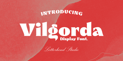 Vilgorda is a unique bold display font. This type of font perfectly made to be applied especially in logo, headline, signage and the other various formal forms such as invitations, labels, logos, magazines, books, greeting / wedding cards, packaging, fashion, make up, stationery, novels, labels or any type of advertising purpose. Features : uppercase & lowercase numbers and punctuation multilingual PUA encoded We highly recommend using a program that supports OpenType features and Glyphs panels like many of Adobe apps and Corel Draw, so you can see and access all Glyph variations. How to access opentype feature : letterhend.com/tutorials/using-opentype-feature-in-any-software/ Email us to letterhend@gmail.com if you need something! Happy Designing!
 - Dountyland by Letterhend,
$19.00 The Dountyland is a bold monoline script with a touch of vintage look and feel. This type of font perfectly made to be applied especially in logo, headline, signage and the other various formal forms such as invitations, labels, logos, magazines, books, greeting / wedding cards, packaging, fashion, make up, stationery, novels, labels or any type of advertising purpose. Features : uppercase & lowercase numbers and punctuation multilingual alternates / swashes and ligatures PUA encoded We highly recommend using a program that supports OpenType features and Glyphs panels like many of Adobe apps and Corel Draw, so you can see and access all Glyph variations. How to access opentype feature : letterhend.com/tutorials/using-opentype-feature-in-any-software/
 - Glico Prime by Letterhend,
$17.00 Glico Prime is a heavy, bold, standout sans serif with futuristic theme. It has few styles with 3 stylistic, This type of font perfectly made to be applied as a headline, logo, title, quotes which is need a standout font, and the other various formal forms such as invitations, labels, logos, magazines, books, greeting / wedding cards, packaging, fashion, make up, stationery, novels, labels or any type of advertising purpose. Features : Regular, inline & outline 3 stylistic set numbers and punctuation multilingual ligatures PUA encoded We highly recommend using a program that supports OpenType features and Glyphs panels like many of Adobe apps and Corel Draw, so you can see and access all Glyph variations.
 - Bouldster by Letterhend,
$19.00 Introducing, Bouldster - a standout bold script with a touch of nostalgic look and feel. Inspired by 50s 60s signages, this font made to bring back the good ol' days. This type of font perfectly made to be applied especially in logo, headline, signage and the other various formal forms such as invitations, labels, logos, magazines, books, greeting / wedding cards, packaging, fashion, make up, stationery, novels, labels or any type of advertising purpose. Features : uppercase & lowercase numbers and punctuation multilingual alternates / swashes and ligatures PUA encoded We highly recommend using a program that supports OpenType features and Glyphs panels like many of Adobe apps and Corel Draw, so you can see and access all Glyph variations.
 - Khamden Script by Solidtype,
$16.00 Khamden is a thick handmade font of beautiful bold type with an authentic touch. This includes OpenType features with encoded PUA such as alternatives and ligature. This font is perfectly made to be applied especially in logos, and various other formal forms such as invitations, labels, logos, magazines, books, greeting / wedding cards, packaging, fashion, makeup, stationery, novels, labels, or any type from advertising purposes. Feature: uppercase & lowercase letters numbers and punctuation marks multilingual PUA is coded We highly recommend using a program that supports OpenType features and the Glyphs panel like many Adobe and Corel Draw applications, so you can see and access all Glyph variations. Thank you! - Don't hesitate to ask me
 - 1689 GLC Garamond Pro by GLC,
$42.00 This typeface family was inspired by a set of fonts, designed in the Garamond style, used for an edition of Remarques critiques sur les œuvres d’Horace by “D.A.E.P.”, published in Paris in 1689 by two different booksellers: Deny Thierry and Claude Barbin. We can see some differences in comparison with our “pure” Garamond (see our 1592 GLC Garamond), particularly in the lowercase of the Normal style and the uppercase of the Italic. Unfortunately, we know neither the name of the punchcutter, nor that of the printer. This complete font set contains small caps, fractions all the way up to 1999/1999, historical and standard ligatures, and all of the fleurons contained in the edition (Normal style only). The alphabet covers all Western, Eastern and Central European languages (including Celtic diacritics) and Turkish.
 - Ohex by kome.studio,
$12.00 Contemporary geometric typeface. Ohex™font family consists of 5 unique font styles — thin, light, regular, bold and black + VARIABLE version. Opentype features including stylistic alternates, ligatures and kerning pairs. Currency glyphs and stylish digits. Capital letters are designed on the shape of a hexagon. Lowercase letters to cooperate with them, refers to the street style look. Great for logos, posters, magazine layouts, headers, apparel and prints. - Multilanguage support covering Western, South and Central Europe. 1256 Latin 1 / 1250 Latin 2: Eastern Europe / 1254 Turkish / 1257 Windows Baltic / Macintosh Character Ser (US Roman) 1256 Latin 1: Afrikaans, Basque, Catalan, Danish, Dutch, English, Faeroese, Finnish, French, Galician, German, Icelandic, Irish, Italian, Norwegian, Portuguese, Scottish, Spanish, and Swedish. 1250 Latin 2: Eastern Europe / 1254 Turkish / 1257 Windows Baltic : Czech, Polish, Hungarian, Croatian, Romanian, Estonian, Latvian , Lithuanian, Turkish, Slovak and Slevenian -
 - ITC Elan by ITC,
$29.99 ITC Élan combines a gothic simplicity with elegance in a distinctive yet subtle typeface design. There is also a feeling of architectural strength which is derived primarily from an optically even line-weight and a sense of vertical stress. The small, almost Latin, serifs add distinction at both display and text sizes. The large x-height, minimum stroke variance, and open counters are ideal design traits for typeface legibility. Additional characteristics which distinguish ITC Élan are the splayed M" and bowls which do not quite close in the "a," "b" and several other letters. In contrast to the roman, there is almost a calligraphic playfulness to the italic. ITC Élan is the second ITC typeface from Albert Boton of France, who also designed ITC Eras. ITC Élan comes in four weights, book, medium, bold, and black, each with a corresponding italic."
 - Bluset Now Mono by Elsner+Flake,
$35.00 Bluset Monospaced enlarges the re-worked and expanded text- and headline typeface family Bluest Now with 6 new cuts. The concept for Bluest Now was based, in its original form, on a corporate design typeface by Elsner+Flake in 2004, ordered by the Landor Agency for a large German energy corporation. Regularly re-worked and brought up to modern standards, the typeface is still used to this day. Because of its large x-height and its well-balanced appearance, Bluset Now Mono is also excellent for use in small typesizes. The three Roman cuts, Regular, Medium and Bold, and the corresponding obliques, allow a clear differentiation of base- and display applications for every typesize. The character complement has been created for 72 Latin-based language areas and thus allows a neutral text exchange across language borders. Translation Inga Wennik
 - Noyh by Typesketchbook,
$55.00 Noyh is a modern geometric font family that is based on research of similar typefaces of the 1990s and 2000s. Based on that research, font designer Chatnarong Jingsuphatada created a design whose main purpose is to perform equally well in as many environments as possible. Noyh offers a geometric structure with smooth corners, giving it great legibility and making it clean and friendly. As a result, Noyh works well both in print and on screen; it can be used freely for e-books and mobile applications and is perfect for headlines, banners, posters, web-sites, magazines, etc. Perhaps the greatest advantage of Noyh is the stunning number of fonts it includes. There are no less than 72 fonts, each containing over 350 glyphs. The family has 4 formats – Normal, Rounded, Slim and Slim Rounded. Each format is supplied in 9 weights – from Hairline to Black with their respective italics. The individual fonts work very harmoniously with one another, giving the potential user a variety of options. The Noyh font family was created by Thai designer Chatnarong Jingsuphatada and is released by the Typesketchbook type foundry. Chatnarong intends to add an additional member to the family – Noyh A – that will include ornaments, undoubtedly making the Noyh family even more versatile and multi-functional. In the meantime, please take a look at his other typographical projects: Delm, Mairy, Tolyer, Abula.
 - Rolphie by Aah Yes,
$9.95 Rolphie can be your go-to sans-serif, with 16 easy-to-read weights and 10 versions for each weight, and the subtlety of choice that represents. The versions contained in each weight are: Regular; Condensed; Half-Condensed; Expanded; Small Capitals: and their italic counterparts. (At heavier weights particularly it seemed to be justified to have two Condensed versions). Plus there's 20 funky versions with the letters all shook up (that would make a good title for a song), or jumbled around, plus some Shadow, Doubled-Up, College, and other FX versions. In total there's 180 variations, giving a comprehensive selection of both standard and funky fonts, and that subtle degree of choice of weight. To make things easier, the weights are put in ascending numerical order from 01 to 16, and the FX versions have been stuck in the 80s and 90s, (like two musicians I know). There are grouped packages available for certain weights (which have 10 fonts in them) and the complete family package (180 fonts) which represent better value than the individual fonts, and there's a basic package containing the Normal and Italic versions of all 16 weights (32 fonts). A limit of 5 sub-family packages has been imposed, unfortunately, which precludes a more comprehensive selection. To let you know what's in the font that you might otherwise never know about . . . With Discretionary Ligatures on, you get special characters if you type Mc St. Rd. Bd. Ave. c/o No. (p) (P) - include the full-stop/period. With Stylistic Alternates switched on, you get plenty of extra characters - including a WiFi symbol (type Wifi or WiFi) / bullet numbers instead of ordinary numbers / that different U-dieresis / special characters for c/o No. Mc / an upside down ~ / a huge bullet, and different forms for cent, dollar, percent, per-thousand. As you'd expect, there's all the accented characters for all Western European scripts using Latin letters, and standard ligatures, plus other Open Type features including Class Kerning, Slashed-Zero, Historical Forms, Sub- and Superscript numbers, fractions for halves, thirds and quarters, Ornamental forms giving bullet numbers, etc. There's also the main mathematical operators, symbols like card-suits and male/female signs and so on, and some more obscure stuff like schwa and O-horn, U-horn - and there's lots more if you can Access All Alternates. Much will depend on what your software recognises. The Small Caps versions have (intentionally) lost the ligatures for lower case ff, fi, fj, fl, fr, fu, ffi, ffj, ffl, ffr, ffu. The names for the weights are not absolute - we had to make up some names to make them stretch out to sixteen - so rather - see them as relative to each other, being in ascending numerical order by weight.
 - Elyzabeth Pro by moriztype,
$15.00 Elyzabeth Pro is a very elegant and practical sans serif font family and precise in its creation. clean fonts that stand upright elegantly that are soft and familiar and easy to read, Not boring to the reader. This type of font is great to use for very large writing purposes, ranging from notes on daily activities, magazines, newspapers, logos, posters, product compositions, product descriptions to be sold and indications of any product composition that requires writing shadows. Elizabeth Pro contains eight fonts. Broadly speaking, this font has two models, namely Regular and Italic. (Thin, Thin Italic, Regular, Regular Italic, Semi Bold, Semi Bold Italic, Bold and Bold Italic. They all support Latin, Greek, and Cryillic characters. This font will be a great asset to your font library, as it has the potential to enhance your next project creation.
 - Cyan Sans by Wilton Foundry,
$29.00The design of Cyan was inspired by features found in classic Roman and styles like Trajan and Bodebeck. The characters stay true to the same features as the capitals, resulting in an unusually distinctive style. The Capitals version contains Roman numerals. Cyan's weight is similar to Trajan's but the horizontal strokes are slightly bolder resulting in better legibility for small sizes, especially for lowercase characters. Cyan Sans evolved out of the hugely successful Cyan Serif family. Cyan Sans retains the same geometric Roman proportions with open centers in B,P,R b, d, p . This helps create a thick and thin stroke illusion since the actual strokes don't vary much. There are many subtle details in Cyan Sans that become more interesting in larger sizes. The beauty of Cyan Sans is that it has no features that "jar" the eye. The result is a very pleasing and distinctive sans that scales well. Cyan Sans is a robust font that will exceed expectations in areas never explored before. The name is inspired by the Greek word cyan, meaning "blue". Blue as a primary color that has many hues and uses. Cyan the font, we hope will be seen in a similar light. Obviously Cyan Sans is a perfect companion to the Cyan Serif family. - Heavy Duty by Gerald Gallo,
$20.00 Heavy Duty is a bold condensed sans serif font set. Heavy Duty Solid is crisp and clean while Heavy Duty Sketch suggests characters that could have been sketched with a pen or pencil. Both fonts have the same uppercase and small caps lowercase alphabet, numbers, punctuation, symbols, and miscellaneous characters. The Heavy Duty fonts are ideal for making a bold statement in headlines, titles, or text. Heavy Duty Solid and Heavy Duty Sketch are to be sold only as a set priced at $20.
 - MVB Chanson d'Amour by MVB,
$39.00An old book found at a Paris bouquiniste contained samples of the typeface “Caractère de finance,” a bâtarde design by 18th century typefounder Pierre Simon Fournier. Rather than revive the type, Kanna Aoki decided to reinvent it, using a felt pen to achieve a rustic, handwritten quality, departing from the 18th century model as she saw fit. MVB Chanson d'Amour conveys a soulful elegance that stops short of the ostentatious, overwrought found in many formal scripts. It is lovely and sweet, but never saccharine. - Blubber by Jesse Tilley,
$18.64 This strange mysterious "blubber" is told to hold the secrets of the universe, many legends and myths have been told about its strange and amazing powers. Great fortunes await to those who can harness its power. NOT TO BE USED FOR EVIL. Get it before it gets you...
 - Ratatouille by Jonahfonts,
$40.00 Ratatouille was inspired by wooden faces of old with pointed serifs. Very suitable for Packaging greeting cards magazines posters and Advertising Ads. Designed in four weights from Extra-Light to Bold including Italics, covering a large range of editorial and advertising applications.
 - Raifin by Hooper Type,
$9.99 Out with the old in with the BOLD. Raifin is a messy, gory and fantastical piece of work which shoves two fingers up at conformity. A title font, a copy font, a bonkers font. An experimentation of the rules, or lack thereof. Enjoy!
 - Clocko by upirTYPO,
$7.00 Clocko automatically turns the time stamp text into an analog clocks using the OpenType ligatures. Even when the ligatures are turned off, the time is still visible and readable, and it does not change or ruin the layout. Perfect for web usage and even for small sizes. For a crisp look, please use sizes divisible by 30, for example 30pt or 60pt. To make a custom analog clock, type any uppercase or lowercase letter to have a border (see previews for examples), and then type the time in 12 hour or 24 hour format with or without seconds. Use colon, comma, semicolon, hyphen, period or plus as a separator. Few examples: 12:45 9:25:46 10.50 13:30.10 The borders can be mixed together for more interesting look, please see the screenshots above. An additional background shape can be added to the clocks by typing a symbol (! # $ % & ( ) < = > ) as a first character, for example %A12:40:55. Please note that in order to keep the clocks visible, the background shape and the clocks need to have a different colors.
 - Tavern by FontMesa,
$25.00 Tavern is a super font family based on our Algerian Mesa design, with Tavern we've greatly expanded the usability by creating light and bold weights plus all new for 2020 with the introduction of extra bold and black weights Tavern is now a five weight family. The addition of the bold weight made it possible to go further with the design by adding open faced shadowed, outline and fill versions. Please note, the fill fonts are aligned to go with the open faced versions, they may work with the outline versions, however you will have to apply them one letter at a time. The Tavern Fill fonts may also be used a stand alone font, however, the spacing is much wider than the regular solid black weights of Tavern. In the old days of printing, fill fonts rarely lined up perfect with the open or outline font, this created a misprinted look that's much in style today. To create that misprinted look using two different colors, try layering the outline fonts offset over the top of the solid black versions. Next we come to the small caps and X versions, for a font that's mostly seen used in all caps we felt a small caps would come in handy. The X in Tavern X stands for higher X-height, we've taken our standard lowercase and raised it for greater visibility in small text and for signage where you want the look of a lowercase but it needs to be readable from the street. In August of 2016 I started the project of expanding this font into more weights after seeing the font in use where someone tried creating a bold version by adding a stroke fill around the letters. The result didn't look very good, the stroke fill also caused the shadow line to merge with the serifs on some letters. This lead me to experiment to see if a new bold weight was possible for this font and I'm pleased to say that it was. After the bold weight was finished I decided to type the regular and bold weights together in a first word thin second word bold combination, however the weight difference between the two wasn't enough contrast. This lead me to wonder if a lighter weight was possible for this font, as you can see yes it was, so now for the first time in the history of this old 1908 type design you can type a first word thin second word bold combination. So why the name change from Algerian to Tavern? Since the original font was designed in England by the Stephenson Blake type foundry I decided to give this font a name that reminded you of the country it came from, however, there were other more technical reasons. During the creation of the bold weight the engraved shadow line was sticking out too far horizontally on the bottom right of the serifs dramatically throwing the whole font off balance. The original font encountered this problem on the uppercase E, L and Z, their solution was a diagonal cut corner which was now needed across any glyph in the new bold weight with a serif on the bottom right side. In order to make the light and regular weights blend well with the bold weight diagonal cut offs were needed and added as well. This changed the look of the font from the original and why I decided to change the name, additional concerns were, if you're designing a period piece where the font needs to be authentic then this font would be too new. Regular vs. Alt version? The alternate version came about after seeing the regular version used as a logo and secondary text on a major product label. I felt that some of the features of the regular version didn't look good as smaller secondary text, this gave me the idea to create an alternate version that would work well for secondary text in an advertising layout. But don't stop there, the alternate version can be used as a logo too and feel free to exchange letters between both regular and alternate versions. Where are the original alternates from Algerian? Original alternates from Algerian are built into the regular versions of Tavern plus new alternates have been created. We're excited to introduce, for the first time, all new swash capitals for this classic font, you're going to love the way they look in your ad layout, sign or logo. The best way to access alternate letters in Tavern is with the glyph map in Adobe Illustrator and Adobe InDesign products, from Adobe Illustrator you can copy and paste into Photoshop as a smart object and take advantage of all the text layer style features Photoshop has to offer. There may be third party character maps available for accessing alternate glyphs but we can't advise you in that area. I know what you're thinking, will there be a Tavern Condensed? It takes a lot of hours to produce a large font family such as this, a future condensed version will depend on how popular this standard version is. If you love Tavern we're happy to introduce the first weathered edge version of this font called Bay Tavern available in February 2020.
 - Hand Writing of Janina by TypoGraphicDesign,
$19.00 The typeface Hand Writing of Janina is designed from 2021 for the font foundry Typo Graphic Design by Janina Fels & Manuel Viergutz. The character of the handwritten script typeface is rough, ruggend and raw. With state-of-the-art OpenType-Feature (like Contextual Alternates (calt) and Stylistic Alternates (salt)). Each uppercase and each lowercase letter has automatically alternated two variations to bring humanly-random characteristics of handwriting to life. 4 font-styles (Book, Bold, Dark & Icons) with 786 glyphs (Latin 3) incl. 100+ decorative extras like icons, arrows, catch words, dingbats, emojis, symbols, geometric shapes (type the word #LOVE for ♥︎ or #SMILE for ☺ as OpenType-Feature dlig) and stylistic alternates. For use in logos, magazines, posters, advertisement plus as webfont for decorative headlines. The font works best for display size. Have fun with this font & use the DEMO-FONT (with reduced glyph-set) FOR FREE! Font Specifications ■ Font Name: Hand Writing of Janina ■ Font Styles: 4 font-styles (Book, Bold, Dark, Icon) + DEMO (with reduced glyph-set) ■ Font Category: Display Script for headline size ■ Font Format:.otf (Mac + Win, for Print) + .woff (for Web) ■ Glyph Set: 786 glyphs (Latin 3 incl. decorative extras like icons) ■ Language Support: 93 languages: Afrikaans, Albanian, Asu, Basque, Bemba, Bena, Breton, Catalan, Chiga, Colognian, Cornish, Croatian, Czech, Danish, Dutch, Embu, English, Esperanto, Estonian, Faroese, Filipino, Finnish, French, Friulian, Galician, Ganda, German, Gusii, Hungarian, Inari Sami, Indonesian, Irish, Italian, Jola-Fonyi, Kabuverdianu, Kalenjin, Kamba, Kikuyu, Kinyarwanda, Latvian, Lithuanian, Lower Sorbian, Luo, Luxembourgish, Luyia, Machame, Makhuwa-Meetto, Makonde, Malagasy, Maltese, Manx, Meru, Morisyen, Northern Sami, North Ndebele, Norwegian Bokmål, NorwegianNynorsk, Nyankole, Oromo, Polish, Portuguese, Quechua, Romanian, Romansh, Rombo, Rundi, Rwa, Samburu, Sango, Sangu, Scottish Gaelic, Sena, Serbian, Shambala, Shona, Slovak, Soga, Somali, Spanish, Swahili, Swedish, Swiss German, Taita, Teso, Turkish, Upper Sorbian, Uzbek (Latin), Volapük, Vunjo, Walser, Welsh, Western Frisian, Zulu ■ Design Date: 2021 ■ Type Designer: Janina Fels, Manuel Viergutz
 - Queen Kelly Sword Regular by Julia Visht,
$21.00 “Queen Kelly’s Sword” - new elegant luxury bold serif from Julia Visht. Classical font serif with stylish decorative elements! Romantic and elegant, “Queen Kelly’s Sword” – is a luxury bold serif with both modern and vintage curves. “Queen Kelly’s Sword” is a must-have for your collection of fonts. Main features: Ligatures. Set of OpenType ligatures allows to make your design truly unique. Alternates. Set of stylistic alternates allows you to create even more authentic custom-feel text. OpenType Style Set. Open Type Style Sets allow to create many perfect styles of your text. Multyfunctionality. It's perfect for: elegant modern branding, web-design, posters, headers, advertising, wedding stationery, book cover designs, classy packaging, album covers, greeting cards, wall art, websites, photos, and so much more. Multylangual support. English, German, Italian, French, Danish, Norwegian, Swedish, Italian, Spanish, Filipino, Scottish Gaelic, Indonesian, Irish, Swiss German, Portuguese. Stylish font for your stylish projects! Happy creating! Designers: Julia Kruk Publisher: Julia Visht
 - Enagol Math by deFharo,
$12.00 The Enagol Math family consists of 4 weight plus True italics. It is a typeface with rounded Slab-Serif of Semi-Condensed proportions. I have composed all the proportions of the character based on a study of mathematical proportions related to the golden sequences of Perrin, Lucas and Fibonacci. From an initial matrix of golden proportions applied in the letters 'H' for capital letters and 'n' for lowercase letters, calculated for the versions of the extremes of the Light and Bold type, below I do the whole calculation of proportions using my formula of three axes and by interpolation I generate the intermediate versions Regular and Medium. For the Italic versions I have drawn a complete set of lowercase letters that give these fonts an aspect close to the Italic writing. In these versions I have also applied many optical corrections to balance the deformations created in many curves by the mere inclination of the letters, which in the case of this type is 11°.
 - Strikers Script by Mans Greback,
$59.00 Strikers Script is a vintage baseball font. In a cool retro look, this calligraphic family has an optimistic attitude and the genuine appearance of a sport jersey or a club logotype. The Strikers Script family consists of 14 professional styles, such as Thin, Bold, Outlined and Swashes, plus more variations and combinations, complimenting each other for ultimate usability. Use underscore _ to make a swash. Example: Letter_ Use multiple underscores to make longer swashes. Example: Baltimore____ For the outlined version, use symbols < > around the word to make beginning and end. Example: The font is built with advanced OpenType functionality and has a guaranteed top-notch quality, containing stylistic and contextual alternates, ligatures and more features; all to give you full control and customizability. It has extensive lingual support, covering all Latin-based languages, from Northern Europe to South Africa, from America to South-East Asia. It contains all characters and symbols you'll ever need, including all punctuation and numbers.
 - Dolly Pro by Underware,
$50.00 Dolly Pro is a book typeface with a flourishing flavour. She’s suitable for classical book type setting as well as for more contemporary magazine designs. The family consists of four fonts: Dolly Regular is neutral and useful for long texts. Dolly Italic is narrower and lighter in colour than the Regular, and so it can be used to emphasize words within Regular text. Dolly Bold is also useful in emphasizing words within Regular text. It also works well as a display type. Dolly Small Caps is intended for setting whole words or strings of characters. With its relatively low contrast, Dolly is perfectly legible in really small sizes. When Dolly is applied in bigger sizes, such as book covers, more crispy details will show up. These four fonts provide a good basis for most of the problems of book typography. Dolly Pro fonts have Underware’s Latin Plus character set, supporting a total of 219 languages.
 - Swonderful by The Ampersand Forest,
$19.00 Everyone loves an Art Deco typeface. And there are hundreds of similarly-designed deco faces out there! But not one of them seems to have every form of every character that you want or need at any given moment. That’s why Swonderful was created! It has more letterform variations than you can shake a stick at (if you're inclined to shake sticks at things). With four variations of every uppercase form, two variations of every lowercase form (plus diacritical characters for the standard set), you’re bound to find the character you need for any given project, whether the style is French Art Deco, American Streamline Moderne, or Jazzy Midcentury Gaspipe. Just switch between stylistic sets! And you’ll find all those characters in three standard weights: Light, Regular, and Bold. They’re designed as a unicase, so they’re all height-compatible, and every set works with every other set, so you can mix and match to your heart’s delight!
 - Hero Sandwich Pro by Comicraft,
$19.00 As comic book readers know all too well, team ups are every super hero’s bread and butter... when the brave and the bold are in a pickle, and super villains are running onion rings around them, here’s how they roll: They Meat! They Team-Up with your taste buds! They Fight Hunger! Our original Hero Sandwich font has become a go-to for video game and app graphics, due to its easy readability and friendly demeanor. The new Pro version adds nine weights from Thin to Heavy, with matching italics, plus a versatile Variable Font to dial in your preferred combination of weight and italic slant. Each weight includes four numbering options and support for 222 languages, including Cyrillics. So take a footlong bite out of crime, and make the subways safe again with our mouthwatering Hero Sandwich! Prepared with care and plastic gloves by those awfully nice chaps at the Comicraft deli.
 - Doretypo by Rosario Nocera,
$10.00 Doretypo was born accidentally, during the design of a poster for a jazz festival in Rome. I was going to realize a typesetting, but I could not find the right character and decided to draw the letters I needed, starting from the first letter of the headline, capital M. I was looking for a lettering able to evoke musical notes, where each letter could be linked to the following one, to the previous one, to the largest at the top and the smallest at the bottom. From this idea doretypo came to life gradually. In the beginning there were a few medium capital letters with very few glyphs, but given the good results I decided to decline in light and bold, integrating minuscule letters, for a whole of 374 glyphs. Today doretypo OpenType is a family of fonts with three weights, 374 glyphs, supporting about 57 languages, ligatures standard, plus a new “NY”. Moreover, each glyph can be used individually to create textures and graphic symbols.
 - Secca by astype,
$42.00 Secca is a fresh and versatile typeface series. With its workhorse qualities, Secca is perfectly suited for a wide range of applications - especially where legibility and economy are important factors. Secca is rooted in the tradition of early German Grotesk typefaces, but is tailored for the needs of today, with a wide language support and many typographic features and extras. » pdf specimen « The core family comes in nine weights from Thin to Ultra Black plus another three Hairline weights - each with italics, small caps and italic small caps. While the weights from Light to Bold perform well in text sizes, the more extreme styles give extra freedom for Headlines & Signage. For setting tables and charts, Secca offers tabular figures, fractions, currency signs and mathematic operators which share the same fixed width throughout the entire range of weights. This special feature is called “weight duplexing” and is a time saver for designers of annual reports and other figure-heavy texts.
 - Mouvere by Fikryal,
$18.00 Mouvere – Old Style Serif Family, comes with four types of typefaces, Regular, Italic, Bold, and Bold Italic. This font is very suitable to be applied in various aspects of design, and your branding. It’s perfect for logos, branding, title, social media posts, advertisements, product packaging, product designs, label, photography, watermark, special event, magazine, web designs, etc. Features : Multilingual Support If you have any questions please don’t hesitate to contact me follow my Instagram: @fkryall Thank you
 - Guadalupe by Latinotype,
$45.00 Guadalupe –from the family of classic Didots– is a high performance font with a great set of alternates & swashes and carefully refined details. Especially suited for fashion magazines, logotypes and luxury contexts with a range of two different terminal versions; “Regular” –a classic roman typeface– and “Gota”, much more expressive for word setting.
 - ITC Benguiat Gothic by ITC,
$29.99A roman face designed in the early 1980s by Ed Benguiat for ITC, ITC Benguiat shows a strong Art Nouveau influence. As with ITC Korinna, the stress of the ITC Benguiat font family occurs in the upper half of each capital. This distinctive typeface is particularly useful for display and advertising work. - Atta Weird by Kaer,
$21.00 Hello! Do you need a weird font for your lettering, invitations, or banners? Please try it. There are a lot of ligatures and multilingual glyphs. What you will get: * Uppercase (lowercase glyphs are same) * Multilingual support * Numbers and symbols If you have any questions or issues, please contact me: kaer.pro@gmail.com Best, Roman.
 - Nouveau Spurred JNL by Jeff Levine,
$29.00 The hand lettered title on the 1915 sheet music for “On the Banks of the Amazon” was the design model for Nouveau Spurred JNL, which is available in both regular and oblique versions. This gently spurred Art Nouveau Roman is a beautiful choice for headlines, book titles and other retro-influenced projects.
 - Setir Paghoni by Attract Studio,
$20.00 Setir Paghoni is a modern serif font that uses unique ligatures to connect letters smoothly. Setir Paghoni comes with matching slanted trim. Perfect for adding a unique touch to wordmark logos, fashion headlines, editorial designs, branding projects, magazine titles and more. Included: 2 Weights (Roman & Oblique) PUA Encoded Ligatures Opentype Feature Multilanguange.
 - Compressed Wood JNL by Jeff Levine,
$29.00 Two word examples (“nice” and “bud”) from the J.G. Cooley & Co.’s Specimens of Wood Type catalog for the typeface ‘Roman Triple Extra Condensed Fifty Line’ offered only seven letters to work with. Despite this lack of characters, it inspired Compressed Wood JNL, which is available in both regular and oblique versions.
 - Bunken Tech Sans by Buntype,
$49.00 The Bunken Tech Sans superfamily: A reminiscence of constructed fonts of the modern age designed with considerably cleaner forms. Bunken Tech Sans follows in the best tradition of the straight-lined and somewhat angular structures of its predecessors while offering a much more open and mild design. The shapes of the letters are therefore reduced to the most essential elements: The spurs on a, b, n and other lower case letters occur just as little as decorative or style details, the lightly rounded inside edges are more pleasing to the eye than certain historic role models and make for a harmonic, flowing style. Use In particular Bunken Tech Sans stands out as an easy, distinctive headline font with its straight-lined, technical design. Open counters and large x-height make it equally suited for use in shorter texts. It is also perfectly complemented by Bunken Sans or Bunken Slab in longer texts (available soon). Features Available in 10 styles with widths ranging from Light to ExtraBold with associated Italics. All of the styles are very extensive: Support for at least 58 languages, Small Capitals, 9 number sets (e.g. Lining, Oldstyle, Tabular and Small Cap Figures), ligatures, alternate characters, numerous Opentype functions, and lots of other small features that make it more pleasant to work with the font on a daily basis as well as fulfilling typographic desires. Each style contains more than 870 characters! Each style is available in a professional (Pro) and standard (Std) edition with a reduced range of functions. (Language support, OpenType features and number of glyphs). Details can be found on the respective pages. Bunken Tech Sans is part of the Bunken Tech superfamily and is available in Condensed, Normal and Wide. Also of interest: The slab serif variation Bunken Tech Slab Features in Detail: 12 Weights: -Light -Book -Medium -SemiBold -Bold -ExtraBold and corresponding Italics 3 Widths: -Condensed -Normal -Wide Alternate Characters: A, E, F, L, S, e, f, t, s, y, etc. Small Capitals 5 Sets of Figures: -Lining Figures -Old Style Figures -Tabfigures -Old Style Tabfigures -Small Cap Figures Automatic Ordinals Automatic Fractions Extended Language Support and more...
 - Fancy Free JNL by Jeff Levine,
$29.00 Up until the late 1920s, it was a popular habit in American songwriting to use African Americans as the topic of compositions using denigrating themes, words and even exaggerated character illustrations on the covers of the published sheet music. One such example of what was considered "entertainment" for its time was a piece entitled "Little Black Me". While this now socially and morally unacceptable piece of forgettable tripe is collected by some only for the historical documentation of the times they reflected, one good "positive" came out of this negative chapter of our country's musical heritage: The beautiful floral ornamented letters in the song's title has yielded Fancy Free JNL. Originally hand-lettered on an arc, these spurred Roman letters have been re-drawn, and are offered in both the regular design and a companion version with the ornamentation removed for lettering that is less ornate.
 - Persimmon by Typadelic,
$19.00 Persimmon is elegant and semi-formal with some very unusual letter shapes. Calligraphic in nature, Persimmon can be used where you want a distinctive and unique lettering style.
 - Melcheburn by Scriptorium,
$18.00Melcheburn is a classic late-medieval gothic font based on original lettering by Samuel Welo. It has strong, formal lower case letters and extremely ornate and decorative capitals.