10,000 search results
(0.042 seconds)
- Walanor by Konstantine Studio,
$10.00 Jump back to the retro vintage vibes with WALANOR. A bold, casual, and fun display font. Inspired by the visual trends of so-called retro and vintages from the 80s era. We talk about disco, pop culture, vinyl records, sign painting, magazines, posters, labels, and many more.
 - Shabon Dama by Abdulrhman Saeed,
$19.99 Shabon Dama is a cheerful fun Arabic typeface, it bridges the gap between formal and fun, thus keeping it readable. It fits well with video games rated for everyone, kids comics and books, and cheerful marketing. Featuring three weights: Light, Regular, and Bold. ARABIC CHARACTERS ONLY.
 - Zeo xay by Saxofont,
$25.00 Zeo Xay is bold and elegant serif font. Simple and easy to use, this font will be very beautiful if you mix it with your various craft designs. This font is PUA encoded which means you can access all of the glyphs and swashes with ease!
 - Michael by Tanincreate,
$10.00 Michael Script - a casual handwritten style font with a range of ligatures, opentype stylistic ends, decorative swashes, perfect for any awesome projects that need handwriting taste. Suggested for logos, titles, body texts, branding, invitations and also when used along other fonts with strong and bold styles.
 - Garvis Pro by James Todd,
$40.00 Inspired by both turn of the century neoclassical forms and Dutch Fleischmann Type, Garvis is designed to bring the character of those typefaces into more modern times by increasing the sturdiness of the forms without losing their character. At display sizes, this typeface displays the subtle inconsistencies commonly found in traditional metal type printing. This detail is designed to virtually disappear at text size so as not to become distracting while still giving the text a warm, human quality. Garvis includes support for all contemporary (and many historic) Latin orthographies as well as complete IPA support.
 - Yellow Tamarin by Flawlessandco,
$9.00 Yellow Tamarin is a blackletter font, also a yellow font with decorative elements and a metal or tattoo-inspired look. This makes it a highly unique and versatile font, with many potential uses in design. There's some connected letters and some alternates that suitable for any graphic designs such as branding materials, t-shirt, print, business cards, logo, poster, t-shirt, photography, quotes .etc This font support for some multilingual. Also contains uppercase A-Z and lowercase a-z, alternate character, numbers 0-9, and some punctuation. If you need help, just write me! Thanks so much for checking out my shop!
 - Nixin by Kinobrand,
$33.00 A nixie tube is a technology from the 50’s used to display numerals that are composed by metal filaments that light up much like a lamp bulb. Due to their beauty these little numerals (0-9) are a love case for any designer, and formally it’s where the inspiration for the Nixin typeface came from. All the other typeface characters and weights are an interpretation from the original 10 numerals, always keeping the same minimalistic spirit and formal elegance. Nixin is a geometric and regular typeface, with a vintage touch and a bit of modernism.
 - Valfieris Aged by insigne,
$21.99Valfieris Aged looks as though it just came off an antique printing press. Ink has pooled in the serifs and on the corners, and the metal did not make full contact with the paper in center of the letters. Valfieris Aged includes a full set of OpenType alternates for every character in the English alphabet, swash alternates, ending swashes, titling alternates, oldstyle figures, historical forms, small caps and 64 discretionary ligatures. These ligatures are used to alter the appearance of the type so that the printing appears realistic and without any duplicate letters to detract from the antique appearance. - LTC Archive Ornaments by Lanston Type Co.,
$24.95 Unlike previous dingbat fonts released from Lanston Type Co., Archive Ornaments derives from a unique collection of brass ornament plates that were originally used in creating the matrices for casting metal type. Using the plates as a reference point allowed for a more precise rendering of the ornaments. Letterpress prints were made directly from the brass plates, which were then re-drawn and digitized. Each character has been optimized for the combination of decorative borders and patterns as well as individual accentuation. The completed digitized font contains over 100 glyphs, ranging in style from geometric to organic designs.
 - Baskerville by Bitstream,
$29.99 John Baskerville spared no effort to create the ultimate typographic book. He prepared deep black inks and smoothed paper to show to full effect the letters that he had John Handy cut from his own brilliant designs, based on a lifetime of calligraphy and stonecutting. Punches and matrices survive at the Cambridge University Press. The present design is an accurate recutting, with particular attention to George W. Jones’ revision from the metal of Baskerville’s English (14pt) roman and italic in 1929 for Linotype & Machinery Ltd; Mergenthaler Linotype imported this design to the USA two years later.
 - Korolev Rough by Device,
$39.00 Korolev Rough is an inky, distressed version of Korolev , designed to mimic vintage letterpress, photocopies or hot metal on rough paper. A 20-weight sans serif family based on lettering by an anonymous Soviet graphic designer from the propaganda displays at the Communist Red Square parade in 1937, it has been named in honor of Sergey Pavlovich Korolyov, or Korolev, considered by many to be the father of practical astronomics. Every weight and style comes with an alternate double-story “a”. The complete Korolev family includes standard, italic, condensed, and compressed versions, each in five weights.
 - Voltage by Laura Worthington,
$19.00 Voltage is an unexpected and energetic standout in the world of script fonts. Evocative of the metal lettering on automobiles of the past, Voltage references the late days of the Industrial Age; its structured lettering emphasizes practicality and uniformity that is assertive, yet down-to-earth. Voltage provides 154 unique swash designs (a total of 348 swash variations), 39 alternates, and 15 ligatures. See what’s included! http://bit.ly/1wsNonR These fonts have been specially coded for access of all the swashes, alternates and ornaments without the need for professional design software! Info and instructions here: http://lauraworthingtontype.com/faqs/
 - Talent Stencil by Jeff Levine,
$29.00 Stencils have played a number of roles over the years, from decorative patterns to military markings; from labeling shipping containers to a student’s school project. One unusual application of a stencil alphabet was some metal letters spotted for sale at an online auction site. These antique letters were used for promoting the current show on a theater marquee just as plastic ones are used nowadays. Following the auction images as a guide, the Roman stencil font from those marquee letters is now preserved digitally as Talent Stencil JNL; which is available in both regular and oblique versions.
 - Willow by Adobe,
$29.00Willow is an Adobe Originals typeface designed in 1990 by Joy Redick for the Adobe Wood Type series. Willow is a condensed typeface modeled on nineteenth-century wood types known as Clarendons (wood type Clarendons do not resemble the English metal types of that name). Clarendon condensed faces were originally so well-designed that words or a line of display type have an even color that is remarkable for wood types. Taken from proofs of type in the Rob Roy Kelly Collection housed at the University of Texas at Austin, Willow can be used for display work such packaging, advertising, and posters. - Narrow Deco JNL by Jeff Levine,
$29.00 The hand lettered word ‘puzzles’ from the box cover of a 1940s set of metal “connected” puzzle pieces manufactured by the A.C. Gilbert Company was the initial typographic model, but some additions and changes were made. Instead of the right side of the ‘P’ being a semi-circle, it was changed to a more conservative ‘’squared’ look. After drawing out all of the necessary glyphs, the overall height of the characters was extended to make the letters and numbers appear taller and narrower. The end result is Narrow Deco JNL, which is available in both regular and oblique versions.
 - Letterpress by FaceType,
$18.00 Meet the Letterpress! Jakob Erbar’s Phosphor was released by the Ludwig & Mayer Foundry before 1923. The origins of Aurora date back to 1912 (Johannes Wagner Foundry). Permanent Headline was designed by Karlgeorg Hoefer, also known simply as Headline. It was fun making a mix out of the three classics – with Letterpress Bastard you will quickly get astounding results. To complete the family we added a font containing random symbols we also found in the metal type boxes. Please note that we provided loads of ligatures for double-letters to make your design look as authentic as possible.
 - 1925 My Toy Print Deluxe Pro by GLC,
$42.00 This family was created inspired from two French (one so common and a very rare large one) "toy print" boxes, named Le petit imprimeur, with rubber stamp characters from the 1920's. The big difference from our 1920 My Toy print is that this font is complete, with upper and lower cases, accented, complete punctuation and some symbols. The doubly of each usual character in each style (A-Z/a-z and numerals) allow to give a rich and variously uneven appearance, looking like the results of the real use of those old rubber stamps, with bad kernings and alignement. The font is containing West (including Celtic), Central, East European, Turkish and Cyrillic characters. The bold style may be used as a reinforcement, mixed with normal style without disadvantage, allowing finally four choices for each usual letter... The original size is 6mm (about 17 pts).
 - Buum by Ondrej Chory,
$70.00 The Buum typeface evolved from the explosive lettering originally designed as part of a house style for an interactive science centre for kids. Beside its usual application as a strong display font in print and on screen, the bold angular shapes of glyphs are adapted for negative machine- or laser-cutting into structural materials such as iron sheets, plywood, or stone ... and for creating tactile expressive surfaces and 3D objects. This pictogrammic and dazzling font remotely echoes the morphology of the lettering of futurism and constructivism, when avant-garde typography was once an exciting adventure. It is a lettering building kit with a number of stylistic alternatives of glyphs that enable a user to shape the same word differently each time. Buum is recommended by nine out of ten old school futurists, favored by steampunk CNC operators and respected by the majority of infantile anarchists.
 - Margit Variable by Schriftlabor,
$324.00 Margit Variable is the single font file of the type family Margit. Containing two-axis, one for setting the weight and another for the italic, this convenient single font file allows you to explore and mix endless typesetting combinations. You can now precisely choose a unique combination using the two-axis sliders, fitting your exact needs. The complete family is included in Margit Variable, containing all the characters and features in Margit, including Latin and Cyrillic scripts, supporting over 200 languages. Margit's letterforms have a contemporary style with pointy edges and friendly curves inspired by old wood-type specimens. Its bold and unapologetic design will be great to use in poster design, giving the content a stronger voice. This font family can bring a unique look to your packaging projects and modern branding solutions. Explore the extensive range of styles and weights that make this typeface ultra-versatile.
 - Nature Boy by Adorae Types,
$20.00 Nature Boy was born in a fantasy world of old, where you can find magic, elegance, dreams and fun all together... just like nature in its purest form with its leafy curves and shapes that make it peacefully enjoyable. Soft and simple yet fairly ornamental, attributes that create an enchanting atmosphere but keep the texts legible at the same time when combined. Nature Boy can bring life and magic to every design, from editorial to posters, brands and packagings. Just picture this font on any product intended to move your soul and take you on a journey into a different and most beautiful place and time and let the adventure begin. This font family is made up of optically corrected regular, italic and bold types. All of them contain functional ligatures with alternative glyphs for texts and words to be dynamical and fluently graphed.
 - Umba Soft by TypeThis!Studio,
$54.00 The best thing about Umba is its surprise! UMBA Soft is a mellow sans serif typeface designed by Anita Jürgeleit. Your creation should be soft and gentle and you need a suitable font? Something that should be cuddly, sweet and soft but a serious type family that covers all your concerns? Umba Soft is your match! Your typographic composition will improve with your new favourite font. Thirty styles from thin to bold and matching italics helps you to create a highly appealing design product. Alternates and small caps are accessible in separate styles. There is no need for any special software to use them. The styles will appear in your font menu to make sure you stay aware of the many possibilities that your new font offers. 30 styles Italics Alternates Small Capitals Predefined Fractions Sub-/Superscript Numerator/Denominator Old style figures Tabular figures Ligatures Let’s get in touch! www.typethis.studio
 - Retro Morely by Typeskets,
$17.00 I want to introduce this cool font, namely (Retro Morely) which is a Bold script font with a charming touch of Retro style, this font also looks interesting because I added some alternative features that you can use, don't forget to add extrude style in it to make it look more Attractive for your designs, this font is suitable for those of you who want a design that displays an old-fashioned side but is still relevant for a charming modern look. there's nothing wrong if you feel all the experience of using this font in your designs, make this font as one of the font collections on your computer what will you get : Retro Morely Retro Morely Extrude Alternates Features PUA encoded We hope you enjoy this font! please feel free to comment if you have any thoughts or feedback. Thanks for purchasing and happy creating! :)
 - Bistern by Letterhend,
$19.00 About the Product Bistern is a typeface which is inspired by vintage lettering sign and art. While this font has a victorian touch, it still looks bold and solid. Very suitable for for headline, logotype, apparel, invitation, branding, packaging, advertising etc with old school / retro theme. This typeface contains with beautiful decorative ornaments in vector format that ready to use to create a vintage lettering in sec. It also comes in uppercase, lowercase, punctuations, symbols & numerals, stylistic set alternate, ligatures, etc also support multilingual and already PUA encoded. Features : ornaments in vector format uppercase & lowercase numbers and punctuation multilingual alternates and ligatures swashes PUA encoded We highly recommend using a program that supports OpenType features and Glyphs panels like many of Adobe apps and Corel Draw, so you can see and access all Glyph variations. How to access opentype feature : letterhend.com/tutorials/using-opentype-feature-in-any-software/
 - Maiers Nr. 8 Pro by Ingo,
$27.00 A handwritten ”font for technicians“ from ca. 1900. Very geometrical, rigid forms borrowed from the typical characteristics of Jugendstil / Art Nouveau. This script is found in an old magazine which was issued sometime in the years shortly before WWI. The original copy, produced by means of a galvanized plate, is just 7 centimeters wide. It served as the model for technical professions in which, at that time, the captions of drawings were still done by hand. ingoFonts has not only digitized this beautiful typeface, we have also extended it to a whole family. In »Maier’s Alte Nr. 8« special attention was given to ensure the ”uneven“ edges, typical of handwritten script, remained effectively noticeable even in the digitized form. As a result, this ”technical“ font retains a handmade touch, while »Maier’s Neue Nr. 8« is the clean version with exact contours. The Art Nouveau forms, which are characteristic for the period of origin around the turn of the century around 1900, look especially pretty. The high degree of abstraction also seems strange in Maier's No. 8, especially when the age of the original is known. It is generally assumed that it was not until the Bauhaus in the late 1920s that such "modern" typefaces were created. Maier's No. 8 is a generation older! So many of today's supposedly "ultramodern" typefaces look quite old in comparison. In addition to the original two weights, Light and Bold, the Maiers Neue Nr. 8 got a regular and a extra-bold weight. Furthermore, the Neue is also available in italics. Although this is only a slanted version, unlike common practice, it is inclined to the left. Maier’s Nr. 8 Pro is suitable for all European languages. It includes ”Latin Extended-A,“ for Central and Eastern Europe incl. Turkish, and even Cyrillic and Greek, too. The font includes several stylistic alternates as well as a number of ligatures.
 - Syntax Next by Linotype,
$50.99 Syntax was designed by Swiss typographer Hans Eduard Meier, and issued in 1968 by the D. Stempel AG type foundry as their last hot metal type family. Meier used an unusual rationale in the design of this sans serif typeface; it has the shapes of humanist letters or oldstyle types (such as Sabon), but with a modified monoline treatment. The original drawings were done in 1954; first by writing the letters with a brush, then redrawing their essential linear forms, and finally adding balanced amounts of weight to the skeletons to produce optically monoline letterforms. Meier wanted to subtly express the rhythmical dynamism of written letters and at the same time produce a legible sans serif typeface. This theme was supported by using a very slight slope in the roman, tall ascenders, terminals at right angles to stroke direction, caps with classical proportions, and the humanist style a and g. The original foundry metal type was digitized in 1989 to make this family of four romans and one italic. Meier completely reworked Syntax in 2000, completing an expanded and improved font family that is available exclusively from Linotype GmbH as Linotype Syntax. In 2009 the typeface family was renamed into a more logical naming of "Syntax Next" to fit better in the Platinum Collection naming." Syntax® Next font field guide including best practices, font pairings and alternatives.
 - Qualitype by Bülent Yüksel,
$19.00 QUALITYPE + VARIABLE FONT FAMILY "QualiTYPE" font extends its use by providing weights from "Thin" to "Black". Natural curves, ridges, and curved bodies grow in character as the font gains weight. "Qualitype" is an exciting serif font with contemporary twists. It has a distinctive sound that preserves the simplicity and elegance of classic "serif" fonts with a fresh, stylish rework. Her personality is bold and fills the space without shouting, she looks elegant and confident. The low X-height provides a great amount of visibility at all weights and is optically corrected for better readability. In the process of working on "Qualitype" we wanted to expand the functionality of the typeface a bit more, so after a few tries two different fonts were born: "Old", "Neo" and "italics" versions. "Qualitype" is perfect for use in magazines, in the fashion industry, in the branding of premium goods and services. "Qualitype" is quite versatile and suitable for use both in headings and in text arrays. In addition, we have done manual hinting in the typeface, and now it can be used with a clear conscience in the web and applications. “Quality” typeface consists of 56 styles: 2 style, 2 Shining, 7 weights and italics. Each typeface style consists of 860+ glyphs (except for the decoratives). “Qualitype” supports over 80+ languages. A variant version of the basic styles has been prepared for the most demanding users. Using the variability slider, you can adjust and select the individual thickness regardless of the current weight distribution. An important clarification - not all programs support variable technologies yet, you can check the support status here: https://v-fonts.com/support/. OPENTYPE FEATURES aalt, dnom, onum, pnum, tnum, lnum, numr, frac, zero, sing, sups, subs, case, c2sc, smack, salt, hist, titl, holing, dig, liga, ss01, ss02, ss03, ss04, ss05, ss06, ss07, ss08, ss09, ss10, kern FEATURE SUMMARY: - 4 Axes: 2 Style: Old and Neo. 7 weights: Thin, Light, Book, Regular, Medium, Bold and Black. 2 Shining: Dark and Lamp. Matching italics (12º) for all weights and style . - Matching small caps for all weights and widths. - Lining and old style figures (proportional and tabular). - Alternate characters (a, d, g, m, n, p, q, r, u, y). - Unlimeted fractions. - 24 Dingbats. - Extended language support. - Extended currency support. You can contact me at buyuksel@hotmail.com, pre-purchase and post-purchase with questions and for technical support. You can enjoy using it.
 - Sonetto by TupiType,
$33.00 Sonetto is a typeface designed for the making of poetry books comprised of two styles: Regular, for setting prose, and Italic for verses. It is the result of a typographical exploration carried out at the UBA Type Design Master’s which sought to relate italics and cursive italics. Initial drawings were based on Griffo’s italics and early 16th century italian manuscripts that showcased connections between letters. Sonetto is in fact a historical revival, not of a particular style, but rather of a broader concept.
 - Slowly by PaulaType,
$10.00 Slowly - A Classy Handwritten font perfect for high impact headlines Every single letter has been creative carefully and Perfectly Playful new font pair. This font is a perfect script designed for making your set of invitations, Brand, blog posts, and more completely beautiful multilingual support for the following languages: Cornish, Danish, Dutch, English, Estonian, Faroese, Filipino, Finnish, French, Galician, German, Icelandic, Indonesian, Irish, Italian, Norwegian Bokmål, Norwegian Nynorsk, Portuguese, Spanish, Swahili, Swedish, Swiss German. Thank you for purchasing our product again Paula Type :)
 - Rectory by Kavoon,
$15.00 Introducing our new typeface, Rectory - a contemporary, Art Deco-inspired display typeface full of character, quirky ligatures, and glyphs to keep your designs fresh. This is a display font that we recommend using in the following types of work; magazines (titles and layouts), logos and branding, invitations, quotes, blog headers, posters, and advertising. Language Support: Afrikaans, Albanian, Catalan, Danish, Dutch, English, French, German, Italian Norwegian, Portuguese, Spanish, Swedish and Zulu. What's included: Uppercase and lowercase glyphs Punctuation Numbers Multilingual support Unique ligatures glyphs
 - theLUXX by Resistenza,
$39.00 The Luxx font was born in 2010 and in the 2013 has been redesigned. Luxx is based on a style of lettering often seen on Italian art deco posters and advertising of the 1930s. This font is very modern, and is inspired by the “velocitá-speed” of this artistic period. TheLuxx is perfect for when you want to use eye-catching big texts for anything from posters and retro-advertisements, and art, but it´s especially striking for printed projects.
 - Streamline Moderne by Cotbada Studio,
$10.00 Streamline Moderne is a gorgeous serif typeface that is both classically elegant and modern. Create beautiful wedding invitations, use it as an elegant solution for your next magazine layout,logo, powerpoint templates design , quotes teks or choose Streamline Moderne for any graphics that require a sleek look with a vintage flair. Create something beautiful today with Streamline Moderne. What's included? - Uppercase Characters - Lowercase Characters - Multilingual support for various languages including: French, German, Spanish, Portuguese, Italian, Dutch, Finnish, Swedish, and more.
 - Fruity Mellow Sun by Epiclinez,
$18.00 Fruity Mellow Sun is a lovely script font featuring charming, playful characters that seem to dance along the baseline. Add this font to your most creative ideas, and notice how it makes them stand out!. This script font is supporting Multi-Languages, which include: Afrikaans Albanian Catalan Danish Dutch English Estonian Finnish French German Italian Norwegian Portuguese Spanish Swedish Zulu. So what's included: Basic Latin A-Z & a-z. Numbers, symbols, punctuations and ligatures. Multilingual Support. Accented Characters : ÀÁÂÃÄÅÆÇÈÉÊËÌÍÎÏÑÒÓÔÕÖØŒŠÙÚÛÜŸÝŽàáâãäåæçèéêëìíîïñòóôõöøœšùúûüýÿžß Thank You.
 - Cortese by Hanoded,
$15.00 As usual, I stumbled upon a great 1971 Italian movie poster when looking for something else. The poster for “La Morte Cammina Con I Tacchi Alti” (directed by Luciano Ercoli), was made by an unknown artist and comes with a great font. Cortese was based on this movie poster font, but as I started working on the glyphs, I figured they would even look better in ligatures. So here it is: Cortese font - complete with 135 ligatures, accents and even Greek and Cyrillic!
 - QB One by BoxTube Labs,
$19.00 Introducing QB One - A variable block font with a unique style that stands out from the crowd. QB One was designed to be your favorite versatile and powerful communications tool. It's perfect for logotypes, sports branding, posters, apparel design, magazine headlines, labels and much more. The font family features support for most Western- and Central European languages including: Afrikaants, Basque, Breton, Catalan, Danish, Dutch, English, Finnish, French, Gaelic, German, Icelandic, Indonesian, Irish, Italian, Norwegian, Portuguese, Sami, Spanish, Swahili and Swedish.
 - Santerini Initials by Celebrity Fontz,
$24.99Elaborate high-quality three-dimensional initials, with shadows, in various styles including numerous exotic letters, incorporating vignettes, flourishes, stems, flowers, vines, and other decorative elements. These masterpieces of typographic art were inspired by Italian hand-etched designs dating back to 1839. Includes one set of A-Z ornamental initials conveniently assigned to both the upper and lower case alphabet characters. Perfect for starting off the beginning of paragraphs in artistic publications, storybooks, fairy tales, and texts conveying the feel of the 1800s. - Gilbertino by Keristyper Studio,
$14.00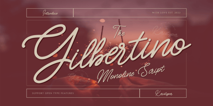 Gilbertino is casual script font With a clean stroke, super slanted, and fun character. This font is great for vintage designs, logos, labels, badges, posters, and more. Multilingual support: Afrikaans, Albanian, Catalan, Danish, Dutch, English, Estonian, French, Finnish, German, Icelandic, Indonesian, Italian, Malay, Norwegian, Portuguese, Spanish, Swedish, Zulu, and many more. What’s Included : Standard & Multilingual glyphs Ligature Works on PC & Mac Simple installations Accessible in Adobe Illustrator, Adobe Photoshop, Adobe InDesign, and even work on Microsoft Word. Hope you enjoy our font!
 - Linotype Graphena by Linotype,
$29.99Linotype Graphena is part of the Take Type Library, selected from the contestants of Linotype’s International Digital Type Design Contests of 1994 and 1997. It is a handwriting font designed by the Italian artist Giancarlo Barison. Consciously irregular and erratic, the letters dance across a page, large and small, tilted and erect. Linotype Graphena could be described as angular, restless, even mischievous. It should be set in point sizes no smaller than 12 and is best used for headlines and displays. - Fady Lingers by PizzaDude.dk,
$20.00 Fady Lingers is a mispronunciation of that famous Italian cookie - nevertheless, there is nothing awkward or wrong with the font! It is handmade using a thin marker, leaving an uneven edge. I did spend some time cleaning up each letter, but was carefully observant to keep the original handmade and organic look. I've added 4 slightly different versions of each lowercase letter. and they automatically changes as you type - a really great way to make your design stand out as organic and lively!
 - Clair De Lune by Hanoded,
$20.00 Clair De Lune is part of the famous Suite Bergamasque, written by Claude Debussy in 1890, and published in 1905. It means Moonlight in French, a kind of romantic name. The name is exactly what I had in mind for this übercute font. Clair De Lune can be used to design postcards and posters, liven up websites and give your designs an overall happy feel. Clair De Lune was handmade using a 0.5 pen, eco friendly Italian paper and a wooden kitchen table.
 - FF Folk by FontFont,
$41.99 Italian type designer Maurizio Osti and American type designer Jane Patterson created this display FontFont in 2003. The family contains 4 weights and is ideally suited for advertising and packaging, music and nightlife as well as poster and billboards. FF Folk provides advanced typographical support with features such as ligatures, alternate characters, case-sensitive forms, and stylistic alternates.The font was based on the original alphabet created by Ben Shahn in 1940. It comes with proportional lining and tabular lining figures.