10,000 search results
(0.021 seconds)
- Doughnut by AType,
$24.95This font thicker than my Fatman. It so thick and round, that looks as a doughnut. Yes, it is a doughnut! - Times New Roman PS Cyrillic by Monotype,
$67.99In 1931, The Times of London commissioned a new text type design from Stanley Morison and the Monotype Corporation, after Morison had written an article criticizing The Times for being badly printed and typographically behind the times. The new design was supervised by Stanley Morison and drawn by Victor Lardent, an artist from the advertising department of The Times. Morison used an older typeface, Plantin, as the basis for his design, but made revisions for legibility and economy of space (always important concerns for newspapers). As the old type used by the newspaper had been called Times Old Roman," Morison's revision became "Times New Roman." The Times of London debuted the new typeface in October 1932, and after one year the design was released for commercial sale. The Linotype version, called simply "Times," was optimized for line-casting technology, though the differences in the basic design are subtle. The typeface was very successful for the Times of London, which used a higher grade of newsprint than most newspapers. The better, whiter paper enhanced the new typeface's high degree of contrast and sharp serifs, and created a sparkling, modern look. In 1972, Walter Tracy designed Times Europa for The Times of London. This was a sturdier version, and it was needed to hold up to the newest demands of newspaper printing: faster presses and cheaper paper. In the United States, the Times font family has enjoyed popularity as a magazine and book type since the 1940s. Times continues to be very popular around the world because of its versatility and readability. And because it is a standard font on most computers and digital printers, it has become universally familiar as the office workhorse. Times?, Times? Europa, and Times New Roman? are sure bets for proposals, annual reports, office correspondence, magazines, and newspapers. Linotype offers many versions of this font: Times? is the universal version of Times, used formerly as the matrices for the Linotype hot metal line-casting machines. The basic four weights of roman, italic, bold and bold italic are standard fonts on most printers. There are also small caps, Old style Figures, phonetic characters, and Central European characters. Times? Ten is the version specially designed for smaller text (12 point and below); its characters are wider and the hairlines are a little stronger. Times Ten has many weights for Latin typography, as well as several weights for Central European, Cyrillic, and Greek typesetting. Times? Eighteen is the headline version, ideal for point sizes of 18 and larger. The characters are subtly condensed and the hairlines are finer." - Times New Roman Seven by Monotype,
$67.99In 1931, The Times of London commissioned a new text type design from Stanley Morison and the Monotype Corporation, after Morison had written an article criticizing The Times for being badly printed and typographically behind the times. The new design was supervised by Stanley Morison and drawn by Victor Lardent, an artist from the advertising department of The Times. Morison used an older typeface, Plantin, as the basis for his design, but made revisions for legibility and economy of space (always important concerns for newspapers). As the old type used by the newspaper had been called Times Old Roman," Morison's revision became "Times New Roman." The Times of London debuted the new typeface in October 1932, and after one year the design was released for commercial sale. The Linotype version, called simply "Times," was optimized for line-casting technology, though the differences in the basic design are subtle. The typeface was very successful for the Times of London, which used a higher grade of newsprint than most newspapers. The better, whiter paper enhanced the new typeface's high degree of contrast and sharp serifs, and created a sparkling, modern look. In 1972, Walter Tracy designed Times Europa for The Times of London. This was a sturdier version, and it was needed to hold up to the newest demands of newspaper printing: faster presses and cheaper paper. In the United States, the Times font family has enjoyed popularity as a magazine and book type since the 1940s. Times continues to be very popular around the world because of its versatility and readability. And because it is a standard font on most computers and digital printers, it has become universally familiar as the office workhorse. Times?, Times? Europa, and Times New Roman? are sure bets for proposals, annual reports, office correspondence, magazines, and newspapers. Linotype offers many versions of this font: Times? is the universal version of Times, used formerly as the matrices for the Linotype hot metal line-casting machines. The basic four weights of roman, italic, bold and bold italic are standard fonts on most printers. There are also small caps, Old style Figures, phonetic characters, and Central European characters. Times? Ten is the version specially designed for smaller text (12 point and below); its characters are wider and the hairlines are a little stronger. Times Ten has many weights for Latin typography, as well as several weights for Central European, Cyrillic, and Greek typesetting. Times? Eighteen is the headline version, ideal for point sizes of 18 and larger. The characters are subtly condensed and the hairlines are finer." - Times New Roman WGL by Monotype,
$67.99 In 1931, The Times of London commissioned a new text type design from Stanley Morison and the Monotype Corporation, after Morison had written an article criticizing The Times for being badly printed and typographically behind the times. The new design was supervised by Stanley Morison and drawn by Victor Lardent, an artist from the advertising department of The Times. Morison used an older typeface, Plantin, as the basis for his design, but made revisions for legibility and economy of space (always important concerns for newspapers). As the old type used by the newspaper had been called Times Old Roman," Morison's revision became "Times New Roman." The Times of London debuted the new typeface in October 1932, and after one year the design was released for commercial sale. The Linotype version, called simply "Times," was optimized for line-casting technology, though the differences in the basic design are subtle. The typeface was very successful for the Times of London, which used a higher grade of newsprint than most newspapers. The better, whiter paper enhanced the new typeface's high degree of contrast and sharp serifs, and created a sparkling, modern look. In 1972, Walter Tracy designed Times Europa for The Times of London. This was a sturdier version, and it was needed to hold up to the newest demands of newspaper printing: faster presses and cheaper paper. In the United States, the Times font family has enjoyed popularity as a magazine and book type since the 1940s. Times continues to be very popular around the world because of its versatility and readability. And because it is a standard font on most computers and digital printers, it has become universally familiar as the office workhorse. Times?, Times? Europa, and Times New Roman? are sure bets for proposals, annual reports, office correspondence, magazines, and newspapers. Linotype offers many versions of this font: Times? is the universal version of Times, used formerly as the matrices for the Linotype hot metal line-casting machines. The basic four weights of roman, italic, bold and bold italic are standard fonts on most printers. There are also small caps, Old style Figures, phonetic characters, and Central European characters. Times? Ten is the version specially designed for smaller text (12 point and below); its characters are wider and the hairlines are a little stronger. Times Ten has many weights for Latin typography, as well as several weights for Central European, Cyrillic, and Greek typesetting. Times? Eighteen is the headline version, ideal for point sizes of 18 and larger. The characters are subtly condensed and the hairlines are finer."
 - Times New Roman by Monotype,
$67.99 In 1931, The Times of London commissioned a new text type design from Stanley Morison and the Monotype Corporation, after Morison had written an article criticizing The Times for being badly printed and typographically behind the times. The new design was supervised by Stanley Morison and drawn by Victor Lardent, an artist from the advertising department of The Times. Morison used an older typeface, Plantin, as the basis for his design, but made revisions for legibility and economy of space (always important concerns for newspapers). As the old type used by the newspaper had been called Times Old Roman," Morison's revision became "Times New Roman." The Times of London debuted the new typeface in October 1932, and after one year the design was released for commercial sale. The Linotype version, called simply "Times," was optimized for line-casting technology, though the differences in the basic design are subtle. The typeface was very successful for the Times of London, which used a higher grade of newsprint than most newspapers. The better, whiter paper enhanced the new typeface's high degree of contrast and sharp serifs, and created a sparkling, modern look. In 1972, Walter Tracy designed Times Europa for The Times of London. This was a sturdier version, and it was needed to hold up to the newest demands of newspaper printing: faster presses and cheaper paper. In the United States, the Times font family has enjoyed popularity as a magazine and book type since the 1940s. Times continues to be very popular around the world because of its versatility and readability. And because it is a standard font on most computers and digital printers, it has become universally familiar as the office workhorse. Times?, Times? Europa, and Times New Roman? are sure bets for proposals, annual reports, office correspondence, magazines, and newspapers. Linotype offers many versions of this font: Times? is the universal version of Times, used formerly as the matrices for the Linotype hot metal line-casting machines. The basic four weights of roman, italic, bold and bold italic are standard fonts on most printers. There are also small caps, Old style Figures, phonetic characters, and Central European characters. Times? Ten is the version specially designed for smaller text (12 point and below); its characters are wider and the hairlines are a little stronger. Times Ten has many weights for Latin typography, as well as several weights for Central European, Cyrillic, and Greek typesetting. Times? Eighteen is the headline version, ideal for point sizes of 18 and larger. The characters are subtly condensed and the hairlines are finer."
 - Times New Roman Small Text by Monotype,
$67.99In 1931, The Times of London commissioned a new text type design from Stanley Morison and the Monotype Corporation, after Morison had written an article criticizing The Times for being badly printed and typographically behind the times. The new design was supervised by Stanley Morison and drawn by Victor Lardent, an artist from the advertising department of The Times. Morison used an older typeface, Plantin, as the basis for his design, but made revisions for legibility and economy of space (always important concerns for newspapers). As the old type used by the newspaper had been called Times Old Roman," Morison's revision became "Times New Roman." The Times of London debuted the new typeface in October 1932, and after one year the design was released for commercial sale. The Linotype version, called simply "Times," was optimized for line-casting technology, though the differences in the basic design are subtle. The typeface was very successful for the Times of London, which used a higher grade of newsprint than most newspapers. The better, whiter paper enhanced the new typeface's high degree of contrast and sharp serifs, and created a sparkling, modern look. In 1972, Walter Tracy designed Times Europa for The Times of London. This was a sturdier version, and it was needed to hold up to the newest demands of newspaper printing: faster presses and cheaper paper. In the United States, the Times font family has enjoyed popularity as a magazine and book type since the 1940s. Times continues to be very popular around the world because of its versatility and readability. And because it is a standard font on most computers and digital printers, it has become universally familiar as the office workhorse. Times?, Times? Europa, and Times New Roman? are sure bets for proposals, annual reports, office correspondence, magazines, and newspapers. Linotype offers many versions of this font: Times? is the universal version of Times, used formerly as the matrices for the Linotype hot metal line-casting machines. The basic four weights of roman, italic, bold and bold italic are standard fonts on most printers. There are also small caps, Old style Figures, phonetic characters, and Central European characters. Times? Ten is the version specially designed for smaller text (12 point and below); its characters are wider and the hairlines are a little stronger. Times Ten has many weights for Latin typography, as well as several weights for Central European, Cyrillic, and Greek typesetting. Times? Eighteen is the headline version, ideal for point sizes of 18 and larger. The characters are subtly condensed and the hairlines are finer." - Times New Roman PS Greek by Monotype,
$67.99In 1931, The Times of London commissioned a new text type design from Stanley Morison and the Monotype Corporation, after Morison had written an article criticizing The Times for being badly printed and typographically behind the times. The new design was supervised by Stanley Morison and drawn by Victor Lardent, an artist from the advertising department of The Times. Morison used an older typeface, Plantin, as the basis for his design, but made revisions for legibility and economy of space (always important concerns for newspapers). As the old type used by the newspaper had been called Times Old Roman," Morison's revision became "Times New Roman." The Times of London debuted the new typeface in October 1932, and after one year the design was released for commercial sale. The Linotype version, called simply "Times," was optimized for line-casting technology, though the differences in the basic design are subtle. The typeface was very successful for the Times of London, which used a higher grade of newsprint than most newspapers. The better, whiter paper enhanced the new typeface's high degree of contrast and sharp serifs, and created a sparkling, modern look. In 1972, Walter Tracy designed Times Europa for The Times of London. This was a sturdier version, and it was needed to hold up to the newest demands of newspaper printing: faster presses and cheaper paper. In the United States, the Times font family has enjoyed popularity as a magazine and book type since the 1940s. Times continues to be very popular around the world because of its versatility and readability. And because it is a standard font on most computers and digital printers, it has become universally familiar as the office workhorse. Times?, Times? Europa, and Times New Roman? are sure bets for proposals, annual reports, office correspondence, magazines, and newspapers. Linotype offers many versions of this font: Times? is the universal version of Times, used formerly as the matrices for the Linotype hot metal line-casting machines. The basic four weights of roman, italic, bold and bold italic are standard fonts on most printers. There are also small caps, Old style Figures, phonetic characters, and Central European characters. Times? Ten is the version specially designed for smaller text (12 point and below); its characters are wider and the hairlines are a little stronger. Times Ten has many weights for Latin typography, as well as several weights for Central European, Cyrillic, and Greek typesetting. Times? Eighteen is the headline version, ideal for point sizes of 18 and larger. The characters are subtly condensed and the hairlines are finer." - Times New Roman PS by Monotype,
$67.99In 1931, The Times of London commissioned a new text type design from Stanley Morison and the Monotype Corporation, after Morison had written an article criticizing The Times for being badly printed and typographically behind the times. The new design was supervised by Stanley Morison and drawn by Victor Lardent, an artist from the advertising department of The Times. Morison used an older typeface, Plantin, as the basis for his design, but made revisions for legibility and economy of space (always important concerns for newspapers). As the old type used by the newspaper had been called Times Old Roman," Morison's revision became "Times New Roman." The Times of London debuted the new typeface in October 1932, and after one year the design was released for commercial sale. The Linotype version, called simply "Times," was optimized for line-casting technology, though the differences in the basic design are subtle. The typeface was very successful for the Times of London, which used a higher grade of newsprint than most newspapers. The better, whiter paper enhanced the new typeface's high degree of contrast and sharp serifs, and created a sparkling, modern look. In 1972, Walter Tracy designed Times Europa for The Times of London. This was a sturdier version, and it was needed to hold up to the newest demands of newspaper printing: faster presses and cheaper paper. In the United States, the Times font family has enjoyed popularity as a magazine and book type since the 1940s. Times continues to be very popular around the world because of its versatility and readability. And because it is a standard font on most computers and digital printers, it has become universally familiar as the office workhorse. Times?, Times? Europa, and Times New Roman? are sure bets for proposals, annual reports, office correspondence, magazines, and newspapers. Linotype offers many versions of this font: Times? is the universal version of Times, used formerly as the matrices for the Linotype hot metal line-casting machines. The basic four weights of roman, italic, bold and bold italic are standard fonts on most printers. There are also small caps, Old style Figures, phonetic characters, and Central European characters. Times? Ten is the version specially designed for smaller text (12 point and below); its characters are wider and the hairlines are a little stronger. Times Ten has many weights for Latin typography, as well as several weights for Central European, Cyrillic, and Greek typesetting. Times? Eighteen is the headline version, ideal for point sizes of 18 and larger. The characters are subtly condensed and the hairlines are finer." - Courage by Positype,
$35.00 High-contrast? High impact? Have Courage? Eye-catching and (extra, extra) bold, Courage balances ultra-high stroke weight, delicate details, and unique letterforms with a self-indulgent passion that will make you feel a little guilty using it. Honestly, use it large and don’t try to force it into a small space, because these fearless letterforms need room to move. Flavored with both upright and italic styles, each font includes an indulgent level of alternates, swashes and titling options, visual elements and more. A backstory with a different name Years ago, I was commissioned to take my Lust typeface and produce something unique to use for large format graphics for an event…cool. It needed to be hyper-contrast with a lot of over-the-top details. With a tight turnaround, I looked for primers within my development catalogue to help me, and settled on some early work on a typeface I had drawn called Hedonist. I used those sketches and its conventions to retrofit and build out Lust Hedonist (only to see the project go bust on the client’s end). I intended to go back shortly after the Lust Hedonist release to finalize a retail version of the OG Hedonist, but I never could settle on the look of the 'g' or the numerals, got distracted with other projects, and never picked it back up… until last year. After randomly doodling a fat, flat ‘g’ with an extremely tilted counter axis, I knew immediately how it could be used and that (re)set things in motion. Only problem was, in the process of refining the letterforms I began truly dissecting the pieces, rediscovering all of the recklessness within Hedonist, and decided on fundamentally rewriting the approach to the typeface… literally flaying it to the bone. I’m much, much happier with this finished typeface now, but the name no longer fit the moniker given to the first, adolescent approach—there’s far more audacity and cleverness in these letterforms, tenacious in their resolution now. As a result, the name Courage fit the mettle of this typeface so much more, so I kept it.
 - Mollisa by Aqeela Studio,
$15.00 Mollisa felt equally charming and graceful. Looks great on wedding invitations, thank you cards, quotes, greeting cards, logos, branding, business cards, and any other design that requires a handwritten touch. This font is PUA encoded which means you can access all glyphs and swashes with ease! To activate the Stylistic OpenType alternative, you need a program that supports OpenType features such as Adobe Illustrator CS, Adobe Indesign & CorelDraw X6-X7, Microsoft Word 2010 or later. and there is an additional way to swash, using the Character Map (Windows), Nexus Fonts (Windows), Font Book (Mac) or a software program like PopChar (for Windows and Mac). https://www.youtube.com/watch?v=XzwjMkbB-wQ Thank you for your purchase!
 - Pueblo by Monotype,
$29.99Like many of Jim Parkinson's alphabets, Pueblo began as poster lettering. It shows a range of influences: turn-of-the-century sign painting, old Speedball lettering books, and a touch of art nouveau. While developing Pueblo, Parkinson debated whether to make the ends of the serifs rounded or square. Rounded looked more like the work of a Speedball lettering pen, but squared stroke endings made the letters more legible at small sizes. The finished design sports serifs that are just slightly rounded. According to Parkinson, the design feature is “enough to be noticed at large sizes, while going virtually unnoticed at smaller point sizes,” adding to the versatility of this distinctive typeface. - Journal Hand by Typadelic,
$9.95 Journal Hand was inspired by a 45-year-old travel diary I bought at an estate sale. The carefully constructed all-uppercase letters indicated that this traveler cared about style and legibility. Each picture, postcard and brochure that was glued into the diary had a neatly written caption and I admired the care this day tripper took to record his European trek. While the pages are now yellowed and falling apart, the handwriting is still legible and stylish. Because his handwriting totally suits today's uses, I re-created it in modern journalistic style that looks like it was written with a technical pen. Use this typeface when you need a neatly handwritten style. Uppercase only!
 - Billie Crimson by Letterhend,
$17.00 Billie Crimson is a stylish serif font that exudes class and timelessness. Its sophisticated & classic looks make it perfect for a variety of design projects, especially in logo, and the other various formal forms such as invitations, labels, logos, magazines, books, greeting / wedding cards, packaging, fashion, make up, stationery, novels, labels or any type of advertising purpose.The font comes with several alternate characters that add even more versatility and uniqueness to your designs. Features : Uppercase & lowercase Numbers and punctuation Alternares Multilingual PUA encoded We highly recommend using a program that supports OpenType features and Glyphs panels like many of Adobe apps and Corel Draw, so you can see and access all Glyph variations.
 - Linotype Syntax Lapidar Serif Text by Linotype,
$29.99Modeled on the writings chiseled in stone in the second century B.C., Syntax™ Lapidar is an energetic, spirited typeface designed by Hans Eduard Meier in 2000. Linotype Syntax Lapidar Text and Linotype Syntax Lapidar Serif Text have five weights each, with both cap and lowercase letterforms. Lapidar Display and Lapidar Serif Display also have five weights each, with mostly all cap letterforms and many alternates. It's a terrifically fun and inventive family, and if you look closely, you can see the resemblance to the more modern and restrained Syntax™ relatives. Great for menus, artist books, travelogues, or advertising - and if used very sparingly, it could add just the right element of lapidary significance to corporate documents. - Brigattin by Muhammad Alkaf,
$14.00 Brigattin is a calligraphy script font that comes with beautiful alternative characters. a mixture of copper calligraphy with handleting style. Designed to bring style elegance. Brigattin Script attracts such a subtle, clean, feminine, sensual, glamorous, simple and very readable typeface. The classic style is perfect to apply in various formal forms such as invitations, labels, menus, Logos, fashion, make up, stationery, letterpress, romantic novels, magazines, books, greeting / wedding cards, packaging, labels. Brigattin has 494 glyphs. including multiple language support. With OpenType features with stylish alternatives, ligatures and characters, allowing you to mix and match pairs of letters to fit your design, as well as a touch of ornament to make this font look elegant.
 - Conga Brava by Adobe,
$29.00Conga Brava is the work of type designer Michael Harvey, a combination of the high-minded, purist letterforms of revivalist, modern calligraphers with the mundane, even crude, lettering of warehouse stenciling. The resulting lyrical yet utilitarian forms have a visually exciting graphic effect, which Harvey has frequently used in his book jacket designs. Like his other typefaces, Ellington, Strayhorn, and Mezz, Harvey named his design after a jazz classic, Conga Brava", by Duke Ellington and his trombonist Juan Tizol. The rolling rhythm, polished swing, and stacatto brass treatment of the tune suits the look of this sassy roman design and even more so, its stencil mate. When you need a typeface that radiates sound and motion, think Conga Brava." - Yoshinta by Suza Studio,
$15.00 Yoshinta Script Font Duo is a new modern script font with an irregular base line. Trendy and feminine style. Yoshinta Script looks beautiful in wedding invitations, thank you cards, quotes, greeting cards, logos, business cards, and more. Perfect for use in ink or watercolours. Including beginning and end letters, alternatives and support for many languages. To enable the OpenType Stylistic alternative, you need a program that supports OpenType features such as Adobe Illustrator CS, Adobe Indesign & CorelDraw X6-X7, Microsoft Word 2010 or newer versions. There are several additional ways to access alternatives / swashes, using Character Maps (Windows), Nexus Fonts (Windows), Font Books (Mac) or software programs such as PopChar (for Windows and Mac).
 - Adaniya by Sealoung,
$15.00 Introducing, Adaniya - a standout bold script with a touch of nostalgic look and feel. Inspired by 50s 60s signages, this font made to bring back the good ol' days. This type of font perfectly made to be applied especially in logo, headline, signage and the other various formal forms such as invitations, labels, logos, magazines, books, greeting / wedding cards, packaging, fashion, make up, stationery, novels, labels or any type of advertising purpose. Features : Uppercase & lowercase Numbers and punctuation Multilingual Alternates / swashes and ligatures PUA encoded We highly recommend using a program that supports OpenType features and Glyphs panels like many of Adobe apps and Corel Draw, so you can see and access all Glyph variations.
 - Lovanaru by Attype Studio,
$24.00 Lovanaru is a Sans Serif font with all caps, that provides a modern and minimalistic design. It comes with smart OpenType features, ligatures, clean letterforms and monoline strokes. Lovanaru is an excellent choice if you are looking for an easy to read and enjoyable font. Lovanaru is perfect for minimalistic themed product, branding, logo, invitation, stationery, product packaging, merchandise, monogram, blog design, game titles, cute style design, Book/Cover Title and more. Features : - Lovanaru Font - Ligatures - Multilingual, US Roman, Latin 1 Support Thank you for purchasing premium fonts from Attype Studio. Follow and explore our work on Pinterest & Instagram. If you have any question, don’t hesitate to contact us. We hope you enjoy with our font! Attype Studio
 - Hirace by Din Studio,
$29.00 Do you want your designs to have strong characters? Hirace is a display font in capital letters perfectly created to meet your needs. A racing theme sticks in its display, which is a brilliant idea. This font, in accordance with its theme, shows a strong brave character to use anytime designers need a large-sized text. Other incredible features are also available to maximize the design projects. Features: Multilingual Supports PUA Encoded Numerals and Punctuation Apply this font for any design projects such as posters, banners, logos, book covers, headings, printed products, merchandise, social media, and so on. Find out more ways to use this font by taking a look at the font preview. Get it now. Happy designing.
 - Hey Tiny by Prioritype,
$15.00 Hey Tiny - Playful Font Family Handwritten font with 3 weights that are fun and beautiful to look at. Whether applied to quote designs, book covers, logos, food packaging, merchandise, branding or just for social media promotions. Features: Uppercase, Lowercase, Numeral, Punctuation & Multilingual. Multilingual contained: Afrikaans, Albanian, Asu, Basque, Bemba, Bena, Breton, Catalan, Chiga, Cornish, Danish, Dutch, English, Estonian, Filipino, Finnish, French, Friulian, Galician, German, Gusii, Indonesian, Irish, Italian, Kabuverdianu, Kalenjin, Kinyarwanda, Luo, Luxembourgish, Luyia, Machame, Makhuwa-Meetto, Makonde, Malagasy, Manx, Morisyen, North Ndebele, Norwegian Bokmål, Norwegian Nynorsk, Nyankole, Oromo, Portuguese, Quechua, Romansh, Rombo, Rundi, Rwa, Samburu, Sango, Sangu, Scottish Gaelic, Sena, Shambala, Shona, Soga, Somali, Spanish, Swahili, Swedish, Swiss German, Taita, Teso, Uzbek (Latin), Volapük, Vunjo, Zulu. Thanks :)
 - NorB Type Writer Roughen by NorFonts,
$25.00 NorB TypeWriter Roughen is the roughen version of my NorB TypeWriter typeface witch's my emulation of the IBM Selectric 'Light Italic' ball witch was used by my grand-brother for his correspondance during the 70’s and 80’s. It's however a slanted mono-spaced looking typewriter font. You may want to use this font with any word processing program for text and display use, print and web projects, apps and ePub, comic books, graphic identities, branding, editorial, advertising, scrapbooking, cards and invitations and any casual lettering purpose… or even just for fun! NorB TypeWriter Roughen features 677 glyphs, OpenType features and comes in 6 weights each with their matching italics and in a Light, Normal and Bold version.
 - Equestrian Style by Nathatype,
$29.00 Wanna make your branding spark? Looking for a gorgeous and stylish font? If you need to create a big, bold logo for your business, work on a poster for an event, or whatever your project may be-then we've got what you want. Equestrian Style - A Signature Font Equestrian Style is a handcrafted font designed to bring your branding to life and add a touch of elegance, modernity, and style. Every swash, stroke, and curve was created to entice happiness and elegance. The best choice for your logo, book cover, poster, t-shirt, branding, and advertisement needs. Features: Ligatures Stylistic Set Swashes PUA Encoded Numerals and Punctuation Thank you for downloading premium fonts from Nathatype
 - Linotype Syntax Lapidar Serif Display by Linotype,
$29.99Modeled on the writings chiseled in stone in the second century B.C., Syntax™ Lapidar is an energetic, spirited typeface designed by Hans Eduard Meier in 2000. Linotype Syntax Lapidar Text and Linotype Syntax Lapidar Serif Text have five weights each, with both cap and lowercase letterforms. Lapidar Display and Lapidar Serif Display also have five weights each, with mostly all cap letterforms and many alternates. It's a terrifically fun and inventive family, and if you look closely, you can see the resemblance to the more modern and restrained Syntax™ relatives. Great for menus, artist books, travelogues, or advertising - and if used very sparingly, it could add just the right element of lapidary significance to corporate documents. - Rainbow Chalk Cyrillic by Ira Dvilyuk,
$16.00 Rainbow Chalk is a playful serif fun kid's font and it contains uppercase and lowercase letters, a large range of numerals, and punctuation. The Rainbow Chalk font will be perfect for use in all your fun design projects be it logos, labels, packaging design, blog headlines. Also, it will look great on mugs, cards, kid's books headlines, or other typographic projects. Multilingual Support for 33 languages: Afrikaans, Albanian, Basque, Bosnian, Catalan, Danish, Dutch, English, Estonian, Faroese, Filipino, Finnish, French, Galician, Indonesian, Irish, Italian, Malay, Norwegian Bokmål, Portuguese, Slovenian, Spanish, Swahili, Swedish, Turkish, Welsh, Zulu And Cyrillic glyphs support for Russian, Belorussian, Bulgarian, Ukrainian, and Kazakh languages. Works perfectly on the Canva platform. For Cricut & Silhouette recommended.
 - Linotype Syntax Lapidar Display by Linotype,
$29.99Modeled on the writings chiseled in stone in the second century B.C., Syntax™ Lapidar is an energetic, spirited typeface designed by Hans Eduard Meier in 2000. Linotype Syntax Lapidar Text and Linotype Syntax Lapidar Serif Text have five weights each, with both cap and lowercase letterforms. Lapidar Display and Lapidar Serif Display also have five weights each, with mostly all cap letterforms and many alternates. It's a terrifically fun and inventive family, and if you look closely, you can see the resemblance to the more modern and restrained Syntax™ relatives. Great for menus, artist books, travelogues, or advertising - and if used very sparingly, it could add just the right element of lapidary significance to corporate documents. - Gondolieri by Greater Albion Typefounders,
$16.50 The design of Gondolieri has its origins in an experiment to combine aspects of Didone and Tuscan typefaces. The result has a continental 'Italianate' feel. If you wonder what lies behind the name, just look at the lower case 'f'...definite overtones of a Venetian Gondola here, and throughout the design. Gondolieri is offered in regular and bold weights, as well as a simplified form for smaller text use. All of these are available in three widths. The Gondolieri family has a lovely Didone, 'Belle Epoch' feel for use in design, posters, book covers and so forth. An extensive range of Opentype features, including ligatures and terminal forms is included in the regular and bold faces.
 - Untold History by Arterfak Project,
$15.00 Lights up your past memory with Untold History font, a classic typewriting font designed in modern style. Comes in four available styles: regular, bold, underlined, and inky. Each style has its own unique touch, allowing you to create a variety of designs. The inky style adds a subtle ink bleed effect to the letters, giving it a more authentic vintage look. Inspired by classic typing machines, this font gives the taste of the past while still being versatile enough for modern designs. Untold History is suitable for a range of projects, such as editorial designs, vintage posters, books, branding, and quotes. Fonts featured : Uppercase Lowercase Numbers & symbols Punctuation Stylistic alternates Multilingual support Thank you for always supporting our work!
 - Radnick by Letterhend,
$19.00 Introducing, Captivate Script - A beautiful modern calligraphy script based on manual hand writing. The natural flow with the swashes make this font looks even more prettier. This type of font perfectly made to be applied especially in wedding invitation, labels, logos, magazines, books, greeting / wedding cards, packaging, fashion, make up, stationery, novels, labels or any type of advertising purpose. Features : uppercase & lowercase numbers and punctuation multilingual swash and ligature alternates PUA encoded We highly recommend using a program that supports OpenType features and Glyphs panels like many of Adobe apps and Corel Draw, so you can see and access all Glyph variations. How to access opentype feature : letterhend.com/tutorials/using-opentype-feature-in-any-software/
 - Nachinta by Letterhend,
$19.00 Nagintha is a handwritten script with natural look and feel. You can use also for headline or signature. This type of font perfectly made to be applied especially in logo, and the other various formal forms such as invitations, labels, logos, magazines, books, greeting / wedding cards, packaging, fashion, make up, stationery, novels, labels or any type of advertising purpose. Features : uppercase & lowercase numbers and punctuation multilingual alternates and ligatures PUA encoded We highly recommend using a program that supports OpenType features and Glyphs panels like many of Adobe apps and Corel Draw, so you can see and access all Glyph variations. How to access opentype feature : letterhend.com/tutorials/using-opentype-feature-in-any-software/
 - Krostenia by Letterhend,
$19.00 Introducing, Krostenia - a monoline script with a touch of vintage look and feel. You will also get 12 detailed hand drawn objects ready to use. This type of font perfectly made to be applied especially in logo, headline, signage and the other various formal forms such as invitations, labels, logos, magazines, books, greeting / wedding cards, packaging, fashion, make up, stationery, novels, labels or any type of advertising purpose. Features : uppercase & lowercase numbers and punctuation multilingual alternates / swashes and ligatures PUA encoded 12 hand drawn objects We highly recommend using a program that supports OpenType features and Glyphs panels like many of Adobe apps and Corel Draw, so you can see and access all Glyph variations.
 - Marizta Script by Shape Studio,
$10.00 Marizta Script is a new modern script calligraphy font with an irregular baseline. Trendy and feminine style. Marizta Script looks lovely on wedding invitations, thank you cards, quotes, greeting cards, logos, business cards and more. Perfect for using in ink or watercolour. Including initial and terminal letters, alternates, ligatures and multi-lingual support. To enable the OpenType Stylistic alternates, you need a program that supports OpenType features such as Adobe Illustrator CS, Adobe Indesign & CorelDraw X6-X7, Microsoft Word 2010 or later versions. There are additional ways to access alternates/swashes, using Character Map (Windows), Nexus Font (Windows), Font Book (Mac) or a software program such as PopChar (for Windows and Mac).
 - Boosley by Letterhend,
$19.00 Introducing, the Boosley - a standout bold script with a touch of nostalgic look and feel. Inspired by 50s 60s signages, this font made to bring back the good ol' days. This type of font perfectly made to be applied especially in logo, headline, signage and the other various formal forms such as invitations, labels, logos, magazines, books, greeting / wedding cards, packaging, fashion, make up, stationery, novels, labels or any type of advertising purpose. Features : uppercase & lowercase numbers and punctuation multilingual alternates / swashes and ligatures PUA encoded We highly recommend using a program that supports OpenType features and Glyphs panels like many of Adobe apps and Corel Draw, so you can see and access all Glyph variations.
 - Circuity by Din Studio,
$29.00 Circuity is a display font designed in a racing theme which provides a unique yet modern capital letter font. Each stroke shows a firm brave character. Due to its shape and size, it is suitable to apply for a large-sized text such as titles. Enjoy the interesting features to maximize the design projects. Features: Multilingual Supports PUA Encoded Numerals and Punctuation Circuity is definitely proper to use in any design projects such as posters, banners, logos, book covers, headings, printed products, merchandise, social media, and so on. Find out more ways to use this font by taking a look at the font preview. Thanks a lot for purchasing our font. Happy designing.
 - Valintina by Letterhend,
$19.00 Valintina Signature is a signature script based on manual hand writing. The stylistic alternate, ligatures and the tick and thin stroke make this font looks a real hand writing instead of typing a font. This type of font perfectly made to be applied especially in logo, and the other various formal forms such as invitations, labels, logos, magazines, books, greeting / wedding cards, packaging, fashion, make up, stationery, novels, labels or any type of advertising purpose. Features : uppercase & lowercase numbers and punctuation multilingual alternates and ligatures PUA encoded We highly recommend using a program that supports OpenType features and Glyphs panels like many of Adobe apps and Corel Draw, so you can see and access all Glyph variations.
 - DEXTER by Type Innovations,
$39.00 Dexter is an original new typeface creation by Alex Kaczun. It is a warmer, more sophisticated grotesque that is both fun and interesting. Its tight letter spacing and narrow proportions make the typeface particularly well suited for display sizes and headlines. This intriguing sans with distinctive letter shapes is typical for display fonts of the late 19th and early 20th centuries. Dexter is ideal for titles and headlines looking for impact and style. Dexter is also an excellent choice for magazines, books, posters, brochures, flyers, etc. The large Pro font character set, which supports most Central European and many Eastern European languages, also includes a corresponding small caps font along with old style figures.
 - Exec Demiserif by Wiescher Design,
$35.00 I created my new »EXEC« Sans and this Demiserif cut during the years 2018 to mid 2020. As the entire »EXEC«-family the Demiserif also has 7 weights, ranging from Thin to Bold (no italics, doesn’t look nice). The Demiserif is also suited well for editorial, book text, advertising and packaging, logo, branding, small text as well as web and screen design. »EXEC«-Demiserif has advanced typographical support including ligatures, small caps, alternate characters, case-sensitive forms, fractions, super- and subscript characters. »EXEC«-Demiserif comes with a range of figures, oldstyle and lining figures, each in tabular and proportional widths. »EXEC«-Demiserif supports Basic-, Western-, and Central-European Latin-based languages including Turkish.
 - Laviossa by Jehoo Creative,
$17.00 Laviossa is an elegant serif font that has a soft and modern character. Small letters have a distinctive accent that represents a flexible wind, their soft curves make for a bold impression and easily blend into your designs. so that your design looks beautiful and stands out Laviossa has an alternative binder that is perfect for a simple and minimalist style. The stunning details and versatility of this font make it an essential addition to any type of design, such as magazines, books, ui ux designs, posters and many more. Laviossa has 5 weights, which is more than 380 glyph at each weight including various opentype features in it. already supports many Latin languages.
 - Falstaff MT by Monotype,
$29.99 Falstaff first appeared with Monotype in 1931, an alphabet in the style of a wide, bold antiqua that was especially popular in the first third of the 19th century. Such typefaces distinguished themselves through their consistent basis in the transitional antiqua style. They are characterized by their extremely fine unflexed serifs with no curve connecting them to the thick strokes. The numerals with their generous curves and ball-like stroke endings and beginnings are particularly decorative. The vertical strokes are dominant and give lines of this typeface a column-like and therefore static look. Falstaff is today often used for book titling, especially for mystery novels. It is best used sparingly in middle and larger point sizes.
 - New Journey by Letterhend,
$16.00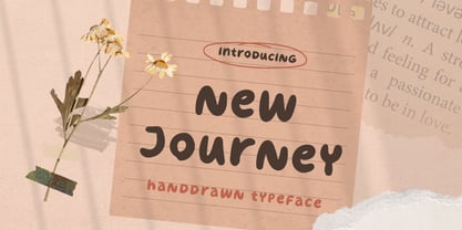 New Journey is a display font with fun and playful looks. This type of font perfectly made to be applied especially in storybook children or child theme which is need a standout font, and the other various formal forms such as invitations, labels, logos, magazines, books, greeting / wedding cards, packaging, fashion, make up, stationery, novels, labels or any type of advertising purpose. Features : uppercase and lowercase numbers and punctuation multilingual ligatures PUA encoded We highly recommend using a program that supports OpenType features and Glyphs panels like many of Adobe apps and Corel Draw, so you can see and access all Glyph variations. Email us to letterhend@gmail.com if you need something! Happy Designing!