3,025 search results
(0.011 seconds)
- Controwell by Alit Design,
$14.00 Visiting the end of 2018, we launched "Controwell Victorian Typeface" which adheres to Serif and Script style. Controwell Regular has 2 layers that give a cool metal effect. Besides that, there are many alternative character choices that suit your taste. This charming Controwell Script is very well suited combined with Controwell Serif Regular. the elegant and unique impression looks very hard. just like the serif font, this script also has many alternative character choices, up to "SS10" and 600 glyphs. You create designs with modern Victorian themes or classically themed themes that are suitable for collecting Controwell Victorian Typeface, in addition to many choices of your character is also very easy to use. just choose and change some characters, the design that you design is ready to be printed or published on social media. This font is very suitable for logotype design, packaging design, beer design, vodka, whiskey label, poster design, victorian book cover and design.
 - Merc by Canada Type,
$24.95 Merc is a four-letter word that stops just one y short of Mercy. Merc is also the standard street abbreviation for mercenary, or a soldier for hire. Now that the global security business has become a two hundred billion dollar industry, we thought you would like to have your very own affordable merc. Knew you'd be pleased. Merc is based on an all-cap metal face called Agitator, designed by Wolfgang Eickhoff and published by Typoart in 1960. The rough brush letters look like they were made by someone who is capable of elegance but has no time for it. These are letters that live to catch the eyes and warn them loudly: Doom is here, and if you want it screamed out, this Merc is at your service. This font contains more than 460 glyphs, which means quite a few stylistic alternates and support for the majority of Latin languages.
 - MFC Monarchy Initials by Monogram Fonts Co.,
$19.95 The inspiration source for Monarchy Initials is the 1934 Book of American Types by American Type Founders. In that specimen book, they had created a sophisticated two color initial design they called "Stationers Initials" which was only available in metal type at 24, 36, and 48 points. This wonderfully detailed initial style is now digitally recreated and revived for modern use. Monarchy Initials is only capable of initial or single letter monograms due to its unique design. The two color aspect of the original design has been preserved and made accessible within all programs. The Capital character slots contain the background color glyphs, and the lowercase slots hold the outline art for the letters. You can choose a color, type a capital letter, then switch to black and type a lowercase letter for the two color effect, or just tpe a lowercase letter on its own. It's that easy! Download and view the Monarchy Initials Guidebook if you would like to learn a little more.
 - ITC New Winchester by ITC,
$29.99ITC New Winchester is a revival of a typeface that never really had a first release. The original Winchester was an experimental design created by the American type designer W.A. Dwiggins in 1944. Dwiggins was interested in improving the legibility of the English language by reducing the number of ascenders and descenders; to do this, he gave Winchester very short descenders and created uncial forms for a number of letters. The result was a distinctive text typeface that was occasionally used by Dwiggins and Dorothy Abbe in handset form. Fifty years later, Indiana type designer Jim Spiece has turned Dwiggins's experiment into a new family of digital text types. Spiece gave New Winchester a bold weight, as well as small caps (both roman and italic) and old style figures; he also created two forms of the lowercase f, one with and one without an overhang (in metal type, a kern), and a full set of f-ligatures. - Academica by Storm Type Foundry,
$44.00 Josef Týfa first published the Academia typeface in 1967-68. It was the winning design from competition aimed at new typeface for scientific texts, announced by Grafotechna. It was cut and cast in metal in 1968 in 8 and 10 point sizes of plain, italic and semi-bold designs. In 2003 Josef Týfa with František Štorm began to work on its digital version. During 2004 Týfa approved certain differences from the original drawings in order to bring more original and timeless feeling to this successful typeface. Vertical stem outlines are no more straight, but softly slendered in the middle, italics were quietened, uppercase proportions brought closer to antique principle. Light and Black designs served (as usual) as starting points for interpolation of remainig weights. The new name Academica distinguishes the present digital transcription from the original idea. It comprises Týfa’s rational concept for scientific application with versatility to other genres of literature.
 - Basic Commercial by Linotype,
$57.99 Basic Commercial is a family of fonts based on historical designs from the hot metal type era. First appearing around 1900, these designs were created by type designers whose names have not been recorded, but whose skills cannot be overlooked. These typefaces were popular among groups and movements as diverse as the Bauhaus, Dadaism, and the masters of Swiss/International-Style typography. They influenced a variety of later grotesque fonts, such as Helvetica and Univers. Basic Commercial was distributed for many years in the United States under the name Standard Series. The typeface worked its way into many aspects of daily life and culture; for instance, it became the face chosen for use in the New York City subway system’s signage. The Basic Commercial family members have a clear and objective design. Their forms exhibit almost nothing unusual, but remain both lively and legible nonetheless. Perhaps for this reason, Basic Commercial’s design has been popular with graphic designers for decades.
 - Liminoru by IbraCreative,
$17.00 Liminoru – An Organic Liquid Typface Liminoru is an organic liquid typeface that flows seamlessly between characters, embodying a fluidity reminiscent of cascading water or molten metal. The letters dance with a graceful, serpentine rhythm, each stroke resembling the sinuous movement of organic forms. The typeface’s design evokes a sense of natural beauty and dynamic growth, as if the letters are evolving and adapting to their environment. Liminoru’s unique curves and undulating lines create a harmonious balance between sophistication and an elemental, earthy quality. The liquid nature of the font imparts a tactile, almost sensory experience, making it a visually captivating choice for projects that seek to blend elegance with the organic essence of nature. Liminoru is perfect for branding projects, logo, wedding designs, social media posts, advertisements, product packaging, product designs, label, photography, watermark, invitation, stationery, game, fashion and any projects. Fonts include multilingual support for; Afrikaans, Albanian, Czech, Danish, Dutch, English, Estonian, Finnish, French, German, Hungarian, Italian, Latvian, Lithuanian, Norwegian, Polish, Portuguese, Slovak, Slovenian, Spanish, Swedish.
 - MGT American Copper by Magetype,
$29.00 American Copper Family is a vintage font inspired by an old American motorcycle logo. The logo looks very manly and strong, just like the motorbike. American Copper Script is the dominant one that turns the logo into a font. Whereas the Sans and Block family is a complement to the Script. But all three are a very good unit to be juxtaposed together. American Copper is a font made for you (designers) who love automotives: old cars and motorbikes. Anything related to automotive. Besides these two objects, this font is also very cool for music-themed design needs; rock n roll, metal, rockabilly, and others. Oh yes, Custom Culture is another very interesting thing to be depicted with this font. Workshop logo for example. It will look very unique with Interlock on American Copper Script. Pair it with American Copper Block. And, BOOM! The logo will look very manly. If you are curious, you can download the American Copper Script Demo version to try. Happy Designing. Cheers
 - Fishwrapper by E-phemera,
$25.00 Fishwrapper is a three-member font family (Regular, Bold, and Italic) designed to replicate the look of authentic vintage newspaper typography. The fonts are rough and are meant to be used at newspaper sizes. All three fonts have a complete alternate alphabet built in: using the contextual alternates feature will automatically substitute alternate versions of most glyphs, so that identical characters do not appear side by side, thus helping to create the look of metal type. Fishwrapper Regular has a complete set of small caps built in. Each font features assorted rule lines and other decorative material, many accessible through the discretionary ligature OpenType feature (three em dashes in a row, for example, will become a rule line), as well as fractions and a full international character set. Used in conjunction with some of E-phemera's vintage headline fonts, the Fishwrapper family is intended as a complete vintage newspaper and job-printing type solution.
 - ITC Hedera by ITC,
$29.99ITC Hedera's roots can be traced to a suite of initials intended for book design. Olivera Stojadinovic, the face's designer, made the first sketches for the initials with a handmade tool consisting of two flexible metal strips tied to a wooden handle. This makeshift pen created the distinctive uneven double strokes of the letterforms. Stojadinovic says that she tried to keep the original flavor of the sketches in the finished font. Stroke roughness has been preserved in final execution, though the characters had some cleaning and polishing," she notes. Based on Renaissance letterforms, ITC Hedera has a classical quality that complements its calligraphic exuberance. The name Hedera? According to Stojadinovic, "It's the name of a common ivy. I chose it because of the organic image of the character strokes, which, to me, resemble shapes from nature's leaves or stems of plants." Rough-hewn yet elegant, ITC Hedera is an exceptional display design." - Illustrissims by Typephases,
$-76 illustrations of vintage-inspired characters, most of them drawn from imagination, in the tradition of metal stock cuts or woodtype vignettes. Illustrissims is offered as a free sampler of our illustration style. Its themes are futher developed in the Absurdies, Bizarries, Genteta, Ombres and Whimsies series, also available from MyFonts! These illustrations are ready to use at any size and in any application (their vectorial format ensures they can be scaled to any size with no loss of sharpness). They can be used out of the box, or easily customized in any graphics program, adding colour or texture, resizing, combining... The variety of suggested uses is huge, from small spot illustrations to full-page layouts. Use them to great effect in magazine spreads, advertisements, stationery, packaging, bulletins or poster creative designs. Illustrissims combines three formerly separate dingbats (the Illustries 1-2-3 series), which have been unavailable for quite a few years. - Genesis by Canada Type,
$29.95Genesis is a digitization and expansion of a Frank Riley metal typeface called Grayda, originally published to much applause by ATF in 1939. The concept for this disconnected script is quite novel and original among cursives and calligraphic fonts: The minuscules are mostly made with slightly clubbed strokes, which becomes clearly visible in the ascenders and descenders. This alone gives the face a bubbly appearance unlike any other. The formula is completed with two sets of beautiful calligraphic majuscules and a few alternates. The character set of Genesis boasts full support for Western, Central and Eastern European languages, as well as Baltic, Celtic/Welsh, Esperanto, Maltese, Turkish and Vietnamese. Genesis is available for all platforms and in all popular formats. Genesis Pro, the OpenType version, is where the caps and a few other variations alternate stylistically at the push of a button in OT-savvy applications. Genesis Pro also contains class-based kerning. - VLNL TpDuro by VetteLetters,
$30.00 VLNL TpDuro was designed by chef Martin Lorenz and Juanra ‘Wete’ Pastor. Its concept was inspired by an Albrecht Dürer design from 1525, which shows a system to construct a gothic lowercase letter. Following the logic of this lowercase construction, but not the traditional uppercase letters of regular fraktur (brokenscript) alphabets, some brand new upper case letters were designed. The 45 degree tilted square that forms the basis of the letters, is as square and hard as a cracker. And we love crackers. You can put cheese on them. The ‘pixel’ feeling of the downstroke was intensified by repeating the rotated square module as often as they could. All this resulted in a strong, dark typeface with a steady rhythm, with one foot in history and the other in modern times. It works well as a display typeface for short texts, headlines and logos. Music festivals and heavy metal bands should also pay attention. This is hard stuff.
 - MFC Memoriam Initials by Monogram Fonts Co.,
$19.95 The inspiration source for Memoriam Initials is the 1934 Book of American Types by American Type Founders. In that specimen book, they had created a sophisticated two color initial design they called “University Initials” which was only available in metal type at 24, 36, and 48 points. This wonderfully detailed initial style is now digitally recreated and revived for modern use. Memoriam Initials is only capable of initial or single letter monograms due to its unique design. The two color aspect of the original design has been preserved and made accessible within all programs. The Capital character slots contain the background color glyphs, and the lowercase slots hold the outline art for the letters. You can choose a color, type a capital letter, then switch to black and type a lowercase letter for the two color effect, or just type a lowercase letter on its own. It’s that easy! Download and view the Memoriam Initials Guidebook if you would like to learn a little more.
 - VLNL Cleaver by VetteLetters,
$29.99 Chop chop! VLNL Cleaver is an important tool in the Vette Letters’ kitchen. It’s a butcher knife of a font. Razor sharp, ultra heavy and with pointy slanted serifs. At first glance it seems straight-lined, but a closer look revails that all straight lines are curved inward slightly, which enhances the sharp image even more. Cleaver was originally designed by DBXL for cutting meat - hell, it even hacks right through bone. It can easily splice a chicken in one slash or seperate ribs, just like that. You can also very well use it to chop up hard vegetables like pumpkin or squash on the chopping block. It gets better, the opposite blunt side can be deployed to crush ingredients like garlic, nuts or spices like black pepper. You could use a grinder, but with Cleaver it’s more fun, isn’t it? VLNL Cleaver is suitable to give a sharp edge to flyers, posters, logos (Heavy metal bands and other) or magazine headlines.
 - Garamond Rough Pro by Elsner+Flake,
$59.00 With its animated contours, and set in an appropriate size, the Garamond Rough typeface attempts to simulate printed hot metal typesetting. Its roughened edges make it appear softer and less crisp, and, thus, takes the harshness out of the type image. The size of the offered type complement as well as the number of its affiliated symbols makes it ideal for differentiated text setting. Furthermore, its display types make surprising visual accents possible. The origins of the design of Garamond Rough go back to the middle of the 16th century. They are ascribed to Claude Garamond who was one of the first typographers who designed typefaces specifically for the setting of books. During the course of the past centuries and decades, many different variations and new design interpretations of the Garamond typeface were developed to accommodate the most diverse typesetting and printing practices in many different countries. As such, today’s designers can take advantage of a comprehensive digital repertoire for text and display applications. Translation Inga Wennik
 - Hyper Turfu by Bisou,
$10.00 Made in La Chaux-de-Fonds (Switzerland), HyperTurfu was born during the shooting of “The Return of Hyperturfu Xpress 2”. A GoPro on a lego electric train, meters and meters of rails, an empty industrial space, loads of puppets, paper, cardboard, pizza boxes, lights, hot glue and a bunch of friends preparing a one shot scene for a month. The title of the movie was made out of lego pieces, painted with golden spray and hanged over the rails. It was the first inspiration for this awsome superbold font. HyperTurfu is thought from ground up to give a strong impact. It’s gothic retro science fiction 80’s style makes it best suitable for metal music albums or posters. As the “Banco” font it works perfectly with short texts for advertisement, bar, cofee shops concert places or even fancy hairdresser. Just hang it over a pet shop and see what cool animals will come in.
 - Palatino Sans Informal by Linotype,
$29.99 Palatino Sans Informal was designed as part of a group of three font families: Palatino nova, Palatino Sans, and Palatino Sans Informal. Together these three families act as the fulfilment of Herman Zapf’s original Palatino idea. Palatino, which was born as a metal typeface in 1950, proved to be one of the 20th Century’s most popular designs. Not only is Palatino Sans Informal a completely new typeface, it is also a completely new interpretation of the entire sans serif genre. Its letterforms are curved, rounded, and soft, not hard and industrial. In comparison with Palatino Sans, Palatino Sans Informal offers eccentricities that are somewhat artistic and more individual looking. The fonts in the Palatino Sans Informal family include several OpenType features, such as an extended character set covering all Latin-based European languages, old style figures, small caps, fractions, ordinals, ligatures, alternates, and ornaments. Palatino Sans Informal can be mixed well with Palatino and Palatino Sans.
 - Savaneta by Arterfak Project,
$20.00 Savaneta is an all caps stylish serif font, designed for display and headline. Inspired by the classic metal movable type (circa the 1440s), with the medium serif thickness. Savaneta is a versatile serif combined with calligraphic sense by adding about 300+ alternates characters so you can create a calligraphic design with ease! This font looks strong and feminine at the same time, that possible to be applied for many purposes. Savaneta is perfect for logos, logotype, letterhead, branding, cards, wedding invitations, label design, posters, apparel, quotes, and short body text. It contains over 500 glyphs and is complete with basic Latin characters. P.S: To access the alternates characters, you need a program with OpenType panel like Adobe Illustrator, Adobe Photoshop, or you can simply copy-paste the alternates characters by accessing Font Book (Mac) and Characters Map (Win) Features included: Uppercase Small case Numbers Symbol Standard Latin accents. Stylistic alternates Stylistic set 01-10 Thank you for visiting, and have a nice day!
 - Linotype Projekt by Linotype,
$29.99Linotype Projekt was created by German type designer Andreas Koch with both a well-defined inspiration and goal. It occurred to me that typefaces like Helvetica and Univers seemed to have a higher quality in hot-metal composition as with modern digital typesetting. They are stronger and livelier. This is in part due to the printing process, which presses the characters onto paper, and in part to the forms of the letters, which differ from the PostScript version of the same typeface. An important aspect of printing is the slight increase in character width resulting from the pressure which also serves as an optical correction to the forms. (True exact squares appear slightly barrel-formed to the eye.) I wanted to revive this peculiarity, not because of a nostalgic feeling, rather just because it is more attractive." The result is Linotype Projekt, a text font which is harmonious, clear and extremely legible. Koch lives in Bielefeld, Germany, and is a freelance book and type designer." - AW Conqueror Std Didot by Typofonderie,
$59.00 Homage to 70s phototype typography in 3 styles The AW Conqueror typeface family is a nod to the spirit of phototype typefaces and transfer lettering from the early 70’s. Founded by Ed Rondthaler, Photo-lettering catalogs swarmed with more daring typefaces than the others. Both transfer letter and phototitling have liberated the principle of letter-to-letter spacing, previously impossible with metal type. Phototype allowed operators to position millimeters, on the fly, letter after letter: words, sentences according to the specifications of the art director. AW Conqueror superfamily AW Conqueror Didot is part of a larger family, who include 4 others subfamilies with great potential: They’re but based on same structure, with some connection between them (width for example), to offer a great & easy titling toolbox to any designers, from skilful to beginner. Each of the members try their best to be different from the others because of their features. They should work harmoniously in contrast. Club des directeurs artistiques Prix 2010 European Design Awards 2011
 - Quars by Letterjuice,
$66.00 Quars is a text and display typeface family designed to work on magazines. However, it is also suitable for books and other editorial material. It has a strong personality with elegant, sharp and contemporary features. This typeface comes from several subtle influences, from the contrast of the Scotch Romans to the sharpness of contemporary Dutch designers. Quars is a crystal clear and neat typeface full of small details, its structure is bursting with curves and accurate features which gives it its firm personality. Its italic experiments with the boundaries of italics themselves; with just 1 degree of slant Quars Italic accomplishes its purpose of highlighting pieces of text within its Roman. This carefully thought out inclination protects the uppercase from the usual distortion which Italic caps suffer. It offers a generous glyph set with many ligatures specially crafted for titling and ornaments based on anonymous metal types found in the drawers of an old printing workshop in a coast town near Barcelona.
 - The "Crimson Petal" font by SpideRaYsfoNtS is a unique and artistic typeface that evokes a delicate yet striking aesthetic. As its name suggests, the font design is inspired by the imagery of a crims...
- Scripps College Old Style by Monotype,
$49.00The story of Scripps College Old Style is a heart-warming and inspiring chronicle about a young librarian, a handful of students, a wealthy grandmother, a dedicated educator -- and two eminent American type designers. The story begins in 1938, when Dorothy Drake, the newly hired librarian at Scripps College, a small women's college in southern California, became an impromptu dinner companion of the American type designer Fred Goudy. By the 1990s, the original fonts that Goudy had created for Scripps College in the 1940s had become prized -- but they were seldom-used antiques. Scripps needed digital versions of the metal fonts. This goal posed two immediate challenges: finding a designer familiar with letterpress printing who was skilled at creating digital fonts, and locating the money to commission the designer's services. The first challenge was the easiest to conquer. Sumner Stone was my first and only choice," recalls Kitty Maryatt, the current curator of the Scripps College Press. "I knew he had letterpress experience, was an accomplished calligrapher, and that his typeface designs were simply exquisite. The choice was easy."The second challenge was more difficult. It took the dedication, hard work and tenacity of Maryatt to bring the beautiful Goudy designs into the twenty-first century. While Stone was eager to begin work on the project, the college had no more money for new typeface designs in the 1990s than it did in the1930s. Years of lobbying, cajoling and letter writing were necessary to obtain the college's approval for the design project. Once she had the necessary funding, the design brief posed yet a third challenge. Goudy had provided two sizes of type to the Press: 14 point and 16 point. Which would serve as the foundation for Stone's work? In addition, the Goudy fonts were quite worn. Should Stone use printed samples as his design master, or base his work on the original Goudy renderings? The 14-point master drawings were the ultimate choice, with the stipulation that the finished fonts would provide both a seamless transition from the worn metal versions and a faithful representation of the original Goudy designs. Once the budget and design brief were established, the process of converting the original Goudy drawings into digital fonts took just a little over two months. Stone delivered finished products to Scripps in the fall of 1997. The first official use of the fonts was to set an announcement for a lecture by Stone at Scripps in February of 1998. But the story is not quite finished. Maryatt was so pleased with the new digital fonts, she wanted to share them with the graphic design community. At Stone's suggestion, she contacted Monotype Imaging with the hope that the company would add the new designs to its library. An easy decision! Now Monotype Imaging is part of the story. We are proud to announce the release of Scripps College Old Style as a Monotype Classic font. The once exclusive font of metal type is now available in digital form for designers around the world. " - Snacko by Eko Bimantara,
$22.00 Snacko is one dope display font. It’s got that casual vibe mixed with some 70s soft serif styles, and a playful italic angle that’ll make your designs move and groove! This font is perfect for titling, branding, logos, and all kinds of digital or printed materials. It’s fun and playful, so it’s perfect for designs that are targeted at a younger crowd or need a fresh and modern feel. Snacko’s funky, soft, and cool design makes it the bomb for all kinds of design fields, from advertising to packaging to social media graphics. It’s got a style that’s all its own and can make your designs pop and stand out from the crowd. This font only comes in one style, but don’t trip, it’s versatile and can be used in all kinds of ways. It’s approachable and friendly with a softness that’s off the hook, but also funky and expressive with a unique personality that can take your designs to the next level. Bottom line, Snacko is one creative and versatile font that’ll bring a playful and fun energy to all your designs. It’s got a unique style that’s perfect for any designer’s font collection, so don’t sleep on this one!
 - Akceler by Adtypo,
$45.00 Many sport publications missed typefaces designed especially for sport communication conditions. We usually see only mechanically slanted or other synthetically destroyed standard typefaces. I want to fill in this space and create a system of fonts, that will be used primarily in sport. It is usable for many prints - logotypes, magazines, catalogues, posters etc. Elasticity of glyphs reflected an adrenalinous shapes of latest bikeframes, skies or sportcars. Maximum open arches guaranteed good readability in very small sizes and prevented interchanges of glyphs „o, c, e“ per poor reading conditions. Softness of lowercase is at uppercase balanced in bottom arches, that are subtly kicked-up. Numerals are an important component of sport communication, so this font offers expressive design, different from numerals of book typefaces. Every font has 9 kinds of numerals. Character case contains over 1000 glyphs, sport icons and othes signs creating the sport feeling. The font name, Akceler, represents acceleration, which is characteristic attribute of this typeface. It’s suitable for display and text usage, too. To see more please visit the PDF specimen. ■24 styles (2 alternatives, 3 grades of dynamics, 4 weights) ■over 1 000 glyphs per font ■9 kinds of numerals ■icons of sport equipment ■8 stylistic sets ■8 kinds of arrows ■23 OT features ■support of latin languages
 - KG Two Is Better Than One by Kimberly Geswein,
$5.00 This font was created in honor of my husband for our 12th wedding anniversary. 14 years ago, I met this tall, skinny guy from Indiana in the lobby of a hotel in Hong Kong. We talked. The next day, we had lunch together. And that night we had dinner together. And the next day. And the next. We met just before my 19th birthday, and on my birthday he took me to the top of Victoria Peak, where we looked out over the city of Hong Kong- such a beautiful place to begin a lifetime of love! We spent 4 months together in Hong Kong, falling in love with each other and with the beautiful city we were privileged to call home for that short time. We married the next year. We've lived in Indiana, Texas, China, Kentucky, and Florida over those 12 years of marriage and have welcomed 2 daughters into our lives. I know beyond a shadow of a doubt that he completes my life in a way I didn't know was possible. And I know that I'm blessed beyond words to have a supportive, wonderful, encouraging husband who is also a loving, involved, caring dad to our daughters. This font is for you, Keith!
 - Claudia Betta by Matra Creative,
$14.00 Claudia Betta Font is a formal script font with multilingual support. It is ideal for wedding invitations, magazines, social media, restaurant menus, greeting cards, birthday invitations, headers and more. This font is equipped with a complete set of lowercase and uppercase characters, various kinds of punctuation ligatures, numbers and and multilingual support.
 - Figaro by Monotype,
$29.99Figaro is a very condensed slab serif design of the kind associated with nineteenth century advertising. The Figaro font has considerable weight contrast in the strokes, with a marked weight emphasis on the horizontal elements, including the serifs. Use the Figaro font for display and advertising and for 'Wild West' style posters. - Lullaby by Ania Szerszen,
$20.00 Lullaby is a display font that works great for headlines, posters or logotypes. With its regular rhythm, soft lines, some non-standard ligatures and two versions of each character (caps as alternatives), it gives many possibilities for any kind of typographic artworks. It works best with auto kerning in OpenType savvy applications.
 - Rough Tongue by Comicraft,
$19.00 Here's The Thing -- it can be loosened, twisted, tied, tripped over, wagged, bitten, forked, stuck out or kept in your cheek. You need your tongue to talk, taste, chew, swallow and sing. You can keep a civil tongue in your head or you can give someone the rough side of your tongue...
 - Office Squeeze by Hanoded,
$15.00 Office Squeeze was made with a Japanese brush pen. I kind of like the fact that, despite its roughness, Office Squeeze still maintains a very neat appearance. Office Squeeze can be used for just about anything, but product packaging, logos and posters spring to mind. Comes with a generous square footage of diacritics.
 - Simply Paranoid by Pen Culture,
$15.00 Simply Paranoid is elegant monoline font that comes with various kinds of alternate that will make design very awesome and elegant Feature and what will you get: Uppercase and lowercase Number Punctuation Multilingual support Beautiful alternate Please fell free to contact me on Hipenculture@gmail.com if you have any question Thank you
 - Humion by RagamKata,
$14.00 Humion comes in a modern style featuring Alternates with swash making it easy to adapt to your design. An elegant typeface, Humion is perfect for corporate identities, websites, publications, titles, books, magazines, business cards, logos, product labels, packaging, or any kind of advertising purpose. Thank you, Have a wonderful day, Ragamkata Studio
 - Bat Liar by Sipanji21,
$16.00 Bat Liar is a spectacular decorative font with a Sharpness style and like a wings of bat for your design look awesome. It will elevate a wide range of design projects to the highest level, be it branding, headings, Movie Tittle, designs, invitations, signatures, logotype, wall art illustration, apparel, labels, and much more!
 - Moonlit Walk JNL by Jeff Levine,
$29.00 Another variant to the ever-popular Art Deco sans lettering with solid centers (no counters) was found in the hand-lettered title on the cover of the 1933 song "There's A Ring around the Moon". This became the basis for the digital typeface Moonlit Walk JNL, available in both regular and oblique versions.
 - Doowop Initials JNL by Jeff Levine,
$29.00Here's a companion font for the fun and playful typeface Doowop JNL from Jeff Levine. Doowop Initials JNL features an initial over the silhouette of a 1950s-style singing group. For an extra bonus, there's a handful of 50s-style icons on the number keys in both the upper and lower shift positions. - Dark Witches by Rillatype,
$17.00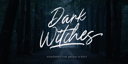 Introducing, Dark Witches a handwritten brush font. dark witches is one kind of a font that is made for you who are looking for a handwritten textured brush font. this font work perfectly for branding, packaging, advertising, headline, logotype, etc. Features : numbers and punctuation multilingual ligatures alternates swash PUA encoded Thank You!
 - NailsNStaples by Ingrimayne Type,
$14.95 In NailsNStaples the letters are made up of nails and staples. (The staples are not the staples one uses to join paper, but the kind one hammers into wood.) It is not often that one needs a typeface made of nails and staples, but if one does, there is a font for that.
 - Izumi Natsuka by Phonnastudio,
$10.00 Izumi Natsuka is a slim typeface with, gorgeous and flowing handwriting in a personalized way, such as branding, greeting, wedding planner, logo, poster, and so on. It can help kind of more your project in the future what you get: - more Stylistic Alternate - more ligatures - Number and Punctuation - Include Multilingual support Latin simple.