1,171 search results
(0.017 seconds)
- P22 Allyson by IHOF,
$39.95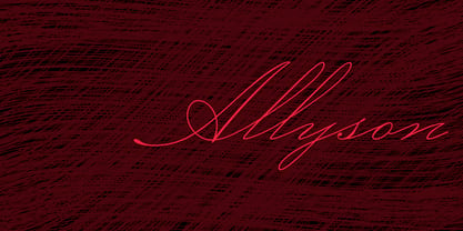 P22 Allyson is based on an old metal font by Barnhart Bros. & Spindler named Hazel Script. This font is perfect for elegant invitations and certificates and has been expanded to meet the needs of today's computer user to include a full character set. Allyson Pro contains OpenType features.
 - Valjean by Solotype,
$19.95Here is a wood type from Tubbs & Co., about 1900. Its lack of decoration reflects the changes that were rapidly occurring in the design of printed pieces at the beginning of the 1900s. There were several similar types in metal in the first decade of the 20th century. - Affiche by RMU,
$35.00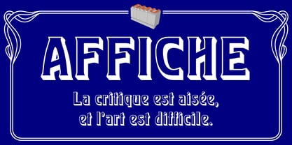 Based on the fin-de-siècle Helios Reklameschrift of the Klinkhardt foundry, Leipzig, Affiche preserves the beautiful art nouveau character of its hot-metal forerunner and was carefully extended to make it multilingual. For more historical authenticity, you can use the long s by typing [alt] and [b].
 - Rumbler by Ramen,
$25.00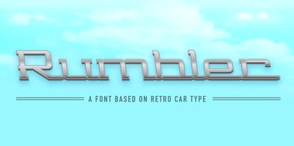 Rumbler is a typeface inspired by old school car lettering, while trying to push it in a unique direction. Reflecting the limitations and constraints of shaped metal, the letter forms twist and contort to create a readable font that can evoke motion and speed, strength, and a retro feel.
 - Saw Mill Stencil JNL by Jeff Levine,
$29.00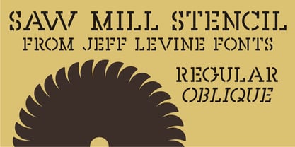 A vintage metal stencil from a saw mill with the term "reusable skid" was the model for Saw Mill Stencil JNL. Although the original was what would be termed a semi-stencil (some letters did not have 'breaks' in them), the font was designed with a more traditional look.
 - Pixwar by FSdesign-Salmina,
$39.00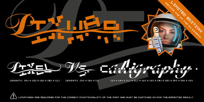 An epochal battle in form of font. Calligraphic characters and pixel fight against each other in this experimental font. Two historical epochs collude. You decide the destiny of the battle using the shift button. The font is based on OpenType technology. Ligatures are required for its correct functionality and must be switched on (both on professional and office applications). May the best win, with Pixwar.
 - Linotype Ergo by Linotype,
$40.99Ergo is a relatively new font oriented on the form philosophy of Univers and Frutiger, namely, that a font which the eye should see as correct cannot be constructed. The eye tends to enlarge horizontals and to perceive verticals as weaker, and the stroke differences of Ergo are therefore designed to accommodate this tendency. Ergo makes a dynamic and modern impression and is extremely legible. - Selene by Flanker,
$17.99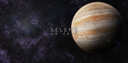 Selene is a sans-serif font family designed by Leonardo Di Lena. The font is based on geometric forms with as few improving legibility optical corrections as possible. If you need a minimalist font, technical but friendly and elegant, this is your choice. There are glyphs for all languages with Latin, Greek and Cyrillic alphabets, all the basic ligatures, old style numerals and alternates.
 - LTC Nicolas Cochin by Lanston Type Co.,
$24.95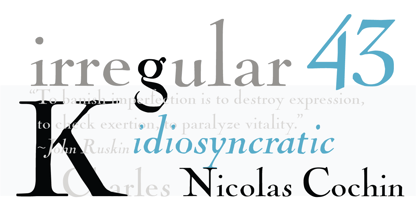 Nicolas Cochin (not to be confused with another font named simply "Cochin") was originally designed by Georges Peignot in the early 20th Century and was based on engraved letters of the 17th Century artist Charles Nicholas Cochin. Many foundries including Lanston released versions in the 1920s. Several digital versions can now be found, but none have kept the irregular details of the metal type which include strokes that cross over each other as if hand drawn (see letters K & y). The new Lanston digitization is the only digital version to retain the idiosyncratic treatment which makes the metal type so alluring. The Opentype version included an expanded Central European character set as well as ligatures, alternates, fractions, superior/inferior numerals (the Italic also has swash characters).
 - Death Mohawk by Mans Greback,
$69.00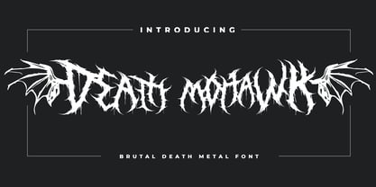 Death Mohawk is a rough metal font. This Korn/Slipknot style typeface with is distressed letterforms is optimized for a musical logotype. Its eroded and destroyed edges gives it a heavy and grungy look. Use parenthesis symbols ( ) [ ] { } < > to make wings around any word. Example: [Heavy Metal] Use % after any letter to make it symmetric. Example: MayheM% or Roxo%R% The font is built with advanced OpenType functionality and has a guaranteed top-notch quality, containing stylistic and contextual alternates, ligatures and more features; all to give you full control and customizability. It has extensive lingual support, covering all Latin-based languages, from Northern Europe to South Africa, from America to South-East Asia. It contains all characters and symbols you'll ever need, including all punctuation and numbers.
 - Welcome Home JNL by Jeff Levine,
$29.00Welcome Home JNL gets its inspiration from metal letters and numbers affixed to homes, posts and mailboxes in the 1920s and 1930s. The block style of lettering that was silk screened onto enameled rectangles of steel was especially popular during that time period. This font has a limited character set. - Celebration by RMU,
$35.00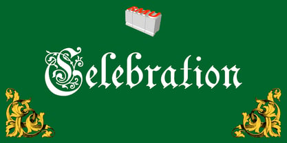 A blackletter font of decorative style and of obscure origin which was rescued for all devotees of these old hot-metal letters. This font contains a bunch of useful ligatures, and by typing 'N', 'o' and period and activating the OT feature Ordinals you get an old-style number sign.
 - Palestina by Tipo,
$50.00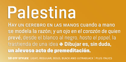 Palestina is a sans serif font designed for reading texts and inspired in the condensed Trade Gothic font, which features a strong influence from the time of metal foundry-based typography. The characteristic of its design is easily recognizable and very stable to use for titles and newspaper and magazine headlines.
 - Bithead by Comicraft,
$19.00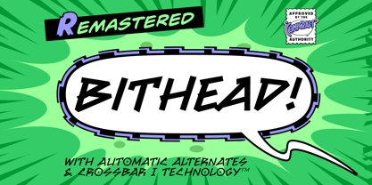 INFO DUMP: Get jacked into cyberspace direct feed, no buffer with this hotwired font by John 'Son of a Glitch' Roshell. Initial upload to Ghost Rider 2099 was prematurely aborted, but not before the downramp pusbag Ozymandias pirated a jagged beta version and assaulted the Uncanny X-Men during 'Onslaught.'
 - Faceless by Gassstype,
$29.00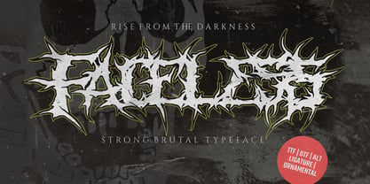 Hello Everyone, introduce our new product Font Faceless it is lack metal Typeface, Rooted, but still readable.This is a Textured Natural Style and classy style with a clear style and dramatic movement. This font Faceless is great for your next creative project such as logos, printed quotes, invitations, cards, product .
 - Collect Em All BB by Blambot,
$12.00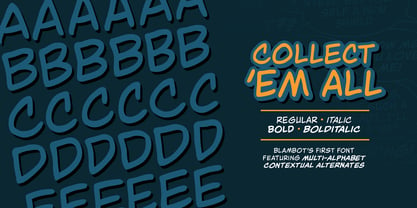 Blambot’s first font featuring Contextual Alternates: COLLECT EM ALL BB! As you type, you'll discover six versions of every letter, three versions of every number, three versions of the exclamation point and question mark, auto-correction of serif-I per standard American comic book tradition, and if you type from three to six of any letter, you'll get a bouncy baseline! All this, plus a hefty set of European characters.
 - Vitage by Fractal Font Factory,
$10.00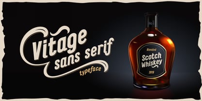 This sans-serif type family of two weights plus matching italics. Influenced by the geometric-style sans serif faces that were popular during the 1920s and 30s, the fonts are based on geometric forms that have been optically corrected for better legibility. Vitage has a functional look with a warm touch. It is manually hinted and optimized for screens, so it will be a good choice for Websites, eBooks or Apps.
 - Sunbeam by Kustomtype,
$25.00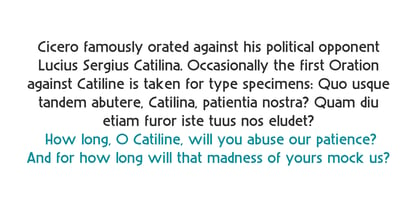 Sunbeam is a new, classy & modern typeface that looks incredible! The contrasting lines and vibrant shapes give sunbeam a sleek and elegant look. Sunbeam is a versatile typeface that's full of character, using optical correction for better legibility, sunbeam is the perfect fit for graphic design, editorial design, magazines, posters, logotypes, brands and corporate design. Sunbeam is designed by Coert De Decker in 2019 and published by Kustomtype Font Foundry.
 - VG Sans by Vitaliy Gotsanyuk,
$25.00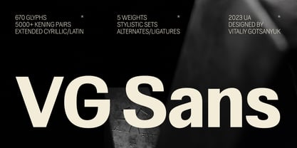 VG Sans is a distinctive grotesque font that preserves the features of old grotesques while incorporating new conceptual solutions. Working on the font, its shape has been completely transformed, corrected, and the glyph set has been expanded. The font has a light contrast that increases with weight. VG Sans includes 5 weights, 670 glyphs, an extended Cyrillic/Latin character set, multiple stylistic sets, ligatures, numeral sets, and more.
 - Stamp Of Approval JNL by Jeff Levine,
$29.00Back in the 20th Century B.C. (Before Computers) there was what was known as a "paper" office. Workers used typewriters, correction fluid and a drawer full of rubber stamps. Jeff Levine has taken twenty-six of the common phrases found on those old office stamps and created Stamp of Approval JNL. Use these images as they are, or run them through a filter for a worn or inked-up effect. - Pigeon Street - Unknown license

- Moscovium by Throndsen,
$29.99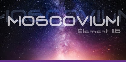 Moscovium is a radioactive, synthetic element about which little is known. It is classified as a metal and is expected to be solid at room temperature. It decays quickly into other elements, including nihonium. The element had previously been designated ununpentium, a placeholder name that means one-one-five in Latin. Element 115
 - Bamboo by Solotype,
$19.95Even the original founder, Barnhart Bros. & Spindler, thought this was a freaky font, and indeed they called it "Freak" when they introduced it in 1889. It was reintroduced in 1925 under the somewhat more elegant name of "Bamboo," and is one of the prizes that the collectors of antique metal types seek. - Ornamental Deco 2D by 2D Typo,
$36.00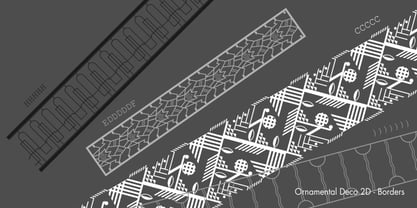 This font was inspired by Lviv ArtDeco architecture dominating in 1920s-30s. This collection of ornaments is a graphic representation of building decorative elements, mostly of metal tracery elements and wall bas-relief. This font can be used for a variety of purposes, in graphic design as well as in industrial design.
 - Erler Titling by RMU,
$30.00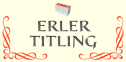 Herbert Thannhaeuser’s 1953 titling font Erler-Versalien which was distributed by Typoart in hot-metal times, was carefully redrawn and redesigned. To preserve its handwritten character, irregularities in the letters’ strokes were left as they are. This font spreads best its beauty in book titles, magazines, diplomas, greeting cards or as initials.
 - Morning Paper JNL by Jeff Levine,
$29.00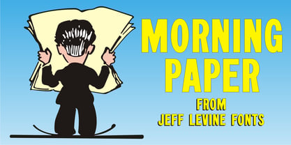 Morning Paper JNL is part of a small series of fonts re-drawn from screen captures of original vintage newspaper headlines. The typefaces are classic wood and metal faces that were popular in all forms of print of the time. This sans is a companion to Final Edition JNL and Evening Paper JNL.
 - Ranchstyle by Ampersand Type Foundry,
$29.00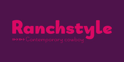 Based off of research into Nevada cattle branding irons of the 19th century, Ranchstyle takes the vernacular from rancher’s brands of the old west, digitizes it, and brings it into the contemporary world as a vivacious spunky typeface. The letterforms mimic bent metal and have the fluidity that follows such a material.
 - MGN Humble by Morgana Studio,
$17.50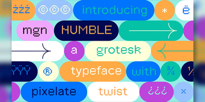 MGN Humble is a sans-serif type that provides room for users to express their experimental and playful side. The pixelated strokes engage venturously with the need to communicate excitement; a perfect set for clothing, gaming, technology, and experimental poster use. Currently available in a beta version and to be developed further.
 - Bleak by Andinistas,
$34.00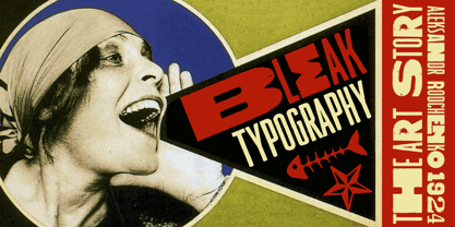 @andinistas presents Bleak , an experimental font designed by #carlosfabiancg. Bleak is based on the imaginative use of contrast applied in the empty space and on the dramatic distributions of the wide and compressed horizontal of more than 400 textured symmetric capitals inspired by compositions of the Lissitzky, Theo van Doesburg, among others. In the Europe of the 20s, scarce resources prevailed, which gave these great artists the firm determination and dedication to create a visual vocabulary, characteristic of the composition with movable types of wood and metal. As they did not readily dispose of the forms of the letters they required, they did not hesitate to construct them with metal rulers, ornaments and other improvised pieces and remains and obtained in the forgotten corners of the typographic composition workshop.
 - Bloody Night by LfarStudio,
$17.00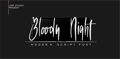 Halo! thank for your visit :) Bloody Night is a dark metal handwritten font with a horror feel and creepy impression. it looks stunning on movie title, book covers, photography, greeting cards, creepy quotes, and much more. This font is PUA encoded which means you can access all of the glyphs and swashes with ease!
 - Circensis by RMU,
$35.00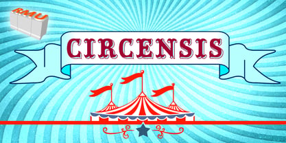 Picking up a concept of Fritz Richter, Circensis is the realization of an adorned diplay font which had not been hitherto available, neither as a hot-metal font nor digitally. It is a great and legible font for circus and variety ads and posters, as well as for films, cafés, ice-cream parlors etc.
 - MGN Jovial by Morgana Studio,
$17.50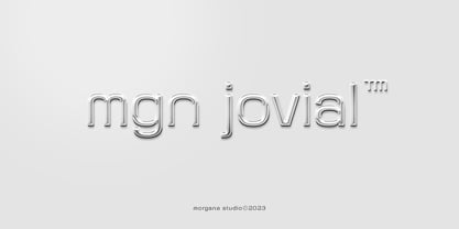 MGN Jovial (2023) by Morgana Studio is a sleek font perfect for futuristic logotypes, embodying a minimalist and avant-garde design. Its versatility shines in tech logos and futuristic app interfaces. The color palette, featuring metallic tones and futuristic blues, amplifies its high-tech appeal. Scalable and legible, it encapsulates modernity and sophistication in design.
 - Shaken, Not Stirred by Hanoded,
$15.00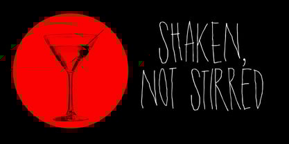 Shaken, Not Stirred. A famous line from just about every James Bond movie (yes, we're talking Martini-time). The font is also quite shaken (and not stirred). It looks like someone scrawled something onto paper, or etched the letters in metal. Shaken, Not Stirred comes with a set of diacritics befitting a Secret Agent.
 - Graphique by profonts,
$41.99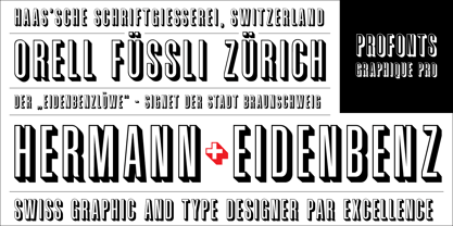 Graphique was originally created by Swiss designer Hermann Edenbenz in 1945, and issued as hot metal font by Haas'sche Schriftgie�erei, Switzerland.German type designer Ralph M. Unger digitally remastered and expanded the typeface for profonts, and the digital OTF Pro version comprises of more than 400 characters including the complete Latin and Cyrillic glyph sets.
 - Arsis by Linotype,
$40.99Arsis is a condesed modern headline face that was originally produced and cast in hot metal by the Dutch type foundry Lettergieterij Amsterdam. The Arsis font family was designed by Gerry Powell in 1937. Arsis is a Serif (Antiqua) Modern Style font. Arsis font family attributes include roman serif, Didone, elegant, formal, modern style, feminine. - Euro Stencil JNL by Jeff Levine,
$29.00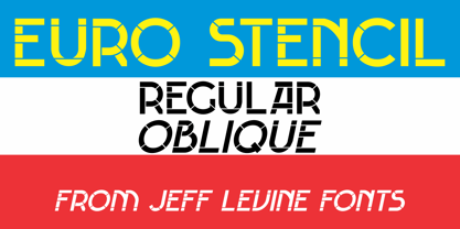 An online photo gallery showcased a number of vintage and unique signs around Europe – mostly from Germany. One particular sign (“1818-Hoofdkant Spaarbank-1921”) was formed in metal and with stencil letters of a distinctive 1970s feel. This served as the model for Euro Stencil JNL, which is available in both regular and oblique versions.
 - Ramban by WingBuk Studio,
$17.00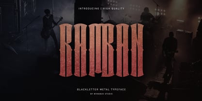 Ramban is a high quality blackletter typeface for your designs, with metal and gothic accents to make your designs even more exclusive. Can be use for various designs such as band logos, cloting, even film covers or tour posters. Includes Uppercase Letters and unique Roman Numbers with some extra bonus Ligature Characters. No Punctuation !
 - Hoofer by Scholtz Fonts,
$15.00 Light and flexible, slightly retro, casual and readable, Hoofer combines 28 brush script, mono line script and sans-serif styles with ornaments into one Mega-Family. The different styles of the Hoofer Mega-family have been chosen to work together and to harmonize in a pleasing way. The Hoofer Mega-Family of fonts can be divided into three sub-families: Hoofer BRUSH subfamily: An eclectic group of five fonts. These are mainly joined scripts. Hoofer LINE subfamily: Seven mono-line scripts with joined letters in a number of weights, widths and styles. Hoofer SANS subfamily: Sixteen casual, Sans-Serif fonts. They are very readable and in a variety of weights & styles The mood of the Hoofer mega-family is light and flexible, slightly retro, casual and readable. It combines script and many sans-serif styles with ornaments into one Mega-Family. The different styles of the Hoofer Mega-family have been chosen to work together and to harmonize in a pleasing way. The Brush Sub-Family is designed for titling, packaging and display purposes, The Line Sub-Family can also be used for titling, packaging and display, however, it is less “showy”, and conveys an air of informality. The Sans Sub-Family is designed to shine as sub-heads and as body text. The wide range of Hoofline styles gives you, the designer, great flexibility in creating just the mood or impression that you want. Most of the fonts can use one or more OpenType Features. These can be accessed in a number of ways. The reason for this is that the major software producers provide different (and often conflicting) ways of accessing OpenType Features. In some cases such software manufacturers provide NO way of accessing certain OpenType Features. We have tried to remedy this by providing a highly flexible family of fonts. OPENTYPE (these OpenType features are only available in the “otf” fonts and not in the “ttf” fonts.) OpenType features that Hoofer makes use of are: Swashes (Word-Begin and Word-End Features); Alternate Numerals; and True Small Caps. ORNAMENTS In addition the Hoofer family has a font containing 94 ornaments. ALTERNATE NUMERALS You can access two sets of figures (numbers) in Hoofer Sans fonts. Both sets are tabular and lining but they differ in the height (but not the width) of the figures. The height of the alternate figures has been chosen so that they are compatible with the small caps. However, these alternate figures are available in ALL Hoofer Sans fonts, whether they feature small cap fonts or not. Hoofer has all the features usually included in a fully professional font. Language support includes all European character sets, Greek symbols and all punctuation. Opentype features include automatic replacement of some characters and discretionary replacement of stylistic alternatives.
 - Tale by Suomi,
$25.00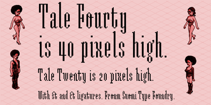 Tale is an experiment to convert the script-style calligraphy into bitmap format. The two variants have the same dimensions, but (as the naming suggests), Forty has double amount of pixels in it when compared to Twenty. Both variants have hand made bitmaps to compliment these correlating point sizes, and you can always get the appropriate bitmaps by multiplying by two.
 - Prolexia by Dyslexica,
$10.00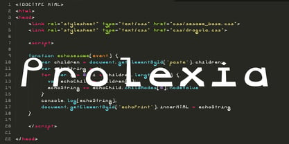 Prolexia is designed to make the font friendly towards those with dyslexia. All the characters are unique with no rotation or mirroring, this makes it harder for the mind to mix up similar glyphs. The characters are made with the illusion of perspective: this helps orient characters in the correct direction to make mental reorientation harder. Finally the o shape is somewhat flattened, this also helps to counteract mental rotation of characters.
