10,000 search results
(0.022 seconds)
- Basic Commercial by Linotype,
$57.99 Basic Commercial is a family of fonts based on historical designs from the hot metal type era. First appearing around 1900, these designs were created by type designers whose names have not been recorded, but whose skills cannot be overlooked. These typefaces were popular among groups and movements as diverse as the Bauhaus, Dadaism, and the masters of Swiss/International-Style typography. They influenced a variety of later grotesque fonts, such as Helvetica and Univers. Basic Commercial was distributed for many years in the United States under the name Standard Series. The typeface worked its way into many aspects of daily life and culture; for instance, it became the face chosen for use in the New York City subway system’s signage. The Basic Commercial family members have a clear and objective design. Their forms exhibit almost nothing unusual, but remain both lively and legible nonetheless. Perhaps for this reason, Basic Commercial’s design has been popular with graphic designers for decades.
 - Liminoru by IbraCreative,
$17.00 Liminoru – An Organic Liquid Typface Liminoru is an organic liquid typeface that flows seamlessly between characters, embodying a fluidity reminiscent of cascading water or molten metal. The letters dance with a graceful, serpentine rhythm, each stroke resembling the sinuous movement of organic forms. The typeface’s design evokes a sense of natural beauty and dynamic growth, as if the letters are evolving and adapting to their environment. Liminoru’s unique curves and undulating lines create a harmonious balance between sophistication and an elemental, earthy quality. The liquid nature of the font imparts a tactile, almost sensory experience, making it a visually captivating choice for projects that seek to blend elegance with the organic essence of nature. Liminoru is perfect for branding projects, logo, wedding designs, social media posts, advertisements, product packaging, product designs, label, photography, watermark, invitation, stationery, game, fashion and any projects. Fonts include multilingual support for; Afrikaans, Albanian, Czech, Danish, Dutch, English, Estonian, Finnish, French, German, Hungarian, Italian, Latvian, Lithuanian, Norwegian, Polish, Portuguese, Slovak, Slovenian, Spanish, Swedish.
 - Illustrissims by Typephases,
$-76 illustrations of vintage-inspired characters, most of them drawn from imagination, in the tradition of metal stock cuts or woodtype vignettes. Illustrissims is offered as a free sampler of our illustration style. Its themes are futher developed in the Absurdies, Bizarries, Genteta, Ombres and Whimsies series, also available from MyFonts! These illustrations are ready to use at any size and in any application (their vectorial format ensures they can be scaled to any size with no loss of sharpness). They can be used out of the box, or easily customized in any graphics program, adding colour or texture, resizing, combining... The variety of suggested uses is huge, from small spot illustrations to full-page layouts. Use them to great effect in magazine spreads, advertisements, stationery, packaging, bulletins or poster creative designs. Illustrissims combines three formerly separate dingbats (the Illustries 1-2-3 series), which have been unavailable for quite a few years. - Genesis by Canada Type,
$29.95Genesis is a digitization and expansion of a Frank Riley metal typeface called Grayda, originally published to much applause by ATF in 1939. The concept for this disconnected script is quite novel and original among cursives and calligraphic fonts: The minuscules are mostly made with slightly clubbed strokes, which becomes clearly visible in the ascenders and descenders. This alone gives the face a bubbly appearance unlike any other. The formula is completed with two sets of beautiful calligraphic majuscules and a few alternates. The character set of Genesis boasts full support for Western, Central and Eastern European languages, as well as Baltic, Celtic/Welsh, Esperanto, Maltese, Turkish and Vietnamese. Genesis is available for all platforms and in all popular formats. Genesis Pro, the OpenType version, is where the caps and a few other variations alternate stylistically at the push of a button in OT-savvy applications. Genesis Pro also contains class-based kerning. - VLNL TpDuro by VetteLetters,
$30.00 VLNL TpDuro was designed by chef Martin Lorenz and Juanra ‘Wete’ Pastor. Its concept was inspired by an Albrecht Dürer design from 1525, which shows a system to construct a gothic lowercase letter. Following the logic of this lowercase construction, but not the traditional uppercase letters of regular fraktur (brokenscript) alphabets, some brand new upper case letters were designed. The 45 degree tilted square that forms the basis of the letters, is as square and hard as a cracker. And we love crackers. You can put cheese on them. The ‘pixel’ feeling of the downstroke was intensified by repeating the rotated square module as often as they could. All this resulted in a strong, dark typeface with a steady rhythm, with one foot in history and the other in modern times. It works well as a display typeface for short texts, headlines and logos. Music festivals and heavy metal bands should also pay attention. This is hard stuff.
 - Balcony by Shaily Patel,
$10.00 Balcony is a decorative display typeface inspired by the patterns of metal safety grills. Its highly geometric features may be used to identify it as Art Deco. It is a monospaced type family with all characters confined in a square frame. The main idea of Balcony is to create a grill-like pattern when letterforms are placed together. This creates an illusionary experience for the reader. The best way to use this typeface is without leading, as shown in the visuals. Balcony also comes with two stylistic sets. The first stylistic set contains most characters with more decorative elements and the second one includes Dingbats. These Dingbats are motifs with simple geometric patterns that may be used for any kind of ornamentation. The diacritics letterforms are geometrically squeezed within the square frame to include the accents. This experimental typeface comes with about 650 characters and four weights (Thin, Light, Regular and Bold). The font family supports Western and Central European languages.
 - Hyper Turfu by Bisou,
$10.00 Made in La Chaux-de-Fonds (Switzerland), HyperTurfu was born during the shooting of “The Return of Hyperturfu Xpress 2”. A GoPro on a lego electric train, meters and meters of rails, an empty industrial space, loads of puppets, paper, cardboard, pizza boxes, lights, hot glue and a bunch of friends preparing a one shot scene for a month. The title of the movie was made out of lego pieces, painted with golden spray and hanged over the rails. It was the first inspiration for this awsome superbold font. HyperTurfu is thought from ground up to give a strong impact. It’s gothic retro science fiction 80’s style makes it best suitable for metal music albums or posters. As the “Banco” font it works perfectly with short texts for advertisement, bar, cofee shops concert places or even fancy hairdresser. Just hang it over a pet shop and see what cool animals will come in.
 - AW Conqueror Std Didot by Typofonderie,
$59.00 Homage to 70s phototype typography in 3 styles The AW Conqueror typeface family is a nod to the spirit of phototype typefaces and transfer lettering from the early 70’s. Founded by Ed Rondthaler, Photo-lettering catalogs swarmed with more daring typefaces than the others. Both transfer letter and phototitling have liberated the principle of letter-to-letter spacing, previously impossible with metal type. Phototype allowed operators to position millimeters, on the fly, letter after letter: words, sentences according to the specifications of the art director. AW Conqueror superfamily AW Conqueror Didot is part of a larger family, who include 4 others subfamilies with great potential: They’re but based on same structure, with some connection between them (width for example), to offer a great & easy titling toolbox to any designers, from skilful to beginner. Each of the members try their best to be different from the others because of their features. They should work harmoniously in contrast. Club des directeurs artistiques Prix 2010 European Design Awards 2011
 - C-Nation by URW Type Foundry,
$39.99 Marit Otto about C-Nation: The building typeface. Although the 70ties were very liberating and progressive, still girls played mainly with dolls and sweet things and boys with all kinds of challenging stuff. They did all sorts of basic scientific experiments in mini labs and of course built cool things with Meccano building sets. As a girl I was perfectly happy with the toys I had access to. But at the same time I was very curious about all the adventure toys and discoveries my brother did. It also made me wonder why the grown up people thought that our world could be separated so easily by separating our toys in pink and blue sections. At this day of age Meccano is probably hopelessly old fashioned and far to manual. Children of today are fed by fast images and cool animations on screen, they learn, play, communicate and relax in the same space, the digital space. The special feature of Meccano was that even though it was very basic there was the promise you could create anything. It might even contribute to a logical mind. The typeface I designed refers to the Meccano feel. It is a creative typeface. A bit masculine and bold looking perhaps but after the first impression a subtle and refined female touch is revealed. It has links to architecture and associations with metal constructions like ‘The Eiffel Tower’ and (old railway) bridges. I am convinced that we all think of that as very charming man-made objects.
 - Diane Script by GroupType,
$27.00 In 1995, FontHaus came upon a rare opportunity to create a revival of Aries, a little known and previously unavailable typeface by the legendary Eric Gill. Discovering a lost typeface by one of the major designers of the 20th Century, was the discovery of a buried treasure, and being the first type company to release it was an honor. Thirteen years later, FontHaus came across another little known typeface treasure: Diane. Designed by the legendary French designer Roger Excoffon in 1956, this remarkable script has never been faithfully recreated until now. In close collaboration with Mark Simonson, FontHaus and Mr. Simonson painstakingly researched rare type books, publications, European metal type services, and period showings from the United States, England, Germany and from the University of Groningen in the Netherlands. Finding full specimens of the font turned out to be quite a challenge. In most cases, only the caps and lowercase were shown. Furthermore, the more we researched Diane, many curious facts came to light. The caps in earlier specimens of Diane are completely different from specimens published later, suggesting that the face was redesigned at some point, perhaps in the mid-1960s. So we are left with two different sets of caps. The original had very elaborate, swirly strokes, very characteristic of Excoffon¹s gestural designs for posters and logos. Later on, these appear to have been replaced by a set of simpler, more traditional script caps. The original caps are criticized in one source Mark found (Practical Handbook on Display Typefaces, 1959) as being "exquisite" but "not highly legible". Perhaps this is what led to the simpler caps being introduced. Nevertheless, FontHaus's release includes not only both sets of caps, but a range of alternates and a number of new characters not originally available such as the Euro, and a magnificent alternate Ampersand to name a few.
 - Maiandra by Galapagos,
$39.00The Maiandra family of typefaces were inspired by an early example of Oswald Cooper's hand-lettering, as seen in an advertisement for a book on home furnishing, circa 1909. Although many of Oz Cooper's letterform designs were cast in metal type, this particular one was not. Cooper's design itself was inspired by examples of letterforms he had admired in his study of Greek epigraphy (inscriptions). Cooper combined those ancient forms with the flair characteristic of design styles of his time. The result was an attractive design possessing subtle, purposeful irregularities, or "meanders" in his skilled brushwork. The Cooper design exhibits a unique warmth and harmony in text, while presenting a compelling rhythm, color and texture on the page. "Realizing the presence of this uniform warmth and readability," notes Dennis, "I decided to expand the design into a family of three weights with companion italics." The weights for the Maiandra family were selected for their versatility in usage over a broad range of output device resolutions. Indeed, "the consideration of eventual display resolutions, be they for screen or printer, provided the greatest challenge in the design of this typeface family," explains Dennis. Creating shapes that conform to the rigors of digital letterforms and modern rendering environments, without losing the unique characteristics of Oz Cooper's original design, is what Dennis has accomplished with his tribute to this great designer of the past. Maiandra, whose name derives from the Greek 'maiandros', meaning 'meander,' is intended for extended text use, as well as for informal subject matter, such as business correspondence, brochures and broadsides. "An example of a good use for Maiandra," notes Dennis, "is in printed matter relating to the turn-of-the-century art period known as the Arts and Crafts Movement. It can stand alone or be used with designs that complement its shape and color." - Hartsinger by Maulana Creative,
$12.00 Hartsinger is a fancy handwritten font. With cartoon vibes or notes on the book scratch, had a fun character with a bit of ligatures and fun swashes. To give you an extra creative work. Hartsinger font support multilingual more than 100+ language. This font is good for logo design, Social media, Movie Titles, Books Titles, a short text even a long text letter and good for your secondary text font with sans or serif. Make a stunning work with Hartsinger font. Cheers, MaulanaCreative
 - MM Agrafa by MM Fonts,
$19.00 A paper-clip-inspired typeface with character. Agrafa is a technical but versatile display face that works well in both large and small sizes. Most of the glyphs are made from one continuous line and shows the constraints of bending a paperclip/wire. The family consist of four weights, Hairline, Thin, Light and Book, last three also comes with an oblique companion. While Hairline works best for setting large headlines/words, the Book weight can be used even for small size texts.
 - Grotesca Negra by MAC Rhino Fonts,
$59.00 Grotesca Negra is a charming sans serif with a flirt towards the Jugend era. Still its modern enough not to feel outdated. It is briefly inspired by a local typeface named Grotesca chupada negra, found in a Spanish edition of a type specimen book from the German Bauer type foundry. It has an angle on the horisontal strokes on many of the letters. It is one of many display face derived from book cover designs. Intended to work as a display typeface.
 - Tiamaria by Galapagos,
$39.00In the 70's I went out with a girl whose father was a card-carrying member of 3 of the biggest unions in the printing arts. He gave me 2 things, a pre-war Linotype specimen book and an ancient 'how to' lettering book that contained 30 or 40 script specimens from lettering artists of the time. Tiamaria is the developed glyphs of one of these specimens. Tiamaria is the name of one of the islands in the Galapagos chain. - Water Splash by Putracetol,
$21.00 Water Splash is a unique display font. This font is inspired by the water splash shape. There are 3 directions for the splash water (direction to the left, up and down and to the right), and they are alternate from this lowercase font. With these variations, it will make it easier for you to create creativity for your project. Water Splash would be perfect for branding, logo, product, title, quotes, doodle, comic, books, greeting cards, toys, posters, baby clothing, picture books, etc.
 - North by Trine Rask,
$40.00 North Family is a small type family designed for books and pages of text in smaller or bigger sizes. It has been designed with special care for the Scandinavian languages, their letter combinations and special characters, but contains accented characters for all european languages. North is a soft and warm typeface, legible and friendly, very suitable for setting text that you just want to be read as easy as possible. Also very usable for children books with its simple forms.
 - Machine Killer by Invasi Studio,
$18.00 Machine Killer Font is a modern Blackletter style font that is perfect for your Display or Body text designs. It adds a bold touch to your projects and will inspire you to create something unique and modern. Funky Gloom Font is ideal for headings, flyers, greeting cards, product packaging, book covers, printed quotes, logotype, apparel design, and album covers, and it is perfect for headings, flyers, greeting cards, product packaging, book covers, printed quotes, logotype, apparel design, and album covers.
 - Snow Blue by Girinesia,
$17.00 Hello guys... We proudly presenting our new font. It's name SNOW BLUE. SNOW BLUE is modern display font. SNOW BLUE is a bold decorative font perfect for your celebration party like Halloween, Chrismast or New Year. SNOW BLUE would perfect for Titles for kid`s book, scrapbook, logo, icon, phrases or quotes for winter greeting cards ( Halloween, Christmas or New Year holidays), photo overlay, short phrases, children’s book, gift shops tag, presentation in social media Pinterest, Instagram, Facebook or others.
 - Delm by Typesketchbook,
$39.00 Delm font family is one of those large and useful families that you really can’t miss if you are looking for typeface combining originality and legibility. Delm is one of these – a sans serif with geometric modern look designed very smart with soft round look and very specific inktraps that complement its uniqueness. It is developed in 9 separate weights ranging from Hairline to Black, each coming with corresponding slanted version (called ‘Oblicua’). The light weights look more elegant, gentle and with more sensible feeling for geometry while the black versions are more soft, friendly even puffy and the geometric skeleton of the family is dominated by the overall roundness. The mid-weights are strong and prominent setting right the middle point in the contrast range of the family. Delm is a font with dedication – with so many options for different character contrast combined with slanted styles, it is perfect for editorial design where it could be easily used either for text or display font. Editorial is not of course the only application – you could successfully rely on this typeface if create brand or corporate identity, typographic posters, signboards, instruction plates, etc. Very diverse and original, this font will not leave you unsatisfied – moreover – it will surely make you try it in more and different designs be it printed or designed for screen. Web sites, banners, applications and e-books are places where Delm will show its best because of its originality, finely tuned contrast and its enhanced legibility. Fully equipped with OpenType features like ligatures and multilingual support, Fontmatters highly recommends to get the whole Delm font family for maximum results and satisfaction.
 - Roughmarker by 38-lineart,
$16.00 Roughmarker font consists of two handwritten scripts, a slant (regular) version and upright. This Script fonts are manually handwritten with quick and rough strokes. We write them on paper until we find a very proportioned form. Then we scanned and took the selected glyphs to be processed into a font. The biggest challenge in making textures fonts are the very many node points, many node points make the font processing performance a bit slow. At first we tried raising the node parameters to 2000-4000 points in one glyph. This is a big number, but if this number is lowered it will eliminate the impression of brush and natural look. We repeatedly look for gaps to minimize points so that the font capacity is not too large and comfortable when typed. This script font is equipped with ligature as well as several alternate according to handwriting habits, very effective in the sense of not too much but often used. This font is the great choice for contemporary brands, especially for businesses in fashion, urban style, websites, trends in architecture, cosmetics, and energetic lifestyle themes. An attractive typographic layout makes it also looks more premium in writing quotes.
 - Hello My Love Pro by Debi Sementelli Type Foundry,
$39.00 “Hello My Love” is a font love story. Inspired by my own long and happy marriage of 35 years, it was created to celebrate love! A classic hand-lettered script with a modern and fresh feel, it fits beautifully with current designs and yet is sure to stand the test of time. Made with invitation designers in mind, the Hello My Love Pro script font includes a total of 1985 glyphs plus a BONUS FONT, Hello My Love Ornaments! It has 91 hand illustrations including frames, florals and design elements. As a result, you will be able to create a variety of designs to highlight your special project. It’s especially well-suited for invitations for branding weddings and other special occasions! And it supports 129 languages! The font is loaded with features: Stylistic and Contextual Alternates, Swash Caps, Standard and Discretionary Ligatures, Beginning Swashes for lower case letters, Cross-less t and f that can be combined with a flourished letter to avoid clashing plus 3 ampersands, small word art "and" & "No.", Roman Numerals, Ordinals and Fractions. This font was created to make designing easy. Need to convert upper case letters into Roman numerals throughout a guest list? Just turn on contextual alternates in Open Type capable programs and presto, the caps become Roman! Want a variety of letter choices? There are 215 stylistic alternate upper cases and 259 stylistic alternate lower cases as well as 69 ligatures to give you plenty of options. You can choose from swashes in 4 different styles and 3 different lengths resulting in unique beginning lower case letters. Works for Cutting Machines! No special software is required to use Hello My Love. All of my fonts have been specially coded for PUA (Private Use Area) so you can access all of the swashes and alternates using Character Map (PC) or Character Viewer (Mac) or with any number of apps including PopChar. If you would like to purchase PopChar at a special discount email me and I will send you the link. For Microsoft Word users, you can easily access the Stylistic and Contextual Alternates and the Roman Numerals through the Typography feature. (Microsoft Word 2010 and later) For more details about how to use my fonts, check out my video tutorials on my YouTube channel: https://www.youtube.com/user/Letteringartstudio/videos
 - ITC Ellipse Neo by Typorium,
$30.00 The Typorium presents a new optimized and enriched version of ITC Ellipse which first appeared in 1996 in the International Typeface Corporation typeface library. ITC Ellipse Neo design has been lightly modified. Three weights have been added (light, Medium, Extra Bold, including Italics) to the original Regular and Bold styles. ITC Ellipse Neo is both modern and classic. Modern in the unusual shape based on the geometric ellipse form. And classic in the structure of some letters like the lower cases c, e, g, o, s. These letters alone could come from a traditional typeface, but they fit perfectly with the atypical rest of the alphabet giving it a present-day and traditional mix. Furthermore, the ellipse shape fits naturally in the italic styles, giving the font an organic and fluid feeling. ITC Ellipse Neo offers OpenType features such as alternate characters for upper and lower case, and an extended accented character set to support many languages. Five weights have been created for each style to offer a wide range of graphic possibilities in a tidy digital footprint. Designer: Jean-Renaud Cuaz Publisher: Typorium MyFonts debut: December 15, 2020 Le Typorium présente une nouvelle version optimisée et enrichie d'ITC Ellipse qui est apparue pour la première fois en 1996 dans la bibliothèque de caractères de l'International Typeface Corporation. Le design de ITC Ellipse Neo a été légèrement modifié. Trois graisses ont été ajoutées (léger, moyen, extra gras, y compris les italiques) aux styles originaux Regular et Bold. ITC Ellipse Neo est à la fois moderne et classique. Moderne dans le dessin inhabituel basé sur la forme géométrique de l’ellipse. Et classique dans la structure de certaines lettres comme les minuscules c, e, g, o, s. Ces lettres pourraient provenir d'une police de caractères traditionnelle, mais elles s'intègrent parfaitement avec le reste de l'alphabet plus insolite en lui donnant un mélange de modernité et de tradition. De plus, la forme de l'ellipse s'intègre naturellement dans les styles italiques, donnant à la police une sensation organique et fluide. ITC Ellipse Neo offre des fonctionnalités OpenType telles que des caractères alternatifs pour les capitales et les bas de casse, et un jeu de caractères accentués étendu pour prendre en charge de nombreuses langues. Cinq graisses ont été créés pour chaque style afin d'offrir un large éventail de possibilités graphiques pour une empreinte numérique rigoureuse.
 - Media Blackout by KC Fonts,
$14.00 Media Blackout is a handmade font with rugged good looks. The Media Blackout Family consists of three fonts: Normal, Italic & Marker. Media Blackout Marker takes the handcrafted look one step further by adding heavy hand etched lines for a truly unique look. For an even more handmade look, switch between uppercase and lowercase for a change of etching.
 - Ladylove by Creaditive Design,
$14.00 Ladylove is a beautiful handwritten font. It has an elegant style and it will add a sophisticated look to your designs. It will perfect for wedding invitations, bussiness card, logos, and quotes. Featuring a light weight it looks fantastically elegant. With lowercase Swashes can make your design looks beautiful, also Ligatures make your design more smooth and looks natural.
 - DB Spring Fling by Illustration Ink,
$3.00DB Spring Fling is full of uniquely designed images with a spring theme. Use this DoodleBat to add a fresh spring feel to any of your scrap booking pages. - Backers by Maulana Creative,
$14.00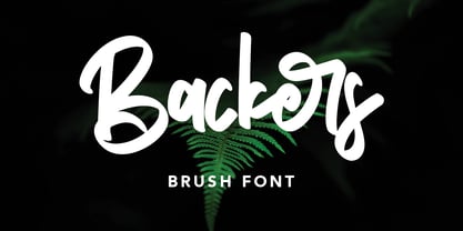 Give your designs an authentic handcrafted feel. "Backers" is perfectly suited to signature, stationery, logo, typography quotes, magazine or book cover, website header, clothing, branding, packaging design and more.
 - Erazm by Justyna Sokolowska,
$19.00 To design the font Erazm, I was inspired by books from the 30's from Poland. From a few letters I created an entire typeface - lower and uppercase characters.
 - Evor by Edcreative,
$15.00 Evor is an original handwritten font that can be used in various needs of the network such as screen printing of clothes, posters, films, magazines, banners, books, and more!
 - Poster Gothic by GroupType,
$19.00 Poster Gothic was inspired by showcard lettering samples featured in the book,""Commercial Art of Show Card Lettering"" by James Eisenberg, published by D. Van Nostrand Company in 1945.
 - Artlove by BonjourType,
$15.00 ArtLove is a lovely font for every art lover. Try ArtLove for book covers, stationery, marketing, magazines, films, wedding card designs, logotype, website headers, fashion designs and much more.
 - Longreach by Hanoded,
$15.00 Longreach is a carefully crafted, handmade all caps display font. The glyphs are nice and crisp, with slightly rounded corners. Use Longreach for your product packaging, books and websites.
 - Fifty Famous Fairy Tales by Funk King,
$20.00 Fifty Famous Fairy Tales was inspired by lettering on the cover of a children’s book of the same name published by Whitman Publishers back in the 50s or 60s.
 - FG Noel by YOFF,
$13.95 FG Noel works great at small and large sizes. I can imagine a kids' book with this font and it will be perfect for cute quotations on greeting cards.
 - Noodle by Letterhead Studio-VV,
$15.99 Noodleis a hand made font. It's a fun and whimsical font that would be perfect for greeting cards, toys, picture books or anything that requires a naive sensibility. Enjoy!
 - Balleys by Maulana Creative,
$14.00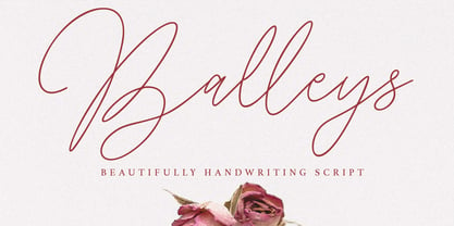 Give your designs an authentic handcrafted feel. "Balleys" is perfectly suited to signature, stationery, logo, typography quotes, magazine or book cover, website header, clothing, branding, packaging design and more.
 - Sound Bubble by Hanoded,
$15.00 Sound Bubble is a nice, uncomplicated cartoon-ish font. It will liven up your designs, especially book covers, posters and packaging. Comes in a normal and a dotty version.
 - Torches Realistic Brush Font by Maulana Creative,
$13.00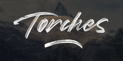 Give your designs an authentic handcrafted feel. "Torches" is perfectly suited to signature, stationery, logo, typography quotes, magazine or book cover, website header, clothing, branding, packaging design and more.
 - Obscure Stencil JNL by Jeff Levine,
$29.00 A bold, handmade stencil alphabet from the book “Lettering” by Harry B. Wright (1950) served as the model for Obscure Stencil JNL – available in both regular and oblique versions.
 - Brightsand by Sibelumpagi,
$18.00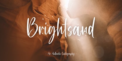 Brightsand is an authentic calligraphy font with a handwritten feel. It’s perfect for logos, product packaging, wedding invitations, branding, headlines, signage, labels, signature, book covers, posters, quotes and more.