10,000 search results
(0.03 seconds)
- Mother Hen AOE by Astigmatic,
$19.95 Mother Hen is an offbeat comic latin typestyle full of quirkiness and bounce. Inspired by the 1965 Looney Tunes cartoon titled “Highway Runnery”, this typeface has all of the spunk of its source. The end result, a lively tribute to its origin, easy to read and fun to look at, a perfect typeface for childrens' books, advertisements, and playful designs!
 - Mafisha by Letterena Studios,
$17.00 Proudly present Mafisha Typeface , created by Storytype, A serif modern and classic typeface that his own unique style & modern look. This typeface is perfect for an elegant & luxury logo, book or movie title design, fashion brand, magazine, clothes, lettering, quotes, and so much more. This font is PUA encoded which means you can access all of the amazing glyphs and ligatures with ease!
 - Thirsty Spine by PizzaDude.dk,
$17.00 Here's a creative font for your crafts, postcards, posters, book covers or perhaps your next birthday invitation! Thirsty Spine covers a lot of needs, where a crazy handmade look is needed. Each letter has 5 different versions, all with it's own charm. I did very little when digitizing this font, and that in order to keep the genuine pen strokes.
 - Humming by Garisman Studio,
$18.00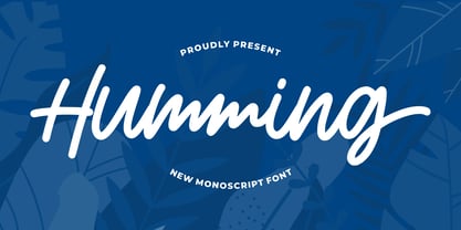 Humming is a naturally modern script, delivering a stylish look and is guaranteed to add an eye-catching appeal to your logo designs, brand imagery, quotes, product packaging, merchandise, social media posts, and more. - Simple installation - Work for Windows or MAC - PUA Encoded Open - Versatile for poster, logotype, labels, book cover - Supported for: Adobe Illustrator, Photoshop, Shillouette, Corel Draw, Indesign, and Procreate (updated)
 - Vincente by Dharma Type,
$19.99 Vincente is a contemporary but Didone-look serif with condensed proportion. Inspired by vintage iron works and antique botanical pictorial book. Very simple and orthodox letter forms with some charming accent such as can be seen in "y". Sophisticated curves but they have human warmth as if they are hand-crafted. Consists of six weights and supporting almost all latin languages.
 - Yokset by Dhan Studio,
$19.00 Yokset is a cool brush font because it is deliberately made with a little texture that looks natural and beautiful. It contains several ligatures and alternates which designers can use for any current or modern design. Yokset is suitable for use in title design, clothing, invitations, book tittles, stationery designs, quotes, branding, logos, greeting cards, t-shirts, packaging designs, posters and more.
 - Headstone by RagamKata,
$14.00 Headstone a classic blackletter typeface combining a modern and classic typography style, with a touch of retro style. A very suitable font to make your project look elegant with it’s rounded and bold shape. Headstone is very ideal for heading, flyers, posters, product packaging, book cover, printed quotes and many more. Enhance your work with Headstone to make your work more well-known!
 - The font named Black Metal G encapsulates the raw energy and unbridled aggression found in the black metal music genre. Designed to echo the visual aesthetics commonly associated with this style of m...
- Zubilo by ParaType,
$25.00 An informal decorative sans serif was designed by Gennady Fridman and released by ParaType in 2004. Based on informal lettering. In Russian 'Zubilo' means 'Cold cutter' or 'Chisel'. Colorful letterforms seems to be cut by an amateurish but strong hand used to operate with rough metal tools, not with pen or pencil. The face is good for use in advertisements, posters and headlines, especally for comic editions and youth press. Decorative styles were added in 2011 by the same author.
 - LTC Artscript by Lanston Type Co.,
$24.95 Artscript was Sol Hess's "attempt to convert into rigid metal the graceful penmanship of the ancient scribe". This type of script is more common in digital from but when originally released in 1948, it required special handling to avoid breakage. Extensive alternates were added based on original Hess drawings and additional sources. Both versions are combined into the Opentype version along with an expanded Central European character set as well as ligatures, Swash/Alternates, fractions, superior/inferior numerals and ornaments.
 - Office Visit JNL by Jeff Levine,
$29.00 Dan Hardie, a Miami-based graphic artist and creative consultant at Mutiny, Inc. shared an image he’d spotted online of some interesting signage formerly on the front of the Miami Medical Building. Comprised of hand-cut metal characters (with a thoroughly avant-garde “Art Deco meets Modernist” approach), this instantly became a font design idea unusual and quirky enough to develop as a digital typeface. The end result is Office Visit JNL, which is available in both regular and oblique versions.
 - Matricule 59 by designdefontes,
$24.00 Matricule 59 is a typeface whose design is inspired by license plates and by the deformations due to the stamping in the metal plates. These deformations give a very specific style, especially concerning the hairlines. It is the Ultra Condensed version of Matricule, a Typeface designed by Loïc Choquet. It consists of 4 fonts : Light, regular, bold and black. For Mac or PC. Well-suited for edition, logotypes, posters, etc. Each font contains 359 glyphs and supports up to 89 different languages.
 - Matricule 57 by designdefontes,
$24.00 Matricule 57 is a typeface whose design is inspired by license plates and by the deformations due to the stamping in the metal plates. These deformations give a very specific style, especially concerning the hairlines. It is the Condensed version of Matricule, a Typeface designed by Loïc Choquet. It consists of 4 fonts : Light, regular, bold and black. For Mac or PC. Well-suited for edition, logotypes, posters, etc. Each font contains 359 glyphs and supports up to 89 different languages.
 - Babble by Comicraft,
$19.00 Babble go gaga? Babble a liddle baba aba dittle boo-boo? Babble gotta Owie? Babble wanna see dada go bonk? See dada go WAAHHH?! Babble wanna bockle? Babble wanna see mama? Babble wanna have milky milky num-nums? Ahhh... Babble id soooooooo cuuuuuute! Dada and Mama love Babble. Big Hug, babble!
 - LTC Village by Lanston Type Co.,
$24.95 Village was originally designed by Frederic Goudy in 1903 for Kuppenheimer & Company for advertising use, but it was decided it would be too expensive to cast. It was later adopted as the house face for Goudy's Village Press. The design was very much influenced by William Morris's 'Golden' type. Paul Hunt began working on a digital version of Frederic Goudy's Village type prior coming to P22 in 2006 for an internship (which evolved into a staff designer position at P22.) Around this time, The Tampa Book Arts Studio was looking for a digital version of Village to complement with a letterpress edition of a book called "The Rich Mouse" by JJ Lankes. Many years later the Rich Mouse project has been completed, so we decided to release the Village type on the same day as the release of the Rich Mouse Book!
 - DiaBolo by Volcano Type,
$19.00 DiaBolo is the result of a few broken slide frames glued together. It is no problem to build any letter with a simple slide frame. DiaBolo is a digitally and organic font.
 - Beatnik by Type Innovations,
$39.00 I was working at Bozell Worldwide, an advertising agency, on their yearly promotional pitch. An art director was looking for a condensed informal headline treatment to be used on one of the new ad campaigns. I took several different font designs and started to condense and scale the proportions in the hopes of finding several good solutions. They finally settled on a version of Times Roman, scaled horizontally to about 50 percent proportions. I liked the look so much that I later went back to the drawing board and refined the concept by adding slanted serifs and a varying alignment on all the letter forms giving the typeface a very casual and informal appearance. At about that time, I was reading a book by Jack Kerouac, and was so inspired by his writings on the ‘beat generation’ that I decided to name the font ‘Beatnik’. Afterwards, I added a set of true small capitals and old style figures. I'm currently working on additional weights and variations to expand this ‘hip’ new font series. Groovin' baby.
 - Pythagoras by Factory738,
$15.00 Are you looking for a font that is both modern and classic? Look no further than Pythagoras, the contemporary serif font with 7 weights. This versatile font is perfect for a variety of projects, from logos to book covers. Its clean lines and elegant design make it an excellent choice for those who want to make a statement with their typography. So why settle for a boring font when you can have Pythagoras? 7 Weights Basic Latin A-Z and a-z Numerals & Punctuation Stylistic Ligatures and Alternate Glyphs Multilingual Support for ä ö ü Ä Ö Ü ... Free updates and feature additions Thanks for looking, and I hope you enjoy it.
 - Embrown by Nathatype,
$29.00 Ready to enhance your branding? Looking for that “something” that’ll make your audience go WOW and clients get on board immediately? Ready to enhance your branding? Looking for that “something” that’ll make your audience go WOW and clients get on board immediately? Embrown-A Playful Sans Serif Font Embrown is a typeface that is made all characters in uppercase. An excellent choice to add colorful touch. This typeface with cheerful style looks very interesting for loads of different projects and promotions. A great all-in-one package for your logo, book cover, poster, t-shirt, branding, and advertisement needs. Features: Ligatures Bonus Ornament PUA Encoded Numerals and Punctuation Thank you for downloading premium fonts from Nathatype
 - Tenky by Twinletter,
$13.00 Introducing “Tenky Font” – Embrace the Essence of Summer. Tenky Font embodies the spirit of summer in every stroke. With its refreshing summer theme, this font brings the warmth and vibrancy of the season into your creative projects. Whether you’re designing beach party flyers, tropical-themed banners, or anything under the sun, Tenky Font effortlessly captures attention and infuses your designs with the joyful essence of summer. Crafted with meticulous detail, Tenky Font radiates the energy and sunshine of the season, creating an immediate connection with your audience. Its versatility knows no bounds, making it a perfect fit for a wide range of applications, from vacation postcards to festival posters. Tenky Font elevates your text with its playful and breezy characters, giving your designs a carefree and inviting look. Plus, it supports various languages, ensuring it resonates with a global audience. Capture the essence of summer in your creative projects with Tenky Font. Explore this delightful typeface today and let your designs shine with the warmth and spirit of the season. – PUA Encoded Characters – Fully accessible without additional design software.
 - Bouquet by Serebryakov,
$39.00 Bouquet font is a cursive fat typeface influenced by brush writing and skilfully flavored with elements of fractur. The result is really amazing – a font with bespoke personality, strong unique presence and classy standing out amongst the other look. Type designer Dzianis Serabrakou really did well in every single letterform, aperture, curve and line, but this was probably below satisfactory and he didn’t stop here – Denis developed the font to a higher level by making it fully open-type compatible. Bouquet supports large set of multilingual diacritics plus a beautifully designed set of Cyrillic characters. Additionally you will be able to use also ligatures and really lots of alternative symbols to bring more life, versatility and personalization in your work. Initially Bouquet has been designed as a logo font – it is so identical that could easily turn every brand name into logo icon. Furthermore this font is perfect for designing t-shirts, typographic posters, packaging etc and it is highly recommended for letterpress as well as for normal offset and screen printing.
 - Meridiana Pro by Unio Creative Solutions,
$3.00 The concept behind Meridiana Pro was to create an amalgamation between a rounded sans and a monospaced font in order to obtain an extensive and usable variable type-system. This typeface encapsulates a symmetrical and balanced rhythm due to the unique blend of different sources of inspiration. Proportions are precisely adjusted with smooth contours and subtle contrasts. These forms give the font an eye-catching look without compromising elegance and minimalism, ensuring that each glyph will work well in any graphic design purpose. The focus was to create a versatile type family with range of alternates, ligatures, and symbols, including the extensive language support of most European languages. Meridiana Pro design space includes two axes, weight and italic and is available as a variable font or as a separate OpenType family, including weights from Thin to Heavy plus their obliques. Specifications: - Version included: Meridiana Pro Variable, Meridiana Pro Static - 8 weights with matching obliques - Multi-language support (Central, Eastern, Western European languages) - OpenType Features (Superscript and Subscript Numerals, Fractions, Ligatures, Alternates) Thanks for reading, Unio.
 - Wien Pro by Wannatype,
$36.00 Wien Pro, the sans serif by Ekke Wolf. Typeface lovers looking for a modern, well-developed sans serif font with a touch of retro and warm, individual lettering will get excited about a new addition to the font market. The more than complete Wien Pro front comes in three styles and four different weights. In addition to the upright Wien Pro there is the Wien Pro Oblique with a moderate 6° slant and the Wien Pro Superoblique with an 18° slant. Available weights are light, regular, medium, bold and black. These fonts are equipped with extended Latin alphabet for Central and Eastern Europe and also Cyrillic and Greek alphabet. The set of characters includes nine different sets of numbers, plus its own set for the small caps, as well as alternative characters and groovy ligatures. In addition, all Wien Pro styles are also available as unicase with upper case and lower case x-height alignment. The style, metrics and proportions of Wien Pro combine perfectly with the Liebelei Pro and the script fonts of the Calafati Pro.
 - Remeeq by Twinletter,
$17.00 Introducing Remeeq, the futuristic font that will take your designs to the next level! With 53 alternate characters for uppercase letters and 49 ligatures, this font offers endless possibilities for creating unique and futuristic designs. The sleek and modern design of this font is perfect for those looking to create designs that are cutting-edge and ahead of their time. Whether you’re designing for a sci-fi movie poster or a tech startup, Remeeq is the font that will make your designs stand out from the crowd. Plus, with multilingual support, you can use this font for projects in any language. Upgrade your design project with Remeeq and impress your audience with your futuristic and innovative designs. What’s Included : - File font - All glyphs Iso Latin 1 - Alternate, Ligature - Simple installations - We highly recommend using a program that supports OpenType features and Glyphs panels like many Adobe apps and Corel Draw so that you can see and access all Glyph variations. - PUA Encoded Characters – Fully accessible without additional design software. - Fonts include Multilingual support
 - Manual Marquee by Mix Fonts,
$13.00 When you need a handpainted sign, this is the one to use. Manual Marquee is inspired by handpainted signs, retro ticket stubs, coffee shop menu boards, and flea market price tags. The font has multilingual support, including not just basic letters and punctuation but also a whole slew of accented glyphs to accommodate all languages. It’s a clean handwritten sans serif that teeters the line between clean technical digital and rough handpainted letterforms. Whether you want a more rough and authentic look, or a cleaner and more polished one, Manual Marquee has got you covered. Plus, it’s easy to use in any design software, making it the perfect choice for both professional designers and hobbyists alike. So why settle for a plain and generic font when you can add a touch of personality and vintage charm to your designs with Manual Marquee. Get your hands on this one-of-a-kind font today and elevate your designs to the next level! Manual Marquee includes the following characters: ABCDEFGHIJKLMNOPQRSTUVWXYZ abcdefghijklmnopqrstuvwxyz 0123456789 !@#$%^&*()`~♥✿•· ÷×+−±≈=≠≥≤[]<>:;'”,.\|/?{}“”‘’-–—_ ‚„©®™‹›«»°¹²³¡¿₱¢€£¥¶§†´`ˆˇ˜¨˙˚˘¯˝˛¸- ÁÀÂÄȦÃÅĂĀĄÆĆĈČĊÇÐĐÉÈÊËĖĒĘḞǴĜǦḠĠĤȞḦḢIÍÌÎÏĪĮĴḰǨŁḾṀŃÑŇ ÓÒÔÖÕŌŐØŒṔṖŔŘṘŚŜŠŞȘŤṪȚÚÙÛÜŨŮŬŪŰŲẂẀŴẄẆÝŶŸŹẐŽŻƵ áàâäȧãåăāąæćĉčċçðđéèêëėēęḟǵĝǧḡġĥȟḧḣıíìîïīįĵḱǩłḿṁńñň óòôöõōőøœṕṗŕřṙśŝšşșťṫțúùûüũůŭūűųẃẁŵẅẇýŷÿźẑžżƶ
 - Argo Nova by Eliezer Grawe,
$- In Greek mythology, Argo was the ship on which Jason and the Argonauts sailed from Iolcos to Colchis to retrieve the Golden Fleece. The Argo Nova font is an adventure though geometric sans universe with a touch of humanistic feel, bringing a different look with curved vertical strokes and high contrast on thicker weights. Designed with OpenType features, it includes extended Latin support, fractions, tabular and old-style figures, ligatures and more. With no excess in mind, it came in 10 styles (5 uprights and is matching italics) and it is a font family ideal for text, branding, signage, editorial, print and web design creations. 5 weights: Thin, Light, Regular, Bold and Black Matching italics Lining and old-style figures with proportional and tabular spacing Ligatures on “f” Alternate characters for a, æ, g and ß Fractions Ordinals Extended language support, designed following the Underware Latin Plus character set, with 534 glyphs, supporting 219 Latin based languages (see https://underware.nl/latin_plus/languages/). * Some features require an application with OpenType support.
 - Bellwood Gothic by Breauhare,
$19.99 Bellwood Gothic™ is an unorthodox but happy pairing of upper and lowercases that breaks typographic rules: its capitals evoke traditional early 20th century styling and strength. Lowercase displays a softer, more warm and friendly flavor that points to a Bauhaus aesthetic. But for some strange reason they work so well together! Therein lies the mystique of this font. Overall it isn’t strictly uniform in stroke but shows some variation of color. The sofa poster includes a cameo appearance by breauhare’s own popular Daddy’s Hand™ font. Bellwood Gothic’s nostalgic flavor of the 1960s & 1970s still conveys a modern look that lends itself to sports, fashion, lifestyle and more. The wide track of the lettering helps short words easily fill spaces. Includes stylistic alternates for the lowercase a, e, & l (L), plus 13 uppercase letters! Among OpenType features are Stylistic Alternates, Stylistic Sets, Ligatures, Fractions, & Case-sensitive forms. Extended support for Western, Central, and Eastern European languages is included. Use it for headlines, subheads, branding, editorial, packaging, and logos!
 - FF Hertz by FontFont,
$68.99 Low stroke contrast, generous spacing, and fine-grained weights from Light to Extra Bold make FF Hertz a workhorse text typeface which holds up well under today’s widely varying output conditions from print to screen. The quite dark Book style works well on e-ink displays which usually tend to thin out letters, as well as in print when you want to evoke the solid letter image of the hot-metal type era. Two sizes of Small Caps are included: A larger size for abbreviations and acronyms, and a smaller size matching the height of the lowercase letters. FF Hertz is a uniwidth design, that means each letter occupies the same space in all weights. This feature allows the user to switch between weights (but not between Roman and Italic styles) without text reflow. Jens Kutilek began work on FF Hertz in 2012. From a drawing exercise on a low-resolution grid (a technique proposed by Tim Ahrens to avoid fiddling with details too early), it soon evolved into a bigger project combining a multitude of influences which up until that point had only been floating around in his head, including his mother’s 1970s typewriter with its wonderful numbers, Hermann Zapf’s Melior as well as his forgotten Mergenthaler Antiqua (an interpretation of the Modern genre), and old German cartographic lettering styles. Jens likes to imagine FF Hertz used in scientific books or for an edition of Lovecraftian horror stories.
 - P22 Brass Script by IHOF,
$39.95 P22 Brass Script is a new font from an old source. This script font was discovered in a booklet from Dornemann & Co. of Magdeburg Germany, circa 1910. The book was titled Messingschriften fur Handvergoldung, which roughly translates to “Brass types for hand foil stamping.” The mini catalog called this type simply “Script.” It has not been previously digitized or seen in standard metal type form. The antique specimen book featured most of the characters needed for a full alphabet, but a number of letters were not shown. Since no other examples of this style could be found, P22 enlisted the assistance of master calligrapher Michael Clark to draw the missing characters in the same style as the original. The style is very loosely based on the secretarial hands and reminiscent of “French Hand” with a very early 20th century, pre-modern feel. It has an unusual flow that is neither too casual nor too formal. The font would be useful for wedding invitations or packaging and advertising. P22 Brass Script Pro features include: automatic ligatures for common pairs such as ll, tt, qu and a variety of f ligatures, full CE language support including Turkish and Romanian and a variety of swash underscores for different length words that can be added manually in OpenType ready applications with the glyph palette or with the contextual alternates. The length of the word will automatically select the best length of swash for the work.
 - Cameta Cuttes by Gilar Studio,
$16.00 New Font : Cameta Cuttes - Beautiful Script Cameta Cuttes - Beautiful Script will work perfectly for fashion, e-commerce brands, trend blogs, wedding boutiques or any business that wants to appear upscale and chic. Cameta Cuttes - Beautiful Script also Suitable for Logo, greeting cards, quotes, posters, branding, name card, stationary, design title, blog header, art quote, typography, art, modern envelope lettering or book design, happening style like handdrawn design or watercolor design theme, craft design, book title, or any purpose to make your art/design project look pretty and trendy. Features : Uppercase & Lowercase Numerals & Punctuations (OpenType Standard) Accents/Multilingual characters PUA Encoded Ligature Stylistic Set Alternate Check my other Font here : https://gilarstudio.com/
 - Willmaster Calligraphia by Alcode,
$23.00 Willmaster Calligraphia is a classic yet modern script. It is particularly suitable for wedding media, book covers, greeting cards, logos, branding, business cards and certificates, in fact for any design work that requires a classic, formal or luxurious look. Try Willmaster Calligraphia, enjoy the richness of OpenType features and let her fun and elegant excitement make you happy and enhance your creativity! You can use this font very easily. Includes multilingual support and ornamental features. If you do not have programs that support OpenType features like Adobe Illustrator and CorelDraw X Versions, you can access all alternative flying machines using Font Book (Mac) or Character Map (Windows).
 - KiddieGrinder - Unknown license

- Retail Packaging JNL by Jeff Levine,
$29.00 The retail storage box for a vintage metal numbering stamp manufactured by the American Numbering Machine Company had its brand name hand lettered in an Art Nouveau style that most likely went back to the 1920s, as the company was in existence from 1908 to around 1971. Numbering machines were used in offices, schools, libraries, and anywhere a series of numbers needed to be marked onto printed items. Similar to what was called a ‘crash numberer’ used in letterpress shops, the machines could be set to do a run of digits [for example: 4000, 4001, 4002] or repeat numbers for forms used as carbon copies. As computers took over most forms of printing, the use of numbering machines dwindled, but they are still available. The American Numbering Machine Company was one of several Brooklyn, New York companies that specialized in the manufacture of these machines. Retail Packaging JNL replicates the lettering from their packaging, and is available in both regular and oblique versions.
 - Nameplate JNL by Jeff Levine,
$29.00 Two attractive cast metal door signs reading "Men" and "Ladies" from back in the Art Deco era inspired the idea for Nameplate JNL. The left parenthesis key starts the border decoration, and the right parenthesis key closes it off. Nameplate JNL has just a basic A-Z and numeral set; the letters "floating" within the parallel lines of the border to form complete nameplates, apartment numbers or any similarly encased words. A period, comma, apostrophe and dash are on their respective keys. A small blank space is on the left bracket key, a medium space is on the right bracket key and a large space is on the left brace key. There is a small, complete frame on the right brace key. For names such as "MacDonald" or "McIntyre", the small "ac" is on the colon key and the small "c" is on the semicolon key. No kerning has been applied in order to give the type more of an antique, "mechanically assembled" look.
 - Merc by Canada Type,
$24.95 Merc is a four-letter word that stops just one y short of Mercy. Merc is also the standard street abbreviation for mercenary, or a soldier for hire. Now that the global security business has become a two hundred billion dollar industry, we thought you would like to have your very own affordable merc. Knew you'd be pleased. Merc is based on an all-cap metal face called Agitator, designed by Wolfgang Eickhoff and published by Typoart in 1960. The rough brush letters look like they were made by someone who is capable of elegance but has no time for it. These are letters that live to catch the eyes and warn them loudly: Doom is here, and if you want it screamed out, this Merc is at your service. This font contains more than 460 glyphs, which means quite a few stylistic alternates and support for the majority of Latin languages.
 - VLNL Cleaver by VetteLetters,
$29.99 Chop chop! VLNL Cleaver is an important tool in the Vette Letters’ kitchen. It’s a butcher knife of a font. Razor sharp, ultra heavy and with pointy slanted serifs. At first glance it seems straight-lined, but a closer look revails that all straight lines are curved inward slightly, which enhances the sharp image even more. Cleaver was originally designed by DBXL for cutting meat - hell, it even hacks right through bone. It can easily splice a chicken in one slash or seperate ribs, just like that. You can also very well use it to chop up hard vegetables like pumpkin or squash on the chopping block. It gets better, the opposite blunt side can be deployed to crush ingredients like garlic, nuts or spices like black pepper. You could use a grinder, but with Cleaver it’s more fun, isn’t it? VLNL Cleaver is suitable to give a sharp edge to flyers, posters, logos (Heavy metal bands and other) or magazine headlines.
 - Palatino Sans Informal by Linotype,
$29.99 Palatino Sans Informal was designed as part of a group of three font families: Palatino nova, Palatino Sans, and Palatino Sans Informal. Together these three families act as the fulfilment of Herman Zapf’s original Palatino idea. Palatino, which was born as a metal typeface in 1950, proved to be one of the 20th Century’s most popular designs. Not only is Palatino Sans Informal a completely new typeface, it is also a completely new interpretation of the entire sans serif genre. Its letterforms are curved, rounded, and soft, not hard and industrial. In comparison with Palatino Sans, Palatino Sans Informal offers eccentricities that are somewhat artistic and more individual looking. The fonts in the Palatino Sans Informal family include several OpenType features, such as an extended character set covering all Latin-based European languages, old style figures, small caps, fractions, ordinals, ligatures, alternates, and ornaments. Palatino Sans Informal can be mixed well with Palatino and Palatino Sans.
 - Zephyrus Cyber by Ferry Ardana Putra,
$19.00 Introducing Zephyrus, our new condensed modern cyber font that's designed to take your designs to the next level! With its unique condensed squared feel, this font is perfect for anyone looking to add a modern and futuristic touch to their work. But we didn't stop there - we've also included a rounded version of Zephyrus, which softens the edges and provides a more approachable feel. This versatility means that you can use Zephyrus for a wide range of design projects, from logos and branding to websites and digital presentations. In addition, Zephyrus comes equipped with numerals, symbols, punctuation, and foreign language support, making it a versatile and functional font that's suitable for global projects. Whether you're creating a tech-based project or looking to add a futuristic touch to your branding, Zephyrus has you covered. Zephyrus is a great font for modern and futuristic designs. Its unique condensed squared feel and rounded version make it a versatile choice for a wide range of design applications. Here are some perfect use cases for Zephyrus font: Technology-based websites and apps: Zephyrus is an excellent choice for designing websites and apps that focus on technology and innovation. Its modern and futuristic design complements the content of these websites and apps and creates an atmosphere of innovation. Corporate branding: Zephyrus can be used to create a modern and innovative corporate branding identity for companies in the technology and innovation sectors. It is perfect for creating logos, letterheads, business cards, and other branded materials. Advertising campaigns: Zephyrus is perfect for advertising campaigns that require a futuristic or high-tech look and feel. It can be used in print ads, online ads, and other promotional materials to create a sense of innovation and modernity. Product packaging: Zephyrus can be used to create packaging designs for technology-based products. Its modern and futuristic design can help these products stand out on shelves and create an impression of innovation and quality. Presentations: Zephyrus is a great choice for creating compelling and modern presentations. Its unique design can add an element of creativity and innovation to your presentations and help you stand out from the competition. Video game design: Zephyrus can be used to create a video game design that requires a futuristic or cyberpunk style. Its unique design can help create an immersive gaming experience for players. In conclusion, Zephyrus is the perfect choice for anyone looking for a condensed modern cyber font that's both versatile and functional. With its squared feel, rounded version, and support for numerals, symbols, punctuation, and foreign languages, Zephyrus is a font that's sure to take your designs to the next level! Zephyrus features: A full set of uppercase Numbers and punctuation Multilingual language support PUA Encoded Characters OpenType Features Cyber Style +278 Total Glyphs ⚠️To enable the OpenType Stylistic alternates, you need a program that supports OpenType features such as Adobe Illustrator CS, Adobe InDesign & CorelDraw X6-X7, Microsoft Word 2010, or later versions. There are additional ways to access alternates/swashes, using Character Map (Windows), Nexus Font (Windows), Font Book (Mac) or a software program such as Pop Char (for Windows and Mac). ⚠️For more information about accessing alternatives, you can see this link: http://adobe.ly/1m1fn4Y ——— 🔑Important tutorial from the author: Tutorial for Mollusca font trio: https://lnkd.in/d984CQD6 How to use Midway | Retro Script Font on illustrator: https://lnkd.in/eusbZd7s How to use Midway | Retro Script Font on Photoshop: https://lnkd.in/evsYrwgs How to use Hellfire Flames | Death Metal Font on Photoshop: https://www.youtube.com/watch?v=Z0MSBYzl9EM&t=35s How to use Rusted Sabbath | Black Metal Font Font on Photoshop: https://www.youtube.com/watch?v=_BTTgnSszsM&t=6s How to use Black Dread | Death Metal Font on Photoshop: https://www.youtube.com/watch?v=cKoSvIEbdZ4 ——— 🔥 Thank you for purchasing our product, hope you like it and have fun with our product. If you have any queries, questions, or issues, please don't hesitate to contact us directly. If you are satisfied with our product, please give 5 stars rating. ——— Happy Designing...😊
 - Renault MN - Unknown license

- FF Real Text by FontFont,
$50.99 FF Real is a convincing re-interpretation of the German grotesque style from between 1998 and 1908, but with much more warmth and improved legibility as well as a hint towards the warmer American grotesques. Later on, not just slanted styles, but a “proper” italic version was added inspired by the way Roman and Italic are distinguished in traditional serif faces. NEW: a specially created set of obliques were added in 2018 to give designers more design flexibility, for those looking for a less calligraphic look. In 2020 the family was extended with matching condensed weights. FF Real was originally conceived by Erik Spiekermann as one text weight and one headline weight to be used as the only faces in his biography ‘Hello I am Erik’, edited by Johannes Erler, published in 2014. While Spiekermann drew the alphabets, he passed on the font data to Ralph du Carrois and Anja Meiners who cleaned it up and completed it. In the meantime, FF Real has been extended to a family of two styles and 65 weights each. The design of FF Real is rooted in early static grotesques from the turn of the century. Several German type foundries – among them the Berlin-based foundries Theinhardt and H. Berthold AG – released such designs between 1898 and 1908. The semi-bold weight of a poster-size typeface that was lighter than most of the according semi-bolds in metal type at the time, gave the impetus to FF Real’s regular weight. In the words of Spiekermann, the historical example is “the real, non-fake version, as it were, the royal sans serif face“, thus giving his new typeface the name “Real” (which is also in keeping with his four-letter names, i.e. FF Meta, FF Unit). FF Real is a convincing re-interpretation of the German grotesque style, but with much more warmth and improved legibility. With a hint towards the warmer American grotesques, Spiekermann added those typical Anglo-American features such as a three-story ‘g’ and an ‘8’ with a more defined loop. To better distinguish characters in small text sizes, FF Real Text comes in old style figures, ‘f’ and ‘t’ are wider, the capital ‘I’ is equipped with serifs, as is the lowercase ‘l’. What’s more, i-dots and all punctuation are round.

