10,000 search results
(0.027 seconds)
- Fairbank by Monotype,
$29.99Monotype Bembo is generally regarded as one of the most handsome revivals of Aldus Manutius' 15th century roman type, but the original had no italic counterpart. The story is told that Stanley Morison commissioned Alfred Fairbank, a renowned calligrapher, to create the first italic for Bembo, which was released as metal fonts in 1929. Alfred Fairbank, however, claimed that he drew the design as an independent project and then sold his drawings to Monotype. According to him, the statement has been made that I was asked to design an italic for the Bembo roman. This is not so. Had the request been made, the italic type produced would have been different." Whichever version you believe, it was obvious that Fairbank's design - while undeniably beautiful - was not harmonious with Bembo roman. A second, more conventional italic was eventually drawn and added to the Bembo family. Fairbank's first design, which was based on the work of sixteenth-century writing master Ludovico degli Arrighi, managed to have a modest life of its own as a standalone font of metal type. It never made the leap into phototype fonts, however, and the face could have been lost, were it not for Robin Nicholas, Monotype Imaging's Head of Typography in the United Kingdom, and Carl Crossgrove, a senior designer for Monotype Imaging in the US. Nicholas and Crossgrove used the original drawings for Fairbank as the starting point for a new digital design, but this was only the beginning. They improved spacing, added subtle kerning and optimized the design for digital imaging. In addition, Nicholas created an alternative set of lowercase letters, fancy and swash capitals and enough alternate characters to personalize virtually any design project. By the time his work was complete, Nicholas and Crossgrove had created a small type family that included Fairbank, a revived version of the earlier metal font, and Fairbank Chancery, a more calligraphic rendition of the design. An additional suite of ornate caps, elegant ligatures, and beginning and ending letters accompanies both fonts, as does a full complement of lowercase swash characters. Now, instead of a failed Bembo italic, Fairbank emerges in its true glory: a sumptuous, elegant design that will lend a note of grace to holiday greetings, invitations, and any application where its Italianate beauty is called for." - Rejoicingly by Get Studio,
$15.00 Rejoicingly is a sweet marker handwritten font. It comes with unique lower and uppercase plus numbers, punctuation & multilingual letters.
 - GG Dingbats by Gerald Gallo,
$20.00 Contains an assortment of ornaments from the other Gerald Gallo ornament fonts plus additional unique ornaments totaling 182 ornaments.
 - Angars Runes by Mans Greback,
$59.00 Angars Runes is a Middle Age style rune typeface. With engraved letterforms and gothic curves, this font is the perfect addition to a medieval project. The font was drawn and created by Måns Grebäck in 2019. Use the symbols plus + period . multiply × colon : for decorative separators. Angars Runes contains all characters you will ever need, as well as numerals and alternate letters. This is a font with multilingual support.
 - Inflex by Monotype,
$29.99 Released by the Monotype Corporation around 1932, Inflex Bold is a Scotch Roman fat face design similar to many others popular in the nineteenth century. A high-contrast bold roman, Inflex Bold is good for informal display work when used sparingly.
 - Barbou by Besnowed,
$19.99 Barbou was originally cut in 1925 by Monotype as a counterpart to Fournier, siblings that were different in design but both based on the work of Pierre-Simon Fournier. Whether by choice, accident or oversight, Fournier was preserved digitally, and Barbou was lost to history. Barbou was notably used by Stanley Morrison, in particular as the face of The Fleuron. I fell in love with Barbou when I saw it, and knew that I wanted to bring it to a new generation of designers and readers. This is a revival of Barbou, a faithful recutting with new weights, characters and many of the best features that modern font technology brings. Particular attention was paid to the original Monotype Barbou 178 specimen sheet. Originally only available in a single weight, Barbou has been recut with a variable weight, providing a large degree of flexibility between Regular and Bold. Barbou excels as a comfortable reading face for books, and the variable weight allows you to fine tune the darkness and texture of the page in a way never before possible. Barbou has a distinctive softness, and this revival of Barbou preserves much of the effect the medium of metal type had on the letterforms. This results in a subtly rounded yet defined type, elegant not worn, with the utmost attention and respect to the smallest of details. Barbou was originally cut with disparate x-heights for roman and italic, and this revival of Barbou features both the original italic, as well as a new italic redesigned at the same height as the roman. In Fournier’s time, roman and italic would not be mixed on the same line, but the type must change to meet the needs of a new generation. Barbou also features unique ligatures and alternates, old style numbers, small caps and a full Greek alphabet. Barbou is perfect for books and anywhere a comfortable reading face is required, and excels in flexibility.
 - Phlebodium by Fat Hamster,
$20.00 Phlebodium - geometric sans serif typeface, 16 fonts Phlebodium is a modern geometric sans serif font family. Nostalgic, soft and playful font in 80s 90s 2000s techno rave style. BONUS: vector cannabis / hemp leaf, sunflower, mushroom / fungus, meat, unicorn, heart, pizza, hot dog, sun, phlebodium, clover, dog, cat, bear, sun character mascot illustrations and t-shirt designs Phlebodium type family available in 16 styles. 8 Italics 4 weights: Thin, Regular, Medium and Bold 2 widths: Normal and Condensed This bold typeface is ideal for use in display sizes. Perfect for headlines and logos, text blocks, any type of graphic design, printing, t-shirts, posters, branding, web and applications, social media and many more Phlebodium typeface contains 4 weights, normal, condensed and italic styles
 - Big Fish DD by Doffdog,
$14.00 Big Fish DD is a decorative, metal and punk rock music inspired font. It is perfect for: Logos Posters Headlines Apparel Music covers & more Stay true! Stay metal!
 - Gorezack Blackmetal by Madhaline Studio,
$34.00 We RECOMMEND that you purchase both of these fonts to get the look like in the font preview image. Tutorials: https://www.youtube.com/@madhalinestudio Gorezack is a carefully crafted font, which features a very heavy black metal feel. Gorezack suitable for metal band logos, merchandise, clothing, apparel, or anything that needs a black metal feel
 - Gorecobra Blackmetal by Madhaline Studio,
$34.00 We RECOMMEND that you purchase both of these fonts to get the look like in the font preview image. Tutorials: https://www.youtube.com/@madhalinestudio Gorecobra is a carefully crafted font, which features a very heavy black metal feel. Gorecobra suitable for metal band logos, merchandise, clothing, apparel, or anything that needs a black metal feel.
 - Snoserose Blackmetal by Madhaline Studio,
$34.00 We RECOMMEND that you purchase both of these fonts to get the look like in the font preview image. Tutorial : https://www.youtube.com/@madhalinestudio Snoserose is a carefully crafted font, which features a very heavy black metal feel. Snoserose suitable for metal band logos, merchandise, clothing, apparel, or anything that needs a black metal feel.
 - Lapidary Capitals by Kostic,
$20.00 Based on Roman lapidary writing from 2nd century BC.
 - Blue Island by Adobe,
$29.00British designer Jeremy Tankard began Blue Island in 1996 with the idea of creating a completely ligature-based roman typeface, an original but complex task that took years to realize. Individually, Blue Island's letters can appear a bit dismembered, but when set together, they are clearly transformed into words which fall in waves down the page. Successfully balancing readability with intriguing decorative forms, Blue Island is especially effective for titling. As for its romantic name, Blue Island is the title of a poem, also by Tankard, which evokes notions of freedom, escape, intrigue, and the undulating beauty of the sea. - Majadira by Attype Studio,
$14.00 Introducing Majadira Font - a beautiful digital font that comes in two versions, Regular and Extrude. When combined, these two fonts give a 3D-like appearance to your designs. With its stylistic alternates, Majadira Font is visually appealing and perfect for wedding designs and Valentine's Day themes. Create stunning invitations, posters, and banners with this elegant font. Whether you're designing for a romantic event or just looking for a stylish touch, Majadira Font is the perfect choice. Features : - Majadira Font Family - Stylistic Alternates - Multilingual, US Roman, Latin 1 Support Hope you enjoy with our font! Attype Studio
 - Drawn by WingBuk Studio,
$25.00 Drawn is a heavy metal font made with a touch of darkness, featuring a heavy metal feel to compliment your design. Drawn is very easy to use in any variation or writing combination, also perfect for metal band logos, merchandise, clothing, apparel, or anything else that calls for a heavy metal feel. Here is video Tutorial how to use it on Adobe Photoshop, Adobe Illustrator, and CorelDRAW https://youtu.be/rGfSWmztRT0 Recomended Software to use: Corel Draw Adobe Photoshop Adobe Illustrator Clip Studio Paint
 - 2009 Primitive by GLC,
$38.00 This is not an historically accurate font but rather one intended capture the spirit of ancient Roman manual type. It was inspired by various patterns used in documents and books created by Latin scribes between the second and fourth centuries. They used either calamus and ink on papyrus, or a pointed metal stick on wax tablets. We have created the font for contemporary use; distinguishing between U and V, I and J, which had no meaning for ancient Latin scribes, and adding thorn, Oslash, Lslash, W, Y and common accented characters that did not exist at the time. A lot of titlings and contextual alternates complete the set. Available only in TTF and OTF format.
 - Mecanica by Type Innovations,
$39.00 Mecanica is an original design by Alex Kaczun. It is a display font not intended for text use. It was designed specifically for display headlines, logotype, branding and similar applications. The entire font has an original look which is strong, dynamic, machine generated and can be widely used in publications and advertising. Mecanica is a futuristic, techno-looking and expressive typeface with an appearance of metal-like parts with some very sharp edges. This attractive display comes in roman with lower case and lining figures. The font also is available with true-drawn slant italics. Other design style variations include Swash as well as Ornamental Italic Capitals along with a few Ornamental Symbols to embellish and enhance the possibilities.
 - Phantom Lord by Subversive Type,
$13.00 Inspired by thrash metal band logos. Ideal for creating a sense of speed and aggression to any project. Ideal for metal bands, graphic novels, action films and video games.
 - Inox by Intellecta Design,
$24.95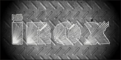 Metal surface font.
 - Caesar - Unknown license

- Magellan by Monotype,
$29.99The Magellan font family is a roman in the Swedish Grace tradition. And since the Swedish language has long words, Magellan is a bit narrower than most romans. Magellan was an honorable prize winner in the Morisawa (Japan) international typeface design competition 1993. - P22 Latimer by IHOF,
$24.95 Latimer is one of a series exploring a fusion of Roman and Gothic forms. Characteristics of each genre can be seen: the fluid tapering serifs and rounded shapes of the Roman form, contrasted with the angular diamond and hexagonal shapes of Gothic.
 - Rahere Esoteric by ULGA Type,
$25.00 Rahere Esoteric is a gothic-flavoured, quasi-Roman display font with an eccentric persona and more quirks than a Tim Burton film. A member of the extended Rahere typeface family, it’s the enigmatic cousin of Rahere Roman Display & Rahere Sans. This is a niche display font that doesn’t try to please everyone. Rahere Esoteric revels in its mystical aura, using a bewildering array of ligatures to magically transmute itself as characters loop, curl, jerk and strut, randomly connecting and disconnecting into words like a retro-futuristic steam train clattering along a disused railway track, challenging and delighting the reader at the same time. To add more sparkle, there are alternatives, inferior and superior caps plus a [Wicca] basketful of symbols, ornaments, weird faces and even a snake-infused ampersand. Whilst Rahere Esoteric has been designed primarily as an all-caps font, the lowercase slots contain small caps with corresponding numerals. However, because this is an arcane, unpredictable font, order and regularity are frowned upon, which means there are no tabular numerals – so company reports or accounts are a solid no! Unless they’re for the Golden Circle of Alchemists PLC or Gothic Blackstar Corporation. It is ideal for all things pagan, esoteric, alchemy, other-worldly or magic-related projects and particularly useful for music genres across the Gothic / Darkwave / Ethereal spectrum. What about legibility? Hey, look into my eyes: Esoteric is all about the mystique. If a secondary font is needed for the important stuff, I recommend its cousin, Rahere Sans, which pairs beautifully with this display font and is perfect for long passages or small text. The initial idea for Rahere Esoteric came about during a visit to Whitby, a small coastal town in Yorkshire, UK and famous for its inclusion in Bram Stoker’s novel, Dracula. A Steampunk festival was in full swing and the narrow streets of the town centre were teeming with people adorned in a glorious fusion of clothing and accessories influenced by a love of 19th-century life, science fiction, horror, fashion and art. I was fascinated by the juxtapositions of colour, patterns, material and style – archaic mechanical Sci-fi, gothic, the American Wild West and romantic Victorian. But what intrigued me the most, somehow, all the disparate elements worked as a whole. Thus, like Frankenstein, this font jolted into existence. Supported languages include Western Europe, Vietnamese, Central/Eastern Europe, Baltic, Turkish and Romanian.
 - Rose Thorns by Putracetol,
$35.00 Introducing Rose Thorns - A Deathmetal Font. This font is inspired by underground and metal music band logostyle. There are ligature character in this font, which makes this font even super cool. Rose Thorns is suitable for death metal music, underground, hardcore music, blackletter, death metal logo design, clothing, logos, music covers, posters or other designs with the theme deathmetal.
 - Sabersong Blackmetal by Madhaline Studio,
$34.00 We RECOMMEND that you purchase both of these fonts to get the look like in the font preview image. Tutorials Photoshop: https://youtu.be/qfUNZr0m4n8 Procreate: https://youtu.be/R_5O_pfPBIY Sabersong is a carefully crafted font, which features a very heavy black metal feel. Sabersong suitable for metal band logos, merchandise, clothing, apparel, or anything that needs a black metal feel.
 - Maskneyes by Madhaline Studio,
$34.00 We RECOMMEND that you purchase both of these fonts to get the look like in the font preview image. Youtube Tutorials : https://www.youtube.com/@madhalinestudio Mask n eyes is a carefully crafted font, which features a very heavy black metal feel. Mask n eyes suitable for metal band logos, merchandise, clothing, apparel, or anything that needs a black metal feel.
 - Divert by Little Fonts,
$15.00 Based on the outline of each character, Divert works by re-directing each outline as a single meandering stroke that moves back and forth to create a quirky yet clean typeface. The typeface contains an uppercase character set plus two lowercase character sets (one standard and one alternate) and two sets of numerals. Plus all punctuation and basic latin European accents. See glyphs for full character set.
 - Lancea by Asenbayu,
$15.00 Lancea is a fancy sharp serif font. Inspired by medieval roman writing combined with the sharpness of a lance, Lancea is packaged in a font that has sharpness in each letter with an elegant shape that has a strong appeal. Lancea also gives it a sophisticated feel with a sleek and clean serif shape. Lancea typography can help you complete various projects such as luxury brand logos, journals, business cards, headline, products, social media posts, web, etc. There is a decorative alternative style feature for uppercase letters. If you are involved in a project that requires fancy and professional writing, Lancea is perfect to assist you in completing it. Thank you!
 - LTC Forum Title by Lanston Type Co.,
$24.95 Forum Title was originally designed by Frederic Goudy in 1911. It was intended to be the heading font used for a book set in Kennerley. Based on inscriptional Roman stone cut capitals, this face is true to the early Roman forms which did not have a lower case. Forum exemplifies the classic Roman letterform at its finest. If a lower case were desired, Forum Title can be paired with Goudy Oldstyle for a harmonious hybrid font.
 - Salvatore by W Type Foundry,
$25.00 Salvatore is the neo-grotesque younger brother of Nutmeg type family. It comes with 36 weights that have been separated in two flavours. The first half is Salvatore normal, which has more neutral features; and the second one is Salvatore Roman, which has more versatility at the end of the characters. The name comes from the Mad Men character Salvatore Romano, who was a publisher in the mid 60s. In that period, grotesques typefaces ruled advertising, nevertheless, there wasn't a typeface that represented publishers as Salvatore Romano, that’s why we gave birth to this project. Designed with powerful OpenType features in mind, each weight includes alternate characters, ligatures, fractions, special numbers, arrows, extended language support and many more… Perfectly suited for graphic design and any display/text use. The 36 fonts are the first part of a larger Salvatore family. We’re proud to introduce: Salvatore.
 - AJ Quadrata by Adam Jagosz,
$25.00 Once, Blackletter was a calligraphy style. Full of ligatures, with letters bumping into each other to create an unapologetic picket-fence pattern. Some even claimed that the regularity improved legibility! But then Blackletter was cast into metal, and only a handful of established ligatures survived, while most interletter connections were disentangled. Everyone since followed suit, and hundreds of years later, digital Blackletter fonts were modelled mostly on the metal fonts that prevailed rather than the original handwriting. Up until now! AJ Quadrata is an authentic revival of the textura quadrata hand, and its major inspiration is a 15th-century Latin manuscript of the Bible from Zwolle, the Netherlands. The typeface is delivered in two flavors. The default cut is a modern take on textura quadrata that can be useful for today and tomorrow. The standard ligatures feature employs nearly all letters. The tittle of i retains its original, hasty squiggle form (except for the Turkish localization). Discretionary ligatures include medieval ligatures da, de, do, pa, pe, po (and their mixed-case counterparts!). Stylistic sets allow to use historic letter variants such as long s and rotunda r, closed-counter a, and alternate capitals. AJ Quadrata Medieval is perfect for setting Latin. Default forms of capital F, H and O are swapped with the alternates. The squiggles above i only appear for disamibiguation nearby m, n or u, as in original manuscripts. Discretionary ligatures and historic variants are promoted to the standard ligatures feature to make room in the discretionary ligatures feature for a variety of scribal abbreviations. Dedicated stylistic sets include medieval punctuation and justification alternates — glyphs with elongated terminals used for lengthening lines that end up too short. The Rubrum styles can be layered and colored to create the illuminated effect on the capital letters. Besides a faithful rendition of extended Latin including Vietnamese, numerous synthetic additions are included: polytonic Greek, Armenian, and Cyrillic (with Bulgarian and Serbian/Macedonian localizations). Both flavors of the typeface can be considered a starting point that can be further customized using OpenType features, including Stylistic Sets (some features differ between AJ Quadrata and AJ Quadrata Medieval): ss01 Alt E ss02 Descending F / Roman F ss03 Uncial H / Roman H ss04 Angular O / Round O ss05 Contextual closed-counter a ss06 Diamond-dot i j / Always dotted i, j ss07 Contextual rotunda r / No r rotunda ss08 Contextual long s / No long s ss09 Dotless y ss10 Serbian Cyrillic ss11 Alt Cyrillic de ss12 Alt Cyrillic zhe ss13 Alt Cyrillic sha ss14-ss17 [reserved for future use] ss18 Scribal punctuation ss19 Alt linking hyphen ss20 Justification alternates
 - Basic Sans Narrow by Latinotype,
$29.00 Basic Sans Narrow is a narrower version of Basic Sans. It is a family of Grotesque features with a functional, neutral and seeming clean style that looks to keep a neutral (or basic) appearance on paper, but including lots of details that give it a unique personality. Basic Sans Narrow is a sans-serif typeface well-suited for publishing projects, medium-sized text, branding, posters, headlines and more! This font family comes in 7 weights—ranging from Thin to Black—plus matching italics and it has a set of 416 characters that support 206 different languages.
 - Daphne by Ahmet Altun,
$20.00 In the beginning, this font had been designed for an affiche work as wood pattern which includes one font and medium weight. The stylish design of this font had been inclined us to create more weights and more styles. Daphne Font Family comes in three weights; normal and italic. Plus two additional styles which are wood pattern and shadow. You can get great wood pattern results with Daphne Font Family; also with colored shadows, you can get gorgeous results in poster works and t-shirt prints. Even in very small type sizes, it can be legible.
 - Empyrean by Greater Albion Typefounders,
$16.00 Empyrean is a display Roman typeface which sets out to be deliberately different. Its letterforms explore white space and the art of leaving things out. Empyrean is a futuristic Roman design which builds in respect for typographic tradition with an exploration of design possibilities.
 - Jatina Script - Personal use only

- Luvya Babe - Personal use only

- Anastasia - Unknown license

- Old Script - Unknown license

- Burdigala X Sans by Asgeir Pedersen,
$24.99 Burdigala X Sans is an open and spacious typeface, ideal for larger amounts of (printed) texts in brochures, magazines and books. Being wider than usual, it works especially well in media intended for on-screen reading, such as in Pdf-documents, e-books, applications and so on. Burdigala is the ancient Roman name of the city of Bordeaux France.
 - Woof by Outside the Line,
$19.00 Woof! A font full of the best-loved dogs plus one mutt. Distinct lines convey the character and heart of each breed.


