10,000 search results
(0.026 seconds)
- Pretty Berelly by MJB Letters,
$17.00 Pretty Berelly is a beautiful and cursive script font. It has a lively, elegant and modern look that can be used for logos, branding, invitations, stationery, wedding designs, social media posts, and much more!
 - Black Wednesday by Lemon Studio Type,
$20.00 Black Wednesday is a bold serif typeface in modern and classy style. OpenType features include more Alternative character sets. Black Wednesday is ideal for headlines, headers, logos, labels, packaging, postcards, presentations, magazines, invitations, etc.
 - Sangkury by Stringlabs Creative Studio,
$29.00 Sangkury is a unique display font. It features a spooky feel that makes it perfect for any project that requires a horror-themed. Use it for movies, flyers, posters, Halloween’s craftings and much more!
 - Christmas Celebration by Yoga Letter,
$14.00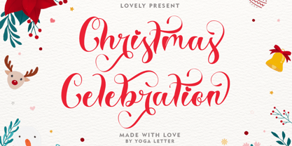 "Christmas Celebration" is a beautiful and unique handwritten font. This font features uppercase, lowercase, lowercase alternative, swashes, titling, multilingual support, binders, numbers, and punctuation. great for Christmas, weddings, invitations, promotions, social media, and more.
 - Equalizer by Negara Studio,
$17.00 EQUALIZER is a bold font. The capitals have a set of alternates that can be used to give more personality when needed. EQUALIZER is great for display projects such as packaging, posters and branding.
 - Ballestro by Rex Face,
$19.99 Ballestro is a playful, versatile display font. Its name is a nod to the characters being constructed using a grid-like pattern of balls. Ballestro is great for headlines, signage, logos, packaging and more.
 - Keanu by Soares,
$25.99 Keanu is a display sans serif square typeface, with a strong visual impact. Defined by its dramatic squaring with curved strokes, this typeface is perfect for headings, signage systems, interface designs, branding and more.
 - Astylooms by Maulana Creative,
$14.00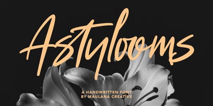 Give your designs an authentic brush handcrafted feel. "Astylooms Handwritten Brush Font" is perfectly suited to signature, stationery, logo, typography quotes, magazine or book cover, website header, flyer, clothing, branding, packaging design and more.
 - Summer Fable by Seemly Fonts,
$14.00 Summer Fable is a brand new display font. Summer Fable is perfectly suited for stationery, logos, t-shirt, paper, print design, website headers, photo frames, flyers, music covers, posters, image sliders, and much more.
 - Fringio by Rex Face,
$19.99 Fringio is a fun-loving sans-serif display font. Key characters are formed with curved, flowing lines, resulting in some pleasing word forms. Fringio is great for branding, headlines, signage, social media and more.
 - Grimly Fiendish by Comicraft,
$19.00 Twas brillig and the slithy toves did gyre and gimble in the wabe. All mimsy were the borogoves and the mome raths outgrabe. Nuff Said! Features: Two weights (Regular & Bold) with alternate uppercase characters.
 - Sunday Mood by DRM Works,
$9.99 Sunday Mood is a beautiful new modern monoline script font that suits for watermark, branding, logo, invitations, stationery, wedding designs, social media posts, advertisements, product packaging, product designs, labels, photography, special events, and more.
 - Aahill by Khurasan,
$10.00 Introducing Aahill Typeface - a font that is very fresh and unique style handmade. Aahill Signature Typeface is perfectly suited to logo, stationery, poster, apparel, branding, wedding invitation, card, tagline, layout design, and much more !!
 - Shine Glitter by Skinny Type,
$15.00 Shine Glitter is a handwritten font with a modern calligraphy feel. Shine Glitter is perfect for modern projects, titles, blogs, logos, branding, invitations and more! Accent characters are included at this time. Thank you!
 - Tralee by Tanincreate,
$12.00 Tralee Font family consist of 2 styles, regular with outline and bold filled with background colour. Originally designed for packaging typography, also would be suitable for titles, headlines, greeting cards, adverts, books and more.
 - Splinter2 - Personal use only

- Swollen - Unknown license

- Signatires by Din Studio,
$29.00 Are you looking for a unique signature font to show your style? We have the right signature font for you. This is the Signatires, our signature font to help you create a visually amazing signature. This font is carefully designed to express elegant, dazzling characters which also helps you deliver your messages easily. Signatires’ contrast is high with swinging end wipes. Furthermore, its legibility is so great that it is suitable to apply for any text sizes. You can enjoy the available features here as well. Features: Stylistic Sets Ligatures Multilingual Supports PUA Encoded Numerals and Punctuations Signatires fits best for various design projects, such as brandings, posters, banners, greeting cards, magazine covers, quotes, printed products, merchandise, social media, etc. Find out more ways to use this font by taking a look at the font preview. Thanks for purchasing our fonts. Hopefully, you have a great time using our font. Feel free to contact us anytime for further information or when you have trouble with the font. Thanks a lot and happy designing.
 - PF DIN Mono by Parachute,
$45.00 PF DIN Mono is the latest addition to the ever-growing set of DIN super-families by Parachute. It was based on its proportional counterpart DIN Text Pro but was completely redesigned to reflect its new identity. DIN Mono is a monospace typeface which is comprised of characters with fixed width. Traditionally, monospaced fonts have been used to create forms, tables and documents that require exact text line lengths and precise character alignment. DIN Mono, on the other hand, can prove to be more than a useful typeface for technical applications. In the world of proportionality, DIN Mono stands out as a fresh new alternative to the popular standard, particularly for publishing and branding applications. Additional care was given to the aesthetic form and its pleasing characteristics. The spacing attributes of the glyphs were redefined and legibility was further improved by revising or changing the shape of the letterforms. Furthermore, kerning was not included in order to preserve the monospace nature of this typeface. The family consists of 12 weights including true-italics. Currently, it supports Latin, Eastern European, Turkish and Baltic.
 - Nostalgia by Resistenza,
$39.00 Say Hello to Nostalgia! A Modern Font with a retro feeling 3 Fonts Regular, Effect and Flowers Go back in time and travel through the magazines and graphics from the fabulous 1970´s. Different serif typefaces, rounded and bold were the big focus to add a spark of life and modernity to the products. Nostalgia is our contemporary interpretation of this beautiful collection of fonts. Our aim is to draw the positive mood of these nostalgic letterforms with softened edges and rounded terminations, to evoke a fresh and contemporary view on this graphic approach. An extended set of alternates & swashes specially designed to create stylish lettering compositions have been included. You can Access your OpenType features and discover all the possibilities. Combining the glyphs with "Nostalgia Icons" as well as changes of color you'll feel the magic. This endless collection of flowers and decorative forms will boost the vintage mood to any project. The result is a very versatile font that works in a wide range request, from logos, headlines, branding, magazine design to wedding cards, poster and so much more.
 - TessieSpinners by Ingrimayne Type,
$13.95 A tessellation is a shape that can be used to completely fill the plane—simple examples are isosceles triangles, squares, and hexagons. Tessellation patterns are eye-catching and visually appealing, which is the reason that they have long been popular in a variety of decorative situations, such as quilting. Most of the shapes in TessieSpinners suggest a spinning motion. Most do not resemble real world objects. The TessieSpinners fonts contain shapes that can be used to construct tessellation patterns. It has two styles, an outline style and a filled or black style. The black style can be used to construct colored patterns. To see how patterns can be constructed, see the “Samples” file here. Most or all of these shapes were discovered/created by the font designer during the past twenty years in the process of designing maze books, coloring books, and a book about tessellations.(Earlier tessellation fonts from IngrimayneType, the TessieDingies fonts, lack a black or filled version so cannot do colored patterns. Make sure the leading is the same as font size or the rows will not line up.)
 - ITC Caslon No. 224 by ITC,
$40.99 The Englishman William Caslon (1672-1766) first cut his typeface Caslon in 1725. His major influences were the Dutch designers Christoffel van Dijcks and Dirck Voskens. The Caslon font was long known as the script of kings, although on the other side of the political spectrum, the Americans used it as well for their Declaration of Independence. The characteristics of the earlier Renaissance typefaces are only barely detectable. The serifs are finer and the axis of the curvature is almost or completely vertical. The overall impression which Caslon makes is serious, elegant and linear. Next to Baskerville, Caslon font is known as the embodiment of the English Baroque-Antiqua and has gone through numerous new interpretations, meaning that every Caslon is slightly different. ITC Caslon 224 was designed by Edward Benguiat and appeared with ITC in 1982. It is the text font which expanded upon the title font ITC Caslon 223. The alterations in the proportions of the letters make this Caslon 224 a noticeable departure from the original, but make the font overall more legible.
 - Sitcom by GroupType,
$19.00 If there was an American Typeface Hall of Fame, Bank Gothic, designed by the great Morris Fuller Benton would hold a place of special distinction considering this design has survived so many trends in typographic fashion since being introduced in 1930. It's just as desirable today as it was over eighty years ago; arguably more. Today, Bank Gothic is a very popular choice as a titling face for science fiction books, posters and countless television and movie titles. It is also a popular typeface for use in computer games and digital graphics. GroupType’s 2010 revival of this American classic is true to the design, the period, and Benton’s aesthetic. GroupType worked with some of the most talented and experienced type designers that were historically grounded and sensitive to this design project. Fortunately, Mr. Benton has left us a large selection of other great typefaces for insight and guidance. GroupType’s new revival includes the original three weights in regular and condensed style but also a new small cap and lowercase in each font necessary for 21st century typography.
 - Alevander by Rotterlab Studio,
$15.00 Introducing Alevander Script Alevander Script is a classic calligraphy font. This is a classic thin font with an italic style. Here will get a beautiful classic font. This font has several modern swirls that can make work look elegant, sweet and perfect. With a style like this, this font would be perfect for logos, branding projects, homeware designs, product packaging, mugs, quotes, posters, shopping bags, logos, t-shirts, book covers, business cards, invitation cards, greeting cards, and more. all other beautiful projects. Can use this font for work very easily. Because there are many features in it. Contains a full set of lowercase and uppercase letters, punctuation marks, numbers, web fonts and multilingual support. This font also includes several binding styles and an alternative Stylistic Set for those who have software capable of working with OpenType (Corel Draw / Photoshop / Illustrator / InDesign). If you don't have a program that supports OpenType features like Adobe Illustrator and CorelDraw X Versions, you can access all the alternative glyphs using Font Book (Mac) or Character Map (Windows): Thank you for buying!
 - Synthica by Volcano Type,
$35.00 Synthica is the advanced version of a geometrically constructed typeface – designed for a thesis project in summer 2010 in Pforzheim. In the context of electronic music and the profound analysis of its parameters, this typeface is primarly based on a strict modular grid. Additionally, the ascender, descender and the x height had slightly been increased in order to even out a visual difference in size between the glyphs. The name „Synthica“ dervives from a basic principle in electronic sound synthesis. Sinus, triangle and square are some of the basic waveforms in the synthesizers’ oscillator section and were thus used as geometric modules for the grid. The modularity and geometry also derive from different structures of electronic music. The strong emphasis on diagonal lines creates a rhythmic typeface that connotates electronic music patterns with highly recognisable glyphs. The contrast between digital and analog is another basic idea of this typeface: while Synthica Outline has a more synthetic and fragile character, the filled version Synthica Black serves as the analog counterpart.
 - Mule Cargo by Menagerie Type,
$20.00 The Mule is a very special mix – it has a donkey father and horse mother, and they often inherit the best qualities of both. "The mule is an example of hybrid vigor, Charles Darwin wrote: The mule always appears to me a most surprising animal. That a hybrid should possess more reason, memory, obstinacy, social affection, powers of muscular endurance, and length of life, than either of its parents, seems to indicate that art has here outdone nature." They are typically very strong for their size compared to horses and are able to cope with bad weather better than donkeys. Mules rarely become ill and their behavior is Intelligent and sensitive. In the right home, they can make great companions for other equines, and wonderful pets. However, if they are unhandled or not correctly trained, mules have the potential to be dangerous. The inner shapes of Mule Cargo are almost identical between the Regular and the Heavy weight. This shared genom make them very powerful pair and a useful design tool for display purposes.
 - Wonder Garden by Calamar,
$15.00 A new modern calligraphy font with Latin & Cyrillic support is here: It's Wonder Garden Script. This beautiful font is for those who are needing of elegance and stylish for their designs and particularly well suited for wedding invitations, cards and feminine branding. Wonder Garden Script includes Uppercase and Lowercase Cyrillic and Latin Basic Characters, Numbers and Punctuation. Also the font contains ligatures and stylistic alternates (for initial and final letters) to perfectly re-create natural calligraphy. Wonder Garden Script supports Latin & Cyrillic alphabets giving a huge range of language support, including: - albanian, belarusian, bosnian, bulgarian, croatian, czech, danish, dutch, english, estonian, filipino, finnish, french, german, hungarian, icelandic, indonesian, irish, italian, latvian, lithuanian, luxembourgish, polish, portuguese, romanian, russian, slovak, slovenian, spanish, swedish, swiss german, turkish, turkmen, ukrainian, welsh and much more. You can check your language typing characters in text box above. The Sans Serif font is perfect pair to the Script. It's a classy, high-contrast font that contains only uppercase characters, numerals and punctuation. Now creating your own wedding invitation is super easy and quick.
 - Another Grotesk by Aleksandrs Golubovs,
$32.00 Another Grotesk is a contemporary typeface that was inspired by the early grotesques. Upon closer inspection you will notice the terminals of some of the characters are slightly turned inwards, this detail gives Another Grotesk its distinctive and friendly personality. Another Grotesk is functional and has been crafted with a great attention to detail. It is available in 9 weights and two optical sizes with matching italics which adds up to 36 styles. Another Grotesk Text family has been carefully redesigned some of the details were removed and simplified, x-height increased, and ink traps added, but preserved the overall look and feel of the display version, to ensure a greater legibility and clarity in running text. The extensive language support allows type setting in more than 200 languages across Latin, Cyrillic and Greek scripts. Another Grotesk also includes small caps and punctuation, tabular and old-style figures, as well as case sensitive feature and offers stylistic alternates for K, a, g, and y to fulfil any creative need of a designer.
 - Goldbill by Wahyu and Sani Co.,
$20.00 Goldbill is modern sans serif typeface which designed based on geometric shapes. It is not just another geometric typeface, the uppercase letters were designed to have more squared form instead of circular and the lowercase retain the circular looks. It was designed with 2 axes variable; x-height and weight that generates 54 fonts with 3 different x-heights and 9 different weights. The basic version of Goldbill is the best for text, while the Goldbill XS with the narrowest x-height is ideal for display text, logo, etc, and the one with the largest x-height, Goldbill XL would be good for heading, shorter paragraph text or web font. Goldbill type family with its 3 different x-heights would be a great type system for any modern graphic design and typographic work. Each font has 470+ glyphs which covers Western and Eastern Europe Latin based languages, and also equipped with some OpenType Layout Features, such as: Denominators, Fractions, Standard Ligatures, Localized Forms, Numerators, Ordinals, Scientific Inferiors, Subscript, Superscript, and Tabular Figures.
 - Bouquet by Serebryakov,
$39.00 Bouquet font is a cursive fat typeface influenced by brush writing and skilfully flavored with elements of fractur. The result is really amazing – a font with bespoke personality, strong unique presence and classy standing out amongst the other look. Type designer Dzianis Serabrakou really did well in every single letterform, aperture, curve and line, but this was probably below satisfactory and he didn’t stop here – Denis developed the font to a higher level by making it fully open-type compatible. Bouquet supports large set of multilingual diacritics plus a beautifully designed set of Cyrillic characters. Additionally you will be able to use also ligatures and really lots of alternative symbols to bring more life, versatility and personalization in your work. Initially Bouquet has been designed as a logo font – it is so identical that could easily turn every brand name into logo icon. Furthermore this font is perfect for designing t-shirts, typographic posters, packaging etc and it is highly recommended for letterpress as well as for normal offset and screen printing.
 - Dialogist by Nathatype,
$29.00 Dialogist is a display serif font animated in balanced beauty with curvy lines on each letters’ edges to make it look elegant and classic. Due to its bigger size than any other serif fonts, it becomes a noticeable and eye-catching font design. Proportions among letters equal to low contrasts, but it is still legible due to the font’s wide spaces. As a result, you may apply this font for any text sizes. Additionally, you can enjoy various features available here. Features: Stylistic Sets Ligatures Multilingual Supports PUA Encoded Numerals and Punctuations Dialogist fits best for various design projects, such as posters, banners, logos, magazine covers, quotes, headings, printed products, invitations, name cards, merchandise, social media, etc. Find out more ways to use this font by taking a look at the font preview. Thanks for purchasing our fonts. Hopefully, you have a great time using our font. Feel free to contact us anytime for further information or when you have trouble with the font. Thanks a lot and happy designing.
 - Digot by Fontsphere,
$16.00 DIGOT is a pixel-style, grid-based, geometric, display typeface. The idea for this font was born while combining lettering and illustrations in a geometric and pixel art style. What was needed was a font built with attention to detail for an interesting and unconventional creation of text and geometric images. The font is designed so that its modules lie on a grid and have their own rhythm and geometric order. So that it gives great editing possibilities and allows you to maintain a unique look. Optimal kerning is important here. The spacing between and within characters is well thought and designed to respect these rules (e.g. full pixel increments). Digot typeface offers a lot of creative possibilities in many types of graphic design and digital art. Posters, t-shirts, apparel printing, as well as website design, brand identity, and much more. The font contains a large range of characters, numbers, punctuation. Although it is an all-caps font, the T character is in two options. Digot includes support for a wide range of languages, e.g. Cyrillic, etc. Enjoy!
 - Bank Gothic by GroupType,
$29.00 If there was an American Typeface Hall of Fame, Bank Gothic, designed by the great Morris Fuller Benton would hold a place of special distinction considering this design has survived so many trends in typographic fashion since being introduced in 1930. Its just as desirable today as it was over eighty years ago; arguably more. Today, Bank Gothic is a very popular choice as a titling face for science fiction books, posters and countless television and movie titles. It is also a popular typeface for use in computer games and digital graphics. GroupType’s 2010 revival of this American classic is true to the design, the period, and Benton’s aesthetic. GroupType worked with some of the most talented and experienced type designers that were historically grounded and sensitive to this design project. Fortunately, Mr. Benton has left us a large selection of other great typefaces for insight and guidance. GroupType’s new revival includes the original three weights in regular and condensed style plus two new distressed fonts. All have a new small cap and lowercase in each font necessary for 21st century typography.
 - Detective Client JNL by Jeff Levine,
$29.00 There is no doubt that the 1941 version of “The Maltese Falcon” was superior to the prior two attempts by Warner Brothers at filming Dashiell Hammett’s 1930 novel. Sam Spade was perfectly portrayed by Humphrey Bogart, and the supporting cast of Mary Astor, Peter Lorre, Sidney Greenstreet and Elisha Cook, Jr. rounded out the main players in a great suspense film that is considered to be the first (if not one of the first) of the film noir genre. The title cards for the production and cast credits were hand-lettered in a spurred serif type style strongly reminiscent of the Art Nouveau period, so instead of naming the digital version with some “tough guy detective” moniker, it was decided that Detective Client JNL was more appropriate. After all, this is a reasonably attractive font, and in this kind of film it’s usually the “attractive damsel in distress” [be she the victim or the actual perpetrator] that gets the story rolling… Detective Client JNL is available in both regular and oblique versions.
 - Broadside by Device,
$39.00 Broadside is a versatile, authoritative and functional family inspired by the sans serifs seen on ’40s and ’50s patriotic posters and period advertising. It is available in seven weights across condensed, normal and extended widths, each with reweighed italics. The type from this period was very often hand-drawn, and so differs considerably from poster to poster. Many American examples of this period use a Photo-Lettering style called Murray Hill and its derivatives, although their UK counterparts, designed by such luminaries as Abram Games or Tom Eckersley, are more stylistically diverse. Even though no single model is available to base a digitisation on, there are certain recurring stylistic quirks that give the type its unique flavour, and so the most interesting examples from several sources were be combined for the final family. Alternate short descenders, allowing for tighter line spacing, can be toggled on or off in the Opentype panel of Indesign or Illustrator. Tabular and lining numerals and a single-story ‘a’ are also available in all weights and styles.
 - Yes Dear by HiH,
$8.00 Yes Dear is a hopefully humorous acknowledgement that men and women communicate differently — one of those Mars-Venus things. Women tend to talk about their feelings. Men hide in the cave. It sounds funny, but it can have serious consequences in people’s lives and their relationships. T. D. Jakes deals with the subject effectively in his DVD, He-Motions. We guys need to find our way out of the cave. Our women need to recognize what is going on and gently help us emerge from the cave. Men and women were certainly never meant to be identical, but it would be useful if we could learn to communicate our feelings in more healthy and effective ways. Yes Dear has a full character set, including accented caps. Two empty frames are provided at positions 135 & 137. The Gallery includes a PDF file showing some text and the full character set and a JPG looking out from the cave. A lot going on outside the cave. Be sure and take a look.
 - PF Centro Slab Press by Parachute,
$75.00 Centro Slab Press: Specimen Manual PDF Ever since its first release, Centro Slab has been particularly popular with corporate applications, branding and print media. The new Centro Slab Press version was redesigned with narrower proportions which are better suited for publications such as magazines and newspapers as well as web applications. Centro Slab Press is a very clean and legible typeface even at heavier weights, a characteristic which is not often seen among slab typefaces. This is part due to the fact that Centro Slab Press is not overpowered by clumsy serifs. Instead it incorporates semi-slabs which provide comfortable reading without compromising its modern profile. The italics are narrower than the romans and incorporate beautiful cursive characteristics. Each style consists of 659 glyphs with several opentype features and an extended set of characters which support more that 100 languages such as those based on the Latin, Greek and Cyrillic alphabet. The family is composed of 16 styles from ExtraThin to UltraBlack along with their italics. All weights were meticulously hinted for excellent display performance on the web.
 - EraMax Radial by Our House Graphics,
$16.00 EraMax Radial is a geometric sans serif meant to be set BIG, for big statements. It's the perfect face for signage, packaging posters, branding and so on and on, where a strong voice is needed. It has a modern look that will work in a retro setting. Or, should that be a vintage look that will work in a modern setting. This is the first of what is to be a series to typefaces inspired by the original hand painted signage found in the TH&B train station in Hamilton Ontario. This classic Art Deco, Or, more precisely, Art Moderne building designed by the New York architectural firm of Fellheimer and Wagner and completed in 1933. The original lettering included about 75% of the uppercase letters only, so the balance of the uppercase and the lowercase plus all the other glyphs were extrapolated from the look and feel of the existing uppercase letters. Figures are based on the numerals on the station clock, with adjustments made to harmonised with the letters.
 - Stempel by Linotype,
$29.99The Stempel family consists of two fonts; each made to look like a set of block stamps. Each letter appears inside its own roughly drawn square. Stempel One's letters are very simple form/counterform objects. Stempel Two's forms are more ornate: each square stamp has a thin border inside of it, and then the individual letterforms have been knocked-out, so that the colored area depicts the counters around the letters rather than the letters themselves. As a line of text is typed, a box appears for each letter entered, and all of the boxes slightly nudge against each other to form the line. The Stempel fonts have the appearance of a hand-made quality to them. Their forms appear too random, too delicate, and too thought out to have been made on a machine. Using these fonts will add a nice warm, linoleum-cut touch to your work. Both Stempel One and Stempel Two were designed by German designer Martina Balke in 2002, and are part of the Take Type 5 collection from Linotype GmbH." - ITC Kabel by ITC,
$40.99 The first cuts of Kabel appeared in 1927, released by the German foundry Gebr. Klingspor. Like many of the typefaces that Rudolf Koch designed for printing use, Kabel is a carefully constructed and drawn. The basic forms were influenced by the Ancient Roman stone-carved letters, which consisted of just a few pure and clear geometric forms, such as circles, squares, and triangles. Koch also infused Kabel with some elements of Art Deco, making it appear quite different from other geometric modernist typefaces from the 1920s, like Futura. Linotype has two versions of Kabel in its library. Kabel has a shorter x-height, with longer ascenders and descenders, making it a bit truer to Koch's original design than the second version, ITC Kabel, which was designed by Victor Caruso. This version, also known in the United States as Cable, has a larger x-height, shorter ascenders and descenders, more weights ,and a diamond shaped i-dot. Typefaces in the same oeuvre include Avenir Next, ITC Avant Garde Gothic, Metrolite, Metromedium, Metroblack, and Erbar, just to name just a few."

