10,000 search results
(0.132 seconds)
- Castorgate - Unknown license

- Dunley by Eko Bimantara,
$18.00 Dunley is soft script that fit for various design purposes. Good for display sizes, branding, titles, logo and more.
 - Robusta by Wiescher Design,
$39.50 Robusta is somehow more elegant than Courier and sturdier than Bodoni. Yours in an in-between mood, Gert Wiescher.
 - DB Foliage by Illustration Ink,
$3.00DB Foliage is more than just ground cover. This DoodleBat offers great borders or adornments for your creative projects. - Venfro by ffeeaarr,
$11.00 venfro is dynamic including tech display fonts, is a bold with futuristic character. it's work for games, logo & more
 - Reklamefraktur by RMU,
$25.00 Reklamefraktur is a stout, eye-catching blackletter font for labels, product branding, posters, ads, the internet and much more.
 - Perpetuity by Zang-O-Fonts,
$25.00Strict, strong and narrow, Perpetuity is clean and perfectly designed to be used as a more formal display face. - Printers Decorations JNL by Jeff Levine,
$29.00 More vintage cartoons, decorations, embellishments and various letterpress dingbats have been re-drawn and collected in Printers Decorations JNL.
 - Stockroom JNL by Jeff Levine,
$29.00Stockroom JNL is the companion sans serif stencil font to Delivered JNL. Bolder and wider, it commands more attention. - Stereoflows by Maulana Creative,
$16.00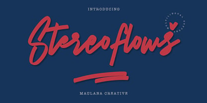 Give your designs an authentic handcrafted feel. � Stereoflows� is perfectly suited to stationery, logos and much more. Many Thanks!
 - Lockup JNL by Jeff Levine,
$29.00Lockup JNL is a more condensed version of Jeff Levine's Hoosegow JNL - based on a classic wood type design. - Racer Sore by Forberas Club,
$18.00 Racer Sore is modern handwritten. Recommended to use this font for display, comic, poster, sport template, and many more.
 - Lido STF by Storm Type Foundry,
$39.00Times with a Human Face: In my article of the same name which appeared in the magazine Font, volume 2000 I described the long and trying story of an order for a typeface for the Czech periodical Lidové noviny (People’s Newspaper). My task was to design a modification of the existing Times. The work, however, finally resulted in the complete re-drawing of the typeface. The assignment, which was on the whole wisely formulated, was to design a typeface which would enable “a smooth flow of information in the reader’s eye”, therefore a typeface without any artistic ambitions, from which everything which obstructs legibility would be eliminated. A year later Lidové noviny had a different manager who in the spring of 2001 decided to resume the cooperation. The typeface itself definitely profited from this; I simplified everything which could be simplified, but it still was not “it”, because the other, and obviously more important, requirement of the investor held: “the typeface must look like Times”. And that is why the above-mentioned daily will continue to be printed by a system version of Times, negligently adjusted to local conditions, which is unfortunately a far cry from the original Times New Roman of Stanley Morison. When I was designing Lido, the cooperation with the head of production of Lidové noviny was of great use to me. Many tests were carried out directly on the newspaper rotary press during which numerous weak points of the earliest versions were revealed. The printing tests have proved that the basic design of this typeface is even more legible and economical than that of Times. The final appearance of Lido STF was, however, tuned up without regard to the original assignment – the merrier-looking italics and the more daring modelling of bold lower case letters have been retained. The typeface is suitable for all periodicals wishing to abandon inconspicuously the hideous system typefaces with their even more hideous accents and to change over to the contemporary level of graphic design. It is also most convenient for everyday work in text editors and office applications. It has a fairly large x-height of lower case letters, shortened serifs and simplified endings of rounded strokes. This is typical of the typefaces designed for use in small sizes. Our typeface, however, can sustain enlargement even to the size appropriate for a poster, an information table or a billboard, as it is not trite and at the same time is moderate in expression. Its three supplementary condensed designs correspond to approximately 80% compression and have been, of course, drawn quite separately. The intention to create condensed italics was abandoned; in the case of serif typefaces they always seem to be slightly strained. I named the typeface dutifully "Lido" (after the name of the newspaper) and included it in the retail catalog of my type foundry. In order to prevent being suspected of additionally turning a rejected work into cash, Lido STF in six designs is available free of charge. I should not like it if the issuing of this typeface were understood as an “act out of spite” aimed against the venerable Times. It is rather meant as a reminder that there really are now alternatives to all fonts in all price categories. - Crake by Narrow Type,
$35.00 Crake is a contemporary high-contrast serif typeface with a distinctive look. It combines organic details with strong geometry shapes. The typeface comes in 5 weights from Light to Bold. Crake has rounded counters of uppercase letters A, B, E, F, P and R which creates an unique and organic character. With different stylistic sets you can change the feel of your design from more organic to more standard. The typeface also offers many discretionary and standard ligatures. Crake is a display typeface with large x-height which works best for headlines or short to medium-length texts. It’s a perfect typeface for branding, editorial design and much more.
 - Retrolight by Almarkha Type,
$29.00 Introducing Neon Font called Retrolight A unique Fonts with Retro Style can make your logotype become more interesting. inspired by real world neon light signs, it features minimal letter forms with smooth rounded corners and, true to real neon tubes, strictly uses lines with open start and end points. This font is perfect for adding your own glowing light effects or can be used to actually design real world neon signs. Retrolight fonts is perfect for your project and allows you to create designs, headlines, posters, logos, badges, t-shirts and many more that are beautiful. It is also best used for posts, logos, posters, certificates, labels and more.
 - Yagi by Ably Creative,
$25.00 Yagi is a serif typeface that contrasts with old-fashioned proportions creating a more defined texture than your usual sans-serif, and Yagi is elegant enough for fashion, art, and luxury; yet sincere enough for serious business. And at 2 styles, ready for complex typographic demands. When we started this project, we wanted to try drawing modern serifs with accurately verified shapes and detailed elaboration of each character, making your text look great both on paper and on screen. Yagi creates unique and organic characters, with different sets of styles, you can change the feel of your designs from more organic to more standard. Let your designs fly!
 - Script Typewriter Rough by Jeremia Adatte,
$19.00 Script Typewriter Rough from Jeremia Adatte Studio is the very first complete cursive typewriter font ever made after the original 1960 Smith-Corona Electra 210 typewriter that comes with a unique script typeface design. It’s loaded with more than 270 ligatures to avoid letter texture repetition in a word (switch Discretionary Ligatures on) and is extremely detailed to imitate the subtle letterpress effect you get with a real typewriter. During the typewriting era, only a few models came with this rare type style that was created to imitate hand-lettering to add more personality in a correspondence. You can send letters around the world in more than 80 languages!
 - Amnestia by Arterfak Project,
$14.00 Amnestia is a vintage serif typeface with a modern-classic feel. Inspired by vintage signage and minimalist serif style, this All-Caps font comes with 100+ alternates that gives you more options to get many variations in your designs. Amnestia has a medium height that looks perfect for display or sub-text. Amnestia available in 2 styles, distressed and normal, and is a great choice to be used in logos, insignia, apparel, labels, packaging, posters and more. Amnestia has a stylistic set 01 - 10 as the alternates of the letterforms. Some alternates have swashes and tails that you can explore to get more possibilities to create different typographic looks.
 - Canden by Struggle Studio,
$17.00 Canden – Display Handwritten Font serif look with simple, clean, visual elegance with subtle curves and beautiful bindings, An incredibly versatile font that works both large and small. This font is suitable for a wide variety of projects such as: headlines, logos, labels, branding projects, magazines, home appliance designs, product packaging, mugs, quotes, posters and many more. It can also be more expressive and playful, thanks to the many alternatives and binders that blend harmoniously in this font and make it more attractive and versatile. Try to change alternatives, fasteners and you will get a lot of options for your project that will make it Vintage & Unique.
 - Cansum Hand by Bülent Yüksel,
$19.00 Cansum Hand, 24 fonts and 448 glyphs. It was made to brighten your projects, everything more beautiful. Cansum is my daughter name. Mean is life water. The hand drawn sans serif - display type family is intended to be used in applications like: websites, print, motion graphics, logo design, packaging design, t-shirts, food, clothes, living, wedding stationery and more... Cansum Hand for professional typography. As an exclusively OpenType release, these fonts have an extended character set to support Central and Eastern European as well as Western European languages. Alternates, Ligatures, Oldstyle, Fractions, Superior, Numerators, Denominators, Inferior and much more. You can enjoy using it.
 - Contane Text Cnd by Hoftype,
$49.00 Contane Text Condensed is the text optimized version of Contane Condensed. More solid, more robust, it embodies the power addition to the more delicate members of the Contane Condensed family. Stronger hairlines and stronger serifs also make it appropriate for smaller text size applications. Contane Text Condensed supports up to 80 languages and it’s OpenType format allows a wide range of typographic applications. 20 styles offer fine graduation of the weights. All weights contain small caps, ligatures, superior characters, proportional lining figures, tabular lining figures, proportional old style figures, lining old style figures, matching currency symbols, fraction- and scientific numerals, matching arrows and alternate characters.
 - Ranmor by Arterfak Project,
$24.00 Ranmor is a vintage slab serif typeface. Inspired by vintage logos & design, Ranmor gets the more strong typeface by adding the grunge feels, and inky effect on the letterforms. This font is a perfect choice for vintage or old-school themes. Ranmor represented strength, confidence, and an old-school aesthetic. You can use this font for many purposes such as vintage logo, mug, embroidery, prints, display, short text, packaging, cards, emblem, signage, and many more! Equipped with special characters to get your design more powerful. TTF & OTF in a zip file including : Uppercase Lowercase Numbers & punctuation Accented characters Stylistic alternates Stylistic set 01-02 That's all, folks! Thank you for visiting.
 - Smart Chameleon by Cititype,
$17.00 We are pleased to offer a unique typewriter font. Consists of two versions, namely regular and italic, Smart Chameleon has more than 650 glyphs and can be used in more than 150 languages. We present it in a handwritten version with untidy curve that makes you even more exasperated. Smart Chameleon has a vintage style that is packaged in the current version. Suitable for all styles, you only need to replace the color and background of the design and the appearance will totally change, from children's style to fancy, retro or modern youth style. Just like a chameleon that changes according to the conditions. Enjoy.
 - Lerof by Asphodel Design,
$9.00 Lerof - A Timeless Script Create bold, gorgeous headlines and cool designs with a vintage flair. Lerof's contrasting lines and curved terminals give a sleek, elegant look to logos, holiday and business cards, quotes, advertisements, and more. The font is written by hand and each letter is unique; not one element in the font is repeated! Many different variation of letter forms to choose from. Create something beautiful today with Lerof. What's included? 327 Unique Glyphs Lowercase Characters Discretionary Ligatures Math Characters Multilingual support for various languages including: French, German, Spanish, Portuguese, Italian, Dutch, Finnish, Swedish, and more. Follow my shop for upcoming updates, and for more of my work! Happy Creating!
 - New Lanzelott by Otto Maurer,
$12.00 The New Lanzelott is a brand new Version of an old Font of me called Lanzelott. The new Version get more curves and round Glyphes, it get more Soul. The Serif - Versions are shorter but more exactly. Every Font comes with many Open-type-features and Handmade Kerning. I like the old Version but this much better, much beautyfuller. All Fonts come with the German new big sharp S and a smaler sharp S and the normal sharp S. I you Write SS and want the big sharp S, you have only to make it with the Ligatur-Feature I hope you ll like it...
 - After Midnight by Natural Ink,
$18.00 After Midnight - a serif look with simple, clean and visual elegance with smooth curves and beautiful ligatures, A very versatile font that works in both large and small sizes. This font is suitable for a wide variety of projects such as: headlines, logos, labels, branding projects, magazines, homeware designs, product packaging, mugs, quotes, posters, and more. It can also be more expressive and fun, thanks to the many alternatives and binders that combine harmoniously in this font and make it more interesting and versatile. Try to change alternatives, binders and you will get many options for your project which will make it Smooth & beautiful.
 - Avaneonz by Almarkha Type,
$29.00 Introducing Neon Font called Avaneonz A unique Fonts with Retro Style can make your logotype become more interesting. inspired by real world neon light signs, it features minimal letter forms with smooth rounded corners and, true to real neon tubes, strictly uses lines with open start and end points. This font is perfect for adding your own glowing light effects or can be used to actually design real world neon signs. Avaneonz fonts is perfect for your project and allows you to create designs, headlines, posters, logos, badges, t-shirts and many more that are beautiful. It is also best used for posts, logos, posters, certificates, labels and more.
 - Neonblitz by Almarkha Type,
$33.00 Introducing Neon Font called Neonblitz A unique Fonts with Retro Style can make your logotype become more interesting. inspired by real world neon light signs, it features minimal letter forms with smooth rounded corners and, true to real neon tubes, strictly uses lines with open start and end points. This font is perfect for adding your own glowing light effects or can be used to actually design real world neon signs. Neonblitz fonts is perfect for your project and allows you to create designs, headlines, posters, logos, badges, t-shirts and many more that are beautiful. It is also best used for posts, logos, posters, certificates, labels and more.
 - Benjir by Struggle Studio,
$18.00 Benjir Typeface – Display Handwritten Font look with simple, Sport, visual elegance with subtle curves and beautiful bindings, An incredibly versatile font that works both large and small. This font is suitable for a wide variety of projects such as: headlines, logos, labels, branding projects, magazines, home appliance designs, product packaging, mugs, quotes, posters and many more. This font can also be more expressive and fun, thanks to the many alternatives and ligatures that combine harmoniously in this font and make it more attractive and versatile. Try to change alternatives, fasteners and you will get many options for your project that will make it Vintage & Awesome.
 - Stacker by Almarkha Type,
$29.00 Introducing Neon Sci-fi Futuristic Font called Stacker A unique Fonts with Futuristic Style can make your logotype become more interesting. inspired by real world neon light signs, it features minimal letter forms with smooth rounded corners and, true to real neon tubes, strictly uses lines with open start and end points. This font is perfect for adding your own glowing light effects or can be used to actually design real world neon signs. Stacker fonts is perfect for your project and allows you to create designs, headlines, posters, logos, badges, and many more that are beautiful. It is also best used for posts, logos, posters, labels and more.
 - Cusp by Typeco,
$29.00 Cusp is a display font that was initially inspired by austere Art Deco lettering. After the capitals were refined, then the lowercase was designed with a bit of techno flair. From these basic letterforms a variety of styles were created, ranging from the rigid DeStijl to the whimsical Loose. The result is a versatile display font family that allows the user to mix, match, and overlay the letters for a dynamic effect. In-fact 2 overlay fonts were designed specifically so that one can create graffiti-like multi-layered effects. Cusp is a super-kawaii display family of 16 fonts plus 2 overlay fonts.
 - Krosta by Ekahermawan,
$19.00 Krosta is an unique display family that consists of 6 weights from ExtraLight to ExtraBold. All the alternates and ligatures characters of Krosta are specially designed to make your typography design result looks more unique and attractive. Krosta is suitable for many different projects such as logo design, wedding, branding, poster, magazines, labels, merchandise, invitation, presentation, advertising and so much more! FEATURES: OpenType support Playful to use (with ligatures and alternates options) Multilingual support PUA Encoded If you need support or more information about this item, please kindly contact me: ekahermawanputu@gmail.com Thank you so much...I really hope you enjoy when using it!
 - Geogrotesque Sharp by Emtype Foundry,
$69.00 Geogrotesque Sharp is a superfamily of seven widths and 99 styles, that puts together the work of a decade. Some design aspects has been simplified but without losing its soul, we have removed ink traps and rounded corners. This update lead Geogrotesque to another dimension, becoming more usable and less idiosyncratic. A Variable Font version is included with the family, or as a separate style. Despite being more web oriented, this new format has gained popularity in recent years, so we thought it was the right moment to launch a variable Geogrotesque. For more info visit emtype website or see the Geogrotesque Sharp PDF.
 - Balgino Display by Natural Ink,
$12.00 Balgino Display - a serif look with simple, clean and visual elegance with smooth curves and beautiful ligatures, A very versatile font that works in both large and small sizes. This font is suitable for a wide variety of projects such as: headlines, logos, labels, branding projects, magazines, homeware designs, product packaging, mugs, quotes, posters, and more. It can also be more expressive and fun, thanks to the many alternatives and binders that combine harmoniously in this font and make it more interesting and versatile. Try to change alternatives, binders and you will get many options for your project which will make it Smooth & beautiful.
 - Cordon Bleu by Pen Culture,
$17.00 Proudly present our newest font called “Cordon Bleu” Cordon bleu is a modern and elegant serif font that comes with more than 50 alternate. With alternates that have an elegant shape, this font will be very suitable for various needs such as branding, logo design, magazines, posters, Instagram feeds and of course there are many more that you can explore with this font. I really hope you enjoy it – please do let me know what you think, comments & likes are always hugely welcomed and appreciated. More importantly, please don’t hesitate to drop me a message if you have any issues or queries. Thank you
 - Marmaris by Larin Type Co,
$15.00 Marmaris this is a soft and elegant serif font. It carries a bold weight, round shapes it is well readable and works well in headlines and with text. This font is suitable for a wide variety of projects such as: logos, labels, branding projects, magazines, homeware designs, product packaging, mugs, quotes, posters and much more. It can also be more expressive and playful, thanks to the many alternatives and ligatures that are harmoniously combined in this font and make it more attractive and versatile. Try to change the alternatives, ligatures and you will get a lot of options for your project that will make it unique.
 - DIN Next Slab by Monotype,
$56.99 Now even more design possibilities with the popular DIN Next. With its technical and neutral character, DIN Next has earned a permanent place in contemporary typography. Now, DIN Next Slab expands the font family further, offering new design potential. Now comes the next step, DIN Next Slab, also produced under the direction of Akira Kobayashi. On a team with Sandra Winter and Tom Grace, Kobayashi is creating the new font variant based on the optimized shapes of DIN Next. The expansion will make the popular font all the more flexible and versatile. Apart from that, the geometric slab serifs underline the technical and formal nature of the font and emphasize a central design element of DIN Next. However, the team did have some challenges to overcome. While it is relatively easy to imagine DIN Next Light with slab serifs, the amount of available space quickly disappears when it comes to the Black styles. Winter explains that many tests and trials were necessary to find a compromise between space, letters and the serif shapes. Experiments with modified contrast in the weight or only one-sided serifs were quickly abandoned. The central, technical and powerful character of the font changed too much. Nevertheless, it was necessary to simplify slightly the shape of some letters, such as the ‘k’ or ‘x’, for example. These changes, first developed in the Black styles, were applied to all weights in order to lend the font a consistent appearance. Like DIN Next, DIN Next Slab also has seven weights, which cover the range from Ultralight to Black, each with matching italic. There are various character sets in all of the styles and the four middle weights have small capitals available. DIN Next Slab harmonizes perfectly with the styles of DIN Next: the basic letterforms and weights are identical. Both versions of the font can work together perfectly, not just in headlines and body text, but also within a text; they complement each other very well as design variations. With the new DIN Next Slab, Monotype expands the DIN Next super family consistently. With DIN Next Slab, you can underscore the technical and formal nature of the understated font not only in headlines, but in texts, as well. In this way, you have new and diverse potential for application, thanks to the way the different styles of DIN Next combine perfectly.
 - TT Nooks by TypeType,
$39.00 TT Nooks useful links: Specimen | Graphic presentation | Customization options TT Nooks is an experimental font family that includes a high contrast serif, TT Nooks, and an upright italic, TT Nooks Script. Despite the difference in style, both subfamilies get along well, which is partially thanks to their similar proportions. Each of the subfamilies includes 4 weights: Light, Regular, Bold and Black. The main subfamily is TT Nooks—a stylish high-contrast serif with a light touch of self-centeredness. If TT Nooks were a person, it would be an elegant lady with an independent and firm personality. In the original sketches of TT Nooks there were traces of a broad pen, but in the course of further evolution the typeface moved away from this style, retaining only the high contrast of strokes. In addition, in the process of design searches TT Nooks has obtained a touch of geometricity. The serifs in TT Nooks stand out especially visibly thanks to their geometric shape that resembles slippers. In addition to their peculiarity, such serifs add stability to the font and allow better compensation of the black and white ratio within the letters. TT Nooks has small capitals for Latin and Cyrillic alphabets, as well as a set of stylistic alternates (including some figures) that makes the typeface a bit more geometric. In addition, we have drawn more than 25 ligatures, including ligatures for capital letters, slashed zero and many other useful OpenType features. TT Nooks Script is a complementary family designed to harmoniously extend the main family and expand its scope. The forms of the characters in bold and light fonts of TT Nooks Script are quite different. For example, Black & Bold have high contrast strokes and an open aperture, and in Regular & Light the aperture of the characters is closed. TT Nooks also has small capitals for Latin and Cyrillic alphabets, ligatures, oldstyle figures and other OpenType features. In light faces, TT Nooks Script is more humanist and has artifacts inherent to the continuous movement of a flat pen. In bold faces, TT Nooks Script has a very dense and dynamic typing rhythm, and the shape of the letters begins to geometrize. We had had the difficult task of preserving the continuity of forms between bold and light faces, and we have managed to solve it thanks to the found rhythm, which united different fonts, and proximate stylistic solutions.
 - Fleischmann Gotisch PT by preussTYPE,
$29.00 Johann Michael Fleischmann was born June 15th, 1707 in Wöhrd near Nuremberg. After attending Latinschool he started an apprenticeship as punchcutter in the crafts enterprise of Konstantin Hartwig in Nuremberg, which ought to last six years. For his extraordinary talent Fleischmann completed his apprenticeship after four and a half years, which was very unusual. 1727 his years of travel (very common in these days) began, during which he perfected his handcraft by working in different enterprises as journeyman. First location was Frankfurt/Main where he worked for nearly a year at the renowned type foundery of Luther and Egenolff. Passing Mainz he continued to Holland, where he arrived in November 1728 and stayed till he died in 1768. In Amsterdam he worked for several type founderies, among others some weeks for Izaak van der Putte; in The Hague for Hermanus Uytwerf. Between 1729 and 1732 he created several exquisite alphabets for Uytwerf, which were published under his own name (after his move to Holland Fleischmann abandoned the second n in his name), apparently following the stream of the time. After the two years with Uytwerf, Fleischmann returned to Amsterdam, where he established his own buiseness as punchcutter; following an advice of the bookkeeper and printer from Basel Rudolf Wetstein he opened his own type foundery 1732, which he sold in 1735 to Wetstein for financial reasons. In the following Fleischmann created several types and matrices exclusively for Wetstein. In 1743 after the type foundery was sold by Wetstein’s son Hendrik Floris to the upcoming enterprise of Izaak and Johannes Enschedé, Fleischmann worked as independent punchcutter mostly for this house in Haarlem. Recognizing his exceptional skills soon Fleischmann was consigned to cutting the difficult small-sized font types. The corresponding titling alphabets were mostly done by Jaques-Francois Rosart, who also cut the main part of the ornaments and borders used in the font examples of Enschedé. Fleischmann created for Enschedé numerous fonts. The font example published 1768 by Enschedé contains 3 titling alphabets, 16 antiquacuts, 14 italic cuts, 13 textura- and 2 scriptcuts, 2 greek typesets (upper cases and ligatures), 1 arabic, 1 malayan and 7 armenian font systems, 5 sets of musicnotes and the poliphonian musicnotesystem by Fleischmann. In total he brought into being about 100 alphabets - the fruits of fourty years of creative work as a punchcutter. Fleischmann died May 27th, 1768 at the age of 61. For a long time he was thought one of the leading punchcutters in Europe. A tragedy, that his creating fell into the turning of baroque to classicism. The following generations could not take much pleasure in his imaginative fonts, which were more connected to the sensuous baroque than to the bare rationalism of the upcoming industrialisation. Unfortunately therefore his masterpieces did not survive the 19th century and person and work of Fleischmann sank into oblivion. The impressive re-interpretation of the Fleischmann Antiqua and the corresponding italics by Erhard Kaiser from Leipzig, which were done for the Dutch Type Library from 1993 to 1997, snatched Fleischmann away from being forgotten by history. Therefore we want to place strong emphasis on this beautiful font. Fleischman Gotisch The other fonts by Fleischmann are only known to a small circle of connoisseurs and enthusiasts. So far they are not available in adequat quality for modern systems. Same applies the "Fleischman Gotisch", which has been made available cross platform to modern typeset-systems as CFF Open Type font through the presented sample. The Fleischman Gotisch has been proved to be one of the fonts, on which Fleischmann spent a good deal of his best effort; this font simply was near to his heart. Between 1744 and 1762 he created 13 different sizes of this font. All follow the same principles of forms, but their richness of details has been adapted to the particular sizes. In later times the font was modified more or less sensitive by various type founderies; letters were added, changed to current taste or replaced by others; so that nowadays a unique and binding mastercopy of this font is missing. Likewise the name of the font underwent several changes. Fleischmann himself probably never named his font, as he did with none of his fonts. By Enschedé this textura was named Nederduits, later on Nederduitsch. When the font was offered by the german type foundery Flinsch in Frankfurt/Main, the more convenient name of Fleischmann-Gotisch was chosen. In his "Masterbook of the font" and his "Abstract about the Et-character" Jan Tschichold refered to it as "Duyts" again. To honour the genious of Johann Michael Fleischmann we decided to name the writing "Fleischmann Gotisch PT" (unhyphenated). Developing the digital Fleischman Gotisch I decided not to use one of the thirteen sizes as binding mastercopy, but corresponding to the typical ductus of the font to re-create an independent use of forms strongly based on Fleischmann´s language of forms. All ascenders and descenders were standardised. Some characters, identified as added later on, were eliminated (especially the round lower case-R and several versions of longs- respectively f-ligatures) and others were adjusted to the principles of Fleischmann. Where indicated the diverse characters were integrated as alternative. They can be selected in the corresponding menu. All for the correct german black letter necessary longs and other ligatures were generated. Through the according integration into the feature-code about 85% of all ligatures in the type can be generated automatically. Problematic combinations (Fl, Fk, Fh, ll, lh, lk, lb) were created as ligatures and are likewise constructed automatically. A historically interesting letter is the "round r", which was already designated by Fleischmann; it is used after preceding round letters. Likewise interesting is the inventive form of the &-character, which is mentioned by Tschichold in his corresponding abstract. Nevertheless despite all interpretation it was very important to me to maintain the utmost fidelity to the original. With this digital version of a phantastic texturfont of the late baroque I hope to contribute to a blossoming of interest for this genious master of his kind: Johann Michel Fleischmann. OpenType features: - Unicode (ISO 10646-2) - contains 520 glyphes - Basic Latin - Latin-1 Supplement - Latin Extended-A - Latin Extended-B - Central European Glyhps - Ornaments - Fractions - Standard ligatures - Discretionary ligatures - Historical ligatures - Kerning-Table
 - Equine - Unknown license


