10,000 search results
(0.021 seconds)
- Handler by Surotype,
$22.00 Handler a signature typeface great for Logotype, Poster, Digital Lettering Arts, Clean Design, Branding Design, Signs,and more. To enable the OpenType Stylistic alternates, you need a program that supports OpenType features such as Adobe Illustrator CS, Adobe Indesign & CorelDraw X6-X7 and more.
 - Rhiccus by Patria Ari,
$19.00 Rhiccus is inspired from vintage and classic look. This font is suitable for any design like branding, print templates, fashion, print templates, & more. With more than 9 variants, this font works well to mix and match with each other to best fit the occasion.
 - Extrend by Attractype,
$15.00 Extrend, a clean and modern sans serif typeface, ideal for text that requires more space. suitable for corporate use as well as corporate branding and identity design, magazines, books, comics. With five styles, Extrend can be used to make your creative projects more interesting.
 - Trio CT by CastleType,
$39.00 I was commissioned by Publish magazine to digitize Trio in 1990. Originally designed in a Light weight only, Trio is now available in Medium and Bold weights as well. Uppercase only, but each weight includes two alphabets, one more "deco," the other more "modern."
 - The Matesih by FallenGraphic,
$20.00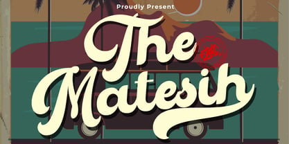 The Matesih is an amazing handwritten font. This font will make your design more beautiful and powerful, and is suitable for any design such as branding, quotes and more. It includes: -Accents (Multilingual Characters) -PUA encoded -Numerals and Punctuation (OpenType Standard) -Many alternate characters
 - Country Charm by Okaycat,
$28.50 Country Charm is a picture font. A cute collection of vectored sketches brought to life by designer Natsuko Hayashida. More than 50 unique illustrations. Her depictions of fruits, vegetables & herbs are beautiful organic shapes, perfect for you to use on signs, posters, invitations, and more.
 - Stay Drips by Ditatype,
$29.00 Stay Drips is an interesting, unique font in capital letters with uneven edge lines and ink drop details to give lovely, dynamic visual effects. The letters have soft brush wipes, and the ink drop details on some letter parts show a unique nuance of organic and artistic touch. The font’s unique, flexible characteristics can carry on various design styles such as formal, creative, and experimental ones. Designs with this font will express strong, amazing, unique impressions. In addition, bright and contrast colors will outstand this dynamic font that is more applicable for big text sizes to be greatly legible. You can also enjoy the available features here. Features: Multilingual Supports PUA Encoded Numerals and Punctuations Stay Drips fits best for various design projects, such as brandings, quotes, printed products, merchandise, social media, etc. Find out more ways to use this font by taking a look at the font preview. Thanks for purchasing our fonts. Hopefully, you have a great time using our font. Feel free to contact us anytime for further information or when you have trouble with the font. Thanks a lot and happy designing.
 - CrEAtOR CamPotype by Campotype,
$15.00 So far the Creator Campotype standard version known in the form of free font (published on several websites by license: free for personal use). The font takes the basic form of modern typography, but some user feedback consider it in the medieval look. Whatever it is, the inspiration of the font was originally set off from the logotype of internal student magazine where the designer had studied in the late 80s. Creator Campotype is a pure display font. This fonts do not have faces lowercase, but all caps. Nevertheless forms of different characters can be accessed by pressing the uppercase and lowercase on the keyboard. Maximum usage can be made by combining them as necessary. Some forms of characters were made more stylistic such as slash and backslash which “out of” the conventional form. In addition, the circle effects on several glyphs were created by default (as found on the free version) so that the glyph was enough to generated with the keyboard access as usual. Information for those who have access to the free version, there are significant changes in this version (2001) as described in the file “creator ct pdf” (gallery)
 - Tailgates by Ditatype,
$29.00 Introducing Tailgates, a script font that exudes a robust and inviting charm. This typeface showcases a substantial weight, offering your text a bold and captivating presence. Tailgates is characterized by its rounded letterforms, contributing to a friendly and approachable aesthetic. With consistent proportions and a relatively high contrast, it achieves a dynamic and eye-catching design. What sets Tailgates apart are the captivating swinging ends that adorn select letters. These elegant flourishes add a sense of whimsy and grace to your text, creating a visual experience that is both lively and engaging. The combination of round shapes and these decorative elements adds a unique touch to your designs. In addition, enjoy the features here. Features: Ligatures Stylistic Sets Swashes Multilingual Supports PUA Encoded Numerals and Punctuations Tailgates fits in headlines, logos, posters, flyers, branding materials, print media, editorial layouts, and many more designs. Find out more ways to use this font by taking a look at the font preview. Thanks for purchasing our fonts. Hopefully, you have a great time using our font. Feel free to contact us anytime for further information or when you have trouble with the font. Thanks a lot and happy designing.
 - Brown Amsonia by Nathatype,
$29.00 Brown Amsonia is a lovely script font of which letters are in handwriting to express unique, personal nuances in your designs. Such a handwriting font is available in high contrasts having noticeable differences between the bright and the dark letter parts to produce clear, firm displays making the designs look professional and modern. Besides, Brown Amsonia can express personal, artistic displays to create more interesting, noticeable designs. The letters are interconnected and their details show sharp, curvy scratches on the edges. Due to the complex font style details, this font is better to apply for big text sizes. In addition, you may enjoy the available features here. Features: Ligatures Stylistic Sets Multilingual Supports PUA Encoded Numerals and Punctuations Brown Amsonia fits best for various design projects, such as brandings, invitations, greeting cards, name cards, quotes, printed products, merchandise, social media, etc. Find out more ways to use this font by taking a look at the font preview. Thanks for purchasing our fonts. Hopefully, you have a great time using our font. Feel free to contact us anytime for further information or when you have trouble with the font. Thanks a lot and happy designing.
 - Nimbus Sans Novus by URW Type Foundry,
$89.99 The first versions of Nimbus Sans have been designed and digitized in the 1980s for the URW SIGNUS sign-making system. Highest precision of all characters (1/100 mm accuracy) as well as spacing and kerning were required because the fonts should be cut in any size in vinyl or other material used for sign-making. During this period three size ranges were created for text (T), the display (D) and poster (P) for small, medium and very large font sizes. In addition, we produced a so-called L-version that was compatible to Adobe’s PostScript version of Helvetica. Nimbus was also the product name of a URW-proprietary renderer for high quality and fast rasterization of outline fonts, a software provided to the developers of PostScript clone RIPs (Hyphen, Harlequin, etc.) back then. Also in the 80s, a new, improved version of the Nimbus Sans, namely Nimbus Sans Novus was designed. Nimbus Sans Novus was conceptually developed entirely with URW’s IKARUS system, i.e. all styles harmonize perfectly with each other in terms of line width, weight, proportions, etc. On top of that, Nimbus Sans Novus contains more styles than Nimbus Sans.
 - Happy Holidays by Comicraft,
$19.00 Back in 2006 when we first released our Happy Holidays font, we thought the War on Christmas was over! We'd taken down our Menorahs, our Christmas trees, reclining Buddhas and red, black and green Kwanzaa decorations, and were prepared to sprinkle nothing more than a little Season's Greetings over our end of year celebrations. When we saw our friends and neighbors at department stores, we'd greet them with a simple, cordial, non-denominational “Happy Holidays.” But the font showed up at our company party this year having learned over 200 new languages (and, it must be said, a little bit loaded on Stylistic Alternates) in a mood to celebrate EVERYTHING. It was wishing people happy Bodhi Day, Solstice, Festivus, you name it! It even brought (count 'em) THREE new outfits based on the colors of Christmas, Hanukkah and Kwanzaa. So may the designs on the cups of the hot beverages that take you through the long dark coffee break of the soul that stretches from Halloween to Thanksgiving to New Year's Day be a little more festive this year with the refreshed, Remastered, all-inclusive spirit of Happy Holidays!
 - Rubrical by Ditatype,
$29.00 Introducing Rubrical, a script font that gives personalized feel to the design with a confident presence. This typeface is characterized by its substantial weight, giving your design a bold and impactful appearance. Rubrical maintains consistent proportions across all its letters, offering a sense of stability. It also adds a sense of warmth and personality. It has flowing and connected letterforms that are embellished with graceful swings that adorn select letters. These decorative elements, which can include ornate initials or elegant swinging flourishes, add a touch of sophistication and artistic flair to your text. They create a visual journey that is engaging, unique, and memorable. In addition, enjoy the features here. Features: Ligatures Stylistic Sets Swashes Multilingual Supports PUA Encoded Numerals and Punctuations Rubrical fits in headlines, logos, posters, flyers, branding materials, print media, editorial layouts, and many more designs. Find out more ways to use this font by taking a look at the font preview. Thanks for purchasing our fonts. Hopefully, you have a great time using our font. Feel free to contact us anytime for further information or when you have trouble with the font. Thanks a lot and happy designing.
 - Geographica by Three Islands Press,
$29.00 Thomas Jefferys (ca. 1710–1771) was the best-known map maker in 18th-century England, chiefly because he won (and hyped) the title “Geographer to King George III.” Jefferys was really more an engraver/publisher than a geographer, since he mostly relied on the cartographic materials of others. Still, his maps of the North American colonies were well known. Geographica is a legible, four-style serif family modeled after the neat hand-lettered place names and peripheral text on Jefferys’s maps. With its long serifs, tall x-height, and robust curves, Geographica somehow combines classic elegance with a whiff of coastline and sea. The italic styles have the slant and warmth of the hand-drawn source materials. And the typeface comes with a slew of distinctive map-based ornaments—including compass wheels and sailing ships. This evocative serif works well in both display situations and long blocks of text, whether on paper or screen. OpenType features include small capitals, numerous ligatures, and two stylistic sets of titling caps. Geographica offers full support for Central and Eastern European languages—more than 1,200 glyphs in all.
 - Carolingian Majuscul by Kaer,
$28.00 I'm happy to present you my new Romanesque font from the Codex Gigas. The manuscript was created in the early 13th century in the Benedictine monastery of Podlažice in Bohemia. The codex was written in a handwriting atypical for the 13th century, which is actually a late version of the Carolingian minuscule. Texts about repentance and exorcism were written in large Majuscule (Square Capitals (Imperial Roman capitals written with a brush)). Majuscules first incised in stone more than two millennia ago, married to minuscule letterforms that evolved from manuscript hands of the eighth and ninth centuries. Majuscule font is the name given to a type of decorative upper-case letters used in inscriptions and, typically, at the start of a section of text in medieval manuscripts. They are characterized by their straight forms unlike rounded in Lombardic capitals with thick, curved stems. Majuscule capitals were also used to write words or entire phrases. The text is divided into words, punctuation marks are used consistently – periods indicate the end of a sentence and the middle of a phrase. You will get: * Uppercase glyphs * Numbers and symbols * Multilingual support * Ligatures * Free future updates Thank you!
 - FF Cocon by FontFont,
$65.99 FF Cocon’s designer, Evert Bloemsma (1958—2005) described it as a “serious typeface”. Despite first impressions, the description holds up well. Since its 2001 release, FF Cocon has been used in an astoundingly wide variety of design applications. At large sizes, FF Cocon works as a display face, with beautiful detailing. And at small sizes, it remains surprisingly readable. The lowercase letters a, b, d, g, h, m, n, p, q, r and u, were drawn without spurs, as Bloemsma made an attempt to erase every trace of handwriting; even “normal,” neutral sans serif typefaces still retain elements in their letterforms like this. Bloemsma wanted none of it. Although a difficult starting point for a typeface, this proved successful. Bloemsma’s design is a family of rounded yet rather asymmetrical forms with details reminiscent of brush-strokes, but that were not made with a brush in hand. In spite of its claim to seriousness, FF Cocon is a family of seductive, voluptuous styles. The original FF Cocon had two widths—normal and condensed. Later, a more compact Extra Condensed version was introduced, as well as italics.
 - Petala Pro by Typefolio,
$39.00 Pétala Pro took its first steps almost ten years ago. Since then, the quest for perfection has forced several interruptions. It was necessary recalculate the route, tread other ways, discover new maps, and make easy curves. In the end, a new milestone on typeface design was reached. Pétala Pro combines readability with a gentle but strong personality. The smooth and balanced forms shares space with expressive ink traps. The 18 styles of the family – from Thin to Black – allow the flexibility needed to complex design briefs. When designing the different weights, rather than automated solutions, subtle adjustments were made to value the optical qualities of each style. Such care makes all the difference under extreme conditions. The wide variety of alternates makes Pétala Pro even more versatile. All the styles come with a lot of advanced OpenType features such as stylistics sets, localized forms, contextual alternates, ligatures, small caps, numbers, fractions and more. Pétala Pro brings your message with efficiency and personality for a multi-language environment and in any medium or support, such as video, mobile and computers screens. Pétala Pro is the ideal choice for editorial, advertising, branding and corporate identity.
 - Chubby Lines by Yumna Type,
$15.00 It can be a difficult task to find a unique, attractive, prominent display font for your design because you always want to use a more distinctive font than the others. Therefore, Chubby Lines offers you the best solution. It is a lovely display font in rounded shapes to express soft, friendly nuances to your design. Its unique geometry details and contrast sketch lines create a visually interesting font. To be easily readable, this font is best applied for big text sizes, which also provides you with a special clipart as a bonus. Furthermore, you can enjoy the available features here. Features: Multilingual Supports PUA Encoded Numerals and Punctuations Chubby Lines fits best for various design projects, such as brandings, posters, banners, headings, magazine covers, quotes, printed products, merchandise, social media, etc. Find out more ways to use this font by taking a look at the font preview. Thanks for purchasing our fonts. Hopefully, you have a great time using our font. Feel free to contact us anytime for further information or when you have trouble with the font. Thanks a lot and happy designing.
 - Nightshade by MKGD,
$13.00 Nightshade was my attempt to bring the Old English fonts up to date. The capital letters still contain flourishes, but they look more machined and less calligraphic. I called the font Nightshade after the plant of the same name. Like the plant, it may be considered to be beautiful or poisonous depending on one's outlook. As a result, it can be applied when an attractive, ornate look is required, or it can be used when there is a need to create a more chilling effect. Nightshade has a glyph count of 389 and supports the following languages Afrikaans, Albanian, Asu, Basque, Bemba, Bena, Bosnian, Catalan, Chiga, Colognian, Cornish, Croatian, Czech, Danish, Embu, English, Esperanto, Estonian, Faroese, Filipino, Finnish, French, Friulian, Galician, German, Gusii, Hungarian, Icelandic, Indonesian, Irish, Italian, Kabuverdianu, Kalaallisut, Kalenjin, Kamba, Kikuyu, Kinyarwanda, Latvian, Lithuanian, Low German, Lower Sorbian, Luo, Luxembourgish, Luyia, Machame, Makhuwa-Meetto, Makonde, Malagasy, Malay, Maltese, Manx, Meru, Morisyen, North Ndebele, Norwegian Bokmål, Norwegian Nynorsk, Nyankole, Oromo, Polish, Portuguese, Romanian, Romansh, Rombo, Rundi, Rwa, Samburu, Sango, Sangu, Scottish Gaelic, Sena, Shambala, Shona, Slovak, Slovenian, Soga, Somali, Spanish, Swahili, Swedish, Swiss German, Taita, Teso, Turkmen, Upper Sorbian, Vunjo, Walser, Zulu
 - FHA Condensed French by Fontry West,
$25.00 FHA Condensed French One could speculate that FHA Condensed French probably started life as wood type for displays, headlines and posters. The exaggerated sharp serifs and condensed forms were not uncommon for that period. At some point, sign painters picked up Condensed French added their own character. At the end of the nineteenth century, Frank H. Atkinson included Condensed French in his samples of lettering for his book, ”Sign Painting, A Complete Manual.” This book became one of the definitive guides for signwriting and hand lettering. In 1999, Mike Adkins digitized Condensed to add to our Atkinson collection. For its re-release, Condensed French has been updated with more language support, ligatures, and OpenType alternates. It has true vintage character but still plays well in more modern designs. A font for all seasons, the condensed forms and sharp serifs fit in every layout from wildwest days posters and creepy film credits to Christmas ads and Mother’s Day cards. While I can’t really see FHA Condensed French as the font for phone aps or video game text, it will provide impact to logos, branding, and product labeling.
 - Vintagedeck by Ditatype,
$29.00 Vintagedeck is a charming script font that gracefully combines vintage elegance with contemporary style. Each character in Vintagedeck is crafted with care. Designed with a fairly thick weight and a shape that gently nods to rounded forms, Vintagedeck is a versatile font that brings a touch of welcoming feel. The overall looks create a warm, approachable aesthetic reminiscent of classic handwriting, yet perfectly suited for the demands of current design trends. To truly appreciate the beauty and clarity of this font, it is recommended to use it in a larger font size. This not only improves readability but also allows its unique characteristics to shine. In addition, enjoy the features here. Features: Ligatures Stylistic Sets Multilingual Supports PUA Encoded Numerals and Punctuations Vintagedeck fits in headlines, logos, posters, flyers, branding materials, greeting cards, print media, editorial layouts, and many more designs. Find out more ways to use this font by taking a look at the font preview. Thanks for purchasing our fonts. Hopefully, you have a great time using our font. Feel free to contact us anytime for further information or when you have trouble with the font. Thanks a lot and happy designing.
 - Jogan by Wahyu and Sani Co.,
$15.00 Inspired by the early days of video games where the graphics were made of squares (pixels), Wahyu Wibowo comes up with pixel based typeface design, Jogan, but instead of having medium width, he decided to make it narrow which is rarely exist in pixel style font. The style were expanding in the development process, so the family have 4 subfamilies: Jogan (regular, bold and monospace) Jogan Soft (regular, bold and monospace) Jogan Round (regular and monospace) Jogan Slab (regular and bold) Each Jogan font style contains 280+ glyphs which covers Western Europe languages: Afrikaans, Albanian, Asu, Basque, Bemba, Bena, Breton, Catalan, Chiga, Cornish, Danish, Dutch, English, Filipino, French, Friulian, Galician, German, Gusii, Indonesian, Irish, Italian, Kabuverdianu, Kalenjin, Kinyarwanda, Luo, Luxembourgish, Luyia, Machame, Makhuwa-Meetto, Makonde, Malagasy, Manx, Morisyen, North Ndebele, Norwegian Bokmål, Norwegian Nynorsk, Nyankole, Oromo, Portuguese, Quechua, Romansh, Rombo, Rundi, Rwa, Samburu, Sango, Sangu, Scottish Gaelic, Sena, Shambala, Shona, Soga, Somali, Spanish, Swahili, Swedish, Swiss German, Taita, Teso, Uzbek (Latin), Volapük, Vunjo, Zulu. Retro, retro-futuristic, futuristic, modern, techno theme projects fit perfectly with this typeface, any works from logo, poster, video, headlines, titles, and more!
 - Type Tiles JNL by Jeff Levine,
$29.00 Type Tiles JNL is based on a ‘completed’ version of ‘Alpha-Blox’ by American Type Founders, circa 1944. The capitals, lower case and numerals shown in the sample sheet put out by ATF depicted type made with five-high blocks comprised of modular units spaced two points apart. These units could be combined in varying ways to create custom type of varying heights and widths and was available for purchase in both linear (multi-line) and reverse (white on black) formats. Using the 'reverse' model shown on the sample sheet, all of the characters were re-created digitally, and missing punctuation, foreign characters and other glyphs found in a basic computer font were drawn and added. The 'J' and 'T' in the type sample had truncations, so a more complete character was created for each of those letters. For those wanting an unbroken string of words or blank end caps, there is a double column space on the vertical bar key. A single column space is located on the broken bar key for shorter end caps. Type Tiles JNL is available in both regular and oblique versions
 - Standbyte by Din Studio,
$29.00 Standbyte is an exquisite script font that beautifully captures the essence of cursive handwriting with delicate brush details. This typeface combines the fluidity of handwritten script with the artistic touch of brush strokes, resulting in a captivating and elegant design. Standbyte's flowing letterforms emulate the natural movement of cursive handwriting, giving it a sense of authenticity and warmth. The brush details add a touch of artistic flair, creating subtle variations in stroke width that infuse the font with a handcrafted charm. Its flowing, interconnected letters lend themselves well to creating seamless and eye-catching appearance. Because of its legibility you can use this font in a variation of text sizes. Enjoy the available features here. Features: Multilingual Supports PUA Encoded Numerals and Punctuations Standbyte fits in headlines, logos, posters, flyers, invitations, greeting cards, branding materials, print media, editorial layouts, website headers, and many more. Find out more ways to use this font by taking a look at the font preview. Thanks for purchasing our fonts. Hopefully, you have a great time using our font. Feel free to contact us anytime for further information or when you have trouble with the font. Thanks a lot and happy designing.
 - Sunetta by Linotype,
$29.99An inkstone, a brush, ink, and paper. In China, one speaks of “wenfang sibao” — the four treasures of the scholar’s study. With these centuries-old hand tools, Werner Schneider created a calligraphic type trilogy of the highest aesthetic order; he named this typeface family after Buddha’s stepbrother, Sunetta. Sunetta is an outstanding choice for contemporary display type purposes. Its combination of lively forms overcome sterile text passages, lending them a more personal note and feeling. But Sunetta is not only recommended for documents bestowing distinction and accolades; the fonts are superb for shorter text passages as well. Sunetta’s spirited flow raises it above the fray that so many generic letterforms find themselves mired in, creating an unforgettable impression. Sunetta’s three complementary styles, Sunetta Flair, Sunetta Charme, and Sunetta Magic, offer three varying degrees of calligraphic verve. The family’s base font, Sunetta Flair, harkens back to the showcard lettering styles of the 1950s, while remaining distinctly European in taste. Sunetta Charme has a more swash-type appearance, while Sunetta Magic is joyfully decorative — its brush-written strokes dance across the line. Together, they may help you reach typographic nirvana. - Interleave OCR SB by Scangraphic Digital Type Collection,
$26.00Since the release of these fonts most typefaces in the Scangraphic Type Collection appear in two versions. One is designed specifically for headline typesetting (SH: Scangraphic Headline Types) and one specifically for text typesetting (SB Scangraphic Bodytypes). The most obvious differentiation can be found in the spacing. That of the Bodytypes is adjusted for readability. That of the Headline Types is decidedly more narrow in order to do justice to the requirements of headline typesetting. The kerning tables, as well, have been individualized for each of these type varieties. In addition to the adjustment of spacing, there are also adjustments in the design. For the Bodytypes, fine spaces were created which prevented the smear effect on acute angles in small typesizes. For a number of Bodytypes, hairlines and serifs were thickened or the whole typeface was adjusted to meet the optical requirements for setting type in small sizes. For the German lower-case diacritical marks, all Headline Types complements contain alternative integrated accents which allow the compact setting of lower-case headlines. Please note that Interleave SB and Interleave OCR SB are versions which are for decorative purposes only. - Ongunkan Varna Vinca by Runic World Tamgacı,
$50.00 The Vinča script is a cache of symbols found belonging to the Vinča culture of the central Balkans over 7000 years ago. The symbols have been a topic of debate amongst historians. The Tărtăria tablets are three tablets discovered in 1961 in the village of Tărtăria(Hungarian: Alsótatárlaka). This is about 30 km (19 mi) from Alba Iulia in Romania.The tablets, dated to around 5300 BC, have symbols inclay: the Vinča symbols. Some claim they are a yet undeciphered language. If this is so, they would be the earliest known form of writing. In 1908 similar symbols were found during excavations, by Miloje Vasić (1869–1956) in Vinča. This is a suburb of Belgrade (Serbia), some 300 km from Turdaș. Later, more were found in another part of Belgrade. Since 1875 over one hundred and fifty Vinča sites have been found in Serbia alone. Many, including Vinča itself, have not been fully excavated. The culture of the whole area is called the Vinča culture. Although some of these symbols look exactly the same as some letters in Etruscan, Greek, and Aramaic, they are generally regarded as a an original, independent development.
 - Primot by Plau,
$49.00 Primot is an upright script heavily influenced by italian gelaterias . After releasing 3 sans serifs , we were looking for an opportunity to design a display type with less constraints for legibility and expression. We started playing with brush lettering and looking into vintage scripts from different eras. Some cool things that made it into Primot were some unusual vertical connections and the sweet brush flairs in the letter endings. From that point on, we set out to create a beautiful looking vertical script – something we don’t see that often – in which each word set could would make a nice piece of graphic design (think logos, video game titles, shop windows etc.). We also made it smart by including hand-lettering inspired features such as initial and final forms for letters, contextual alternates and swashes. The result is a versatile 900+ glyphs display typeface, suitable for a wide range of applications. We hope you have as much fun with it as we had designing it! And while we’re here, you may like that it also pairs beautifully with our sturdy sans-serif family Motiva Sans .
 - Trafit by Nathatype,
$29.00 Finding the right fonts for your projects is a challenge because improper fonts will deliver improper messages resulting in unprofessional appearances. Therefore, Trafit is here as your problem solver. This is Trafit, a perfect font to show luxury, class, and eternity. Trafit is an outstandingly designed stylish serif font. Its soft, clean lines and indentations show elegant impressions for your prominent designs. Its letter edges have hooks like the other serif fonts. The simple shapes and even sizes help to make it legible. Due to the great legibility, this font is applicable for any text sizes and length. In addition, you can enjoy the features available here. Features: Ligatures Multilingual Supports PUA Encoded Numerals and Punctuations Trafit fits best for various design projects, such as brandings, posters, banners, greeting cards, magazine covers, quotes, printed products, merchandise, social media, etc. Find out more ways to use this font by taking a look at the font preview. Thanks for purchasing our fonts. Hopefully, you have a great time using our font. Feel free to contact us anytime for further information or when you have trouble with the font. Thanks a lot and happy designing.
 - Letrista Script by Estudio Calderon,
$69.99 Letrista Script is a product of observation and sensitivity of sign painter artists not only from United States but from other parts of the world, where the brushstrokes letters have reached a high level of importance in different context, where the writing makes fundamental part. With more than 1000 glyphs, this typography was created to achieve a unique texture without losing the legibility or force, to interact with the alternation of decorative characters and adornment that will surprise. After a year of working and checking with many artists, Letrista Script come up to the public with the guarantee of being an useful tool in your computer in the design time. When you know it, you surely won't stop using it, because of its beautiful characters and great texture. It is full of surprises and facilities for the users. Letrista Script includes standard ligatures, stylistics alternatives, discretionary ligatures, swashes, titling alternates and terminal forms, Stylistic Set 1, 2, 3 and 4, ornaments and a complete package of Catch Words. See specimen and samples here. Letrista Script was selected at the Bienal Tipos Latinos 2012. Check out some uses of this font here https://fontsinuse.com/uses/20207/ica-beverages
 - Tombo Brush by Ditatype,
$29.00 Tombo Brush is an interesting font that combines brush font’s artistic and organic characteristics with even line edges which are clear and firm. Furthermore, the capital letters express more modern, simple impressions by following the brush script font’s characteristics of the soft and smooth brush wipes, yet the even smooth lines on the edges show clearer, firmer nuances. Bright and contrast colors can show interesting, dynamic nuances on designs with this font. The even edge lines will ease the application of colors and show clearer visual effects separated from the background. You can apply this font for big text sizes for a legibility reason and also enjoy the available features here. Features: Multilingual Supports PUA Encoded Numerals and Punctuations Tombo Brush fits best for various design projects, such as brandings, quotes, printed products, merchandise, social media, etc. Find out more ways to use this font by taking a look at the font preview. Thanks for purchasing our fonts. Hopefully, you have a great time using our font. Feel free to contact us anytime for further information or when you have trouble with the font. Thanks a lot and happy designing.
 - Vintage Stages by Ditatype,
$29.00 Vintage Stage is a gracefully designed script font that captures the essence of classic calligraphy with a modern twist. Crafted with a weight that is delicately balanced—not too thick nor too thin—this font offers a subtle elegance and a versatile appearance. The consistent sizing ensures that the font maintains a rhythmic flow, resembling traditional handwriting, but with the clarity and readability required in contemporary design. The relatively low contrast of the strokes further enhances the font’s legibility while maintaining a soft and approachable feel. One of the most captivating characteristics of Vintage Stage is the inclusion of swinging ends on select letters. In addition, enjoy the features here. Features: Ligatures Stylistic Sets Multilingual Supports PUA Encoded Numerals and Punctuations Vintage Stage fits in headlines, logos, posters, flyers, branding materials, greeting cards, print media, editorial layouts, and many more designs. Find out more ways to use this font by taking a look at the font preview. Thanks for purchasing our fonts. Hopefully, you have a great time using our font. Feel free to contact us anytime for further information or when you have trouble with the font. Thanks a lot and happy designing.
 - Finest Vintage by Din Studio,
$20.00 Choosing fonts for design projects can be a daunting task because there’s thousands of fonts out there all over the web that you could use. Here it is. A font that can add touch of magic whether you’re looking to create a big, bold logo for your business, work on a poster for an event, or whatever your project may be. Finest Vintage-A Retro Script Font Finest Vintage is a beautiful font, employing the iconic bubble style with strong outlines and fat strokes. This font features thick and angular letters that easy on the eyes and nice to look while it’s also easy to read. It is well suited for making your logos really stand out. The font comes with a range of multilingual glyphs and is one of those bubble fonts styles that’s hard to take your eyes off. Finest Vintage becomes more special with extruding version option. Perfect to create amazing headings, logos, menus, social media graphics, and many more. Our font always includes Multilingual Support to make your branding reach a global audience. Features: Ligatures Stylistic Alternates Swashes PUA Encoded Numerals and Punctuation Thank you for downloading premium fonts from Din Studio
 - Long Vacation by Din Studio,
$27.00 Do you want something prominent yet legible? This is Long Vacation, our new handwritten font, ideal for all of your design needs. Long Vacation is a visually interesting handwritten font showing a unique handwriting style giving the natural, lovely nuances on your designs. The flowing letters are interconnected and the scratches that connect the letters make the font look more natural. Details on each letter and curves on the edges show high contrasts. Due to its great legibility, you can apply this font to both big and small text sizes. Additionally, enjoy the features available here. Features: Stylistic Sets Multilingual Supports PUA Encoded Numerals and Punctuations Long Vacation fits best for various design projects, such as brandings, posters, banners, invitations, greeting cards, magazine covers, quotes, printed products, merchandise, logos, social media, etc. Find out more ways to use this font by taking a look at the font preview. Thanks for purchasing our fonts. Hopefully, you have a great time using our font. Feel free to contact us anytime for further information or when you have trouble with the font. Thanks a lot and happy designing.
 - Busan Garden by Ditatype,
$29.00 Busan Garden is a bold display font that brings the spirit of Busan to life. Inspired by the vibrancy of Korean aesthetics, this font exudes strength and cultural richness, making it a captivating choice for designs that demand a powerful and impactful presence. The characters in Busan Garden stand tall with a robust and thick weight, portraying a sense of confidence and solidity. The sturdy letterforms, characterized by sharp angles, create a visually striking appearance that captures the dynamic energy found in Korean design. Busan Garden is not just a font; it's a visual journey through the streets of Busan. In addition, enjoy the features here. Features: Alternates Ligature Multilingual Supports PUA Encoded Numerals and Punctuations Busan Garden fits in headlines, logos, posters, flyers, branding materials, greeting cards, print media, editorial layouts, and many more designs. Find out more ways to use this font by taking a look at the font preview. Thanks for purchasing our fonts. Hopefully, you have a great time using our font. Feel free to contact us anytime for further information or when you have trouble with the font. Thanks a lot and happy designing.
 - Maxengine by Ditatype,
$29.00 Maxengine is a bold script font that refuses to conform. This rebellious yet playful typeface marries boldness with a touch of whimsy, creating a dynamic and unique script that captures attention and refuses to be confined by traditional design norms. The characters in Maxengine boast a rounded shape, bringing a sense of friendliness and approachability to the bold script. What truly sets it apart is the intentionally uneven outline details, adding an element of spontaneity and creative flair to each letter. This unconventional approach results in a font that exudes personality and breaks away from the ordinary. In addition, enjoy the features here. Features: Ligatures Stylistic Sets Multilingual Supports PUA Encoded Numerals and Punctuations Maxengine fits in headlines, logos, posters, flyers, branding materials, greeting cards, print media, editorial layouts, and many more designs. Find out more ways to use this font by taking a look at the font preview. Thanks for purchasing our fonts. Hopefully, you have a great time using our font. Feel free to contact us anytime for further information or when you have trouble with the font. Thanks a lot and happy designing.
 - Biotrons by Ditatype,
$29.00 Biotrons is not your ordinary bold display serif font—it's a visual powerhouse that commands attention with its unique design. This font is a daring exploration of boldness and precision, bringing a cutting-edge aesthetic to the world of script typography. The characters in Biotrons are defined by their bold strokes and sharp corners, creating a strong and impactful visual presence. The deliberately uneven outlines add an element of unpredictability, giving each letter a sense of individuality and flair. Biotrons is a font that thrives on breaking away from the expected norms, offering a dynamic and modern take on the traditional script. Enjoy the features here. Features: Ligatures Stylistic Sets Multilingual Supports PUA Encoded Numerals and Punctuations Biotrons fits in headlines, logos, posters, flyers, branding materials, greeting cards, print media, editorial layouts, and many more designs. Find out more ways to use this font by taking a look at the font preview. Thanks for purchasing our fonts. Hopefully, you have a great time using our font. Feel free to contact us anytime for further information or when you have trouble with the font. Thanks a lot and happy designing.
 - Blindness Graffiti by Colllab Studio,
$14.00 "Hi there, thank you for passing by. Colllab Studio is here. We crafted best collection of typefaces in a variety of styles to keep you covered for any project that comes your way! What if you could have a graffiti font collection? Or a street-inspired font collection? What if you want something clean, legible, yet still playful and fun? Searches online turn up nothing. Those popular sites only provide typical graffiti fonts. Well don't worry. What you’re looking for lies right here. We combine art and technology to bring the most extensive graffiti font collection around to your doorstep easier, faster, and cheaper than anywhere else. Introducing, Blindness Graffiti font is more than just random lettering. Its structured strokes and grungy strokes ooze its strong characteristic, inspired by urban style or cyberpunk design. It’s out of this world yet the balance between action and serenity keeps the font grounded. Blindness Graffiti is available in uppercase, lowercase, numerals, punctuations and lots of variations on each character include OpenType features, alternates, common ligatures and also additional swash to let you customize your designs. A Million Thanks www.colllabstudio.com
 - News Gothic SB Vietnam by Scangraphic Digital Type Collection,
$26.00 This version of News Gothic contains the Vietnamese character set. Since the release of these fonts most typefaces in the Scangraphic Type Collection appear in two versions. One is designed specifically for headline typesetting (SH: Scangraphic Headline Types) and one specifically for text typesetting (SB Scangraphic Body Types). The most obvious differentiation can be found in the spacing. That of the Body Types is adjusted for readability. That of the Headline Types is decidedly more narrow in order to do justice to the requirements of headline typesetting. The kerning tables, as well, have been individualized for each of these type varieties. In addition to the adjustment of spacing, there are also adjustments in the design. For the Body Types, fine spaces were created which prevented the smear effect on acute angles in small type sizes. For a number of Body Types, hairlines and serifs were thickened or the whole typeface was adjusted to meet the optical requirements for setting type in small sizes. For the German lower-case diacritical marks, all Headline Types complements contain alternative integrated accents which allow the compact setting of lower-case headlines.
 - Night Circus by Yumna Type,
$25.00 Night Circus is a capitalized display font in a circus theme having unique, interesting designs with big, prominent letter sizes to catch attention. All of its letters are peculiarly designed in bright colors and many decorative circus elements. The power-expressing big, thick letters are perfect to use in power, boldness message-delivering designs. The advantages of Night Circus font, which provides a clipart in line with the theme, are the abilities to produce unique, charming nuances to your designs and to make your products more interesting which increases the products’ attractiveness. You can use it in big text sizes to be greatly legible and enjoy the available features here. Features: Multilingual Supports PUA Encoded Numerals and Punctuations Night Circus fits best for various design projects, such as brandings, headings, magazine covers, quotes, printed products, merchandise, social media, etc. Find out more ways to use this font by taking a look at the font preview. Thanks for purchasing our fonts. Hopefully, you have a great time using our font. Feel free to contact us anytime for further information or when you have trouble with the font. Thanks a lot and happy designing.