665 search results
(0.014 seconds)
- Melyana by Yumna Type,
$16.00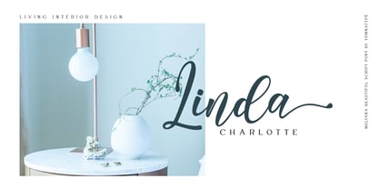
- Mintaka by Hoperative Design,
$12.00
- Menara by Hazztype,
$20.00
- Menoka by Valentino Vergan,
$16.00
- Menaka Serif by Gunjan,
$49.00
- Ornata F by Wiescher Design,
$39.50
- Egyptienne F by Linotype,
$29.99 - F line by alphabeet.at,
$30.00
- F*ck Beans - 100% free

- C Elle F by TeGeType,
$19.00
- SAA Series F by URW Type Foundry,
$35.00 - FF OCR-F by FontFont,
$68.99
- Lewis F. Day 191 - Unknown license

- F. O. T. R. by JAF 34,
$9.90
- M Ling Wai F HK by Monotype HK,
$523.99
- Karnac - 100% free

- Comica Brush by Letteralle,
$23.00
- Ripple - Unknown license

- Maassslicer - Unknown license

- Clarvoyant by Intellecta Design,
$18.90
- GALLEDIS - Unknown license

- RMU Kontrast by RMU,
$30.00
- Deco Blocks - Unknown license

- Clarendon Semi by Wooden Type Fonts,
$15.00
- Schneider Kontrast by Intellecta Design,
$9.00 - wetalmorker - Unknown license

- Durango - Unknown license

- BlackForest - Unknown license

- Andromeda - Unknown license

- Fireworksfont - Unknown license

- Ambrosia - Unknown license

- ArtlookinOneType - Unknown license

- Village - Unknown license

- Schneidler Grobe Gotisch by Intellecta Design,
$24.90 - Night Life JNL by Jeff Levine,
$29.00
- Raleigh Gothic by Red Rooster Collection,
$45.00 - EnglishTowne-Normal - Unknown license

- Be safe - Unknown license

- Burgundian - Unknown license

- Malachim - Unknown license


Page 1 of 17Next page