10,000 search results
(0.439 seconds)
- Tungsten by Sparklefonts,
$22.00A digital foundry situated in England's rural South-West and established in 2005, Sparklefonts is Geoff Andersen, a man on a quest, from philosophy to aesthetics, from wild inspiration to wild gesticulation, from post-modernism right through to post-rationalisation. Boldly seeking unique and viable letterform architectures, he is equally determined to maintain legibility without compromising style. His journey has taken him through stencils and uncials, calligraphy and typography, through graphic design and guitar design. The story has been moving, the view spectacular, the punctuation superb. Geoff's sources are apparently limitless, his passion overwhelming, his fonts a labor of love, his therapist a Trojan! - Text by Alias Collection,
$60.00 Whereas blackletter types were hand written, Text letterforms are drawn using a series of graphic shapes that slot together in a series of permutations, one set for lower case and another for the upper case. As the link between the method of construction of the letterforms has been removed from the appearance (the quill pen with which they were written resulting in the angle and sharp stresses) there is no logic for these stylistic elements to work in any set way. As this fundamental rule of the blackletter style has been removed the typeface has become something other than a typical or derivative blackletter font.
 - Dialog by Sparklefonts,
$22.00A digital foundry situated in England's rural South-West and established in 2005, Sparklefonts is Geoff Andersen, a man on a quest, from philosophy to aesthetics, from wild inspiration to wild gesticulation, from post-modernism right through to post-rationalisation. Boldly seeking unique and viable letterform architectures, he is equally determined to maintain legibility without compromising style. His journey has taken him through stencils and uncials, calligraphy and typography, through graphic design and guitar design. The story has been moving, the view spectacular, the punctuation superb. Geoff's sources are apparently limitless, his passion overwhelming, his fonts a labor of love, his therapist a Trojan! - Festival by Sparklefonts,
$22.00A digital foundry situated in England's rural South-West and established in 2005, Sparklefonts is Geoff Andersen, a man on a quest, from philosophy to aesthetics, from wild inspiration to wild gesticulation, from post-modernism right through to post-rationalisation. Boldly seeking unique and viable letterform architectures, he is equally determined to maintain legibility without compromising style. His journey has taken him through stencils and uncials, calligraphy and typography, through graphic design and guitar design. The story has been moving, the view spectacular, the punctuation superb. Geoff's sources are apparently limitless, his passion overwhelming, his fonts a labor of love, his therapist a Trojan! - Motora Sans by Hubert Jocham Type,
$39.00 Many of my typefaces like Narziss and Mommie and also NewLibris or Verse are rather feminine. With Motora Sans I wanted to be the opposite. Masculine with a smell of gasoline and sweat. Technical and angular. Strong and self-confident. The weights are laid out in the usual way I create my families. 9 weights up to a strong UltraBold, all with italics. What was the inspiration for designing the font? A typeface you would long for in a men's magazine. What are its main characteristics and features? Legible constructed sans serif with German industrial and heritage. Usage recommendations: Corporate branding and magazines and other publications.
 - Wingstone by Omotu,
$18.00 Wingstone is a modern beautiful display sans font. Comes with 2 styles, decorative and regular. Suitable for logotype, branding, packaging design, poster design, website/display, editorial, headline, advertising, and more. Whats Include? 01. Opentype support 02. Multilingual support 03. PUA encoded 04. Features: Uppercase, lowercase, numerals, punctuations, contextual alternates 05. Accessible in the Adobe Illustrator Glyphs panel, or under Stylistic Alternates in the Adobe Photoshop OpenType menu, Adobe InDesign, Corel Draw, even work on Microsoft Word Please message me if you're unsure of any language support. Thanks for looking, and I hope you enjoy it! Please don't hesitate to drop me a message if you have any issues or queries.
 - Amanda Manopo by IRF Lab Studio,
$15.00 Amanda Manopo is a calligraphy script font that comes with very beautiful changing characters, a kind of classic decorative copper script with a modern touch, designed with high detail to bring stylish elegance. Amanda Manopo Script is attractive as a typeface that is smooth, clean, feminine, sensual, glamorous, simple and very easy to read, because there are many fancy letter connections. I also offer a number of viable style alternatives for many letters. The classic style is perfect to be applied in various formal forms such as invitations, labels, restaurant menus, logos, fashion, make up, stationery, novels, magazines, books, greeting / wedding cards, packaging, labels or any type of advertising purpose.
 - Competition by sportsfonts,
$15.00 Competition is a state of the art sports typeface. A large width range, slant angles from –12 to 12, and an adjustable inline make it extremely versatile. It’s devided into 5 subfamilies, from the sizes S, M, L & XL with decreasing inline weights to Solid without an inline at all. (By the way: S doesn’t mean it doesn’t look good in large sizes!) Choose from 105 predefined styles, or 1 variable font with axes for width, slant and inline weight (which is included in the family package). Competition embraces the Latin S character set and therefore supports 400+ Latin-based languages. Go for Gold!
 - Mortice by ArtyType,
$24.00 I set out to create a solid, bold, strong, rugged font, one that would lend itself to any industrial type of use, and by that I mean industry in general, but probably sectors that would still be considered male preserves such as carpentry or metalwork. I thought specifically of mortice & tenon joints, whilst toying with shape and form for this self imposed challenge. I was also visualizing a router tool used for producing most wood joints nowadays. I think the general premise worked out well; in the end I settled on the name Mortice, referring to the slots or negative spaces that the matching part, or tenon would fit into.
 - Fezola by IbraCreative,
$17.00 Fezola, a handwritten signature typeface, epitomizes the essence of personalized elegance. With its fluid strokes and graceful curves, Fezola captures the artistry of a handcrafted signature, infusing a sense of individuality into every letter. The seamless connectivity between characters emulates the natural flow of a pen, creating a signature style that feels authentic and unique. Whether used for branding, invitations, or personal correspondence, Fezola adds a touch of sophistication and warmth, transforming words into a visual representation of personal expression. This typeface transcends conventional fonts, embodying the charm and character of a handwritten signature to impart a distinctive and memorable quality to any project it graces.
 - Bonitto by Omotu,
$18.00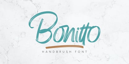 Bonitto is a handwritten script font with 2 styles, Regular and Slant. Bonitto is suitable for branding, logotype, apparel, t-shirts, hoodies, product packaging, quotes, flyers, posters, advertising and more. What's Included? 1. Uppercase and lowercase characters 2. Multilingual support. 3. Numerals, punctuations, and ligatures 4. Accessible in the Adobe Illustrator Glyphs panel, or under Stylistic Alternates in the Adobe Photoshop OpenType menu, Adobe InDesign, Corel Draw, even work on Microsoft Word. Please message me if you're unsure of any language support. Thanks for looking, and I hope you enjoy it! Please don't hesitate to drop me a message if you have any issues or queries. Omotu Studio
 - Button by Scholtz Fonts,
$21.00Button is a solid, chunky, font, with a bold symmetry that makes it a must for products aimed at the younger set. Its unusual letter shapes all point to “NEW TREND!” It is the perfect choice for marketing companies targeting: ⁃ web-design and the creation of stylish buttons and menus ⁃ the music scene: CD covers, posters, music videos ⁃ the movie scene: posters, ads, movie titles ⁃ the theatre scene: posters, programs, ads, promotions ⁃ the fashion scene: swingtags, posters, brochures, signage, ads It has been carefully letterspaced and kerned. It contains a full character set: all upper and lower case characters, punctuation, numerals and accented characters are present. - Legestue by Bogstav,
$16.00 Legestue is danish and means playroom. But perhaps that translation is too direct. Legestue is a place where you can come with your kids and play with other kids. Kinda like a kindergarten, but in much smaller scale. I attended a Legestue when my kids were like 2 years old. But that's a looong time ago! I like the idea of just dropping by and see who's playing and who's around. And the same goes for this font - each letter is off and different, and quite playful. Also, the letters has a crunchy outline, which made me think of some of the cookies I ate at the Legestue :)
 - Nophine by Mantype Studio,
$18.00 Nophine is a typeface conceived by Sulai Man specifically for intensive editorial use, mainly in newspapers, magazines, and online, its personality and flexibility make it a true multipurpose typeface. The intermediate weights deliver a neutral look when used in text sizes, providing the usual robustness expected in a newspaper font. The unobtrusive appearance, excellent texture, and slightly colour allow it to behave flawlessly in continuous text, even in the most unforgiving editorial applications. As it becomes larger in print,Nophine shows its personality through a series of measured particularities which make it easy to remember and identify. Its energetic character, becomes evident when used for subheadings and headlines.
 - Pinkhoff Caps by TypeFaith Fonts,
$10.00 This fantastic beautiful Amsterdam School fonts brings alive the roaring twenties and crashing thirties. An art deco typeface from the Netherlands that summons a thirties vibe for a nostalgic twist on chic lines. It's the work of designer Leon Hulst, and you can see from the layout examples here that nostalgia means ruin, and it has become super cool to use a ruin vibe in retro aesthetics. Yep, there's a touch of class to that worn out look and feel, and the beautiful lines of the typography and numerals show how the barely restrained charisma of art deco can be coupled with the new obsession with all things vintage.
 - Hibrush by Omotu,
$18.00 Hibrush is a font that comes in 2 versions, a brushed texture regular version and a solid style. Hibrush is perfect for logos, apparel, T-shirt, hoodies, product packaging, or anything else. It includes Uppercase and lowercase characters, Supports international languages, contains numerals, punctuations, ligatures, stylistic alternates, and stylistic sets. Those are accessible in the Adobe Illustrator Glyphs panel, or under Stylistic Alternates in the Adobe Photoshop OpenType menu, Adobe InDesign, Corel Draw, even work on Microsoft Word. Thanks for looking, and I hope you enjoy it. Please don't hesitate to drop me a message if you have any issues or queries. Omotu (ibnu.blawong2@gmail.com)
 - Lisboa by Vanarchiv,
$35.00 This humanist sans-serif typeface was exhaustively designed, full-featured typeface family that reveals its character and distinctiveness in complex text. It features a large complement of ligatures, lining and old-style figures, expert characters, dingbats (arrows, brackets, and symbols for both Regular weights). In the original Lisboa Pro the forms of the letters are humanist, with hooked headterminals, the characters contains medium contrast with a left-angled stress on the strokes. After ten years from the first version publication, this new version (0.2) is available with Latin (Western, Central Europe) and Cyrillic alphabets. It was selected by Our Favorite Fonts of 2005 (Typographica).
 - Sore by Omotu,
$18.00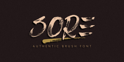 Sore is an authentic brush font, real brush texture. All caps characters. Sore is suitable for branding, logotype, apparel, T-shirts, Hoodies, product packaging, quotes, flyer, poster, advertising and more. Whats Include? 1. Uppercase and lowercase characters 2. Multilingual support. 3. Numerals, punctuations, alternate, and ligatures 4. Accessible in the Adobe Illustrator Glyphs panel, or under Stylistic Alternates in the Adobe Photoshop OpenType menu, Adobe InDesign, Corel Draw, even work on Microsoft Word. Please message me if you're unsure of any language support. Thanks for looking, and I hope you enjoy it! Please don't hesitate to drop me a message if you have any issues or queries. Omotu Studio
 - Lisboa Sans by Vanarchiv,
$35.00 This humanist sans-serif typeface was exhaustively designed, full-featured typeface family that reveals its character and distinctiveness in complex settings. It features a large complement of ligatures, lining and old-style figures, expert characters, dingbats (arrows, brackets, and symbols for both Regular weights). Lisboa Sans lacks the hook-head terminals, but its structure and proportions are the same. The simplicity of the sans weight created very strong readability at small sizes. After ten years from the first version publication, this new version (0.2) is available with Latin (Western, Central Europe) and Cyrillic alphabets. It was selected by Our Favorite Fonts of 2005 (Typographica).
 - Park Avenue by URW Type Foundry,
$35.99 Park Avenue Park Avenue was designed by R.E. Smith in 1933 for American Type Founders. Park Avenue is an elegant and light script with freely drawn capitals. Park Avenues pen-drawn quality is particularly evident in the lowercase. The ascenders and descenders of this script font are long; the ascenders are bent-over at the top. Park Avenue has a small 'x' height with tall ascenders, giving the face a refined, elegant appearance. The full elegance and lightness of Park Avenue are only apparent when combining upper and lowercase. It would be worthwhile trying this script in display sizes, for personal messages, invitations, business cards and greetings cards.
 - Csemege by Roland Hüse Design,
$19.00 Csemege is a fully cursive even script inspired by Hungary's 60' 70's shop signages of mostly food and grocery stores and restaurants, and their neon light scripts. Csemege means Delicatessen in Hungarian. I have developed this set of characters with Contextual alternates and a few Stylistic alternates to make the letter connections smooth and perfect. It has a friendly look yet decorative and elegant script. For best result please make sure you are using this font with softwares that supports open type features and you have these features turned on: Contextual alternates, Stylistic alternates and Standard ligatures. Language support (accents) : Western European and Hungarian.
 - Perola by IKIIKOWRK,
$17.00 Introducing Perola - Fancy Type, created by ikiiko. Perola means "pearl" and comes from spanish language. This letter has a distinctive feature on its hook, which is in the form of a unique and dynamic curve. This letter is suitable if you want to show a cheerful impression or playful design with solid color. This typeface is perfect for an cute branding, pop art design, packaging product, food & beverages, quotes, or simply as a stylish text overlay to any background image. What's included? Uppercase & Lowercase Number & Punctuation Multilingual Support Works on PC & Mac Enjoy our font and if you have any questions, you can contact us by email : ikiikowrk@gmail.com
 - Zidler by MKGD,
$13.00 One of my all time favourite movies is Baz Luhrmann’s Moulin Rouge. In it, there’s a brief scene where the proprietor of the Moulin Rouge (Harold Zidler) signs away the deeds to the establishment. The actual signing of his signature is what motivated me to create this script font. Although it’s not an exact replica of the character’s hand, I like to think that it has the same crisp immediacy of the original. With its consistent oblique slant, narrow and long ascenders and descenders, and the occasional blobbing of letters, the overall effect, gives the appearance of a correspondence penned by lamplight while a storm rages outside.
 - Scientia by ParaType,
$30.00Scientia (means 'knowledge', 'science' in Latin) is a neutral serif typeface in eight styles. It contains four weights (Regular, Medium, Bold, Black) with corresponding italics. All the styles support Western and Central European Latin, basic and Asian Cyrillic and Greek. Regular and Medium styles include smallcaps for all supported languages. In addition to the standard set of non-alphabetic characters Scientia has arrows and some supplemental mathematical symbols. The font was created by Natalia Vasilyeva. Being a professional book designer, Natalia uses Scientia in astronomy books. Scientia is a good choice for literary fiction and academic non-fiction texts. The typeface was released by ParaType in 2016. - Eckhardt Bold JNL by Jeff Levine,
$29.00 Eckhardt Bold JNL continues a series of sign painter-inspired type designs and is named in honor of the late Al Eckhardt, a talented sign man who was a good friend of Jeff Levine for about 18 years until his passing. The font is available in both regular and oblique versions and was inspired by an example found in the 1928 edition of E.C. Mattthews' "How to Paint Signs and Sho' Cards". Both squat and wide for maximum use in wall and window applications, the original name for the design is "Heavy Plug". Plug was the sign painter's term at the time for describing this type of letter form.
 - Salient by Device,
$39.00 Elegant, classic yet contemporary. Salient is a updated interpretation of the Didot school of type design, typified by Giambattista Bodoni in Italy and the “modern” French styles of high-contrast fonts cut by Fermin Didot in Paris the early 19th century. Salient is not a historical revival but a contemporary reworking, using fewer pen-derived forms especially in the lower case. This gives it a cleaner edge. Instead of ball serifs, it uses lightly flicked stroke terminals. It is suitable for both text and headline, and the wide range of weights make it a versatile choice for books, magazines, reports, posers, packaging and corporate identities.
 - Groundhog by Sparklefonts,
$22.00A digital foundry situated in England's rural South-West and established in 2005, Sparklefonts is Geoff Andersen, a man on a quest, from philosophy to aesthetics, from wild inspiration to wild gesticulation, from post-modernism right through to post-rationalisation. Boldly seeking unique and viable letterform architectures, he is equally determined to maintain legibility without compromising style. His journey has taken him through stencils and uncials, calligraphy and typography, through graphic design and guitar design. The story has been moving, the view spectacular, the punctuation superb. Geoff's sources are apparently limitless, his passion overwhelming, his fonts a labor of love, his therapist a Trojan! - Khalifah Script by Solidtype,
$15.00 Khalifah Script is a calligraphy script font that comes with very beautiful changing characters, a kind of classic decorative copper script with a modern touch, designed with high detail to bring stylish elegance. Khalifah Script is attractive as a typeface that is smooth, clean, feminine, sensual, glamorous, simple and very easy to read, because there are many fancy letter connections. I also offer a number of viable style alternatives for many letters. The classic style is perfect to be applied in various formal forms such as invitations, labels, restaurant menus, logos, fashion, make up, stationery, novels, magazines, books, greeting / wedding cards, packaging, labels or any type of advertising purpose.
 - Jotia by Hashtag Type,
$32.00 Creating a combination between serif and sans serif typefaces, Jotia utilises the best of both worlds, resulting in a unique and modern neo-humanist font family. Taking its inspiration from lapidary inscriptions rather than pen drawn text, Jotia uses triangular serif shape details to create a strong uniformed personality with clear legibility. This original quality enables characters to be expressive in headlines, as well as in printed and onscreen text situations. Jotia also works beautifully alongside both serif and sans serif typefaces giving complex editorial work a more powerful and visually stimulating dynamic. Details include six weights, manual kerning and spacing, ligatures and alternatives.
 - Antura Script by Solidtype,
$18.00 Antura Script is a calligraphic script font that comes with very beautiful changing characters, a kind of classic decorative copper script with a modern touch, designed with high detail to bring stylish elegance. Antura Script is an attractive typeface that is smooth, clean, feminine, sensual, glamorous, simple and very easy to read because there are many fancy letter connections. I also offer a number of viable style alternatives for many letters. The classic style is perfect to be applied in various formal forms such as invitations, labels, restaurant menus, logos, fashion, make up, stationery, novels, magazines, books, greeting/wedding cards, packaging, labels or any type of advertising purpose.
 - Gerdika by Mantype Studio,
$22.00 Gerdika is a typeface conceived by Sulai Man specifically for intensive editorial use, mainly in newspapers, magazines, and online, its personality and flexibility make it a true multipurpose typeface. The intermediate weights deliver a neutral look when used in text sizes, providing the usual robustness expected in a newspaper font. The unobtrusive appearance, excellent texture, and slightly colour allow it to behave flawlessly in continuous text, even in the most unforgiving editorial applications. As it becomes larger in print,Gerdika shows its personality through a series of measured particularities which make it easy to remember and identify. Its energetic character, becomes evident when used for subheadings and headlines.
 - Sequal by Mans Greback,
$29.00 Sequal is a handwritten graffiti tag script. It was drawn and created by Måns Grebäck between 2018 and 2020. Its round and soft letters are youthful and active, and cool while being cute. Sequal is a typeface family of five weights: Thin, Light, Regular, Bold and Black. The different weights ensures usability in any context, while also giving the ability to emphasize phrases or words. The font supports hundreds of languages, including European and Asian Latin scripts. Composed of over 1250 glyphs, it is guaranteed to contain all characters you'll ever need, including all punctuation and numbers. It also contains OpenType features such as alternates and ligatures.
 - Singaphore by Zaki Creative,
$12.00 Singaphore is Stylish calligraphy font, Singaphore made by hand with copperplate pen and opentype feature with pua encode, Singaphore calligraphy include alternative,stylistic set and swash, Every glyph lowercase have a stylistic style, Singaphore is perfect for branding, wedding invites and cards or quote. In order to use the beautiful swashes, you need a program that supports OpenType features such as Adobe Illustrator CS, Adobe Photoshop CC, Adobe Indesign and Corel Draw. The swashes are called alternative style. For example, letter "a" with ss.01 and ending swashes are alternative style for "a". In order to access you need them you need to open Glyphs panel.
 - Fallery Script by Zane Studio,
$15.00 Fallery Script is a calligraphy script font that comes with exquisite character changes, a kind of classic decorative copper script with a modern twist, designed with high detail for an elegant style. Fallery Script is interesting because it is smooth, clean, feminine, sensual, glamorous, simple and very easy to read, because of its many fancy letter relationships. I also offer a decent number of stylistic alternatives for some of the letters. Classic style is very suitable to be applied in various formal forms such as invitations, labels, restaurant menus, logos, fashion, make up, stationery, novels, magazines, books, greeting/wedding cards, packaging, labels or all kinds of advertising purposes.
 - Gondess by Omotu,
$16.00 Gondess, a handwritten script font with 4 lowercase alternate variations. Gondess is perfect for branding, logotypes, apparel, T-shirts, Hoodie, product packaging, quotes, flyers, posters, and more. Whats does Gondess offer? 1. Uppercase and lowercase characters 2. Supports international languages 3. Numerals, punctuations, stylistic alternates. 4. Accessible in the Adobe Illustrator Glyphs panel, or under Stylistic Alternates in the Adobe Photoshop OpenType menu, Adobe InDesign, Corel Draw, even work on Microsoft Word. 5. Multilingual support. Please message me if you're unsure of any language support. Thanks for looking, and I hope you enjoy it. Please don't hesitate to drop me a message if you have any issues or queries.
 - Punkaholic by Sharkshock,
$115.00 Punkaholic started out as a loopy, all caps display font with a semi condensed feel. Before completion some of the letters such as A and W were given a more traditional look and were penciled in for alternates. In the end, however, they were added as uppercase characters instead. For this reason most words in lowercase vary in appearance from their uppercase counterparts. This dichotomy between straight lined capitals and rounded ones makes for some interesting contrasts. Punkaholic works best in less formal settings such as café menus, t-shirts, or children’s publications. It comes in 3 styles and contains Latin, extended Latin, punctuation, and kerning.
 - Chips Snack by Omotu,
$16.00 Chips Snack! A hand-written font with 2 styles, regular (brush texture) and solid. Chips Snack is perfect for short typography, logotype, apparel, T-shirt, Hoodie, product packaging, quotes, flyer, poster. Whats Include? 1. Uppercase and lowercase characters 2. Supports international languages 3. Numerals, punctuations 4. Accessible in the Adobe Illustrator Glyphs panel, or under Stylistic Alternates in the Adobe Photoshop OpenType menu, Adobe InDesign, Corel Draw, even work on Microsoft Word 5. Multilingual support Please message me if you're unsure of any language support. Thanks for looking, and I hope you enjoy it! Please don't hesitate to drop me a message if you have any issues or queries.
 - Monolina by Petra Docekalova,
$29.99 Monolina is a contemporary monolinear script that is based on the contrast between classical (beautiful) calligraphy and quickly jotted manuscript (sketches). As all styles are based on the single stroke of a round nib pen, the letter is rounded. The typeface features two sets of capital and curly uppercase letters, swash characters and alternative lowercase letters, which combine well in three styles. The font also features swash figures and decimal figures for writing years and summer sales. Accent marks for all languages using Latin letters, currency symbols and punctuation marks are included. The typeface comes across as fresh as is particularly effective at headline point sizes.
 - Emmeline by Dear Alison,
$19.00 There's something about the endless variations of handwriting, the tactile process of pen, pencil or brush to paper, and the personal and ephemeral quality as a whole. I recently came across some old handwritten letters from when my younger sister was going to college, and as soon as I saw them, a flood of memories came back to me. All just from seeing her handwriting. That's just one thing handwriting can do. I hope you find enjoyment in my sister's handwriting as much as I still do. This font is complete with alternates that will auto-typeset via the ligature feature to give a more handwritten feel.
 - Whitenow by Proportional Lime,
$15.99 In the year 1528 Pierre Attaignant led a revolution in music printing. His method of once-press moveable type, greatly simplifying the original 3 impression process developed by Petrucci, remained in use till near the end of the 17th century. The method could only realize one line of music per staff, and the introduction of barlines as a common means of aligning multiple staves brought this method to a close after nearly two centuries of use. This font is meant to allow the printing of music using that method with the notation of that era. It is largely based on an exemplar printed by Snodham of London.