10,000 search results
(0.035 seconds)
- Kettonia by Keristyper Studio,
$14.00 Kettonia is a modern aesthetic serif font that is both memorable and stylish. This font is good for logo design, Social media, Movie Titles, Books Titles, short text even long text letters, and good for your secondary text font with sans or serif. **Featured:** * Standard Uppercase & Lowercase * Numeral & Punctuation * Multilingual : ä ö ü Ä Ö Ü ß ¿ ¡ * Alternate & Ligature * PUA encoded We recommend programs that support the OpenType feature and the Glyphs panel such as Adobe applications or Corel Draw. so you can use all the variations of the glyphs. Hope you enjoy our fonts!
 - Gardens by The Rivertown Inkery,
$20.00 Gardens is a nostalgic arena font. Inspired by a soon-to-be demolished arena, this font was created to capture the memories and good times this building once contained. Upon hearing the news of the demolition, our team was struck with sadness and nostalgia. As youngsters we can recall attending a wide variety of events, such as hockey games, pro wresting and the circus. Our hope is that others can share in our nostalgic love of this once prominent arena. With curvy retro styling Gardens is unique and will fit in with many retro and vintage logos and design. Wether its t-shirts, posters or digital, Gardens will surely make your work stand out!
 - The Best We Could Do by Chank,
$39.00 The new font “The Best We Could Do” was created by artist and author Thi Bui who used the font in the graphic novel by the same name. The font is brush-script handwriting font which displays human personality rendered with bold confident strokes full of passion and expression. Chank’s work on this font captured Bui’s distinctive textual style and also saved her a ton of headache and time in inking. A debut memoir that tells the story of one family’s journey from their war-torn home in Vietnam in the 1970s to their new lives in America, the autobiographical book is lauded for its heart-breaking exploration of identity, family, and home. Bui ties her modern life with the multi-generational experiences of her family, weaving together the emotional threads of their relationships to find clarity in her current day. “The Best We Could Do” graphic novel is published by Abrams ComicArts and is available wherever fine books are sold.
 - Narony by Alit Design,
$22.00 Introducing "Narony" – where sophistication meets nature in a harmonious dance of elegant typography and organic inspiration. This unique font seamlessly blends the timeless allure of serif with the dynamic fluidity of script, creating a typographic masterpiece that is both refined and enchanting. Serif Elegance: Embrace the classic charm of serif letterforms that exude sophistication and readability. Narony's serif elements add a touch of timelessness to your text, making it perfect for both formal and creative contexts. Dynamic Script: The script elements in Narony bring a sense of movement and fluidity to your words. The dynamic script flows effortlessly, adding a touch of personality and modernity to your designs. Whether used for headings or accents, Narony's script component elevates your text with grace. Natural Harmony: Immerse your designs in the serenity of nature with Narony's natural concept. Adorned with elegant leaf illustrations, each character is delicately intertwined with botanical elements, creating a seamless blend of man-made artistry and the beauty of the natural world. Versatility in Design: Narony is designed for versatility, making it suitable for a wide range of applications. From branding and logo design to wedding invitations and editorial layouts, this font effortlessly adapts to various design needs. Distinctive and Memorable: Set your projects apart with a font that is both distinctive and memorable. Narony leaves a lasting impression on your audience, ensuring that your message is not just read but experienced. Ideal Usage: Branding and Logo Design Editorial Layouts Wedding Invitations Packaging Design Social Media Graphics Nature-themed Projects Elevate your designs with the perfect blend of sophistication and nature – Narony. Let your words flourish in the graceful strokes of this font, where each character is a work of art and each design tells a story of elegance and harmony. Experience the beauty of Narony and redefine your typographic expression.
 - WTF Bokytime by Wasabib Type Foundry,
$17.00 Bokytime is a display script font is a typeface that exudes elegance and sophistication with its flowing, timeless, minimalistic yet impactful sweeping letterforms. It captures attention and adds a touch of artistic flair to any design project. The ornate and decorative nature of display script fonts makes them ideal for creating a memorable impact in logos, headlines, invitations, and other creative applications. Bokytime is also bold and commanding, with thick, substantial letterforms. It conveys a strong presence and demands attention. Thick fonts are commonly used in headlines, posters, and other design projects where the goal is to make a bold statement. The weightiness of the strokes adds a sense of strength and solidity to the typography, creating visual impact and enhancing readability.
 - Discota by Craft Supply Co,
$20.00 Discota - Fluffy Display Font embodies the retro coolness of the 80s and 90s, exuding a playful and groovy aesthetic reminiscent of those iconic decades. Its rounded, boogie-inspired design with soft edges and friendly appearance makes it an ideal choice for projects aiming to evoke nostalgia or a carefree, energetic atmosphere. Discota effortlessly captures the spirit of the past, making it the perfect choice to infuse your creative work with a touch of nostalgia and a whole lot of fun. Choose Discota to bring the funky and stylish aesthetics of the 80s and 90s to your designs, creating a memorable and captivating visual experience. This typeface enhances a wide range of design projects, including greeting cards, packaging, brand identity, posters, and more, adding eye-catching and trendy appeal.
 - JollyGood Serif by Letradora,
$16.00 JollyGood Serif is another member of the JollyGood family. This is a hand drawn serif/typewriter font that can work both for comics or as a display face . It is a complete complete family with 4 weights in regular and italic (8 fonts in total). It has an amazing character set, with support for most latin languages, as well as extra characters and ligatures.
 - Matita Geometric by Trine Rask,
$30.00 Matita Geometric is part of a larger type family developed from 2005-2019 with handwriting and teaching in mind. A humanistic geometric sans serif in five weights containing mathematical symbols, roman numerals, fractions, superior-& inferior numerals, tabular & proportional figures. The family share proportions and weights to ensure all fonts (family members) work together well. Matita Geometric is also a very basic typeface suitable for many purposes.
 - Stevie Sans by Typefolio,
$29.00 Some years ago I had my first contact with a grotesque typeface, when handling a sample catalog of typographic specimens from the age of phototypesetting. The style eventually settled in my memory waiting for the work of time. Behind its apparent neutrality, there is a complex balance game, that almost leads to the basic principles of design which deliver such power to the grotesque style. Stevie Sans is the answer to the action of time. A bridge that allows the designer to go into the past, while being in the present and looking towards the future. It is what it’s expected from a grotesque designed in the 21st century. With 7 roman styles ranging from thin to black, support to many languages and essential opentype features, Stevie Sans is the ideal choice for your project.
 - Vamp by Burghal Design,
$29.00A quintet of remorseless homewreckers, each member of the Vamp family contains hypnotic dingbats to lure you into their web. The Vamp family consists of the bewitching Vamp, the bigger, brasher Vamp Bold, the dangerous, psychedelic Psycho Vamp, as well as the lean (but still mean!) Vamp Slim and Vamp Slim Oblique. The Vamp family's seductive art deco form and fiendishly geometric wiles will break your heart and steal your soul. - SL Che by Sudtipos,
$29.00SL Che is a homage to Ernesto Guevara de la Serna, “El Che”, who lived between 1928 and 1967. El Che turned into an universal icon through a memorable photograph which was reproduced and multiplied to the infinite. It was that way he became a synonymous of resistance, revolution and change for lots of generations. That "Che" comes back today by the hand of the genial Jorge Alderete, who designed heroic, laughing and cool variations of that popular first icon. SL Che unfolds like a fan of thousands of "Che", in a development plenty of metaphors. SL Che abridges a sum of original iconographic illustrations in True Type format, which masterly synthesizes the most important themes of the grand genius of the literature. SL Che takes part of the "Icons of Icons" Gallery, developed by SinergiaLab for Sudtipos - FDI Tierra Nueva by FDI,
$25.00 Four fonts — found on a map of America, created by the spanish cartographer Diego Gutiérrez and the dutch engraver Hieronymus Cock anno 1562. From the start of the digitization by Sebastian Nagel in 2005, Tierra Nueva has gone a long way. On its journey of exploration it has grown to four members of a family (regular, bold, italic and script) with an overall count of almost 3.700 characters for different languages and purposes, extensively featured with useful typographic options. Over six years after the start of the expedition, it shall be launched. Land ahoy!
 - Valsity by Ingrimayne Type,
$9.00 Valsity is a squarish slab-serif family with five weights and two widths, each with an italics for a total of twenty members. With negligible contrast, it is almost monoline. It is for decorative uses; it is too square and lacks the contrast to make it a good choice for extensive text. Valsity began with a blending of two other squarish slab-serifs, Valgal and Kwersity, and its name reflects that ancestry. From there it took on a life of its own, often diverging from its parents.
 - Missing Lovely by Allouse Studio,
$16.00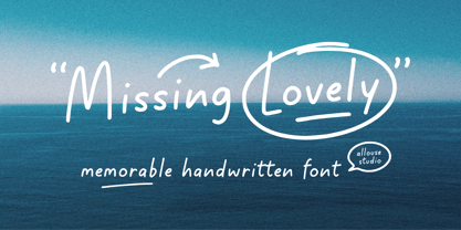 Proudly Presenting, Missing Lovely A Memorable Handwritten Font. Missing Lovely is perfect for any titles, logo, product packaging, branding project, megazine, social media, wedding, or just used to express words above the background. Missing Lovely also come with Multi-Lingual Support. Enjoy the font, feel free to comment or feedback, send me PM or email. Thank You!
 - Little Brownie by The Ocean Studio,
$10.00 Little Brownie is playful font family which puts a smile on your projects and will inspire you to create something fun and memorable. It is perfect for headings, flyer, greeting cards, product packaging, book cover, printed quotes, logotype, apparel design, album covers, etc. Features: – Multilingual Support – PUA Encoded – Numerals and Punctuation Thank you for downloading from Ocean Stud.
 - Delliger by Twinletter,
$15.00 Delliger, a stunning, energetic display typeface with eye-catching forms, is now available. This font is ideal for graffiti-themed projects, outdoor projects, special events, penning lovely quotes, and much more. With this font, you can make your project gorgeous and memorable for everyone. This graffiti font is great for product logos, poster titles, headlines, packaging, film titles, logotypes, gorgeous writing, and trendy graffiti designs, among other things. Of course, if you utilize this font in your numerous creative projects, they will be perfect and outstanding. Use this typeface right away for your one-of-a-kind and remarkable projects.
 - Zt Chablis by Khaiuns,
$14.00 Chablis is a serif font with two different design colors including a cyliric typeface. Chablis comes in 2 styles, and each style has 5 weights, Chablis Basic shape with a harmonious and classic look that makes you feel nostalgic for precious memories from the golden years that have passed, Chablis Slow shape with a sharp look at the bottom corner of small letters but very elegant and classy, very suitable for presenting a new atmosphere of corporate identity design, websites, publications, titles, books, magazines, business cards, logos, product labels, packaging or any kind of purpose advertising. Includes: Numbers & punctuation Classic Numbers Ligature Foreign language support I hope you have fun using zt Chablis Thanks for using this font ~ Khaiuns X zelowtype
 - Givani by Khoir,
$15.00 Introducing, Givani, a font with a retro look but cute impression making this font unique with a consistent thickness, making memories of the 70s era, this font has an interesting alternative as well as several ligatures to complement it. This font is perfect for creating logos, invitations, novels, books, magazines, labels, greeting / wedding cards. So what are you waiting for! What's included? Uppercase Characters Lowercase Characters Support 75+ Language FEATURES Givani (OTF) So what are you waiting for? immediately purchase this font, feel free to comment, or send me my PM or email at khoirtypework@gmail.com Thank you for seeing
 - Gladick Display by Dora Typefoundry,
$17.00 Gladick is a modern take on a sans style typeface but mixes in the added contrast of serifs to make the font contemporary and memorable. Each letter is crafted with care to make your text unique yet stylish. Soft curves make for a bold type Now with the addition of italics. Great for fashion branding and editorial design. Features: All Uppercase and Lowercase Number & Symbol Supported Languages Alternates and Ligatures PUA Encoded This type of family has become the work of true love, making it as easy and fun as possible.I really hope you enjoy it! if you have any questions or problems please contact email:doratypefoundry@gmail.com Thank you and good job.
 - Shàngó Chiseled by CastleType,
$59.00 Based on the elegant and somewhat delicate Shàngó "Classic", Shàngó Chiseled goes to the other extreme with a bold and emphatic design that continues the legacy of the beautiful classic proportions of Dr. Schneidler's original titling typeface. Warm, cheerful, open, and sensitively masculine, Shàngó Chiseled can give you the impact you need. Perfect for an embossed look, or of classic lettering in stone. A complete character set that supports most European languages. Shàngó Chiseled is a member of the extended Shàngó family (Classic, Chiseled, Sans, Gothic).
 - Jumiko Faux by Twinletter,
$15.00 Jumiko is a display typeface with a Japanese motif and a dramatic hand touch that results in a stunning and futuristic mix of words. You can simply use this font to make your project unique and memorable, making it stand out and easy to remember for everyone. Logotypes, food banners, branding, brochure, posters, movie titles, book titles, quotes, and more may all benefit from this font. Of course, using this font in your various design projects will make them excellent and outstanding; many viewers are drawn to the striking and unusual graphic display. Start utilizing this typeface in your projects to make them stand out.
 - QOROSHI by Twinletter,
$15.00 Qoroshi is a Japanese-style font with a distinctive display theme in each letter that may turn your project into a natural continent and give it a unique impression. Each lovely curve in each letter character makes your project memorable in the minds of your customers. Logotypes, food banners, branding, brochure, posters, movie titles, book titles, quotes, and more may all benefit from this font. Of course, using this font in your various design projects will make them excellent and outstanding; many viewers are drawn to the striking and unusual graphic display. Start utilizing this typeface in your projects to make them stand out.
 - Standard CT by CastleType,
$59.00 CastleType was commissioned in 1991 by San Francisco Focus magazine to digitize three members of the Standard family. This is a Continental lineale that was popular in Switzerland in the 1950s and later in the United States. A cousin to the classic sans serifs, Standard is an alternative that is considerably warmer and a bit more idiosyncratic. In 2008, CastleType released additional members of the Standard CT family to make it a complete typographic solution with three widths (normal, condensed, extended) of four weights each (Regular, Medium, Bold, and Extra Bold). Some of the original Standard fonts, particularly Standard Regular, appear to have been hastily designed (or perhaps too closely imitated Helvetica); these have been greatly improved in the CastleType versions with more harmonious proportions and other refinements. The three lighter weights of the Extended subfamily were designed from scratch based on the new Standard CT Regular and Standard CT Extended Extra Bold. More recently, four light weights (Light, Extra Light, Ultra Light, and Hairline) have been added to each of the three widths. The entire Standard CT family includes support for most European languages, OpenType features, arbitrary fractions, and a collection of geometrics, dingbats & fleurons.
 - Die Bruecke by Hanoded,
$15.00 Die Brücke was a group of German expressionists which formed in Dresden in 1905. Members of the group include Erich Heckel, Fritz Bleyl, Ernst Ludwig Kirchner and Karl Schmidt-Rottluff. Much of the group's work was influenced by primitivism and medieval woodblock printing. Die Bruecke font was based on a printed invitation for an art exhibition from 1906. Although the font is all caps, upper and lower case glyphs differ and can be interchanged. Of course Die Bruecke comes with extensive language support.
 - Ballet Mechanique by Characters Font Foundry,
$25.00 Ballet Mechanique is a custom designed font for musician Jeroen Borrenbergs, aka Ballet Mechanique. For his upcoming record releases Jeroen asked me to create a special font for him. As co-founder and graphic designer at Stoere Binken Design he creates his own artwork and therefor had very specific wishes. The font should be warm, soft and have soul. He gave me some sketches for his logo that I should use as a starting point. The result is a very narrow, kind of techno, monocased font called "Ballet Mechanique" (what else). After having served his purpose, Jeroen Borrenbergs allowed his font to be sold publicly. Jeroen Borrenberg’s debut work, in 1996, received hugely praising reviews. Muzik Magazine made Evolutionary Entities techno single of the month, Laurent Garnier and Mister C constantly played it in their sets and Morgan Geist just said “I won’t do a review here - let me just encourage all of y’all to listen to and/or pick up the new Eevolute 12″. Beautiful stuff - complex, melodic, soaked in just enough reverb to take it to another room. Check or regret.”
 - Lewis by Thierry Fétiveau,
$10.00 Lewis is a stencil typeface inspired by vintage sign painting. Lewis is designed for display use within printed publications as it has a high contrast of organic forms. Lewis consists of 3 styles; Classic, Display and Inline. Each style is based on the same skeleton but with a different personality. The Classic style is a simple and elegant stencil typeface which is also the original structure of Lewis. The Display style features intertwined flourish like parts and the last member of the family is the Inline style which features subtle internal details.
 - Nisse by Typoforge Studio,
$30.00 Say hello to a new Typoforge member! Nisse is a display font family that consists of 4 styles (including italics). The regular and rough versions differ in the amount of wear. It’s inspired by Rex typeface first published by „The Jan Idzikowski and Co. Foundry“ in 1930. Nisse has a high amount of detail making it ideal for large prints and poster design. It is specified by a huge amount of automatic alternates. Each basic latin letter has five versions, the numbers have thee versions and extended latin letters have two versions.
 - Amuttix by Twinletter,
$15.00 Welcome to the era of modern elegance with Amuttix, a slab serif display font that will elevate your visuals to the next level. Are you looking for a clean, elegant, and powerful look for your project? Amuttix is the answer. With four different family variants, including Regular, Outline, Shadow, and Light, Amuttix gives you incredible flexibility in delivering a look that suits your design vision. You can create powerful and memorable messages with a distinctive touch of elegance. This font not only offers great visual appeal but also supports multiple languages, ensuring your message is accessible to audiences around the world. Amuttix - a symbol of modern perfection in every letter. Immediately use this font to bring an unforgettable impression to each of your projects!
 - Toisy by Letrizmo,
$21.00When the right late seventies / early eighties message is needed, Toisy comes to the rescue. Founded on a mix of references from letterforms of the time, this new original nods to a style that defined an era. A sexy theme font that conveys a clear image of what was truly chic thirty years ago, this alphabet is deeply rooted in sultry memories of soft, endless nights. Exaggerate contrast between strokes and angular lines combine with rounded corners to provide a unique character and a look that sharply differs when set in all caps or lower case, thanks to an uncommon treatment of density and proportions. Set it real tight, as was typographically in fashion circa 1981. Toisy and Toisy Greek include a set of 13 matching images inspired in leisure stuff and the clothing of the last days of disco. They are different from the set included with Toisy Alt. - Tati by Wiescher Design,
$33.33I only had this bouncy curve and a photograph of a daily menu (Truite Meunière) I took outside an obscure Paris restaurant when starting the design of this font. But while working on it I suddenly started thinking about Jacques Tati the famous but almost forgotten french director of Les Vacances de Monsieur Hulot, Jour des Fêtes, Mon Oncle, Playtime, Trafic etc. I thought about his bouncy walk and his hilarious ideas. The memories never left me while working on the font, so I decided to name the font after this great French moviemaker who gave me so many happy hours. Since Tati was a very funny character, I gave my characters a funny price. Thank you Jacques Tati, yours Gert Wiescher - Worthbites by Invasi Studio,
$13.00 WORTHBITES is a Biteable, Uneven, Unexpected, and Playful font special for Food Display, that puts a smile on your projects and will inspire you to create something fun and memorable. WORTHBITES will help you to create special and touching typographical designs for fun or childish projects, It is perfect for headings, flyers, greeting cards, product packaging, book cover, printed quotes, logotype, apparel design, album covers.
 - Great Outback by Epiclinez,
$18.00 Great Outback is a display typeface that's bold, fun and playful. It's also clean and versatile, making it a perfect addition to any designer's kit. Packed with personality, this typeface screams out loud. Great Outback is suitable for headlines, packaging, logo etc. Use it to give your design that memorable edge. Out of the ordinary and into the great outdoors! So what’s included : Standard Latin Numbers, symbols, and punctuations Multilingual Support. Accented Characters : ÀÁÂÃÄÅÆÇÈÉÊËÌÍÎÏÑÒÓÔÕÖØŒŠÙÚÛÜŸÝŽàáâãäåæçèéêëìíîïñòóôõöøœšùúûüýÿžß PUA Encoded and fully accessible without additional design software Simple Installations Works on PC & Mac Thank You!
 - Jazek by Twinletter,
$17.00 "Welcome to the typographic world of creativity! A display font with a genuinely distinctive handwritten look is called Jazek. Jazek is the ideal option if you want a powerful and distinctive look for your various visual design tasks. What sets Jazek apart? Unrestricted imagination. Jazek allows you the freedom to produce character-rich and distinctive letter designs thanks to the various ligatures and alternates. You have the opportunity to use originality in each assignment. We value effective communication with a global audience, which is why Jazek supports a variety of tongues. Your message will be able to resonate with a variety of global audiences thanks to Jazek. Prepare yourself to produce memorable and inspirational designs. Purchase Jazek right away to see how it can convert any of your projects into captivating works of typographic art.
 - Nobodi by Wilton Foundry,
$29.00This Bodoni-like font sets out to slightly square off rounded shapes, adding a very slight curve to the join from the square serif and stem, and minimizing and softening the pronounced bulbs found in Bodoni. There are hints of Walbaum and Melior but the overall effect is a more subtle, and interesting letterform that is friendly, fresh and contemporary. Ideal for corporate communications, ads and magazines. - Minehead by Hanoded,
$15.00 As a family, we love to go camping. We have a big Norwegian tunnel tent (4 season - with room for a wood stove), some really warm down sleeping bags and a primitive field kitchen. Even though our camping trips are usually devoid of luxury, the kids love them! We always choose campsites that are close to nature, like a national park or in the mountains. A couple of years ago, we toured the southern part of England and one of our camping stops was in Exmoor National Park. Minehead is a small coastal town, not far from where we camped, so I named this font after a fond memory! Minehead is a handmade display font. It was loosely based on Haettenschweiler. Use it for your packaging, your tourist information leaflets and your book covers. And do visit Minehead one day!
 - 8th Avenue by Our House Graphics,
$16.00 Inspired by the strange, blocky lettering on the sides of a set of a set of plastic kitchen containers in my childhood home, 8th Avenue is a sophisticated, somewhat syncopated font with a retro look and feel that at the same time brings a very modern attitude to your design. 8th Avenue works well as display font for packaging, headlines and logos. Those pastel turquoise plastic boxes from the early 1950s, with white screen printed letters reading FLOUR, SUGAR, COFFEE etc. on one side were a simple quiet presence in our home back then and for decades after. Seeing them, even that soft blue-green colour felt like home. SUGAR, the soul survivor of that set has become one of those mundane items of daily life that somehow become simple icons of another time, ripe with memories. Obviously I had to make a font. September 2014
 - Stateside by Studio K,
$45.00 Stateside is a bold condensed serif with a vintage feel. It has an urban and, I like to think, urbane character which puts me in mind of classic Thirties architecture like the Rockefeller Centre or the Empire State Building. I did consider calling it Rockefeller, but the family might think it a bit of a liberty, and I can’t afford to get into a copyright battle with them!
 - Toonerville NF by Nick's Fonts,
$10.00The original sheet music for Ted (Is Everybody Happy?) Lewis’ signature tune, When My Baby Smiles at Me, inspired this whimsical wonder. The sheet music was discovered in the Library of Congress American Memory Collection, an incredible online resource. The typeface gets its name from a slightly loony early 1900s comic strip by Fontaine Fox. This new and improved version has beefed-up outlines, so it renders well even at smaller sizes. Both versions contain the complete Unicode 1252 (Latin) and Unicode 1250 (Central European) character sets, with localization for Romanian and Moldovan. - Nimba by Pedroglifos,
$12.00 Inspired by the magic in the clouds, this part paintbrush, part san serif, Nimba is a hybrid display typeface that brings swiftness and joy to any project. Ideal for projects that require a sans type without sacrificing personality. This family contains true italic members, providing a stronger sense of motion and speed. Elegant, yet Vivid, this typeface will make your project stand out from the sans dominated design world.
 - Youbee by Ingrimayne Type,
$9.95 Youbee is a casual serifed font that is highly legible. It has a bit of contrast, but not much. It could be used as book text, but is better suited for less formal uses such as newsletters and pamphlets. Youbee gets its name from it origin, the Ultimate Blend (UB) of four very different typefaces: Euroika, Ingriana, BetterTypeRight, and KampFriendship. The earliest members of the family were constructed in 1996, with a shadow version added in 2011, extra weights in 1999, and two different widths in 2022.