10,000 search results
(0.049 seconds)
- Gerusa by Scannerlicker,
$33.00 Gerusa is a sans-serif technical typeface family by Loligovulgaris.com. It features a 970+ glyph set per cut, with monospaced uppercase and text-suitable lowercase characters, a very complete set of diacritics, math glyphs and a full range of OpenType features. This family is OCR and ISO inspired, with an engineering/architectural feel, robust and pragmatic, with the usual technical ugliness chopped away.
 - Claire Murphy by Sarid Ezra,
$17.00 Introducing, Claire Murphy - a stylish italic serif with bunch of alternates! Claire Murphy is a classic and stylish italic serif with a bunch of alternates that will make your presentation or logo even more stunning and elegant. You can use this font for any purpose, such as a wedding invitations, logo, or instagram post. This font also support multilingual and already PUA Encoded.
 - Stardelle by Letterhanna Studio,
$19.00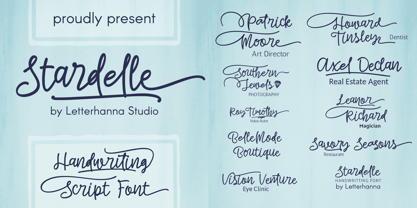 "Introducing 'Stardelle,' a bold and beautifully handcrafted font that adds a touch of elegance to your designs. With its flowing lines and abundant swashes, 'Stardelle' exudes charm and sophistication. This handwritten font is perfect for adding a personal and artistic flair to invitations, posters, branding, and more. Let 'Stardelle' illuminate your creativity and bring a touch of magic to your projects."
 - Acceptable JNL by Jeff Levine,
$29.00 Acceptable JNL is a typeface modeled from hand lettering on a piece of 1940s sheet music, and has a distinctly casual, yet Art Deco flair. It's name can also be mischievous, for when you're asked "which font should I use for the job" you can answer "the Acceptable font". This may well start a dialogue reminiscent of Abbott and Costello's "Who's On First?"
 - Bolognia by Craft Supply Co,
$15.00 Bolognia is a classic serif typeface with high-contrast leaning to the concept of contemporary typefaces. Bolognia has a tall x-height value, modern proportion, transitional serif and extreme stroke contrast with vertical stress. Available in 6 weights, this typeface is a good choice to provide clear solutions for a variety of situations and settings such as editorials and headlines.
 - The Hipton by Ilham Herry,
$19.00 A new layered font family called The Hipton. Inspired from single strokes of gothic letters from signed paintings and made it layered. This is a collection of styles with a layered type system and many possible combinations and options. As a display typeface, The Hipton is suitable for headlines, logotypes, signs, posters, greeting cards, letterhead, t-shirts, and many more applications.
 - Adira smile by Sulthan Studio,
$14.00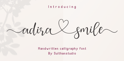 Adira smile is a handmade calligraphic font made with a touch of love in each character with a heart that can be connected to make this font more graceful. This font is perfect for logos, branding, business cards, watermarks, posters and more. Adira smile comes with a full set of uppercase letters, lowercase numbers and punctuation marks, and multilingual support.
 - Alore by AB Studio,
$9.49 Alore is a modern serif font family in geometric design, based on the complimenting design of AB ONE. By focusing on the small details during the design, a font was made that comes with a very dynamic style, combining modern elements with classical serif elements. Use Alore for a wide range of your projects, from headlines all the way to messages and text.
 - Holand Century by Fargun Studio,
$19.00 Holand Century is classified as a contemporary display grotesque font. It features sharp and dynamic strokes, a strong contrast between thick and thin lines, and delicate pointed grotesque elements. Its extensive set of styles, versatile usage, and support for various languages make it a valuable tool for designers looking to create clean, elegant, and visually striking typography for a wide range of applications.
 - Santa Robin by Balpirick,
$15.00 Santa Robin is a Modern Handbrushed Font. Santa Robin is a sweet and friendly handwritten font. This playful font will look gorgeous on a variety of design ideas. It will add a joyful and romantic touch to each of your projects! Santa Robin also multilingual support. Enjoy the font, feel free to comment or feedback, send me PM or email. Thank you!
 - Queensberry by Talbot Type,
$17.00 Queensberry is a contemporary take on the classic, Egyptian slab-serif style. It is a highly legible text font and an elegant display font at larger sizes. Its versatility is further enhanced by the free-flowing, bespoke italic, which is loaded with personality. Queensberry is available in a full family of five weights and includes a full range of accented characters.
 - Luxury Home by Fo Da,
$5.00 Luxury Home is a slab serif typeface of 9 weights from Extra Light to Extra Black and can be used as both a headline and text face. "Luxury Home" is recommended for using in long-form writing and articles, since a serif is far more readable for longer passages of text. The typeface has a carefully crafted weight range, with ligatures .
 - Everything Calligraphy by Aldedesign,
$18.00 Everything Calligraphy is a stylish calligraphy font that features a varying baseline, smooth line, modern and with a deep love. For those of you who are need a touch of love and modernity for your designs or branding, it can be used for various purposes such as headings, wedding, invitation, signature, logos, branding, t-shirt, letterhead, signage, labels, news, posters, badges etc.
 - Gellatick by Ardian Nuvianto,
$23.00 Gellatick is a charming and whimsical script font that brings a delightful handwritten feel to any design. With its playful curves and bouncy letterforms, this font is perfect for adding a touch of joy and friendliness to your projects. Whether you're designing greeting cards, invitations, or social media graphics, Gellatick will infuse your creations with a sense of warmth and personality.
 - Zenaida by Hanken Design Co.,
$30.00 Zenaida is a distinctive display serif font adorned with stylized serifs, evoking a floral essence. Its graceful, flowing ligatures and stylistic alternates add an organic touch to text. Featuring a range of styles including Regular, Medium, Bold, ExtraBold, and an additional semibold weight, Zenaida offers versatility across various design applications, providing a diverse set of options to infuse character and distinction into projects.
 - Centaur by Monotype,
$29.99 A refinement of Roman inscriptional capitals designed by Bruce Rogers as a titling design for signage in the Metropolitan Museum. Rogers later designed for the Monotype Corporation a lowercase based on Jenson’s work, turning the titling into a full typeface, Centaur, the most elegant and Aldine of the Jenson derivatives. Centaur® font field guide including best practices, font pairings and alternatives.
 - Primavera by Sudtipos,
$49.00 Primavera is a fresh and spirited take on casual handwriting. The usual playfulness and expertise of Angel Koziupa's forms, along with the smooth, crisp outlines of Alejandro Paul, provide a humorous and lively typeface in two styles that fit perfectly on food packaging labels, greeting cards, journals or wherever a design needs to convey freshness, young spirit, and a cool spring breeze.
 - Luxiana by Canden Meutuah,
$15.00 Serif is a modern serif font packaged in a modern and classy style, complete with access to your feature to access a large selection of alternative letters and ligatures, the choice of letters you like from various uppercase and lowercase letters for a luxurious impression and elegant appearance. this is equipped with full uppercase, lowercase, numbers and punctuation + Multi-language support
 - Reznik by The Northern Block,
$32.00 A compact sans serif with a technical origin. Each character was drafted out from a grid template and then refined through the application of subtle curved detailing. The result is a precise, contemporary typeface best suited to identity, mobile and video game development. Details include 9 weights with italics, 500 characters, 5 variations of numerals, stylistic alternatives, manually edited kerning and Opentype features.
 - Lineart by Atom,
$22.00 With the concept of a slightly bold monoline and a touch of fast strokes to produce a very unique modern typography. Lineart , a modern font that really stands out, will add dynamism to your design needs. It will be very dynamic when combined with serif and sans serif fonts. With Lineart, make your design look different than others! Many thanks Eko Kurniawan | Letteratom
 - Numis by Tyler Jamieson Moulton,
$11.00 Numis was born out of a coin collecting hobby. A quick survey of coins from the late medieval to modern periods to today led to this unicase design. The rounded corners and smoothed edges are meant to evoke a the slightly worn letterfaces found on old coins; a process that tends to bolden the text before being rubbed away completely.
 - Mood by Device,
$39.00 A sleek and elegant high-contrast sans with a hint of high fashion and a touch of tomorrow. Available in two versions that can be freely mixed for effect, each with alternatives for the M, P, Q, R and W that are available via the Stylistic Alternates feature in Adobe Illustrator, as a Stylistic Set in Indesign, or direct from the Glyphs palette
 - Pelita by Lafontype,
$25.00 Pelita is a sans serif family which is divided into 2 sub-families, Regular and Grande. Pelita is designed with a terminal that forms a curved angle on one side so as to give the impression of representing firmness and softness. The grande version is a modified version of the main version, but is designed more streamlined with curves and more extreme angles.
 - Mary Read by Melli Diete,
$50.00 Mary Read is a modern handwritten Display Font, showing its fancy curves best in headlines as well as short texts. For typographic variety the typeface offers a range of features and extras. Give your texts a quite playful and handwritten note. Being chi chi is not a crime, don’t hesitate to pepper some sweetness in the midst of people’s attention.
 - Sackem PB by Pink Broccoli,
$14.00 There’s just nothing quite like a heavyweight geometric typestyle with tiny counters, you just love it like the Bee Gees. Sackem started as a digitization of a singular film typeface called Benman Jumbo by Lettergraphics. From there, this mechanical typeface was expanded into a giant family of playful widths and obliques: from the condensed “Slim” style to the original “Jumbo” style.
 - Bucanera Soft by Corradine Fonts,
$24.95 Bucanera Soft is a clean modern blackletter designed especially considering its readability. Due to its soft edges, Bucanera Soft leaves the traditional look of aggressive and hard blackletters and allows to find a more friendly appearance in a wide range of applications. Bucanera Soft was selected as a winner in the 3rd Communication Arts Magazine Typography Contest in Typeface Design category, 2013 issue.
 - MPI Arcadian by mpressInteractive,
$5.00 Arcadian was first produced in wood type around 1870 by William H. Page & Company. It is a semi-ornamented face based on a French Clarendon, with dots added to the median and the tops and bottoms of the letters. It has a distinctly “Old West” feel, and was likely used to add a little pizzazz to advertising and broadsides of the time.
 - Daffodilly by Calligraplay,
$13.00 Daffodilly is a fresh and quirky handlettered font with multi-language compatibility that includes custom ligatures, alternate characters, and a unique sense of style. Designed as a calligraphic display font, use it for posters, signage, branding, invitations, menus, and any artwork that needs unconventional handwritten lettering. Multi-lingual, connected, and with a range of symbols, the font includes 362 glyphs.
 - Toby Font by Ingo,
$19.00 A playful handwriting of a child Twelve-year old Tobias Düsel designed the characters of this font in 2002 during his family’s furlough in the USA. He drew the alphabet freehand in pencil on a piece of stationery, and clearly had examples of the well-known college and military fonts in mind. The characters in their basic form are geometrically thought out, as well as the construction of the shadows. But remarkably, while drawing, Tobias Düsel did not reach for the obvious aid of a ruler. In fact, the strokes of the letters are not linear, rather are recognizably well-balanced with declining and increasing straights as can be seen in polished classical fonts. Originally this font consists only of upper case letters — all other characters (punctuation marks, figures and similar) have been modified from the components of the capital letters. Complementary to the original Outline-Shadow-Version TobyFont Empty, the variations TobyFont Inside and TobyFont Full are also available. ”Empty“ is, so to speak, the frame of the typeface as “Inside” is the filling, and “Full” is the sum of both. All three versions have the exact same body size so that they can be placed over one another congruently. In this way the effect of a font in two or three colors can be attained. TobyFont is excellently suitable for designing “picturesque” or “hand-carved” contents; large weights are especially charming and striking.
 - St Croce Pro by Storm Type Foundry,
$29.00 Our eye is able to join missing parts of worn letters back into undisturbed shapes. We tend to see things better than they really are. Thanks to this ability we ignore faults of those close to us as we can’t accept the fact that every once in a while we convene with an impaired entity. Typography is merely a man’s invention, hence imperfection and transience, albeit overlooked, are its key features. This typeface is based on worn-out letterings on tombstones in the St. Croce basilica in Florence. For hundreds of years, microscopic particles of marble are being taken away on the soles of visitors: the embossed figures become fossilised white clouds, fragments of inscriptions are nearing the limits of legibility. First missing are thin joins and serifs, then the main strokes finally slowly diminish into nothingness over time. Unlike an archaeologist, for whom even completely featureless stele is valuable, the typographer must capture the proper moment of wear, when the type is not too “new” but also not too much decimated. Such typeface is usable for catalogue jackets, invitations and posters. Calligraphy is a natural human trait. To write is to create characters of reasonable beauty and content, according to the nature of the writer. A natural characteristic of architecture is to create an aesthetic message very similar to the alphabet. A doric column, the gabled roof, the circle of the well plan: these are the basic shapes from which all text typeface is derived.
 - SP Honey Bunny by Studio Pulp,
$12.00 Discover the effective simplicity of SP Honey Bunny, a masterfully crafted display font created in 2023 by Studio Pulp. Inspired by the character Honey Bunny, the partner of Pumpkin in the cinematic classic "Pulp Fiction" (1996), this font, while not taking center stage, exudes a striking presence. This remarkable typeface, designed with meticulous attention to detail and craftsmanship, showcases versatility that seamlessly complements various design projects, particularly excelling in titles. The three well-balanced weights provide the freedom to unleash your creativity, while the clear, open forms optimize readability. SP Honey Bunny, anchored in a clean grid design, embodies modern minimalism and accessible elegance. Whether you're working on web design, graphic design, or print materials, this font adds a touch of timeless class to your creations. Be inspired by the seamless blend of functionality and aesthetics in SP Honey Bunny. Specifically crafted to meet the demands of 2023, this font brings a contemporary flair to your projects while remaining true to Studio Pulp's legacy of dedication to quality and innovation. Transform your typographic landscape with SP Jody and leave a lasting impression.
 - STP Stencil Cyrillic by Sete Std,
$30.00 Developed from the STP Display Cyrillic, the STP Stencil Cyrillic Typeface follows the same characteristic premise as its sister, in addition to composing the same number of Cyrillic and Latin characters. What distinguishes them it’s that the STP Stencil Cyrillic can be applied more easily anytime, anywhere, increasing the possibility of being used in a more craft and artistic way. Since it has characteristics of a stencil font, it brings a more urban and contemporary look, which makes ideal to use it in public spaces with large circulation of people. In addition, wayfinding, architectural, advertising, packaging, posters, among others projects, are a good request for STP Stencil Cyrillic show its vigor and all its beauty. The STP Stencil Cyrillic is a modular feature source, perfect to use it in major event signaling projects or similar. It can also be useful in any demands that requires improvisation and quick solutions. The STP Stencil has very expressive forms and counterforms, but still counts with the practicality of a stencil source and its infinite possibilities of use.
 - Stajn Pro by Anže Veršnik,
$45.00 stajn-type.com — Stajn Pro Type Family Website where you can get DEMO version of Stajn Pro Book Stajn Pro was designed upon a main goal of using this typeface to set larger amount of text. The slightly condensed proportion allows for more content per page while large x height with its larger counters improves legibility and readability while used on smaller sizes. Despite the fact that Stajn Pro was designed as a body text Type Family, it works as well as a display too. Wide variety of weights as well as interesting, strong and at the same time beautiful character along with some stylistic alternate makes Stajn Pro a useful typeface in a field of editorial, magazine and promotional materials design. The Stajn Pro character includes some humanistic typeface characteristics, which add some softness and elegance in its strong and stable presence. More information about development, usage and characteristics of a Stajn Pro Type Family at stajn-type.com If you have any other questions please do not hesitate to write me at info@stajn-type.com
 - Averica by Letteralle,
$23.00 Introducing my latest creation, Averica! a playful and friendly display font that is sure to add a touch of personality to any project. Averica is handmade with love and attention to detail, ensuring that each character is unique and full of charm. Whether you're looking to create eye-catching headlines, playful graphics, or fun social media posts, title, branding, merchandise, ads, poster, Averica is the perfect choice. With its bold and distinctive style, it will help your message stand out and capture the attention of your audience. Crafted with precision and care, Averica boasts smooth curves, clean lines, and just the right amount of quirkiness. It's playful and approachable, yet still maintains a professional feel, making it ideal for a variety of projects. So why settle for a bland and boring font, when you can add a touch of fun and personality to your work with carefully fashioned display font? Try it out today and see the difference it can make! Any Questions? Just Ask! I hope you enjoy! Thank You. Letteralle Studios
 - Wink by Sudtipos,
$49.00 Wink has been created as the result of exhaustive research, trial and development. It is an OpenType set of fonts which appears in a friendly and fun way, with a new twist on what Joluvian has previously created. Full of personality, with a brave and strong creative line, it is intended to reflect authenticity when being used in all types of media and styles. The ornaments offered in this font work as a graphic resource that expand all the possibilities for Wink users. Although Wink is inspired by traditional calligraphic flourishes, its modern twist makes it elegant and simple at the same time. It’s not completely a brush type but it has been created with the same calligraphy base Joluvian usually works with. Wink also has a caps version with the same style of the script. Both versions could work perfectly, individually or together. As usual, the type has been developed with Ale Paul for Sudtipos, and the collaboration of Macus Romero has been essential to illustrate the style that Wink represents.
 - Verbatim by Monotype,
$25.99 This extensive 60-font type family was inspired by the best (and worst) of 1970s science fiction TV shows and movies. Verbatim aims to extract the essence of futuristic type from that era, add a dash of modern style and conjure a cinematic typeface for the 21st century. From the extremes of the thin condensed, all the way through to the black extended, Verbatim has the scope to add drama to your titles and headings, and finesse to your logo and branding projects. Distinguishing features include a large x-height and open counters that aid legibility. This typeface crosses a few boundaries of type specification in that it is both rounded and square, it is part geometric in construction with a touch of humanistic flair and stroke contrast – giving Verbatim a distinctive and confident air. Key features: • 6 weights in Roman and Oblique • 5 Styles – Condensed, Narrow, Regular, Wide, Extended • Small Caps and 7 Alternates • European Language Support (Latin) • 600 glyphs per font. See more detailed examples at the Verbatim microsite.
 - Absalon by Michael Nordstrom Kjaer,
$39.00 Absalon has square letter shapes. It has some characteristics semi-sharp and semi-rounded corners and it has a relatively tall x-height for legible text. To create the perfect typesetting the spaces between individual letter forms has been precisely adjusted. The Absalon font family is perfect for the web as well as for print, for display as well as longer text, for motion graphics, on the side of a van, t-shirts, logotypes and so on. The font family consist of 5 weights or 10 styles and it has 410 glyphs. A total of more than 4000 glyphs. The styles are: Light, Light Italic, Regular, Italic, Medium, Medium Italic, Bold, Bold Italic, Extra Bold & Extra Bold Italic. It has OpenType features such as automatic fractions, subscript, superscript, numerators, denomerators, ordinals and the “f” ligature set. Absalon has extended language support (most Latin-based scripts are supported). The name of the font family is Absalon and it is a reference to a Danish bishop in the middle ages. He was a key figure in the founding of Copenhagen, the Capital of Denmark.
 - LaRuja by SilverStag,
$19.00 Embrace the captivating elegance of LaRuja, a modern serif font that seamlessly blends feminine grace with unwavering strength. Its distinctively high contrast between horizontal and vertical lines creates a dynamic interplay of elegance and structure, making it a versatile choice for a wide range of applications. LaRuja's gracefully tapered terminals and subtly curved arches exude a sense of refined femininity, while its sturdy serifs and well-defined letterforms project an unyielding strength. This unique balance of characteristics makes LaRuja the ideal choice for projects that demand both beauty and substance. LaRuja's extensive language support, encompassing over 90 languages, makes it a global font that can be effortlessly adapted to diverse cultural contexts. From fashion magazines and branding materials to websites and marketing campaigns, LaRuja seamlessly conveys your message across borders. LaRuja's comprehensive weight system, ranging from Thin to Black, enables you to tailor the font's appearance to suit the specific needs of your project. The lighter weights, such as Thin and Light, exude elegance and sophistication, while the heavier weights, such as Semibold and Black, project authority and impact. Happy creating everyone!
 - Mayfair by Canada Type,
$24.95The long awaited and much requested revival of Robert Hunter Middleton's very popular classic is finally here. Mayfair Cursive was an instant hit for Middleton in 1932, and it went on being used widely until late into the 1970s, in spite of it never having crossed over to film type technology. Like a few of its contemporary designs, most notably the work of Lucien Bernhard, Mayfair is a formal script that is somewhat based on traditional italic forms with swash uppercase, but also employs subsidiary hairline strokes in some of its lowercase as an emphasis to the script's cursive traits. Why these gorgeous letters never made the leap into photo typesetting is a mystery to us. But here they are now in digital form, almost three quarters of a century since they first saw the light in metal. Mayfair was redrawn from original 48 pt specimen. It also underwent a major expansion of character set. Plenty of swash characters and ligatures were added. An alternate set of lowercase was also made, in order to give the user a choice between connected and disconnected variations of the same elegant script. Mayfair ships in all popular font formats. While the Postscript Type 1 and True Type versions come in two fonts (Mayfair and Mayfair Alt), the OpenType version is a single font containing all the extra characters in conveniently programmed features that are easily accessible by OpenType-supporting software applications. We are quite sure today's graphic designers will be appreciative of having access to the face that all but defined menus, romance covers, wine and liquor labels and chocolate boxes for almost two 20th century generations. - Blumenkind by Catharsis Fonts,
$15.00 Blumenkind is a fresh, bright, humanist script font radiating boundless optimism and friendly enthusiasm. Its strokes are based on the rounded triangle, which lends it a dynamic bounce and a confident human touch. It shines in a wide range of display and editorial applications, but excels in particular in the context of art, creativity, food, social events, and spirituality. Blumenkind is inspired by an instance of metal-strip lettering found on the B�rgermeister Kornmesser Siedlung residential building complex in Berlin from the 1960s. The font name, being German for �flower child�, aims to capture the positive zeitgeist of that time evident in the letters. Blumenkind comes with extensive language support, tight kerning, attractive ligatures, and subtly varied alternate shapes for some of the most commonly doubled letters � and all that in three linear weights and one calligraphic weight. Furthermore, a complementary version of the font (Blumenkind Alternate) is available, in which the overlapping tittles and accent marks of the original are replaced with more traditional free-floating marks. This font is dedicated to the miracle of medical science. Thanks to Georg Seifert, Rainer Scheichelbauer, and Michael Wallner for technical aid.