10,000 search results
(0.044 seconds)
- Lubeck by FoxType,
$15.00 Introducing Lubeck Display, new generation Typeface with 3 Weights. Lubeck Typeface created with the vision of to attract the audience to your brand . The finest details of this typeface are methodically and mathematically created. Lubeck is created with all the tasks of a corporate font and also for the usage in a variety of projects, including branding, logos, titles, headlines, servers, screens, display, digital ads, and everything else. We are putting a lot of effort on this font as a long-term project. The Typeface includes Three Weights. Light, Regular and Medium Features: Numerals, extended punctuation & Basic Symbols(200+ Glyphs). Expert kerning and quality crafting. Uppercase Letters & Lowercase Letters.
 - Maestro by Canada Type,
$24.95 Out of a lifelong inner struggle, Philip Bouwsma unleashes a masterpiece that reconciles classic calligraphy with type in a way never before attempted. Maestro takes its cue from the Italian chancery cursive of the early sixteenth century. By this time type ruled the publishing world, but official court documents were still presented in calligraphy, in a new formal style of the high Renaissance that was integrated with Roman letters and matched the refined order of type. The copybooks of Arrighi and others, printed from engraved wood blocks, spread the Italian cancellaresca across Europe, but the medium was too clumsy and the size too small to show what was really happening in the stroke. Arrighi and others also made metal fonts that pushed type in the direction of calligraphy, but again the medium did not support the superb artistry of these masters or sustain the vitality in their work. As the elegant sensitive moving stroke of the broad pen was reduced to a static outline, the human quality, the variety and the excitement of a living act were lost. Because the high level of skill could not be reproduced, the broad pen was largely replaced by the pointed tool. The modern italic handwriting revival is based on a simplified model and does not approach the level of this formal calligraphy with its relationship to the Roman forms. Maestro is the font that Arrighi and his colleagues would have made if they had had digital technology. Like the calligraphic system of the papal chancery on which it is modelled, it was not drawn as a single finished alphabet, but evolved from a confluence of script and Roman; the script is formalized by the Roman to stand proudly in a world of type. Maestro came together on screen over the course of several years, through many versions ranging widely in style, formality, width, slant, weight and other parameters. On one end of the spectrum, looking back to tradition it embodies the formal harmony of the Roman capitals and the minuscule which became the lower case. On the other it is a flowing script letter drawing on the spirit of later pointed pen and engravers scripts. As its original designers intended, it works with simple Roman capitals and serifs or swash capitals and baroque flourishes. The broad pen supplies weight and substance to the stroke which carries energy through tension in balanced s-curves. Above all it is meant to convey the life and motion of formal calligraphy as a worthy counterbalance to the stolid gravity of metal type. The Maestro family consists of forty fonts distributed over two weights. The OpenType version compresses the family considerably down to two fonts, regular and bold, each containing the entire character set of twenty fonts, for a total of more than 3350 characters per font. These include a wide variety of stylistic alternates, ligatures, beginning and ending letters, flourishes, borders, rules, and other extras. The Pro version also includes extended linguistic support for Latin-based scripts (Western, Central and Eastern European, Baltic, Turkish, Welsh/Celtic, Maltese) as well as Greek. For more thoughts on Maestro, its background and character sets, please read the PDF accompanying the family.
 - Rasgos Escritura Nuevos by Intellecta Design,
$16.00 a sort of decorative fleurons
 - Baltimore Typewriter by Intellecta Design,
$20.90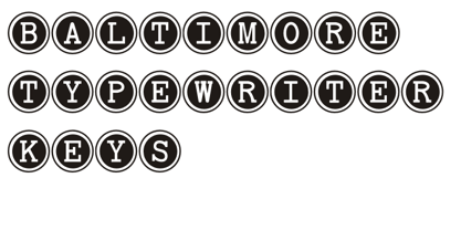 a comprehensive family of fonts
 - Quartan by Linotype,
$29.99Quartan is an industrial, unicase sans serif family, with three weights. The Austrian designer Maria Martina Schmitt developed this series of typefaces for designers to use when setting chunks of text en masse. Being a unicase design, Quartan¿s letterforms have no ascenders or descenders; lines of text may be stacked virtually on top of one other. This offers a multitude of possibilities for headline, logo, or corporate identity design. - Bolton Commercial by Greater Albion Typefounders,
$14.00 Bolton Commercial revives and updates one of Greater Albion's designer's earliest typeface families, Bolton, which was recently used on the credits of a popular UK television series. The family consists of five faces- Regular and Obliqued, Blocked, Embossed and Engraved. All have a late Victorian/Edwardian feel and are ideal for posters, signage, Book covers...and of course television credits! Bolton Commercial combines the virtues of flair, fun and legibility.
 - Sidewalker by FSD,
$50.00In Sidewalker we can see pieces of OCR-A, letters and of other fonts; letters pressed over metallic supports with too much ink and then redesigned on a computer. Reminiscent of how different materials in Burri or Rauchenberg's paintings are used. Some numbers have the same shape of some letters (J=2, 6=G=9, I=1=l ...) and many pieces of letters are copied into others. Very experimental... - ITC Noovo by ITC,
$29.99ITC Noovo is from British designer Phill Grimshaw and grew out of his work on ITC Rennie Mackintosh. He says, I still had 'Nouveau' coming out of my ears" and he drew it after a series of computer-intensive projects, "when I was missing the smell of permanent marker pens and the feel of paper." ITC Noovo is highly stylized yet works as both a text and display typeface." - Middle Earth by Mans Greback,
$59.00 Middle Earth is a Medieval calligraphy serif font. With the historic charm of ancient manuscripts and the ethereal beauty of elven realms, Middle Earth typeface weaves tales of valor and legends. Its calligraphic allure is accentuated by rounded contours, reminiscent of Tolkien's enchanted worlds. The unusually large lowercase, almost circular in its form, seems to echo the undulating hills of the Shire, while its Irish-inspired design lends a timeless elegance.
 - Solido Condensed by DSType,
$40.00 Solido is a very versatile and usable type system with five widths: Solido, Solido Constricted, Solido Condensed, Solido Compressed and Solido Compact, in a total of 35 fonts with many of alternate characters.
 - Solido Compressed by DSType,
$40.00 Solido is a very versatile and usable type system with five widths: Solido, Solido Constricted, Solido Condensed, Solido Compressed and Solido Compact, in a total of 35 fonts with many of alternate characters.
 - Solido by DSType,
$40.00 Solido is a very versatile and usable type system with five widths: Solido, Solido Constricted, Solido Condensed, Solido Compressed and Solido Compact, in a total of 35 fonts with many of alternate characters.
 - Solido Constricted by DSType,
$40.00 Solido is a very versatile and usable type system with five widths: Solido, Solido Constricted, Solido Condensed, Solido Compressed and Solido Compact, in a total of 35 fonts with many of alternate characters.
 - Summer Motion by Seemly Fonts,
$12.00 Summer Motion is a simple and friendly display font, featuring the perfect amount of trendiness. This original look will appeal to a wide range of crafty ideas, from letterheads and titles to stationery.
 - Pictypo by Typogama,
$19.00 Pictypo is a functional set of dingbat fonts, created with an open, rounded style, that contains a large range of symbols, from the usual arrows, to weather or office icons or mobility vehicles.
 - Stridere by Greater Albion Typefounders,
$16.00 Think of a slender Black Letter screeching to a halt on the page and you have the essential idea of Stridere. Want ornate formality and fast movement all in one? Here it is!
 - Hanger by Wordshape,
$20.00 Hanger is a limited character display typeface. Based on the shapes of the alphabet if made out of a bent wire hanger, Hanger is suitable for apparel design, merchandising, and identity design projects.
 - Sunny Days by Seemly Fonts,
$14.00 Sunny Days is a simple and friendly display font, featuring the perfect amount of trendiness. This original look will appeal to a wide range of crafty ideas, from letterheads and titles to stationery.
 - Summer Folk by Seemly Fonts,
$14.00 Summer Folk is a simple and friendly display font, featuring the perfect amount of trendiness. This original look will appeal to a wide range of crafty ideas, from letterheads and titles to stationery.
 - Simple Farmhouse by Seemly Fonts,
$14.00 Sunny Days is a simple and friendly handwritten font, featuring the perfect amount of trendiness. This original look will appeal to a wide range of crafty ideas, from letterheads and titles to stationery.
 - Animosa by Stefano Giliberti,
$15.00 Animosa is a font family high in spirit and even in temperament. It supports 114 languages, features a total of 508 glyphs and includes an italicized version for each of the 5 weights.
 - Solido Compact by DSType,
$40.00 Solido is a very versatile and usable type system with five widths: Solido, Solido Constricted, Solido Condensed, Solido Compressed and Solido Compact, in a total of 35 fonts with many of alternate characters.
 - Mindwalk by TOMO Fonts,
$15.00 TOMO Minkwalk is a casual but legible hand-made font. A tall, single weight, all-caps typeface with lots of language support. Ideal for book covers, or large pieces of text. Have fun!
 - Nurture Happiness by Seemly Fonts,
$12.00 Nurture Happiness is a tall, adaptable, and smart-looking display font. Add it to each of your party invitations, gathering, or pretty much any design that requires a touch of youth and joy.
 - Pleasant Feelings by Seemly Fonts,
$14.00 Pleasant Feelings is a simple and friendly display font, featuring the perfect amount of trendiness. This original look will appeal to a wide range of crafty ideas, from letterheads and titles to stationery
 - Study Hall JNL by Jeff Levine,
$29.00A cardboard stencil toy for children from the late 1950's or early 1960's was the inspiration for Study Hall JNL, part of a series of stencil revival fonts from Jeff Levine. - Marmo by Stefano Giliberti,
$15.00 Marmo is a font family with sharp-edged and thick-bodied character. It supports 113 languages, features a total of 486 glyphs and includes an italicized version for each of the 5 weights.
 - The Magistica Bright by Letterena Studios,
$9.00 The Magistica Bright is a magical script font carefully created with a touch of elegance. This font is PUA encoded which means you can access all of the glyphs and swashes with ease!
 - Biloxi Calligraphy by Roland Hüse Design,
$15.00 Biloxi Calligraphy is heavier weight version with calligraphic strokes of a handwritten font of mine called "Biloxi Script". Casual handwritten style with a calligraphy feel, ideal for blog headers, menus, headlines and logotypes.
 - Christmas Happiness by Seemly Fonts,
$14.00 Christmas Happiness is a simple and friendly handwritten font, featuring the perfect amount of trendiness. This original look will appeal to a wide range of crafty ideas, from letterheads and titles to stationery.
 - Got Milk by Just My Type,
$20.00 Working on a parody of the “got milk?” ads and loved the challenge of creating a whole font (family) from 8 glyphs. Quite condensed, clean, jaunty san serif Usage recommendations Advertising, announcements, logos
 - Oyange by Stringlabs Creative Studio,
$29.00 Oyange results out of a stunning pairing of a brush pen that makes it look incredibly endearing and authentic. Use this gorgeous and unique script font to bring any DIY project to life!
 - Park Slope JNL by Jeff Levine,
$29.00 The free-form geometric shapes of the lettering on a vintage piece of sheet music entitled "Four Pictures" is the basis for Park Slope JNL, named for a neighborhood in Brooklyn, New York.
 - Hadrianus by Scriptorium,
$18.00Hadrianus is a full-featured text font with calligraphic qualities. It's derived from Roman period lettering, but with the weight and style of pen-drawing and the features of a sophisticated text font. - Muguet by Max Prive,
$28.00 MUGUET is a reinvention of the Skin typeface designed by Max Prive in 2016. MUGUET features reimagined capital letters and improved kerning. It’s ultra clean, ultra minimalist with a hint of retro aesthetics.
 - Partita 1990 by Stefano Giliberti,
$15.00 Partita 1990 is a font family to use in the initial simulation. It supports 113 languages, features a total of 482 glyphs and includes an italicized version for each of the 5 styles.
 - Outside Voice by Molly Suber Thorpe,
$13.99 Outside Voice is a handwritten, all-caps typeface, created as an homage to the robust history of handwritten protest signs. It's a beautiful display font for a huge range of projects, from poster art to holiday cards. With contextual alternates enabled, this font will automatically cycle through three sets of handwritten alphabets as you type. The result is type that looks as imperfect and handmade as a digital font can get. This makes Outside Voice a wonderful choice for pairing with hand-drawn illustrations. Consider varying the size, slant, and/or color of each line in your layouts. These adjustments make Outside Voice look even more handmade and organic, which is great for fun designs like posters and quotes. This typeface is quirky and ligature-rich, with over 600 glyphs and icons. It supports Latin and Modern Greek alphabets, and includes all European language diacritical markings. It includes a set of decorated word ligatures comprised of common protest words like 'peace,' 'vote', and 'yes!'. Additionally, you'll get a full set of common protest icons, such as a raised fist, planet, dove, and peace sign.
 - MVB Diazo by MVB,
$59.00 Mundane information—the sort you might ignore—often appears in the form of very simple, utilitarian lettering, devoid of personality, the sort of industrial lettering you find on old blueprints, park restrooms, and electrical boxes. MVB Diazo is such a thing. It looks like lettering done earnestly with a plastic template. The monoline caps—constructed from straight lines and simple curves—have rounded details as if rendered by a blunt pen on a topographical survey or by a router on a rustic campground sign. The MVB Diazo fonts are compact, available in two widths: Condensed and Extra Condensed. Each width offers four weights from Light to Black. The fonts are perfect for wherever plain and boring letterforms are required. All widths and weights are also available in two distressed textures (#1 and #2) that accentuate the industrial character of the design. Rough #1 is gritty, with finer texture for use at larger sizes. Rough #2 exhibits more damage, the roughness apparent when used at smaller sizes. The Rough fonts include alternates of a number of glyphs so that variation of texture is possible when letters repeat in a word.
 - Port Vintage by Onrepeat,
$25.00 Guided tour available here. Port Vintage is a new typeface expanded upon the original Port typeface, released in 2013, and being an experimental Didone typeface with a modern twist, inspired by the well known forms of typography masters such as Bodoni and Didot and the exuberance and elegance of calligraphy typefaces. A lot of changes were made, the whole typeface is now softer and has less rough edges, the time it took to mature made it possible to achieve an entirelly new and distinct flavour from the original Port, giving away the rough edges from Port and giving place to the soft transitions and curved connections between the stems and serifs of Port Vintage. Port Vintage melts the straight lines and strong contrasts of the Didone typefaces with the elegant lines of calligraphy in a geometric way, resulting in exuberant characters with geometric swashes that can be combined in countless ways. The result of this experiment is Port Vintage, an unique and rich display typeface meant to be used on big sizes and it’s main perk is the amount of alternative characters it features. Port Vintage is Open-Type programmed and includes hundreds of alternates, from swashes to titling alternates, ligatures and stylistic sets with each character having a thin version of itself, giving complete freedom to all your creative needs. Port Vintage is available in 10 different styles: Port Vintage Regular, being the base version and featuring the whole base character set; Port Vintage Regular Decorated, featuring richer forms and containing more ornamentated and more extravagant characters; Port Vintage Medium and Port Vintage Medium Decorated, designed for the occasions you need a bit more thickness and the decoration variants: Port Vintage Ornaments, containing a wide set of elements meant for the creation of fillets, vignettes and fleurons, resulting in an almost infinite number of possible combinations to embellish your designs and Port Vintage Words, a set of some of the most common words used in English, Spanish, French, German, Italian and Portuguese. All styles, except Port Vintage Ornaments and Port Vintage Words, include italic styles. For a better understanding of all the uses of Port Vintage and the full character list the reading of the manual is recommended.
 - DeDisplay by Ingo,
$24.99 A type designed in a grid, like on display panels Type is not only printed. There were always and still are a number of forms of type versions which function completely differently. Even very early in the history of script there were attempts to combine a few single elements into the diverse forms of individual characters and also efforts to construct the forms of letters within a geometric grid system. The “instructions” of Albrecht Dürer are probably most well-known. But although designers of past centuries assumed the ideal to basically be an artist’s handwritten script, the idea which developed in the course of mechanization was to “build” characters in a building block system only by stringing together one basic element — the so-called grid type was discovered, represented most commonly today by »pixel types.« But even before computers, there were display systems which presented types with the help of a mechanical grid display, like the display panels in public transportation (bus, train) or at airports and train stations. In a streetcar, I met up with a modern variation of this display which reveals the name of each tram stop as it is approached. This system was based on a customary coarse square grid, but the individual squares were also divided again diagonally in four triangles. In this way it is possible to display slants and to simulate round forms more accurately as with only squares. The displayed characters still aren’t comparable to a decent typeface — on the contrary, the lower case letters are surprisingly ugly — but they form a much more legible type than that of ordinary [quadrate] grid types. DeDisplay from ingoFonts is this kind of type, constructed from tiny triangles which are in turn grouped in small squares. The stem widths are formed by two squares; the height of upper case characters is 10, the x-height 7 squares. DeDisplay is available in three versions: DeDisplay 1 is the complex original with spaces between the triangles, DeDisplay 2 forgoes dividing the triangles and thus appears somewhat darker or “bold,” and DeDisplay 3 is to some extent the “black” and doesn’t even include spaces between the individual squares.