10,000 search results
(0.024 seconds)
- Calligraphic Griffo by Alice Tebaldi,
$25.90 Calligraphic Griffo comes from my personal interpretation of Francesco Griffo works. He was one Italian's type founder, punch cutter and type designer and the first who drawn and realize the typographical's punch of the italics around the 1500. His dedication to works and incredible perfection make me fall in love with his typefaces. Here my font: a readable and classical Serif with well-proportioned letterforms, a lot of ligatures combination and initial Swash Letters. Hope you like it, enjoy!
 - Central Park JNL by Jeff Levine,
$29.00 The beautiful Art Deco monoline pen lettering on the cover of a 1940s piece of sheet music inspired Central Park JNL. The 1940s was an era when couples took romantic walks along the pathways of Manhattan's Central Park or rode around it in hansom cabs. Big bands played at the major clubs and ballrooms and "uptown" meant the well-to-do. Men dressed in their tuxedos and top hats and the ladies were in their jewels and evening gowns.
 - Oldblend by Zealab Fonts Division,
$11.00 Oldblend is a playful and elegant retro font and was designed as a display type for titles, headlines, and posters and will work well with any retro execution. It is characterized primarily by a modern look with straight shapes, but on closer view, you will notice its subtle connection to retro type design. Oldblend includes uppercase, lowercase, ligature and also Multiple Language Supported I can’t wait to see what you guys will come up with with using this font!
 - Inverted Squircle by Aurora Borealiz Design,
$- What is an inverted squircle? To answer that we must first identify a squircle, which is a square with rounded edges. An inverted squircle isn't just a regular old square. It is a square with inverted rounded edges. This font is a modular font designed to create inverted rounded square edges. This font was created with using just a few shapes stacked and rotated to make a unique, digital font with a little bit of quirky personality.
 - Mr Dum Dum by Hipopotam Studio,
$60.00 Mr Dum Dum was designed for our game – Ba Ba Dum. In Ba Ba Dum players can learn words in different languages, so we needed a typeface that can support not only all latin characters but also Cyrillic, Greek and two Japanese syllabaries – Hiragana and Katakana. Eventually we wanted to add Chinese support so we designed 1314 Simplified Chinese characters – just enough to cover all words available in Ba Ba Dum plus necessary logograms to translate the games UI.
 - DIN Neuzeit Grotesk by Linotype,
$40.99 The German Standards Committee suggested the light Neuzeit-Grotesk’ font in 1970 for use in official signage, traffic directional systems, etc. The typeface had been designed by Wilhelm Pischner and appeared with the font foundry D. Stempel in 1928. The font Neuzeit Grotesk was once the standard in the print industry, as a timeless typeface with no real distinguishing features. Like other typefaces of the 1920s, DIN Neuzeit Grotesk reflects the philosophy of the times, Form is Function.’
 - Buntaro by Hanoded,
$15.00 I am reading a great book by David Mitchell, called Number 9 Dream. One of the characters is called Buntaro, so I decided to call my new inky font after him. Like the book, Buntaro is quite unusual: it has no real baseline, comes with some strange characters, feels familiar, but surprises you nonetheless. It was made with a broken bamboo satay-skewer, Chinese ink and a lot of patience. Buntaro comes with a wealth of diacritics.
 - Sassoon Primary by Sassoon-Williams,
$48.00 The Regular typeface was researched with children and developed specially for use in children’s reading books - bridging the gap between reading and handwriting. Short ascenders and descenders may not trouble literate adults but it is quite a different matter for children struggling to read. These fonts include extended ascenders and descenders and slight slant makes blocks of text easier to read. Free to download resources How to access Stylistic Sets of alternative letters in these fonts
 - Hip Pop NF by Nick's Fonts,
$10.00Type designer Friedrich Poppl is perhaps best known for his classic text faces and elegant scripts, but it seems he had a playful side as well. This frisky face is based on Dynamische Antiqua, which Poppl did for the Stempel foundry in 1960, but which was never released. Bright, bold and bouncy, it’s the perfect choice for headlines with impish impact. Both versions of this font include the complete Unicode Latin 1252 and Central European 1250 character sets. - Worriment by The Ampersand Forest,
$20.00 Worriment is a simple, one-off typeface; part of the Dreads collection from the Ampersand Forest. He was born of a whimsical sense of queasiness and unease — he's not just scary, he's Scary Fun! A little kitsch, a little horror. Great for use on Halloween-themed designs, and reminiscent of a "wizarding" look. In terms of letterforms, Worriment is a quirky blackletter-latin hybrid with a sharp, slightly bouncy baseline, and jangly angles, suitable for display use.
 - Chapeau by EVCco,
$20.00 The cold, conservative strokes of a typical sans-serif/grotesque descend into a distinctive "bat-wing drip" in this subtly spooky font named after the band for which it was originally designed. Perfect for any wordings which project darkness or menace, yet still require an air of respectability. Business in the front, evil in the back. Comes packaged in both TrueType and OpenType formats with standard complement of alpha-numeric glyphs, punctuation marks, mathematical symbols, and European diacritics.
 - Generisch Sans by Akufadhl,
$29.00 Generisch - a german equivalent of generic - sans serif typeface has gain its own place among designers and earn such popularity due to its "simple" design. Generisch is influenced by early grotesk typefaces from early 1900's when sans was starting to get popular and used as a body type. Some old ligatures such as ch ck and ng are present in generisch (not the ct and st tho), old style numeral for better typesetting experience and more.
 - Kumo Sans by EchadType,
$10.00 Kumo Sans is a clear and comprehensible font stylized to mimic marker pen handwriting. The idea was to interpret swift and negligent hand movement in a distinct and easy to read familiar glyph silhouette. Family comes in three weights and italic slant option. Shadow version with outline and shadow effect is perfect for short catchy phrases, brand names and headlines use. Font contains Latin diacritics, Hebrew cursive writing, Bitcoin, Indian Rupee, New Israeli Shekel symbols, fractions etc.
 - Welo Casual NF by Nick's Fonts,
$10.00Another tip of the hat to master draftsman Samuel Welo. His famous Studio Handbook was hand-lettered throughout, and provided the inspirations for many of Nick's favorite fonts. This little number is based on the unnamed style Mr. Welo used for much of his paragraph text. Use it when you want to convey homespun warmth and a handmade feel. Both versions of this font include the complete Unicode Latin 1252, Central European 1250 and Turkish 1254 character sets. - Manufactory JNL by Jeff Levine,
$29.00 Manufactory JNL and its oblique counterpart were re-drawn from examples of a now-antique typeface used within many advertisements found throughout the pages of The American Stationer magazine, circa 1879. The term ‘manufactory’ was popular during this era; the word being a more archaic form of ‘factory’. There is a bit of Western flavor to this type design, as the spurred serifs and the top and bottom strokes are heavier than the vertical and mid-point stroke weights.
 - Felora by Supfonts,
$18.00 Introducing the elegant new Felora script! For those of you who are needing a touch of elegance and modernity for your designs, this font was created for you! Представлю вам свой новый элегантный шрифт Фелора! Для тех, кто нуждается в красивом и современном шрифте для своих проектов. Встречайте - этот шрифт был создан для вас! What's Included: Felora script OTF / TTF Multilingual Latin support Multilingual Cyrillic support Полная поддержка русского языка Check out my blog: www.instagram.com/dmitriychirkov pinterest.com/dmitriychirkov7
 - Waterloo Bold by ITC,
$29.99The slab serif Waterloo Bold was designed by Alan Meeks. He chose unique and individual forms to give this alphabet its unmistakable character. The cross strokes of the capitals are not in the optical center, the serifs have light furrows, and the figures have a slight slant tot he right, giving this font a dynamic, flowing look. Waterloo Bold is reminiscent of cigars, whiskey and the 1930s and should be used only in headlines in large point sizes. - Ellabette by Bombus Hollow,
$24.00 Ellabette™ is a script font that was created by a wedding stationery designer after working in the industry for over a decade and getting request after request for script fonts that were formal but legible. Ellabette is warm and inviting, playful but elegant. Perfect for all things weddings, branding, editorial, social media, and websites. Designed with weddings in mind with fun special ligatures like "RSVP" "and" and "to" and works beautifully for legible address lists and envelope printing.
 - New Romantine by Orenari,
$18.00 Hi! It's Orenari here want to introduce a romantic display serif font, New Romantine. This font has lovely curves and almost of all the uppercase and lowercase has stylishtic alternates. The fact of this font is Romantine was my very first font. This New Romantine is the newer version of Romantine. It's bolder than the old version. Just launch the New Romantine in February so this font will bring the Valentine's Vibe to your creative projects.
 - ITC Aftershock by ITC,
$29.99Bob Alonso’s Aftershock was designed to resemble woodcut or linocut lettering; its irregular shapes make it stand out from its background. Dominant features of this typeface are its generally square forms and its emphasized horizontal strokes. The strong, heavy alphabet makes an overall regular impression in spite of the idiosyncracies of its individual characters. To emphasize the unique contours of the forms, it is best to use Aftershock in larger point sizes and exclusively in headlines. - Southside Fizz by Hanoded,
$15.00 Southside Fizz is a cocktail (made with gin, lime, mint and soda). Southside Fizz font was based on a single word in a 1930’s advertisement and my Palembang font. I did not have that many glyphs to work with, so I made most of them up. Southside Fizz became a very elegant all caps Art Deco font, quite useful for wedding invitations, books and posters. It comes with a roaring amount of diacritics as well.
 - French Stencil Serif JNL by Jeff Levine,
$29.00 Spotted for sale online, a partial set of antique tin stencils from France had a distinctively handmade look about them. Many of the characters were inconsistently wider than others, some characters were missing and one was damaged. Despite the obvious flaws, the image of these stencils served as the model for a digital font revival once the characters took on a more uniform appearance. French Stencil Serif JNL is available in both regular and oblique versions.
 - Pema by Designpiraten,
$65.00 Pema – a contemporary Tibetan sans serif encoded in the Unicode standard. This is the first Tibetan typeface influenced by western sans serif fonts. It was designed especially to match multilingual purposes. The rather calligraphic Tibetan scripts did not match with the design aesthetics of western and Indian fonts and so I came up with the idea to design a “modern” Tibetan sans serif. Pema comes in two weights, Regular and Bold, each equipped with almost 1.300 glyphs.
 - Message by Wire JNL by Jeff Levine,
$29.00 A Western Union telegram from 1951 provided the typographic inspiration for Message by Wire JNL, which is available in both regular and oblique versions. Unlike other available type fonts which emulate the ink ribbon-struck printed characters from the teletype machines, this version was redrawn to celebrate the actual type design itself. The typeface letter spacing has been equalized so that when in use, it looks much like the printed output of an old telegram messsage.
 - Serp and Molot by ParaType,
$30.00 Designed for ParaType in 2003 by Tagir Safayev. The typeface was inspired by some of the Cyrillic letterforms of Sergey Chekhonin (1878-1936). Chekhonin belonged to the World of Art group, which is so closely associated with the flowering of Russian book and theater design at the beginning of the 20th century. For use in advertising and display typography. Serp & Molot has been adjugded Award of Excellence in Type Design of 'bukva:raz!' ATypI International Type Design Competition, 2001.
 - Funky Nouveau JNL by Jeff Levine,
$29.00 The free-form Art Nouveau hand lettering for the 1905 song "Will You Love Me in December as You Do in May" was the design model for Funky Nouveau JNL, which is available in both regular and oblique versions. Since the 1960s hippie counterculture embraced elements of the Art Nouveau period in their art and design, it seemed only fitting to use the term "Funky Nouveau" in the fontís name as an homage to both eras.
 - Posterizer KG by Posterizer KG,
$40.00 This slab serif font is inspired by European industrial, machine-made letters. It looks rational and geometric, but optically corrected and balanced. As the name says this font face is designed to be used by mostly for posters, headlines, visual identities and short texts. Font was created for Celebration of the 5 year anniversary of Design Studio Box from the city of Kragujevac (KG), the industrial city of Serbia. Posterizer KG contains all the Latin and Cyrillic glyphs.
 - Damian by I Can Be Your Type,
$10.00Damian is a font designed with simplicity in mind and a hint of flare to catch the attention of the user. The sans serif style is based off of the geometrical features of Futura and Univers. With the focus on the circle creating the forms this font is geared towards a feeling of modern art deco. The name comes from a colleague who asked to be named after the font, it was his birthday, how could I say no. - Ensenada by Wordshape,
$30.00 Ensenada is a typeface designed based on hand-cut lettering that adorns businesses throughout the city of Ensenada in Baja California in Mexico. - What was the inspiration for designing the font? Looking at the hand-cut lettering in Ensenada, Mexico. Variations on this type of lettering are often used by Mexican pop-techno acts. - What are its main characteristics and features? It is a geometric display face that works in both retro and futuristic settings. - Usage recommendations: Display type
 - ITC Black Tulip by ITC,
$29.00ITC Black Tulip was designed by Dudley Rees and inspired by the modular simplicity of the Greek fret band, an ancient repeating pattern formed by tracing a line at right angles between two horizontal rules to form an interlocking motif. Rees admired the discipline of the motif, I saw how that simple rigid rectangular network suggested an alphabet that would need little or no kerning," he says. He describes ITC Black Tulip as a "dramatic headline face"." - Venose by Reyrey Blue Std,
$14.00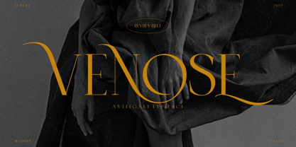 Venose is a serif typeface crafted with elegance and luxury. For those of you who are needing a touch of elegant, stylish, classy, chic and modernity for your designs, this font was created for you! This font is perfect for branding projects, fashion, logos, magazine imagery, jewelry, wedding invitations, posters, apparel, packaging, website headers, or simply as a stylish text overlay onto any background image. Features : · All Uppercase and Lowercase · Number & Symbol · Supported Languages · Alternates and Ligatures · PUA Encoded
 - Mosaic by Paul O'Connell,
$9.95 This innovative styled Mosaic font was created to suit various design applications within the typeface market and is aimed at people looking for a modern styled brush script typeface that doesn't fit in with the regular trends of script fonts. Designed and produced by Paul O'Connell of POCT, it is a slick and light hearted script typeface that reflects many irregularities, but still manages to retain a very balanced and modern feel with just a touch of fun too.
 - VU Milwaukee by VisualizeUnited Fonts,
$65.00 Milwaukee, is a geometric typeface with an embellished-like touch. Designed in 2011, in capital English & Greek characters, including numerals, and basic punctuation marks, as well as CE characters. It was initially inspired by Byzantine and Japanese typography and later from the cityscape of Milwaukee, thus its name. This typeface comes in four weights and is suggested for logos, short titles, social media marketing, book covers, posters, labels and more applications you will choose to go with.
 - Volcano by Match & Kerosene,
$40.00 Volcano is titling family of four is broken down into a gothic and island style. The island style features a "toothed" look that gives it a very unique look that can be used for a variation of project styles: Jungle, Island, Cruise, Vacation, Tiki, Retro, and Comicbook. The gothic style features a more industrial look and was inspired by gaspipe lettering styles. Each style features a different inline font file that can be layered over to produce striking headlines.
 - Soma by Funk King,
$10.00Soma is inspired by the Soma cube and the work of MC Escher. The font uses geometric patterns to create “impossible” glyphs. Some can be easily imagined; others bend the mind. Many alternate versions of glyphs have been provided for additional design possibilities. This is my 2nd most popular font at Dafont with over 50,000 downloads. The original set was 26 basic characters (A-Z), repeated for uppercase and lowercase. Now the set is almost 300 glyphs. - Onyon by Ingrimayne Type,
$9.00 Onyon is a bizarre typeface with vertical stems that thicken in the middle and narrow at the ends. It was created as an experiment to see what a typeface would look like if the vertical stems were diamond or rhombus shaped. The letters are angular with unusual triangular serifs and they have no curves. It is a harsh, cruel typeface that will make your eyes water if you use it at small point sizes for text.
 - Hobo by URW Type Foundry,
$35.99 The Hobo font is a dynamically tapering face in which all strokes are accentuated curves, achieving a superb decorative effect. Hobo almost suggests a freely drawn alphabet with its unusual robust roundness. The Hobo font was designed to be used at large sizes. It has no descenders: the lower case g, p, q and y are incorporated into the x-height. The Hobo font imparts a friendly personality to display work such as invitations, menus, signage and packaging.
 - Humus by AndrijType,
$25.00 Ukrainian humanistic sans of universal purpose. Thanks to humanistic proportions and somewhat calligraphic sharpness, the typeface unobtrusively disturbs the eye, while remaining at the same time a “strong” modern grotesque. Asymmetric motive, distinctive letters and alternative glyphs give the font a Ukrainian flavor. The character set includes Slavic Cyrillic, European Latin and Monotonic Greek. Humus contains traditional and original ligatures, numeral variants, fractions, stylistic and historical alternatives in Cyrillic. The typeface was designed by Andrij Shevchenko in 2007-2022
 - Bitblox by PSY/OPS,
$10.00 Bitblox fonts are based on the lettering created for Glyfyx’ eponymous wooden alphabet blocks. The characters are inspired by the low-res bitmap lettering seen on early generation computer devices. The Bitblox family consists of eight pixelated fonts, including a trio of styles that stack up to create a colorful, dimensional effect. An extensive multi-styled dingbat collection is also included. The Bitblox lettering was designed by James Beall with PSY/OPS Type Foundry, for Glyfyx Inc.
 - Grecian Empire by Elemeno,
$25.00The designer's father, Philip Grecian drew a logo for his business, Grecian Creative Services and asked Alex Grecian to expand on the logo. Alex extrapolated from the existing letters, creating a font to compliment his father's logo. Naming it was the easy part. Grecian Empire has since become one of the most popular fonts offered by Elemeno. The Strikes Back and Engraved styles have limited character sets and are far less versatile than the regular version.