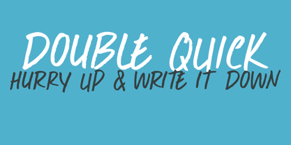
Double Quick is a fast, handwritten font with excellent legibility. It was designed to look like a quick grocery list, a hasty 'I Love You' note penned down on a Post-it or a home improvement to-do list. Comes with extensive language support.
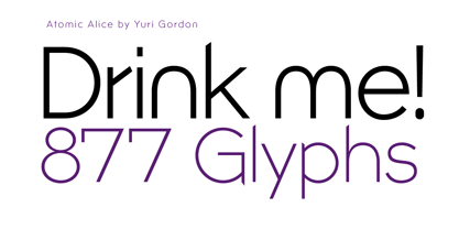
Atomic Alice was designed by Yuri Gordon in 2018. This typeface is simple and clear, with strong character. Gives wide opportunity to create expressive texts with 877 glyphs. Atomic Alice has has some OpenType features including small caps, stylistic alternates and huge amount of ligatures.
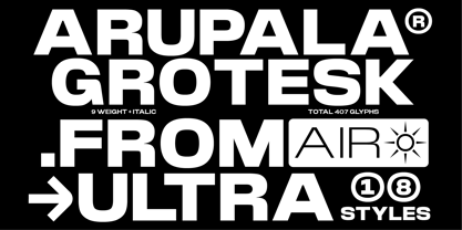
Arupala Grotesk is a Grotesk font this versatile typeface will grab readers’ Attention. This font was inspired by a character named H. Aroepala. This font is suitable for both formal and informal events and is also suitable for various types of print and digital media.
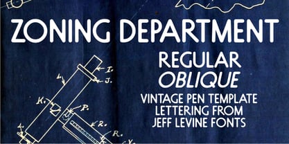
A 1930s-era sign lettering template set manufactured for the National Carbon Company by Wrico (The Wright-Regan Instrument Company) yielded the familiar lettering that comprises Zoning Department JNL. This rounded-end typestyle was also widely used on architectural drawings, signage, blueprints and the like.
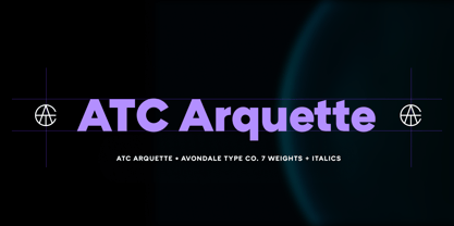
ATC Arquette, is a best-selling geometric sans-serif font created with minimal ornamentation to adhere with accessibility and visibility guidelines, and be as visually legible as possible. Contains 400+ glyphs, full alphabet, ligatures, numberals, accents and punctuation. ATC Arquette was released in 2018.
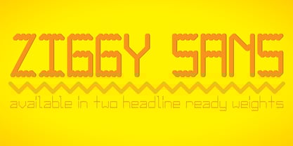
Ziggy Sans is my debut font, a straightforward headline typeface. It was devised from simple sketches and came together fairly smoothly, but very slowly. Each letterform is comprised of only two shapes for maximum consistency, and every letter combination has been painstakingly kerned by hand.
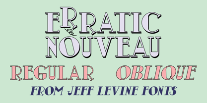
The title on the 1925 sheet music for “By the Light of the Stars” was hand lettered in an eccentric Art Nouveau type style with varying character shapes and line widths. This is now available as Erratic Nouveau JNL in both regular and oblique versions.
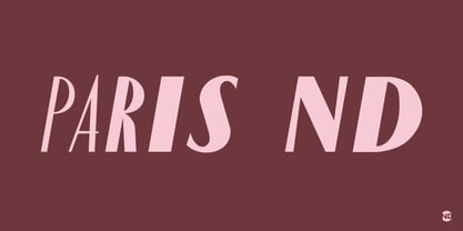
Paris was designed by Crous-Vidal in 1953 and is part of the Grafía Latina collection. Paris Bold originally had two alternative capital letters O, one with pronounced 45° stress; they are both incorporated in the ND version. París is a Trademark of BauerTypes SL
Schattig was designed by Alexis Carrillo, published by Aisiv. Schattig is ideal for titles, booklets, and old photograph-style designs, the font contains Basic Latin and Latin-1 (ISO 8859-1) characters, along with 53 different ligatures for more realism to your titles and designs.
Decorative three-dimensional display font with cap and lowercase. Originally designed for a shoe company. Works with colors, gradients and filters. Cullens Shoes was designed for all media and works best at 30 point and above. Cullens Shoes requires subjective display kerning and compensation.
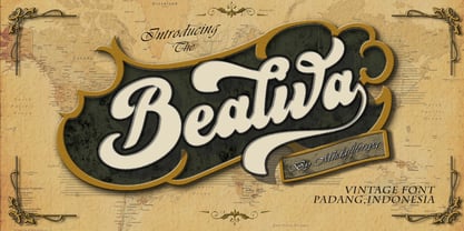
Bealiva is one of my fonts based on a hand lettering project in 2020. It was very inspired from the famous retro typography designs in late 60's until 70's. It includes the extrude look, so you will not have to add it later.
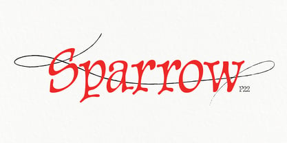
P22 Sparow is based on handwritten lettering executed with a fine-pointed steel "crow-quill" pen. Designed for use in small sizes of continuous text setting such as poetry. This style was originally designed for a series of hand-crafted calligraphic booklets in 1963.
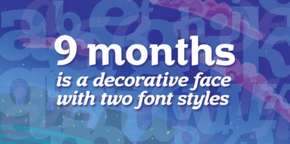
9 months is a decorative face with two font styles. It would look nice on candy and food package, in children's books and magazines. This work is devoted to the period in my wife's life when she was pregnant during 9 months with our daughter.
Tubby came about when I made a book with Cooper Black as a headline font. I started playing with heavy forms, and as a result was Tubby. It has a fat and friendly feel, and with swash italics it is fairly versatile in use.
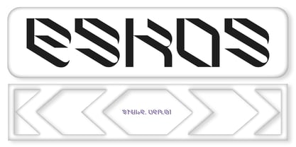
Eskos is designed for headings. It is deliberately diagonal and gives a sharp, oblique texture in the text set. It has rough irrational knots and oblique strokes. Eskos supportsBasic Latin, Cyrillic and more than 100 languages all together. The font was designed by Viktor Pesotsky.
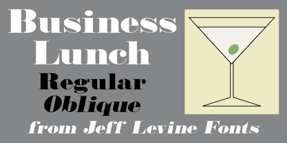
Business Lunch JNL is an extra bold hairline serif font based on Monotype’s Falstaff, which in turn was greatly influenced by Bodoni Extra Bold. Great for posters, menu headers and other forms of headlining, Business Lunch JNL is available in both regular and oblique versions.
This was originally brought out as a caps-only font, but later the foundry scrounged up a lowercase that wasn't our idea of a very good match. So we cleaned up the caps and made them a bit bolder, then drew a harmonizing lowercase.
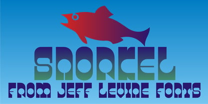
A package for a swim mask and snorkel was the basis for this decidedly unusual typeface with a wild 1970s-era design. There's no telling how to apply this font to a project, but think black light posters, psychedelic music and some cheap wine!
Beauvoir is based on a sample of Art Nouveau period hand-drawn poster lettering designed by Chicago designer Frank Atkinson. The original sample was limited, so we extrapolated from it and added new characters and character variations to make the final result more interesting.
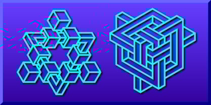
Impossible Ornaments was inspired by the designs of Swedish artist Oscar Reutersvärd and Dutch artist M. C. Escher whose drawings may initially appear feasible yet cannot be physically constructed, therefore impossible. There is an assortment of 47 ornaments all located under the character set keys.
Tallahassee Chassis JNL was modeled from a toy alphabet rubber stamp set made in Japan and imported to the U.S. during the late 1950s and early 1960s. The lettering style somewhat resembled that found on the side of old railroad cars, buses or trolleys.
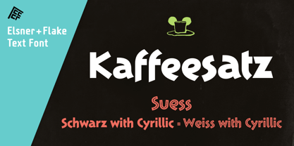
The Kaffeesatz EF typeface was designed in 1993 by Ralf Borowiak in three weights: “Schwarz”, “Weiß” and „Süß“ (“Black“, “White” and “Sweet”). Since it is experiencing ever increasing popularity, the Elsner+Flake Designstudios augmented the “Schwarz“ and “Weiß“ versions with a complement of Cyrillic characters.
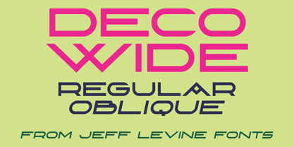
A unique and stylized type design with Art Deco influence was found within the French publication “Modèles de lettres modernes par Georges Léculier” (“Models of Modern Letters by Léculier”). This lettering is now digitally available as Deco Wide JNL in both regular and oblique versions.
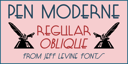
A classic example of Art Deco lettering made with a round nib ink pen was found within the pages of “Lettering” by Harry B. Wright (circa 1950). Now available as a digital type font, Pen Moderne JNL is available in both regular and oblique versions.
News Gothic was created by Morris Fuller Benton in 1908 and presented by the American font foundry American Typefounders. Despite, or perhaps because of, the font’s unconventional relationships in proportion and form, News Gothic has long been a popular typeface for almost any use.
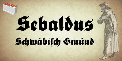
The former hot-metal font Sebaldus Gotisch, a 19th century Berthold in-house design, was carefully redesigned and updated for today’s use. This font contains a long s which you can access by typing alt b or by using the historical alternate OTF feature.
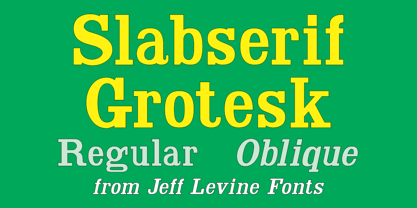
Slabserif Grotesk JNL was modeled from an example of a wood type design called Antique Light Face, and is available in both regular and oblique versions. The numerals (although an odd fit to the overall design) make this vintage font quite unusual and charming.