10,000 search results
(0.066 seconds)
- JetJaneMono by Ingrimayne Type,
$9.00 JetJaneMono is a large family of sans-serif faces which are monospaced. It is very plain (plain=plane=jet). The font family has two widths and three weights, with each upright style paired with an italics style. These twelve fonts are then duplicated with another set in which small caps replace the lower-case letters. The typeface was created in 1994 and in 2021 the condensed widths were added.
 - Jolly Good Proper Serif by Letradora,
$- What do you get if you mix a proper serif typeface with cartoony fun? JollyGood Proper Serif! A whimsical font legible enough to work in longer texts, it’s perfect for childrens’ books and magazines.. It is a complete complete family with 6 weights in regular and italic (12 fonts in total). It has an amazing character set, with support for most european languages, as well as alternates and ligatures.
 - Klassisk by David Engelby Foundry,
$25.00 Klassisk is the Danish name for “classic” [’klasisg]. Taking its inspiration from a wide range of classic serif traditions, Klassisk can be your partner in crime for almost every kind of design job! It has the four classic weights PLUS two lighter display weights for headers and big letter sizes in general. Klassisk also comes with … a large variety in numerals (three styles) swashes and special ligatures a vibrant italic style.
 - Lazurski by ParaType,
$30.00 Designed at Polygraphmash type design bureau in 1984 by Vladimir Yefimov, with the addition of demi and demi italic. Based on a hot-metal typeface (1962) by Moscow book designer Vadim Lazurski (1909–1994), inspired by the early 16th century typefaces of Italian Renaissance. The typeface is useful for text and display composition, in fiction and art books. An 'expert set' was added by ParaType (ParaGraph) in 1997.
 - Uchrony by deFharo,
$14.00 Uchrony is a condensed proportion slab serif typeface. The font family is made up of 3 styles, Roman, Small Caps & Italics, with 6 weights each. The lowercase letter "o" has guided the basic proportions and curves, in an exercise in minimalist construction, providing morphological coherence and maximum legibility, for this multi-purpose typeface family. The typography includes alternative letters, several sets of numbers, and advanced OpenType features. • View specimen in PDF
 - Artigo Display by Nova Type Foundry,
$40.00 Artigo Display is the odd sister of Artigo text typeface. It is a contemporary interpretation of handwriting shapes in a display version of the italic. It is more expressive and it has its own personality. It was renovated with five new weights that bring more flexibility to use the typeface in different mediums. Artigo Display has won a Certificate of Typographic Excellence from the Type Directors Typeface Competition in January 2018.
 - Cobe by Stawix,
$39.00 The result of reducing elements of letterforms to only its necessity in lowercase is mostly influenced by the ideal of Aerodynamics. The true intention behind the design of Cobe is to construct a fluid typeface while maintaining a strong structure of uppercase that possessed distict forms, shapes and corners, resulting in an eye-pleasing texture when forming a sentence. Cobe comes in 9 consecutive weights with italics and standard features.
 - Biofolio Ultimate by Formatype Foundry,
$30.00 Behance Biofolio Ultimate is geometric Grotesk typeface exploration proportion and simplicity in typeface, Inspired by the elegant plainness seen in many of the less common 20th centuries sans Comes in 10 weights matching Italics —20 fonts in all, Biofolio Ultimate supports around 150 languages in the Latin based languages, Designed with multiple OpenType features, such as powerful stylistic alternates, case-sensitive forms, contextual and stylistic alternates. The standard numerals set encompasses tabular figures and symbols, superiors and inferiors, numerators and denominators, plus fractions.
 - Decima Mono Pro by TipografiaRamis,
$39.00 Decima Mono Pro is an upgrade of the well received Decima Mono typeface, released back in 2009 and quite successful ever since. This is a modern monospaced condensed sans serif family with classic geometric design, built in three weights and six styles. The letterforms in roman style are techno (engineered) in appearance, while italics remind one of elegant handwriting balanced with Roman geometry.\ The typeface is released in OpenType format with extended support for most Latin languages, as well as Greek and Cyrillic.
 - Florida Rose by Yahya Type,
$16.00 Florida Rose is a Sharped version of "Peroba Rosa" Font. It is a modern sans serif type family featuring a blend of modern, classical, and playful characteristics. The simple, clean forms and classically inspired proportions give it a timeless quality and interesting visual rhythm. Florida Rosa is perfect for logo design, magazine headers, product packaging, branding projects, clothing or simply as a stylish text overlay to any images or websites. WHAT’S INCLUDED? • Comes with regular, thin, light, italic, bold, thin italic, light italic, bold italic and bold italic font styles. • Uppercase & lowercase letters, numbers, punctuation Ligature & Huge Stylistic alternate, Multilingual support. Still got a question? Send me a message and I’ll be happy to answer! qura.yahya@gmail.com
 - Allumi Std by Typofonderie,
$59.00 Technology in mind in 12 fonts Allumi is a different font. Different from anything Jean François Porchez has designed in the past. Allumi is a sleek typeface designed with technology in mind. It’s a perfect font family for any communication concerning design, robotics, or functionality. Pushed to its extreme limits, the Allumi shapes are neither perfectly round or geometrically square. It’s a human design with a high tech touch. Allumi can be described as the Eurostyle (designed by Aldo Novarese in 1964) of the new century, mixed with Frutiger. Allumi is a serious typeface because of the unique design and sturdy form. The pure shapes can create a global presence today with an eye on the world of tomorrow. Two widths The Allumi family has been built around two series of widths, standard and extended. Italics have been carefully designed as slanted roman with all necessary optical and human corrections to create a perfect and neat italic. I Love Typography 2009
 - Dossier by Tabular Type Foundry,
$29.99 Dossier is a monospaced serif face that originates in Dwiggins's designs for typewriter. It has a soft and casual personality and comes in 8 weights and matching italics, making it ideal for text typography, package and advertisement design. Dossier is an adaptation of William Addison Dwiggins's unfinished typewriter faces. He worked with multiple typewriter manufactures including Underwood, Remington Rand, and IBM, but none of them were finished. He left a number of intriguing drawings which are now kept at the Boston Public Library. You could see in the drawings that Dwiggins was also interested in exploring designs of varied width. Toshi Omagari decided to combine these materials to make a cohesive family: the upright was taken from a drawing of monospaced lowercase for an unknown client, and the italic was from the work he did for Underwood which he called "Aldine". Toshi added narrower and wider alternates in the same way Dwiggins devised.
 - Aptifer Slab by Linotype,
$39.00 Aptifer Sans and Aptifer Slab are two 21st century typeface families created by Mårten Thavenius. Each family has seven weights, in roman and italic respectively, making 28 font styles in total. A heritage from two design traditions can be seen in Aptifer. One is the robust American gothic typefaces, like M. F. Benton’s, from around 1900. This is combined with the openness and legibility that comes from the humanist tradition. The sans serif part of the family, Aptifer Sans, is designed without excessive details disturbing the reading. Its sibling Aptifer Slab with its wedge slab serifs is more eye-catching but still suited for text settings. The italics fit well into the text flow of the roman. They are a bit narrower than the roman and have cursive characteristics. Both Aptifer Sans and Aptifer Slab are highly legible typefaces and can be used both in print and on screen. Featured in: Best Fonts for PowerPoints
 - Klint by Linotype,
$40.99 Type designer Hannes von Döhren created Klint. A sans serif typeface with a technical appearance and humanistic streak. The family includes five weights; each weight ships in three widths: condensed, regular, and extended. All of the 15 Klint variants have a companion Italic, rounding out family at 30 fonts. Klint's large x-height makes the design especially legible at small point sizes. In today's day and age, appliance manufacturers and/or companies in the mobile phone, computer hardware and software or Internet sectors are becoming ever more important. Klint fills the rising need for superfamilies with a technical feeling that are also legible in both text and display settings. Through conspicuous letters like R, K, k, or g, as well as the independent nature of its Italic, Klint exudes an ethos that separates it from the competition. Longer text passages in brochures, catalogs, or magazines would be well served by Klint's Light, Regular, and Medium weights. The heavier cuts are optimized for poster settings and headlines."
 - Drystick Geo Grotesk by deFharo,
$14.00 Drystick is a Sans Serif typographic family of Geo-Grotesque style with 8 pesos plus the italic versions all include small capital letters the symbol of Bitcoin (b #) and other cryptocurrency symbols. It is a geometric typography, minimalist, with neo-grotesque modulations. The typeface has alternative letters and numbers, small caps and advanced OpenType functions. The Italic versions have some of their own characters (&, @, Q, a, g, y), these versions have many optical corrections to balance the deformations created in many curves by the mere inclination of the letters, which in the case of This typography is 9 °. The drawn of the vectors is careful to obtain smooth curves and elegant appearance, the thicker versions have ink traps in the joints of the joints to use in small sizes. The Metric and the Kerning of all the versions I have reviewed individually to obtain maximum readability in any type of text and size.
 - Garalda by TypeTogether,
$49.00 Type designer Xavier Dupré’s Garalda is a charming 21st century family that renews a legacy of finesse. As paragraphs on a page, Garalda’s overall impression is of a workaday personality, committed to the main purpose of the job: easy long-form reading. But setting it in display sizes proves something different: This reinvented Garamond is anything but basic. The Garalda story begins with the serendipitous finding of a book typeset in a rare Garalde, called Tory-Garamond, with which Dupré was not immediately familiar. This Garamond was used in bibliophile books in the decades surrounding 1920, but after that it became déclassé for an unknown reason. Dupré found the italic styles especially charming and discovered the family was probably the mythical Ollière Garamond cut from 1914. He obtained low resolution scans of the typeface and used them, rather than high resolution scans, as the basis for his new type family. This allowed Dupré the mental freedom to experiment and remix as he saw fit, culminating in a contemporary family with heritage. As seen in the simplistic rectangular serifs, Garalda is a humanist slab serif, but with a mix of angles and curves to give the classic shapes a fresh, unorthodox feeling. While almost invisible in paragraph text, these produce a graphic effect in display work. The set of ligatures in the roman and italics lend themselves to unique display use, such as creating lovely logotypes. In the italics, some swashes inspired by different historic Garamonds are included, sometimes breaking their curves to be more captivating. Just look at how the italic ‘*-s’ ligatures create ‘s’ with a cursive formation rather than merely a flowing slant. And how the roman ‘g’ link swings as wide as a trainer’s whip. These are all balanced by squared serifs in the roman to keep an overall mechanised regularity. The Garalda family comes in eight styles, includes some of the original arrows and ornaments, and speaks multiple languages for all typesetting needs, from pamphlets to fine book printing. The complete Garalda family, along with our entire catalogue, has been optimised for today’s varied screen uses.
 - Bookseller Bk by Cyanotype,
$20.00 Bookseller Bk is a typeface designed for books and legible text at a small sizes, with an old book feeling. This typeface is the reinterpretation of a sample found in a French book, published between 1882 and 1893 and its author —Ernest Michel— lived between 1837 and 1896. This sample has influence from Didot, Scotch Roman and Clarendon (typefaces which were in use at that time). This reinterpretation expands the basic set for the contemporary era. Bookseller Bk includes small caps, old style figures, lining figures, fractions and basic Cyrillic alphabet. Everything in 3 different optical widths. You can save some lines with Reduced weight or fill some lines with Ample weight. All of them with italics, bold and bold italics. Bookseller Bk is also available in Caption size. 12 fonts for legibility at smaller sizes. Subhead & Title sizes are now in development. Finally this typeface was the result of the course Digital Reinterpretation of Classic Typography by Oscar Guerrero Cañizares at Domestika. Do you require additional glyphs? Please contact me to consider your request in order to expand Bookseller in further updates.
 - Bookseller Cp by Cyanotype,
$20.00 Bookseller Cp is a typeface designed for books and legible text at a smaller sizes, with an old book feeling. This typeface is the reinterpretation of a sample found in a French book, published between 1882 and 1893 and its author —Ernest Michel— lived between 1837 and 1896. This sample has influence from Didot, Scotch Roman and Clarendon (typefaces which were in use at that time). This reinterpretation expands the basic set for the contemporary era. Bookseller Cp includes small caps, old style figures, lining figures, fractions and basic Cyrillic alphabet. Everything in 3 different optical widths. You can save some lines with Reduced weight or fill some lines with Ample weight. All of them with italics, bold and bold italics. Bookseller Cp is also available in Book size. 12 fonts for legibility at small sizes. Subhead & Title sizes are now in development. Finally this typeface was the result of the course Digital Reinterpretation of Classic Typography by Oscar Guerrero Cañizares at Domestika. Do you require additional glyphs? Please contact me to consider your request in order to expand Bookseller in further updates.
 - Samsheriff by Ingrimayne Type,
$5.00 Samsheriff is a large sans-serif family with a touch of quirkiness. It contains an eclectic mix of letter styles but is very legible. The origin of this typeface was in the caps-only letters used for the novelty font Coffinated. Adding lower-case letters, additional widths, additional weights, and italics resulted in the 30 styles that make up the Samsheriff family.
 - FebDrei by Ingrimayne Type,
$9.95 FebDei is neat, meticulous hand printing in two weights, plain and bold, each with italics. It has little contrast and appears as if it was written with a pencil or ball-point pen. Unlike many other hand-printing fonts, it has tiny serifs. FebDrei was created in the process of making the fonts AllSmiles and BringInTheFrowns and can be used with them.
 - FF Tsunami by FontFont,
$41.99 Dutch type designer Donald Beekman created this display FontFont in 1999. The family has 8 weights, ranging from Regular to Bold in Normal and Expanded (including italics) and is ideally suited for music and nightlife and poster and billboards. FF Tsunami provides advanced typographical support with features such as ligatures and case-sensitive forms. It comes with proportional lining figures.
 - Rileno Sans by Degarism Studio,
$40.00 Rileno Sans is sharp with geometric forms and strong personality. It is constructed in a geometric manner and inspired by the constructivist typefaces of the 1920s with a humanistic quality. It comes in 6 weights, 6 uprights and their matching italics. Rileno Sans is equipped with opentype features like Alternate charates, Fractions, Monospace Numbers, Superscript/subscript, Arrow, Roman Numbers, Ligatures and More.
 - Queen Mestalla by ZetDesign,
$17.00 Queen Mestalla is a sherif font in gothic style with a good thickness making this font look bold and eye catching. This font is perfect for designing t-shirts, posters, music albums, magazines, billboards, and graffiti. This font is available in 2 style options, regular and italic, also comes with many alternative style options making it easy to create more awesome designs.
 - Hostil by Intellecta Design,
$34.95Hostil is a modern typeface ready to fight for you. In any territory. Hostil has complete sets in Latin, Hebrew, Cyrillic, and Greek chracters. Plus Central European, Vietnamese, Baltic, Turkish complete sets with all diacritic signs and punctuation marks and extra characters belonging this ranges. Hostil has a wide variety of presentations, like Regular, Bold, Italic, Outline Wide, ExtraWide, Shadow and Compressed. - Girl lova by Aminmario Studio,
$20.00 Introducing Girl Lova Font Girl Lova is a lovely script font. Its charm makes it appear wonderfully, readable, and, ultimately, incredibly versatile. Comes in Regular and Italic styles. Equipped with beginning and ending love tail. This font will look outstanding in any context, whether it’s being used on busy backgrounds or as a standalone headline! Thank you for the purchase. Happy creating design :)
 - Onda by John Moore Type Foundry,
$7.00 Onda is a display typeface based on a synthesis of curvilinear nostalgic spirit leads us to a new psychedelia words are immersed in the spirit of the 60s. Onda is provided "style forms" to small caps, in both its Regular and Italic. Its use is recommended for bands, pop spirit signs, markings or titles for scuba diving, oceanography and water industry.
 - Sidesakey by Aminmario Studio,
$20.00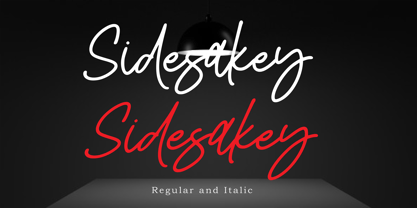 Sidesakey simplifies elegance into one truly stunning handwritten font. With its relaxed feel, Sidesakey is incredibly versatile, suitable to each of the design projects you may have in mind! Use it to create beautiful greeting cards, wedding invitations, logos, website titles and much more! Comes in Regular and Italic styles. Thank you for your purchase! Hope you enjoy with our font
 - Redob by Product Type,
$18.00 The Redob Racing Font is a strong-looking font that gives your project a bold and sporty personality. This font was designed with attention to detail to make your design project stand out from the rest. A bold, masculine font that’s perfect for creating that “in your project” look. Comes in 6 different styles: Regular, Round & Italic, each with a slightly different feel.
 - Redoneta Rounded by Rafael Jordan,
$30.00 Redoneta Rounded is an extension of Redoneta font family created by Rafael Jordan, adding kindness to the rational geometry, keeping its workhorse vocation mixing efficiency and the beauty of simplicity. Redoneta Rounded is available in 6 weights and its matching italics. It has an extended collection of OpenType features, including seven stylistic sets to customize how performs in multiple ways.
 - Linotype Aperto by Linotype,
$40.99Linotype Aperto is a typical text font in the style of transitional faces, like its often-used cousin Times. It is available in roman, semibold and bold weights, each with its matching italic. The roman weight is complete with old style figures and small caps. Its balanced, reserved appearance makes Aperto extremely flexible, good for long texts as well as headlines. - Gayatri by Océane Moutot,
$32.90 Gayatri is sans serif font with high contrast and smooth lines. Its large variety of glyphs, including accents, old-style numbers, ligatures,... will give you freedom for all of your projects. It offers a large choice of uses such as magazine, branding, edition and so on. Gayatri is available in 16 styles from thin to black, in roman and italic.
 - Primordial by Hanoded,
$15.00 Primordial is a chaotic handmade script font. It is rough around the edges, glyphs are shaky and don’t follow a baseline. Yet, in all this chaos, you will find the budding of a new idea, a glimpse of hope and a glint of something beautiful. Primordial comes in a regular and italic style, plus a back slanted style called Primordial Chaos.
 - Zanjabeel Arabic by Boharat Cairo,
$20.00 Zanjabeel is an Arabic typeface with a hybrid design between the Naskh and Modern Kufi styles, comes in 9 weights, and some italic letters that give a unique and dynamic feel. the typeface works well with large sizes, headlines, and short text. also, works in printing and digital uses. The typeface is a collaboration with the Egyptian designer Ibrahim Hamdi
 - Sincerity by Océane Moutot,
$32.90 Sincerity is an elegant and strong typeface identified by its high contrast, its sharp shapes and triangular serifs. Inspired by the Didone style, Sincerity adds modernity and some unique features to it. It offers a large choice of uses, from titles of magazines to newspapers, logotypes and so on. Sincerity is available in 16 styles, from thin to black in roman and italic.
 - Ciabatta by Sudtipos,
$39.00 Ciabatta is a luscious font made especially for packaging. Thanks to 5 weights, it can be used for all eventualities; powerful in headlines or as lettering, yet very legible in small texts. Its shapes are slightly narrow and based on classical italics but Ciabatta includes alternates with a double-storey ‘a’ and ‘g’ which offer a more formal appearance upright.
 - Parity Sans by Shinntype,
$19.00 The Parity concept takes the minimalist unicase alphabet and expands it in another dimension, that of the megafamily encompassing a variety of weights, optical sizes and styles (roman/italic, serif/sans, proportional/monowidth)—of benefit whether fine tuning a single, quite specific font for the task at hand, or harmoniously combining several in the hierarchy of a multi-formatted page layout.
 - Funky Flamingo by Hanoded,
$15.00 I really can’t tell you why I called this font Funky Flamingo. Normally I name fonts after something I see or do, but I don’t have a special thing for flamingoes, nor do I keep them in my backyard. Funky Flamingo is a happy handmade serif with a retro look. It comes in regular and bold styles, each style with its own Italic.
 - Nouvelle by Mina Arko,
$45.00Nouvelle is an elegant sans serif family of six fonts (light, regular, semibold and italics). This modular typeface works just as well as display typeface as it does in body text. Because of the high x-hight it stays readable in very small sizes. It has 1884 characters: oldstyle numerals, ligatures and extra characters that support almost all European languages. - Battleslab by Kostic,
$40.00 Battleslab is a slab serif made for setting few words in large sizes. Two heavily contrasted weights work well when combined, with its mono-line wide light and heavy black it is perfect for making that "one-two punch" in headlines or logotypes. Display oriented Battleslab derived from Battlefin Family (which is much more comprehensive with its ligatures, italics and SC).
 - Vinkel by Typolar,
$72.00 Composed, clean and slightly angular, as its name says. It's organic, warm and round in the right places too. A sanserif typeface family Vinkel is a handsome androgyne with an excellent balance of Neo-grotesque and Humanist DNA. Vinkel comes in eight weights from Thin to Extra Black, all with italics, small caps, several sets of numerals, arrows, alternate characters, and more.