10,000 search results
(0.04 seconds)
- Carlgine by Muksal Creatives,
$10.00 Carlgine is a unique and modern family of serif fonts. Carlgine has 18 families Regular and italic font, starting from the small thin to the largest black. This typeface is versatile and can be used successfully in magazines, posters, branding, websites, etc.*
 - Betm by Typesketchbook,
$39.00 Betm is a geometric sans-serif font family created by Chatnarong Jingsuphatada (a Thai type designer) and published by Typesketchbook. Inspired by clean modern and, somewhat, mild geometric lines, Betm comes in 10 very useful weights along with complementary italics. You’ll love Betm!
 - Carltine by Muksal Creatives,
$10.00 Carltine is a unique and modern family of Sans serif fonts. Simply Conception has 18 families Regular and italic font, starting from the small thin to the largest black. This typeface is versatile and can be used successfully in magazines, posters, branding, websites.
 - Spartacus by Alan Meeks,
$45.00 A further development of the Colosseum range but this with a slab serif. Visually monoline and modern in appearence it still retains its Trajan characteristics. The addition of Spartacus black with its unusual Italic gives a the face a strong original headline font.
 - Bommer Slab Rounded by dooType,
$- Bommer Slab Rounded designed by Eduilson Coan is the softer sister of Bommer Slab released in April 2014. This family includes 14 weights: seven uprights and seven italics and opentype features such as: all caps, ligatures, ordinal, fractions, numerator, denominator, superscript and subscript.
 - Eskorte Latin by Rosetta,
$60.00 Eskorte is a diligently designed Latin type family with an uncomplicated, engaging poise that conveys a crisp, businesslike tone. Its precise range of styles looks to no-nonsense efficiency and ease of use by non-designers in the office and text-intensive professional environments. Eskorte supports over ninety languages in a full range of weights, with both upright and matching italics. The italics are lively, fluid forms that infuse their charms into text settings or take on their own personality in large, dominant headlines. In concert with the hardworking upright styles, the two fit smartly into a range of publications, from corporate to casual. All of the weights and styles offer an adept set of features like small caps, case-sensitive punctuation, and both tabular and proportional figures to make short work of any typographic task. Whether employed in enterprise reports, lifestyle publications, or identity work, Eskorte is ready for business.
 - Distopia by Unio Creative Solutions,
$5.00 Distopia is a contemporary type system which focus on clarity and legibility, developed in two weights with true matching italics. Distopia includes, as previously said, two contrasting versions: Light and Regular with corresponding true italics. This font family combines modernist shapes with slight grotesque touches. Each variant was designed with an attentive optical evaluation; curves, details and spaces were specifically tweaked to better suit the requirements of a highly-legible typeface. The end result is a family with full multilingual capabilities and a coverage of several languages based on the Latin alphabet; Distopia aims to become your next typographic companion. Specifications: - Files included: Distopia Light, Distopia Regular with corresponding true italics - Multi-language support (Central, Eastern, Western European languages) - OpenType features Thanks for viewing, Unio.
 - Cicada by Larin Type Co,
$15.00 Cicada is an elegant and modern sans-serif font family. It includes upright and Italic style, each of them has five weights from Extra light to bold. This is a multi-purpose font that is perfect for any project, it is contrasted, modern and easy to read. With it, you can create logos, use in advertising, packaging, book covers and magazines, headings, descriptions and much more. Also use Italic style to add dynamics to your project. This font is easy to use has OpenType features.
 - Le Monde Livre Classic Std by Typofonderie,
$59.00 A Renaissance style typeface in 4 series Le Monde Livre Classic works beautifully on text and titling settings. Designed as an extension of Le Monde Livre, this family distinguishes itself by its historical forms and by its numerous stylistic effects. Le Monde Livre Classic’s italics follow the models of the Renaissance and feature italic capital and lowercase swashes. Le Monde Livre Classic works beautifully for book typography, magazine settings from text to display. Le Monde Livre Classic revisited Type Directors Club .44 1998 European Design Awards 1998
 - Quta Rounded by Fo Da,
$15.00 Quta Rounded "derivative typeface from Quta" is a sans serif typeface produced by FoDa foundry, that meets all the needs of professionals who search a family of clean rounded geometric font, very well suited for headlines, newspaper and many purposes. With a basic character set in Five weights with their italics. Quta Rounded covers many features like: -Five main weights (Light, Regular, Medium, Bold and Extra Bold) -Matching italics for all weights. -language support for many Latin-based scripts -Ligatures and many other OpenType features.
 - Puanto by Larin Type Co,
$15.00 Puanto is a elegant serif font that includes two styles: regular and true Italic. This font has a lightweight and looks amazing in logos, branding, arranging wedding invitations, business cards, packaging, titles and much more, it is very readable and recognizable. This font includes alternates and ligatures for Uppercase and Lowercase, with them you can make your project more elegant and unique and italic style will add dynamics to your design, it also includes alternates and ligatures This font is easy to use has OpenType features.
 - Dear And Fans by Anaya Studio,
$8.00 Dear and Fans is all class. A stylish modern font that is a mix of serif and sans serif. It's soft curves mixed with high contrast glyphs lend it self to both feminine and masculine qualities. With a contrasting light italic, Dear and Fans works great in layout design for quotes or body copy. The Elegant curves also make for a unique logo or masthead. Dear and Fans comes with multilingual support also. Full upper/lower case, numbers, punctuation and multilingual support. Full italic style included also.
 - Calendula by ParaType,
$30.00 Calendula is a humanistic font with low contrast and one-sided serifs. There are eight styles: four regular of different weights from Light to Bold and corresponding italics. The main set of regular styles is close to upright italics, so the font is percieved as informal and friendly. However, Calendula allows you to combine business with pleasure by switching the stylistic set, and turns into a calm text font with traditional upright forms. The font was designed by Natalia Vasilyeva and released by Paratype in 2017.
 - Leidener by Talavera,
$40.00 This font family is inspired by printed work made by the Elzevir family back in the XVIIth century at Leiden (NL). They worked with material from several type designers, but further investigations sends us to the tracks of one in particular: Robert Granjon. Granjon italics were way ahead of his time, making some really beautiful signs like swashy ampersands and minuscule v letters. This font also contains old style figures in the same fashion as they were printed, like the flipped number 8 and open forms in 6 and 9. This is as much a revival as an original design, because of their weights bold and heavy (both with italics) that were inspired on some titles. In this font you can also find a lot of ligatures, small caps, diacritics and even a fleuron for each weight and variation. Leidener came up from two books: Constantini Imperiatoris (1611) and Exercitationum Mathematicarum (1657), printed by Louis and John Elzevir on their Leiden Workshop, back in the day.
 - ITC Officina Display by ITC,
$29.99When ITC Officina was first released in 1990, as a paired family of serif and sans serif faces in two weights with italics, it was intended as a workhorse typeface for business correspondence. But the typeface proved popular in many more areas than correspondence. Erik Spiekermann, ITC Officina's designer: Once ITC Officina got picked up by the trendsetters to denote 'coolness,' it had lost its innocence. No pretending anymore that it only needed two weights for office correspondence. As a face used in magazines and advertising, it needed proper headline weights and one more weight in between the original Book and Bold."" To add the new weights and small caps, Spiekermann collaborated with Ole Schaefer, director of typography and type design at MetaDesign. The extended ITC Officina family now includes Medium, Extra Bold, and Black weights with matching italics-all in both Sans and Serif -- as well as new small caps fonts for the original Book and Bold weights. - ITC Officina Sans by ITC,
$40.99When ITC Officina was first released in 1990, as a paired family of serif and sans serif faces in two weights with italics, it was intended as a workhorse typeface for business correspondence. But the typeface proved popular in many more areas than correspondence. Erik Spiekermann, ITC Officina's designer: Once ITC Officina got picked up by the trendsetters to denote 'coolness,' it had lost its innocence. No pretending anymore that it only needed two weights for office correspondence. As a face used in magazines and advertising, it needed proper headline weights and one more weight in between the original Book and Bold."" To add the new weights and small caps, Spiekermann collaborated with Ole Schaefer, director of typography and type design at MetaDesign. The extended ITC Officina family now includes Medium, Extra Bold, and Black weights with matching italics-all in both Sans and Serif -- as well as new small caps fonts for the original Book and Bold weights. - ITC Officina Serif by ITC,
$40.99 When ITC Officina was first released in 1990, as a paired family of serif and sans serif faces in two weights with italics, it was intended as a workhorse typeface for business correspondence. But the typeface proved popular in many more areas than correspondence. Erik Spiekermann, ITC Officina's designer: Once ITC Officina got picked up by the trendsetters to denote 'coolness,' it had lost its innocence. No pretending anymore that it only needed two weights for office correspondence. As a face used in magazines and advertising, it needed proper headline weights and one more weight in between the original Book and Bold." To add the new weights and small caps, Spiekermann collaborated with Ole Schaefer, director of typography and type design at MetaDesign. The extended ITC Officina family now includes Medium, Extra Bold, and Black weights with matching italics-all in both Sans and Serif -- as well as new small caps fonts for the original Book and Bold weights."
 - Bommer Slab by dooType,
$15.00 Bommer project started in January of 2014 and I am happy to announce the first family - Bommer Slab - is now ready for release. This family includes 14 weights - being seven uprights and seven italics. This font has a strong personality, that makes it perfect for use in headline sizes but means it also works gracefully within text blocks.
 - Vanage by Katatrad,
$29.00 Vanage is is an elegant high contrast contemporary sans-serif stencil typeface provides advanced typographical support with features such as ligatures and alternate characters. It is rooted in the style of a classic high contest typeface, excluding the typical serifs and ball terminals. Vanage is made for display use, Available in 5 weights and their Italics.
 - ITC Golden Cockerel by ITC,
$40.99ITC Golden Cockerel font is based on designs created by Eric Gill in 1929 for the Gold Cockerel Press in England. These elegant and meticulously crafted typefaces were inspired by and modeled on Gill's skills of stone carving, calligraphy and wood engraving. The typeface family includes ITC Golden Cockerel Roman, Italic, Titling, and Initials and Ornaments. - Blicalon by Tanincreate,
$24.00 Blicalon is a geometric sans serif font with modern look and good legibility. Blicalon aims to be a universal, it works great in headlines, short and long texts, high-end branding, logo designs, magazines, product packaging & invitations. It comes in 2 different styles - regular and italic and is equipped with an extended character set, supporting most European languages.
 - Sunbird by Hanoded,
$15.00 Sunbird is a happy, rounded, cartoonish font family. It comes in three weights: regular, medium and black - each with its very own Italic style. Sunbird is quite versatile: it looks good as a display font, but setting a (short) text in it could work as well. Its versatility makes Sunbird an ideal font for product packaging and posters.
 - Boldblaster by Sign Studio,
$12.00 Boldblaster brings vintage themes into the modern era. Neatly arranged lowercase characters are needed for writing a brand or logo. With regular and italic styles, the Boldblaster family can be used together in one display and can support each other in your designs. Supporting font on preview : HEXI ( https://www.myfonts.com/fonts/sign-studio/hexi/ ) Thank You
 - ITC Galliard by ITC,
$41.99 Galliard was originally designed for Mergenthaler Linotype in 1978 as a photocomposition typeface. It is modeled on the work of Robert Granjon, a sixteenth-century punchcutter whose typefaces are renowned for their beauty and legibility. ITC Galliard is a notable typeface for text; the italic is very distinctive in occasional pieces such as invitations and informal announcements.
 - Larryline by Erwin Krump,
$28.00 The Larryline family contains 6 stroke thicknesses and a proper italic, also in 6 thicknesses. It is suitable for a wide range of applications and can be readily combined with other fonts. The x-height of Larryline is identical with the x-height of Lunaquête font. Erwin Krump, typograph and sculptor, developed the Larryline font in 2016—2020.
 - Acherus Grotesque by Horizon Type,
$25.00 Acherus Grotesque is a rounded sans serif type family based on geometric forms. It comes in 20 styles, 10 uprights and matching italics. In this version standard greek and cyrillic scripts added plus all glyphs renewed. Each weight includes extended language support, ligatures and more. Acherus Grotesque is incredibly useful for nearly any creative design. Acherus Specimen Behance
 - Chopsee Softee by TypeUnion,
$35.00 Chopsee Softee is the marshmallowy version of our 2017 release Chopsee. It's fun and curvaceous and comes in 8 weights with matching italics. Just like Chopsee the soft version maintains the fluidity and movement with the accentuated curves and terminals, but with added fun and freedom. Chopsee Softee is perfect font for packaging to branding and everything in between.
 - Brinton Signature by Aminmario Studio,
$20.00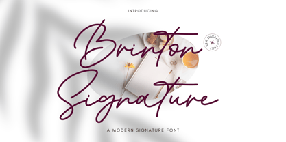 Introducing Brinton Signature Font Brinton Signature is a modern signature font. Its charm makes it appear wonderfully, readable, and, ultimately, incredibly versatile. Comes in Regular and Italic styles. This font will look outstanding in any context, whether it’s being used on busy backgrounds or as a standalone headline! Thank you for the purchase. Happy creating design :)
 - Believe by Haksen,
$19.00 Believe is a versatile font family. Strong capitals and a smooth, open lowercase are effective in a variety of applications. The geometric, near-monoline construction lends a classic durability, tempered by softened edges and vibrant shapes. Version Including : Thin, Regular, also in slant (Italic). Every letter has been redrawn and refined, with improved kerning and expanded language support.
 - Breda Two by Eurotypo,
$24.00 Breda Two is the condensed version of the Breda family, but it is presented as an independent family of fonts because they can work as a single face in your design. As a Breda font, this style is austere, functional and clear, emerged from straight lines and primary shapes. Breda Two is released in four weights with two italics.
 - Decimosexto NF by Nick's Fonts,
$10.00This typeface family includes Spanish Roman letters and “Griffo” style italics, both hand-drawn by Francisco Lucas in Madrid, 1577. The letters, sometimes slightly mismatched in size or off the baseline, capture the look and feel of sixteenth-century printing. Both versions of the font include 1252 Latin, 1250 CE (with localization for Romanian and Moldovan). - LTC Cloister by Lanston Type Co.,
$24.95Designed by Morris Fuller Benton 1913-15, this Oldstyle family was digitized by Jim Rimmer in the early 2000's. It is a roman face closely styled to that of Nicholas Jensen's with a companion italic in the style of Aldus Manutius. Benton considered Cloister the ideal typeface and it does indeed lend itself to many uses. - Dudek PRO by Hotniedog Studio,
$22.00 Dudek is a highly functional font family. Styles from thin to black with italics for each one, allows to create wide and consistent design systems. I wanted Dudek to be soft and simple. Not too much geometrical, but also not calligraphic in detail. Dudek can help in every day jobs and wide multilingual support leaves no one behind.
 - Ridley Grotesk by Radomir Tinkov,
$25.00 Ridley Grotesk is a modern sans-serif. It comes in nine weights with matching italics, designed with powerful opentype features in mind. Each weight includes true small capitals, alternate characters, extended language support, ligatures and more. Perfectly suited for graphic design and any display use. It could easily work for web, signage, corporate as well as for editorial design.
 - Beautiful ES - 100% free

- Beroga Fettig - 100% free

- Caslon Antique - Unknown license

- StingRay - Unknown license

- Velocette - Unknown license

- Titan - 100% free


