10,000 search results
(0.035 seconds)
- Asking Ladies by Youngtype,
$18.00 New Asking Ladies Beautiful Modern Serif . This professional resource is also powerful because each font has its own magical design. Equipped with three versions Regular, Italic & Bold. You can use it for almost anything like blog headers, posters, wedding elements, t-shirts, clothing, book covers, business cards, greeting cards, branding, invitations and quotes, and so on. Feature: Uppercase Lowercase Number Accents (multilingual characters) How To Access Alternate Characters: https://www.youtube.com/watch?v=Go9vacoYmBw https://www.youtube.com/watch?v=XzwjMkbB-wQ https://www.youtube.com/watch?v=x1A_ilsBsGs https://www.youtube.com/watch?v=xFlMwARHusY https://www.youtube.com/watch?v=NVJlZQ3EZU0 Thanks for your purchase!
 - XXII Geom by Doubletwo Studios,
$- XXII Geom and its slab-serific XXII Geom Slab are modern geometric type systems designed with focus on functionality & legibility and with an eye on the old masters. Their well balanced low contrast letter shapes come with a tall x-height. The italics are designed with a little more curvy approach what brings up a different individual character fitting perfect to the straighter forms of the uprights. With its large range of Opentype features it is designed to fulfill the needs your content deserves (Smallcaps, Case Sensitives, Ligatures…) as well as serving your individual taste (Stylistic alternates & Sets). More information on Behance.
 - Symbolum by Type Fleet,
$9.00 Symbolum Croatian heritage awakened. Symbolum is the first ever contemporary interpretation of Glagolitic script. This rediscovered Croatian gemstone gleams again with its unique and glorious letter shapes that give this typeface an exceptional value and meaning. The letters of this contemporary slab serif are inspired with Glagolitic script, but it is not the revival. Some letters originally don’t exist, but are invented, so the font can cover the central European character set. It is suitable for branding, game design, art and conceptual projects, but also for longer texts and more complex designs. The italics are designed at an 10° angle.
 - Praho Pro by Picador,
$29.00 Praho Pro is a part of Warsaw Types – a project based on Warsaw’s local typographic heritage. The project, presented at the Museum of Praga, is a collaboration of 12 young Polish typographers. Praho Pro is a multilingual family inspired by the unique, historical character of Praga district of Poland's capital - Warsaw. High contrast, thin serifs, sharp terminals and large x-height are key features for distinctive headlines. The whole family consist of 9 weights and real italics, small caps, superscript and subscript letters, oldstyle, tabular figures and fractions. It covers latin and cyrillic script. Every weight has almost 2000 glyphs.
 - Quiet Sans by Dharma Type,
$29.99 Quiet Sans is a super geometric sans-serif family for text designed by Ryoichi Tsunekawa and the whole family consists of 6 weights from ExtraLight to ExtraBold and their matching Italics. The basic concept of this family is not only to make crisp, sharp and strong impact by geometric letter form but also to be legible and readable even on small size screen by their sophisticated design. Quiet Sans supports almost all European languages: Western, Central, South Eastern Europeans and afrikaans. And proportional figures, superior figures, inferior figures, denominators, numerators, fractions, ordinals and case-sensitive-forms can be accessed by using OpenType features.
 - Olyford Variable by NicolassFonts,
$148.99 Olyford Variable font is a contemporary sans serif typeface that is derived from the Olyford font family. It features a range of weights and italics. OpenType features: Access All Alternates, Stylistic Alternates (Alternative n, m, p, q, r, u), Stylistic Set 1 (Alternative K, k), Stylistic Set 2 (Alternative W), Stylistic Set 3 (Alternative t), Stylistic Set 4 (Alternative w), Stylistic Set 5 (Alternative 5), Stylistic Set 6 (Alternative ¢, $, €, ₽, ¥), Stylistic Set 7 (Alternative Đ, Ħ, Ð, ≠, ∫), Standard Ligatures, Discretionary Ligatures, Proportional Figures, Tabular Figures, Case-Sensitive Forms, Fractions, Kerning, Denominators, Numerators, Scientific Inferiors, Subscript, Superscript, Ordinals, Localized Forms.
 - Neue Augenblick by Harmnessless Type,
$40.00 Neue Augenblick is a modern contemporary Germany-esque grotesk. This Font face carries a powerful mechanical and industrial feel, it is inspired by aesthetic personality of beautiful Panzerkampfwagen and Post-war Brutalist Architectural. There are ten weights, ranging from Thin to Black, each with oblique italics and plenty of alternates. Neue Augenblick comes with attention-grabbing ink traps make it feels more contemporary. Various opentype features from stylistic alternates, multilingual extended latin support, ligatures, discretionary ligatures, fractions, arrows, scientific numerals, catchwords set, icons and more. Neue Augenblick is suited for embrace both maximalism or minimalism design works for designers to play with.
 - Harfesto by Keristyper Studio,
$14.00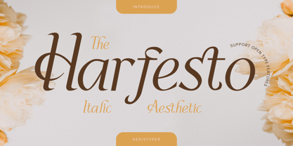 Harfesto is an elegant glamour and stylish italic serif with modern classy and feminine characteristic. This font is good for logo design, Social media, Movie Titles, Books Titles, short text even long text letters, and good for your secondary text font with the script, sans, or serif. Featured: Standard Uppercase & Lowercase Numeral & Punctuation Multilingual : ä ö ü Ä Ö Ü ß ¿ ¡ Alternate & Ligature PUA encoded We recommend programs that support the OpenType feature and the Glyphs panel such as Adobe applications or Corel Draw. so you can use all the variations of the glyphs. Hope you enjoy our fonts!
 - VVDS Clementia by Vintage Voyage Design Supply,
$15.00 • Clementia – a stylish condensed serif font with Art Deco mood and huge variety of stylistic alternates and ligatures. Thereby your typographic gets a unique and authentic style for a vide variety of projects. Cafe's menu, wedding invitation, branding, magazine's headers, t-shirt prints, posters - all these projects will breathe uniqueness. Your typography may be more discreet with basic stylistic set or it can be more playful, artistic and expressive with any of ligatures or stylistic alternates. • 970 Glyphs total; True Italics; Open Type Features as stylistic alternates, ligatures, old style / tabular / fraction / superior figures, manicules and small caps; Multilingual (Include alternates)
 - Linotype Really by Linotype,
$29.99Linotype Really, designed by Gary Munch, is a typeface family of six weights with italics and small capitals that offers a broad palette of expressions to draw from, sensibly light to brightly stentorian. The moderate-to-strong contrast of the vertical to horizontal strokes recalls the Transitional and Modern styles of Baskerville and Bodoni, and the subtly obliqued axis of the stoke weight recalls the old-style faces of Caslon. A strong belt of sturdy serifs completes the Realist sensibility of a clear, readable, no-nonsense text face whose clean details offer the designer a high-impact display face. - Bebas Neue by Dharma Type,
$- Bebas Neue is a free font which is licensed under the SIL Open Font License 1.1. Designed by Ryoichi Tsunekawa. - Bebas Neue Pro has lowercases and Italics. - Bebas Neue SemiRounded are some derived, Semi rounded fonts from this Bebas Neue. - Bebas Neue Rounded are some derived, rounded fonts from this Bebas Neue. - Mocha Mattari is a distressed, vintage-effected font based on this Bebas Neue. When you need more impact for titling, please try our Kaneda Gothic, Dharma Gothic and Rama Gothic. When you need body-text font matching with this Bebas family, please try our Bio Sans font family.
 - Jealousy Heart by Bosstypestudio,
$12.00 Jealousy Heart is a script type family of four fonts. It is inspired by Lovely Fonts and has a soft and welcoming look. Jealousy Heart can be used for branding, packaging and wherever you need a script font that is easy to read and smooth. Jealousy Heart has many ties, strokes, and alternative characters that will make your designs unique and beautiful. You can also purchase Jealousy Heart as a Font Family and adjust the weight of Jealousy Heart seamlessly between Italic and Bold weights. Note that you need design software that supports the Font Family. Thank You...
 - Quador by Fontador,
$24.99 Quador is a squarish serif, especially designed for contemporary typography on print and screen. The superellipse-based forms and high x-height allow large and open letterforms, perfectly adapted to the pixel grid on screen. With rounded serifs Quador provides a soft and friendly atmosphere. The font contains 6 weights from light to ultrabold plus true italics. 1.115 glyphs include 187 ligatures, small caps, tabular, old style, fractions …, and a wide range of flexibility for latin language and cyrillic support for every typographical needs. Quador is a contemporary serif typeface, special for logotypes, brands, magazines and editorial.
 - The Bellonte by Aminmario Studio,
$20.00 The Bellonte is a fashionable and relaxed handwritten font with a unique feel and a stunning impact. Comes with rough style regular and italic. This font is great for your creative projects such as watermark on photography, and perfect for logos & branding, photography, invitation, watermark, advertisements, product designs, stationery, wedding designs,label, product packaging, social media, movie titles, books titles, a short text even a long text letter and good for your secondary text font with sans or serif. And also for special events or anything that need handwritting taste. Thanks for checking out this font. I hope you enjoy it!
 - Ragik Sans by Hurufatfont,
$29.00 Ragik; It is a low-contrast sans serif font family with two accents. The letters are designed with a clear and simple elegance, devoid of ornaments. The open terminals of the letters “S, C, G, s, a, c, e” are elegant and legible with their large open areas. It consists of 16 styles, from thin to heavy, with true italics. Ideal for modern typographic posters, packaging and branding designs. It comes with rich OpenType features. Alternating glyphs, elegant and functional ligatures. All number sets (tnum, onum, lnum, numr, denom, sinf, sups etc.) have a rich symbol library with ornaments and arrows.
 - Miegha by Dora Typefoundry,
$18.00 Miegha is a serif typeface inspired by the beauty of classic serif and calligraphy styles, Both upright and italic fonts blend with modern appeal and unique binding, high contrast and light weight font perfect for feminine logo signs, fashion heads & editorial designs, branding projects , Apparel Branding, packaging, magazine titles, advertisements, T-shirts, postcards and more. Here's what's included: · Alternates & Ligatures · Numbers & punctuation · Characters with accents · Supports Multiple Languages · PUA Encoded This type of family has become the work of true love, making it as easy and fun as possible. I really hope you enjoy it! Thank You!
 - Humber by Fettle Foundry,
$10.00 Humber is a rational sans serif typeface designed with a large X-height to provide clarity at both text and display sizes – with subtle features that really shine at larger sizes. Inspired by 20th century typefaces and modern European designs, Humber is suitable for a wide range of projects and audiences looking for a typeface that feels professional – without being overly familiar. Featuring seven weights and matching italics, discretionary ligatures, lining, old-style, and tabular figures, and conditional kerning for accented characters, Humber is truly versatile. With over 738 glyphs, Humber supports over 339 latin-based languages.
 - Bandaneira Style by Sensatype Studio,
$15.00 A Modern Stylish Duo Font that we created special for elegant branding needs, with unique shape will be ready to add value of your brand. It so nice to leverage designer or product owner that need solutions to make their design look more stylish and modern. And specially for Bandaneira font, We prepared any characters to help you create unlimited variations for your creative needs. Bandaneira Modern Stylish Duo Font ready with: Unique Beauty Characters Bandaneira (Regular and Italic) Preview as a inspirations that you can do with Bandaneira font Ready with Lowercase and Uppercase characters Wish you enjoy our font. :)
 - Binario by Tarallo Design,
$14.99 Binario is a simple and friendly font with three weights and matching obliques. The geometric and modular characteristics of this typeface subtly reference the Art Deco and early modernist periods. It is an ideal choice for achieving a clean, distinctive, and contemporary aesthetic, making it suitable for branding, posters, and screen-based designs. The light weight of Binario is good for body text. The regular weight exudes confidence, making it suitable for both body and heading text. For impactful headlines, the bold weight is superb. The clear weight distinction of this family make it easy to create organized text. Binario was designed in Siena, Italy taking some inspiration from train stations and shop signage. The name Binario means train platform in Italian. Other aspects that informed the design of this font are modularity and efficiency. The interior rounded forms of the letters (counterforms) are based on shape of the Roman arch. Binario has a sibling, Binario Soft. This version has gently rounded stroke ends, which make a softer impression on the page.
 - Ongunkan Archaic Etrusk by Runic World Tamgacı,
$50.00 Etruscan was the language of the Etruscan civilization, in Italy, in the ancient region of Etruria (modern Tuscany, western Umbria, northern Latium, Emilia-Romagna, Veneto, Lombardy and Campania). Etruscan influenced Latin but was eventually completely superseded by it. The Etruscans left around 13,000 inscriptions that have been found so far, only a small minority of which are of significant length; some bilingual inscriptions with texts also in Latin, Greek, or Phoenician; and a few dozen loanwords. Attested from 700 BC to AD 50, the relation of Etruscan to other languages has been a source of long-running speculation and study, with its being referred to at times as an isolate, one of the Tyrsenian languages, and a number of other less well-known theories. The consensus among linguists and Etruscologists is that Etruscan was a Pre–Indo-European,and a Paleo-European language and is closely related to the Raetic language spoken in the Alps, and to the Lemnian language, attested in a few inscriptions on Lemnos. Grammatically, the language is agglutinating, with nouns and verbs showing suffixed inflectional endings and gradation of vowels. Nouns show five cases, singular and plural numbers, with a gender distinction between animate and inanimate in pronouns. Etruscan appears to have had a cross-linguistically common phonological system, with four phonemic vowels and an apparent contrast between aspirated and unaspirated stops. The records of the language suggest that phonetic change took place over time, with the loss and then re-establishment of word-internal vowels, possibly due to the effect of Etruscan's word-initial stress. Etruscan religion influenced that of the Romans, and many of the few surviving Etruscan language artifacts are of votive or religious significance.
 - Nova Quinta by Mans Greback,
$69.00 Nova Quinta is a breathtaking, enchanting formal script font that weaves an air of magic and sophistication into your designs. With its delightful swirls and exquisite swashes, this font radiates a lovely charm, perfect for adorning wine labels, farm produce packaging, and luxury branding. Imagine your design coming to life with the genuine elegance of Nova Quinta, transforming your work into an enchanting piece of art. The font's irresistible beauty and decorative allure make it a dreamy choice for projects that require a touch of refinement and grace. The Nova Quinta font family includes four mesmerizing styles to suit various design needs: Regular: A gracefully balanced, enchanting style Bold: A more assertive and captivating presence Italic: A whimsical dance of flourishes and movement Bold Italic: The perfect blend of boldness and flair Unleash your creativity with the advanced OpenType functionality of Nova Quinta. This font family ensures top-notch quality and provides you with full control and customizability. It includes stylistic and contextual alternates, ligatures, and other features to make your designs a vibrant, one-of-a-kind masterpiece. Nova Quinta embraces an extensive lingual support, covering all Latin-based languages, from Northern Europe to South Africa, from America to South-East Asia. It contains all the characters and symbols you'll ever need, including all punctuation and numbers.
 - Liguria NF by Nick's Fonts,
$10.00Discovered within the pages of a turn-of-the-Twentieth-Century specimen book of the Società Nebiolo of Turin, Italy, was this little gem, which shows both antique and Art Nouveau influences. Both versions of this font include the complete Latin 1252 and Central European 1250 character sets. - The Grinched 2.0 font is a display sans-serif typeface that is both highly decorative and playful, making it instantly suitable for cartoon and holiday themes. The characters are heavy and bold, with...
- Bibliophile Script by Sudtipos,
$79.00 A friend once jokingly told me that what I really do is mine extinct arts for parts to use in modern things, like going to the scrapyard to pick up bumpers, quarter-panels and dashboards off of Datsuns and Ponies to build a shiny new Ferrari. I still kind of grin at that, but I certainly do spend a lot of time looking at old things and imagining ways they would work today. This shiny new Ferrari here is called Bibliophile, and it contains scrap heap parts from various pages by Louis Prang, the Prussian-American printer and publisher who inspired my Prangs fonts. This is my second engagement with the late 19th century man, and it’s quite a bit more intricate than just an italic Didone with a connected lowercase. Bibliophile marries Round Hand calligraphy with Italian capitals, two styles not often relayed in the same alphabet, but work together beautifully when combined well. When you combine them well with a few long-practised tricks of the trade, then mix in a few trusted features from my previous work over the years, you get my usual crazy exuberance, like 17 different shapes for the d, 21 different forms for the y, endings, beginnings, swashes, ornaments, and so on. It’s no secret that I can get carried away when I’m so consumed by an idea. — Bibliophile comes in 2 weights, each of them with over 900 glyphs covering all the latin languages. Bibliophile also comes with a bold weight, something I’m always reluctant to do with something as adventurous and complex as the structure of this historical mashup. But I couldn’t chase away the idea of increasing the contrast while maintaining the hairlines in a lowercase this narrow. Part of it was the curiosity about the outcome, and part was the sheer challenge of it. I think it turned out OK. Words set in either weight will show delicateness and elegance, and the more time you spend inside the font and micro-manage the setting, the more ways you will find to magnify either. Bibliophile can be as muted or luxurious as you want it to be. This is the kind of alphabet that fits well in fashion marketing and high-end packaging, from the very subdued to the super-exquisite. Enjoy the gleaming new vehicle made with freshly polished old parts.
 - SCR-N by URW Type Foundry,
$39.99 SCR fonts are screen optimized (also called 'pixel fonts'). Unlike standard fonts (and like the few well-hinted fonts like Verdana or Arial), they give a crisp look on screen at very small sizes, thus increasing legibility. The perfect applications for those fonts are web pages and software user interfaces (computer, cellular phones, console games and any other system that uses a screen interface). Unlike most pixel fonts, SCR fonts contain kerning information. Kerning is the adjustment of space between certain pairs of characters (like 'AV') to make text look more fluid, thus increasing legibility and appeal. To benefit from this feature, auto-kerning must be activated in the application. In Photoshop, kerning must be set to 'Metrics'. Although SCR fonts are optimized for screen, they can be used for print (in Illustrator or Indesign for example) for a decorative 'computer text' effect. In this case, there is no constraint: they can be used as any other font. For screen use (in Photoshop, Fireworks, Flash... ), they have to keep aligned with the screen pixel grid not to look blurred or distorted. To achieve this, here are the guidelines to follow: RESOLUTION If the application permits it (Photoshop, Fireworks), document resolution must be set to 72 pixels per inch. SIZE The font size must be set to 10 (or multiples of 10) points. POSITIONING & ALIGNMENT The reference points of text fields and text blocks (upper left corner for left aligned text, upper right for right aligned text) must be positioned at integer values of pixels. In Photoshop, text can be precisely moved with [Edit Free Transform]. In Flash, movie clips containing text fields must also be positioned at integer values on the stage. Text must be aligned to the left or right only. Center alignment can be simulated with left alignment by adding spaces at the begin of each line. To dispense with the positioning and alignment constraints, text anti-aliasing can be turned off if the application permits it (Photoshop, Flash MX 2004). OTHER SETTINGS Leading (line spacing), tracking (letter spacing), manual kerning and baseline shift must be set either to integer values of points or to multiples of 100 units (depending on the application). Vertical and horizontal scaling must be set to 100%. Faux bold or Faux italic must not be used. The document must neither be resized on export, nor allow resizing (Flash Movies).
 - SCR-I by URW Type Foundry,
$39.99 SCR fonts are screen optimized (also called 'pixel fonts'). Unlike standard fonts (and like the few well-hinted fonts like Verdana or Arial), they give a crisp look on screen at very small sizes, thus increasing legibility. The perfect applications for those fonts are web pages and software user interfaces (computer, cellular phones, console games and any other system that uses a screen interface). Unlike most pixel fonts, SCR fonts contain kerning information. Kerning is the adjustment of space between certain pairs of characters (like 'AV') to make text look more fluid, thus increasing legibility and appeal. To benefit from this feature, auto-kerning must be activated in the application. In Photoshop, kerning must be set to 'Metrics'. Although SCR fonts are optimized for screen, they can be used for print (in Illustrator or Indesign for example) for a decorative 'computer text' effect. In this case, there is no constraint: they can be used as any other font. For screen use (in Photoshop, Fireworks, Flash... ), they have to keep aligned with the screen pixel grid not to look blurred or distorted. To achieve this, here are the guidelines to follow: RESOLUTION If the application permits it (Photoshop, Fireworks), document resolution must be set to 72 pixels per inch. SIZE The font size must be set to 10 (or multiples of 10) points. POSITIONING & ALIGNMENT The reference points of text fields and text blocks (upper left corner for left aligned text, upper right for right aligned text) must be positioned at integer values of pixels. In Photoshop, text can be precisely moved with [Edit Free Transform]. In Flash, movie clips containing text fields must also be positioned at integer values on the stage. Text must be aligned to the left or right only. Center alignment can be simulated with left alignment by adding spaces at the begin of each line. To dispense with the positioning and alignment constraints, text anti-aliasing can be turned off if the application permits it (Photoshop, Flash MX 2004). OTHER SETTINGS Leading (line spacing), tracking (letter spacing), manual kerning and baseline shift must be set either to integer values of points or to multiples of 100 units (depending on the application). Vertical and horizontal scaling must be set to 100%. Faux bold or Faux italic must not be used. The document must neither be resized on export, nor allow resizing (Flash Movies).
 - Affluent by Typodermic,
$11.95 Looking for a typeface that exudes intelligence, sophistication, and technical know-how? Look no further than Affluent—the sleek, modern sans-serif typeface that blends cutting-edge technology with scientific elegance. One of the key features of Affluent is its unique mix of unconstrained vertical lines and perfectly flat, quantized near-horizontal lines. The result is a design that feels both dynamic and precise—perfect for conveying complex technical information with ease. Whether you’re designing materials for a military organization, a scientific research institute, or a cutting-edge technology company, Affluent is the font that will help you make your mark. With four distinct styles to choose from—Regular, Semi-Bold, Bold, and Italic—you can customize your design to perfectly match your brand’s personality and message. So why settle for a boring, generic font when you can choose Affluent and take your design to the next level? Try it out today and see the difference for yourself! Affluent comes in Regular, Semi-Bold, Bold, and Italic styles. Most Latin-based European, Greek, and some Cyrillic-based writing systems are supported, including the following languages. Afaan Oromo, Afar, Afrikaans, Albanian, Alsatian, Aromanian, Aymara, Bashkir (Latin), Basque, Belarusian (Latin), Bemba, Bikol, Bosnian, Breton, Bulgarian, Cape Verdean, Creole, Catalan, Cebuano, Chamorro, Chavacano, Chichewa, Crimean Tatar (Latin), Croatian, Czech, Danish, Dawan, Dholuo, Dutch, English, Estonian, Faroese, Fijian, Filipino, Finnish, French, Frisian, Friulian, Gagauz (Latin), Galician, Ganda, Genoese, German, Greek, Greenlandic, Guadeloupean Creole, Haitian Creole, Hawaiian, Hiligaynon, Hungarian, Icelandic, Ilocano, Indonesian, Irish, Italian, Jamaican, Kaqchikel, Karakalpak (Latin), Kashubian, Kikongo, Kinyarwanda, Kirundi, Komi-Permyak, Kurdish (Latin), Latvian, Lithuanian, Lombard, Low Saxon, Luxembourgish, Maasai, Macedonian, Makhuwa, Malay, Maltese, Māori, Moldovan, Montenegrin, Ndebele, Neapolitan, Norwegian, Novial, Occitan, Ossetian, Ossetian (Latin), Papiamento, Piedmontese, Polish, Portuguese, Quechua, Rarotongan, Romanian, Romansh, Russian, Sami, Sango, Saramaccan, Sardinian, Scottish Gaelic, Serbian, Serbian (Latin), Shona, Sicilian, Silesian, Slovak, Slovenian, Somali, Sorbian, Sotho, Spanish, Swahili, Swazi, Swedish, Tagalog, Tahitian, Tetum, Tongan, Tshiluba, Tsonga, Tswana, Tumbuka, Turkish, Turkmen (Latin), Tuvaluan, Uzbek (Latin), Ukrainian, Venetian, Vepsian, Võro, Walloon, Waray-Waray, Wayuu, Welsh, Wolof, Xhosa, Yapese, Zapotec Zulu and Zuni.
 - Wyvern by Typodermic,
$11.95 Introducing Wyvern—the sans-serif typeface that exudes professionalism and precision. With its high x-height and short descenders, Wyvern is a true testament to the vintage typewriters and daisy wheel printers that inspired its creation. Its sleek and compact design boasts clean edges that give it an open and vibrant appearance, perfect for businesses looking to make a brave statement. But it’s not just its appearance that sets Wyvern apart—its italics are a testament to its strength. With angled stems and altered stem widths, Wyvern maintains a dynamic and natural appearance without the use of cursive forms. This makes Wyvern ideal for businesses that want to convey a sense of innovation and forward-thinking. Wyvern comes in seven weights and italics, providing a range of options for businesses looking to make their mark. Whether you’re creating an audacious new brand identity or refining your existing design, Wyvern is the perfect choice for designers that want to make an impact. So why wait? Experience the power of Wyvern today and take your design to the next level. Most Latin-based European writing systems are supported, including the following languages. Afaan Oromo, Afar, Afrikaans, Albanian, Alsatian, Aromanian, Aymara, Bashkir (Latin), Basque, Belarusian (Latin), Bemba, Bikol, Bosnian, Breton, Cape Verdean, Creole, Catalan, Cebuano, Chamorro, Chavacano, Chichewa, Crimean Tatar (Latin), Croatian, Czech, Danish, Dawan, Dholuo, Dutch, English, Estonian, Faroese, Fijian, Filipino, Finnish, French, Frisian, Friulian, Gagauz (Latin), Galician, Ganda, Genoese, German, Greenlandic, Guadeloupean Creole, Haitian Creole, Hawaiian, Hiligaynon, Hungarian, Icelandic, Ilocano, Indonesian, Irish, Italian, Jamaican, Kaqchikel, Karakalpak (Latin), Kashubian, Kikongo, Kinyarwanda, Kirundi, Kurdish (Latin), Latvian, Lithuanian, Lombard, Low Saxon, Luxembourgish, Maasai, Makhuwa, Malay, Maltese, Māori, Moldovan, Montenegrin, Ndebele, Neapolitan, Norwegian, Novial, Occitan, Ossetian (Latin), Papiamento, Piedmontese, Polish, Portuguese, Quechua, Rarotongan, Romanian, Romansh, Sami, Sango, Saramaccan, Sardinian, Scottish Gaelic, Serbian (Latin), Shona, Sicilian, Silesian, Slovak, Slovenian, Somali, Sorbian, Sotho, Spanish, Swahili, Swazi, Swedish, Tagalog, Tahitian, Tetum, Tongan, Tshiluba, Tsonga, Tswana, Tumbuka, Turkish, Turkmen (Latin), Tuvaluan, Uzbek (Latin), Venetian, Vepsian, Võro, Walloon, Waray-Waray, Wayuu, Welsh, Wolof, Xhosa, Yapese, Zapotec Zulu and Zuni.
 - Moritza Script by Max.co Studio,
$15.00 Moritza Script is a calligraphy script font that comes with a very beautiful character change, a kind of classic decorative copper script with a modern touch, designed with high detail, it took time since July 2019 - September 2020 to present an elegant style. Moritza Script is attractive as a typeface that is smooth, clean, feminine, sensual, glamorous, simple and very easy to read, because there are many fancy letter connections. I also offer a number of viable style alternatives for many letters. The classic style is perfect to be applied in various formal forms such as invitations, labels, restaurant menus, logos, fashion, make up, stationery, novels, magazines, books, greeting / wedding cards, packaging, labels or any type of advertising purpose. Moritza Script including various language support. With OpenType features with alternative styles and elegant ligatures. The OpenType feature does not work automatically. I highly recommend using a program that supports OpenType features and Glyphs panels such as Adobe Illustrator, Adobe Photoshop CC, Adobe InDesign, or CorelDraw, so you can see and access all Glyph variations. Moritza Script is encoded with Unicode PUA, which allows full access to all additional characters without having special design software. Mac users can use Font Book, and Windows users can use Character Map to view and copy one of the extra characters to paste into your favorite text editor / application. How to access all alternative characters using Adobe Illustrator: https://www.youtube.com/watch?v=XzwjMkbB-wQ How to access all alternative characters, using Windows Character Map with Photoshop: https://www.youtube.com/watch?v=Go9vacoYmBw If you need help or have questions, please let me know. I'm happy to help. Thanks & Happy Designing! New Update • Moritza Script! Moritza has now been updated to include 3 styles; bold version, regular & italic version. This gives you the option to completely change your font style with the click of the mouse, whether you're looking for a smoother style, a bold version, or an italic finish. And don't forget the elegant touch of ornament.
 - FF Info Pict by FontFont,
$62.99 Erik Spiekermann, working in collaboration with Ole Schäfer, originally designed FF Info® Display for use in the context of wayfinding systems. The variants FF Info™ Text and FF Info™ Correspondence were developed later for text setting and office communication. FF Info Display The sober and clear forms of the sans serif FF Info Display have been deliberately molded to make them perfect for use on wayfinding systems. The font by Ole Schäfer and Erik Spiekermann not only takes the problem of lack of space into account - it is some 15% narrower than comparable typefaces - the characters have also been designed to ensure they remain legible even in adverse conditions for reading. As text on signs often contains words with which readers are unfamiliar and which are thus deciphered letter for letter rather than perceived as whole words, it is essential to provide for a clear differentiation between glyphs. Additional serifs on the lowercase "i" and uppercase "I" and a small arch on the terminal of the lowercase "l" ensure that it is possible to readily discriminate between these particularly problematic letters. Moreover, sharp corners on glyphs can also make it difficult to read signs with backlighting or when driving past. The rounded corners of FF Info Display counteract this effect and make sure that the character forms remain well defined.FF Info Display is available in five carefully coordinated weights, from Regular to Bold. In the corresponding italic variants, the letters appear overall more rounded while the lowercase "a" has a closed form and the "f" has a descender. Also included among the glyphs of FF Info Display are several ligatures and arrow symbols. Pictograms with different themes that complement the typeface are also available in four weights. FF Info Text Thanks to his know-how gained through designing other typefaces, Erik Spiekermann became aware that fonts created for use in problematic environments can be used in many different situations. In smaller point sizes, FF Info Display cuts a fine figure when used to set longer texts. So Spiekermann carefully reworked FF Info Display to produce FF Info Text, a font perfected for use in this context. Not only can the characters be more generously proportioned, certain features, such as additional serifs to aid with the differentiation of problematic letters, are also no longer necessary in textual surroundings. The upright styles have a double-story "g" while Spiekermann has added oldstyle figures and small caps. FF Info Correspondence FF Info Correspondence has also been designed for setting block text although it recalls the style of old typewriter characters and is specifically intended for use in office communication. The characters of this third member of the family are thus more formal, without rounded terminals but with rectangular punctuation marks. The narrower letters are provided with large serifs to give them more space although, at the same time, this reduces the differences in terms of letter width among the alphabet. In contrast with its two siblings, FF Info Correspondence has only three weights, each with corresponding italic.The three styles of the FF Info super family cover an extensive range of potential applications. If the different kerning is adjusted manually, the three styles harmonize happily with each other and can be readily used in combination to set, for example, headlines and texts and also creative display options.
 - Tandelle by Typodermic,
$11.95 Welcome to the world of Tandelle—a sans-serif typeface with a unique flavor that will make your designs stand out. Tandelle was designed with a specific purpose in mind: to operate efficiently when there is a limited amount of horizontal space available. Its narrow letterforms are perfect for headlines, captions, and other types of text where space is at a premium. What sets Tandelle apart from other sans-serif typefaces is its flat points on verticals such as “A” and sharp points on horizontals such as “Z”. These distinctive features add a touch of sophistication and elegance to your designs, making them visually appealing and easy to read. Tandelle’s spacious shapes and minimal detail make it simple to read despite its narrowness. The typeface’s clean lines and modern design lend themselves to a wide range of applications, from branding and advertising to packaging and web design. Tandelle comes in four styles: Regular, Italic, Bold, and Bold-Italic. Whether you’re looking for a subtle accent or a bold statement, Tandelle has you covered. With its narrow letterforms and unique flavor, Tandelle is the perfect choice for any project that requires a touch of sophistication and style. So why settle for ordinary when you can have extraordinary? Try Tandelle today and see the difference for yourself. Most Latin-based European writing systems are supported, including the following languages. Afaan Oromo, Afar, Afrikaans, Albanian, Alsatian, Aromanian, Aymara, Bashkir (Latin), Basque, Belarusian (Latin), Bemba, Bikol, Bosnian, Breton, Cape Verdean, Creole, Catalan, Cebuano, Chamorro, Chavacano, Chichewa, Crimean Tatar (Latin), Croatian, Czech, Danish, Dawan, Dholuo, Dutch, English, Estonian, Faroese, Fijian, Filipino, Finnish, French, Frisian, Friulian, Gagauz (Latin), Galician, Ganda, Genoese, German, Greenlandic, Guadeloupean Creole, Haitian Creole, Hawaiian, Hiligaynon, Hungarian, Icelandic, Ilocano, Indonesian, Irish, Italian, Jamaican, Kaqchikel, Karakalpak (Latin), Kashubian, Kikongo, Kinyarwanda, Kirundi, Kurdish (Latin), Latvian, Lithuanian, Lombard, Low Saxon, Luxembourgish, Maasai, Makhuwa, Malay, Maltese, Māori, Moldovan, Montenegrin, Ndebele, Neapolitan, Norwegian, Novial, Occitan, Ossetian (Latin), Papiamento, Piedmontese, Polish, Portuguese, Quechua, Rarotongan, Romanian, Romansh, Sami, Sango, Saramaccan, Sardinian, Scottish Gaelic, Serbian (Latin), Shona, Sicilian, Silesian, Slovak, Slovenian, Somali, Sorbian, Sotho, Spanish, Swahili, Swazi, Swedish, Tagalog, Tahitian, Tetum, Tongan, Tshiluba, Tsonga, Tswana, Tumbuka, Turkish, Turkmen (Latin), Tuvaluan, Uzbek (Latin), Venetian, Vepsian, Võro, Walloon, Waray-Waray, Wayuu, Welsh, Wolof, Xhosa, Yapese, Zapotec Zulu and Zuni.
 - Grenale #2 by insigne,
$24.00 Grenale #2 shapes the new standard of elegance within the Grenale family. Not your typical sans, this pure, geometric structure with its glamorous sensitivity draws much inspiration still from Grenale's didone sans and the haute couture influence. Independently attractive, though, the form abandons the original's high contrast for its own minimal stroke variation, achieving proper balance through its graceful strokes. Grenale's thin weights are simple but vibrant--elegant forms that naturally lend themselves to designer journals and high-end branding along with upscale applications. With added energy and power, the thicker weights give your work a firmer, statlier look. Grenale #2's upright versions are also matched by optically adjusted italics. While unique in appearance, any of #2's weight also provide a well-matched companion to its original counterpart. The fashionable typeface includes a multitude of alternates that may be accessed in any OpenType-enabled application. The stylish features include a large group of alternates, swashes, and meticulously refined details with ball terminals and alternate titling caps to accessorize the font. Also included are capital swash alternates, old style figures, and small caps. Peruse the PDF brochure to see these features in action. OpenType enabled applications such as the Adobe suite or Quark can take full advantage of the automatic replacing ligatures and alternates. This family also offers the glyphs to support a wide range of languages. It's time to think high-class. Graceful and assured, the carefully crafted forms of Grenale #2 step pleasantly onto each page with elegant charm. Include its range of alternate glyphs, and this chic font is a superb choice for bringing a far more refined look to your projects.
 - Rubis by Nootype,
$45.00 Rubis is a contemporary serif typeface with a sharp aspect designed for long running text. It’s a family with a serious aspect but it keeps a certain charm. The idea behind Rubis was to create a typeface with flawless curves, every letter and symbol has been designed in this idea, it can be seen in the terminals which finish the letter with an extreme fluidity. It’s a family which mixes classical influence such as the calligraphic terminaison and the sharpness of a modern typeface. The Regular and Medium are optimized for long text while the Light and Black can be useful for Title. The range of style give a good flexibility to this family. It’s an excellent family for editorial use. Rubis consists in a 10 styles family, from Light to Black with their corresponding italics. Each font includes OpenType Features such as Small Caps, Proportional Figure, Tabular Figures, Numerators, Superscript, Denominators, Scientific Inferiors, Subscript, Ordinals, Fractions and ligatures. Rubis family supports Latin and Cyrillic, all these languages are covered: Latin language support: Afar, Afrikaans, Albanian, Asturian, Azeri, Basque, Bosnian, Breton, Bulgarian, Catalan, Cornish, Corsican, Croatian, Czech, Danish, Dutch, English, Esperanto, Estonian, Faroese, Filipino, Finnish, Flemish, French, Frisian, Friulian, Gaelic, Galician, German, Greenlandic, Hungarian, Icelandic, Indonesian, Irish, Italian, Kurdish, Latin, Latvian, Lithuanian, Luxembourgish, Malagasy, Malay, Maltese, Maori, Moldavian, Norwegian, Occitan, Polish, Portuguese, Provençal, Romanian, Romansch, Saami, Samoan, Scots, Scottish, Serbian, Slovak, Slovenian, Spanish, Swahili, Swedish, Tagalog, Turkish, Walloon, Welsh, Wolof Cyrillic language support: Adyghe, Avar, Belarusian, Bulgarian, Buryat, Chechen, Erzya, Ingush, Kabardian, Kalmyk, Karachay-Balkar, Karakalpak, Kazakh, Komi, Kyrgyz, Lak, Macedonian, Moldovan, Mongol, Permyak, Russian, Rusyn, Serbian, Tatar, Tofa, Tuvan, Ukrainian, Uzbek .
 - ITC Tactile by ITC,
$29.99ITC Tactile is a puzzle of subtle typographic contradictions. Capitals have traditional epigraphic proportions, but the lowercase has a uniform optical width. Light weights are stately and elegant, but bold designs are almost jolly. This paradoxical alphabet even combines two distinctively different serif designs. Designer Joe Stitzlein says, “I wanted to create a modern and dynamic serif face that draws its forms from antiquity. I also wanted to have as much fun as possible with the drawing and architecture of each letter. Hopefully I've created a very legible typeface that grabs the reader's eye in a nice, 'tactile' way.” The apparent inconsistencies of the design are the result of careful consideration. Of the seemingly odd serif design, Stitzlein explains, “The transitional serif is an entry point for the eye into the letterform, and the long slab is an exit, leading to the next letter.” The result is a typeface that's easy to read at text sizes but offers surprising details when enlarged to display sizes, setting ITC Tactile apart from more traditional designs. While this is his first commercial typeface design, Stitzlein has ample experience creating custom typefaces for corporate branding, including companies such as Silicon Graphics and Sempra Energy. His graphic design business has served a wide range of clients, including Apple Computer and the 2002 Salt Lake City Olympics. The ITC Tactile family is available in three weights, with complementary italic designs and a suite of small caps for each of the roman designs. Stitzlein drew the small caps to match the height of the lowercase x-height, which enables “bi-form” or “unicase” setting in display copy. - Ranelte by insigne,
$- The beauty of a classic is that it never really goes out of style. The pure, simple elements which define its greatness only strengthen and solidify with time and exposure--elements like those that inspired Ranelte, the new sans serif from insigne design. While it pays homage to the enduring DIN series of the early-20th century, the new Ranelte is far from outdated. The classic style happily connects with its more modern side, incorporating a more pronounced curve than many of its contemporaries do. This accentuated curve helps pad the type against being cold or overly technical, especially with its inherent semi-modular form and geographic feel. In short, you end up with a good vibe at the intersection of high-tech and friendly. A versatile typeface, Ranelte is designed for headline use as well as print and web copy. Within this family’s three widths and eight weights (along with italics), the letter proportions remain easily readable through their tendency toward equalisation, while still avoiding strict monospacing. The typeface also features sophisticated typographical help in the form of OpenType features. Included in the set are case-sensitive types, fractions, super- and subscript characters, and stylistic alternates. It comes using a comprehensive array of old style and lining figures. All features comprehensively cover the Latin-based languages. Thinking about it again, a classic may never go out of style, but that doesn’t mean you can’t improve on it. A little adjustment can have a beauty all its own. So discover the tuning of Ranelte, and enjoy all the new things you can do with a classic.
 - Dederon Sans by Suitcase Type Foundry,
$75.00Dederon Serif has been specifically designed for book setting. Preliminary sketches were drawn in 2004. Its inspiration — particularly its weight and width proportions — can be traced to the Liberta typeface from the TypoArt type foundry in former Eastern Germany. After a careful study of the model, the design of Dederon branched off into its own direction, finding its distinctive voice and becoming a wholly original type family. Dederon Serif kept most of the elements typical for the Old Style Roman lettering, such as the angle of the stress, the medium x-height, and lower contrast. In large sizes, the typical shapes of the letters stand out — the calligraphic feel characteristic for the Czech typefaces by Oldrich Menhart, the unusual serifs hinting at the angle of the pen, the shapes of the stems, or the terminals of dots and ears. Upon finishing the serif version, a sans-serif variant called Dederon Sans was added. The construction principles are also derived from the Old Style Roman model, which lends the lettering its open, humanist feel. Yet the design also conforms to the rules of the modern sans serif. Most characteristics of Dederon Sans match the serif version — the weight of individual cuts, the width proportions, x-height, ascenders' and descenders' length, and the slope of the italics. Each version of Dederon Open Type Std contains the standard Western Latin character set and the Central European characters; a number of basic and accented ligatures, small caps; old style, small caps and caps, table, fraction and superscript numerals; expert glyphs and alternative characters. This brings the total to a comfortable 820 glyphs per weight - Freitag Display by Zetafonts,
$39.00 Probably as a reaction to the pragmatism of modernist design, the seventies saw an explosion of buoyant, vivacious typography. Psychedelia fueled a return to the melting, lush shapes of Art Nouveau while Pop culture embraced the usage of funky, joyful lettering for advertising, product design and tv titling. New low-cost technologies like photo-lettering and rub-on transfer required new fonts to be expressive rather than legible, pushing designers to produce, bubbly, high-spirited masterpieces, where geometric excess and calligraphic inventions melted joyfully. Freitag is Cosimo Lorenzo Pancini's homage to this era and its typography. His starting point was the design of a heavy sans serif with humanist condensed proportions, flared stems and reverse contrast, that generated both the main family, and a variant display subfamily. The main typeface family slowly builds the tension and design exuberance along the weight axis - a bit like our desire for the weekend increases during the week. In Light and Medium weights the font shows a more controlled, medium-contrast design, tightly spaced for maximum display effect. The Book weight follows the same design but uses a more relaxed letter spacing to allow usage in smaller sizes and short body copy. As weight increases in the Bold weight the style becomes more expressive, with a visible reverse contrast building up and culminating in the Heavy weight with his clearly visible "bell bottoms" feel. In the display sub-family the design is pushed further by introducing variant letterforms that have a stronger connection to calligraphy and lettering. Also, the weight range becomes a optical one, with weights marked as Medium, Large, XLarge, as bringing the contrast and the boldness to the extreme creates smaller counterspaces that require bigger usage sizes. Another important addition of the display sub-family is the connected italics that sport swash capitals and cursive letterforms, developed with logo design and ultra-expressive editorial design in mind. To balance the extreme contrast in the XL weight, contrast of punctuation is reduced, creating a rich, highly-dynamic texture wherever diacritics and marks are used in the text. The full family includes 16 styles + 4 variable fonts, allowing full control of the design over its tree-hugging design space. All 20 fonts share an extended latin charset with open type features including case sensitive forms, single and double story variants and alternate glyphs. According to its creator, "Freitag is the typeface that sounds like an imaginary Woodstock where on the stage with Jimi Hendrix with Novarese, Motter, Excoffon and Benguiat playing onstage with Jimi Hendrix". Jeepers creepers!
 - The Cronus font, designed by Sharkshock, is a display sans-serif typeface with enough personality for various projects. It is categorized as both a straight sans-serif and a ...
- Asgard by Zetafonts,
$39.00 Francesco Canovaro designed Asgard as a way to mix his passion for the raw energy of extra bold sans serif typography with the expressivity of high contrast and calligraphy-inspired letterforms. He built the typeface around a strong geometric sans skeleton, to make the letters feel solid and powerful while using wood-type vernacular solutions to solve density through high contrast details. The typeface name was chosen as an homage to the mythical homeland of the Norse Gods, evoking a land of fierce warriors, power and strength - but also of divine, delicate beauty. Thanks to the help of Andrea Tartarelli and Mario de Libero the original design was extended along with the design space, expanding the number of weights and widths with a "workhorse typeface" approach, and adding also a slanted axis to experiment with italics. The result is a super-family of 9 styles of 8 weights for a total of 72 fonts, each coming with an extended set of 968 glyphs covering over 200 languages using Latin, Greek and Cyrillic scripts. The three variation axes (width, weight, slant) are also all accessible in a variable font version that is included with the whole family. This gives the designer a full range of options for typesetting, with the Roman and Fit widths providing basic display and text-sized alternatives, and the Wide width adding more display and titling options. The inclusion of backslant italic styles gives Asgard an extra chance to add its voice to the typographic palette. To complement this, all Asgard fonts have been given a full set of Open Type Features including standard and discretionary ligatures, stylistic sets, positional numerals and case sensitive forms. Dynamic and expressive, Asgard is a super-family that manages to look brutal and refined at the same time, quoting the vernacular typographic practices of letterpress print while expressing the contemporary zeitgeist. • Suggested uses: perfect for contemporary branding and logo design, bold editorial design, dynamic packaging and countless other projects. • 73 styles: 8 weights + 8 italics + 8 backslant italics, 3 different widths + 1 variable font. • 968 glyphs in each weight. • Useful OpenType features: Access All Alternates, Contextual Alternates, Case-Sensitive Forms, Glyph Composition / Decomposition, Discretionary Ligatures, Denominators, Fractions, Kerning, Standard Ligatures, Lining Figures, Localized Forms, Mark Positioning, Mark to Mark Positioning, Alternate Annotation Forms, Numerators, Oldstyle Figures, Ordinals, Scientific Inferiors, Stylistic Set 1, Stylistic Set 2, Stylistic Set 3, Subscript, Superscript, Slashed Zero • 219 languages supported (extended Latin, Greek and Cyrillic alphabets): English, Spanish, Portuguese, French, Russian, German, Javanese (Latin), Vietnamese, Turkish, Italian, Polish, Afaan Oromo, Azeri, Tagalog, Sundanese (Latin), Filipino, Moldovan, Romanian, Indonesian, Dutch, Cebuano, Igbo, Malay, Uzbek (Latin), Kurdish (Latin), Swahili, Greek, Hungarian, Czech, Haitian Creole, Hiligaynon, Afrikaans, Somali, Zulu, Serbian, Swedish, Bulgarian, Shona, Quechua, Albanian, Catalan, Chichewa, Ilocano, Kikongo, Kinyarwanda, Neapolitan, Xhosa, Tshiluba, Slovak, Danish, Gikuyu, Finnish, Norwegian, Sicilian, Sotho (Southern), Kirundi, Tswana, Sotho (Northern), Belarusian (Latin), Turkmen (Latin), Bemba, Lombard, Lithuanian, Tsonga, Wolof, Jamaican, Dholuo, Galician, Ganda, Low Saxon, Waray-Waray, Makhuwa, Bikol, Kapampangan (Latin), Aymara, Zarma, Ndebele, Slovenian, Tumbuka, Venetian, Genoese, Piedmontese, Swazi, Zazaki, Latvian, Nahuatl, Silesian, Bashkir (Latin), Sardinian, Estonian, Afar, Cape Verdean Creole, Maasai, Occitan, Tetum, Oshiwambo, Basque, Welsh, Chavacano, Dawan, Montenegrin, Walloon, Asturian, Kaqchikel, Ossetian (Latin), Zapotec, Frisian, Guadeloupean Creole, Q’eqchi’, Karakalpak (Latin), Crimean Tatar (Latin), Sango, Luxembourgish, Samoan, Maltese, Tzotzil, Fijian, Friulian, Icelandic, Sranan, Wayuu, Papiamento, Aromanian, Corsican, Breton, Amis, Gagauz (Latin), Māori, Tok Pisin, Tongan, Alsatian, Atayal, Kiribati, Seychellois Creole, Võro, Tahitian, Scottish Gaelic, Chamorro, Greenlandic (Kalaallisut), Kashubian, Faroese, Rarotongan, Sorbian (Upper Sorbian), Karelian (Latin), Romansh, Chickasaw, Arvanitic (Latin), Nagamese Creole, Saramaccan, Ladin, Kaingang, Palauan, Sami (Northern Sami), Sorbian (Lower Sorbian), Drehu, Wallisian, Aragonese, Mirandese, Tuvaluan, Xavante, Zuni, Montagnais, Hawaiian, Marquesan, Niuean, Yapese, Vepsian, Bislama, Hopi, Megleno-Romanian, Creek, Aranese, Rotokas, Tokelauan, Mohawk, Onĕipŏt, Warlpiri, Cimbrian, Sami (Lule Sami), Jèrriais, Arrernte, Murrinh-Patha, Kala Lagaw Ya, Cofán, Gwich’in, Seri, Sami (Southern Sami), Istro-Romanian, Wik-Mungkan, Anuta, Cornish, Sami (Inari Sami), Yindjibarndi, Noongar, Hotcąk (Latin), Meriam Mir, Manx, Shawnee, Gooniyandi, Ido, Wiradjuri, Hän, Ngiyambaa, Delaware, Potawatomi, Abenaki, Esperanto, Folkspraak, Interglossa, Interlingua, Latin, Latino sine Flexione, Lojban, Novial, Occidental, Old Icelandic, Old Norse, Slovio (Latin), Volapük.
 - United Kings by Mans Greback,
$59.00 United Kings is a masterfully crafted formal script font that exudes an air of perfection and fine art. Designed for high-end projects and showcasing genuine, authentic craftsmanship, this font brings an unparalleled sense of balance and beauty to your creative work. The exquisite, well-crafted letterforms of United Kings make it an exceptional choice for logotypes, professional branding, and artisanal projects that require a touch of finesse and sophistication. Use ¤ to make tail swashes, or multiple for longer swashes. Example: Kingdom¤¤¤ Use underscores _ anywhere in a word to make an underline. Example: Belo__ved Use # after any letter to give it a crown. Example: Que#en The United Kings font family includes six elegant styles to suit various design needs: The weights Thin, Regular and Bold, enabling your design to range from a delicate and graceful style for a refined touch, to a more bold, assertive and captivating presence for impactful designs. In addition to the thicknesses, each style is provided as Italic. Built with advanced OpenType functionality, United Kings ensures top-notch quality and provides you with full control and customizability. It includes stylistic and contextual alternates, ligatures, and other features to make your designs as unique and impressive as the font itself. United Kings offers extensive lingual support, covering all Latin-based languages, from Northern Europe to South Africa, from America to South-East Asia. It contains all the characters and symbols you'll ever need, including all punctuation and numbers.