10,000 search results
(0.058 seconds)
- Carnero by Monotype,
$50.99 Carnero™ is a feisty hybrid of precise geometry and calligraphic flair; a design that walks that fine line between being sensible and a standout. In an increasingly monotone typographic landscape – Carnero has a unique pulse that moves the reader along with a new energy. Carnero gives life to simple utility with kinetic letter shapes, open apertures, and generous counters. Drawn by Steve Matteson for the Monotype Studio, Carnero’s versatility is its strength. From digital ads and applications to packaging and branding, Carnero is comfortable and contemporary. The lightest and boldest weights create inviting headlines, while the middle weights read well for body copy. Used together, they build a lively brand and a clear hierarchy. Matteson infused Carnero with a modernist exterior resting on a 10th century calligraphic foundation. Delightful flourishes on the capital R and K, and lowercase a, k and l, give the design a distinctive demeanor; while the alternate italic swash caps are a saucy nod to the scribes. The result is a design that is warm, approachable – and a bit lighthearted. Matteson describes Carnero as, “transcending the static posture of the geometric sans genre.” The Carnero family is a compact collection of six distinct weights, ranging from an engaging light to an authoritative black, each with an italic counterpart. Its extended Latin character set ensures worry-free localization for eastern/western European languages. This is a design that will prove its value many times over. Matteson has drawn over 80 distinctive typeface families for major corporations, branding firms and retail sales. His passions for the outdoors and performing music balances an intense focus on work – and subtly finds its way into typefaces like Carnero. Matteson has designed custom fonts for three generations of the Microsoft Xbox® game console, the original core fonts for the Android® mobile-phone platform, in addition to branding typefaces for Toyota®, Rocket Mortgage®, and Google®. He also drew the Kootenay™ family, Monotype’s proprietary branding typeface. Matteson’s retail designs range from the elegant and utilitarian Open Serif™ (a companion to Google’s Open Sans), to a growing series of Frederic Goudy revivals. Carnero Variables are font files which are featuring one axis and have a preset instance from Light to Black.
 - Vicky by Letritas,
$30.00 Vicky is a slab serif typeface for headlines designed with geometric proportions. Like all slab serif typographies, it has a very particular strength and robustness. The peculiarity of its forms, as it was born from geometrical figures, creates a cascade of delicate details and inner analogies that make it unique. Vicky is a joyful, happy and shiny typography marked by delicate forms, but with a very strong character. It was born to be soulmate of Liliana, another geometric typeface by Juan Pablo De Gregorio. When working with Liliana and Vicky, together with a compatible chromatic work, you can quickly generate very showy results especially when working on short texts. Vicky is optimal for being used in marketing assets, packaging design, magazines, branding, film captions, headlines, editorial, quotes, logos, corporate identity, and motion graphics. The italic version has a 8-degree slant. This feature is intended to convey a gorgeous feeling of tension, power, and agility. It’s very interesting to realize how the dynamism in the italic characters works when combined with the regular ones. The typeface has 9 weights, ranging from “thin” to “heavy”, and two versions: "regular" and "italic". Its 18 files contain 707 characters with ligatures, alternates, and swashes. It supports 219 Latin-based languages, spanning through 212 different countries. Vicky supports this languages: Abenaki, Afaan Oromo, Afar, Afrikaans, Albanian, Alsatian, Amis, Anuta, Aragonese, Aranese, Aromanian, Arrernte, Arvanitic (Latin), Asturian, Atayal, Aymara, Bashkir (Latin), Basque, Bemba, Bikol, Bislama, Bosnian, Breton, Cape Verdean Creole, Catalan, Cebuano, Chamorro, Chavacano, Chichewa, Chickasaw, Cimbrian, Cofán, Corsican Creek,Crimean Tatar (Latin),Croatian, Czech, Dawan, Delaware, Dholuo, Drehu, Dutch, English, Estonian, Faroese, Fijian Filipino, Finnish, Folkspraak, French, Frisian, Friulian, Gagauz (Latin), Galician, Ganda, Genoese, German, Gikuyu, Gooniyandi, Greenlandic (Kalaallisut)Guadeloupean, Creole, Gwich’in, Haitian, Creole, Hän, Hawaiian, Hiligaynon, Hopi, Hotc?k (Latin), Hungarian, Icelandic, Ido, IgboI, locano, Indonesian, Interglossa, Interlingua, Irish, Istro-Romanian, Italian, Jamaican, Javanese (Latin), Jèrriais, Kala Lagaw Ya, Kapampangan (Latin), Kaqchikel, Karakalpak (Latin), Karelian (Latin), Kashubian, Kikongo, Kinyarwanda, Kiribati, Kirundi, Klingon, Ladin, Latin, Latino sine Flexione, Latvian, Lithuanian, Lojban, Lombard, Low Saxon, Luxembourgish, Maasai, Makhuwa, Malay, Maltese, Manx, M?ori, Marquesan, Megleno-Romanian, Meriam Mir, Mirandese, Mohawk, Moldovan, Montagnais, Montenegrin, Murrinh-Patha, Nagamese Creole, Ndebele, Neapolitan, Ngiyambaa, Niuean, Noongar, Norwegian, Novial, Occidental, Occitan, Old Icelandic, Old Norse, Oshiwambo, Ossetian (Latin), Palauan, Papiamento, Piedmontese, Polish, Portuguese, Potawatomi, Q’eqchi’, Quechua, Rarotongan, Romanian, Romansh, Rotokas, Sami (Inari Sami), Sami (Lule Sami), Sami (Northern Sami), Sami (Southern Sami), Samoan, Sango, Saramaccan, Sardinian, Scottish Gaelic, Serbian (Latin), Seri, Seychellois Creole, Shawnee, Shona, Sicilian, Silesian, Slovak, Slovenian, Slovio (Latin), Somali, Sorbian (Lower Sorbian), Sorbian (Upper Sorbian), Sotho (Northern), Sotho (Southern), Spanish, Sranan, Sundanese (Latin), Swahili, Swazi, Swedish, Tagalog, Tahitian, Tetum, Tok Pisin, Tokelauan, Tongan, Tshiluba, Tsonga, Tswana, Tumbuka, Turkish, Turkmen (Latin), Tuvaluan, Tzotzil, Uzbek (Latin), Venetian, Vepsian, Volapük, Võro, Wallisian, Walloon, Waray-Waray, Warlpiri, Wayuu, Welsh, Wik-Mungkan, Wiradjuri, Wolof, Xavante, Xhosa, Yapese, Yindjibarndi, Zapotec, Zulu, Zuni.
 - Temeraire by TypeTogether,
$49.00 Quentin Schmerber’s Temeraire serif font family was not designed to be invisible. It is a typographic exploration meant to be seen — with its beauty, one could even say beheld. While some fonts aim to be as easily ignored as possible, Temeraire is offered as a gift to wide-eyed readers with its anything-but-boring character and its conspicuous inconsistency in styles. Most type families increase the weight of each character to expand the family. Instead, research into 17th century sources produced Temeraire’s wide range of letterforms, from the predictable to the odd and loosely related through time. Each style is designed to work alongside the others but are also standalone homages to specific parts of English lettering tradition: gravestone cutting, writing masters’ copperplates, Italiennes, and others. Temeraire’s Regular style is a contrast-loving Transitional Serif with vertical stress, making it great for period and classic works, ironic pieces, and modern throwbacks. The weight of the Bold squares off the ends of each glyph to give it stability, and the italic style rings true: flowing, contrasting, and purposefully inconsistent. Temeraire’s Display Black style is one salvaged from expressive gravestone artistry. The details most easily noticed are the ‘g’ with its descending bowl that has been pressed back up in the centre, and the additional serif on the ‘t’ crossbar that holds its neighbouring character at bay. (The ‘g’ and ‘Q’ have loopless alternates.) The final style is the Italienne, the horizontally stressed counterpoint to the family. By design its characters flow and bend in ways not in step with the rest of the family. All the weight has been pushed to either hemisphere within each glyph, resulting in a display style that demands space and peacefulness around it so its presence can impress. As with all TypeTogether families, Temeraire meets the current designer’s needs. Not only does its five styles shine in print work, it includes alternates for when the defaults are too boisterous and has been expertly crafted for screens. The Temeraire serif font family is resurrected from echoes in time and finds its family relation through impeccable taste.
 - Port Vintage by Onrepeat,
$25.00 Guided tour available here. Port Vintage is a new typeface expanded upon the original Port typeface, released in 2013, and being an experimental Didone typeface with a modern twist, inspired by the well known forms of typography masters such as Bodoni and Didot and the exuberance and elegance of calligraphy typefaces. A lot of changes were made, the whole typeface is now softer and has less rough edges, the time it took to mature made it possible to achieve an entirelly new and distinct flavour from the original Port, giving away the rough edges from Port and giving place to the soft transitions and curved connections between the stems and serifs of Port Vintage. Port Vintage melts the straight lines and strong contrasts of the Didone typefaces with the elegant lines of calligraphy in a geometric way, resulting in exuberant characters with geometric swashes that can be combined in countless ways. The result of this experiment is Port Vintage, an unique and rich display typeface meant to be used on big sizes and it’s main perk is the amount of alternative characters it features. Port Vintage is Open-Type programmed and includes hundreds of alternates, from swashes to titling alternates, ligatures and stylistic sets with each character having a thin version of itself, giving complete freedom to all your creative needs. Port Vintage is available in 10 different styles: Port Vintage Regular, being the base version and featuring the whole base character set; Port Vintage Regular Decorated, featuring richer forms and containing more ornamentated and more extravagant characters; Port Vintage Medium and Port Vintage Medium Decorated, designed for the occasions you need a bit more thickness and the decoration variants: Port Vintage Ornaments, containing a wide set of elements meant for the creation of fillets, vignettes and fleurons, resulting in an almost infinite number of possible combinations to embellish your designs and Port Vintage Words, a set of some of the most common words used in English, Spanish, French, German, Italian and Portuguese. All styles, except Port Vintage Ornaments and Port Vintage Words, include italic styles. For a better understanding of all the uses of Port Vintage and the full character list the reading of the manual is recommended.
 - Evans by Zetafonts,
$39.00 Evans was named after Walker Evans, an american photojournalist whose photographs often featured unassuming subjects – ordinary people, roadside scenes, and the subtle details of the American landscape. His ability to find beauty in simplicity and appreciate the mundane inspired Cosimo Lorenzo Pancini and Andrea Tartarelli to create this typographic family that aims to convey the ideals of journalistic storytelling: simplicity, clarity, and unpretentious honesty. Looking for a soothing, relaxed visual flow in body text, Evans was designed by gently narrowing classical proportions to answer the designers' need of maximizing the arrangement of lengthy text within confined spaces. Combining the vintage appeal of a semi-condensed old-style structure with a very slight transitional slanted axis resulted in text-oriented typeface with visual charm on both printed and digital pages. Subtly reducing the size of majuscules allowed the effect of an increased x-height, balancing space saving with increased readability at same point size. Using soft, semi-calligraphic shapes and keeping a generous letter spacing, the designers embraced a minimalist approach, aiming at a smooth reading experience. For maximum versatility, Evans provides two distinct variations tailored to different purposes: the Regular and the Narrow subfamilies. While both are fine-tuned for body text applications , the second is suited also for display-oriented contexts, where attention-grabbing headlines take center stage. Each subfamily is developed in a range of 8 weights from Extralight to Heavy, and includes over 700 glyphs with full coverage of language using extened latin glyphs. True italics are designed for all weights, providing additional typographic control through the design of Swash Alternates, available through Open Type features that also include Standard and Discretionary Ligatures, Positional Numerals, Case Sensitive Forms and Stylistic Alternates. The family is complemented also by a rich set of Ornaments, available both as special glyphs or in a separate font. With its retro-inspired design and unwavering commitment to form and function, Evans effortlessly extends its versatility from editorial design to digital interfaces and logo creation, inviting users to appreciate the beauty in simplicity, find joy in the ordinary, and embrace a relaxed and unhurried mindset.
 - Skapa by Fontoura,
$24.00 Skapa is all about creation (translation from Old Norse: "to create"). It's simply the font I always needed and wanted. A well balanced, modern with delicate round corners sans serif, comprised of 5 weights with matching italics. Great for varied graphic design projects and perfect for logos and headlines, print art, billboards etc. Extended support for Central, Eastern and Western European languages. OpenType layout features: Fractions, oldstyle figures, ligatures, slashed zero, superscript, subscript, numerator, denominator and combining diacriticals (Mark Positioning) plus tabular figures for standard figures ,oldstyle figures & currency symbols. Think. Design. Create.
 - Brilliant Soulmate by Din Studio,
$22.00 Brilliant Soulmate is a modern signature typeface. It’s perfect for any signature or name card design, for branding projects, product packaging, quotes, logos, book covers, and many other awesome projects. With the combination of elegant and casual style, this font contains a full set of lowercase and uppercase letters. Includes: Brilliant Soulmate Regular Version 1,2,3 Brilliant Soulmate Italic Version 1,2,3 Features: Stylistic Alternates and Ligatures Character Set A-Z Numerals and Punctuation (OpenType Standard) · Accents (Multilingual Characters) · PUA Encoded With an elegant and casual design, I hope this font could fit your design needs.
 - Ela Sans by Wiescher Design,
$39.50 Ela Sans is the sister of the typeface I originally designed for the business of my second wife and mother of my two sons, her name is - of course - Michaela. Ela - the typeface - is suitable for magazines, newspapers, posters, advertiments, books, text, documentation/business reports, business correspondence, multimedia, and corporate design. Because lately this typeface became very popular I decided to extend the Ela Sans family to eight weights and I added italic and smallcaps versions to it. So now Ela Sans and Demiserif together is a full fledged typeface family.
 - Bergsland Display by Hackberry Font Foundry,
$24.95 This is a display version of a stylized sans serif font family that is very high-waisted and sleek called Bergsland Fashion. This four-font set has a Regular and a Black plus the italics. The stroke is only slightly modulated. The letterforms are higher, with a more open aperture, and sprinkled with breaks to add light and sparkle. This an attempt at a readable sans serif for text. It has many OpenType features and 465 characters per font: Caps, lower case, small caps, old style figures, numerators, denominators, accents characters and so on.
 - Syke Mono by The Northern Block,
$39.00 A monospaced companion of the Syke type family. Using the proportional typeface as the reference details are carefully drawn into specially chosen characters to help improve centre alignment, function, and readability. Syke mono has a modern aesthetic style that is distinctive and stands out from the typewriter crowd without being too overpowering making it ideal for computer coding, database applications, ebooks and other screen-based interfaces. Details include five weights and true italics, over 590 characters with an alternative lowercase a, i, l and r. Five variations of numerals, manually edited kerning and Opentype features.
 - Diorite by Three Islands Press,
$24.00Diorite is modern face built on classical letterforms -- but left with a bit of residual roughness. Some might call Diorite forthright, others brutal. (It reminded the designer of the dark, hard igneous rock of the same name, treasured by the ancient Egyptians for statuary.) The typeface has a relatively chunky, four-style family; the italics are true cancellaresca corsiva, also writ heavy. "The cancellaresca is of course a Gothic design," notes the designer. "Just use a broader pen, and you'll see!" Has four styles: regular, bold, cursive, and cursive bold. - Monera by Skypia,
$15.00 Monera is a new elegant stencil & modern serif font featuring a regular,outline & italic version. Its luxurious lines will work perfectly for any sophisticated design project. Perfect for luxury product packaging, labels, branding, advertising & much more. Monera includes all standard glyphs plus a few essential ligatures as well as multilingual characters. Unique, playful and versatile serif family with 69 ligatures and 94alternates to beautify the design you like. This font is perfect for branding projects, Logo design, Clothing Branding, packaging, magazine headings, advertising, T-shirts, postcards and much more. Thank you, Skypia
 - Angesia by Crowntype Studio,
$12.00 Angesia is a script type family of four fonts. It is inspired by Lovely Fonts and has a soft and welcoming look. Angesia can be used for branding, packaging and wherever you need a script font that is easy to read and smooth. Angesia has many ties, strokes, and alternative characters that will make your designs unique and beautiful. You can also purchase Angesia as a Font Family and adjust the weight of Angesia seamlessly between Italic and Bold weights. Note that you need design software that supports the Font Family. Thank You...
 - Bassidle by Josstype,
$24.00 Bassidle Font is a sans serif font family that is simple but strong, defined by sharp edges with a modern touch. It is designed to exude a sense of strength and toughness as well as optimal readability. t’s a perfect choice for branding, magazines, posters, advertising, packaging, headlines, logos, web, print etc. 14 styles: 7 uprights and matching italics. 222 glyphs. Latin based languages. OpenType features, including ligatures. OTF, TTF files. Variable Font Includes. Thank you for your purchase! and please let me know if you have any questions. via email: joelpopon@gmail.com
 - Roag by The Northern Block,
$27.95 Roag is an industrial geometric sans paying homage to mechanical designs of the 1930s. A precise balance of modern geometrics, with a functional yet sparing style that effectively communicates without distraction. Roag is a straightforward, unadorned type family with efficient construction. Details include seven weights with matching italics and over 950 characters per style. Opentype features consist of eight variations of numerals, including inferiors, superiors, fractions, case figures and circled figures. Additional features include small caps, case-sensitive forms, stylistic alternates, ligatures, game symbols, arrows and language support covering Western, South, Central Europe and Vietnamese.
 - Flounder Pro by Dominik Krotscheck,
$10.00 The Flounder Pro is a simple and clean condensed all-caps sans serif font. It is a close relative of the Floz, but has rounded edges. It comes with Cyrillic, Greek and Latin alphabets, the latter including loads of accented characters. It is also equipped with a bunch of ligatures, as well as alternates for the letters J, W, Q, Z, Ω and Ξ. Those features are easily accessible via opentype features. This family includes three weights with their respective italics and backslanted versions. The Flounder works well for Logos, Headlines, or short texts.
 - Momentic Yesterday by Flawlessandco,
$9.00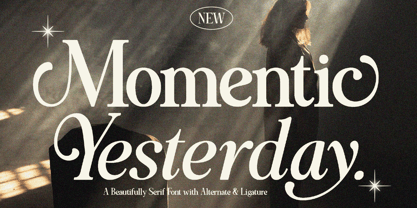 Momentic Yesterday is a Modern Font Duo that contains Serif and Italic Typeface also gives a feel of Elegant font type. There's some connected letters and some alternates that suitable for any graphic designs such as branding materials, t-shirt, print, business cards, logo, poster, t-shirt, photography, quotes .etc This font support for some multilingual. Also contains uppercase A-Z and lowercase a-z, alternate character, numbers 0-9, and some punctuation. If you need help, just write me! Thanks so much for checking out my shop!
 - Bilton by Fettle Foundry,
$10.00 Bilton is a sans-serif typeface with the personality of serif and an incredibly large X-height. Intended for headlines and display sizes, Hutton can also be used at body sizes if needed. High contrast, sharp angles, and subtle serif-like flares are used throughout the design, making Bilton feel playful yet classy. Featuring ten styles – five roman and five matching italics – Bilton is suitable for a wide range of uses. The family supports more than 300 latin-based languages, and features contextual alternatives for character combinations and languages.
 - Nanueng by Jipatype,
$27.00 ฟอนต์sหน้าหนึ่ง เป็นอักษรแบบแซนเซอริฟที่แบบอักษรโดยรวมมีความเป็นสีเหลี่ยม ซึ่งแบบอักษรจากหนังสือพิมพ์เป็นแรงบันดาลใจ ดูแข็งแกร่ง มีความเป็นเครื่องกล เครื่องจัก ทันสมัย เหมาะสำหรับการใช้พาดหัว รองพาดหัว มีทั้งหมด 9 น้ำหนักและตัวเอียงของแต่ละน้ำหนักรวมทั้งหมดมี 18 สไตล์ และมีฟีเจอร์อื่น ๆ เช่น Small Caps หรือ Stylistic Set 01 และฟีเจอร์อื่น ๆ พร้อมให้คุณได้เลือกใช้งาน รองรับหลากหลายภาษา Nanueng is a sans serif display typeface with square shape base. Inspiration from typeface on the Thai newspapers. Look strong, machine and modern feel. Suitable for headline, sub-headline Comes with 9 weights and italics of each weight total 18 styles, and there are features such as Small Caps or Stylistic Set 01 and many features available for you. Support multi-languages.
 - Yingyai by Jipatype,
$26.00 ฟอนต์ยิ่งใหญ่ เป็นอักษรแบบแซนเซอริฟ ที่มีความหนาของเส้นมากว่าปกติ สังเกตุได้จากน้ำหนัก Black ให้ความรู้สึกหนักแน่น หนา ใหญ่ และ ทันสมัย มีทั้งหมด 9 น้ำหนักและตัวเอียงของแต่ละน้ำหนักรวมทั้งหมดมี 18 สไตล์ รองรับหลากหลายภาษา เหมาะสำหรับการใช้ผาดหัว ป้าย เนื้อความ ฟอนต์ยิ่งใหญ่สามารถช่วยส่งเสริมให้งานของคุณดูสะดุดตาอย่างยิ่ง เหมาะกับผู้ที่ต้องการให้โฆษณาสินค้าและบริการดูสะดุดตากว่าใคร ๆ Yingyai is a sans serif typeface with a large line stroke thickness more than usually, especially Black weight. It gives a heavy, big and modern feel. Comes with 9 weights and italics of each weight total 18 styles. Support multi-languages. Suitable for headline, sub-headline or text body. Yingyai can make your work more eye-catching, for those who want to advertise products and services more eye-catching than others.
 - Vaughan Pro by Factory738,
$15.00 Vaughan is a contemporary and minimalist sans serif font family. The different weights offer a variety of options to help you find the best typographic color for your project. This is an unrivaled sans serif for varying your headlines, branding visual identity, poster, logo, magazines, and so on. 5 Weights (Light, Regular, Semibold, Bold, Black) 4 Styles (Regular, Oblique, Italic, All Caps) Basic Latin A-Z and a-z Numbers & Punctuation Ligatures Multilingual Support for ä ö ü Ä Ö Ü ... Free updates and feature additions Thanks for looking, and I hope you enjoy it.
 - Open Heart by Aminmario Studio,
$20.00 Open Heart is a modern and beautiful script font. Comes with regular and italic, also support multilingual. This font is great for your creative projects such as watermark on photography, and perfect for logos & branding, photography, invitation, watermark, advertisements, product designs, stationery, wedding designs,label, product packaging, social media, movie titles, books titles, a short text even a long text letter and good for your secondary text font with sans or serif. And also for special events or anything that need handwritting taste. Thanks for checking out this font. I hope you enjoy it!
 - Copyman by Roman Pavliuk,
$20.00 Copyman is an experimental one for the creative ones. Monumental & minimalistic, great for the contemporary & urban design, this font is a good choice for confident branding & logotypes as well as for brutal or futuristic interfaces. Copyman’s title is an anagram for a Company. First of all, this font was created for branding purposes of businesses, who want something as practical as a little bit different from what they already get used to. This chamfered typeface contains 8 styles, Regular & Italic, both Cyrylic & Latin, 287 glyphs, 8256 pairs, 119 groups, has well–balanced kerning & clever spacing.
 - Postulat by ParaType,
$30.00 Postulat is a contemporary slab serif typeface. The family contains 16 fonts: 8 romans with matching italics, from Hairline to Bold. The character set include contains more than 600 glyphs which support most Latin and Cyrillic languages. The font uses a combination of smooth and extremely simple straight shapes. The author abandoned the use of teardrop-shaped classical elements, replacing them with straight ones, which makes Postulat more dynamic and modern. These unique features give the font a unique personality. Postulat is the perfect choice for headlines, logos, branding, packaging, publications and websites.
 - JY Shapa by JY&A,
$45.00 Designed by Jure Stojan, JY Shapa—his first serif family for JY&A Fonts—has a wide-pen, calligraphic feel, with the upper half of the letters reasonably conservative to aid recognition, but the lower half more decorative and dynamic to achieve a specific rhythm. The italics are more dynamic, with the upper halves more flowing, with Stojan taking greater liberties with the design. Ligatures such as ct and st are included, as well as small caps for all weights. The JY Shapa fonts come with over 5,000 kerning pairs each.
 - Young Finesse by Doyald Young,
$50.00Young Finesse is a light, two-weight, announcement face with a large x-height whose characters contain only a few straight lines. It is based on the titling font that I designed for the dust jacket of my book Fonts & Logos. Its inspiration comes from Hermann Zapf’s Optima, a serifless roman text face, based on Renaissance inscriptions.Young Finesse italic has a set of elaborate swash caps that reference 16th-century writing hands. Both Young Finesse and Home Run include Richard Isbell’s “interrabang,” appropriately used for statements that are both interrogative and exclamatory. - Visia Pro by Designova,
$12.00 VISIA Pro - Our flagship Geometric Sans-Serif typeface, a perfect blend of elegant, minimal and premium design aesthetics at it's level best. A perfect typeface for logotypes, headlines, branding, marketing graphics, corporate identities, all web & print purposes. This pack comes with a total of 14 fonts: 7 Weights (Extra Light / Light / Regular / Semi Bold / Bold / Extra Bold / Heavy) 7 Weights of Italic versions (Extra Light / Light / Regular / Semi Bold / Bold / Extra Bold / Heavy) Each weight includes extended language support including Western European & Central European sets. A total of 258 glyphs are included.
 - Redoneta by Rafael Jordan,
$30.00 Redoneta™ is a contemporary geometric sans serif family of 6 weights with its matching italics. From a refined Thin to a solid Regular and a forceful Bold gives us multiple voices and uses according its multipurpose vocation. Also, its smooth and clean shapes gain more personality with his alternates: from rounded to square and angular forms across 7 combinable stylistics sets. Dozens of Latin languages supported and other OpenType features as fractions, superscript, subscript, tabular figures, arrows and more give useful tools to the user for editorial design, web or others intensive uses.
 - Mochaik by Say Studio,
$15.00 Mochaik - Psychedelic Display Font Here's a lettering style that just might be exactly on your wavelength. Add just the right dose of vintage freak-a-delia to your retro graphics with this original psychedelic-style design. Great for music posters, album graphics, book titles, etc. Evoke a warpy, wavy, whimsical vibe that harks back to the carefree 1960s or early 1970s era with Sixties Flashback; it's pure hippie, trippy fun! Whats Includes : - Mochaik Regular, Outline, Italic - Multilingual Support If you want any Question, let me know Have a wonderful Day, Saystudio
 - Banda by Typedepot,
$- Banda is a semi-serif typeface characterized by a tall x-height and rounded semi-serifs. Although it was first designed as a display typeface, Banda quickly evolved into more complex type consisting of seven weights plus their respectful italics. Banda can be used for short passages of text as well as a fancy display type. Varying from the elegant and finesse, thinner weights to the almost childish bubbliness of the heavier weights, Banda is a great all-round performer suitable for logos, headlines, package & food designs & much more.
 - Anicon Slab by NREY,
$79.00 Anicon Slab font consist of 18 weight: from Thin to Black with each weight paired by italic. Also including Latin & Cyrillic language support with more than 35 languages. Anicon is a fonts superfamily, semicondensed sans serif and slab serif with humanistic forms of characters. This font was crafted with the intention to present a clean, legible, multipurpose font family that is easy to read wether it's on screen or print. Fit for all purposes; text, display, headline, print, corporate identity, logo, branding, product, infographic, photography and other application and medium.
 - Gampita by Amelia Studio,
$12.00 Gampita is a script type family of four fonts. It is inspired by Elegant Fonts and has a soft and friendly look. Gampita can be used for branding, packaging and anywhere else you need a script font that is readable and smooth. Gampita has many ties, strokes and alternate characters that will make your designs unique and beautiful. You can also purchase Gampita as a Family Font and adjust the weight of Gampita smoothly between Italic and Bold weights. Note that you need design software that supports Family Fonts.
 - Typold by The Northern Block,
$29.55Typold originated out of the desire to improve geometric forms and push beyond previous achievements through collaborative working methods and knowledge sharing. The result is a finely balanced modern sans serif constructed from mathematical inputs, typographers needs, and the natural hand and eye of an artisan. Details include nine weights and matching italics, three separate widths, 1000 characters with an alternative lowercase a and y, small caps, 12 variations of numerals, Opentype features inferiors, superiors, fractions, case sensitive punctuation, extended symbols including emoji's and language support covering Western, South and Central Europe. - Breezy Pro by Reyrey Blue Std,
$18.00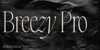 Introducing, Breezy Pro Typeface. A classical typeface with a complementary italic version. It's elegant, modern, and stylish. Mix and match them to create eye-catching effects and make every word a masterpiece. Breezy Pro is perfectly suited for fashion and magazine design, Inspirational quote designs, logo designs, simple and classy Logos, web font, branding, product packaging, and much more. This font is PUA-encoded, which means you can easily access all of the glyphs! Features : All Uppercase and Lowercase Number & Symbol Supported Languages Ligatures PUA Encoded Hope you enjoy our font!
 - Titular by Latinotype,
$26.00 Titular is a condensed Sans Serif typeface that works well with headings, subheadings, newspapers, magazines as well as with logotypes, brands and posters. This typeface revives the spirit of old Woodtypes, but adding a contemporary flavour and Latin American seasoning. The family comes with 2 subfamilies: one regular and one alternative. Just like many of our faces, every subfamily includes 7 weights plus italics. Titular is a Latinotype’s typeface designed by Bruno Jara, and produced and supervised by Latinotype Team. Latinotype Team comprises: Luciano Vergara, Daniel Hernández, Bruno Jara, César Araya and Rodrigo Fuenzalida.
 - Force by Outras Fontes,
$24.00 Force is a contemporary sans serif ultra-black family designed by Ricardo Esteves. There are 4 font styles: Force Regular, with a upright roman structure; Force Italic, with more cursive lowercase forms; Force Shadow, that can be used alone or as a second layer to Force Regular; and Force Dingbats, containing some pictograms. Each font file has some OpenType features: discretionary ligatures, fractions, subscript and superscript. The Force family is suitable for big-size high impact situations like posters, headlines, titles, magazines, packaging and many others you may creatively think of.
 - Ahganirya by Hishand Studio,
$15.00 Ahganirya is display font that boasts a modern, minimalist design, making it perfect for businesses looking for a clean and sophisticated look. The font's elegant curves and sharp edges make it a stunning choice for logos, business cards, and other design projects. Ahganirya font offers versatility and flexibility to designers looking to create a cohesive and professional brand identity. Whether you're working on a print or digital project, Ahganirya font's legibility and unique design will surely make your work stand out. Complete with - ligatures - alternates - regular - italic - icon - kerning - multilingual support
 - Augdia by Amelia Studio,
$12.00 Augdia is a script type family of four fonts. It is inspired by Elegant Fonts and has a soft and friendly look. Augdia can be used for branding, packaging and anywhere else you need a script font that is readable and smooth. Augdiahas many ties, strokes and alternate characters that will make your designs unique and beautiful. You can also purchase Augdia as a Family Font and adjust the weight of Augdia smoothly between Italic and Bold weights. Note that you need design software that supports Family Fonts.
 - Wavelength by Mysterylab,
$8.00 Wavelength is a unique sans serif family of five weights and italics. For all of it's unusual detailing and arc-shaped strokes, this typeface is a solid workhorse, and is highly legible at all sizes. It's an excellent starting point for a unique logotype or offbeat headline, and is able to cross genres and styles because of its essential letterform simplicity. Wavelength is contemporary, but with a nod to 1930s art deco, streamline, and even 1990s tech futurism. It's great all-arounder that works well with shadows, outlines, extrusions added within vector editing programs.
 - Sportivo by muccaTypo,
$33.00 Sportivo is a 5-speed font that runs blazing fast. With a choice of 5 slants and a wealth of OpenType features, Sportivo is the ideal display font for titles that ask for a modernist-retro flair. With multiple alternates and special ligatures, Sportivo will take your headlines straight to the winners’ podium. The unique back-slanted design translates to Italic with three intermediate styles to electrify your layouts. Fast and furious, Sportivo is also equipped for victory at any Grand Prix thanks to its high-octane language support and turbo-charged OpenType features.