10,000 search results
(0.023 seconds)
- Boruna by Nirmana Visual,
$24.00 Inspired by fashion magazine adverts, right in with bringing retro Boruna offers beautiful typographic harmony for a diversity of design projects, including logos & branding, social media posts, advertisements & product designs.
 - As of my last update in April 2023, without direct information on a specific typeface designated as "13_Fletcher," I can fabricate a creative description based around the intriguing elements the name...
- Sedona by Jeff Kahn,
$29.00 Sedona is a quirky, all capitals, display font that evokes the American West, Native Americana, vacations, travel, campgrounds, rustic lodges, needle point, Christmas, holidays, Arts and Crafts movement, quilts, tiles, and alpine resorts. It is based on an isometric grid and individual shapes that conform to the grid's structure. Each letter or glyph is made up of numerous triangular shapes. The letters have gaps of space that create a dynamic texture. Our mind connects the triangles to complete the letter and recognize the familiar letterform. Sedona will create a unique identity for book cover titles, editorial headings, packaging, logotypes and signs. Create multicolored letters by selecting individual shapes within each letter and apply various colors. Simply convert type in Adobe Illustrator or InDesign with these two steps: 1. "Creating Outlines", 2. "Release Compound Path". You may also want to "Ungroup" the letters. Great care was taken to align the shapes perfectly. There are no overlapping or misaligned shapes. Sedona includes punctuation, numerals, and basic math glyphs.You will find some additional and alternate glyphs in the "Glyph Palette". Sedona does not include a lowercase or diacritics for foreign languages. You may type in lowercase but the letters will appear as uppercase.
 - Aeroko Variable by Monotype,
$279.99 Meet Aeroko, a slick variable typeface that evokes grit and speed, a dynamic play, a future–present competitive edge that evokes motorsport and all progressive brand design. This is a robust type system that creates memorable brand headlines. Powered by four display weights and three widths. Turbo-charged by a two-axes variable font. High performance brands can expect Aeroko to out-pace in every graphic condition. Aeroko is bold and assertive, it moves fast in headlines, it flexes when and where you need it. The forms are boxed and solid from Condensed to Wide, and they provide a distinct contrast when paired with rounder text fonts. Aeroko’s secondary power unit is harnessed from the ever adaptable variable font format. Variable font technology enables vast levels of typographic scale and expression, furthermore it allows Aeroko to react instantly in any digital space to maximize results. Aeroko evokes confidence, this is a typeface that actively encourages you to be courageous and daring with type in your own way. Brands demand distinct and robust typography, much in the same way that drivers demand pace. Aeroko meets these demands with ease, delivering assurance and weight across a valiant aesthetic. Aeroko is designed by Krista Radoeva and the Monotype Studio.
 - PF Beau Sans Pro by Parachute,
$79.00 The design of Beau Sans was inspired by Bernhard Gothic which is considered one of the first contemporary American sans serifs and was designed by Lucian Bernhard in the late 1920s. Panos Vassiliou came across this font while attempting to reduce the design elements of a text typeface, by introducing Bauhaus-like minimal forms to the characters. The first version was completed back in 2002 and introduced one year later in Parachute’s 3rd catalog, under the name PF Traffic. Some time later it was decided to make a few improvements but the project was so carried away that the new typeface which emerged needed urgently a new name. Beau Sans Pro is a modern sans-serif family of 16 fonts which includes true-italics. Just like all other Parachute fonts, it covers a broad range of languages by incorporating 3 major scripts i.e. Latin, Greek and Cyrillic in one font. Furthermore, every font in this family has been completed with 270 copyright-free symbols, some of which have been proposed by several international organizations for packaging, public areas, environment, transportation, computers, fabric care and urban life. This typeface is totally recommended for titles and/or body text when you want to give a distinct and contemporary identity to a product or service.
 - Afical by Formatype Foundry,
$30.00 Afical update 2.0 version Afical Composed of 3 set families, consists of 35 fonts matching italic: Afical Std, Afical Neue, Afical Stencil. families all with distinctive qualities and features but share the same basic construction and proportions. Afical has been carefully crafted to focus on Text sizes and legibility with a high x-height, we developed it with Manual TrueType Hinting. Afical It's a perfect choice for publication, Packaging, logo, branding, Signage, wayfinding design systems, as well as web and screen design OpenType features: Alternate Characters SS.01, SS.02, SS.03, SS.04, SS.05, Denominators Case-Sensitive Forms, Tabular Lining, Fractions, Ordinal, Ligatures, Discretionary Ligatures, Subscript, Superscript, Language Support: 63+ (Latin based) languages Afrikaans, Albanian, Asu, Basque, Bemba-language, Bena, Danish, Dutch, English, Estonian, Faroese, Filipino, Finnish, French, Friulian, Gaelic (Irish, Scots), German, Gusii-language, Hungarian, Icelandic, Indonesian, Irish, Italian, Kabuverdianu, Kalenjin, Cornish, Luhya, Luo-Language, Machame, Madagascan, Makhuwa-Meetto, Makonde, Malayan, Manx, Morisyen, North-Ndebele-Language, Norwegian, Bokmål, Nynorsk, Nyankore, Oromo, Pare, Portuguese, Rombo, Rwandan, Rukiga, Rundi, Rwa, Samburu, Sango, Sangu, Swedish, Swiss German, Sena, Shambala, Shona, Soga, Somali, Spanish, Swahili, Taita, Teso, Vunjo, Zulu Behance Looking for custom Afical? Please send us an email at hello@formatypefoundry.com Designed 2017 Published 2021 2021 Copyright © Formatype Foundry All rights reserved
 - Malden Sans by Monotype,
$49.00 Malden Sans is a mischievous grotesque sans serif with charming details that gives designers a solid typographic voice. It was created by Michele Patanè with regular and condensed widths, as a utilitarian typeface family for print and digital environments. It was originally designed as part of a type system for cinema magazines, and embodies the devil-may care attitude of the silver screen. Designer Michele Patanè looked back to an earlier era of typography to create the typeface, embracing unusual details, rather than ironing them out. “There is a very naive way of using typography in the 30s and 40s, something not as clean as how it’s used in the late 50s and 60s when everything passed through a rationalisation of the typographic palette,” he explains. “In film magazines you can still see a bit of roughness, and I like that.” This is a design that’s desperate to be used in editorial environments, and has been created to stand up to lower quality paper. It would be equally at home on posters, packaging, and even in digital environments where designers are looking for something more expressive than another geometric sans serif. Malden Sans includes a Normal and Condensed range, with 7 weights in the normal and 6 in the Condensed, both including italics.
 - Pollen by TypeTogether,
$49.00 This typeface finds a perfect balance between technical excellence, careful design of letter forms for extended reading, and a measured dose of charm and personality. Its informal feel allows for successfully typesetting a wide range of applications, from magazines and fiction books to advertising and websites. Calligraphy, be it done with the broad-edge pen, brush, or other tools, has been fundamental in the development of Pollen. Its influence is clearly visible in the construction of the top serifs contrasting the curved bottom serifs and the fluid aspect of terminals and tails, such as on “g” and “r”. The shapes of the diagonal letters are based on a less formal calligraphic model, but still uses the broad edge pen. The letters were then subject to a further process of pencil drawing and digital re-interpretation, which gave them the final shape. The designs of “e” and “c” are derived from drawings made with only one continuous line, with the pencil always touching the paper. The letters “g” and “y” express the intention to bring informal elements to a typeface intended for long text reading, usually characteristic of casual writing. Pollen consists of 3 basic styles with an extended OpenType Pro character set and large language support, perfectly serving the most common typographic needs.
 - Pastiche Brush by Eclectotype,
$40.00 This handmade looking brush font is inspired by the titles of the 1959 movie, Imitation of Life, by prolific film titles artist, Wayne Fitzgerald. The 'pastiche' of the font's name derives from the 'imitation' of the film's title, and from the imitation of the brush. OpenType enabled software can make Pastiche Brush feel even more handmade. There are alternates for every letter and number, and most punctation marks and symbols. Every letter has at least one alternate glyph, and more commonly used (in English at least) letters have up to three, so when contextual alternates are enabled, the font automatically cycles through glyphs in a pseudo-random manner. This means no double letter combination will ever contain two identical glyphs. Not only this, but it's highly likely the same word will look different elsewhere in the sentence. The contextual alternates feature also takes care of start and end forms of letters, for an even more handmade feel. This is a great font for headlines in fashion glossies, food packaging where an organic look is desirable, posters, perfume bottles, wine bottles... the list goes on. And with extensive language support, it's going to be a very usable addition to your display font repertoire.
 - Hyptis by TripleHely,
$16.00 “Hi! I’m Hyptis – the script font based on brush handwriting. I was drawn with a soft, wet brush and digitally cleaned with care, but some of my characters keep their natural texture. If you are looking for a font for logos, postcards, product packaging, quotes, text overlays – or anything else – I am a good choice!” Hyptis has two types of embedded auto-replacement: lowercase letters without connecting strokes (for a case of the last character of the word), and ligatures (for a case of two letters that do not pair well together). These features work well in many apps (even simple ones like Notepad/TextEdit), and if you need to customize their application – you could use programs that support OpenType features (for example, Adobe apps or CorelDraw). All these additional glyphs are PUA-encoded, so if your software does not support OpenType — you could access them through Character Map (Windows) or Font Book (Mac). Hyptis also has wide multilingual support: Western-, Central- and Eastern-European, Baltic, Turkish, Latin-type Africans, and Asian (94 languages in total). And finally, Hyptis comes with a bonus font, Hyptis Swashes, that includes a set of 26 swashes – linear, round or oval. To type it you could simply use small letters from ‘a’ to ’z’.
 - Mexica by Sudtipos,
$39.00 Mexica is a typographic tribute to Nahuatl, the tongue of the Aztecs, but also the lingua franca of ancient Mexico. ‘Mexica’ is not only the feminized, latinized form of the word ‘Mexico’, but also the name of the inhabitants of this place: the Me-xic-cah. Nahuatl, when composed in the Latin alphabet, abounds in diagonal letter shapes: XYZ are ubiquitous in its classic orthography, just as KW are in its modern one. This visual feature is further enhanced by the absence of some rounded letters such as BDG that depict inexistent sounds in this millenarian tongue. Besides, Nahuatl is language with a tendency to form very long words that give the text quite a distinct appearance, unlike English, for instance, with its abundance of short words. Mexica was designed to look well in all these contexts, and to perform as well as a contemporary, daring, stylish serif type family, with several weights for text and display composition. Further, its terminals and general structure —devoid almost completely of straight lines—are inspired by the angled architecture and ornamentation of the ancient city of Mexico- Tenochtitlan. Mexica received an Award of Excellence at the Type Directors Club of New York annual competition.
 - Koo Koo Puff by astroluxtype,
$20.00 Does the world really need one more vernacular pop culture typeface? We here, at astroluxtype shout a resounding yes! Sure, at myfonts.com, you can find the apex of fine font design that will have your mind and eyes burst with joy at the level of sophistication and craftsmanship they exhibit- Koo Koo Puff Light Condensed and Regular Condensed are not one of those fonts. But if kooky goofy is your thing, we're selling it at the astroluxtype booth. Koo Koo Puff Regular Condensed is the companion font to Koo Koo Puff Light Condensed. Both fonts includes an upper and lowercase glyph set. Regular Condensed has a different upper and lowercase “O” from the original Koo Koo Puff Light Condensed. Spacing metrics are looser, as well. The font is not a match for Light Condensed, it is a separate font. Both are headline display faces, for optimum usage it is recommended to be set at 48 points or larger in size. Look to astroluxtype’s Sugarbang ! as the first in a series of fonts inspired by vintage product packaging, Koo Koo Puff is the second release in the Cerealboxx series. The third font is in the fridge getting cool now, watch for it in the future. Rave on you design genius.
 - Sament by Product Type,
$15.00 Sament is a Japanese Style typeface that is ideal for projects that require a distinctly Japanese and Asian touch. This typeface will add uniqueness and creativity to your work with its exquisite style and eye-catching appearance. With appealing characters and inspiration from Japan’s rich culture, the Sament typeface combines a traditional touch with a modern vibe. Each figure is designed with care and refinement, creating an alluring environment and highlighting the richness of Japan’s cultural history. You may add an authentic and appealing vibe to your promotional materials, poster designs, websites, and many other projects by utilizing the Sament font. This font will leave a lasting impact and quickly capture the attention of potential customers. Make your project stand out by using Sament as the main typeface. With its rich richness and distinct style, this typeface provides a visually pleasing experience. With Sament, your designs will create an exceptional experience, instantly engaging potential buyers. What’s Included : - File font - All glyphs Iso Latin 1 - We highly recommend using a program that supports OpenType features and Glyphs panels like many Adobe apps and Corel Draw, so you can see and access all Glyph variations. - PUA Encoded Characters – Fully accessible without additional design software. - Fonts include Multilingual support
 - Aeroko by Monotype,
$49.99 Meet Aeroko, a slick variable typeface that evokes grit and speed, a dynamic play, a future–present competitive edge that evokes motorsport and all progressive brand design. This is a robust type system that creates memorable brand headlines. Powered by four display weights and three widths. Turbo-charged by a two-axes variable font. High performance brands can expect Aeroko to out-pace in every graphic condition. Aeroko is bold and assertive, it moves fast in headlines, it flexes when and where you need it. The forms are boxed and solid from Condensed to Wide, and they provide a distinct contrast when paired with rounder text fonts. Aeroko’s secondary power unit is harnessed from the ever adaptable variable font format. Variable font technology enables vast levels of typographic scale and expression, furthermore it allows Aeroko to react instantly in any digital space to maximize results. Aeroko evokes confidence, this is a typeface that actively encourages you to be courageous and daring with type in your own way. Brands demand distinct and robust typography, much in the same way that drivers demand pace. Aeroko meets these demands with ease, delivering assurance and weight across a valiant aesthetic. Aeroko is designed by Krista Radoeva and the Monotype Studio.
 - PF Encore Sans Pro by Parachute,
$79.00 Encore Sans Pro is a sans serif which projects an image of reliability, authority and competence making it ideal for corporate applications. A functional typeface which combines utility with style. It’s subtle round characteristics such as the slightly curved-in edges, create a distinctly contemporary look, blending effectively traditional with modern details. Encore Sans Pro has received 3 international awards and distinctions including a Silver at the european ED Awards 2010. This is a contemporary typeface which may function as the perfect alternative to several overused classic sans. Encore Sans Pro does not pretend being different but it does claim its own personality. It is simple and stylish. Furthermore, it is extremely versatile. It comes with 22 weights and supports simultaneously Latin, Greek and Cyrillic. Each font contains 1535 glyphs and is loaded with 22 advanced OpenType features. Extreme weights, such as the elegant hairline, are carefully designed to establish an even color throughout, while ultra black despite its heavy characteristics is quite legible and powerful. Other intermediate weights such as light and book are ideal as body text for magazines and catalogs. Every font in this series has been completed with 270 copyright-free symbols, for packaging, public areas, environment, transportation, computers, fabric care and urban life.
 - Metal Cry by Fabulous Rice,
$25.00 Metal Cry is a font family that was inspired by countless hours spent playing video games, watching old movies or reading comic books. And even more hours closely analysing the design of all these things. The art of creating beautiful letters has slowly declined with the rise of the digital age and its solid-colour, 2D fonts. And most of the time, the care given to typography in cultural products just isn't what it used to be anymore. This was the inspiration for Metal Cry, a family of 4 layerable fonts that can bring a feeling of depth to its letters, and offers endless possible combinations. Metal Cry Outlands is the basic shape of all the characters, it can be used as the bright side of the bevel. Metal Cry Front is the inline border font that can be used as the front side of the bevel. Metal Cry Shadow can be used as the dark side of the bevel. Metal Cry Depth can be used to flash out the inside shape of the letter. But of course, any font can be combined with any other font(s) to obtain various results. The planets in the above visuals are courtesy of 3D artist Thomas Veyrat / veyratom.com
 - Rothorn by ROHH,
$35.00 Rothorn™ is a modern, minimalist geometric sans with its own personality derived for subtle design details, such as cut diagonal corners, pointed t, very small contrast and closed aperture. The letterforms give the typeface a lot of charisma, keeping a very minimal, clear and well balanced look at the same time. Its powerful and sharp shapes together with the variety of weights from Hairline to Black make it a perfect choice for headlines and branding. Generous x-height, careful spacing and distribution of weights give it a color and legibility great for long paragraphs of text. Rothorn is a geometric member of a large type system including such families as Montreux Grotesk (Swiss-style grotesk), Lütschine (narrow headline family) and Conthey (narrow headline unicase family). The Rothorn family consists of 10 weights with corresponding italic styles, giving a total of 20 styles. Italic styles were hand drawn to get sharp and fine letter shapes. It includes a 2-axis variable font letting you adjust the weight and italic slant to your exact needs. The family has extended latin language support, as well as broad number of OpenType features, such as, case sensitive forms, ligatures, contextual alternates, lining, oldstyle, tabular and circled figures, slashed zero, fractions, superscript and subscript, ordinals, currencies and symbols.
 - Neue Plak by Monotype,
$57.99 Originally designed in 1928, Plak is something of a lost gem in the type world. Despite being drawn by Futura creator Paul Renner, it never achieved the same popularity and spent decades lacking a much-needed digital revival. Monotype designers Linda Hintz and Toshi Omagari have taken its existing three weights and, after extensive research into the original wood type, extended them into the vast Neue Plak family. The typeface is available in 60 weights that stay true to Renner’s intentions, and offer the same blend of “quirky” details and “German stiffness” – as Hintz describes it. The design is an unusual mixture, bringing together a defiant outer appearance that’s counteracted by more playful details found in the lowercase r, and the large dots of the lowercase i. Other distinctive details include open or strikethrough counters, and a set of hairline widths that reduce Renner’s original design to its bare bones. Neue Plak’s display weights are crying out to be used in editorial, on packaging or in logos, while its text weight works well in both print and digital environments. Neue Plak Text Variables are font files which are featuring one axis and have a preset instance from Thin to Black
 - Frutiger Serif by Linotype,
$42.99 Frutiger® Serif is a re-envisioning of Meridien,a typeface first released by Deberny & Peignot during the 1950s. Working closely with Adrian Frutiger, Linotype's Type Director Akira Kobayashi expanded the original metal type version of Meridien into a new digital family of 20 variants. Renamed Frutiger Serif, this up-to-date Meridien has new weights, widths, and styles that correspond better with several other of Frutiger's designs. Just as Meridien has always been a fine choice for text settings, Frutiger Serif works brilliantly for large amounts of text & also at small point sizes. With its many weights and styles, this family is strong enough for most typographic projects. However, its added versatility is revealed when used in combination with other fonts. Frutiger Serif works well with the original Frutiger, Frutiger Next, and Univers - just to name a few. Paring these serif and sans serif families together is perfect for creating complex hierarchies and clear information design. Working with complicated typographic systems - involving elements such as headlines, captions, pull quotes, multilingual text, etc - is made easy by selecting Frutiger Serif and another of Frutiger's sans serif families. The designer needs simply to mix and match different weights and styles for the various textual elements to create smart and innovative layouts.
 - Lavoza by Alit Design,
$22.00 Presenting the LAVOZA typeface from alitdesign. LAVOZA font is designed by combining a slant blackletter font with a classic serif font style. The Lavoza font is inspired by a classic roman design that we apply modern elements according to current trends. This bold classic concept will create a design that is frightening but still looks modern and elegant. The Lavoza font is perfect for the design of young people who dare to be different and unique from the current trending design concept. Lavoza font is highly recommended to be a collection of fonts for current or future design creation. LAVOZA is perfect for magazine cover designs, brochures, flyers. Instagram ads, Canva Design and so on with unique and modern and brave concepts. besides that this font is very easy to use both in design and non-design programs because everything changes and glyphs are supported by Unicode (PUA). The "LAVOZA"contains 587 glyphs with many unique and interesting alternative options. Language Support : Latin, Basic, Western European, Central European, South European,Vietnamese. In order to use the beautiful swashes, you need a program that supports OpenType features such as Adobe Illustrator CS, Adobe Photoshop CC, Adobe Indesign and Corel Draw. but if your software doesn't have Glyphs panel, you can install additional swashes font files.
 - Mayberry by Ascender,
$92.99The Mayberry® is an extensive family of 14 OpenType fonts. Mayberry was initially designed by Steve Matteson to emulate the technical behavior of a font family called Tiresias™ for use in set top TV devices and user interfaces. Mayberry is a significant improvement in aesthetics and functionality over Tiresias. Mayberry includes true italics and a wide range of weights to provide the highest quality and readability on low resolution devices, while also featuring a range of OpenType features that will appeal to creative professionals. Mayberry is a slightly condensed humanist sans serif which allows for more readable text in a narrower column. Open counters and upright stress help keep the design of Mayberry readable at low resolutions. A significant amount of care has been given to design subtleties allowing the design to function well at large sizes. The Mayberry character set supports Cyrillic, Greek, Central and Eastern European, Turkish and Baltic, Mayberry also includes a slashed zero for use where absolute distinction between 'O' and zero is a concern. Also included are typographic features such as old-style figures, fractions, superior and inferior numbers for use with applications that provide advanced OpenType typographic support. A set of closed captioning symbols and arrows add to the font's versatility in interface design. - Duwal Pro by Volcano Type,
$76.00 The careful balance between the emotional swings and shapes set in strong contrast such as the burly serifs, or generally vertical and orderly appearance within the Duwal Pro determine the special look of this Antiqua typeface. All characters of the Duwal Pro are designed to be open and accessible. The lowercase letters are designed with a large x-height, which is why they are ideal for small font sizes. Many striking details give Duwal Pro a defined and firmer appearance with increasing font size so it is also suitable for use in headlines and work marks. The deliberately constructed and emphasized design of the serifs give the font a strong position and at the same time force the reading direction. Using Duwal Pro in Bold weight, the serifs look clearly striking, the design language is concise and the typeface receives an additional sympathetic force. The Italic weight draws on the expressive but not intrusive design of the Regular, but appears sharper and is ideal for text passages. The font family contains italics, small caps, lots of ligatures, swashes, another format set, contextual alternatives and special characters as well as other open-type features which allow the use of Duwal Pro in 48 languages.
 - Axalp Grotesk by ROHH,
$39.00 Axalp Grotesk™ is a post-Swiss-Style modernist sans serif type family characterized by the play between elegant rounded shapes and sharp angular details. It is minimal, legible, well balanced and charismatic. Its heavy weights deliver powerful yet friendly impact. Thin ones emanate elegance, fine lines and precision. The family has very versatile proportions and generous x-height allowing a successful use for user interfaces, all sorts of display and branding scenarios, as well as a paragraph text typeface. Contemporary minimalistic approach makes Axalp Grotesk an outstanding design tool for creating modern visual identities and user interfaces. A truly universal sans serif family where beautiful forms and proportion work together with careful spacing, kerning and hand-hinting. Axalp Grotesk is an attractive contemporary alternative to the classics of Swiss Design School such as Akzidenz-Grotesk, Univers and Helvetica. It is bright, crisp, modern and friendly in character, and features an alternative stylistic set for more minimalistic and neutral look, simplifying such characters as “Q”, “J”, “a” and “y”. The family has extended latin language support, as well as broad number of OpenType features, such as stylistic alternates, case sensitive forms, ligatures, contextual alternates, lining, oldstyle, tabular and circled figures, slashed zero, fractions, superscript and subscript, ordinals, currencies and symbols.
 - Gens De Baton by HiH,
$10.00 Gens De Baton is based on a charming lower case alphabet that appeared in the Almanach des Enfants pour 1886 (Paris 1886) under the heading “Amusing Grammar Lessons.” Gens De Baton means simply “Stick People.” The unknown designer turned the bare letter forms into drawings of people for the enjoyment of the children for whom the almanac was intended. The letter forms themselves were based on the French Romain du Roi (King’s Roman), except for the ‘g’ and the ‘j’ -- which were based on Baskerville. The letters ‘w’ and ‘y’ were not included, as they are seldom seen in French. We have left the letters somewhat rough, as they appeared in the Almanach des Enfants , resisting the temptation to clean up all the lines and render them with digital perfection. We have used our HiH Firmin Didot to supply an upper case and auxiliary characters, as Didot was originally a modified version of Romain du Roi. It is interesting to observe the contrast between the polished look of the Didot upper case and the rough, hand-drawn look of the lower case. Purchasers of this font have our permission to use it for the amusement of adults as well as children. We recommend setting Gens De Baton at 24 points or larger.
 - KG Two Is Better Than One by Kimberly Geswein,
$5.00 This font was created in honor of my husband for our 12th wedding anniversary. 14 years ago, I met this tall, skinny guy from Indiana in the lobby of a hotel in Hong Kong. We talked. The next day, we had lunch together. And that night we had dinner together. And the next day. And the next. We met just before my 19th birthday, and on my birthday he took me to the top of Victoria Peak, where we looked out over the city of Hong Kong- such a beautiful place to begin a lifetime of love! We spent 4 months together in Hong Kong, falling in love with each other and with the beautiful city we were privileged to call home for that short time. We married the next year. We've lived in Indiana, Texas, China, Kentucky, and Florida over those 12 years of marriage and have welcomed 2 daughters into our lives. I know beyond a shadow of a doubt that he completes my life in a way I didn't know was possible. And I know that I'm blessed beyond words to have a supportive, wonderful, encouraging husband who is also a loving, involved, caring dad to our daughters. This font is for you, Keith!
 - Lady Edith by MKGD,
$13.00 Lady Edith harkens back to the days of flappers and cocktail parties. The early part of the twentieth century, when Art Deco was at it’s height and high fashion was all the rage. A time of beauty, class and elegance. A minimalistic font with clean lines and just enough flare to make it unique. The perfect font for any occasion that needs a bit of high end magic. There is no lower case for Lady Edith as it is a decorative font. The Upper case version serves both the upper and lower case keys. Lady Edith has a glyph count of 397 and supports the following languages; Supported Languages: Afrikaans, Albanian, Asu, Basque, Bemba, Bena, Bosnian, Catalan, Chiga, Colognian, Cornish, Croatian, Czech, Danish, Embu, English, Esperanto, Estonian, Faroese, Filipino, Finnish, French, Friulian, Galician, German, Gusii, Hungarian, Icelandic, Indonesian, Irish, Italian, Kabuverdianu, Kalaallisut, Kalenjin, Kamba, Kikuyu, Kinyarwanda, Latvian, Lithuanian, Low German, Lower Sorbian, Luo, Luxembourgish, Luyia, Machame, Makhuwa-Meetto, Makonde, Malagasy, Malay, Maltese, Manx, Meru, Morisyen, North Ndebele, Norwegian Bokmål, Norwegian Nynorsk, Nyankole, Oromo, Polish, Portuguese, Romanian, Romansh, Rombo, Rundi, Rwa, Samburu, Sango, Sangu, Scottish Gaelic, Sena, Shambala, Shona, Slovak, Slovenian, Soga, Somali, Spanish, Swahili, Swedish, Swiss German, Taita, Teso, Turkmen, Upper Sorbian, Vunjo, Walser, Zulu
 - 1812 by Apostrof,
$40.00 '1812' type family is a revival and further development of the typeface '1812' by Lehmann Type Foundry (St. Petersburg). It was created for the centenary of the French invasion of Russia, known in Russia as the Patriotic War of 1812 along the lines of decorative engraved inscriptions and ornamented typefaces of that time, presumably by the artist Alexandre Benois. It was used mainly for the decoration of luxurious elegant publications. Later, in 1917, this typeface was used on the Russian Provisional Government banknotes. In the Soviet period of time '1812' appeared to be one of the few typefaces included in the first Soviet type standard OST 1337. It was produced for manual typesetting until the early 1990s. This typeface could be seen on Soviet letterheads, forms, posters and even air tickets. The digital version development was launched in 2010. The original version was supplemented with lowercase letters and alternative symbols, the extended Latin and Cyrillic alphabets were fully supported. The font was evolved into a family of 14 decorative styles which can refine any design giving it a festive and elegant but at the same time strict and nostalgic look. Despite its decorative nature, '1812' is perfectly readable in small emphasized text blocks due to its classic shape and careful spacing.
 - Crayond by Dora Typefoundry,
$15.00 - Elegan / Bergaya / Modern - Introducing a beautiful and classy Crayond modern san serif typeface with lots of alternative styles to choose from, planting it firmly in a modern design. It is a careful collaboration between beauty and function. The beautiful modern Crayond sans serif is available in 3 regular and Italic weights including Light, Regular, and Bold. The style of the font family stems from the classic Didone, but makes steps to simplify and modernize some letterforms and make Didone feel more contemporary. If you want to get that classic Haute Couture look - Crayond Sans is a great choice. It is the perfect choice for fashion logos, headlines, short text, magazines, because its simplicity looks great in big typography, branding, identity, website design, album art, covers, posters, advertisements, etc. This purchase includes: Crayond - San serif typeface containing upper and lowercase characters, numbers 0-9, as well as a series of punctuation marks and symbols as well as an alternative style. If you have trouble finding a certain character, you can access it via the glyph panel. You can see all the characters available in the screenshot above, and you can try the font below. Please let me know if you have any questions, leave a comment!
 - 946 Latin by Roman Type,
$35.00 946 is a multilingual techno-style family developed by Berlin-based type designer Roman Wilhelm (RomanType). While more and more text families have recently been extended to a multilingual and multi-script level, not so much attention has been given to the more decorative styles. The 946 family does exactly that. A lot of care has been given to the various diacritics: they were designed a little more brutal, a little more European than with some other fonts of this category. Do also watch out for the non-Latin legs of this family. 946 is inspired by electronic music. When Roman found a second-hand Roland TR-606 drum machine in a store in his hometown back in 1995, he started to hang out with would-be DJs and musicians, trying to play the beats that went around the globe. When he started to study visual communication three years later, he was assigned the matriculation number of 946, which has now become the name of this family. Language support: Afrikaans, Albanian, Catalan, Croatian, Czech, Danish, Dutch, English, Estonian, Finnish, French, German, Hungarian, Icelandic, Italian, Latvian, Lithuanian, Maltese, Norwegian, Polish, Portuguese, Romanian, Slovak, Slovenian, Spanish, Swedish, Turkish, Vietnamese, Zulu. Do also watch out for the other script versions of this family!
 - Mildred by Burghal Design,
$29.00Remember when a coyote was a light-boned rangy member of the canine family and not the name (spelled C-A-O-T-I) of your neighbor's four year old daughter? When a cricket was a leaping, chirping insect and not the name (spelled K-R-I-Q-U-I-T-T-E) of your purple-haired, pierced-tongued waitress? When Madison and Austin were cities, when brie was a variety of cheese, when radon and alar were hazardous substances and NOT FIRST NAMES? Burghal Design remembers the good old days, when people were not named Whisper, Zandren, Skylar or Dakota but were called Eleanor, Arthur, Edward and Irene. In the spirit of these classic monikers, we give you Mildred, a script font family for proud and simple folk: the down to earth Mildred Plain, hearty Mildred Stout, the barely-there Mildred Scrawn,and the barfly Mildred Cocktail. There's also the slightly more formal (but still all-purpose) Mildred Fancy, bolder Mildred Strong, and the wisp of Mildred Mild. Rounding out the family is Mildred Ornaments, a collection of symbols that can be used for snowflakes, for bullets, or just for fun. Mildred: just an old-fashioned, hard working font. - Allisha Croft by Maulana Creative,
$11.00 Allisha Croft is a beautiful feminine script font, With a high contrast stroke clean and fun characters. It has Opentype features of ligatures, makes it a perfect choice for branding and digital designs. Use this font for logos, social media, websites, blogs, instagram, social media, business cards, branding, and more! Allisha Croft font support multilingual more than 100+ language. and good pair for your secondary text font with sans or serif. Make a stunning work with Allisha Croft beautiful feminine script font. Cheers, MaulanaCreative
 - Let's Go Green by Atom,
$15.00 Let's Go Green is a natural, organic, casual, uneven touch font! Made naturally using brush strokes with ink on paper, giving a very unique and distinctive impression. It is ideal for logos, quotes, print media, product packaging, merchandise, advertising, social media and your design projects. Let's Go Green comes as a single font that is packed with OpenType Features. It contains the complete set of lowercase & uppercase letters, various punctuation marks, numbers, and multilingual and ligature support. Thanks for using this font! Happy Design :)
 - Goldshift by Maulana Creative,
$10.00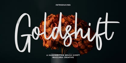 Goldshift is a modern handwritten brush script font, With a rough brush stroke and fun characters. It has Opentype features of ligatures and extra swash, makes it a perfect choice for branding and digital designs. Use this font for logos, social media, websites, blogs, instagram, social media, business cards, branding, and more! Goldshift font support multilingual more than 100+ language. and good pair for your secondary text font with sans or serif. Make a stunning work with Goldshift handwritten brush script font. Cheers, MaulanaCreative
 - Astringe by Twinletter,
$12.00 Atringe is our newest handwriting script font that has its own charm if it is displayed in various promotional design media or product labels, and has a harmonious nature in its arrangement. This font is designed with a natural touch of handwriting which is refined to create a portion and composition that suits your needs. So this font is suitable for craft, children's writing, adventure posters, food banner titles, wedding invitations, product packaging logos, quotes, social media page covers, furniture banner headlines, book covers, and much more.
 - Lets study by Jehansyah,
$9.00 Let's Study the font is this handcrafted font, with bold and round style which is very beautiful to use as a design font of choice for your project, its unique character will make this font design look very natural, there are some additions that let you make your creation more real, suitable for all designs, posters, magazines, covers, invitations, media stories, social media, novels, story books and many more, this font will support your feelings when you want to express something cheerful or enthusiastic about learning
 - Alota by Burntilldead,
$14.00 Say hi to “Alota” retro typeface. Inspired by 70’s design styles, a good decade where we saw many calm colors with groovy, bold, 3D and round shape. This font is very easy to use with hundreds of stylistic alternate (ss01-ss12) & powered with opentype feature. The font really bring a good statement for your logo design and can be the image of a design. Alota is very unique and easy to apply to any media; t-shirts, posters, sign boards, and social media needs.
 - Moonsticky by Maulana Creative,
$10.00 Moonsticky is a modern handwritten font. With contrast stroke and fun character. It has Opentype features of ligatures and alternate lowercase to legibility in a short text, makes it a perfect choice for branding and digital designs. Use this font for logos, social media, websites, blogs, instagram, social media, business cards, branding, and more! Moonsticky handwritten font support multilingual more than 100+ language. and good pair for your secondary text font with sans or serif. Make a stunning work with Moonsticky handwritten font. Cheers, MaulanaCreative
 - Folks Dreaming by Prioritype,
$19.00 Introducing. Folks Dreaming: Comes in a fun groovy style. Great for t-shirt designs, social media posts, posters, covers and more. Features: Uppercase, Lowercase, Numeral, Punctuation, Swash, Multilingual & PUA Encoded. Thanks.
 - Glamori by Balpirick,
$15.00 Glamori is a hand-brushed calligraphy font. It feels bold and charming. This handwritten font is the perfect fit for all of your logos, branding, social media, and crafty DIY projects.
 - Graffiti Youth by Nirmana Visual,
$22.00 Inspired by Graffiti style Design, with 2 Style : Regular & Shadow Graffiti Youth offers beautiful typographic harmony for a diversity of design projects, including logos & branding, social media posts, advertisements & product designs.