10,000 search results
(0.033 seconds)
- Hebrew Moses Std VF by Samtype,
$120.00 his is a beautiful, modern, and super readable font. You can use it in any kind of text, from folders to prayer books. This font is especially good for school and kid's books. This font also has modern punctuation: shevana, kamats katan, dagesh hazak, and holam chaser. This is a Variable font! One font with 5 styles (Regular, Medium, SemiBold, Bold, Heavy)
 - Churchward Isabella by BluHead Studio,
$25.00 Churchward Isabella is a five weight typeface family originally designed during the 1980's by the late type designer Joseph Churchward, from New Zealand. A straightforward, geometric sans serif, it is a no-nonsense, highly legible workhorse design, readable on screen as well as in print, for text, headline and display. The family includes Light, Regular, Medium, Bold and Extra Bold.
 - MPI Circle Sans by mpressInteractive,
$5.00 Circle Sans is one of the most unique wood type font designs we"™ve found. It was made in Europe and our cut measures just 3 picas. Letters are a basic, rounded gothic with a medium amount of stroke contrast. This font is easy to read and packs a special punch dropped out from the negative space of a circle.
 - Preston Signature by Cititype,
$17.00 Prestons signature is made with a medium-sized marker pen with a casual groove. Feel the sensation of natural handwriting. This font is a great choice for digital signatures, brand names, logos, banners, headlines, wedding invitations, business cards, book titles, movies, podcast texts and craft work. we complement with alternate and ligature to strengthen the natural impression on your design
 - Makeevka by NREY,
$19.00 Makeevka typeface is sans-serif semi-condenced font family. It has wide multilingual support with cyrillic also. This font was crafted with the intention to present clean, legible, multipurpose characters that are easy to read wether it's on screen or print. Fit for all purposes; text, display, headline, print, corporate identity, logo, branding, product, infographic, photography and other applications and medium.
 - Detective Bureau JNL by Jeff Levine,
$29.00 Traditional stencil type faces have always projected images of strength, power, police, military or industry. The hand-lettered title card for 1951's "Detective Story" (directed by William Wyler) is a perfect example of this. A bold Roman letter style, it was the perfect inspiration for Detective Bureau JNL.
 - 1529 Champ Fleury Initials by GLC,
$42.00 In 1529, Geofroy Tory, French scholar, engraver, printer, publisher and poet, was publishing the well known so called Champ Fleury, printed by Gilles de Gourmond, in Paris. It is a fully illustrated handbook where the author explains how to draw Roman characters. The font used for the text - a Humane/Jenson type - was not a very beautiful one, but rough and ready, and the book is well known for its capital letters designs. We are offering here the two complete historical type sets and more -- we have entirely redrawn the lacked letters: J, U and W, Eth, Lslash, Thorn and Oslash in the two initial forms. The text font, 1529 Champ Fleury Regular is now containing all characters for West European (including Celtic), Baltic, East and Central European and Turkish language, and the Initial set 1529 Champ Fleury Init is containing two complete alphabets, with a very great effort to be as close as possible to the original pictures.
 - Ghitta Bodoni Cancellaresca by Spurnej Type Foundry,
$39.00 Giambattista Bodoni was an Italian engraver, printer, and publisher who was one of the best typographers of the 18th century and became known worldwide for his iconic serif typeface. In the posthumous edition of Bodoni’s “Manual of Typography” published in 1818 by his widow Margherita “Ghitta” Dall’Aglio may also be found, among the other treasures, the Cancellaresca (Chancery). Ghitta is a redesign of this typeface in its finest form. With strong stroke contrast in 4 optical grades, 850 glyphs with wide range of language support, accented ligatures, oldstyle figures, 8 stylistic sets, and unique way of letter connection, Ghitta Bodoni Cancellaresca follows and builds on the best of Bodoni’s historical prototype and shifts further to a contemporary script typeface full of grace, neatness, and beauty. *** This font is powered by OpenType feature “Ligatures”, so it is necessary to have this function turned on. If you need support or more information, please kindly contact me: spurnej@email.cz
 - BlackHand by JOEBOB graphics,
$39.00 Finally the time has come to publish our new ‘BlackHand’ font. It is a bold and upright handwritten font featuring 150 ligatures, which make for a credible handwritten look and feel. The ligatures will appear quasi random without the user having to search for the right alternate character in a list of glyphs. As you will notice, the font does well in both headers (it even has an ‘instant logo’ quality) and in plain text. The font finds it’s origin in handwritten notes which were done without paying attention to aesthetics. The regular characters and the ligatures were handpicked to form an organic and natural, very readable result. The original writing was done with an Edding 1340 brushpen, giving the font frivolous thick/ thin strokes. We hope you enjoy using the font as much as we did creating it. As an introduction offer, you can get it now at 50% off in the first month after publishing.
 - 1565 Venetian by GLC,
$20.00 This set of initial decorated letters is an entirely original creation, drawn inspired by Italian renaissance engraver Vespasiano Amphiareo's paterns published in Venice circa 1568. It contains two roman alphabets : the first of large Initials, the second of small caps. Both containing thorn, eth, L & l slash, O & o slash. It can be used as variously as web-site titles, posters and flyers design, publishing texts looking like ancient ones, or greeting cards, all various sorts of presentations, as a very decorative, elegant and luxurious additional font... This font is conceived for enlargements remaining very smart and fine. The original height of the initials is at least about one inch equivalent to about four lines of characters, small caps may have the same height than the caps of the font used with, but cover two lines is better. This font may be used with all GLC blackletter fonts, but preferably with "1543 Humane Jenson", "1557 Italic", "1742 Civilite", "1776 Independence" without any fear for doing anachronism.
 - Branding SF by Latinotype,
$29.00 Branding Super Family is an extension of the Branding project , including new variables that cater to a wide array of requirements, still maintaining its essence. It is a super family for modern needs! Additional to its particular design, different widths are included: now Branding Ultra Condensed is a reality. The project also considers a variety of alternate characters, making Branding Super Family a great tool for graphic designers and art directors. It is ideal for use in logotypes, isotypes, short texts, and others. Branding Super Family is a Sans Serif spurless font with medium-large x-height, straight curves and convex terminals. It has 7 weights and 4 widths that vary from thin to black, and from ultra condensed to medium, each with their matching italics. It also includes a set of 544 characters supporting 128 languages. OpenType characteristics include European accents, old style numbers and 4 sets of alternates.
 - Shàngó Gothic by CastleType,
$59.00 Shàngó is CastleType’s beautifully-rendered interpretation of Professor F.H.E. Schneidler's elegant titling typeface released in 1936 with the name 'Schneidler-Mediaeval mit Initialen'. This latter design is usually referred to as Schneidler Initials. Although early on Medium and Bold weights were added to the somewhat delicate design of Shàngó, it seemed there were other possibilities that might be useful for display use. So, for the last couple of years I have been working on and off on a monoline version of Shàngó. This new design maintains the classic letterforms of the original, but its relatively even strokes gives it a more solid appearance, making it useful where a more modern, masculine look is needed. This new family is called Shango Gothic and is available in four weights: Regular, Medium, Bold, and Extra Bold. Shàngó Gothic is a member of the extended Shàngó family (Classic, Chiseled, Sans, Gothic).
 - Thought by Scholtz Fonts,
$15.00 Thought, with its versatile five styles, is ideal for contemporary display work. It has style, flair, legibility, and interesting, flowing letter shapes. The Family: -- REGULAR - of medium weight - clear and legible; -- BLACK - for bolder statements and best readabilty; -- LINEAR 25 - light weight, mono width line -- LINEAR 45 - medium weight, mono width line -- ZEST - variable line, casual, exaggerated appearance Use a combination of styles for product branding, book covers, invitations, greeting cards. Thought has not been designed to be used in "ALL CAPS". The best effects for headings and subheads are obtained with an initial upper case letter followed by lower case characters. If you are using upper and lower case then it is not necessary to use kerning. Thought contains over 250 characters - (upper and lower case characters, punctuation, numerals, symbols and accented characters are present). It has all the accented characters used in most European languages.
 - Avenir Next by Linotype,
$97.99 Avenir Next Pro is a new take on a classic face—it’s the result of a project whose goal was to take a beautifully designed sans and update it so that its technical standards surpass the status quo, leaving us with a truly superior sans family. This family is not only an update though, in fact it is the expansion of the original concept that takes the Avenir Next design to the next level. In addition to the standard styles ranging from UltraLight to Heavy, this 32-font collection offers condensed faces that rival any other sans on the market in on and off—screen readability at any size alongside heavy weights that would make excellent display faces in their own right and have the ability to pair well with so many contemporary serif body types. Overall, the family’s design is clean, straightforward and works brilliantly for blocks of copy and headlines alike. Akira Kobayashi worked alongside Avenir’s esteemed creator Adrian Frutiger to bring Avenir Next Pro to life. It was Akira’s ability to bring his own finesse and ideas for expansion into the project while remaining true to Frutiger’s original intent, that makes this not just a modern typeface, but one ahead of its time. Complete your designs with these perfect pairings: Dante™, Joanna® Nova, Kairos™, Menhart™, Soho® and ITC New Veljovic®. Avenir Next Variables are font files which are featuring two axis, weight and width. They have a preset instance from UltraLight to Heavy and Condensed to Roman width. The preset instances are: Condensed UltraLight, Condensed UltraLight Italic, Condensed Thin, Condensed Thin Italic, Condensed Light, Condensed Light Italic, Condensed, Condensed Italic, Condensed Demi, Condensed Demi Italic, Condensed Medium, Condensed Medium Italic, Condensed Bold, Condensed Bold Italic, Condensed Heavy, Condensed Heavy Italic, UltraLight, UltraLight Italic, Thin, Thin Italic, Light, Light Italic, Regular, Italic, Demi, Demi Italic, Medium, Medium Italic, Bold, Bold Italic, Heavy, Heavy Italic. Featured in: Best Fonts for PowerPoints
 - Lancea by Asenbayu,
$15.00 Lancea is a fancy sharp serif font. Inspired by medieval roman writing combined with the sharpness of a lance, Lancea is packaged in a font that has sharpness in each letter with an elegant shape that has a strong appeal. Lancea also gives it a sophisticated feel with a sleek and clean serif shape. Lancea typography can help you complete various projects such as luxury brand logos, journals, business cards, headline, products, social media posts, web, etc. There is a decorative alternative style feature for uppercase letters. If you are involved in a project that requires fancy and professional writing, Lancea is perfect to assist you in completing it. Thank you!
 - Olivine by URW Type Foundry,
$35.00 In an era of typographic neutrality, Pria Ravichandran adds spirit and flavour to the humanist sans, a genre that is known for legibility. Introducing Olivine. Olivine is a versatile type family that performs admirably across sizes. It is designed with maximum care ensuring legibility across various sizes, angles and distances. The sturdy shapes and the exaggerated ink traps fade to produce an even typographic colour and a lively texture in smaller text sizes. In larger display settings, the details become self-conscious and highlight the spectacular quality of the design. Olivine is neither experimental nor minimal, striking a balance between formality and friendliness. Olivine is clean as well as organic at the same time. Consisting of seven weights in roman and italics, the type-family address typographic hierarchy for texts of all kinds and sizes. Distinctive, yet neutral letterforms add personality to the type family. The counter-forms are large and open giving the design plenty of internal space which is balanced against the generous spacing of the characters. These features of Olivine make the reading process enjoyable in digital as well as the print medium. No squinting to read this type-family! If you are looking to add some flavour into your design, try Olivine. It is a trend-setting typeface that we predict is going that extra mile. Try before you buy, Olivine Medium and Medium Italic are available free for unlimited commercial usage.
 - Planetype by CozyFonts,
$20.00 The Planetype Font Family is Modern. It has 6 Font Styles: X-Light, Light, Medium, Inline, Bold, & X-Bold. Each style has a consistent weight with a square serif of equal weight to its vertical and horizontal strokes. Planetype™ for short or Planet-Type font styles all have extremely clean edges and are sharply defined. There is a standard kerning applied, however evenly letter-spacing these family members give a distinct personality and continues to command the negative space just as in tight kerned examples. The compatible relationship of these font family members, weight to weight, and X-Light to X-Bold is seamless and the overall design coloring of words and sentences is well balanced and extremely legible. The Planetype Family fonts are matching members glyph to glyph. This family works in modern, contemporary and vintage settings. The Planetype Medium matches the outer weight of Planetype Inline. Their are several unique Glyphs that set the character of this family, such as: Caps B, M, Q, R, X and Lower Case a, e, k, r, z to begin with. The numerals and dingbats also have several unique glyphs that flow with the family Style in every matching weight. These characteristics lend well in designing logos, brands, and even monograms. Starting with Planetype X-Light the designer has a command of the clean lines yet expressing Modernism and a touch of Architectural structure. Planetype Medium & Planetype Inline are a dynamic duo giving a positive/negative readability.
 - First Responder JNL by Jeff Levine,
$29.00 First Responder JNL is a back slanted version of Catalog JNL, and is intended to be used for graphics on police and fire vehicles to emulate "forward" movement, which is a popular theme on such vehicles. It is also useful in conveying the same image in print applications and web design.
 - Okezone Chamoon by Alit Design,
$22.00 Get ready to groove with the Okezone Chamoon Groovy Display Serif Font! This font is the perfect blend of retro 80s style, funky cartoon vibes, and a dash of modern flair. With its wavy lines, extensive ligature options, and a whopping 758 characters, Okezone Chamoon is the ultimate choice for designers looking to infuse a playful and nostalgic touch into their projects. Key Features: Groovy 80s Aesthetics: Okezone Chamoon takes you on a trip back to the 1980s with its groovy and wavy design. It's like stepping into a time machine and bringing the funky, vibrant spirit of the 80s into your designs.Funky Cartoon Vibe: This font exudes a playful and fun-loving attitude that's perfect for creating eye-catching headlines, posters, and logos with a whimsical twist. Versatile Ligatures: Okezone Chamoon offers an extensive range of ligatures that seamlessly connect characters, enhancing the flow and style of your text. Experiment with ligatures to create custom and captivating typography. 758 Characters: With a whopping 758 characters at your disposal, you have a wide variety of options to make your text truly unique. Add special characters, symbols, and emojis to express your creativity. Multilingual Support: Don't let language barriers hold you back. Okezone Chamoon supports multiple languages, making it a font that can connect with audiences worldwide. Digital and Print-Ready: Whether you're designing for the web or print, Okezone Chamoon is optimized for both mediums. Your designs will look stunning on screens and in physical publications. Unique Branding: If you want your brand to stand out and be remembered, Okezone Chamoon is the font to make it happen. Its distinct style is sure to leave a lasting impression. Endless Possibilities: Whether you're working on advertising campaigns, retro-themed projects, or simply want to add a touch of nostalgia to your designs, Okezone Chamoon empowers you with endless creative possibilities. With Okezone Chamoon Groovy Display Serif Font, your designs will turn heads, evoke nostalgia, and radiate a playful spirit. Embrace the funky 80s vibe and let your creativity run wild!
 - Evangeliaire Uncial by Intellecta Design,
$14.90an approach to the uncial medieval style of letters - FF Child's Play by FontFont,
$62.99 British type designer John Critchley created this script FontFont in 1993. The family has 7 weights, and is ideally suited for advertising and packaging, editorial and publishing as well as poster and billboards. FF Child's Play provides advanced typographical support with features such as ligatures and alternate characters. It comes with a complete range of figure set options – oldstyle and lining figures, each in tabular and proportional widths.
 - The King Maker by Letterara,
$19.00 The King Maker is a modern serif font family with a unique style. It has a modern and vintage look. this font is suitable for many projects, modern or even retro vintage design, branding, crafting, sticker, sublimation, wedding invitation, advertising, vintage mood boards, logotype, packaging, titles, editorial design, and many more. This font is PUA encoded, which means you can easily access all of the glyphs and swashes!
 - JetJaneMono by Ingrimayne Type,
$9.00 JetJaneMono is a large family of sans-serif faces which are monospaced. It is very plain (plain=plane=jet). The font family has two widths and three weights, with each upright style paired with an italics style. These twelve fonts are then duplicated with another set in which small caps replace the lower-case letters. The typeface was created in 1994 and in 2021 the condensed widths were added.
 - Hamis Pro by Fo Da,
$9.00 Hamis Pro is a display font of 12 weights: Regular, Shadow, Solid, Book, Book Shadow, Book Solid & Italics. Hamis Pro is an advanced typographical support with features such as ligatures, case-sensitive forms, fractions, super and subscript characters, and stylistic alternates. It's ideally suited for advertising and packaging, festive occasions, editorial and publishing, logo, branding and creative industries, posters and billboards as well as web and screen design.
 - Blanc by Latinotype,
$26.00 Blanc is a functional humanist sans typeface with a marked personality and great style that make it ideal for use in headlines. Blanc is an ode to neutrality: a geometric face characterised by low contrast between thick and thin strokes with calligraphic features that emphasise specific glyphs. Blanc comes with 8 weights and an inline version that make it well-suited for headings and subheadings, corporate designs, advertising, publishing, etc.
 - Tango Silver by Letterara,
$16.00 Tango Silver is a Bold serif font family with a unique style. It has a modern and strong look. this font is suitable for many projects, for modern or even retro vintage design, branding, crafting, sticker, sublimation, wedding invitation, advertising, vintage mood boards, logotype, packaging, titles, editorial design, and many more. This font is PUA encoded, which means you can easily access all of the glyphs and swashes!
 - HT Profumeria by Dharma Type,
$19.99 HT Profumeria is a monoline and connected font with a thin line and a unique tail. Its simple and retro look is the best script for branding and packaging, but it may also be useful for headlines, publishing and advertising. Holiday Type Project offers retro hand drawing scripts. Inspired by retro script on shopfront lettering, wall paint advertisements in Italy around 1950s. Check out the script fonts from Holiday Type!
 - Our Pal Hal NF by Nick's Fonts,
$10.00Of the many lettering gurus who published chapbooks on handlettering during its heyday, one of the most prolific was H. C. Martin. This quirky poster face was offered in one of his many Idea Books, and it remains as fresh and frolicsome today, some seventy years later, as when it first appeared. Both versions of this font include the complete Unicode Latin 1252 and Central European 1250 character sets. - Ramadan Elegant by Marmara,
$23.00 If you are a graphic designer, magazine editor, fashion stylist, industrial designer, publisher, printer or have a creative business, this font is for you, I believe it is a font that should be in your font folder for all your work.. Make awesome logotypes; When you write any word, it almost gives a logotype effect, I enjoyed working on it very much, I'm sure you will like it too...
 - Not So Grotesk JNL by Jeff Levine,
$29.00 A circa-1920s book on lettering entitled "Book of Alphabets" by Regan Publishing displayed an example of a Grotesk typeface (a popular style of sans serif of the time). This design was re-drawn digitally as Not So Grotesk JNL and is available in four varieties - regular, oblique, condensed and condensed oblique. Not So Grotesk JNL is the perfect companion font family to use alongside Simply Grotesk JNL.
 - Great Warrior by Letterara,
$16.00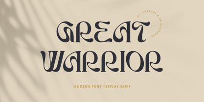 Great Warrior is a modern serif font family with a unique and classy style. It has a modern and vintage look. this font is suitable for many projects, for modern or even retro vintage design, branding, crafting, sticker, sublimation, wedding invitation, advertising, vintage mood boards, logotype, packaging, titles, editorial design, and many more. This font is PUA encoded, which means you can easily access all of the glyphs and swashes!
 - FF Acanthus by FontFont,
$47.99 Japanese type designer Akira Kobayashi created this serif FontFont between 1998 and 2000. The family has 10 weights, ranging from Regular to Bold (including italics) and is ideally suited for book text, festive occasions as well as editorial and publishing projects. FF Acanthus provides advanced typographical support with features such as ligatures, small capitals, alternate characters, and case-sensitive forms. It comes with proportional oldstyle and proportional lining figures.
 - Cinema Nouveau JNL by Jeff Levine,
$29.00 Shadowland was a magazine dedicated to the arts, and was published from 1919 through 1923. The lettering for its masthead was hand lettered in a then-contemporary Art Nouveau style. Although the photoplay (movies) was just an incremental part of the magazine’s overview of the arts, the digital version of the type design has been named Cinema Nouveau JNL, and is available in both regular and oblique versions.
 - Poynter Serif RE by Font Bureau,
$40.00 Inspired by the work of Hendrik van den Keere, Tobias Frere-Jones and David Berlow designed a family of typefaces focused on the challenges of newsprint publishing. This version of the family is part of the Reading Edge series of fonts specifically designed for small text onscreen, having been adjusted to provide more generous proportions and roomier spacing, and having been hinted in TrueType for optimal rendering in low resolution environments.
 - Picturesque Stencil JNL by Jeff Levine,
$29.00 Picturesque Stencil JNL gets its name and design from the title of a circa-1920s children’s stencil activity book entitled “Dean’s Picturesque Stencil Book No. 10 - Series 75”; published by the F. Weber Company of Philadelphia and printed in England by Dean. The book’s stenciled title was hand lettered in a bold Roman design in the Art Nouveau style. Picturesque Stencil JNL is available in both regular and oblique versions.
 - Kathleen Sans by ActiveSphere,
$30.00 Kathleen Sans is a geometric sans-serif display font and works best in text and display applications, such as posters, headline, magazine, logos, titles, product branding, corporate branding and publishing. The Kathleen Sans font family has three weights: Light, Regular, and Bold, each available in italic, making a total of six styles. Each style has a full upper and lower-case, accents, punctuation and a selection of monetary symbols.
 - Lishbona Naskh by Vanarchiv,
$66.00 This font family is simplified Arabic which was inspired from the modern Naskh style, where the reverse contrast is low and the counter forms are open. The original design is from the Lisboa Sans typeface (Latin), published on 2005 and after some years, this multi-script family is the compromise and balance between these two different scripts. This typeface contains characters for setting Arabic, Persian and Urdu languages.
 - SF Abyan by Sultan Fonts,
$19.00 Abyan is An Arabic typeface for desktop applications & display. Abyan is suitable for large display sizes, especially in the area of advertising, while still functioning well as a text face. The font includes a matching Latin design and support for Arabic, Persian, and Urdu. It also includes proportional and tabular numerals for the supported languages. Abyan typeface comes with many opentype features. Designer: Sultan Maqtari Design date: 2019 Publisher: Sultan Fonts
 - Sunbeam by Kustomtype,
$25.00 Sunbeam is a new, classy & modern typeface that looks incredible! The contrasting lines and vibrant shapes give sunbeam a sleek and elegant look. Sunbeam is a versatile typeface that's full of character, using optical correction for better legibility, sunbeam is the perfect fit for graphic design, editorial design, magazines, posters, logotypes, brands and corporate design. Sunbeam is designed by Coert De Decker in 2019 and published by Kustomtype Font Foundry.
 - Suerte by Resistenza,
$39.00 Say hello to Suerte. This new typeface with inverted contrast and bifurcated serifs was inspired by Caslon’s Italian type and by Aldo Novarese’s Estro, published by the turinese foundry Nebiolo. Our aim was to develop a wood type typeface adding a new personality incorporating Tuscan serifs. The complete alphabet was designed with a flat long brush and Indian ink and then vectorized. Suerte contains a big set of icons and dingbats.