10,000 search results
(0.05 seconds)
- Walbaum Antiqua Pro by RMU,
$40.00 Walbaum Antiqua Pro is an RMU redesign of a German font classic, with three different number forms and small caps throughout all font styles.
 - Print Oddities JNL by Jeff Levine,
$29.00 Print Oddities JNL gathers various cartoons, embellishments, spot illustrations, border elements and arrows into one nostalgic collection; all re-drawn from vintage source material.
 - Stencil Extras JNL by Jeff Levine,
$29.00 Stencil Extras JNL contains twenty-six stencil borders, frames, arrows, pointing hands, plants, wildlife and decorative embellishments all re-drawn from vintage source material.
 - Raskal by PizzaDude.dk,
$20.00Yiehar! Woohee! This is a funky and chunky wild west PizzaDude font! Buy all three versions at once and save a fistful of dollars! - Pompelmus by PizzaDude.dk,
$15.00 Crispy: ALL CAPS crispy letters Nutricious: "clean" version of Crispy Fiber: The messy inside of Crispy Healthy: Rough serif font Sweet: Handwritten and crunchy
 - Fleuron Ornaments by Gerald Gallo,
$20.00 Fleuron Ornaments was inspired by old world designs and patterns. There is an assortment of 47 ornaments all located under the character set keys.
 - Fleuron Labels by Wiescher Design,
$39.50Fleurons are embellishments and here is my seventh set. This time I give you all kind of different labels. Your labeled designer Gert Wiescher - PaperCutAlmondDark by PineStreet,
$25.00 This is the 'dark' version of our font PaperCut Almond. It has all of its openings closed to enhance the effect of handcut lettering.
 - Elegant Ornaments by Gerald Gallo,
$20.00 Elegant Ornaments was inspired by typographic ornaments from historic sources. There is an assortment of 47 ornaments all located under the character set keys.
 - Constância Script by Pedro Teixeira,
$20.00 Constância Script, classic and elegant calligraphy. This unique, stylish and legible script is handy for logo, poster, headlines, invitations, cards and all display needs.
 - KG I And Love And You by Kimberly Geswein,
$5.00 Conversation hearts! Use ALL CAPS for even lettering. For bouncy letters, alternate uPpEr and LoWeR cases to make the letters bounce up and down.
 - Vtg Stencil US No 72 by astype,
$42.00 The Vtg Stencil series of fonts from astype are based on real world stencils. All styles offering an extended Latin character set. » pdf specimen «
 - Kg Pdx Bridgetown by Kimberly Geswein,
$5.00 This font is intended to be used with all of the lowercase letters. Alternate glyphs for each letter are contained in the capital letters.
 - Traklin MF by Masterfont,
$59.00 Great sans text font family for all your needs, text, signage, logos etc. Very elegant and suitable for classic as well as formal design.
 - Auxilia by Typomancer,
$20.00 Auxilia is a geometric sans serif font with a bit of humanist feeling, comes with various weights and condensed width for all purpose design.
 - Rugen by Variatype,
$12.00 Rugen is an urban all-caps sans serif that perfectly matches your branding project and more. FONT FEATURES Additional Accents 66 Languages Kerning Alternates
 - HildiniaDonut by JOEBOB graphics,
$- HildiniaDonut is the second font designed by Hilde Rikken (age 10). I think a mouse took a little bite out of all the characters...
 - Getboreg Slab - Personal use only

- AringtonDemo - Personal use only

- Boldstrom - Personal use only

- Brontoburger - Personal use only

- Funkrocker - Unknown license

- Vendetta by Emigre,
$69.00 The famous roman type cut in Venice by Nicolas Jenson, and used in 1470 for his printing of the tract, De Evangelica Praeparatione, Eusebius, has usually been declared the seminal and definitive representative of a class of types known as Venetian Old Style. The Jenson type is thought to have been the primary model for types that immediately followed. Subsequent 15th-century Venetian Old Style types, cut by other punchcutters in Venice and elsewhere in Italy, are also worthy of study, but have been largely neglected by 20th-century type designers. There were many versions of Venetian Old Style types produced in the final quarter of the quattrocento. The exact number is unknown, but numerous printed examples survive, though the actual types, matrices, and punches are long gone. All these types are not, however, conspicuously Jensonian in character. Each shows a liberal amount of individuality, inconsistency, and eccentricity. My fascination with these historical types began in the 1970s and eventually led to the production of my first text typeface, Iowan Old Style (Bitstream, 1991). Sometime in the early 1990s, I started doodling letters for another Venetian typeface. The letters were pieced together from sections of circles and squares. The n, a standard lowercase control character in a text typeface, came first. Its most unusual feature was its head serif, a bisected quadrant of a circle. My aim was to see if its sharp beak would work with blunt, rectangular, foot serifs. Next, I wanted to see if I could construct a set of capital letters by following a similar design system. Rectangular serifs, or what we today call "slab serifs," were common in early roman printing types, particularly text types cut in Italy before 1500. Slab serifs are evident on both lowercase and uppercase characters in roman types of the Incunabula period, but they are seen mainly at the feet of the lowercase letters. The head serifs on lowercase letters of early roman types were usually angled. They were not arched, like mine. Oddly, there seems to be no actual historical precedent for my approach. Another characteristic of my arched serif is that the side opposite the arch is flat, not concave. Arched, concave serifs were used extensively in early italic types, a genre which first appeared more than a quarter century after roman types. Their forms followed humanistic cursive writing, common in Italy since before movable type was used there. Initially, italic characters were all lowercase, set with upright capitals (a practice I much admire and would like to see revived). Sloped italic capitals were not introduced until the middle of the sixteenth century, and they have very little to do with the evolution of humanist scripts. In contrast to the cursive writing on which italic types were based, formal book hands used by humanist scholars to transcribe classical texts served as a source of inspiration for the lowercase letters of the first roman types cut in Italy. While book hands were not as informal as cursive scripts, they still had features which could be said to be more calligraphic than geometric in detail. Over time, though, the copied vestiges of calligraphy virtually disappeared from roman fonts, and type became more rational. This profound change in the way type developed was also due in part to popular interest in the classical inscriptions of Roman antiquity. Imperial Roman letters, or majuscules, became models for the capital letters in nearly all early roman printing types. So it was, that the first letters in my typeface arose from pondering how shapes of lowercase letters and capital letters relate to one another in terms of classical ideals and geometric proportions, two pinnacles in a range of artistic notions which emerged during the Italian Renaissance. Indeed, such ideas are interesting to explore, but in the field of type design they often lead to dead ends. It is generally acknowledged, for instance, that pure geometry, as a strict approach to type design, has limitations. No roman alphabet, based solely on the circle and square, has ever been ideal for continuous reading. This much, I knew from the start. In the course of developing my typeface for text, innumerable compromises were made. Even though the finished letterforms retain a measure of geometric structure, they were modified again and again to improve their performance en masse. Each modification caused further deviation from my original scheme, and gave every font a slightly different direction. In the lower case letters especially, I made countless variations, and diverged significantly from my original plan. For example, not all the arcs remained radial, and they were designed to vary from font to font. Such variety added to the individuality of each style. The counters of many letters are described by intersecting arcs or angled facets, and the bowls are not round. In the capitals, angular bracketing was used practically everywhere stems and serifs meet, accentuating the terseness of the characters. As a result of all my tinkering, the entire family took on a kind of rich, familiar, coarseness - akin to roman types of the late 1400s. In his book, Printing Types D. B. Updike wrote: "Almost all Italian roman fonts in the last half of the fifteenth century had an air of "security" and generous ease extremely agreeable to the eye. Indeed, there is nothing better than fine Italian roman type in the whole history of typography." It does seem a shame that only in the 20th century have revivals of these beautiful types found acceptance in the English language. For four centuries (circa 1500 - circa 1900) Venetian Old Style faces were definitely not in favor in any living language. Recently, though, reinterpretations of early Italian printing types have been returning with a vengeance. The name Vendetta, which as an Italian sound I like, struck me as being a word that could be taken to signifiy a comeback of types designed in the Venetian style. In closing, I should add that a large measure of Vendetta's overall character comes from a synthesis of ideas, old and new. Hallmarks of roman type design from the Incunabula period are blended with contemporary concerns for the optimal display of letterforms on computer screens. Vendetta is thus not a historical revival. It is instead an indirect but personal digital homage to the roman types of punchcutters whose work was influenced by the example Jenson set in 1470. John Downer.
 - Helzapoppin™ - Unknown license

- Elle by Device,
$39.00 Elle is a geometric sans in three weights with rounded stroke terminals and circular forms. Classy, elegant and modern, with just a hint of the future. Inspired by a single-weight Typositor headline typeface from the early 1970s called Pipeline.
 - Bresley by Blankids,
$27.00 Introducing a new clean signatures script called Bresley. Bresley came with open type features such contextual alternates, stylistic alternates, ligature, good for signature logo, wedding invitation, romantic quote, logotype, poster, social media kit, book cover, tshirt design, packaging and any more.
 - Ring Stag by Ochakov,
$14.00 It's important to realize that each of us is unique. I wish Ring Stag will emphasize it. Single but ready for anything. The new Ring Stag is bolder, more dynamic and masculine. New addition to the big family called Ring!
 - Avolus by Kaidosan,
$15.00 Avolus is a cool display font, comprised of a modern and unique style. Fall in love with its incredibly versatile style and use it to create gorgeous wedding invitations, beautiful stationary art, eye-catching social media posts, and much more
 - Funny Frog Display by Sipanji21,
$15.00 Funny Frog - A Fun Display Font With Cute Characters. It will elevate a wide range of design projects to the highest level, be it branding, headings, Kids Zone, designs, invitations, Snack Package, logotype, wall art illustration, apparel, labels, and much more!
 - Beluga Road by Sipanji21,
$15.00 Beluga Road is a spectacular decorative font with a graffiti style. It will elevate a wide range of design projects to the highest level, be it branding, headings, wedding designs, invitations, signatures, logotype, wall art illustration, apparel, labels, and much more!
 - Faust Text by Solotype,
$19.95Barnhart Bros. and Spindler called this Faust Text when they introduced it in 1898. A quarter of a century later, they brought back a number of obsolete faces and renamed them. This one became Missal Text in their 1923 catalog. - Athabasca by Greater Albion Typefounders,
$16.00 Athabasca is "Wild West" Tuscan on steroids. Remember those stylised tall and narrow typefaces that used to appear in Wild West comics, Western movies, "Wanted" posters and so forth? Well, here’s a new, 2017 released take on the idea. Have fun!
 - Anita Honey by Rezastudio,
$9.00 Anita Honey is an adorable quirky handwritten font. It will add an incredibly joyful touch to your designs. Fall in love with its playful style and use it to create beautiful stationary art, eye-catching social media posts, and much more!
 - Wushand Graffiti by Sipanji21,
$10.00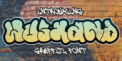 Wushand is a spectacular decorative font with a graffiti style. It will elevate a wide range of design projects to the highest level, be it branding, headings, wedding designs, invitations, signatures, logotype, wall art illustration, apparel, labels, and much more!
 - Homebound by Crumphand,
$19.00 Hello, introducing the new abstract & random fonts. It's called Homebound. Homebound is abstract font. comes with different shape. Good for your graphic, easy to read. What's Included Fonts ? Uppercase Lowercase Numerals Symbols European Multilingual Stylistic Set PUA Encoded Thank You, Regards!
 - Stone Man Decorative by Sipanji21,
$16.00 Stone Man is a decorative font with a Rock decoration characters. It will elevate a wide range of design projects to the highest level, be it branding, headings, wedding designs, invitations, signatures, logotype, wall art illustration, apparel, labels, and much more!
 - Junker by Gassstype,
$27.00 Introducing our latest display typeface called Junker - Normal And Italic Paint Brush Font with a natural style and dramatic movement can make your logotype become more interesting. Best Vintage font and multilingual support. inspired by the decorative arts and architecture movement
 - Dark Graffiti by Yoga Letter,
$20.00 "Dark Graffiti" is a very elegant and unique graffiti font. This font is equipped with uppercase, lowercase, numerals, punctuation, and multilingual support. It is very suitable for painting street walls, designing t-shirts, jackets, logos, stickers, tattoos, bag designs, and others.
 - Ovoda by Alive Fonts,
$40.00 Whether summer, winter or fall, Ovoda is posed to add a youthful yet refined touch to any design. Use Ovoda’s three weights to pucker up your latest packaging or liven up your layouts. Ovoda is a must have for your clubhouse!
 - Wishline by Subectype,
$15.00 Wishline is an exquisite handwritten font, masterfully designed to become a true favorite. It maintains its classy calligraphic influences while feeling contemporary and fresh. Fall in love with it and bring your projects to the highest levels! Thank You Subectype Studio


