4,855 search results
(0.52 seconds)
- Salmah by Letterena Studios,
$9.00 Salmah is a chic, refined script font that emanates sophistication and elegance. Its stylish alternates and ligatures make this font the perfect match for any project. Salmah is PUA encoded which means you can access all glyphs and swashes with ease!
 - Allenisa by Letterafandi Studio,
$14.00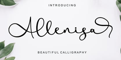 Allenisa is a chic, refined script font that emanates sophistication and elegance. Its stylish alternates and ligatures make this font the perfect match for any project. Allenisa is PUA encoded which means you can access all of the glyphs and swashes with ease!
 - Mon Petit Cahier by Hanoded,
$15.00 My family and I are stuck in quarantine for a week; my eldest son tested positive for Covid19 (but everyone else tested negative), so we can’t go out. That means that the kids follow classes online. I noticed their notebooks and suddenly realised that a notebook used to be called a ‘cahier’, which is a French word meaning the exact same thing. I guess it sounded sophisticated at the time. Mon Petit Cahier (meaning: My Little Notebook) is a handmade script font. It is not meant to be awe-inspiring, nor do you want to use it for headlines or posters. It is a nice little font that feels at home wherever an unobtrusive script is needed. Comes with all the diacritics you want and a set of cool double letter ligatures.
 - Grafiker by Hanoded,
$15.00 Grafiker means 'Graphic Designer' in German. This fat, colored, uneven font with a 1001 uses was loosely based on the work of designers Oskar Kokoschka (1886 - 1980) and Jean Carlu (1900 - 1997). The glyphs were hand-drawn with a 0.5 roller ball and colored in with Chinese ink, using a stiff brush. The result is a lively, rather unusual font.
 - Hello Headline by DearType,
$29.00 Hello Headline is a bold and friendly typeface designed specifically (believe it or not) for headlines. All of the letters are chunky and rounded, which is probably the reason why they are visible from afar. And I mean, really, really afar. The overall feel of the typeface is meant to be very casual and affable, so it is great for businesses that are fun, outgoing and sincere.
 - Mess Hall JNL by Jeff Levine,
$29.00Modeled from a set of individual painting stencils, Mess Hall JNL is named for the armed services cafeteria where thousands of enlisted men endured bland, boring meals day in and day out for years. - Alphaville by Shinntype,
$39.00 All has been said, unless words change their meanings and meanings their words.
 - Vamp by Burghal Design,
$29.00A quintet of remorseless homewreckers, each member of the Vamp family contains hypnotic dingbats to lure you into their web. The Vamp family consists of the bewitching Vamp, the bigger, brasher Vamp Bold, the dangerous, psychedelic Psycho Vamp, as well as the lean (but still mean!) Vamp Slim and Vamp Slim Oblique. The Vamp family's seductive art deco form and fiendishly geometric wiles will break your heart and steal your soul. - Halla by Wilton Foundry,
$19.00 Creating Halla was a bit unusual for me since I started out creating the italic version first and that inspired the name Halla, meaning to tilt in Icelandic. It is also a fairly common female name in Iceland. “Halla” is derived from old Norse word “hallr” = 'flat stone, rock' or 'sloping, leaning to one side' Halla is a true italic inspired by handwriting and mechanical type. The combination of Light and Italic makes Halla ideal for advertising, branding, signage, packaging and editorial design.
 - Utshani by Scholtz Fonts,
$21.00 Utshani means "grass" in the African language: Zulu. Grass has softness but it also has great strength and many African craft implements are made from it. When we describe someone as being "like the grass", it is meant as a compliment for it means that they can be tender and strong. The fluid African font, Utshani, was designed to suggest the flexibility and strength of grass. In this way it contrasts with the majority of other "African-inspired" fonts, which tend to be heavy and hard-edged. It can be used in a wide variety of situations, in adverts and on posters and invitations. The font includes all upper and lower case letters, all numerals and punctuation as well as all special and accented characters. The font has been professionally letterspaced and kerned, and the inter-line gap has been carefully checked.
 - Kolega by Just My Type,
$25.00 Maybe I should have named this font “Communist Block”. But it also works well for Colonial-style tavern signs. It’s square, geometric and rigid, and is the perfect thing for totalitarian themes. The family consists of three fonts: Kolega (“Comrade” in Polish), Kolega Tall, and Kolega Podrobska (Fake Comrade). Kolega and Kolega Tall are fully charactered with U.S., European, Greek and Cyrillic glyphs. The latter font is meant to use in English only; although it contains many accents and character variations, they mean nothing. It’s a joke.
 - Linotype Araby Rafique by Linotype,
$29.99Araby Rafique is a part of the Take Type Library, winners of Linotype’s International Digital Type Design Contest. This font was designed by the British artist Tehmina Rafique. The forms lean sometimes left, sometimes right, which, combined with the stroke contrast, gives the font a dynamic character. Other distinguishing characteristics are the mix of teardrop and fine hair strokes and the handwritten style. This font is good for very short texts and headlines, especially when the look of the text is as important as its meaning. - Single Binghod by Liartgraphic,
$14.00 The latest font from liartgraphic studio. With the name single binghod which means single (one) in English and binghod means (damaging) in Hindi. Our fonts are multilingual, and our alternate glyphs are suitable for creating handwritten logos and posters.
 - Adinkra Symbols by SymbolMinded,
$39.99 The Adinkra name, by legend, comes from the King who was conquered by the Ashante people of Ghana. The king, Adinkra, wore wonderful patterned fabrics. Adinkra means “goodbye,” and the symbols were reserved for funeral garments. Today the symbols are part of the Ghana popular culture and around the world. You will find the symbols on everything from housing, clothing, to tattoos. These 100 symbols are accompanied by the Ghana name, a loose translation and what the symbol has come to represent. The meanings and symbols are by no means the complete list and some people do not use the exact same translations and meaning as you will find here. These are for casual use and not historical or anthropologically completely accurate.
 - Visum by Hanoded,
$15.00 Visum means Visa in Dutch. The name was inspired by Dutch soccer club Vitesse's rather sad decision to leave Israeli player Dan Mori behind, after he was refused a UAE visa because of his nationality. Visum font is a tall and proud all caps typeface. It comes with alternates for the lower case letters, some ligatures and an impressive language support. Of course, upper and lower case glyphs can be freely interchanged.
 - Genki Desu by Hanoded,
$15.00 Genki Desu is one of those Japanese expressions that are used a lot and don’t really mean what you think they mean. You can use it as a greeting: O Genki Desu Ka? (お元気ですか - how are you), or to say you’re feeling fine (元気です - Genki Desu). The word Genki also means ‘energy’ or ‘vigor’. I am not an expert, in fact, there’s so much Japanese I can actually speak (shame on me), but Genki Desu is one of my favourites. Maybe just because it sounds so nice!
 - Nondescript JNL by Jeff Levine,
$29.00 One good pun is worth a simple description… Nondescript JNL… 'Non' - not. 'de' - of, in Spanish. script - a cursive (handwritten) letter form. So… while nondescript generally means lacking any defining description, in this case it also means "not of a script"… which is precisely what a typeface such as this one is!
 - Kotohogi by URW Type Foundry,
$35.99 Kotohogi means "celebration words" in Japanese. It is a typeface of a geometric bright image.
 - Tristero by Illuminaut Designs,
$10.00 “Behind the hieroglyphic streets there would either be a transcendent meaning, or only the earth.... Another mode of meaning behind the obvious, or none.” Tristero is an expansive geometric sans with letter forms that are both classic and quirky. There are over 550 characters in 3 weights. A versatile typeface with a friendly character.
 - Hasta Luego by Hanoded,
$15.00 Hasta Luego means ‘see you later’ in Spanish. It is something you say when parting, but it doesn’t really mean you’ll have to see each other again. Hasta Luego is a happy, all caps font. It’s a bit random, a bit wobbly and it comes with some interesting discretionary ligatures for you to play with.
 - Cresta by James Todd,
$40.00 Loaded with personality and functionality, Cresta is built to look good while surviving the worst conditions. It is at home on screen and in a magazine. Its six weights are intended to be used everywhere. Unlike most typefaces, Cresta was built without a reference. For this project, everything design choice was based on what worked best for a workhorse sans serif family. Cresta was originally created as the primary typeface for this website. This meant it needed to work in copy, headlines, and navigation across all devices, browsers and operating systems. This meant it needed to be sturdy and have enough character to make it stand out from other UI typefaces. With its large x-height, ample counters, and giant apertures, Cresta is meant for easy utility in rough conditions. Even with all of this, that doesnít mean that its dull; as the weights increase, the style of Cresta becomes more appearant. This style is defined most apparently by the terminals on the lowercase r and the angle of the joins between the curved and straight strokes (such as in the connection on the n).
 - Disjecta by Michael Browers,
$15.00Disjecta, derived from disjecta membra meaning fragmented or disjointed, was developed as a grunge script face. - Kopi Senja by Orenari,
$10.00 Kopi means coffee, and Senja means sunset. The inspiration of Kopi Senja Font Duo is indie music fans. Every curves of the character is originaly drawn by my hand with heart. Kopi Senja has sans and script version, mix and match it with your own imagination. Be creative and make your project stand out with Kopi Senja.
 - Whitenow by Proportional Lime,
$15.99 In the year 1528 Pierre Attaignant led a revolution in music printing. His method of once-press moveable type, greatly simplifying the original 3 impression process developed by Petrucci, remained in use till near the end of the 17th century. The method could only realize one line of music per staff, and the introduction of barlines as a common means of aligning multiple staves brought this method to a close after nearly two centuries of use. This font is meant to allow the printing of music using that method with the notation of that era. It is largely based on an exemplar printed by Snodham of London.
 - Rosewood by Adobe,
$29.00Rosewood font, like its relatives Zebrawood, Pepperwood and Ponderosa, was created by the designer trio K.B. Chansler, C. Crossgrove and C. Twombly, and has its roots in the slab serif style. The first weight displays the simplicity typical of display typefaces at the end of the 18th century. The other weights are playful variations on this theme. The tendency toward display and ornametal typefaces began with the English Industrial Revolution. The introduction of new machines made mass production possible in the print industry, a technique meant to constantly produce new and unusual products to sell to more and more consumers. Many of the typefaces created in this time were meant simply to catch attention and to advertise products. The two ornamental weights of Rosewood reflect this tendency and never fail to catch the reader's eye. Rosewood, like Zebrawood and Schwennel, is a bicolor font, meaning that the weight Rosewood fill can be used as a decoration for the inner spaces of Rosewood regular. - Menim Elim by Michael Browers,
$25.00MenimElim, meaning "my hand" in Azeri, is a handwriting-based font available in two weights: regular and bold. - Quantour by TEKNIKE,
$129.00 Quantour is a geometric monospaced display sans typeface which has a distinct style and is inspired by the Mid-Century Modern era. The Quantour name is a combination of the Latin 'quantum' meaning "unit of something" and the French 'tour' which means "to turn". Quantour is recommended for luxury brands, logos, fashion, cinema, architecture, invitations, display work, posters and headings.
 - Gandul by Yock Mercado,
$12.00 Gandul is inspired by the old american typography and also in the "gandul" lifestyle, that means slacker in Spanish.
 - Fire Needle by Fractal Font Factory,
$9.00 Hello! Introducing the vintage Fire Needle font. This font is layered, has an additional font file with a decorative meaning.
 - F2F Allineato by Linotype,
$29.99Allineato was part of the Face2Face project, a fontlabel created with a couple of friend in order to stimulate new ideas and forms in the typographical landscape. Most of the Typefaces were used by Alexander Branczyk in his famous techno magazine "Frontpage". About Allineato: "Al" means "Alessio Leonardi" and Lineato "lined", but if you read it as an italian world means "conformed to a given line". - Musty Scoot by Bogstav,
$15.00 Got a pair of jeans that goes well with both party and casual living? A shirt that would fit well to a Hollywood movie premiere and would be suitable to pick up the kids from the kindergarten? If so, you know exactly what I mean, when I say that the Musty Scoot font is suitable for anything! Well, almost anything...maybe not that highway sign, or that security sign at the airport!!! But suitable for anything for children, toys, adventures, handcraft, invitation, restaurants, playgrounds, libraries...etc etc Each letter has 7 slightly different versions, which automatically cycles as you type. There is even a version of right/left sided arrow to choose from!
 - Cantilever by Meat Studio,
$9.00 Cantilever is a variable, 20 style display typeface designed by Stew Deane. The idea came from using variable type mechanics to create a typeface that became more than type — it's designed to be impactful, fill space and turn text into something graphic and visual. Being fixed-width (at whatever width you choose) means it is perfect for stacking, as well as stretching ultra wide. It's a typeface designed to take centre stage and own space. By using the variable sliders in your design software you can give your typography a bespoke, ownable aesthetic. The sliders in Cantilever are Weight and Width, and are designed for maximum impact in any space. Play around.
 - Zebrawood by Adobe,
$29.00Zebrawood font is a joint work of the typeface designers K.B. Chansler, C. Crossgrove and C. Twombly, who also designed Rosewood, Ponderose and Pepperwood together. Like its relatives, Zebrawood also displays a kind of Wild West character. Its style can be traced back to the Toscanienne typefaces which appeared in advertisements and on signs at the end of the 19th century. Typical of this capital alphabet are the split serifs and robust base forms, which emphasize the typeface's decorative character. Zebrawood is, like Rosewood and Schwennel, meant as a bicolor font, meaning that the weight Zebrawood fill complements the inner spaces of Zebrawood regular. When used carefully in headlines, Zebrawood font will be sure to attract attention. - Katsuji Tai by Kerry Colpus Designs,
$25.00 Katsuji tai means typeface in Japanese. The font was created by taking Japanese letters and manipulated them to look like english letters.
 - Huginn And Muninn by Hanoded,
$15.00 Huginn And Muninn are a pair of ravens that fly all over the world Midgard. They keep the god Odin up to date on the wheelings and dealings of everyone living under the sun. Huginn means 'thought' and Muninn means 'memory' or 'mind' in old Norse. The font is a handwritten notebook-style typeface, messy yet legible. It is ideal to give your designs a lively, personal touch.
 - Indigena by Latinotype,
$29.00 Mapuche means ‘man of the land’ and it is also the name of a group of indigenous inhabitants in South America. During the southern Winter solstice, between June 21 and June 24, the We Tripantu, the Mapuche New Year fest, takes place with a magical rite in the middle of the nature. Indigena is a dingbat font that remakes the artistic expression of the Mapuche people in Chile, recovering the handmade stroke they used in textiles and ceramics, but with a fresh look. This dingbat is based on pre-Columbian iconographic drawings shown in the book Dibujos Indígenas de Chile (1929) by chilean art teacher Abel Gutiérrez.
 - Southwark by Hanoded,
$15.00 London is one of my favourite cities, so it was about time I named a font after it. Well, technically, I named a font after one of London’s districts. Southwark comes from the Anglo-Saxon word Suthriganaweorc, which means ‘Fort of the men of Surrey’. The font Southwork is a handmade Clarendon. I used a Japanese brush pen to create the outlines. I gave the glyphs texture by filling them in with a brush and Chinese ink. Southwark, therefore, has an uneven look and a brushy texture. It looks good on just about anything, but posters, greeting cards and product packaging come to mind.
 - 1312 Sugoi by Ezequiel Filoni,
$10.00 Sugoi means super in Japanese, which it's what the design tries to show as well. A strong, easy-to-read, tittle font. *Uppercase
 - ITC Christoph's Quill by ITC,
$29.99ITC Christoph's Quill is just about everything you could want in a typeface: it's distinctive, beautiful, and exceptionally versatile. According to designer Russell Bean, ITC Christoph's Quill is the culmination of experimentation with a graphics tablet that spanned several years. Then one day, as if by magic, it all just fell into place. The design seemed to flow from my pen." Bean was born in Australia and, except for a brief stint with a photo-lettering firm in Southern California, has spent most of his career working down under. "I can recall a deep fascination for the written word," he says. "Even before learning to spell, read or write, I think I recognized that this was a means of visual communication." Bean's first job was in a small ad agency as a trainee in the production department, where he learned art techniques and how to handle print, as well as "the value of visual impressions," he says. His career path meandered from one design job to another, but always in the general direction of fonts and typefaces. Today, his workload consists of logo design commissions, font editing, typography and print production consultation to a select group of loyal clients - still leaving time, notes Bean, "to pursue my type design ambitions." ITC Christoph's Quill began life as a simple, visually striking font of caps, lowercase, punctuation and numerals. To this Bean added a bold weight, for when a little more strength is desirable. Next came a flock of alternate characters. Finally, Bean drew a set of decorative caps, a suite of logos, and a sprinkling of beginning and ending swashes. The net result is a type family that can add a signature flourish to a vast range of projects: from invitations and menus to logos, signage, packaging and more." - GirlScoutBitch - Unknown license

