10,000 search results
(0.032 seconds)
- 1525 Durer Initials by GLC,
$28.00 In 1525, Albrecht Dürer, the well known German great artist, was publishing the so-called “Underweysung der Messung mit dem Zirckel und Richtscheyt”, printed in Nuremberg. This handbook explained with numeral figures how to draw with a compass and ruler. A large part is devoted to the drawing of Roman characters, which can be used as decorative initials. We are offering two complete historical initial sets and also have entirely redrawn the missing letters: J, U and W, Eth, Lslash, Thorn and Oslash in the two forms, using the Dürer style. The font may be used with all our Humane and Garalde fonts, like 1543 Humane Jenson or 1592 GLC Garamond and others from the GLC foundry catalog.
 - LCT Sbire by LCT,
$49.00 This Font is born basing itself on several standard typographic models. Inspired by our calligraphic drawings, the idea was to synthesize these many shapes into a unique font that can be used commonly. The slab base has been gradually humanized. The serifs have been carved, refined, rounded off, in order to galvanize the font and ease the task of reading in lower case. The angle of attack of the round letters is an echo of the 15 Century typographic heritage. It was important for us to create an expressive and humanized font, which could also be used for edition. The purpose was to confront the Ancient typographic canon of beauty with some funny and fancyful elements.
 - Wallnutt Corps by Here East Fonts,
$18.00 WALLNUTT CORPS is a cool, bold and powerful super modern unicase font, designed for maximum visual and emotional impact. It's great for social media, headlines, large-format print, editorial, branding, posters, fashion designs and websites — everything that strives for being confident and yolo. Definitely has a personality!
 - Quirthy by Brithos Type,
$11.00 Quirthy is a textured brush handwritten font. This fantastic font is best suited for headlines of all sizes, as well as for blocks of text that have both maximum and minimum variations. Whether it’s for web, print, moving images or anything else – Quirthy will look spectacular.
 - Age by Indian Summer Studio,
$35.00 The main 20-th century handwritten display font in the USSR, usually performed with a flat brush or a wide poster pen for all kinds of signage during 1920-1990s. It had also many analogues in other countries, but never was that popular as in the Soviet Union, used everywhere. The softened modern humanistic version.
 - Manifest by Yasin Yalcin,
$12.00 Manifest is a geometric typeface family based on the principles of simplicity, modernity and functionality. With a low-contrast design approach, it performs excellently in any project from print to digital. It comes in five weights with an extended character set including 240+ glyphs per typeface which supports Western and some Central European languages.
 - Rational TW by René Bieder,
$39.00 Rational TW is the typewriter addition to the Rational family. It is a monospaced font building on the same principles as its proportional, neogrotesque brother, such as maximum legibility and flexibility while combining Swiss and American gothic elements with a modern aesthetic. Due to the monospaced environment, some of its letter shapes like “r”, “m”,“f”, “i” and “w” have been slightly adapted but kept the same in appearance. Rational TW comes in two version: Rational TW Display and Rational TW Text. As indicated by its name, Rational TW Text is not limited to, but works best in small font sizes because it features distinctive letter shapes like a double storey “a” or “g” in order to help differentiate similar glyphs in small sizes. Rational TW Display, on the other hand, creates a geometric uniformity by implementing round shapes in “a” and “g”, giving it a subtle friendly and open character. Unlike many other monospaced fonts, Rational TW has a large amount of opentype features like small caps, alternative glyphs, case sensitive shapes, and many more making it the perfect choice for countless scenarios. With more than 700 glpyhs per font, it performs excellently in any project from print to digital.
 - Avus Pro by RMU,
$50.00 Gert Wunderlich’s Maxima font family in a new, most extended redesign by RMU Typedesign.
 - LTC Spire by Lanston Type Co.,
$24.95 LTC Spire with alternate caps was designed by Lanston’s type director Sol Hess in 1937. Spire Roman was designed without lowercase. But it includes alternate rounded caps which transform this extra condensed “fat face” into more of an art deco titling face. Spire Roman has been used within department store logos, luxury hotel signage, perfumes, etc, etc.
 - Discord by Neder,
$19.00 Inspired in the machine aesthetics and in the human conflict with them, Discord is a flexible family of sixteen fonts designed to be used in a wide range of work. Ready for multilingual support and with advanced OpenType features such as Small Caps and Old Style Numbers.
 - Rosacfild by Brithos Type,
$11.00 Rosacfild is a bold script font. This fantastic typeface is best suited for headlines of all sizes, as well as for blocks of text that have both maximum and minimum variations. Use it to create standout headings, promote your online sales, Instagram quotes, business cards, t-shirts, and invitations.
 - Buck by Here East Fonts,
$16.00 BUCK HEAVY is an extremely monumental, architectural and brutal unicase font, designed for maximum visual and emotional impact. Use it in big and really big scales. It's great for headlines, prints, branding, editorial and websites — everything that strives for being really bold, vibrant and super strong and masculine.
 - Petroles by Punch,
$9.50 Petroles was designed to transform from an elegant lightweight into a funky heavyweight to create a more casual attitude, giving it the ability to perform in all sorts of designs, coming with several OTF features to adjust it to your likings. Each weight has a complimenting set of almost monoweight small caps to easily bring contrast & variation.
 - Neue Einstellung by Hanken Design Co.,
$25.00 Neue Einstellung is a geometric typeface with simplicity and straightforwardness that stands out in small or large scale applications. Inspired by the Einstellung Effect, it embodies rigidity in the way it looks and the way it performs. It has been used by contemporary brands all over the world due to the clean and minimalistic feel that it promotes.
 - Burlingame by Monotype,
$50.99 The Burlingame™ typeface family from Carl Crossgrove is a sturdy typeface with open, clear shapes that offer high legibility, even in constrained digital settings, or in challenging print environments such as tiny pharmaceutical labels. The design performs with strength and grace at any size. It’s a multifaceted, multipurpose typeface family – a perfect addition to the Monotype® library.
 - Landeck by Eurotypo,
$40.00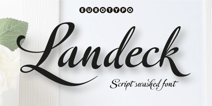 Landeck is an organic script font dramatically slanted giving a dynamic speedy direction. Specially designed for use in logotypes, advertising and packaging. It is interesting to note the use of free-flowing lettering to perform its own eye-catching, connected and unconnected. Landeck contain 473 glyphs with full OpenType features: swashes, ligatures, stylistics alternates and much more.
 - Malena by Tipo,
$69.00 Malena is a typographic family created by Lentino and Muhafara like a shared working project which integrates both views on typography as a whole. Malena is intended to be used in lengthy texts with a wide range of variables, having a striking contrast, with consistent features and standard performance, Ideal to be used in paper with very good finish.
 - Drystick Geo Grotesk by deFharo,
$14.00 Drystick is a Sans Serif typographic family of Geo-Grotesque style with 8 pesos plus the italic versions all include small capital letters the symbol of Bitcoin (b #) and other cryptocurrency symbols. It is a geometric typography, minimalist, with neo-grotesque modulations. The typeface has alternative letters and numbers, small caps and advanced OpenType functions. The Italic versions have some of their own characters (&, @, Q, a, g, y), these versions have many optical corrections to balance the deformations created in many curves by the mere inclination of the letters, which in the case of This typography is 9 °. The drawn of the vectors is careful to obtain smooth curves and elegant appearance, the thicker versions have ink traps in the joints of the joints to use in small sizes. The Metric and the Kerning of all the versions I have reviewed individually to obtain maximum readability in any type of text and size.
 - Enjoy by Andinistas,
$26.00 Enjoy is a font family designed by CFCG. Its 5 fonts work in groups or independently. When used to complement illustrations or spontaneous projects requiring organic fonts, in Enjoy you will find expressive attributes reflected in uppercase, lowercase and numbers written with brush and fluid ink. Its strategies were carefully written providing greater handcrafted realism in its bonds and alternatives to create with eloquent letters at the beginning, middle or end of the word without losing order and readability. Enjoy contains many special textures to maximize its typographical benefits activating opentype buttons. Enjoy contains an authentic worn texture reflected in a variety of alternate characters and ligatures. Due to its maximum and coordinated cursive logic, captivates the interest in graphic design or advertising for cafeterias, sales of plants, bakeries, etc. When complement illustrations or spontaneous projects requiring organic fonts, with Enjoy you will find expressive attributes reflected in uppercase, lowercase and numbers written with brush and fluid ink.
 - New Moon by Melissa Lapadula,
$14.95This font has been derived from different transformations of the moon transcending into different moods which affect the world. A full moon can cause human beings to be aggressive. While a new moon is a good time for new beginnings. This font can function as headings and subheadings. - Blusty by Craft Supply Co,
$15.00 Blusty Font Duo is an handwritten script font based on the expression of real handwriting, lets you transform type into an exciting and beautiful piece of work. The irregular, hand-lettered look adds a real human touch to things and comes along with a lot of loving details.
 - Bartkey by Zamjump,
$11.00 Bartkey is a modern sans serif display all caps font. The font is distributed in OpenType format including kerning and other features. Ideally suited for a space mood, future tech and innovative products great for big titles and small subtexts. Combine with images to really wow them humans.
 - Smoothy by Resistenza,
$29.00 Hello Smoothy - brush script with attitude! This font is the perfect mix between freshy and serious. Urban, modern, handwritten, sign painting inspired, Smoothy is perfect for various occasions. Wedding invitations, T-shirts or cards, Instagram posts, is very flexible. Ligatures and stylistic alternates makes this font even more "human".
 - Pontiac by S&C Type,
$15.00 Pontiac is a sans serif OpenType font designed by Fanny Coulez and Julien Saurin in Paris. Pontiac is a functional font with something more, something warm, geometric but human, something distinctive, something French finally. We also designed an inline Art Deco version of this font, Pontiac Inline. Merci beaucoup!
 - Leonardian by Cubo Fonts,
$25.00 The Vitruvian Man is a world-renowned drawing created by Leonardo da Vinci circa 1487. The drawing depicts a male figure in two superimposed positions with his arms and legs apart and simultaneously inscribed in a circle and square. The drawing and text are sometimes called the Canon of Proportions or, less often, Proportions of Man.The drawing is based on the correlations of ideal human proportions with geometry described by the ancient Roman architect Vitruvius in Book III of his treatise De Architectura. Vitruvius described the human figure as being the principal source of proportion among the Classical orders of architecture. That's how "Leonardian" was buid as well: a quest for ideal proportions, a harmonious design springing up from a geometric "collision", circle and square's intersections.
 - Rhino by Canada Type,
$24.95This is Canada Type's second Helmut Matheis revival. Rhino is what Matheis did under the name Mobil for the Ludwig & Mayer foundry in 1960. It's an informal text face with some attractive irregularities relating to the traits of handwriting. The influence of the human hand can be clearly seen in letters like the A, J, Q, R, T and pretty much all of the lowercase. Though obviously inspired by and tooled after the human touch, Rhino's functionality extends to even a page or two of text setting. Aside from its functionality, Rhino gives short paragraphs what the classic immersive-reading fonts are not built for: immediate friendliness and natural humility. A few alternates and ligatures are included within the font. - Future Bugler by Breauhare,
$35.00 Future Bugler is a font based on the second logo created by Harry Warren in early 1975 for his sixth grade class newsletter, The Broadwater Bugler, at Broadwater Academy in Exmore, Virginia, on Virginia’s Eastern Shore. This font can convey several perspectives or moods. It can suggest a space-age vision of the future, or an art-deco perspective of the future as in the movie “Sky Captain and the World of Tomorrow”. It also communicates the idea of high performance, or extreme sports, without the grunge. Also be sure to check out the upright version of this font, Future Bugler Upright, available separately. Digitized by John Bomparte. Additional tags: NFL, NFL Network, NFLN
 - Quick Silver FS by Designova,
$23.00 Quick Silver FS is unique, fresh and cute handwritten font for branding / logo design / logotypes / greeting cards / promotional graphics and anything in between. Quick Silver FS is inspired from modern era cartoon titles and completely handmade with passion and perfection. Extended Character Sets Along with the basic Latin character set, we have added Western European, Central European, South Eastern European character sets for your convenience. Advanced Kerning We have performed advanced, in-depth kerning for all possible letter combinations. What You Get This font being a handmade typeface, comes with only single weight (Regular). CREDITS: Font designed by Lis at Fontastica, produced by Fontastica, distributed by Designova. Created with ProCreate and Fontself on iPad Pro.
 - Ponderous by Dawnland,
$13.00 He's heavy! He's huge! He's PONDEROUS! Regular & outlined hand drawn upper case display font for maximum impact headlines - or make your text dance combining the different sizes & variants of the font - Regular, Condensed & Expanded! Lowercase letters hold slightly altered versions of the uppercase letters for a trustworthy and hand drawn look!
 - Ellora by 99TyppeFoundry,
$10.00 Ellora , a captivating piece of typographic art, depicts a harmony between traditional elegance and modern simplicity. With a mesmerizing design, each letter is a carefully carved work of art, creating a stunning yet easily understandable appearance. The combination of sans-serif style with a human touch elevates Ellora beyond a mere set of letters. Every curve and angle is meticulously chosen to create a captivating visual harmony, making it the perfect choice for designs that prioritize clarity and elegance. With balanced letter heights and precision in every detail, Ellora establishes a timeless classical ambiance that is invaluable. It's more than just a font; it's an expression of beauty that transcends words. With each character, Ellora Humanis Typeface radiates timeless magnificence and undeniable relevance in contemporary design. As you explore each letter, you'll feel the profound artistic beauty, inviting you to reflect on the richness of aesthetics and tranquility offered by this perfect typography. Ellorai s not just a communication tool; it's a living work of art, telling its beautiful story on every page
 - Molto by TypeTogether,
$49.00 Xavier Dupre’s Molto font family is a tonal master, creating tenderness in a slab serif and tempering toughness with flourishes. Slab serifs created their original niche by their ability to grab attention and overwhelm, which caused them to be seen as strong, dominant, and desired fonts, especially in advertising. Slab serifs are the result of placing defined edges on something meant to take up an inordinate amount of space, rather than meant to be graceful. Molto updates this concept to allow a greater, and gentler, range in the lighter weights. Molto’s nine weights are defined by their intended use. The two extreme weights (Hair and Fat) act as display partners for magazines, titles, and posters. The Hair weight is runway ready with its sturdy serifs, breathy internal space, and stable lettershapes that were designed both to perform and impress. Molto’s Fat weight packs maximum punch in a believable way. Its wide and deliberate curves contrast against thin connections and landing strip stems. Molto can be put to perfect use in a fashion magazine using swashy Hair headlines set against its darkest weight. Molto’s seven intermediate weights, with their classic and legible shapes, are meant for texts of all sizes. The notches on diagonals, distinct numerals, and acute terminals grant benefits from caption sizes up to headings. Molto’s refined light weights and punchy heavy weights set the stage for a swashy surprise — alternate capital letters act as refined garments laid atop its concrete skeleton. The Molto font family rejects saving space in favour of intensifying shapes, placing maximum weight on the edges for better legibility and impact. Latin-based digital and printed designs will benefit from Molto’s design voice and breadth. This means UI, video, and online text, and print materials like dictionaries, packaging, advertising, and branding can all put Molto’s robust forms to multipurpose use. Molto successfully creates balance in a slab serif design: an opinionated and striking type family, stalwart in captions and exuberant in display, thanks to swashes which add some originality to the slab category.
 - Infoma by Stawix,
$40.00 Infoma is designed based on simplicity results in easy and comfortable usage which allows Infoma to perform flawlessly in every layouts. If meticulous, flexible, eye-pleasing and easy to use typeface you are looking for, we recommend Infoma. Infoma consists of 18 styles from Line to Ultra, supporting many OpenType features, such as tabular numerals, inferiors & superiors, numerators & denominators, fractions, ligatures etc.
 - Carole Sans by Schriftlabor,
$34.00 Carole Sans is the sibling to Carole Serif, a modern interpretation of the old-style serif model. Carole Sans follows the same skeleton and proportions, while creating a strong distinct texture with a wider range of weights. It performs great in small sizes, yet offers tons of character for packaging or editorial design. Designed by Matz Gasser and Helene Krieger.
 - GaoYah Display by Stones Design Lab,
$20.00 GaoYah Display Thin is a type in very thin line, GaoYah means Elegance in Mandarin, some characters build in unique shapes can make a good memory. This font is suitable for huge titles display, in which way the line and detail shows elegance. It will make good performance in dark background as well. Including Basic English and Western Europe languages.
 - Carole Sans Variable by Schriftlabor,
$129.00 Carole Sans is the sibling to Carole Serif, a modern interpretation of the old-style serif model. Carole Sans follows the same skeleton and proportions, while creating a strong distinct texture with a wider range of weights. It performs great in small sizes, yet offers tons of character for packaging or editorial design. Designed by Matz Gasser and Helene Krieger.
 - Redoneta Rounded by Rafael Jordan,
$30.00 Redoneta Rounded is an extension of Redoneta font family created by Rafael Jordan, adding kindness to the rational geometry, keeping its workhorse vocation mixing efficiency and the beauty of simplicity. Redoneta Rounded is available in 6 weights and its matching italics. It has an extended collection of OpenType features, including seven stylistic sets to customize how performs in multiple ways.
 - Fram by Juraj Chrastina,
$29.00 Fram is an uppercase stencil typeface. It comes with a fine-tuned kerning, its extensive character set ensures multiple languages coverage and the design is adapted to different ranges of size through size-specific optical compensation. Fram L is intended for use at large sizes and Fram S with larger gaps guarantees good performance even when the size is reduced.
 - Pacifista by Suitcase Type Foundry,
$39.00 Pacifista takes advantage of the well-tested structure of our constructed typefaces, the directness and simplicity of which are by far the best suited to stencils. Straight lines, regular arcs and purity of drawing facilitate maintaining the maximum possible legibility even in a typeface that is practically devoid of any joining of strokes.
 - Wildest Grass by Sabrcreative,
$25.00 Elevate your design projects with the timeless charm of Kastangel Font, an exquisite handwriting signature typeface. Crafted with care, this font embodies the fluidity of human penmanship, adding a touch of sophistication to your creations. With its captivating uppercase characters, numbers, punctuations, and multilingual support, Kastangel Font offers versatility for various design applications.
 - Nouveau Nights JNL by Jeff Levine,
$29.00 The deep well of creativity that is the era of the hand lettered sheet music title page brings forth Nouveau Nights JNL. Re-drawn from a period example of the 1920s, this titling font perfectly captures the warm "human" look of pen and ink lettering, long before the advent of "perfect" digital type.