10,000 search results
(0.045 seconds)
- Roughmarker by 38-lineart,
$16.00 Roughmarker font consists of two handwritten scripts, a slant (regular) version and upright. This Script fonts are manually handwritten with quick and rough strokes. We write them on paper until we find a very proportioned form. Then we scanned and took the selected glyphs to be processed into a font. The biggest challenge in making textures fonts are the very many node points, many node points make the font processing performance a bit slow. At first we tried raising the node parameters to 2000-4000 points in one glyph. This is a big number, but if this number is lowered it will eliminate the impression of brush and natural look. We repeatedly look for gaps to minimize points so that the font capacity is not too large and comfortable when typed. This script font is equipped with ligature as well as several alternate according to handwriting habits, very effective in the sense of not too much but often used. This font is the great choice for contemporary brands, especially for businesses in fashion, urban style, websites, trends in architecture, cosmetics, and energetic lifestyle themes. An attractive typographic layout makes it also looks more premium in writing quotes.
 - Nebula Glorius by Struggle Studio,
$18.00 Give your typography designs a retro touch with the Glorius Nebula! Nebula Glorius is one of my fonts based on handwriting projects in 2021. This font is great for product logos, logos, clothing brand logos, vintage designs, and more.
 - Lust Hedonist by Positype,
$50.00 Check out the new Lust Pro & Lust Pro Didone to see how the series has grown and evolved. Confident, voluminous and versatile, Lust is an exercise in indulgence—an attempt to create something over the top and vastly useful. Lust Hedonist pushes contrast almost to the limit. The letterforms, especially the Script style are very self-indulgent for me, dare I say Hedonistic, and how I like to see letter masses taken to extreme contrast. The series unapologetically channels Herb Lubalin, but produced with a deliberate, contemporary twist. There is an intentional slyness infused in the letterforms—the extreme thick and thin lines flow effortlessly without becoming gratuitous. It’s always just enough, not too much. What makes the type series so appealing? The curves. When asked to describe the letterforms, most people unwittingly allude to the human form, using adjectives usually reserved for describing physical traits… creating all-too-familiar comparisons. Summerour has grown to accept this as unavoidable and reasonable given his acknowledgement of its influences and has provided nuances within the letterforms to accentuate that.
 - Fast Rewind by Wing's Art Studio,
$20.00 Fast Rewind: A Timeless Handwritten Script Font A handwritten brush script with a versatile, relaxed and nostalgic feel. This illustrative brush script owes its inspiration to the 1950s art direction typical of mainstream magazines and book covers. A relaxed hand-lettered title was often paired with illustrations of handsome couples or escapist scenes, encouraging readers to settle into the latest gripping story from authors such as Ray Bradbury, Donald Westlake or Arthur Miller. Fast Rewind aims to repurpose this vintage look for contemporary designers with two handwritten fonts, drawn in ink and brush, and then digitally mastered to maintain those all-important human imperfections. Included are the Regular and Alternative designs, with a complete set of uppercase and lowercase characters, along with numbers, symbols and language support. Also included are a variety of underlines and illustrations as seen in these visuals. Each style also comes with its own selection of extra glyphs to helps you achieve the perfect flow between characters and avoid tell-tale repetition. Thanks to all the great photographers who provided images for these visuals.
 - Sebastian Pro by Storm Type Foundry,
$32.00Sans-serif typefaces compensate for their basic handicap – an absence of serifs – with a softening modulation typical of roman typefaces. Grotesques often inherit a hypertrophy of the x-height, which is very efficient, but not very beautiful. They are like dogs with fat bodies and short legs. Why do we love old Garamonds? Beside beautifully modeled details, they possess aspect-ratios of parts within characters that timelessly and beauteously parallel the anatomy of the human body. Proportions of thighs, arms or legs have their universal rules, but cannot be measured by pixels and millimeters. These sometimes produce almost unnoticeable inner tensions, perceptible only very slowly, after a period of living with the type. Serifed typefaces are open to many possibilities in this regard; when a character is mounted on its edges with serifs, what is happening in between is more freely up to the designer. In the case of grotesques, everything is visible; the shape of the letter must exist in absolute nakedness and total simplicity, and must somehow also be spirited and original. - Little Boxes by Resistenza,
$39.00 A new happy handwritten sans serif font has arrived! Little Boxes has been designed with felt pen on smooth paper to create the illusion of human craft and then digitalized. Three different fonts Regular, slanted and dance. Optimized shapes to obtain the best readability without loosing the analogical feeling of the original designing tool, makes this font perfect both for printing and digital environments and it allows the use of the font on any project with different media supports. This fresh font family is ready for text, but check your opentype features window while using the font and discover a beautiful set of alternate letters. Create catchy words and add more fun to any layout, which makes it a perfect match for titles and display too. A friendly typeface to give a whimsical touch to your projects. We highly recommend using Little Boxes for App, web, ePub, digital Ads, Video games, and a great fitting for printing; headlines, posters, DIY hand-lettered artwork, books, holiday cards, invitations, T-shirts, labels, packaging, artisanal goods, etc.
 - Astrum by Fontex,
$40.00 Astrum is a very decorative script font using elegant caligraphic handwritten letters that are all mutually interconnected, creating a unique look & feel of a personalized human handwritting. Its clean and prefined lines makes Astrum very appealing and modern, although being very classical in its core essence. The idea for the creation of this font had originally came up from the need to create a beautiful design for Weddings, wedding occasions, etc., but none of the existing fonts were satisfactory - so I decided to create a new and unique typeface to fill this need. Letters and other characters are recognizeable by prefined ornaments, incorporated in a very subtle way. Whitespace between capital letters, lower-case letters, numbers and other characters are done in a way to minimize the need for kerning. The font Astrum, besides being a celebration of class and exclusivity, is a very luxurious and elegant handwritten font perfectly suited for Wedding cards. The character set for this font contains all western, central-european latin and cyrillic characters.
 - Mela by Resistenza,
$39.00 Mela was created with a pointed brush and walnut ink using thick brushstrokes. The original idea was to make a kind of urban graffitti with a fat brush, but the final result is more refined and elegant. Something new - light and bold together. The letters are a little bit slanted using sharp strokes, the brush gives the illusion of a fat-tipped marker. This handmade typeface has a lot of contrast, it brings together the beauty of the calligraphic shapes and strokes with the esthetics of a modern urban style. It creates a carefree feeling, contemporary, adding a perfect modern touch to your work. The possibilities for customized layouts are limitless, using the opentype ligatures and alternates to you make Mela your own. Mela Pro contains 473 glyphs: alternates, ligatures, icons, ornaments, and much more. Mela regular is limited to letters, figures and punctuation. Mela & Mela Pro are perfect for headlines and short texts. Use it for magazines, packaging, advertising, branding, posters, editorials, TV, movies and websites to give to your projects the unmistakable human touch of beautiful handwritten letters.
 - State Machine by Barnbrook Fonts,
$30.00 State Machine is a display typeface inspired by lettering applied to American and Russian Cold War-era military vehicles. It also features an alternate character set inspired by 1970s hand-made political banners. The name State Machine is a term found in both political theory and computer programming. The theoretical definition describes the political and bureaucratic organisation of a state as well as the repressive state apparatuses such as the military and police. Max Weber describes the state as "a human community that (successfully) claims the monopoly of the legitimate use of physical force within a given territory". In computer programming, a state machine is a mathematical model of computation used to design computer programs. It is conceived as an abstract machine that is in one of a finite number of states. It can change from one state to another when initiated by a triggering event or condition. Taken at a wider conceptual level, when these two definition are combined the meaning becomes analogous to a tool (such as a philosophical idea) with which to transform a society.
 - Lust Pro by Positype,
$50.00 Confident and versatile, Lust Pro™ is an exercise in indulgence—an attempt to create something over the top and vastly useful. If Lust Pro seems both new and familiar, that’s because it is. The series unapologetically channels Herb Lubalin, but produced with a deliberate, contemporary twist. There is an intentional slyness infused in the letterforms—the extreme thick and thin lines flow effortlessly without becoming gratuitous. It’s always just enough, not too much. What makes the type series so appealing? The curves. When asked to describe the letterforms, most people unwittingly allude to the human form, using adjectives usually reserved for describing physical traits… creating all-too-familiar comparisons. Summerour has grown to accept this as unavoidable and reasonable given his acknowledgement of its influences and has provided nuances within the letterforms to accentuate that. Intended to be set large, the typeface boasts 3 widths and 5 weights and matching italics for both the Regular and Didone variants (that’s 60 fonts in total), making it perfect for editorial use and a highly flexible solution for any display need.
 - Parabrite by Okaycat,
$19.50Parabrite arrives as a vision of the future. The future is brite - Parabrite - this is unavoidable now. The composition of Parabrite is found to be based on a set of technical behaviors defined from a set of four sub-glyphs and their interactions, similar to the make up of our D.N.A. (A,C,G,T). Likewise, Parabrite's block matrix is composed of four units (S,L,I,C). These units are only allowed to group together according to predefined set of mathematical rules, and affect each other symbiotically. The smallcase letters stand five feathers high, while the capitals add an extra two feathers width. Parabrite is extended, containing the full West European diacritics & a full set of ligatures, making it suitable for multilingual environments & publications. Use Parabrite when you dream of a future world. Since Parabrite is adapted to be quickly read by a wide assortment of electronic scanners, legibility to humans suffers a little, although robots report it is much easier on the eyes. They are happy to read it for you too, if you are having trouble. - Nutmeg by W Type Foundry,
$25.00 Nutmeg is a geometric typeface with a slight flavored touch. Although its structure is stick to the traditional forms, its details transform this typeface in a boldly project that separates it from other geometric fonts. Nutmeg’s texture can be perceived as a clean typeface that is comfortable to the human eye, furthermore, if you use it in big sizes Nutmeg’s details can be seen as a display font. Under these two ways of perceiving this typefamily, we took the decision of split this type project in two families: a cleaner and more rational Nutmeg versus a Headline version that has more flavored details at the end of the characters. Designed with powerful OpenType features in mind, each weight includes alternate characters, ligatures, fractions, special numbers, arrows, extended language support and many more… Perfectly suited for graphic design and any display/text use. The 36 fonts are the first part of a larger Nutmeg family. We’re proud to introduce: Nutmeg. Learn about upcoming releases, work in progress and get to know us better! On Instagram W Foundry On facebook W Foundry wtypefoundry.com
 - Neutraface Text by House Industries,
$33.00 Although better known for his residential buildings, Richard Neutra’s commercial projects nevertheless resonate the same holistic ecology—unity with the surrounding landscape and uncompromising functionalism. His attention to detail even extended to the selection of signage for his buildings. It is no wonder that Neutra specified lettering that was open and unobtrusive, the same characteristics which typified his progressive architecture. House Industries brings the same linear geometry to Neutraface without sacrificing an unmistakably warm and human feel. FEATURES AUTOMATIC SMALL CAPS: If you specify “Small Caps”, InDesign and Photoshop will automatically substitute the true small caps charac- ters as well as the corresponding figures and punctuation for any lowercase characters. NEUTRAFACE TEXT ALTERNATES: Neutraface Text contains several stylistic alternate characters. LIGATURES: This feature is on by default. It will substitute a long list of “f” and “t” ligatures. For example, open InDesign or Photoshop and type “ff” or “tt”. Like all good subversives, House Industries hides in plain sight while amplifying the look, feel and style of the world’s most interesting brands, products and people. Based in Delaware, visually influencing the world.
 - Relato by Emtype Foundry,
$69.00 Relato has a low contrast and “a muscular” structure that makes it useful for setting longer text. In display sizes it has a variety of details that lends it a unique and personal expression. The formal principle of the serif, the variety of terminal strokes and the combination of curves and semi-straight lines gives the Relato a more “human” flavor. The inspiration for the design comes from different traditional calligraphic styles. The upper case letter, for example, is based on roman capitals from the Rennaissance, whereas the lower case relates to humanist handwriting. Even so, Relato is a decidedly contemporary typeface, proposing individual ideas on the design of type. The italic has a distinct typographic color thanks to the construction principle of broken lines. The bold weights have an increased contrast in the union of the strokes which helps improve legibility in small sizes and reinforce their personality in display sizes. The family consists of a Regular version, Italic, Small caps, Semibold and Bold. For a sans serif version of Relato, please see Relato Sans.
 - Lust Pro Didone by Positype,
$50.00 Confident and versatile, Lust Pro™ is an exercise in indulgence—an attempt to create something over the top and vastly useful. If Lust Pro seems both new and familiar, that’s because it is. The series unapologetically channels Herb Lubalin, but produced with a deliberate, contemporary twist. There is an intentional slyness infused in the letterforms—the extreme thick and thin lines flow effortlessly without becoming gratuitous. It’s always just enough, not too much. What makes the type series so appealing? The curves. When asked to describe the letterforms, most people unwittingly allude to the human form, using adjectives usually reserved for describing physical traits… creating all-too-familiar comparisons. Summerour has grown to accept this as unavoidable and reasonable given his acknowledgement of its influences and has provided nuances within the letterforms to accentuate that. Intended to be set large, the typeface boasts 3 widths and 5 weights and matching italics for both the Regular and Didone variants (that’s 60 fonts in total), making it perfect for editorial use and a highly flexible solution for any display need.
 - Toboggan by Jeremy Nelson,
$11.00 TOBOGGAN | Utility Display Typeface Toboggan is a utility display typeface with classically influenced proportions, calligraphic elements, and sporting roots. With 9 weights, upright, and true italics, Toboggan comes in a total of 18 fonts. With flexibility from a crisp Thin weight to an imposing Super in both upright and italic, Toboggan thrives as a utility font spanning the columns of extended text, in artful editorial layouts, eye-catching motion graphics, or commanding headlines in a title role. First drafted around the frame of a perfect circle, Toboggan evolved by taking inspiration from the sweeping contours of the automotive world, expanding into wider proportions, and adopting an abrupt set of constructed features. Sturdy with the spirit of sport, Toboggan’s final form preserves a human connection through features of the written hand, while minimal contrast and its chopped terminals bring a decisive tone with clinical precision. Features: - Nine weights and true Italics - Multilingual support (Extended Latin - Includes Western European coverage and more) - OpenType features including small-caps, stylistic sets, contextual punctuation & more - Extensive numeral sets including stylistic sets, circled, and squared numbers
 - Buffalo Bill by FontMesa,
$35.00 Buffalo Bill is a revival of an old favorite font that’s been around since 1888, the James Conner’s Sons foundry book of that same year is the oldest source I've seen for this old classic. If you're looking for the font used as the logo for Buffalo Bill’s Irma Hotel in Cody Wyoming please refer to the FontMesa Rough Riders font. New to the Buffalo Bill font is the lowercase and many other characters that go into making a complete type font by today’s standards. The Type 1 version is limited to the basic Latin and western European character sets while the Truetype and OpenType versions also include central and eastern European charcters. William F. (Buffalo Bill) Cody called America’s Greatest Showman was one of the United State’s first big celebrity entertainers known around the world, millions of people learned about the Old West through Buffalo Bill’s Wild West shows which traveled throughout the United States and Europe. William Cody, at age eleven, started work on a cattle drive and wagon train crossing the Great Plains many times, he further went on to fur trapping and gold mining then joined the Pony Express in 1860. After the Civil War Cody went on to work for the Army as a scout and hunter where he gained his nickname Buffalo Bill. In 1872 William Cody started his entertainment career on stage in Chicago along with Texas Jack who also worked as a scout, the Scouts of the Prarie was a great success and the following year it expanded to include Wild Bill Hickok and was eventually named The Buffalo Bill Combination. By 1882 Texas Jack and Wild Bill Hickok had left the show and Buffalo Bill conceived the idea for the traveling Wild West Show using real cowboys, cowgirls, sharpshooters and Indians plus live buffalo and elk. The Wild West shows began in 1883 and visited many cities throughout the United States. In 1887 writer Mark Twain convinced Cody to take the show overseas to Europe showing England, Germany and France a wonderful and adventuruos chapter of American history. The shows continued in the United States and in 1908 William Cody combined his show with Pawnees Bill’s, in 1913 the show ran into financial trouble and was seized by the Denver sheriff until a $20,000 debt (borrowed from investor Harry Tammen) could be paid, Bill couldn't pay the debt and the loan could not be extended so the assets were auctioned off. William Cody continued to work off his debt with Harry Tammen by giving performances at the Sell’s-Floto Circus through 1915 then performed for another two years with other Wild West shows. William F. Cody passed away in 1917 while visiting his sister in Denver and is buried on Lookout Mountain joined by his wife four years later. Close friend Johnny Baker, the unofficial foster son of William Cody, began the Buffalo Bill Memorial Museum in 1921, over the years millions of people have visited William Cody’s grave and museum making it one of the top visitor attractions in the Denver area. William F. Cody romantisized the West creating the Wild West love affair that many still have for it today through books and cinema.
 - Selfie by Lián Types,
$37.00 ATTENTION CUSTOMERS :) There's a new Selfie available, have a look here; Selfie Neue is better done and more complete in every aspect. However, you can stay here if you still prefer the classic version. -But first, let me take a Selfie!- said that girl of the song and almost all of you at least once this year. While some terms and actions get trendy, some font styles do it too. It wouldn't be crazy to combine these worlds, in fact it happens often. Selfie is a connected sans serif based in vintage signage scripts seen in Galerías of Buenos Aires. These places are, in general, very small shopping centres which pedestrians sometimes use as shortcuts to get to other parts of the city. Their dark corridors take you back in time, and all of a sudden you are surrounded by cassettes, piercings, and old fashioned cloth. For some reason, all these shops use monolined geometric scripts. Surely, neon strings are easier to manipulate when letterforms have simple shapes. My very first aim with Selfie was to make a font that would serve as a company to those self-shot pictures that have become so popular nowadays. However, the font turned into something more interesting: I realised it had enough potential to stand-alone. Selfie proves that geometry itself can be really attractive. In this font, elegance is not achieved with the already-known contrast between thicks and thins of calligraphy, but with the purity of form. Its curves were based in perfectly shaped circles which made the font easy to be used at different angles (some posters show it at a 24.7º angle) without having problems/deformities. In addition to its nice performance when used over photographs, the font can be a good option for packaging and wedding invitations. TIPS Adding some lights/shadows between letters will for sure catch the eye of the viewer: Words will look as if they were made with tape/strings; so trendy nowadays. Try using Selfie at a 24.7º angle so that the slanted strokes become perfectly vertical. Having the decorative ligatures feature (dlig) activated is a good option to see letters dance. TECHNICAL It is absolutely recommended to use this font with the standard ligatures feature (liga) activated. It makes letters ligate perfectly and also improves the space between words.
 - Adoria by Sarid Ezra,
$17.00 Adoria is a minimalist logo font with unique edge that will make your logo and design looks more simple and modern. With the unique characteristic lowercase, this font can make your logo even more stunning. You can use this font for any purpose, especially to make logotype. You can mix and match the uppercase and lowercase to make your logo more advanced. Adoria also comes with alternates that's why it's called deluxe logo font. This font also comes with number, symbol, and multilingual support!
 - HeroesX by Mightyfire,
$10.00 If you are looking for a font that have strong looks, meet HeroesX. We create HeroesX with a firm, strong and tough looks. This font is perfectly suit for book title, gymnastic logo, sport logo, game logo and any other creative arts.
 - Belgian Chocolate by Double Z Studio,
$16.00 Belgian Chocolate Font. Carefully crafted. It is a sweet chic, beautiful, modern, and elegant script. Smoothly flowing, perfect for designing blog logo, website logo, print ads, book covers, film covers, apparel, cards, logos, posters, etc. Opentype features give you more alternatives in designing.
 - Planet Gamers by Sarid Ezra,
$17.00 Introducing, Planet Gamers, a serif logo font with unique ligatures! Planet Gamers is a serif based font with unique and carefully crafted ligatures that will make your logo stand out clean and modern. You can use this font for any purpose, especially to make logotype. This font is suitable for e-sport logo, game, or hi-tech company logo. This font also support multilingual.
 - Arando Script by Mans Greback,
$59.00 Arando Script is a retro script typeface. A perfected calligraphy with uniquely beautiful letterforms, Arando Script is a professional quality handwriting font family. Drawn and created by Mans Greback in 2022, it is perfect for a formal restaurant headline or feminine logotype design. Arando Script is provided in four styles: Regular, Bold, Italic and Bold Italic, which compliment each other and maximise your options and design experience. The font is built with advanced OpenType functionality and has a guaranteed top-notch quality, containing stylistic and contextual alternates, ligatures and more features; all to give you full control and customizability. It has extensive lingual support, covering all Latin-based languages, from Northern Europe to South Africa, from America to South-East Asia. It contains all characters and symbols you'll ever need, including all punctuation and numbers.
 - Rocklogo by Gaslight,
$25.00 Rock Logo is an all caps, display typeface, inspired by old cool rock/metal band logos. It has many alternates, swashes and ligatures.
 - Monicallisa by Maulana Creative,
$12.00 Monicallisa Feminine Logo Script Font Monicallisa Feminine Logo Script Font is handwritten modern stylish fonts, combines from classic to modern typeface with a elegant baseline. Can be used for various purposes, such as headings, signature, logos, wedding invitation, t-shirt, letterhead, signage, lable, news, posters, badges etc.
 - Skribblugh by Tom Chalky,
$12.00 This was a creative experiment. Writing for a long period of time prior to starting erased any inhibitions that prohibited forming natural, authentic letters and by adding more duration the hands became sore and weak. Allowing minimal control, and a more eccentric outcome. It was a real slog, but totally worth it. Skribblugh is a wobbly, aesthetically pleasing, and obviously handwritten typeface full of character and versatility. Within a modern design; It adds a human’s touch, a final note, a signature. And within a playful, colorful one it helps exaggerate the atmosphere, bringing playfulness and warmth to the center of the stage. With four choices for every uppercase and lowercase letter, there are plenty of opportunities to make designs look personal and relatable!
 - Mobius Infinity by WAP Type,
$15.00 Font with detailed letters that work great as logos or intricate, attention grabbing titles. Mobius Infinity is a special font for your logo & branding
 - Schein by Almarkha Type,
$29.00 Schein – Sans & Slab inspired by the famous minimalist logo and perfect for the purposes of designing templates, brochures, videos, advertising branding, logos and more.
 - Heycold by FadeLine Studio,
$15.00 Heycold is a new beautiful and modern display font! This fun font has cute, round, unique and fancy font characters. Made specifically with attention to appearance, aiming to give happiness to everyone who uses it! With a style like this, Heycold will be suitable in use for comics, logos, branding projects, homeware designs, product packaging, mugs, quotes, posters, shopping bags, logo's, t-shirts, book covers, name cards, invitation cards, greeting cards, and all your other lovely projects.
 - Cutie Cat by Goodigital13,
$20.00 You can use it as a logo, badge, insignia, packaging, headline, poster, etc signature, stationery, logo, typography quotes, magazine or book cover, website header, flyer, clothing, branding, packaging design and more. suitable for logo, branding, greeting card, poster and any design that you create. perfect for many different project such as logos & branding, invitation, stationery, wedding designs, social media posts, advertisements, product packaging, product designs, label, photography, watermark, special events or anything.
 - Hexore by Almarkha Type,
$29.00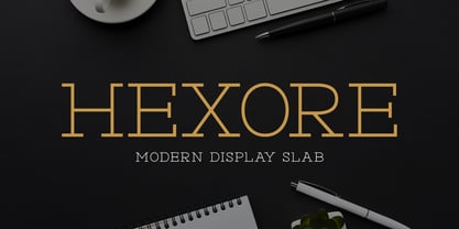 ntroducing Hexore – Modern Display Slab inspired by the famous minimalist logo, perfect for the purposes of designing templates, brochures, videos, advertising branding, logos and more.
 - Modesfa by Almarkha Type,
$33.00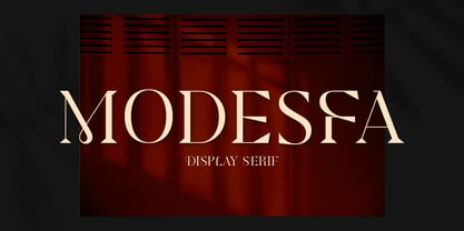 Introducing Modesfa – Modern Display Serif inspired by the famous minimalist logo perfect for the purposes of designing templates, brochures, videos, advertising branding, logos and more.
 - Quinger by Almarkha Type,
$33.00 Introducing Quinger - Unique Sans Display inspired by the famous minimalist logo perfect for the purposes of designing templates, brochures, videos, advertising branding, logos and more.
 - Luxoorea by Almarkha Type,
$25.00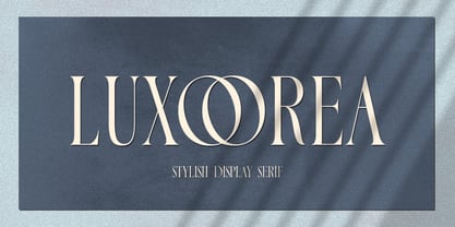 Introducing Luxoorea – Stylish Display Serif inspired by the famous minimalist logo perfect for the purposes of designing templates, brochures, videos, advertising branding, logos and more.
 - Delaproza by Almarkha Type,
$29.00 Introducing Delaproza – Modern Serif font inspired by the famous minimalist logo perfect for the purposes of designing templates, brochures, videos, advertising branding, logos and more.
 - Sangira by Almarkha Type,
$29.00 Introducing Sangira - Modern Ligature Serif inspired by the famous minimalist logo, perfect for the purposes of designing templates, brochures, videos, advertising branding, logos and more.
 - Glamorez by Almarkha Type,
$35.00 Introducing Glamorez - Luxury Display Serif inspired by the famous minimalist logo perfect for the purposes of designing templates, brochures, videos, advertising branding, logos and more.
 - Interrogator Stencil by Typodermic,
$11.95 Interrogator Stencil. This is not your average typeface. It’s a weapon in your design arsenal, engineered for maximum impact. With its military-inspired design and crosshair divisions, Interrogator Stencil is built to command attention and convey authority. Its technical style makes a bold statement, lending your message an assertive accuracy that cannot be ignored. Whether you’re creating a poster for a sci-fi blockbuster or designing a logo for a cutting-edge tech company, Interrogator Stencil is the perfect typeface to elevate your designs to the next level. This font is not for the faint of heart. It’s for those who demand perfection, who refuse to settle for anything less than the best. So if you’re ready to take your designs to the next level, gear up with Interrogator Stencil and get ready to dominate the battlefield of graphic design. Most Latin-based European writing systems are supported, including the following languages. Afaan Oromo, Afar, Afrikaans, Albanian, Alsatian, Aromanian, Aymara, Bashkir (Latin), Basque, Belarusian (Latin), Bemba, Bikol, Bosnian, Breton, Cape Verdean, Creole, Catalan, Cebuano, Chamorro, Chavacano, Chichewa, Crimean Tatar (Latin), Croatian, Czech, Danish, Dawan, Dholuo, Dutch, English, Estonian, Faroese, Fijian, Filipino, Finnish, French, Frisian, Friulian, Gagauz (Latin), Galician, Ganda, Genoese, German, Greenlandic, Guadeloupean Creole, Haitian Creole, Hawaiian, Hiligaynon, Hungarian, Icelandic, Ilocano, Indonesian, Irish, Italian, Jamaican, Kaqchikel, Karakalpak (Latin), Kashubian, Kikongo, Kinyarwanda, Kirundi, Kurdish (Latin), Latvian, Lithuanian, Lombard, Low Saxon, Luxembourgish, Maasai, Makhuwa, Malay, Maltese, Māori, Moldovan, Montenegrin, Ndebele, Neapolitan, Norwegian, Novial, Occitan, Ossetian (Latin), Papiamento, Piedmontese, Polish, Portuguese, Quechua, Rarotongan, Romanian, Romansh, Sami, Sango, Saramaccan, Sardinian, Scottish Gaelic, Serbian (Latin), Shona, Sicilian, Silesian, Slovak, Slovenian, Somali, Sorbian, Sotho, Spanish, Swahili, Swazi, Swedish, Tagalog, Tahitian, Tetum, Tongan, Tshiluba, Tsonga, Tswana, Tumbuka, Turkish, Turkmen (Latin), Tuvaluan, Uzbek (Latin), Venetian, Vepsian, Võro, Walloon, Waray-Waray, Wayuu, Welsh, Wolof, Xhosa, Yapese, Zapotec Zulu and Zuni.
 - Droid Serif by Ascender,
$92.99 The Droid Serif Pro Family (4 fonts) is a contemporary serif typeface family designed for comfortable reading on screen. The font is slightly condensed to maximize the amount of text displayed on small screens. Vertical stress, sturdy serifs and open forms contribute to the readability of Droid Serif while its proportion and overall design complement its companion Droid Sans. The fonts were designed by Steve Matteson, the Type Director at Ascender Corporation. The Droid Serif Pro Family (4 fonts) includes Latin 1 and WGL character sets, along with Old Style Figures (requires an application that support advanced OpenType typographic features).
 - Neue Augenblick by Harmnessless Type,
$40.00 Neue Augenblick is a modern contemporary Germany-esque grotesk. This Font face carries a powerful mechanical and industrial feel, it is inspired by aesthetic personality of beautiful Panzerkampfwagen and Post-war Brutalist Architectural. There are ten weights, ranging from Thin to Black, each with oblique italics and plenty of alternates. Neue Augenblick comes with attention-grabbing ink traps make it feels more contemporary. Various opentype features from stylistic alternates, multilingual extended latin support, ligatures, discretionary ligatures, fractions, arrows, scientific numerals, catchwords set, icons and more. Neue Augenblick is suited for embrace both maximalism or minimalism design works for designers to play with.