10,000 search results
(0.037 seconds)
- Linotype Funny Bones by Linotype,
$29.00Linotype Funny Bones is part of the Take Type Library, chosen from the contestants of the International Digital Type Design Contests of 1994 and 1997. The font was designed by the German artist Ingo Preuss and is available in two weights, one and two. Linotype Funny Bones one consists of two different alphabets containing only capital letters and offers a variety of interesting combinations. Weight two and one set of capitals of weight one are somewhat light and delicate, while the other set of capitals of weight one are of a strongly constructed nature, which makes for a good contrast. The carefully constructed details of the font detract from its legibility, but Linotype Funny Bones is perfect for short texts and headlines in point sizes larger than 12. - Thurbrooke by Greater Albion Typefounders,
$18.50 Thurbrooke is an early 20th century inspired display family, offering two sizes of Roman capitals. Five typefaces are offered in the Thurbrooke family. The Regular face is shaded in horizontally engraved lines and suggests something of vintage advertising captions. A reversed 'Reverso' face, transposing black and white space is offered, as is a 'Black' face with solid letterforms. The remaining two faces are a bit more specialised. Thurbrooke 'Banner' is the latest in our popular line of masthead or cartouche faces-very impressive for banner headings. Thurbrooke Initials is a set of initial capitals, which blend in perfectly with Thurbrooke Reverso, or which also make splendid drop capitals. Why not explore some (or all) of the elements of the Thurbrooke family today, and introduce some early 20th century inspired colour to your work?
 - LC Gianluca by Compañía Tipográfica de Chile,
$29.00 Gianluca is a typeface of glyphic serif, or “flare” inspired by Aldo Novarese’s fonts from the 70s, with a fresh and modern touch. It is a type family that can be elegant in its normal version, or very playful, to compose from extensive texts to flashy headlines in books, magazines, labels, posters, branding and more. It has many discretionary ligatures in capital letters (with its diacritics) to play with the text, 5 stylistic sets: among them medieval style or references to Herb Lubalin, and some special letters. Gianluca consists of 5-weight fonts, from Thin to Extra Bold. All of them with matching italics. It has a nice set of small capitals, modern and old style numbers, and capital-sensitive punctuation, among other striking glyphs. Play with Gianluca!
 - Kingsbury Condensed SG by Spiece Graphics,
$39.00 This delicate condensed typeface evokes a distant 1930s style with its pointed and sloping capital letters. The splayed capital M gives the design a very a definite retro flavor. But deco quickly becomes modern day with the use of slab serifs. The thick body of Kingsbury Condensed is neatly anchored to long thin serifs giving the face an unusual and at the same time contemporary appearance. Great for book covers and large capital letter assignments where a modern revivalist look is appropriate. Kingsbury Condensed Book is also available in the OpenType Std format. Some new characters have been added to this OpenType version. Advanced features currently work in Adobe Creative Suite InDesign, Creative Suite Illustrator, and Quark XPress 7. Check for OpenType advanced feature support in other applications as it gradually becomes available with upgrades.
 - FF Bauer Grotesk by FontFont,
$50.99 FF Bauer Grotesk is a revival of the metal type Friedrich Bauer Grotesk, released between 1933 and 1934 by the foundry Trennert & Sohn in Hamburg Altona, Germany. The geometric construction of the typeface, infused with the art déco zeitgeist of that era, is closely related to such famous German designs as Futura, Erbar, Kabel and Super Grotesk that debuted a few years earlier. However, Bauer Grotesk stands out for not being so dogmatic with the geometry, lending the design a warmer, more homogenous feeling. The oval “O” is a good example of that, as well as characteristic shapes like the capital M or the unconventionally differing endings of “c” and “s” which make for a less constructed look. Watch the FF Bauer Grotesk introduction video on Vimeo
 - Business Helpers JNL by Jeff Levine,
$29.00 Duluth, Minnesota's Horace P. Brouillet Syndicate (later known as Syndicuts, Inc.) was one of a number of stock cuts providers to the letterpress trade in the decades preceding paper, then electronic clip art. Brouillet's "Typeps" catalogs offered a wide range of images covering numerous subjects, as well as cartoons, catch words and automotive logos. Many of these images have been reproduced in a number of royalty-free clip art publications over the years. Twenty-Six of these newly-redrawn catch words are found within Business Helpers JNL in two styles. On the capital keys are the original white-on-black designs, modeled from the vintage source material. The lower case keys have the phrases separated from the decorative ovals and are in black type.
 - Pomarosa by Andinistas,
$29.95 Pomarosa is a typographic family that consists of capital roman letters and twisted lower case letters set randomly. Each one of them is characterized by its multiple calibers and widths. Pomarosa was planned to accompany graphic works done with different techniques and materials such as hand made collages. The narrowness of its glyphs involve its audience with abstract imprecision. Its spirit was born between fabric snippets intervened with pencil and painting. Its three members work in group and also in words or phrases with a non-finished look. Regular Pomarosa and Standard Pomarosa have 260 glyphs each. Both of them simulate to have been done by a right-handed person that works with its left hand. Pomarosa dingbats has 26 illustrations useful for frames and textures.
 - Gabriel Sans by Fontfabric,
$45.00 Gabriel Sans is a font family inspired by the original Sans Serif fonts of the Transitional age like Futura and Grotesk, but with a modern twist. It is clean, elegant and straight-to-the-point. It has features similar to the classic Helvetica - like the endings of the capital C - but goes one step further. It also has a quadratic look, which makes it easily distinguishable and easy to use - the height is nearly as long as the width. It is professional and equally suited to your business or your personal lifestyle; it can be used in logotypes as well as in typeset text. It’s an all-purpose font offering the best of both worlds! Gabriel Sans comes in six weights, italic and normal.
 - Anachrony by Cerulean Stimuli,
$24.00 Reminiscent of circuitry and wrought iron, Anachrony constructs the forms of an Old English Blackletter with the strokes of a Modern Geometric Sans, and lands in the vicinity of Art Deco. For such an unusual chimera, the Anachrony family is legible and versatile. Its glyphs cover pan-European Latin, Greek, and a wealth of symbols including arrows, zodiac, planets, chess, suits, and circled numbers. It is also packed with Opentype features: Small Capitals: Of similar proportions to the default numerals, tall enough to be a suitable choice in place of regular capitals. All Caps Forms: In addition to the four usual types of numerals, there are numerals and currency symbols that match the capitals. Swash: A leading curly swash on capitals, and fancy looped ascenders in the lowercase that are handled by over a hundred standard ligatures where they would collide. Style Set 01: Romanized forms. Especially recommended for all caps. Plainer A/M/T/V/W/Y, J/Q reined in to the baseline, and alternate g. Style Set 02: Masthead forms. Old-fashioned capitals with descenders and that lower left dealy. Also f/x/z/ß in a more traditional fraktur mode. Style Set 03: Mild embellishments. Tall bifurcated ascenders and descenders. Style Set 04: Extravagant swash descenders. Style Set 05: Final swashes for the end of a word. Style Set 06: Converts capital letters into the corresponding connected Roman numerals. Seemed like it could be useful sometime. Easy swooshes: Standard ligatures allow you to type two to seven commas in a row to append an assortment of sweeping or ending swashes. Catchwords: In Anachrony Royale, turn on Discretionary Ligatures for a variety of decorative articles and prepositions.
 - Golden Clouds by Anastasia Kuznetsova,
$22.00 Say hello to Golden Clouds :) A charming and cute font duo with handwritten letters and doodles!! Bring some irresistible fun to your design with Golden Clouds Font Duo! This playful font duo consists of a fast-flowing signature font and a charming font with small capital letters as the perfect companion. But that's not all - the set also includes a bonus Doodle font containing hand-drawn drawings designed to give your "Golden Clouds" fonts the appeal of handmade. Golden Clouds Script • A clean, smooth handwritten signature font containing uppercase and lowercase characters, numbers and a wide range of punctuation marks. Golden Clouds SmallCaps • Clean, charming handwritten font with capital letters. Golden Clouds Doodles • A set of hand-drawn drawings designed in combination with Script and Small Caps fonts. Just set it as your own font and enter any character to create each drawing. "Golden Clouds" is ideal for everyday use in greeting cards, illustrations, quotes, original branding, book covers, children's books, packaging and much more :) Font Features: A-Z; a-z character set; 1 language (English); numbers and punctuation marks, symbols. Fonts can be opened and used in any software that can read standard fonts, even in MS Word. No special software is required to get started. It is recommended to use it in Adobe Illustrator or Adobe Photoshop. Made with love and magic ♡ Thank you for reading it, and do not hesitate to send me a message if you have any questions! ~ Anastasia
 - Trinidad Neue by Sudaca Type Design Studio,
$40.00 Trinidad Neue™️ is a geohumanistic typeface developed by the Chilean Type Design Studio Sudaca. The origin of this work lies in an exercise of comparing classic Roman proportions (Trajan Columns) with the capital letter set of Futura by Paul Renner. I wanted to create my own Sans Serif interpretation of classic proportions. I started working with letters A, H, N, O, R and S. When I finished the uppercase set, this exercise transformed itself into a project. I started to develop a set of lowercase letters choosing as direct references Futura and Kabel by Rudolph Koch; always having in mind that the objective was to find a balance between the humanist and the rational or geometric. Here is when this group is formed, giving its name and identity to this family: Paul, Rudolph & Alexis. The result is a typeface with an elegant, modern and versatile aspect. Its seven stylistic sets make Trinidad Neue™️ into a Swiss army knife to compose short and medium texts for editorial design, branding, exhibitions, motion graphics, etc. The family consists of nine weight variants and its corresponding oblique versions. It counts with many OpenType characteristics in each variant, including small caps, seven stylistic sets that can be combined, standard ligatures and discretionals ligatures, proportional numerals, tabular numbers, fractions, superscript, subscript, normal punctuation and also aligned to small caps and capital letters, arrows, emojis and more. With more than 1000 glyphs, this typeface has a wide idiomatic range that includes more than 190 Latin languages. Trinidad Neue™ is the new and alternative version of LC Trinidad™.
 - Condemned by Grype,
$16.00 Condemned is a light destructive sans typeface created from an old damaged ATF Specimen Book from 1912, and looks reminiscent of poorly transferred rub off type. It contains a complete alternate core character set for a subtly randomized look. Here's what's included with Condemned: 684 glyphs - including Capitals, Lowercase , Numerals, Punctuation and an extensive character set that covers multilingual support of latin based languages. (see the 5th graphic for a preview of the characters included) Contextual Alternates that auto-switches between Capitals & Alternate Capitals, Lowercase and Alternate Lowercase, as well as Numerals and Alternate Numerals for visual randomness. To access the Contextual Alternates feature, you will need to be using software with Opentype compatibility otherwise you can access the alternate glyphs via a Glyphs panel. Stylistic Alternates feature that swaps all standard Capitals, Lowercase, and Numerals with their Alternates Alternate Capitals and Lowercase are complete with all international accented characters Font is provided in TTF & OTF formats. The TTF format is the standard go to for most users, although the OTF and TTF function exactly the same. Here's why Condemned is for you: You're into legible but distressed typestyle that imitates a random distress to it You love condensed gothics, and want to pair them with a distressed condensed gothic You're a fan of old Letraset/Transfertype rub off lettering You're recreating weathered military ephemera and want a typeface with some tooth to it You just like to collect quality fonts to add to your design arsenal
 - Melcheburn by Scriptorium,
$18.00Melcheburn is a classic late-medieval gothic font based on original lettering by Samuel Welo. It has strong, formal lower case letters and extremely ornate and decorative capitals. - KG Who Tells Your Story by Kimberly Geswein,
$5.00 A super-fun handwritten display font for titles. Intended to be used as all capital letters together, all lowercase together, or a mix for a super playful look.
 - Tecna Light Square BNF V1.2 by Descarflex,
$30.00 The Tecn@ Square family were designed to head, enumerate, point out or highlight a point in a writing or plan. In this sense and for this reason, the characters are available only in capital letters and some signs or symbols that could serve such purposes. Among other applications, these characters are used in the personalization of plans, highlighting or indicating parts of the design that facilitate the Descriptive Memory of the plan or the development of a Manual or Installation Instructions.
 - Tecna Dark Square BNF V1.2 by Descarflex,
$30.00 The Tecn@ Square family were designed to head, enumerate, point out or highlight a point in a writing or plan. In this sense and for this reason, the characters are available only in capital letters and some signs or symbols that could serve such purposes. Among other applications, these characters are used in the personalization of plans, highlighting or indicating parts of the design that facilitate the Descriptive Memory of the plan or the development of a Manual or Installation Instructions.
 - Partizano Serif by deFharo,
$22.00 Geometric typography with serif, extra condensed retro look and very elegant for use in publications, graphic design and advertising where you need an exclusive typography with great horizontal space saving for headlines and paragraph texts. It has a complete set of capital letters and numbers and monetary symbols in small caps, also alternative letters such as the 'A' capital letter or the lowercase 'a' type alpha. Use the following keys to write the bitcoin symbol and the partisan icon: b #, a #
 - ALS Kraft by Art. Lebedev Studio,
$63.00 A simple rough font. Kraft is a rough techno-style sans serif meant for setting text in all capitals. Instead of lowercase letters there are capitals of smaller height but with the same stroke width. They make tighter type. Characters are pressed really close together which creates the visual rhythm of very narrow and very wide openings. The wide strokes allow free use of graphics. This font is designed for putting on coarse surfaces, for breaking, crumbing, scratching, or making stencils on concrete.
 - Sombrieul by Greater Albion Typefounders,
$38.00 Sombrieul is Greater Albion’s greatest and grandest Edwardian display typeface yet. Just the thing for any project with a late 19th/early 20th century inspiration. Sombrieul has a LOT of opentype features:- stylistic alternates, ligatures, discretionary ligatures, small capitals, title forms, swash capitals, old-style and lining numerals, numeral title forms. Of course, these features don’t allow for infinite variability in appearance, there must be some limits after all! They do allow for a lot of variety, however! There are over 1,000 glyphs...
 - Gloversville AOE by Astigmatic,
$19.95 Gloversville is a casual marker handwritten style font. Originating from some turn of the century letters to a defunct blinds and shutters company in Gloversville, NY, what began as a limited reference of Capitals, lowercase, numbers and punctuation was expanded to a full typeface with an expanded language glyph set. It contains a unique mixing of capitals and lowercase in the lowercase glyph slots to create a unique typesetting feel. Perfect for a range of designs that require a heavy handed personal touch.
 - Shervington by Greater Albion Typefounders,
$16.00 Shervington is a geometric, All capitals and Small capitals typeface with a range of opentype features ideal for banners, headlines, logo design and good clear signage. The letterforms are all geometrically inspired, and are just unusual enough to stand out without obviously striving to do so. It’s a design of bold horizontal and vertical strokes complimented with ‘tiny’ serifs and owes a certain amount of inspiration to traditional sign writing techniques. The family consists of three typefaces; Regular, Shadow and Weathered.
 - ITC Clover by ITC,
$29.99ITC Clover is the work of California designer Jill Bell. ITC Clover's design is even, rounded, and friendly. It has the look of the loopy cursive writing taught in grade school, although its shapes are much more controlled. Capitals are decorated with generous loops and curlicues, which combine with a lowercase alphabet that is only reserved in relation to the capitals. The letters almost dance across the page even when they are static, and they bring their own dynamism to any animation. - FF Tibere by FontFont,
$41.99 French type designer Albert Boton created this serif FontFont in 2003. The family has 7 weights, ranging from Light to Bold (including italics) and is ideally suited for book text, film and tv, editorial and publishing as well as small text. FF Tibere provides advanced typographical support with features such as swashes, ligatures, small capitals, petite capitals, alternate characters, and case-sensitive forms. It comes with a complete range of figure set options – oldstyle and lining figures, each in tabular and proportional widths.
 - Goudy Lombardy by CastleType,
$19.00 Based on drawings of Medieval versals (capitals used at beginning of verses in manuscripts) by Frederic W. Goudy. Works beautifully as initials with Goudy Text Oldstyle. Uppercase only, no numerals or punctuation; several letters have alternates. Framed, inversed caps are also included. This version of Lombardy Capitals is purposely less regular and clean-cut than some available to maintain a more hand-drawn look similar to the irregularities that would be found in a Medieval manuscript. The alternates help contribute to that look.
 - Polias by Esintype,
$23.00 Polias is an all-caps uniwidth typeface inspired by an ancient inscription carved on a monoblock stone in hybrid characters — between no-contrast linear sans to low-contrast flared serif. The inspiring inscription is the dedication by Alexander the Great, discovered in the Temple of Athena Polias in the ancient Ionian city of Priene. Stanley Morison mentioned this inscription in one of his lectures: “The distinctive feature of this inscription consists of a consistent thickening towards the ends of perpendiculars and horizontals.” … “We have not the right to say that the serif was invented for Alexander the Great's inscription, only that this is its first datable appearance.” The letter proportions are almost identical to the original, but the stroke features have been reinterpreted and characterized. Serif-like nodes at the end of the strokes are subtle extensions that serve to accentuate rather than break its monoline elegance. With an analogy, they are not flowers, but like blooming buds. Polias is a flared sans typeface which is closer to sans-serif forms on the spectrum between sans and serif. It’s especially light looking by design to convey rather thin and white typographic color of its original monumental look. It comes in eight weights and a variable font, scaled from Thin to Bold. It is multiplexed, so the weights do not affect text lengths. Light weights are closely based on the actual carving of the inscription. Thicker weights can be used on smaller typesettings to compensate for the weight difference of larger letters’ strokes, and to keeping the monoline appearance of the entire text block intact. This method can be used for any purpose, such as setting a hierarchy between the lines or to justify their lengths. Some of the original letterforms have been preserved and stylistic alternatives such as Ionic four-bar Sigma, dotted Theta, palm Y are provided as open type feature. Some of the other ancient forms, such as the three-bar Sigma (S), the pointed U, were also added for both the Greek and Latin scripts. Polias is preferable for big type settings such as logos and headlines as a modern representation of perennial classical forms. Its a fine fit for product branding, movie posters, book covers, packaging materials, and more, which require an epic look to attracting attention with a distinctive elegance. Polias can be considered for distinctiveness wherever Roman Capitals work. As a noun, Polias is one of the epithets of Athena / Minerva, and in this case referring to her role as the protector of the city of Priene. Polias is one of the seven typeface designs in Esintype's ancient scripts of Anatolia project, Tituli Anatolian series.
 - Polias Varia by Esintype,
$140.00 Polias Varia is an all-caps uniwidth variable weight typeface inspired by an ancient inscription carved on a monoblock stone in hybrid characters — between no-contrast linear sans to low-contrast flared serif. The inspiring inscription is the dedication by Alexander the Great, discovered in the Temple of Athena Polias in the ancient Ionian city of Priene. Stanley Morison mentioned this inscription in one of his lectures: “The distinctive feature of this inscription consists of a consistent thickening towards the ends of perpendiculars and horizontals.” … “We have not the right to say that the serif was invented for Alexander the Great’s inscription, only that this is its first datable appearance.” In Polias Varia, the letter proportions are almost identical to the original, but the stroke features have been reinterpreted and characterized. Serif-like nodes at the end of the strokes are subtle extensions that serve to accentuate rather than break its monoline elegance. With an analogy, they are not flowers, but like blooming buds. Polias Varia is a flared sans typeface which is closer to sans-serif forms on the spectrum between sans and serif. It’s especially light looking by design to convey rather thin and white typographic color of its original monumental look. It comes in eight weights and a variable font, scaled from Thin to Bold. It is multiplexed, so the weights do not affect text lengths. Light weights are closely based on the actual carving of the inscription. Thicker weights can be used on smaller typesettings to compensate for the weight difference of larger letters’ strokes, and to keeping the monoline appearance of the entire text block intact. This method can be used for any purpose, such as setting a hierarchy between the lines or to justify their lengths. Some of the original letterforms have been preserved and stylistic alternatives such as Ionic four-bar Sigma, dotted Theta, palm Y are provided as open type feature. Some of the other ancient forms, such as the three-bar Sigma (S), the pointed U, were also added for both the Greek and Latin scripts. Polias Varia is preferable for big type settings such as logos and headlines as a modern representation of perennial classical forms. Its a fine fit for product branding, movie posters, book covers, packaging materials, and more, which require an epic look to attracting attention with a distinctive elegance. Polias Varia can be considered for distinctiveness wherever Roman Capitals work. As a noun, Polias is one of the epithets of Athena / Minerva, and in this case referring to her role as the protector of the city of Priene. Polias (family) is one of the seven typeface designs in Esintype’s ancient scripts of Anatolia project, Tituli Anatolian series.
 - Henry VII by Greater Albion Typefounders,
$15.00 Henry VII draws it's inspiration from an inscription in Westminster Abbey dedicated to the memory of His Late Majesty of the same appellation. However, it is also in large part in the best tradition of 19th and 20th century Tudor revival. The inscription consisted wholly and completely of Capital Letter forms and we have 'imagined' all the rest in similar style, so Henry VII is very much a Mock Tudor work. Never the less, we feel it is great fun and ideal for lending an aire of 'Olde England' to any piece of design. Best used with 'Greensleeves' playing ever so softly in the background!
 - Beslin by DYSA Studio,
$18.00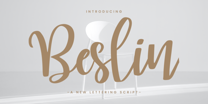 Beslin is handwritten signature font. This another collection of script is perfect for your next branding project, excellent for your business. Beslin have a smooth edges, so this font gives an authentic handcrafted feel style. Beslin is perfect choice for people looking for clean, modern, minimalist, elegant, beauty design styles. Suitable for almost any graphic designs such as logo, branding materials, business cards, gift cards, t-shirt, cover, thumbnail, print, poster, photography, quotes .etc
 - Mongoill Signature by DYSA Studio,
$18.00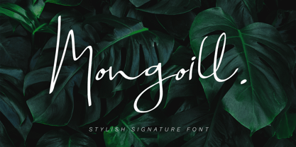 Mongoill is handwritten signature font. This another collection of script is perfect for your next personal branding project, excellent for your business. Mongoill have a smooth edges, so this font gives an authentic handcrafted feel style. Mongoill is perfect choice for people looking for clean, modern, minimalist, elegant, beauty design styles. Suitable for almost any graphic designs such as logo, branding materials, business cards, gift cards, t-shirt, cover, thumbnail, print, poster, photography, quotes .etc
 - Humble Manford Font Duo by Jinan Studio,
$12.00 Humble Manford Font Duo is an excellent choice for logo design, branding, packaging, business card, and adventure-themed designs. Its combination of script and sans serif styles, along with the textured and solid options, provides ample creative opportunities for designers to explore and create stunning visual identities and marketing materials. Thank you a million times for buying and using this font for your projects. Enjoy this font and happy creating! Jinan Studio
 - Meiloly by DYSA Studio,
$18.00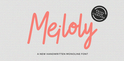 Meiloly is handwritten signature font. This another collection of script is perfect for your branding project, excellent for your business. Meiloly have a smooth edges, so this font gives an authentic handcrafted feel style. Meiloly is perfect choice for people looking for clean, modern, minimalist, elegant, beauty design styles. Suitable for almost any graphic designs such as logo, branding materials, business cards, gift cards, t-shirt, cover, thumbnail, print, poster, photography, quotes .etc
 - Mahendra by BBA Key,
$12.00 Mahendra Script is a new fresh and modern font in handmade calligraphy, with decorative characters and dancing lineage! So wonderful on invitations, greeting cards, branding material, business cards, quotes, posters, and more. If you do not have programs that support OpenType features like Adobe Illustrator and CorelDraw X Versions, you can access all alternates using Font Book (Mac) or Character Map (Windows). If you have any questions, please feel free to contact me via email.
 - Maesha by DYSA Studio,
$18.00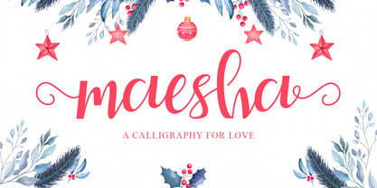 Maesha is handwritten signature font. This another collection of script is perfect for your next personal branding project, excellent for your business. Maesha have a smooth edges, so this font gives an authentic handcrafted feel style. Maesha is perfect choice for people looking for clean, modern, minimalist, elegant, beauty design styles. Suitable for almost any graphic designs such as logo, branding materials, business cards, gift cards, t-shirt, cover, thumbnail, print, poster, photography, quotes .etc
 - Catetin by DYSA Studio,
$18.00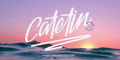 Catetin is handwritten signature font. This another collection of script is perfect for your branding project, excellent for your business. Catetin have a smooth edges, so this font gives an authentic handcrafted feel style. Catetin is perfect choice for people looking for clean, modern, minimalist, elegant, beauty design styles. Suitable for almost any graphic designs such as logo, branding materials, business cards, gift cards, t-shirt, cover, thumbnail, print, poster, photography, quotes .etc
 - Castya by DYSA Studio,
$18.00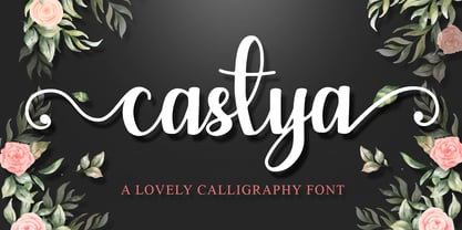 Castya is calligraphy font. This another collection of script is perfect for your branding project, excellent for your business. Castya have a smooth edges, so this font gives an authentic handcrafted feel style. Castya is perfect choice for people looking for clean, modern, minimalist, elegant, beauty design styles. Suitable for almost any graphic designs such as logo, branding materials, business cards, gift cards, t-shirt, cover, thumbnail, print, poster, photography, quotes .etc
 - Markingmate by Nathatype,
$29.00 Unveiling the exquisite charm of Markingmate, a script font meticulously crafted to emulate the fluidity of continuous handwriting while retaining a subtle contrast that adds depth and character to each letterform. The proportions of each letter are thoughtfully varied, resulting in an authentic handwritten quality. For the best legibility use this font in the bigger text sizes. This font fits in logos, posters, flyers, invitations, name cards, branding materials, and many more.
 - Angela Aiglory by Haksen,
$13.00 Hello Everybody, Just launch my New Product "Angela Aiglory" The new fresh handmade script font. Very suitable for greeting cards, branding materials, business cards, quotes, posters, and more! This font are perfect for all brand :) Features : UpperCase & Lowercase Numerals & Punctuations Ligatures Multilingual characters (AÀÁÂÃÄÅCÇDÐEÈÉÊËIÌÍÎÏNÑOØÒÓÔÕÖUÙÜÚÛWYÝŸŸ ÆŒßÞàáâãäåæçèéêëìíîïðñòóôõöøùúûüýÿ) PUA ENCODEDZIP INCLUDED: Angela Aiglory OTF Don't forget to visited the other amazing products Thanks for visited and Please contact me if you have any questions. Happy Design, Haksen
 - Busset City by Haksen,
$11.00 Ladies and Gentleman ! Busset City - a new fresh handmade signature script font. Very suitable for greeting cards, branding materials, business cards, quotes, posters, and more!This font are perfect for wedding postcard. Or you can create perfect and unique design of your logo, blog, stationery, marketing, magazines and more :) Features : UpperCase & Lowercase Numerals & Punctuations Ligatures Multilingualcharacters(AÀÁÂÃÄÅCÇDÐEÈÉÊËIÌÍÎÏNÑOØÒÓÔÕÖUÙÜÚÛWYÝŸŸ ÆŒßÞàáâãäåæçèéêëìíîïðñòóôõöøùúûüýÿ) Busset City OTF Please contact us if you have any questions. Happy Design, Haksen
 - BD Alm - 100% free

- Philco by Monotype,
$29.99The Philco font is a capitals only design inspired by the Art Deco period. Available in plain and decorated form, Philco is suitable for use in advertising, flyers etc.
