10,000 search results
(0.051 seconds)
- P22 Broadwindsor by IHOF,
$24.95 Broadwindsor is part of the "Staunton Script Family" of fonts designed by Ted Staunton for his historic novel. The Broadwindsor font is a neatly written script with capitals and lower case in a close relationship.
 - Dainty by kapitza,
$49.00 Dainty™ is a flower font inspired by the delicate and beautiful structure of the spurge plant Tithymalus. The various sizes of the 52 illustrations in this font make it easy to create stunning compositions.
 - Passing Stranger by Bogstav,
$17.00 Say hello to my all caps wannabe typewriter font. It’s distressed, but still perfectly legible! I have added 5 slightly different versions of each letter for a more handmade feeling, and of course multilingual support!
 - Latinaires by Sudtipos,
$39.00Latinaires Pro is a new version of one of the first published Sudtipos typefaces. Now covering more latin languages and extended to 9 fonts, Latinaires is specially designed for modern brand communication and editorial use. - Merriment JNL by Jeff Levine,
$29.00 Within the pages of the 10th edition of the Speedball Lettering Book (1927) is an alphabet called “Vanitie”. This had been redrawn digitally as Merriment JNL, and is available in both regular and oblique versions.
 - Bases Loaded JNL by Jeff Levine,
$29.00 Bases Loaded JNL is a contour outline variant of Ebbets JNL, which was in turn a stylized variant of the retro-inspired Base Runner JNL. The design is available in both regular and oblique versions.
 - Barryone by Awan Senja,
$14.00 Barryone results out of a stunning pairing of a brush pen and pencil that makes it look incredibly endearing and authentic. Use this gorgeous and unique handwritten font to bring any DIY project to life!
 - Xmas Stencils JNL by Jeff Levine,
$29.00 A retro delight for the holiday season is Xmas Stencils JNL, assembled from original 1950s holiday stencils and other sources. Twenty-Six designs offer a generous variety of embellishments for all of your seasonal projects.
 - Vendome by Linotype,
$40.99One of the most famous modern Old Face fonts, designer Francois Ganeua developed Vendome with the special features and extravagance typical of such forms. Strong and lively, such details give Vendome its unmistakeable, unique appearance. - Despatxada by Type-Ø-Tones,
$40.00 Despatxada letters are the scans of the alphabet of a manual rubber press. Letter by letter. Real prints. Real textures. You will not find another typeface like this. An heroic font in the digital era.
 - Camonflet by TanveerType,
$12.00 This unique set of letters designed in the style of serif. It's cutting edge and expanded looks carefully designed to feel like classic lettering. It's easy to read and cover a small area to utilize.
 - Altemus Suns by Altemus Creative,
$11.00 A collection of 174 sun designs.
 - Charbonne by TypeArt Foundry,
$45.00 Decorative type in style of 1930s.
 - Altemus Rounds by Altemus Creative,
$11.00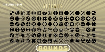 A collection of 174 round designs.
 - Falcon Script by Alan Meeks,
$45.00 An informal version of Kestrel Script.
 - WSK by Fatchair,
$9.95An interpretation of the modern serif. - Kikar Dizengof MF by Masterfont,
$59.00 Lots of alternative weights, readability, contemporary.
 - Altemus Squares by Altemus Creative,
$11.00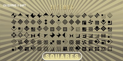 A collection of 174 square designs.
 - Altemus Spirals by Altemus Creative,
$11.00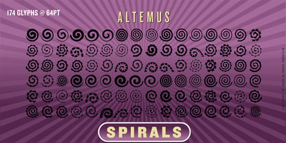 A collection of 174 spiral designs.
 - Fooper by Volcano Type,
$19.00A bastard of the font Cooper. - Easy Ornaments by Intellecta Design,
$17.50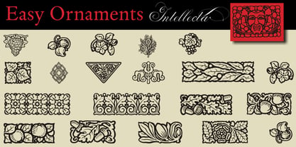 a sort of classic typographical ornaments
 - Babalon by Emboss,
$24.95 Fashioned after the tower of "Babble".
 - Eucaliptus by TypeArt Foundry,
$45.00Decorative type in style of 1930s. - taller evolution - Personal use only

- cibreo - Personal use only

- delizioso - Personal use only

- Rotola TH Pro by Elsner+Flake,
$40.00 Karl-Heinz Lange presented his first drafts of Rotola during a Typoart® type design competition in 1985 under the name "Boutique". A year later, Norbert du Vinage, former manager of the type design department, integrated "Boutique" in his production plan. Due the Fall of the Wall, it took about 18 years until Lange finished this font family in cooperation with Elsner+Flake. Karl-Heinz Lange was born on July 29, 1929 in Wiesenkirch in West Prussia. He was enrolled in the Humanistic Gymnasium at Elbing from 1939 to 1945 and changed to the Wernigerode High School after his family had to flee to central Germany. From 1949 to 1951, Karl-Heinz Lange studied at the Werkkunstschule Halle, where one of his teachers was Professor Post. After 1951, he continued his studies at the Hochschule for Grafik und Buchkunst in Leipzig with an emphasis on book design. He received his diploma in 1955 with distinction based on his design of a hot metal typeface. From 1956 to 1961, Karl-Heinz Lange worked as a lecturer for Type and Commercial Graphics at the Hochschule für Angewandte Kunst in Magdeburg. From 1961 to 1963, he taught at the Hochschule für Grafik und Buchkunst in Leipzig, and finally as a freelance commercial designer in Magdeburg. He worked on a variety of assignments, one of which was the design of trick films. From 1969 to 1976 he took the position of Artistic Director of the Henschelverlag, Berlin; from 1976 to 1994 he was Professor of Type and Typography at the Fachschule für Werbung und Gestaltung in Berlin; and, until 2004, he taught at various institutes for advanced professional education. From 2005 to 2007 he taught at the Fachhochschule Magdeburg/Stendal. Karl-Heinz Lange was awarded the second prize at the "International Type Design Contest 1971" for a headline typeface, and, in 1984, at the XI. Biannual of Graphic Design in Brno, he won a Silver Medal for the design of his typeface family Publica. He created the telephone book typeface Minima and re-designed the Typoart Super Grotesk® (Arno Drescher, 1930) as well as the Newspaper typeface Magna® by Herbert Thannhaeuser for the use on digital typesetting systems. To the day of his death on June 29, 2010, Karl-Heinz Lange lived and worked as a type designer. Among others, he closely followed the designs of the typefaces which were developed under his guidance for Typoart®: "Publica®", "Typoart Super Grotesk®" and "Minima®" which he launched as "Publicala", "Minimala" and "Superla" in 2009. In cooperation with Elsner+Flake, he developed the Typeface family "Rotola" between 2006 and 2009 as well as the script families of the "Viabella®" series. To the end, he followed the development of his first typeface, the "Diplom Antiqua", which he also wanted to bring to market together with Elsner+Flake.
 - TT Barrels by TypeType,
$29.00 TT Barrels useful links: Specimen PDF | Graphic presentation | Customization options TT Barrels is an elegant scotch style modern serif with strong industrial accents in its design. The TT Barrels project was born from a fictional technical assignment in which we tried to combine the technological effectiveness of industrial production used in engineering and the restrictions imposed by it with a beautiful scotch style serif. We decided to create a typeface that could be used to press letters on the metal body of a car, all while the typeface being elegant, and possessing sophisticated details that are typical of the classic text fonts of the late 19th and early 20th centuries. In the process of designing and sketching, we reconsidered certain aspects and abandoned some of the requirements imposed by the technology of metal letter pressing, for example, from the extensive application of visual compensators, the decreased strokes contrast, and the hyperdeformation of individual letter elements to preserve a more pronounced rhythm of these elements. First of all, we wanted both to maintain the ease of reading for the entire text array and follow the rules of aesthetics of each letter in the typeface, while still leaving some influence of industrialism. In the end, this influence is best manifested in serifs, which are quite massive and have a technologically exaggerated wedge shape. TT Barrels consists of 12 fonts: Light, Regular, DemiBold, Bold, Extrabold, Black and the corresponding Italics. Each outline consists of more than 750 glyphs and includes small capitals, ligatures (for Latin and Cyrillic alphabets), stylistic alternates, old-style figures, and many other useful features. FOLLOW US: Instagram | Facebook | Website TT Barrels OpenType features: ordn, c2sc, smcp, case, frac, sinf, sups, numr, dnom, tnum, onum, lnum, pnum, dlig, liga, calt, salt (ss01). TT Barrels language support: Acehnese, Afar, Albanian, Alsatian, Aragonese, Arumanian, Asu, Aymara, Banjar, Basque, Belarusian (cyr), Bemba, Bena, Betawi, Bislama, Boholano, Bosnian (cyr), Bosnian (lat), Breton, Bulgarian (cyr), Cebuano, Chamorro, Chiga, Colognian, Cornish, Corsican, Cree, Croatian, Czech, Danish, Embu, English, Erzya, Estonian, Faroese, Fijian, Filipino, Finnish, French, Friulian, Gaelic, Gagauz (lat), Galician, German, Gusii, Haitian Creole, Hawaiian, Hiri Motu, Hungarian, Icelandic, Ilocano, Indonesian, Innu-aimun, Interlingua, Irish, Italian, Javanese, Judaeo-Spanish, Judaeo-Spanish, Kalenjin, Karachay-Balkar (lat), Karaim (lat), Karakalpak (lat), Kashubian, Khasi, Khvarshi, Kinyarwanda, Kirundi, Kongo, Kumyk, Kurdish (lat), Ladin, Latvian, Laz, Leonese, Lithuanian, Luganda, Luo, Luxembourgish, Luyia, Macedonian, Machame, Makhuwa-Meetto, Makonde, Malay, Manx, Maori, Mauritian Creole, Minangkabau, Moldavian (lat), Montenegrin (lat), Mordvin-moksha, Morisyen, Nahuatl, Nauruan, Ndebele, Nias, Nogai, Norwegian, Nyankole, Occitan, Oromo, Palauan, Polish, Portuguese, Quechua, Rheto-Romance, Rohingya, Romanian, Romansh, Rombo, Rundi, Russian, Rusyn, Rwa, Salar, Samburu, Samoan, Sango, Sangu, Scots, Sena, Serbian (cyr), Serbian (lat), Seychellois Creole, Shambala, Shona, Slovak, Slovenian, Soga, Somali, Sorbian, Sotho, Spanish, Sundanese, Swahili, Swazi, Swedish, Swiss German, Swiss German, Tagalog, Tahitian, Taita, Tatar, Tetum, Tok Pisin, Tongan, Tsonga, Tswana, Turkish, Turkmen (lat), Ukrainian, Uyghur, Vepsian, Volapük, Võro, Vunjo, Xhosa, Zaza, Zulu.
 - Paranoid - 100% free

- Golden Record by Mans Greback,
$59.00 Golden Record is an elegant all caps sans serif typeface with a tall, classic, and high-quality feel. Its timeless design is perfect for adding a touch of sophistication to any project. The font's classiness evokes a sense of luxury and opulence, making it ideal for high-end branding and design applications. Golden Record is a versatile typeface family consisting of the styles Light, Regular, Bold, and Outline, each available in Italic, offering a wide range of creative possibilities. The idea for Golden Record came to life when Mans Greback was inspired by the elegance of vintage vinyl records and their iconic gold labels, merging classic aesthetics with modern design principles. Mans Greback is a Swedish typeface designer known for crafting high-quality fonts with a focus on versatility and aesthetics. He created Golden Records to provide designers with a unique and sophisticated typeface for upscale projects. Greback is committed to delivering exceptional quality in every font he designs, consistently pushing the boundaries of typography.
 - Holland Gothic by URW Type Foundry,
$39.99 Blackletter fonts are timelessly beautiful and still very popular. At some point, it seems that every type designer discovers the beauty of these forms and the great pleasure in creating blackletter characters. Like also Dutch designer Coen Hofmann who, after designing Caxtonian Gothic, has designed yet another Blackletter font: Holland Gothic. Holland Gothic reminds of the 18th century »Duytsch« typefaces of Joan Michael Fleischmann and Christoffel Van Dyck. But Hofmann was mainly inspired by the Dutch calligraphers from the 17th and 18th century. Holland Gothic develops its full charm and beauty at larger sizes because of the hairlines in the upper case characters. To enable users composing texts in the style of our ancestors, Coen Hofmann added a series of pre-composed ligatures, also in combination with the long s, plus an alternate form for the lower case r which was used in combination with letters b, d, g, o, p, v, and w.
 - Bustani by Monotype,
$103.99 The Bustani™ typeface is a typographic interpretation of Naskh, a principal calligraphic style of Arabic script. Designed by Patrick Giasson and Kamal Mansour, Bustani is the first OpenType® font to offer full classical Naskh contextual shaping, while supporting all the numerous languages that use the Arabic writing system without the need for auxiliary plugins (an OpenType compliant application is required). Through the use of OpenType® stylistic sets, Bustani features intelligence to choose the appropriate letterforms for faithful interpretation of Naskh calligraphy. Bustani supports Arabic, Farsi, and Urdu – in addition to many other languages. While primarily intended for setting literary text, the Bustani typeface can also be used in a broader variety of projects that require classic, graceful shapes. “The face shines in environments where the text is given breathing space,” says Giasson. “This includes poetry, literature and artistic publications – perhaps even adding a bit of flair to parking tickets,” he quipped.
 - Trade Gothic Next by Linotype,
$97.99In 1948, Mergenthaler Linotype released the first weights of Trade Gothic, designed by Jackson Burke. Over the next 12 years Burke, who was the company’s Director of Typographic Development from 1948 through 1963, continued to expand the family. Trade Gothic Next is the 2008 revision of Jackson Burke’s design. Developed over a prolonged period of time, the original Trade Gothic showed many inconsistencies. Under the direction of Linotype’s Type Director Akira Kobayashi, American type designer Tom Grace, a graduate of the MA Typeface Design in Reading, redesigned, revised and expand the Trade Gothic family. Many details were improved, such as the terminals and stroke endings, symbols, and the spacing and kerning. Moreover, there are newly added compressed widths and heavy weights perfect for setting even more powerful headlines. Trade Gothic Next brings more features and better quality for today’s demanding typographers. Trade Gothic Next® font field guide including best practices, font pairings and alternatives. - HWT Arabesque by Hamilton Wood Type Collection,
$24.95 A long lost Art Nouveau wood type from the Hamilton Museum Collection evokes the excesses of Victorian design and the equally quirky 1960s Psychedelic era revival of the Victorian type styles. Free flowing organic designs that flourished with Art Nouveau in the late 1800s were directly referenced and further distorted with with phototype in the late 1960s. This design, known as Arabesque, was produced by the Morgans & Wilcox Co. and the Wm. Page Co. as almost identical designs. Both manufacturers were acquired by Hamilton and offered briefly by Hamilton as design #618. This curious wood type defies most of the basic tenets of type design and what comes to mind when one thinks "wood type". Many characters have a lively eccentricity that were all left true to the original design. Additional characters were designed to fill out the standard range of characters found in digital fonts. This font includes over 280 characters for full unicode support of Western and Central European Latin characters.
 - HS Alwajd by Hiba Studio,
$50.00 Hs Alwajd is an Arabic display typeface, under “titles” category. It is useful for book titles, creative designs and modern logos. Also, it is used when a contemporary and simple look is desired that can fit with the characteristics of Kufi fatmic where horizontal parts are equal than vertical ones. It is a new style based on HS Almajd but without swirling round forms terminating in ball. The font is based on Kufi Fatmic calligraphy along with some derived ideas of decorative fonts, maintaining the beauty of the Arabic font and its fixed rates. Undoubtedly, the insertion of curved ornament in some parts adds more beauty and fascinating diversity in the flow line between sharp, soft and curved parts. This font supports Arabic, Persian, Pashtu, Kurdish Sorani, Kurdish Kirmanji and Urdu, consisting only one weight which can add to the library of Arabic Kufic fonts contemporary models that meet with the purposes of various designs for all purposes and all tastes.
 - Stevens Titling by Linotype,
$29.99 Stevens Titling refers to the classic Roman alphabet as it appears on the Trajan column and numerous other monuments. With its realistic brush strokes, it shows the letterforms as they might have been sketched on the marble before the stonecutter reached for his hammer and chisel. The four fonts that constitute the Stevens Titling suite are named after animals — badger, boar, sable and wolf –, each known for the specific character of its hairs when used to make painting brushes. Sable Brush is the most formal and elegant, with solid forms which show no obvious trace of the handdrawn brush stroke; it comes with a set of small capitals for those classical titles preferred by Hollywood. In fact, each of these fonts would do a great job as a film title and poster font. The Badger Brush variant is compact and firm; Boar Brush is dramatic, and in Wolf Brush each part of the letter is made up of realistic, dry strokes.
 - Varia Display by Tomtype,
$6.00 Introducing Varia Display, a font that emerged from the renowned challenge of 36 Days of Type. In the 2023's edition, I embarked on a journey to explore a wide variety of styles, leading to infinite possibilities for crafting unique letterforms. The result is a meticulously crafted variable font with a single weight axis, designed to push the boundaries of typographic aesthetics across all characters. With each letter and number embodying a distinct and innovative approach, this font offers a captivating typographic experience. With its distinctive and varied letterforms, this font is ideally suited for eye-catching main headlines and complementary typography. Whether you seek diversity or a touch of uniqueness, this font is sure to meet your creative needs. Embrace the world of possibilities it presents and elevate your designs to new heights. Key features: Meticulously designed Variable Font Single Weight Axis Multilingual support 374 glyphs Contact: If you have any doubts or questions please ask me via mail or Instagram hello@tomascastiglioni.com @tomtype
 - ITC Clearface by ITC,
$45.99 The Clearface types were originally designed by Morris Fuller Benton in 1907. Their forms expressed the Zeitgeist of the turn of the 20th century; typical and distinguishing characteristics are the forms of the a" and the "k." The ATF version did not include an accompanying Italic. In 1978, ITC's Victor Caruso was licensed by ATF to develop a new serif typeface and matching italic based on the forms of Clearface. The result was ITC Clearface, a serif typeface with marked stroke contrast and italic weights. The teardrop-formed endings of the lowercase a, c and f (also found in Caslon) define the character of the face. The type's design is also distinguished by its small -- almost slab -- serifs, a large x-height, and little stroke contrast. ITC Clearface, with its historical touch, is good for both texts and headlines, but its slightly condensed nature performs at its best when it is allowed its space.
 - Quaint Gothic SG by Spiece Graphics,
$39.00 Distinctively Art Nouveau with a touch of Arts & Crafts, Quaint Gothic is a typographic gem from the late nineteenth century. Also known as Desdemona, this undulating and organic typeface is a versatile and refreshing alternative to many of the font designs on the market today. Quaint Gothic comes complete with an alternate set of caps and a new set of lowercase characters. And for your convenience, a nifty set of small caps and small figures are included in this version. You may also want to access the word-on-a-wave logotypes like “to” and “and” located in the special character slots. They’re great for constructing provocative headlines and titles. Quaint Gothic is also available as an OpenType font. It contains lining and oldstyle figures, prebuilt fractions, stylistic alternates, a wide variety of discretionary ligatures and word ornaments. These advanced features currently work in Adobe Creative Suite InDesign and Illustrator. Check for OpenType advanced feature support in other applications as it gradually becomes available with upgrades.
 - Hexonu by Ingrimayne Type,
$6.95 Hexonu is a weird, awkward, monospaced font family. In place of true lower-case letters, it has a second set of capitals that, through the magic of the OpenType contextual alternatives (calt) feature, automatically alternates with the set on the upper-case keys. If one wants to use only one set of letters, the contextual alternatives must be turned off and character spacing adjusted. Hexonu is another effort to create a font with alternating sets of letters (see PoultySign, Lentzers, and Caltic for others). The base shape for forming the letters is a lopsided hexagon that resembles an old coffin. In four of the six family members, the alternating shape is a distorted hour-glass. In the other two, coffin shapes heads-up alternate with coffin shapes heads-down. The family was created as an experiment with the calt feature and not for any particular use. It does not work as text but its bizarreness makes it appropriate for some poster and signage applications.


