10,000 search results
(0.141 seconds)
- Furniture Type by Forme Type,
$19.99 Forme Furniture Type Em and Furniture Type En Designed by using the pieces of letterpress furniture usually hidden, to create letter shapes. The square nature of the type means it could be used as a low resolution type. Forme Furniture Type Em – Low resolution type. Designed using *Furniture and **Em quads from letterpress printing. *Furniture: Pieces of wood or metal placed around or between metal type to make blank spaces and fasten the printed matter in the chase. ** Quads: (originally quadrat) is a metal spacer used in letterpress typesetting. An em quad is a space that is one em wide and one em high. Also available as Em Shadow to be used as a headline or display font. Forme Furniture Type En – Low resolution type. Designed by using *Leads and ** En quads from letterpress printing. *Lead or Reglet is a piece of Lead or wooden spacing material used in letterpress typesetting, to provide spacing between paragraphs. **An En quad is a space that is one En wide half the width of an Em quad, and the same height as the typeface. Also available as En Shadow to be used as a headline or display font.
 - Linotype Typo American by Linotype,
$29.99Mark Stanczyk designed Linotype Typo American in 1999. The font is an excellent revival of American style typewriter type. As most of us can remember from our childhood years, or through old stories and movies, everyone used to type with typewriters before the invention of computers. Unlike computers, most individual typewriters only had one typestyle, or font, to chose from. To make matters worse, the letters in a typewriter font would wear down with use. Over time, text typed out on a typewriter would look more and more corroded, old, and uneven. Stanczyk has captured exactly these features in this “revival” font! Also like most older typewriter styles, Linotype Typo American’s letters are all mono-spaced, i.e., the letter i is the same width as the letter w. Typewriter letters also all tended to be cast in the same size, around 12 points or so. When using typewriter-style fonts, it is best to keep setting your text in similar sizes. (Of course, you can set really large and fun headlines with Linotype Typo American, too; if anything the unevenness of the design will come even more across in these applications.) - Colville by Canada Type,
$29.95 The Colville fonts began their existence in 2015 as a project-specific typeface, made to be used on a custom-made headstone commemorating Canadian artist Alex Colville (1920-2013) and his wife Rhoda Wright. For that purpose, some initial shapes were modelled after letters Colville himself had used on a Governor General gold medal he designed in the mid-1970s. From there started a year-long project that culminated in a set of four comprehensive fonts ranging in weight from Light to Bold, each containing over 750 glyphs to cover Pan European language support, stylistic alternates, five sets of figures, automatic fractions, and some ornaments rooted in Alex Colville’s art. These fonts exhibit a strong art deco aesthetic that has always been a favourite of architects, metal casters, and sign makers. This is a very humanist geometry alternating from the precisely calculated to the curvy and lithe, subtle contrast, flat stroke stops, and airy proportions that make for a counterspace built for accommodation and comfort. The breadth and timeless humanism of the Colville set makes fit in a variety of applications, from straightforward headlines, titles, and emphasis captions, to branding and packaging.
 - Blindness Graffiti by Colllab Studio,
$14.00 "Hi there, thank you for passing by. Colllab Studio is here. We crafted best collection of typefaces in a variety of styles to keep you covered for any project that comes your way! What if you could have a graffiti font collection? Or a street-inspired font collection? What if you want something clean, legible, yet still playful and fun? Searches online turn up nothing. Those popular sites only provide typical graffiti fonts. Well don't worry. What you’re looking for lies right here. We combine art and technology to bring the most extensive graffiti font collection around to your doorstep easier, faster, and cheaper than anywhere else. Introducing, Blindness Graffiti font is more than just random lettering. Its structured strokes and grungy strokes ooze its strong characteristic, inspired by urban style or cyberpunk design. It’s out of this world yet the balance between action and serenity keeps the font grounded. Blindness Graffiti is available in uppercase, lowercase, numerals, punctuations and lots of variations on each character include OpenType features, alternates, common ligatures and also additional swash to let you customize your designs. A Million Thanks www.colllabstudio.com
 - Roundhand BT by ParaType,
$30.00 Roundhand was created by Matthew Carter in 1966 on the basis of handwriting by Charles Snell, an English calligrapher of XVII-XVIII known in particular by his "The Pen-man's Treasury Open'd" written in 1694. The typeface has continuous cursive shapes with oval aspect, high contrast emphasized by abrupt transitions from thin to thick and regularity of slope. Its capitals are often used as initials in combinations with other typefaces. The current digital version of the typeface has 3 styles of different weights. Roundhand is clear and easy to read and is well-suited for medium size texts and headlines. It will work well in invitations, menus, packaging, and advertising accentuating elegance and the subtle nature of the content. The Cyrillic version was developed by Vladimir Yefimov and Isabella Chaeva. Released by ParaType in 2013.
 - ITC Django by ITC,
$29.99Australian designer and art director Wayne Thompson has loved typography “ever since I received a battered second-hand Letraset catalog at the age of 10.” He based ITC Django on the handwriting of an acquaintance -- “a fellow I know who writes and illustrates children's books and is also a commercial artist” -- who called himself Django, after the jazz guitarist Django Reinhardt. “I felt that that name Django suited the funky, lively feel of the face,” says Thompson. But he adds, “Django has a split personality: it appears loose and easy at first, but after looking at it for some time I felt an edginess come through that was slightly psychotic.” The looseness of the lowercase contrasts with the spikiness of the capitals. The “edginess” is especially apparent in words in all caps. - Hinton by Dima Pole,
$15.00 Hinton is a modern, clean text font, including 840+ characters, many Opentype features, all European & Slavic symbols. It is calm, orderly and a bit perky. Hinton has a lightweight and pleasant design, so it fits well and easy to read. Its characters are simultaneously austere and elegant, and have their own flavor. Hinton includes all European and Slavic alphabets, Euro and other 8 signs of currencies. In addition to basic Latin and Russian there are German, Dutch, Spain, French, Romanian, Turkish, Czech, Polish, Croatian, Serbian, Ukrainian, Belorussian, Baltic, Scandinavian, Icelandic and others alphabets. Opentype features: stylistic alternates, manual kerning, standard ligatures, discretionary ligatures, small capitals, capitals to small caps, case, oldstyles numerals, tubular numerals, localized forms, stylistic set, historical forms, fractions, ordinals, numerators, denominators, slashed zero and others.
 - Lestina by Larin Type Co,
$14.00 Lestina This is a beautiful and elegant hand drawn font, will emphasize your individuality in any project. You can also use them to create a logo or templates, invitations, blog, branding, marketing, book covers, magazines, advertising, stationery, logo design and much more. This font is easy to use has OpenType features.
 - Sweet Candy Pink Script by Mindtype Co.,
$19.00 Sweet Candy Pink Script a beautiful modern calligraphy font with Extrude Shadow Style. Comes with 2 layered font handwritten, sophisticated flows. Sweet Candy Pink Script offers beautiful typographic harmony for a diversity of design projects, signature, stationery, logo, typography quotes, including logos & branding, wedding designs, social media posts, advertisements & product designs.
 - The Old Navy by Larin Type Co,
$12.00 The Old Navy - a new stencil style font collection. These fonts are ideal for military-style branding and will decorate any of your projects. You can also use them to create a logo or use for small businesses, t-shirts, hoody, book covers, stationery, logo creation, marketing, blogs, magazines, and more.
 - Kianda Pro by QubaType,
$19.00 Kianda typeface was created as a non-classic, sport logo typeface. Now it has two fonts with multilingual uppercase, numerals and punctuation. Almost every letter have 3-4 alternates, which allows you to feature stylish text for your logo. Also this typeface works good with short slogans, packaging and more.
 - Beldon by Aqeela Studio,
$12.00 Introducing a new beautiful calligraphy font, Beldon! It is perfect for elegant logos, upscale packaging, wedding stationery, websites, and any other projects requiring a handwritten and luxurious touch. A wide range of ligature alternates are included so that you can give your logo or name a custom, hand-calligraphy look.
 - Chilok by Dhan Studio,
$19.00 Chilok is a cool handwritten font that is also elegant and fashionable, which looks like a signature or logo, this font also has an alternative to beautify your design. Chilok is perfect for branding, logos, business cards, posters, invitations, greeting cards, news, product packaging, blog posters, all including personal charm, etc.
 - Mitchaella Luxury Serif by Typetemp Studio,
$20.00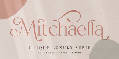 Mitchaella Luxury Serif Font is a modern, unique, and a luxurious serif typeface. The font comes with many alternative characters, ornaments, multilingual support, ligatures and a bonus wedding illustration*. Hence, the font is a suitable for branding, branding logos, magazine imagery, wedding invitations, posters, fashion, packaging, website logos and more.
 - Agave Azul by Fat Hamster,
$25.00 Agave Azul - Hand made old typewriter font Agave Azul Artisan font is perfect for tequila & mezcal label and packaging design, social media quotes, logo & branding design, apparel design, whiskey, beer label and packaging design, heading, scrapbooking, calendars, book covers. Don't forget to use bonus logos, marks and labels for your designs.
 - Times Eighteen by Linotype,
$29.00In 1931, The Times of London commissioned a new text type design from Stanley Morison and the Monotype Corporation, after Morison had written an article criticizing The Times for being badly printed and typographically behind the times. The new design was supervised by Stanley Morison and drawn by Victor Lardent, an artist from the advertising department of The Times. Morison used an older typeface, Plantin, as the basis for his design, but made revisions for legibility and economy of space (always important concerns for newspapers). As the old type used by the newspaper had been called Times Old Roman," Morison's revision became "Times New Roman." The Times of London debuted the new typeface in October 1932, and after one year the design was released for commercial sale. The Linotype version, called simply "Times," was optimized for line-casting technology, though the differences in the basic design are subtle. The typeface was very successful for the Times of London, which used a higher grade of newsprint than most newspapers. The better, whiter paper enhanced the new typeface's high degree of contrast and sharp serifs, and created a sparkling, modern look. In 1972, Walter Tracy designed Times Europa for The Times of London. This was a sturdier version, and it was needed to hold up to the newest demands of newspaper printing: faster presses and cheaper paper. In the United States, the Times font family has enjoyed popularity as a magazine and book type since the 1940s. Times continues to be very popular around the world because of its versatility and readability. And because it is a standard font on most computers and digital printers, it has become universally familiar as the office workhorse. Times™, Times™ Europa, and Times New Roman™ are sure bets for proposals, annual reports, office correspondence, magazines, and newspapers. Linotype offers many versions of this font: Times™ is the universal version of Times, used formerly as the matrices for the Linotype hot metal line-casting machines. The basic four weights of roman, italic, bold and bold italic are standard fonts on most printers. There are also small caps, Old style Figures, phonetic characters, and Central European characters. Times™ Ten is the version specially designed for smaller text (12 point and below); its characters are wider and the hairlines are a little stronger. Times Ten has many weights for Latin typography, as well as several weights for Central European, Cyrillic, and Greek typesetting. Times™ Eighteen is the headline version, ideal for point sizes of 18 and larger. The characters are subtly condensed and the hairlines are finer. Times™ Europa is the Walter Tracy re-design of 1972, its sturdier characters and open counterspaces maintain readability in rougher printing conditions. Times New Roman™ is the historic font version first drawn by Victor Lardent and Stanley Morison for the Monotype hot metal caster." - Times Europa LT by Linotype,
$29.99In 1931, The Times of London commissioned a new text type design from Stanley Morison and the Monotype Corporation, after Morison had written an article criticizing The Times for being badly printed and typographically behind the times. The new design was supervised by Stanley Morison and drawn by Victor Lardent, an artist from the advertising department of The Times. Morison used an older typeface, Plantin, as the basis for his design, but made revisions for legibility and economy of space (always important concerns for newspapers). As the old type used by the newspaper had been called Times Old Roman," Morison's revision became "Times New Roman." The Times of London debuted the new typeface in October 1932, and after one year the design was released for commercial sale. The Linotype version, called simply "Times," was optimized for line-casting technology, though the differences in the basic design are subtle. The typeface was very successful for the Times of London, which used a higher grade of newsprint than most newspapers. The better, whiter paper enhanced the new typeface's high degree of contrast and sharp serifs, and created a sparkling, modern look. In 1972, Walter Tracy designed Times Europa for The Times of London. This was a sturdier version, and it was needed to hold up to the newest demands of newspaper printing: faster presses and cheaper paper. In the United States, the Times font family has enjoyed popularity as a magazine and book type since the 1940s. Times continues to be very popular around the world because of its versatility and readability. And because it is a standard font on most computers and digital printers, it has become universally familiar as the office workhorse. Times™, Times™ Europa, and Times New Roman™ are sure bets for proposals, annual reports, office correspondence, magazines, and newspapers. Linotype offers many versions of this font: Times™ is the universal version of Times, used formerly as the matrices for the Linotype hot metal line-casting machines. The basic four weights of roman, italic, bold and bold italic are standard fonts on most printers. There are also small caps, Old style Figures, phonetic characters, and Central European characters. Times™ Ten is the version specially designed for smaller text (12 point and below); its characters are wider and the hairlines are a little stronger. Times Ten has many weights for Latin typography, as well as several weights for Central European, Cyrillic, and Greek typesetting. Times™ Eighteen is the headline version, ideal for point sizes of 18 and larger. The characters are subtly condensed and the hairlines are finer. Times™ Europa is the Walter Tracy re-design of 1972, its sturdier characters and open counterspaces maintain readability in rougher printing conditions. Times New Roman™ is the historic font version first drawn by Victor Lardent and Stanley Morison for the Monotype hot metal caster." - Times Ten by Linotype,
$40.99In 1931, The Times of London commissioned a new text type design from Stanley Morison and the Monotype Corporation, after Morison had written an article criticizing The Times for being badly printed and typographically behind the times. The new design was supervised by Stanley Morison and drawn by Victor Lardent, an artist from the advertising department of The Times. Morison used an older typeface, Plantin, as the basis for his design, but made revisions for legibility and economy of space (always important concerns for newspapers). As the old type used by the newspaper had been called Times Old Roman," Morison's revision became "Times New Roman." The Times of London debuted the new typeface in October 1932, and after one year the design was released for commercial sale. The Linotype version, called simply "Times," was optimized for line-casting technology, though the differences in the basic design are subtle. The typeface was very successful for the Times of London, which used a higher grade of newsprint than most newspapers. The better, whiter paper enhanced the new typeface's high degree of contrast and sharp serifs, and created a sparkling, modern look. In 1972, Walter Tracy designed Times Europa for The Times of London. This was a sturdier version, and it was needed to hold up to the newest demands of newspaper printing: faster presses and cheaper paper. In the United States, the Times font family has enjoyed popularity as a magazine and book type since the 1940s. Times continues to be very popular around the world because of its versatility and readability. And because it is a standard font on most computers and digital printers, it has become universally familiar as the office workhorse. Times™, Times™ Europa, and Times New Roman™ are sure bets for proposals, annual reports, office correspondence, magazines, and newspapers. Linotype offers many versions of this font: Times™ is the universal version of Times, used formerly as the matrices for the Linotype hot metal line-casting machines. The basic four weights of roman, italic, bold and bold italic are standard fonts on most printers. There are also small caps, Old style Figures, phonetic characters, and Central European characters. Times™ Ten is the version specially designed for smaller text (12 point and below); its characters are wider and the hairlines are a little stronger. Times Ten has many weights for Latin typography, as well as several weights for Central European, Cyrillic, and Greek typesetting. Times™ Eighteen is the headline version, ideal for point sizes of 18 and larger. The characters are subtly condensed and the hairlines are finer. Times™ Europa is the Walter Tracy re-design of 1972, its sturdier characters and open counterspaces maintain readability in rougher printing conditions. Times New Roman™ is the historic font version first drawn by Victor Lardent and Stanley Morison for the Monotype hot metal caster." - Times Ten Paneuropean by Linotype,
$92.99In 1931, The Times of London commissioned a new text type design from Stanley Morison and the Monotype Corporation, after Morison had written an article criticizing The Times for being badly printed and typographically behind the times. The new design was supervised by Stanley Morison and drawn by Victor Lardent, an artist from the advertising department of The Times. Morison used an older typeface, Plantin, as the basis for his design, but made revisions for legibility and economy of space (always important concerns for newspapers). As the old type used by the newspaper had been called Times Old Roman," Morison's revision became "Times New Roman." The Times of London debuted the new typeface in October 1932, and after one year the design was released for commercial sale. The Linotype version, called simply "Times," was optimized for line-casting technology, though the differences in the basic design are subtle. The typeface was very successful for the Times of London, which used a higher grade of newsprint than most newspapers. The better, whiter paper enhanced the new typeface's high degree of contrast and sharp serifs, and created a sparkling, modern look. In 1972, Walter Tracy designed Times Europa for The Times of London. This was a sturdier version, and it was needed to hold up to the newest demands of newspaper printing: faster presses and cheaper paper. In the United States, the Times font family has enjoyed popularity as a magazine and book type since the 1940s. Times continues to be very popular around the world because of its versatility and readability. And because it is a standard font on most computers and digital printers, it has become universally familiar as the office workhorse. Times™, Times™ Europa, and Times New Roman™ are sure bets for proposals, annual reports, office correspondence, magazines, and newspapers. Linotype offers many versions of this font: Times™ is the universal version of Times, used formerly as the matrices for the Linotype hot metal line-casting machines. The basic four weights of roman, italic, bold and bold italic are standard fonts on most printers. There are also small caps, Old style Figures, phonetic characters, and Central European characters. Times™ Ten is the version specially designed for smaller text (12 point and below); its characters are wider and the hairlines are a little stronger. Times Ten has many weights for Latin typography, as well as several weights for Central European, Cyrillic, and Greek typesetting. Times™ Eighteen is the headline version, ideal for point sizes of 18 and larger. The characters are subtly condensed and the hairlines are finer. Times™ Europa is the Walter Tracy re-design of 1972, its sturdier characters and open counterspaces maintain readability in rougher printing conditions. Times New Roman™ is the historic font version first drawn by Victor Lardent and Stanley Morison for the Monotype hot metal caster." - Times by Linotype,
$40.99In 1931, The Times of London commissioned a new text type design from Stanley Morison and the Monotype Corporation, after Morison had written an article criticizing The Times for being badly printed and typographically behind the times. The new design was supervised by Stanley Morison and drawn by Victor Lardent, an artist from the advertising department of The Times. Morison used an older typeface, Plantin, as the basis for his design, but made revisions for legibility and economy of space (always important concerns for newspapers). As the old type used by the newspaper had been called Times Old Roman," Morison's revision became "Times New Roman." The Times of London debuted the new typeface in October 1932, and after one year the design was released for commercial sale. The Linotype version, called simply "Times," was optimized for line-casting technology, though the differences in the basic design are subtle. The typeface was very successful for the Times of London, which used a higher grade of newsprint than most newspapers. The better, whiter paper enhanced the new typeface's high degree of contrast and sharp serifs, and created a sparkling, modern look. In 1972, Walter Tracy designed Times Europa for The Times of London. This was a sturdier version, and it was needed to hold up to the newest demands of newspaper printing: faster presses and cheaper paper. In the United States, the Times font family has enjoyed popularity as a magazine and book type since the 1940s. Times continues to be very popular around the world because of its versatility and readability. And because it is a standard font on most computers and digital printers, it has become universally familiar as the office workhorse. Times™, Times™ Europa, and Times New Roman™ are sure bets for proposals, annual reports, office correspondence, magazines, and newspapers. Linotype offers many versions of this font: Times™ is the universal version of Times, used formerly as the matrices for the Linotype hot metal line-casting machines. The basic four weights of roman, italic, bold and bold italic are standard fonts on most printers. There are also small caps, Old style Figures, phonetic characters, and Central European characters. Times™ Ten is the version specially designed for smaller text (12 point and below); its characters are wider and the hairlines are a little stronger. Times Ten has many weights for Latin typography, as well as several weights for Central European, Cyrillic, and Greek typesetting. Times™ Eighteen is the headline version, ideal for point sizes of 18 and larger. The characters are subtly condensed and the hairlines are finer. Times™ Europa is the Walter Tracy re-design of 1972, its sturdier characters and open counterspaces maintain readability in rougher printing conditions. Times New Roman™ is the historic font version first drawn by Victor Lardent and Stanley Morison for the Monotype hot metal caster." - Wellytonia Package by Letterhend,
$17.00 Wellytonia package is a package consist of script font, sans serif font, illustration, ready-made logos and dingbats! All made by manual hand drawing to make sure the natural looks and feel. This type of font perfectly made to be applied especially in logo, and the other various formal forms such as invitations, labels, logos, magazines, books, greeting / wedding cards, packaging, fashion, make up, stationery, novels, labels or any type of advertising purpose. Features : Wellytonia Script, Sans & Dingbats uppercase & lowercase numbers and punctuation multilingual alternates & ligatures PUA encoded
 - Gadiani by Queenop Studio,
$12.00 Gadiani font is made into a nice and elegant font. Perfect for all your design projects, such as invitation cards, product logos, food brand logos, thank you cards, business card logos and more. Many alternatives will help you create whatever design you need like cute and girly handwritten letters and any other designs that require a beautiful handwritten touch! Enjoy :) Contains full set: -Uppercase -Lowercase -Alternative -Ligatures -Punctuation -Number -Multilingual support. Need help or have questions let me know. I'm happy to help. Thanks & Congratulations on the Design.
 - Elegante Classica by Mokatype Studio,
$18.00 Hello Introducing, Elegante Classica - Luxurious Serif Display is an elegant, inspired by the famous minimalist logo, perfect for the purposes of designing templates, brochures, videos, advertising branding, logos and more. Perfect for adding a unique twist to word-mark logos, monograms or pull quotes. Accessible in the Adobe Illustrator, Adobe Photoshop, Adobe InDesign, even work on Microsoft Word. PUA Encoded Characters - Fully accessible without additional design software. Fonts include multilingual support Image used : All photographs/pictures/vector used in the preview are not included, they are intended for illustration purpose only. Thank You
 - Blushing Rose by Sarid Ezra,
$17.00 Introducing, Blushing Rose - A Stylish Modern Serif with Ligatures and Alternates Blushing Rose is a stylish and modern serif with a bunch of alternates for each characters and ligatures that will make your presentation or logo even more stunning and attractive! You can use this font for unlimited purpose such as wedding invitation, branding, or even your own logo. The ligatures will make your logo more advanced without many steps. This fonts support Multi Language. Features Uppercase & Lowercase Number & Symbol Extended Multi language Alternates for each characters Ligatures
 - Evenstar by Kereatype,
$10.00 Introducing the new ‘Evenstar’ Serif Family font with 9 Weight is a fashionable and modern elegant serif font with some sexy stylish extras:). Based on our experience as a graphic designer who works for a lot of companies, we often are requested to design a logo in a unique style but with an elegant shape. So, we try to brainstorm and create this font to make the idea is going out. This is perfect for BRANDING and LOGO DESIGN. You will get classy, elegant, and certainly unique logos with this font.
 - Blarks by Zamjump,
$12.00 Blarks is a unique font with a strong character. The inspiration for making this font is from several e-sport and typography logos that I have seen on various websites, where I found ideas to make fonts that could be applied without having to use another application to change it. Blarks is ideal for logos, event titles, quotes, product packaging, clothing, or anything that requires a turbo typographic boost. It is perfect for titles and logos. Type any a-z using this font, and you will get a unique font arrangement and strong character.
 - Gogobig by Bogusky 2,
$25.00I have always been frustrated when looking for a bold condensed face. The choices were the usual? Helvetica Bold Condensed, Univers Bold Condensed or Alternate Gothic #2... all rather dated. I was looking for a really unique, clean, uncluttered sans serif face, so I decided to design one. I have since adapted it to many logo designs. So, in my terms and conditions, I decided to permit the modification of the letter forms for logos and monograms, but logos and monograms only, not the typeface in normal usage. - Amper MF by Masterfont,
$59.00 Will this be your next tattoo? Or will this be your new Yacht logo?
 - InSign by Konst.ru,
$- Geometric font for paradoxical or short texts. Also maybe use for headlines, logos etc.
 - Glam Rock MF by Masterfont,
$59.00 Either Futuristic or Space ship logo - it will sure fit to a mysterious poster.
 - ALT Foldgami by ALT,
$5.00 Foldgami is a custom decorative typeface for any type of graphic design mostly logos.
 - Maxim MF by Masterfont,
$59.00 A special high contrast font with unique geometrical shapes for logos, titles, signage etc.
 - Alt UAV31 by ALT,
$- UAV 31 is a geometric experimental display typeface for use on logos,posters etc.
 - Diallome by MJB Letters,
$16.00 Diallome is a stylish signature font that has an elegant flow, this font will look very luxurious on wedding invitations, fashion logos, brand logos, thank you cards, business cards, watermarks, and any other design that wants to have a handwritten touch. Diallome Features - Uppercase and Lowercase - Numerical and Punctuation - PUA Encoded - Multilingual Language
 - Kianda by QubaType,
$20.00 Kianda typeface was created as a non-classic, sport logo typeface. Now it has only one style with Latin and Cyrillic uppercase, numerals and punctuation. Almost every letter have 3-4 alternates, which allows you to feature stylish text for your logo. Also this typeface works good with short slogans, packaging and more.
 - Stabillo by HansCo,
$15.00 Stabillo font family is specially designed for food logo brand identity and packaging design projects. There are several ligature in both fonts and alternate characters just in the Italic version. Some projects that are suitable for this font are food and beverage brand logo, including clothing, flyer designs, posters or brochures. Enjoy!
 - Wanted Denim by Vozzy,
$5.00 Introducing a vintage look layered label font named "Wanted Denim". This font was inspired by classic slab serif fonts from denim labels and logos. Typeface includes six styles (including effect styles), for sample look at 3rd preview. This font will good viewed on any retro design like poster, t-shirt, label, logo etc.
 - Miracle Script by Din Studio,
$22.00 Miracle Script is modern logo typeface. This font will be suitable for t-shirt printing, name-card design, branding projects, product packaging, quotes, logos, book covers, and all other lovely projects. Miracle Script will further power your design with the included extruded weight. For more information you can contact me : donis4design@gmail.com
 - Major Pro Extras NF by Nick's Fonts,
$10.00A supplement to Major Production NF, which includes an assortment of symbols and logos for video, web and mobile applications, including the Blu-ray logo with its region designators. Please remember that logotypes are the property of their respective copyright holders, and should be used solely in accordance with the copyright holder’s guidelines. - Bigotedly by Ali Hamidi,
$12.00 Bigotedly is a casual script and handwritten font. Bigotedly have a chic and simple curves to add charm impression for your design. This Font is perfect for many design needs such as merch, branding, T-shirts, fashion logo, cosmetic, signature logo, wedding invitation, book covers, social media posts, websites, events, and many more.