10,000 search results
(0.051 seconds)
- Casthago by BustanType,
$24.00 Casthago is a transitional, humanist serif typeface family, comes with some contrast in the stroke and medium curve braketed serif that creates a very classic and traditional feel. Casthago designed for body text, creating a steady and readable rhythm, made for immersive reading. Some Character comes with alternate style 'a,h,m,n' that inspirated by Carolingian manuscript that was popular in medieval European period. Casthago consists of 16 styles from Extralight to black including italic styles and 2 variable fonts addition.
 - Nebulosa by Graviton,
$20.00 Nebulosa font family has been designed for Graviton Font Foundry by Pablo Balcells in 2020. It is a futuristic, slightly extended sans serif typeface with semi rounded endings that provide a softened aesthetic without losing its solidity. Nebulosa has been conceived to be most suitable for logos, headlines and display design pieces as well as short length text blocks. Nebulosa consists of 10 styles, 8 of which containing small caps and glyph coverage for several language and 2 of which are free.
 - Tahiti Sans by Sharkshock,
$100.00 Tahiti Sans is a playful, all caps display sans available in 2 versions. At first glance it appears to be the offspring of a rather uniform font and a wacky one. The variations of letterforms as well as random angles are minimal. They’re tall by nature so squeezing text into tight spaces should be easy. Characters are slightly jumbled in a childlike manner and misaligned with varying degrees of spacing. Use it for youth sports, social media, toy packaging or advertising.
 - Nachel Victoria by HandletterYean,
$10.00 Nachel Victoria is a simple, yet aesthetically beautiful typeface. It has a modern script look which can be used for business cards, logos, packaging, branding, magazines, quotes, and much more! What's included: 1. Nachel Victoria (OTF) 2. Style in this font include: Regular, Bold, Italic, and Bold italic 3. Works on Mac & PC 4. Simple installations 5. Accessible in the Adobe Illustrator, Adobe Photoshop, Adobe InDesign, CorelDraw, even work on Microsoft Word. 6. Support multilingual; ä ö ü Ä Ö Ü ß ¿ ¡
 - Spiraling Down by Hanoded,
$15.00 I was listening to an Opeth album called Blackwater Park. By the time I had decided that this font needed some swirls, the band was playing a song called The Drapery Falls - which has the word ‘spiraling’ in it (see poster 2) - and the name was born. Spiraling down is a surprisingly elegant font (given its roughness). I probably wouldn’t set a whole text in it, but it will really stand out as a titling font for packaging or book covers.
 - Sopi by Tipo,
$40.00 Sopi is a typography of ornaments, borders and combined frames. It was inspired by the design of limestone tile floors, located in different places in Buenos Aires. All characters have the same measure, which enables the possibility of any desired combination. In the case of edges or combined frames, the typography was programmed in a way that is possible to generate textures with 2 or more colors, attempting to rescue the colorful designs that were original thought in the limetone tile floor.
 - Space Armada by Wing's Art Studio,
$10.00 Space Armada - A Science-Fiction Font for Out of this World Designs! Space Armada is inspired by a 1980s interpretation of the future, referencing blockbuster sci-fi action movies of the period, along with the emerging video-game consoles and home computer technologies. It's nine unique fonts are designed to work together in a variety of ways, so you can layer it's different styles on top of each other to retro-futuristic effect!* Here's an example of how it works: Start by placing the Regular font on top of the Bold for a simple base outline. Add contrasting gradients to both fonts for an instant metallic or chrome effect. Take it a step further with one of the readymade Outlines for an embossed look. Overlay the Wireframe font for a glimpse inside the machine! This looks particularly good when you apply a glow effect and reduce it's opacity so the other layers show through. That's just one way to use it. Check out my visuals for more usage ideas! You can also follow my short tutorial! Space Armada is an all-caps font with unique uppercase and lowercase characters, along with a range of alternatives for experimentation with different looks. It also includes punctuation, numerals and language support, plus a selection of underlines and symbols. It's a highly customisable font, perfect for retro designs such as movie titles, posters, games, book covers and more! Every care has been taken to ensure that all fonts align perfectly when layering. Due to the variations in how different software handles text tracking, some minor tweaking may be required for pixel perfect alignment.
 - MEGA SLANT LINE by TypoGraphicDesign,
$19.00 CONCEPT/CHARACTERISTICS This strikingly bold, black and extended 3D font reminiscent of sci-fi films and experimental typeface design. The font acts as a chain of ligatures and thus receives a unique aesthetic. The unique letter forms are in sharp contrast to other fonts and thus stand out as a unique selling point. APPLICATION AREA Posters, music cover, book cover, logos, as a headline font for magazines or websites … TECHNICAL SPECIFICATIONS Headline Font | Display Font | Sci-Fi Font »Mega Slant Line« OpenType Font with 303 glyphs – alternative letters and ligatures (with accents & €) & 2 styles (regular & 3d) KONZEPT/BESONDERHEITEN Diese auffällig plakative, fette und breitlaufende 3D Schrift erinnert an Sci-Fi Filme und ist experimentelle Schriftgestaltung. Die Schrift wirkt wie eine Kette aus Ligaturen (Buchstabenverbindungen) und erhält somit eine ganz eigene Ästhetik. Die sehr eigenen Buchstabenformen werden sich deutlich von anderen Schriften abheben und somit als Alleinstellungsmerkmal herausstechen. Der Fluss ergiebt sich aus den EINSATZGEBIETE Plakate aller Art, Musik Cover, Buchcover, für Logos und Wortmarken, als Displayschrift für Zeitschriften oder Websites… TECHNISCHE INFORMATIONEN Headline Font | Display Font | Sci-Fi Font »Mega Slant Line« OpenType Font with 303 glyphs – alternative letters and ligatures (with accents & €) & 2 styles (regular & 3d)
 - Nympha by Onrepeat,
$30.00 Nympha Family Features: 4 Styles 2 Weights Over 800 characters per style (3200 in total) Up to 10 stylistic variations for each character (!) European Language Support Hundreds of Ligatures, Swashes and Stylistic Alternates Old Numerals True Italics & Much More Trailer: https://vimeo.com/471556131 Nympha is an elegantly crafted and luxuriously exuberant serif typeface, exuding femininity and glamour but also a side of exquisity. Its hard contrast and refined details, along with its opulent swashes and voluptuous curves, create a beautiful and powerful statement to any typographic composition, mixing glamour with a contemporary aesthetic. One could say Nympha has two distinct, yet connected, personalities in the form of two stylistic sets of characters: a contemporary and elegant one and an exquisite and unusual one, both can (and should) be mixed to achieve surprising results. Nympha offers a vast amount of swashes, alternates and ligatures, featuring up to 10 stylistic variations for each character, making it possible to generate endless compositions with ease. Available in 4 styles, 2 weights, offering over 3200 characters. Visit https://www.behance.net/gallery/106734865/Nympha-Typeface/ for a full walkthrough of everything Nympha has to offer.
 - Palm Club by Set Sail Studios,
$17.00 Leisure awaits you at the Palm Club 🏖. The weather is warm, the drinks are cold, and the font choices are excellent. This high energy, retro-fuelled script font is ideal for signature style logos, product packaging, display text and 80s/90s inspired graphics. Palm Club includes 2 font files with added features; 1. Palm Club Script • A handwritten script font containing upper & lowercase characters, numerals and a large range of punctuation. 2. Palm Club Swash • Type any a-z character in this font to generate one of 21 swashes. These fast strokes are great for underlining your Beach Club Script text and adding some extra finesse to your lettering. Alts & End Characters • End characters are available for 24 lowercase letters when using the Palm Club Script font. Use these characters at the end of your word to add a stylistic ‘end-swash’. Alternate characters are also available for 11 uppercase letters. These are accessible via software with opentype capability, by turning on ‘Stylistic Alternates’, or via a Glyphs panel. Language Support • English, French, Italian, Spanish, Portuguese, German, Swedish, Norwegian, Danish, Dutch, Finnish, Indonesian, Malay, Hungarian, Polish, Croatian, Turkish, Romanian, Czech, Latvian, Lithuanian, Slovak, Slovenian.
 - Ozana Pro by Mostardesign,
$99.00 Ozana Pro is a bracketed serif font family adapted to the professional requirements of graphic designers, web designers and mobile app developers. Comprised of 24 styles including 12 styles designed especially for headlines and 12 styles for text and long paragraph design, Ozana Pro is a very versatile family of fonts that can be used in many projects such as editorial design, branding or corporate identity creation, design of posters or logos, the creation of websites or the development of mobile applications. This serif font family, with a resolutely modern aspect, also hides a unique typographic design since it has 2 distinct styles (Roman and Display) which have 2 different optical sizes in order to graphically differentiate the appearance of titles, subtitles and long paragraphs. With this design of glyphs differentiated by the optical size according to the styles, the titles have a very graphic aspect while the long texts have a more classic design in order to keep an optimal readability in all cases. Ozana Pro is also equipped with powerful OpenType features such as case sensitivity, true small caps, ligatures, tabular figures, old styles figures, numbers circled. Ozana Pro is also available as a variable font family.
 - Les Tulipes Pro by Fontforecast,
$29.00 We present Les Tulipes Pro. A smart, classy, modern calligraphy layered type system that offers an array of versatility. Les Tulipes Pro is hand drawn with dip pen and ink, with great attention for details. To name a few: - Elongated entrance and exit strokes ( type ++1 to ++10 in front and __1 to __10 at the back of any letter) - 5 different connecting spaces that make it appear as if the pen was never lifted from the paper (type space1 to space5 wherever you want the connecting spaces to appear) - 9 alternate ampersands (type &1 to &9) - 2 alternate at signs (type @1 or @2) - 5 stylistic sets for alternate characters Note: Discretionary ligatures must be ON The various designs of Les Tulipes Pro harmonize beautifully. Les Tulipes Pro Sans was designed to complement and support the other styles. The more straight forward appearance of the Sans styles enable you to balance out your designs perfectly. The Bold and Closed versions offer even more possibilities to combine or highlight words and phrases. On top of that Les Tulipes Pro Extra, with its 85 gorgeous swirls and swashes tempts you to further embellish your design.
 - PF DIN Text Arabic by Parachute,
$145.00 This Arabic typeface is one of Parachute’s most involved text typefaces. For the first time -back in 2010- a contemporary Arabic equivalent to a comprehensive DIN series of fonts was available. In fact, this set of fonts contains the most complete and powerful array of Arabic features commercially today. It comes in eight weights and includes Latin. Based on the DIN Text Pro superfamily, Parachute® released -in collaboration with designer Hasan Abu Afash- 2 new versions. DIN Text Arabic is the basic Arabic version which includes Latin and supports all variations of the Arabic script such as Persian, Urdu and Pashto. The second version DIN Text Universal is the most advanced DIN superfamily ever. It combines the powerful DIN Text Pro with DIN Text Arabic bringing the number of glyphs to 3320 per font. It is also enhanced with 30 advanced opentype features and kerning for all languages. Altogether it supports hundreds of languages, proving to be an essential tool for corporations which operate internationally. The whole family consists of eight weights from extra black to hairline. DIN Text Arabic is featured in the recent book Arabesque 2 by Gestalten.
 - Olivetti Typewriter by Intellecta Design,
$28.90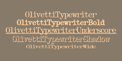 A typewriter font design, great for mimicking the sloppy ink effect of older machines.
 - Stained Glass by Funk King,
$5.00 Stained Glass can be used to created multi-layted effects reminiscent of stained glass.
 - Scabbard by Elemeno,
$25.00A font within a font. Recommended at large sizes only for eye-catching effect. - Rusted Brushpen by Gleb Guralnyk,
$13.00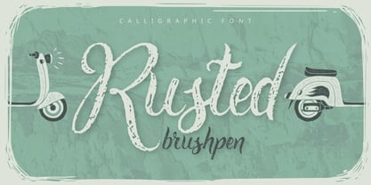 Introducing handcrafted "Rusted brushpen" font. It's a fancy brushpen script with rough grungy effect.
 - Fleischmann Gotisch PT by preussTYPE,
$29.00 Johann Michael Fleischmann was born June 15th, 1707 in Wöhrd near Nuremberg. After attending Latinschool he started an apprenticeship as punchcutter in the crafts enterprise of Konstantin Hartwig in Nuremberg, which ought to last six years. For his extraordinary talent Fleischmann completed his apprenticeship after four and a half years, which was very unusual. 1727 his years of travel (very common in these days) began, during which he perfected his handcraft by working in different enterprises as journeyman. First location was Frankfurt/Main where he worked for nearly a year at the renowned type foundery of Luther and Egenolff. Passing Mainz he continued to Holland, where he arrived in November 1728 and stayed till he died in 1768. In Amsterdam he worked for several type founderies, among others some weeks for Izaak van der Putte; in The Hague for Hermanus Uytwerf. Between 1729 and 1732 he created several exquisite alphabets for Uytwerf, which were published under his own name (after his move to Holland Fleischmann abandoned the second n in his name), apparently following the stream of the time. After the two years with Uytwerf, Fleischmann returned to Amsterdam, where he established his own buiseness as punchcutter; following an advice of the bookkeeper and printer from Basel Rudolf Wetstein he opened his own type foundery 1732, which he sold in 1735 to Wetstein for financial reasons. In the following Fleischmann created several types and matrices exclusively for Wetstein. In 1743 after the type foundery was sold by Wetstein’s son Hendrik Floris to the upcoming enterprise of Izaak and Johannes Enschedé, Fleischmann worked as independent punchcutter mostly for this house in Haarlem. Recognizing his exceptional skills soon Fleischmann was consigned to cutting the difficult small-sized font types. The corresponding titling alphabets were mostly done by Jaques-Francois Rosart, who also cut the main part of the ornaments and borders used in the font examples of Enschedé. Fleischmann created for Enschedé numerous fonts. The font example published 1768 by Enschedé contains 3 titling alphabets, 16 antiquacuts, 14 italic cuts, 13 textura- and 2 scriptcuts, 2 greek typesets (upper cases and ligatures), 1 arabic, 1 malayan and 7 armenian font systems, 5 sets of musicnotes and the poliphonian musicnotesystem by Fleischmann. In total he brought into being about 100 alphabets - the fruits of fourty years of creative work as a punchcutter. Fleischmann died May 27th, 1768 at the age of 61. For a long time he was thought one of the leading punchcutters in Europe. A tragedy, that his creating fell into the turning of baroque to classicism. The following generations could not take much pleasure in his imaginative fonts, which were more connected to the sensuous baroque than to the bare rationalism of the upcoming industrialisation. Unfortunately therefore his masterpieces did not survive the 19th century and person and work of Fleischmann sank into oblivion. The impressive re-interpretation of the Fleischmann Antiqua and the corresponding italics by Erhard Kaiser from Leipzig, which were done for the Dutch Type Library from 1993 to 1997, snatched Fleischmann away from being forgotten by history. Therefore we want to place strong emphasis on this beautiful font. Fleischman Gotisch The other fonts by Fleischmann are only known to a small circle of connoisseurs and enthusiasts. So far they are not available in adequat quality for modern systems. Same applies the "Fleischman Gotisch", which has been made available cross platform to modern typeset-systems as CFF Open Type font through the presented sample. The Fleischman Gotisch has been proved to be one of the fonts, on which Fleischmann spent a good deal of his best effort; this font simply was near to his heart. Between 1744 and 1762 he created 13 different sizes of this font. All follow the same principles of forms, but their richness of details has been adapted to the particular sizes. In later times the font was modified more or less sensitive by various type founderies; letters were added, changed to current taste or replaced by others; so that nowadays a unique and binding mastercopy of this font is missing. Likewise the name of the font underwent several changes. Fleischmann himself probably never named his font, as he did with none of his fonts. By Enschedé this textura was named Nederduits, later on Nederduitsch. When the font was offered by the german type foundery Flinsch in Frankfurt/Main, the more convenient name of Fleischmann-Gotisch was chosen. In his "Masterbook of the font" and his "Abstract about the Et-character" Jan Tschichold refered to it as "Duyts" again. To honour the genious of Johann Michael Fleischmann we decided to name the writing "Fleischmann Gotisch PT" (unhyphenated). Developing the digital Fleischman Gotisch I decided not to use one of the thirteen sizes as binding mastercopy, but corresponding to the typical ductus of the font to re-create an independent use of forms strongly based on Fleischmann´s language of forms. All ascenders and descenders were standardised. Some characters, identified as added later on, were eliminated (especially the round lower case-R and several versions of longs- respectively f-ligatures) and others were adjusted to the principles of Fleischmann. Where indicated the diverse characters were integrated as alternative. They can be selected in the corresponding menu. All for the correct german black letter necessary longs and other ligatures were generated. Through the according integration into the feature-code about 85% of all ligatures in the type can be generated automatically. Problematic combinations (Fl, Fk, Fh, ll, lh, lk, lb) were created as ligatures and are likewise constructed automatically. A historically interesting letter is the "round r", which was already designated by Fleischmann; it is used after preceding round letters. Likewise interesting is the inventive form of the &-character, which is mentioned by Tschichold in his corresponding abstract. Nevertheless despite all interpretation it was very important to me to maintain the utmost fidelity to the original. With this digital version of a phantastic texturfont of the late baroque I hope to contribute to a blossoming of interest for this genious master of his kind: Johann Michel Fleischmann. OpenType features: - Unicode (ISO 10646-2) - contains 520 glyphes - Basic Latin - Latin-1 Supplement - Latin Extended-A - Latin Extended-B - Central European Glyhps - Ornaments - Fractions - Standard ligatures - Discretionary ligatures - Historical ligatures - Kerning-Table
 - Jason Barry by Insan Perkasya,
$12.00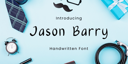 Jason Barry is a handwritten font with a simple and minimalist character. Crafted with sincerity, each letter reflects a friendly and full-of-character personality. This font is perfect for various designs, from greeting cards to branding projects that seek a minimalistic and appealing touch. If you have any question, please contact us.
 - Not My Type by It's me Simon,
$14.00 If you want your design to have that nostalgic typewriter effect, Not my Type would be perfect. It's old-fashioned and retro—letters are worn and grungy like it needs a new ink ribbon. Some of the letters are misaligned—just like a real old typewriter. It is best used at smaller sizes, perfect for logos, headlines, covers and any design where you want that vintage look and feel. Each letter has two alternatives, making three in total. Using the alternative letters, you can make your type layouts look more random, like a real typewriter. You can manually set the alternatives via the glyphs panel in your design software or you can enable them automatically. If you enable contextual alternatives in your design application, the letters will change automatically as you type.
 - Jukebox Hero by Grype,
$19.00 As one of the most popular rock bands of the world, Foreigner has rocked the charts with 10 multi-platinum albums and sixteen top 30 hits in the last 40 years. But one might ask what a band this successful has been missing all these years? No head games here...a consistent typeface based on their logo is the answer. As fans of Foreigner, we've taken the essence of their iconic logotype and expanded it out into a full typeface in regular and bold weights to celebrate their 40th anniversary tour. The Jukebox Hero Family celebrates the typographic stylings of Foreigner, with the soft rounded terminals and an open geometric feel, including the unique stencil flavor of the original logo. It inherited the friendly stylings of the all Capitals logo that inspired it, and goes on to include a full standard character set with expansive international support of latin based languages, and two weights jumping from regular to a beefy bold. This family is ready to rock the charts for your designs towards that of a modern, comfortable appeal. Here's what's included with Jukebox Hero Family bundle: 413 glyphs - including Capitals, Lowercase, Numerals, Punctuation and an extensive character set that covers multilingual support of latin based languages. (see the 3rd graphic for a preview of the characters included) 2 weights: Regular & Bold. Fonts are provided in TTF & OTF formats. The TTF format is the standard go to for most users, although the OTF and TTF function exactly the same. Here's why Jukebox Hero Family bundle is for you: You're a die-hard Foreigner fan, and have a case of "Double Vision" and need both font weights. You're looking for a stylish and sophisticated soft sans-serif stencil typeface family. You've been waiting for fonts like these. You're looking for a Sci-fi vibe typeface that has a look that feels familiar. You just like to collect quality fonts to add to your design arsenal
 - Sickle by Eclectotype,
$20.00 The Wild West meets Russia and India in this heavy duty display face. Although it's uppercase only, most of the characters vary between the uppercase and lowercase alphabets, so it's easy to give your text a hand-made feel by mixing up your cases. OpenType savvy applications can really exploit the extra features of this font. Engage contextual alternates, and G, C, L and alternate form of E will change when placed before a letter with a crossbar to create some cool effects (see the CK and LE combinations in the poster). There are standard ligatures for ff and FF combinations, and discretionary ligatures for 'and', 'the', 'No', 'Mc' and 'Co'. Engage stylistic alternates for a reversed 3 version of E, and the obligatory backwards R for that faux-Russian effect. Also included in the font is a host of ornaments. This font is perfect for wanted posters, heavy metal band logos, Communist propaganda leaflets and no doubt a load of other things too.
 - Teenage Dreams by Indieground Design,
$10.00 This handwritten font is ideal for bringing back 90s nostalgic atmospheres. With its indie nature, this grungy font will add a touch of spontaneity and style to any creative project. This font recreates the atmospheres of our teenage years in the 90s, when we listened to Smashing Pumpkins, wore Chucks, and went to indie gigs. We love thinking about that time of wonder, discovery and imagination, and Teenage Dreams is perfect for bringing them back into our creative projects. Achieve a realistic handwritten effect by mixing the 4 different versions in titles and covers, instantly creating typographic artwork with an alternative, intimate attitude. On top of that, we also added a 5th bonus version of this dreamy font, with scribbles and drawings you can add to your compositions. This way, you will get a grungy scrapbook effect while adding intensity and style to any project. It is awesome when used on dark, noisy backgrounds, or used on top of images and photographs!
 - Pugnax by Pugnax,
$22.34 It is a font suitable for comics, with many ligatures to simulate the "handmade" effect.
 - Bald Eagle by Gleb Guralnyk,
$13.00 Hi! Introducing vintage font Bald Eagle. Stamp textured effect surface makes it really authentic look.
 - Andy Bear by Gatype,
$8.00 Andy Bear embodies oddity and authenticity. This dazzling display font will turn any creative idea into a standout. Get inspired by its fun styles, and use them to brighten up kids or school projects! This font has no shadow effect by default. You can create this effect by duplicating the text and placing the duplicates
 - Moho FX Shadow Pro by John Moore Type Foundry,
$40.00 A display font collection for fantasy headlines within the concept of Moho Condensed based in letters with shadows as Moho Umbra Regular and Italic, or simple shadow effect as Moho Shadow Regular and Italic, or font effects to be used in color layers. all ideal for interesting lettering to magazines, posters and labels design.
 - Khonsong Rounded by Jipatype,
$27.00 Introducing "Khonsong Rounded" a rounded semi-condensed sans serif font that embodies a harmonious blend of modernity, futurism and softness. With its sleek and contemporary appearance, Its semi-condensed proportions strike a perfect balance between space-saving efficiency and legibility, making it an ideal choice for various applications, from online media to print media.
 - Roman Forum by Solotype,
$19.95A special effects font that forms headlines reversed on a background. Many different endpieces are furnished. - StyleBats - Unknown license

- Ambrosia Demo - Personal use only

- El Abogado Loco - Unknown license

- Unpack by PintassilgoPrints,
$19.00 Unpack is a soft and inviting face. It is available in two cuts, upright and slanted, both all-caps with 2 options for each letter for a nice uneven organic look. The family counts also with a picture font, loaded with some handy extras like banners, stars and ornaments. This versatile family fits greatly many usages. Type some food name and you'll get hungry, type a toy and you'll want to play. Don't believe it? You don't even need to unpack it to try!
 - Rip TAPE by TypoGraphicDesign,
$19.00 CONCEPT/CHARACTERISTICS The handmade, dirty and yet modern character of the font was designed with analog tape on paper and later digitized. The motto is sticky, wrinkled and rough APPLICATION AREA The dirty, rough and fancy font „rip TAPE“ would look good at display size for poster, flyer, comics and graphic novel lettering and logos. Headlines in magazines or websites, packaging, music covers or webbanner etc. TECHNICAL SPECIFICATIONS Headline Font | Display Font | Grunge/DIY Font „rip TAPE“ OpenType Font with & 78 glyphs & 2 styles (regular, fixed).
 - Snowky Brush by Letterara,
$10.00 Snowky Brush is a simple layered font inspired by the uniqueness of the snow. It includes 2 fonts. Snowky Brush is great in any branding, posters designs, and your upcoming winter stuff. Get inspired by its snow look & feel! Features : - Uppercase - Numerals - Punctuations (OpenType Standard) - Accents (Multilingual characters) - Works on PC & Mac - Simple installations - Accessible in the Adobe Illustrator, Adobe Photoshop, Adobe InDesign, even works on Microsoft Word. don't wait anymore, put it in your shopping basket :) and follow me, because there will be many promos!
 - FF Brokenscript by FontFont,
$41.99 Dutch type designer Just van Rossum created this blackletter FontFont in 1991. The family contains 2 weights: Bold and Condensed and is ideally suited for advertising and packaging, festive occasions, editorial and publishing, logo, branding and creative industries as well as poster and billboards. FF Brokenscript provides advanced typographical support with features such as ligatures, alternate characters, case-sensitive forms, and stylistic alternates. It comes with proportional oldstyle figures. This FontFont is a member of the FF Brokenscript super family, which also includes FF Brokenscript Rough.
 - Summer Loving by Nicky Laatz,
$17.00 Throw on some shades and get summer ready with the new Summer Loving Font Family! Summer Loving consists of 3 fonts, 2 of which are brush scripts, one textured and a solid version, and a smooth-edged all caps sans serif font. Packed with opentype ligatures and handy alternate letters, the script fonts have natural hand brushed strokes to give your project that ultra-realistic and natural look. 4 Handy Swashes can by created simply by typing out bracket pairs with your opentype ligatures setting active : () {} []
 - Goldbarre by Greater Albion Typefounders,
$19.95 Goldbarre is a finely engraved slab serif face in the spirit of ‘between the wars’ commercial confidence. It’s a solid and dependable face of distinction for use on certificates and posters which need to convey an emphatic yet refined message. The letterforms of Goldbarre combine finely hatched shading with and embossed, three-dimensional, quality. The utility of the family is further enhanced with Goldbarre No 2 - a solid shaded face, Goldebarre No 3 - an open embossed face, and Goldbarre No 4 - a basic black slab-serif face.
 - Hebrew Alter Rebbe of Liadi by Samtype,
$385.00 This is the Alter Rebbe of Liadi Ksav. This is a complete font with all diacritic marks (Nikud and Taamim) and also shevana, kamatz katan, dagesh hazak and holam chaser. There are 2 alternatives kinds of Lamed. The Nikud and the Trop are completily independent of the letters. You can use diferent colors in them. There is no combination of letters except for Alef-Lamed ligature. Two diferents kinds of "He" appears in the Tetragramation. You can make any kind of prayer book with this font.
 - Tecnica by Graviton,
$20.00 Tecnica font family has been designed for Graviton Font Foundry by Pablo Balcells. It is a modular, geometric, sans serif typeface with a slightly condensed design and subtle rounded angles. It has been conceived to be most suitable for all sized headlines, as well as short and middle length text blocks. The standard styles give texts a classic appearence while alternate styles give texts a playfull one. Tecnica consists of 4 styles, 2 weights plus alternates, each containing small caps and glyph coverage for several languages.


