10,000 search results
(0.074 seconds)
- Enforcer by Tour De Force,
$25.00 Modern simple typeface expressing sharp and bright words without need for writing something really smart. Made by Dusan Jelesijevic one day when he left without anything smart to say or write, so he just grabbed a pencil and forced the paper to be cooperative. Someone said that this typeface looks like the ancient Greeks went in present future and used contemporary equipment for writing those letters. It is ideal for branding and avantgarde identities.
 - Capella by Larin Type Co,
$15.00 Capella is a beautiful and charismatic hand drawn font, it will emit your individuality in any project. It will draw attention to itself and highlight the main thing in your design. Ligatures and alternates will help create an impression of integrity. You can also use Capella to create a logo or templates, invitations, blog, branding, marketing, book covers, magazines, advertising, stationery, logo design and much more. This font is easy to use and has OpenType features.
 - Saracen by Hoefler & Co.,
$51.99 Saracen is the Latin (wedge serif) member of The Proteus Project, a collection of four interchangeable type families designed in different nineteenth century styles. The Saracen typeface was designed by Jonathan Hoefler in 1992. Saracen is a design in the ‘latin’ style, characterized by wedge-shaped serifs, a genus of type that emerged in the mid-nineteenth century. A part of The Proteus Project, the typographic theme-and-variations based on related Regency styles, Saracen was created for Rolling Stone, in whose pages the typeface first appeared in 1993 . From the desk of the designer: Though the wedge serif printing type is a nineteenth century innovation, Saracen does not resemble any font from this era. It’s mysterious that typefounders of the Victorian age who sought the extreme and fanciful in their work — exploring all manner of serif treatments, and creating extra-condensed and super-expanded designs — never made a latin font of this straightforward proportion. <
 - Annaberra by IbraCreative,
$17.00 Annaberra – A Natural Handwriten Script Font Annaberra, a natural handwritten script font, embodies the essence of organic and fluid penmanship. Crafted with meticulous attention to detail, each stroke of this font reflects the spontaneity and authenticity of hand writing, capturing the nuances of a personal touch. The gentle curves and varied weights of the letterforms lend Annaberra a graceful and inviting appearance, making it an ideal choice for projects seeking an approachable yet sophisticated aesthetic. Whether used for invitations, branding, or creative displays, Annaberra exudes a timeless charm, seamlessly blending the warmth of human expression with the convenience of digital typography. Annaberra is perfect for branding projects, logo, wedding designs, social media posts, advertisements, product packaging, product designs, label, photography, watermark, invitation, stationery, game, fashion and any projects. Fonts include multilingual support for; Afrikaans, Albanian, Czech, Danish, Dutch, English, Estonian, Finnish, French, German, Hungarian, Italian, Latvian, Lithuanian, Norwegian, Polish, Portuguese, Slovak, Slovenian, Spanish, Swedish.
 - Du by sugargliderz,
$20.00 Du is a self hommage to Uncertain Felttip. Uncertain, made in 2008, is a typeface which reproduced faithfully the style in which I am writing on copy paper, usually using the felt-tip pen. This time, I wrote the new family by the same method but using the tablet PC and the touch pen. Although, as for some characters, Uncertain differs in a form, it is the result of reflecting my hand writing. I wrote all the characters. If it is original, all the characters diverted and composed, for example, characters, such as Aacute and Agrave, are written. Different specification from Uncertain is family composition. Although Uncertain had only 3 weight, 7 weight were designed for Du. This way a user can choose his favorite weight because the variation of weights increased.
 - Kinger by Twinletter,
$15.00 We designed Kinger as a display font with the notion of excellent graffiti writing in mind. We have polished Kinger into a typeface that is ideal for use in a variety of projects since when you use this font, your complete project will appear more beautiful and pleasant in the eyes of many people. This graffiti font is great for product logos, poster titles, headlines, packaging, film titles, logotypes, gorgeous writing, and trendy graffiti designs, among other things. Of course, if you utilize this font in your numerous creative projects, they will be perfect and outstanding. Use this typeface right away for your one-of-a-kind and remarkable projects.
 - Bembo MT by Monotype,
$45.99 The origins of Bembo go back to one of the most famous printers of the Italian Renaissance, Aldus Manutius. In 1496, he used a new roman typeface to print the book de Aetna, a travelogue by the popular writer Pietro Bembo. This type was designed by Francesco Griffo, a prolific punchcutter who was one of the first to depart from the heavier pen-drawn look of humanist calligraphy to develop the more stylized look we associate with roman types today. In 1929, Stanley Morison and the design staff at the Monotype Corporation used Griffo's roman as the model for a revival type design named Bembo. They made a number of changes to the fifteenth-century letters to make the font more adaptable to machine composition. The italic is based on letters cut by the Renaissance scribe Giovanni Tagliente. Because of their quiet presence and graceful stability, the lighter weights of Bembo are popular for book typography. The heavier weights impart a look of conservative dependability to advertising and packaging projects. With 31 weights, including small caps, Old style figures, expert characters, and an alternate cap R, Bembo makes an excellent all-purpose font family.
 - Bembo Infant by Monotype,
$45.99The origins of Bembo go back to one of the most famous printers of the Italian Renaissance, Aldus Manutius. In 1496, he used a new roman typeface to print the book de Aetna, a travelogue by the popular writer Pietro Bembo. This type was designed by Francesco Griffo, a prolific punchcutter who was one of the first to depart from the heavier pen-drawn look of humanist calligraphy to develop the more stylized look we associate with roman types today. In 1929, Stanley Morison and the design staff at the Monotype Corporation used Griffo's roman as the model for a revival type design named Bembo. They made a number of changes to the fifteenth-century letters to make the font more adaptable to machine composition. The italic is based on letters cut by the Renaissance scribe Giovanni Tagliente. Because of their quiet presence and graceful stability, the lighter weights of Bembo are popular for book typography. The heavier weights impart a look of conservative dependability to advertising and packaging projects. With 31 weights, including small caps, Old style figures, expert characters, and an alternate cap R, Bembo makes an excellent all-purpose font family. - Kabusi by Twinletter,
$15.00 Kabusi San Serif is a premium font family with 18 different styles to choose from. Designed to aid you in the creation of visually stunning projects of all types. It is the most widely used typeface on the internet, in printed materials, and in other design projects. This Kabusi San Serif font embodies both modernity and classicism while remaining simple and clean in appearance. Apart from their great looks, this premium font family will assist you in giving your company a more unique look that will pay off! of course, your various design projects will be perfect and extraordinary if you use this font because this font is equipped with a font family, both for titles and subtitles and sentence text, start using our fonts for your extraordinary projects.
 - Elido by Kontour Type,
$50.00 Elido (Odile in reverse) is the sans counterpart to the Odile type. Together they form a sans/serif superfamily with a wide range of variations for editorial use. Elido follows Odile’s proportions and matches the weight and typographic color of its serif twin. Elido is a sans with classical proportions. A slight geometric hint and open counters convey an airy feel. Elido’s family structure and relations within echo the conceptual approach of Odile. The arched stroke low off the stem reveals a script characteristic most pronounced in the Elido Upright Italic. This particular interpretation is gradually diminished in the Italic and becomes even less emphasized in the Regular. Six balanced weights, from an elegant Light to a pronounced Black, are in tune with three display solutions and a set of beautiful Ornaments. These variants allow for a diverse and multifaceted typography for the discerning type user. Sans serif initials amount to a rare finding. The charming monolinear Elido Initials come in two flavors, elaborate and rational, designed to hold their own in editorial and headline sizes. This type design boasts an extensive character set, many OpenType features including roman and italic Small Caps, five sets of numerals, beautiful ligatures, and many more. OT stylistic variants (with accents) offer a one-story “a” for the roman weights, alternate “g” and “s” designs for the italics, and a variant glyph “s” for the Upright Italic. These distinct qualities with its versatile and sincere traits make Elido an excellent choice for text and display use.
 - Soma by Funk King,
$10.00Soma is inspired by the Soma cube and the work of MC Escher. The font uses geometric patterns to create “impossible” glyphs. Some can be easily imagined; others bend the mind. Many alternate versions of glyphs have been provided for additional design possibilities. This is my 2nd most popular font at Dafont with over 50,000 downloads. The original set was 26 basic characters (A-Z), repeated for uppercase and lowercase. Now the set is almost 300 glyphs. - 26 Flowers by Celebrity Fontz,
$24.99 26 Flowers is a digital revival and restoration of a beautiful collection of 26 individually unique ornamental letters from historical texts. Each of the 26 letters of the alphabet are contained in a square frame with a different flower in the background and an antique letter in the top right corner; hence, the name 26 Flowers. This highly ornamented typeface is perfect for leading off paragraphs or in any text dealing with the subject of flowers.
 - Quiet Time by ParaType,
$25.00The font was developed as a part of a corporate identity project for a pillow shop on the base of existing logo. It’s an attempt to reflect the space of a dream -- virtual reality where objects don’t have solid shapes, but present just hardly noticed disappearing contours. This idea determines the design of letters that resemble illustrations rather then alphabetical symbols and are based on ultra thin stems. The font was designed by Elena Kolesnikova and released by ParaType in 2009. - Meilia Beauty by Letterhend,
$17.00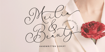 Meilia & Beauty is a gorgeous handwritten script font that embodies the essence of femininity and beauty. Its flowing curves and classy details create a look that is both charm and classy. Perfect for fashion, beauty, and lifestyle brands, this font will add a touch of sophistication and glamour to the other various formal forms such as invitations, labels, logos, magazines, books, greeting / wedding cards, packaging, fashion, make up, stationery, novels, labels or any type of advertising purpose. Features : Uppercase & lowercase Numbers and punctuation Alternates & Ligatures Multilingual PUA encoded We highly recommend using a program that supports OpenType features and Glyphs panels like many of Adobe apps and Corel Draw, so you can see and access all Glyph variations.
 - Duwal Pro by Volcano Type,
$76.00 The careful balance between the emotional swings and shapes set in strong contrast such as the burly serifs, or generally vertical and orderly appearance within the Duwal Pro determine the special look of this Antiqua typeface. All characters of the Duwal Pro are designed to be open and accessible. The lowercase letters are designed with a large x-height, which is why they are ideal for small font sizes. Many striking details give Duwal Pro a defined and firmer appearance with increasing font size so it is also suitable for use in headlines and work marks. The deliberately constructed and emphasized design of the serifs give the font a strong position and at the same time force the reading direction. Using Duwal Pro in Bold weight, the serifs look clearly striking, the design language is concise and the typeface receives an additional sympathetic force. The Italic weight draws on the expressive but not intrusive design of the Regular, but appears sharper and is ideal for text passages. The font family contains italics, small caps, lots of ligatures, swashes, another format set, contextual alternatives and special characters as well as other open-type features which allow the use of Duwal Pro in 48 languages.
 - JetJaneButton by Ingrimayne Type,
$15.00 JetJaneButton has letters on a design that looks like a computer button. Its letters are from JetJane Mono, a sans-serif monospaced font. The typeface contains characters that can add color to letters. There are two ways to do this. One uses layers and the other a combination of characters, some with zero width. This pdf file explains the how this can be done.
 - Albatros by Gatype,
$16.00 Albatross is a beauty Display look. This font is suitable for invitation cards, decorations, clothing products, greeting cards and more. This font also has uppercase, lowercase, numbers, punctuation and multilingual. and there are several alternative ligatures and styles. Albatross is coded with Unicode PUA, which allows full access to all additional characters without having to design any special software. Mac users can use Font Book, and Windows users can use the Character Map to view and copy any additional characters to paste into your favorite text editor/app. How to access all the alternate characters using Adobe Illustrator: https://www.youtube.com/watch?v=XzwjMkbB-wQ Designer: khaidir
 - Aladdin by CozyFonts,
$20.00 Aladdin Black is the 3rd member of our Aladdin Bold Font Family. This new style is extra bold and slightly rounded on the outsides of the glyphs. It is fat, fancy, fearless, forward, devilish, heavy, and stylized. Aladdin Bold was my first font introduced in 2012. I've always felt there were possibilities of adding styles to this family and something triggered the decision, so...here it is. I took much time deliberating over many of the finer details in this version of Aladdin and I hope the 'devil is in the details' for whoever decides to try on Aladdin Black.
 - Mellow Morning by Set Sail Studios,
$18.00 Inject some irresistible fun into your designs with the Mellow Morning Font Duo! This playful font duo consists of a fast flowing signature script, and a charming small caps font as the perfect companion. But that's not all - also included is a bonus doodle font containing 45 hand-drawn doodles - designed to add an eye catching, hand-made appeal to your Mellow Morning fonts. The Mellow Morning Family includes; Mellow Morning Script • A clean, free-flowing handwritten signature font containing upper & lowercase characters, numerals, and a large range of punctuation. Mellow Morning Script Alt • This is a second version of Mellow Morning Script, with a completely new set of both upper and lowercase characters. If you wanted to avoid letters looking the same each time to recreate a custom-made style, or try a different word shape, simply switch to this font for an additional layout option. Mellow Morning Small Caps • A clean, charming handwritten all-caps font. Contains 2 sets of a-z letters, simply switch between upper and lowercase to toggle between both sets. Also includes 8 stylised letters for extra flair, accessible via a Glyphs panel or by switching on Stylistic Alternates. Mellow Morning Small Caps Italic • An italicised version of Mellow Morning Small Caps, which can be used for a more fast-hand flow to your text. Mellow Morning Doodles • A set of 45 doodles designed to pair with the Script & Small Caps fonts. Simply install this as it's own font, and type any A-Z or a-s character to generate each doodle. Language Support • All Mellow Morning fonts support the following languages; English, French, Italian, Spanish, Portuguese, German, Swedish, Norwegian, Danish, Dutch, Finnish, Indonesian, Malay, Hungarian, Polish, Croatian, Turkish, Romanian, Czech, Latvian, Lithuanian, Slovak, Slovenian
 - Ryleigh by Krafted,
$10.00 Introducing Ryleigh - A Modern Calligraphy Font. A fabulous and elegant modern calligraphy font that’ll engage your audience and make your branding stand out from the competition. Handcrafted to create the perfect contrast between your headings and body copy. Perfect for social media branding projects, fashion designs, printed quotes, packaging, or even as a stylish text overlay to any background image. Ryleigh includes Ligature & Stylistic Sets as well as Multilingual Support to make your branding reach a global audience. Let the world see your gorgeous projects with this modern calligraphy font! What you’ll get: Multilingual & Ligature Support Full sets of Punctuation and Numerals Compatible with: Adobe Suite Microsoft Office KeyNote Pages Software Requirements: The fonts that you’ll receive in the pack are widely supported by most software. In order to get the full functionality of the selection of standard ligatures (custom created letters) in the script font, any software that can read OpenType fonts will work. We hope you enjoy this font and that it makes your branding sparkle! Feel free to reach out to us if you’d like more information or if you have any concerns.
 - Caslon Antique by GroupType,
$19.00 Caslon Antique is a decorative American typeface that was designed in 1894 by Berne Nadall. It was originally called "Fifteenth Century", but was renamed "Caslon Antique" by Nadall's foundry, Barnhart Bros. & Spindler, in the mid-1920s. The design of the typeface is meant to evoke the Colonial era. Early printers would reuse metal type over and over again, and the faces would become chipped and damaged from use. Caslon Antique emulates this look. Despite the name, it is not a member of the Caslon family of typefaces. The renaming is believed to have been a marketing maneuver to boost the popularity of a previously unpopular typeface by associating it with the highly popular Caslon types. Caslon Antique is popular today when a "old-fashioned" or "gothic" look is desired. It is used by the musical group The Sisters of Mercy on their albums, for the logo of the musical Les Misérables, and for the covers of the books in A Series of Unfortunate Events. It is also frequently used on historical displays. It was used for the previous edition of the Warhammer Fantasy Role-Play. Most recently, it has been used on promotional material for the smash musical Monty Python's Spamalot on Broadway, the West End, and its tour of the United States. British 80's band The The also used the font in several of their music videos, usually displaying several lyrics from the song in the opening scenes. It used on the cover of Regina Spektor's album, Begin to Hope. This description was sourced (in part) from Wikipedia, the free encyclopedia.
 - Pobla by Tipo Pèpel,
$22.00 Optimum readability in small bodies with scarce interlining, under poor printing conditions such as in newspapers, where velocity and bad quality’s irregular surface papers, truly distort strokes was the challenge taken. Pobla was designed with this in mind, hence Patau present a hybrid between the conventional strokes of a serif’s classical roman type and markedly “fractured” forms inside, providing a unique personality to this typographic family, where calligraphic’s humanistic axis is visibly broken with the straight axis of the fabricated letters. Subtle details in the serifs, give it a modern look to a classic skeleton. Very pronounced ink traps get the shapes rounded in the printed product to artificially increase the average medium-eye and promote reading in the small sizes it was designed for. An absolutely handwriting look for the italics, where the rupture of the stroke marks a white’s subtle change to only whisper in the printing surface a slight difference, but without fuss and so not to break the rhythm of reading. And as we are used to, a complete set of OpenType features, where you will find small caps, fractions, ligatures, old numerals and tabular, discretionary ligatures and support for 220 languages; and all available in twelve weights to meet the needs of any newspaper printing.
 - Sanaa Pro V2 by GHEEN Studio,
$25.00 Font Sanaa is the second version of the Font family. It is an Arabic and Latin font and the splintered languages from them. It contains many characters, signs and languages. It is distinguished by its uniqueness in drawing and shape to meet the needs
 - Soho Gothic by Monotype,
$29.99 “There is just something magical about type design,” says Sebastian Lester. “If you draw a successful typeface it can travel the world, taking a part of you with it.” If this is true, his Soho® Gothic family has taken him far and wide. Understated, modern and exceptionally versatile, the family has been put to good use in just about every application imaginable. A good choice for virtually any type of project, The Soho Gothic family performs equally well as the backbone of a global brand as it would in an edgy fashion magazine. Versatile, extensive, customizable, and multilingual – the Soho Gothic typeface family has it all.With the same proportions as Soho, its slab serif cousin, Soho Gothic ranges across seven weights, from a willowy hairline to a brawny ultra – each with a complementary italic.Lester took care to ensure that the Soho and Soho Gothic designs work in perfect harmony. According to him, “The typefaces were developed alongside each other so that I could consider every aspect of each design and be certain that they would be absolutely compatible.”Soho Gothic is a more understated and more subtle design than Soho. Features that give the design its distinctive tone are the flat, crisp apexes of the diagonal characters like the A and V, and the marked horizontal stress in the a, g and s. “I wanted the family as a whole to radiate effortless modernity,” recalls Lester, “to be a master communicator that works in all conditions and at all sizes.” A collection of alternate and “semi-slab” characters were also part of Lester’s plan. “I like to develop alternate characters for all my type designs,” he says. “I believe they give graphic designers greater flexibility and make a typeface more valuable.” Soho Gothic is available as OpenType® Pro fonts that have an extended character set which supports most Central European and many Eastern European languages. If you’re looking to complete your designs, consider pairing it with Bembo® Book,Joanna® Nova,Neue Frutiger®,PMN Caecilia®,or ITC Stone® Serif.
 - Lyllo by Eurotypo,
$34.00 Lyllo is a casual script font with a huge personality and a bouncy baseline. Each glyph was drawn by hand with a calligraphy pen for later, to be digitized with great precision, carefully guarding the authentic look. It is perfect if you want to convey individuality and style. Lyllo has 745 glyphs: a lot of ligatures that help to sustain the natural flow of handwriting, swashes, finishes, initial shapes and a lot of alternatives for a realistic look with handwriting and for you to give a personalized flare to your designs. Lyllo also offers many catchwords and adornments that complement the charm and uniqueness of the font. To activate the optional glyphs you may click on buttons in any OpenType savvy program or manually choose the characters from Glyph Palette. This lovely font has already an extended character set to support Central and Eastern as well as Western European languages. Lyllo is a perfect choice for greeting cards, posters, labels, t-shirt design, logos, and more. Lyllo was made to make your project more beautiful and attractive!
 - Yorkten Slab by insigne,
$- The Yorkten family of fonts is back with another satisfying addition to its clean style. The rhythmic, new Yorkten Slab expands Yorkten’s basic, contemporary form of geometric and simple lines and adds a level of self-confidence and elegance to your work. Slab's basic structure is compact. It’s more condensed than most slabs, so you can save space yet still have clear, consistent readability. The added serifs create a fresh text color, too, that syncs well with the new font’s inherited features. Like its predecessor, Yorkten Slab offers its natural, simple structure with more than fifty fonts in the family and three different widths - extended, normal or condensed. Each group has eight weights from a lean thin to tough looking black, giving Yorkten Slab plenty of bragging rights among its peers. And like Yorkten, too, Yorkten Slab’s greatest value is the ability of its members to work easily and well together and with a variety of other fonts. Yorkten Slab ensures that you have the necessary tools for any challenge. In combination with its superior functionality and excellent readability, this versatile font can be effectively used for many print and screen operations: e-books, applications, headlines, banners, posters and websites to name a few options. Don’t wait any longer. Start tapping the possibilities that Yorkten Slab offers your work.
 - Codiga by Andinistas,
$19.95Codiga is perfect for titles and badges that need to show a futurist and space sensation. Its angles formed by straight lines and its san serif monolineal design allows its solid and rigid shapes stress its industrial and technology Look. Codiga consisting of 8 styles: Blanca, Gris, Negra, Super Negra, X1, X2, Stencil and Dingbats (Codiga Dingbats includes 26 illustrations characters). Codiga Blanca, Gris, Negra, Super Negra, X1, X2, Stencil include the complete character set with lower and upper case letters, numbers, accents, diacritics, puntuation and monetary symbols. All of the fonts included in this familily are available in the Open Type format and they are Mac and PC compatible. - Basilio by Canada Type,
$29.95 In the late 1930s, old Egyptiennes (or Italiennes) returned to the collective consciousness of European printers and type houses — perhaps because political news were front a centre, especially in France where Le Figaro newspaper was seeing record circulation numbers. In 1939 both Monotype and Lettergieterij Amsterdam thought of the same idea: Make a new typeface similar to the reverse stress slab shapes that make up the titles of newspapers like Le Figaro and Le Frondeur. Both foundries intended to call their new type Figaro. Monotype finished theirs first, so they ended up with the name, and their type was already published when Stefan Schlesinger finished his take for the Amsterdam foundry. Schlesinger’s type was renamed Hidalgo (Spanish for a lower nobleman, ‘son of something’) and published in 1940 as ‘a very happy variation on an old motif’. Although it wasn’t a commercial success at the time, it was well received and considered subtler and more refined than the similar types available, Figaro and Playbill. In the Second World War, the Germans banned the use of the type, and Hidalgo never really recovered. Upon closer inspection, Schlesinger’s work on Hidalgo was much more Euro-sophisticated and ahead of its time than the too-wooden cut of Figaro and the thick tightness of Playbill. It has a modern high contrast, a squarer skeleton, contour cuts that work similarly outside and inside, and airy and minimal solutions to the more complicated shapes like G, K, M, N, Q and W. It is also much more aware of, and more accommodating to, the picket-fence effect the thick top slabs create in setting. Basilio (named after the signing teacher in Mozart’s Figaro) is the digital revival and major expansion of Hidalgo. With nearly 600 glyphs, it boasts Pan-European language support (most Latin languages, as well as Cyrillic and Greek), and a few OpenType tricks that gel it all together to make a very useful design tool. Stefan Schlesigner was born in Vienna in 1896. He moved to the Netherlands in 1925, where he worked for Van Houten’s chocolate, Metz department store, printing firm Trio and many other clients. He died in the gas chambers of Auschwitz in 1944. Digital revivals and expansions of two of his other designs, Minuet and Serena, have also been published by Canada Type.
 - Revolution Gothic P by Dharma Type,
$19.99 Revolution Gothic P font family is designed based on Revolution Gothic and a distressed offshoot from the original. Revolution Gothic is an arranged and extended version of PAG Revolucion released from Prop-A-Ganda type foundry in 2008. The original font is inspired by retro propaganda posters and wallpainting in Cuba from the 60s to 80s. And the original PAG Revolucion is the most popular font from Prop-A-Ganda. The glyphs that damaged by printing the original had been tweaked by hand work with great care to be looked like natural damaged effect. This Revolution Gothic P family contains basic Roman, Italic, Bold and it’s Italic to suit a wide range of your creative works and it will be one of the most powerful solutions for printing and web.
 - Space Time by Lauren Ashpole,
$15.00 What can I say? I like fonts with stars. Space Time is a hand drawn font with a lot of variety. I started designing the regular version with the characters slightly touching but it wasn't quite what I had in my head. I’d imagined tightly spaced letters with overlapping shadows and the only way to get that effect was to create a second version with stackable layers. That means this download includes regular, base, outline, shadow, and stars files. Plus, the base and outline can be used for stacking or work fine as standalone fonts. This font is all caps but the lowercase letters feature alternative styles.
 - Yugone by IbraCreative,
$13.00 Yugone, a delightful hand-drawn font, exudes an endearing charm with its whimsical and playful strokes. Each character is meticulously crafted, embracing a delightful simplicity that lends an approachable and cute aesthetic. The font’s warm, rounded edges create a friendly and inviting feel, making it perfect for conveying a sense of innocence and joy in various design projects. Whether used for greeting cards, children’s books, or social media graphics, Yugone adds a touch of sweetness and character, capturing attention with its uniquely handcrafted appeal. The fluidity of the strokes and the carefully designed details make Yugone an enchanting choice for those seeking a cute and charming hand-drawn font to infuse their creations with personality and warmth.
 - Dopelton by Variatype,
$22.00 Introducing Dopelton, a signature font that transcends the ordinary, embodying the essence of personal style and sophistication. Crafted with meticulous attention to detail, Dopelton is more than a font; it’s a stroke of individuality, a visual symphony that transforms signatures into works of art. Each letter in Dopelton carries a distinctive flair, reminiscent of a signature penned by a hand writer. The fluid strokes seamlessly merge, creating a harmonious rhythm that captures the art of the handwritten with a contemporary twist. The balance between elegance and readability is finely tuned, making Dopelton versatile for various design purposes. Dopelton is not confined to the limits of static characters; it adapts to the natural flow of the hand, ensuring a unique signature experience every time. The font’s dynamic nature brings authenticity to digital signatures, providing a touch of human warmth in the digital realm. The details of Dopelton are a testament to its craftsmanship. Subtle curves, refined loops, and a tasteful interplay of thick and thin lines give each letter a signature-worthy personality. Whether used for branding, invitations, or personalized stationery, Dopelton adds a touch of refined charm to any project. This signature font is designed to make a statement—bold yet graceful, modern yet timeless. Dopelton is more than a font; it’s an extension of your identity, a signature that leaves a lasting impression. Elevate your designs with Dopelton and let your words carry the unmistakable touch of personalized elegance. FONT FEATURES Additional Accents 68 Languages Kerning Alternates Ligatures Swashes
 - Dolsáb by Kent Barns,
$20.00 Dolsáb was designed from scratch with uniqueness in mind. The subtle movement from thick to thin and the variants of sharp to rounded make this cutting edge san serif a must have. The inspiration for Dolsab was a simple pairing of a rhombus and calligraphy. While neither of those two elements can be seen in their entirety in any instance, the influence of both is strong. The rhombus can be notice on most ascenders like on the lowercase t & l, for example. And the calligraphy inspiration is most easily captured on the descenders such as the lowercase y & g. The most beautiful characteristics of Dolsab is definitely the calligraphy-influenced movement. These features really stand out on the lowercase a & e. It's almost amusing to let your eye follow the contours of those two letter forms as they travel from thick to thin, sharp to rounded and back again. Users are welcomed to try all font styles of Dolsab in any applique of their choosing. However, it will be quickly noticeable that only Dolsab Air & Demi (the thiner of the styles) will be best suited for body copy. Personally I like to see these letterforms as large as they can be to really showcase the subtle movement, especially in Dolsab Heavy where these movements become much more dramatic. You'll never know what really works best unless you experiment. Dolsab surely isn't the answer to all projects, but it's certainly worth trying. No other typeface moves quite like Dolsáb.
 - Gaumont - Unknown license

- Music Course by Jeff Levine,
$29.00 The 1927 beginner’s book for Shefte’s Rapid Course in Modern Piano Playing had its title hand lettered in a bold serif typeface that reflected some of the influences of the Art Nouveau era. This became the model for Music Course JNL, which is available in both regular and oblique versions.
 - Evening Walk JNL by Jeff Levine,
$29.00 The cover of the sheet music for 1930's "Walkin' My Baby Back Home" features the title hand lettered in a bold sans serif with the slightest flair of Art Nouveau styling. This design is now available as Evening Walk JNL, which is available in both regular and oblique versions.
 - Nouveau Slab Serif by Jeff Levine,
$29.00 The cover of the 1902 sheet music for "I'll Be Baby in Baby's Place" features the title hand lettered in a wonderful Art Nouveau slab serif style with many eccentric letter forms. This is now available as the digital typeface Nouveau Slab Serif JNL, in both regular and oblique versions.
 - English Monarchs by Celebrity Fontz,
$24.99 English Monarchs is a unique font collection with accurate digital replicas of 84 signatures of English and British monarchs from Richard II through Elizabeth II, including many of the royal consorts. Also included in this font are the Stuart pretenders and Mary Queen of Scots and her consort. A must-have for autograph collectors, desktop publishers, history buffs, fans, or anyone who has ever dreamed of sending a letter, card, or e-mail "signed" as if by one of these famous nobles. This font behaves exactly like any other font. Each signature is mapped to a regular character on your keyboard. Open any Windows application, select the installed font, and type a letter, and the signature will appear at that point on the page. Painstaking craftsmanship and an incredible collection of hard-to-find signatures go into this one-of-a-kind font. Comes with a character map. This font includes signatures from the following noble figures: Richard II, Henry IV, Henry V, Henry VI, Margaret of Anjou, Edward IV, Elizabeth Woodville, Edward V, Richard III, Henry VII, Elizabeth of York, Henry VIII, Catherine of Aragon, Anne Boleyn, Jane Seymour, Anne of Cleves, Catherine Howard, Catherine Parr, Edward VI, Lady Jane Grey, Mary I Tudor, Elizabeth I, James I, Charles I, Henrietta Maria of France, Oliver Cromwell, Richard Cromwell, Charles II, Catherine of Braganza, James II, William III, Mary II, Anne, Prince George of Denmark, George I, George II, George III, George IV, William IV, Victoria, Prince Albert, Edward VII, George V, Edward VIII, Wallis Warfield Simpson, George VI, Elizabeth II, Prince Philip, Prince Charles, Princess Diana, Camilla Duchess of Cornwall, Prince James Edward Stuart, Prince Charles Edward Stuart, Mary Queen of Scots, Henry Stuart Darnley, Francis II of France.
 - Cotillion Pro by Canada Type,
$39.95 Cotillion is an original design Jim Rimmer finished just before the turn of the century. Alongside its evidence of Jim's nostalgia at the deco type designs he was exposed to as a child, it distinctly shows a type designer who has become very comfortable with that rarest of design abilities: Bringing efficient typographic solutions to what is essentially a calligraphic endeavour. This design has all the elements of what made a traditional deco typeface display unmistakable elegance and luxury: The expressively low x-height, the precisely calculated upwards comfort and reserved grace of the vertical metrics, the subtle fusion of calligraphic ornamentation and clean minimalist type technique, and the unique indentity of the original lowercase flow. Cotillion was refined and remastered in 2012 to include a weath of aesthetic and functionality improvements. This Cotillion Pro set includes small caps, true italics, ligatures, seven types of figures, automatic fractions, extended Latin language support, stylistic alternates that include lowercase serif angle options, and plenty of extra OpenType features like caps-to-small-caps substitution, case-sensitive positioning, ordinals, and extended class-based kerning. At over 780 characters, each of the Cotillion Pro fonts is the equivalent of three fonts in one.
 - Vidage by Putracetol,
$26.00 Vidage - Elegant Serif Typeface Font is a sophisticated font that combines the qualities of a display font with an elegant serif style. Its modern and bold design, along with alternative characters, make it a versatile choice for various design applications. Whether you're creating logos, branding materials, product packaging, wedding stationery, invitations, titles, or headlines, this font will add a touch of elegance and visual impact to your projects. The elegant serif style of Vidage exudes a sense of refinement and class. Its clean and modern lines give it a contemporary look while maintaining a timeless appeal. The bold nature of this font ensures that your designs will stand out and make a statement. The inclusion of alternative characters allows for creative exploration and customization, giving you the freedom to find the perfect aesthetic for your project. Whether you're designing a luxurious logo, creating stylish packaging, or crafting elegant wedding invitations, Vidage - Elegant Serif Typeface Font offers the versatility and elegance needed to make your designs shine.
