10,000 search results
(0.036 seconds)
- Japan Stamp by Pavel Boog,
$26.00 Japanese stamp - when creating this font, the author wanted to create a font unlike any other, taking inspiration from Japanese culture and history. It is one of a kind and unique font. It will immerse you in the historical era and add mystery to any of your projects. Anyone who wants to stand out among all this font will suit as out of place.
 - The Mordent by Ironbird Creative,
$15.00 The Mordent is a hand drawn display typeface with organic and vintage feel. Comes with regular, stamp and dingbats styles. Suitable for any graphic designs such as branding materials, t-shirt, print, logo, poster, t-shirt, quotes .etc We hope you enjoy the font, please feel free to comment if you have any thoughts or feedback. Thanks for purchasing and have fun! Regards, Ironbird Creative
 - Space Rocks by Wing's Art Studio,
$10.00 Space Rocks! A Retro Sci-Fi Font Inspired by 1950s Television Serials “Oh boy, oh boy, oh boy! The next episode of Space Rocks is on tonight! What’s it about? Well, it’s all to do with this family of astronauts who crash land on Mars and how they survive all sorts of alien creatures and killer storms! The science is really real too! Who needs school!!!” And so goes the story of one young fan whose imagination is captured by the latest offering in a golden-age of TV science-fiction. A brand of 1950s programming that offered a light-hearted and optimistic view of the future full of exploration, discovery and hazardous adventure! Sometimes even a cautionary tale to live on in your nightmares! With Space Rocks I want to capture this vibe with an all-caps design inspired the opening titles of these shows, fully hand-drawn with a range of discretionary ligatures that add a comic (not atomic!) touch. The package includes Regular and Outlined (all hand-drawn) versions with a complete set of alternatives to help maintain the analogue look. This font also includes unique uppercase and lowercase characters, along with numerals, punctuation, language support, underlines and symbols. It’s perfect for movie and television titles, album covers, posters or any design that needs a dramatic, spacey and fun look. Check out the visuals to see it in action.
 - UNDERSTOOD by Studio Hello Good,
$12.00 Understood is a cool alternative for you to easily create a logo for your underground metal band. Using alternate front and ending letters brings the font to life, It comes with a basic character set and a small group of symbols and signs often used in the extreme music sector – the classics of Death- and Blackmetal like pentagram drops, roots, spikes and more.
 - Aligha by Zane Studio,
$20.00 Introducing the new Elegant Modern Serif!!! Aligha is a modern, elegant and classy serif typeface, best suited for displaying titles, logos, branding, magazines, product packaging and invitations. Shiny comes with clean lines and smooth curves that add an extra touch of class to any project. Aligha is built with OpenType features and includes 110 ligatures, alternatives, numbers, punctuation, and also supports other languages.
 - Adhellia by Zeenesia Studio,
$14.00 The Adhellia Script is a hand lettered script font. It has a bold and smooth style and is perfect for making any design stand out. Best suitable for branding, packaging, print titles, tshirt design, food design, and similar projects. I created more than 70 stylistic alternates and some natural ligatures to make this font very classy and look so beauty.
 - Panther Hunter by Zeenesia Studio,
$16.00 Panther Hunter is a hand lettered script font. It has an elegant and smooth style and is perfect for making any design stand out. Best suitable for branding, logotype, packaging, print titles, tshirt design, food design, and similar projects. I created more than 70 stylistic alternates and some natural ligatures to make this font very classy and look so classy.
 - The overthinkers by Joanne Marie,
$26.00 The overthinkers is a semi script hand lettering font for all of your hand lettering designs! With two sets of uppercase glyphs, three sets of lowercase and over 230 ligatures no two words will be same! So your designs will truly look hand lettered. With so much choice be careful not to overthink your designs ;). This font is perfect on it’s own or you may like to use it with your existing hand lettering fonts. Go ahead and try it out - it’ll compliment any design! It’s perfect for merchandise and food packaging, book designs, logos and much more.
 - Leronine by Wildan Type,
$15.00 Leronine is an elegant, modern and contrast sans-serif font. It includes upright and Oblique style. This is perfect for any project, it is contrasted, modern and easy to read. With it, you can create logos, use in advertising, packaging, book covers and magazines, headings, descriptions and much more. Leronine includes stylistic alternates and ligature. with them, you can change the style of your project and add personality to it and make it more stylized.
 - Kowalski2 by GRIN3 (Nowak),
$28.00 Kowalski2 is a decorative, serif, hand-drawn font. It can be used for invitations, greeting cards, posters, advertising, weddings, books, menus etc. The inspiration came from the beautiful font Desire designed by Charles Borges de Oliveira. Kowalski2 Pro is the most complete style, it contains all the alternates and ligatures. To get the alternate glyph just add "+“, ”=" or "*" before the letter in any OpenType savvy application or manually select the characters from Glyph Palette. Kowalski2 Basic has the basic character set with 345 glyphs and no alternates. Kowalski2 A, Kowalski2 B and Kowalski2 C have less glyphs than the Pro one, they only contain some selected alternates and ligatures. Language support includes Western, Central and Eastern European character sets, as well as Baltic and Turkish languages.
 - MFC Patisserie Monogram by Monogram Fonts Co.,
$19.95 The source of inspiration for MFC Patisserie Monogram is a letter set from the book, "Letters and Lettering" by Paul Carlyle & Guy Oring, published in 1938. This elegant decorative style was shown as Capitals & Numerals only, but we've expanded it out to include Capitals, Smallcaps, Numerals, an Ampersand, and ornamental parenthesis, brackets, and braces. MFC Patisserie Monogram can create one, two, or three letter monograms as well as basic headline and titling settings. It is a refined look that is as darling as it is delicate. The numeral set and bullet dividers allow for more detailed and personalized monograms. If you want an even more customized look, you can add any of a handful of brackets, braces, or parenthesis to surround your monograms in a complimenting style.
 - Tenement JNL by Jeff Levine,
$29.00 A 1916 book entitled “Lettering” by Thomas Woods Stevens features a number of hand lettered alphabets; some plain, others unique. One of the more novel examples was designed by Harry Lawrence Gage and featured letters and numbers with a crude, wavy style described in the book as “adapted to wood block and linoleum cutting”. To keep the design as close to the original as possible, the image from the book page was auto-traced, with each character given just enough of a clean-up as to retain its own quirkiness while smoothing out any jagged lines and fixing some curves. From there, other necessary characters were created for the digital font, and the end result is Tenement JNL, which is available in both regular and oblique versions.
 - Calisia by Sensatype Studio,
$15.00 A serif that we created special for elegant branding needs, with extra ligature and alternates in unique shape will be ready to add value of your brand. It so nice to leverage designer or product owner that need solutions to make their design look more classy and modern. And specially for Calista font, We prepared any ligatures, and any alternate characters to help you create unlimited variations for your creative needs. Calisia sans serif font ready with: Any options to get creative variations (combination of Alternate and Ligatures) Ready 3 Weights (Light, Regular, and Bold) Preview as a inspirations that you can do with Calisia font Ready with Lowercase and Uppercase characters Wish you enjoy our font. :)
 - Agustus Signature by IbraCreative,
$14.00 Agustus Signature is a sophisticated and stylish font that embodies elegance and refinement. Drawing inspiration from the grace and poise of a personalized signature, Agustus Signature delivers a timeless and luxurious feel to any design. Each letter is meticulously crafted with intricate curves and fine details, mirroring the fluid strokes of a genuine signature. This font is perfect for high-end branding, luxury products, and exclusive invitations, adding a touch of prestige and class to any project. With its versatile nature, Agustus Signature seamlessly adapts to a wide range of creative applications, showcasing its impeccable style and leaving a lasting impression of sophistication and distinction
 - Final Parade by Putracetol,
$24.00 The Final Parade - Luxury And Elegant Font Duo is a harmonious combination of two fonts that complement each other beautifully. The first font is a luxurious serif font with strong and commanding characters, while the second font is an elegant signature font with long swashes at the end of each letter, adding an extra touch of sophistication. These fonts can be used individually for distinct purposes or together as a duo, offering versatility for various design needs. Ideal for quotes, logos, product packaging, business names, wedding materials, invitations, greeting cards, posters, and magazines, this font duo adds a touch of luxury and elegance to any project.
 - Firehell by Zamjump,
$21.00 Introducing Fire Hell – a fiery font inspired by the intensity of death metal. With flames dancing within each letter, this font is tailor-made for death metal, black metal, gothic, horror, and other heavy music genres. The sharp, angular design adds a touch of darkness, making it the perfect visual companion for bands seeking a fierce and impactful typographic identity. Unleash the power of Fire Hell to set your artwork ablaze and embody the relentless spirit of heavy music. Ignite the darkness with this visually striking font! Fire Hell features: Allcaps Beginning Uppercase alternate Ending Uppercase alternate Numbers and punctuation PUA Encoded Characters OpenType Features
 - Bossthy by Twinletter,
$14.00 Bossthy is a signature font with a simple modern theme and has a unique curve in each letter, which is written in natural hand strokes making this font more natural, This font in addition to having a dazzling and elegant shape is also equipped with various alternative options that make it easier for you to create beautiful and extraordinary designs This font is perfect for business cards, photography studios, autographs, interior designs, model names, coffee late, travel, weddings, cosmetics, jewelry, social media posts, product packaging, watermarks, special events, or anything else. Start using this font to add an authentic and heartfelt vibe to any design project.
 - Resita by Andfonts,
$17.00 Introducing Resita, a sophisticated and elegant Serif font perfect for adding a touch of luxury to your design projects. Resita's thin strokes and delicate curves create a refined and modern look that is perfect for luxury branding, editorial design, and high-end fashion projects. With its unique and distinctive letterforms, Resita stands out from other Serif fonts and adds an air of sophistication and refinement to any design. Its legibility and versatility make it a great choice for a wide range of design applications, from elegant wedding invitations to stylish fashion magazines. Resita is also versatile and easy to work with, making it a great choice for both print and digital projects. Whether you're creating a logo, designing a website, or working on a branding project, Resita's timeless elegance and sophistication will help you create stunning designs that stand out from the crowd. Choose Resita for your next design project and experience the benefits of this luxurious and refined Serif font.
 - Gathenbury by Viswell,
$14.00 Gathenbury is a playful and fancy script font with a serious vibe. Use it to add an authentic charm to any design project!
 - Laudiea by Nissa Nana,
$19.00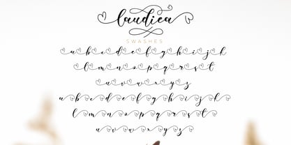 Laudiea is a beautiful script font with a classy, elegant, and modern look. It will add a handwritten touch to any design project!
 - Lambola by ARToni,
$12.00 Lambola is a casual and smooth handwritten font with a playful vibe. Us it to add a personal touch to any design idea!
 - Falange by Vozzy,
$10.00 Introducing a hand-drawn bone-style label font named "Falange". Typeface includes five styles and contains a huge additional and multilingual characters. This font will good viewed on any retro design like poster, t-shirt, label, logo etc.
 - Chive Turkey JNL by Jeff Levine,
$29.00Chive Turkey JNL is a solid version of Jeff Levine's inline font, Toucan Tango JNL. This bold and sassy sans serif has the great retro look of hand lettering and can really add some punch to ad copy. - Jimbatz NF by Nick's Fonts,
$10.00Frantic, man, and solid, Jackson! This crazy-quilt collection of dingbats inspired by the works of famed album-cover artist Jim Flora will add spice, zing and a certain je ne sais quoi to any project they grace. - Spooky Adventure by AEN Creative Studio,
$15.00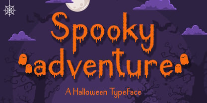 Spooky Adventure is a cool-lettered and spooky decorative font. It is perfectly suitable for any Halloween-related project or crafty idea. Add it confidently to your favorite creations and let yourself be amazed by the outcome generated!
 - Blagak by Twinletter,
$18.00 Add imagination and spice to your next design project with the Blagak font. This elegant font can be used in any project. With a wide variety of fasteners and alternatives, Blagak brings a bit of vintage charm to any design project. Take a trip down memory lane with the Blagak font. This elegant font combines vintage appeal with contemporary design sensibilities to create a whimsical yet professional look. Use this font in any design project to add your own sense of nostalgia.
 - Cool Cat by Fox7,
$10.00 Cool Cat is a fun and comfortable handwritten font that is easy to read. You can use it for various projects, such as blog posts, logos, branding, ads, invitations, greeting cards, planners, photo albums, decorations, and much more. Add it to any of your designs, and enjoy the results!
 - Fondy Script by Mans Greback,
$59.00 Fondy Script is a hand-drawn brush typeface, created by Måns Grebäck during 2018. It is a bold, sporty font in high quality, with soft and rounded characteristics. The font support hundreds of languages and contains contextual and stylistic alternates. Use ¤ after any word for a decorative swash.
 - Trick or Bite by Sipanji21,
$16.00 Trick or Bite is an incredibly unique horror display font, with bite and spider webs in any characters. Add this font to your favorite Halloween themed ideas and notice how it makes them come alive. Trick or bite is perfect for posters, packaging, banners, advertising, apparel, and more.
 - Black Apostle by Chekart,
$17.00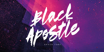 Black Apostle is a hand drawn brush font. It comes with uppercase and lowercase characters, set of punctuation glyphs, numerals, Cyrillic characters, some Cyrillic ligatures and multilingual support. Perfect for logos, quotes, posters, branding projects, product packaging, t-shirt, book cover, greeting cards and applicable for any graphic design.
 - Patternistic by Joanne Marie,
$10.00 Follow me on Instagram for weekly FREEBIES @joannemarie_cm PATTERNISTIC is a cute and fun, all caps font for any hand lettering style projects. There are 2 fonts included in this family and the uppercase are different to the lowercase (one is solid and one is outline). Have Fun!
 - Sigmund Freud Typeface by Harald Geisler,
$29.00 “For those who regret what keyboards and touch screens have done to their penmanship, typographer Harald Geisler has an answer: Sigmund Freud.” — The Wall Street Journal Sigmund Freud was a neurologist who lived from 1856 to 1939. His research and studies led to the foundation of ‘Psychoanalysis’. When I first saw Freud’s century old letters, I was fascinated by the beauty of these historic manuscripts. It made me smile to imagine a person writing his or her shrink a letter set in Freud’s handwriting. I started to plan creating a font based on his manuscripts. I contacted the Sigmund Freud Museum Vienna and Freud Museum London. To start the creation I selected eight handwritten documents from the archive in Vienna – This selection of specimen was my orientation during the design process. The Samples were created between 1883 to 1938 and are of various character such as handwritten scientific papers, personal letters, notes and a telegram. A successful Kickstarter Campaign "The Sigmund Freud Typeface - A Letter to your Shrink" with over 1400 Backers enabled me to visit the archive in Vienna and study the original manuscripts of Sigmund Freud. After a year of preparation and design work, I finished four alphabets based on Freud’s handwriting. What are the different Versions PRO, Kurrent, #1, #2, #3 and #4 about? “This project gives people the convenience afforded by the computer while maintaining the romantic nostalgia, beauty, and character of letter writing with real handwriting.” — Daniel Vahab, The Huffington Post When you write with your hand, every letter looks a little different. When you write a text on your computer every letter looks exactly the same. In order to make type look like handwriting, I chose four different variations of each letter from Freud’s manuscripts, drew and stored them in the font. The font is then programmed to exchange letters while you are typing. This makes the rendered result on your screen or print look like unique handwriting. PRO While you are typing… the PRO Version actively combines all four alphabets and exchanges them automatically. Through this mechanism never the same two o’s will stand next to each other. With every touch a unique look is generated. This works in certain applications i.e. Word 2010(or newer), Pages, TextEdit, Editor(Pre-installed on Windows 7 or newer), InDesign, Illustrator… →Here you can see an animation of what this effect looks like in action. (Please Note: some applications like LibreOffice, OpenOffice do currently not support this feature. Date: December 2013) #1 #2 #3 and #4 The Sigmund Freud Typeface #1, #2, #3 and #4 each hold one individual lowercase alphabet based on Freud’s handwriting. Kurrent Most of Freud’s correspondence was written in German. Until the 1950′s a different handwriting was taught throughout German speaking countries (Switzerland, Austria, Germany). This style is called Kurrent. The name Kurrent and Cursive derive from the Latin word currere - to run, hurry - both styles were designed to write fast. As you can see in the samples above, Freud practiced both Kurrent and when writing english Cursive (Latin script or Joined-up). Kurrent has three significantly different letters (s,h,e). Use Kurrent to render the authentic look of an historic Sigmund Freud letter in German. Bundle On the Top of this page you can get all six fonts of the Sigmund Freud Typeface Family in a bundle. International Typeface All styles of the Sigmund Freud Typeface feature a wide range of accented letters so you can write to all your friends in Sweden (Bjørn) France (Chloé & Zoë), Ireland (Dáirine), Poland (Łucja), Germany (Jörg) and almost everywhere around the globe (Find a complete list in the tech specs). Usage recommendations I hope that this design will be valuable to you and most of all that you have fun with this typeface! 1. Point Size — To reproduce the size of Sigmund Freud’s handwriting adjust the type size between 18-24 point in your word processor. If you are using an imaging software like Photoshop set the resolution to 300dpi and adjust the point size between 18-24. 2. Line Spacing — Narrow the line hight until swashes of capital letters touch the baseline above. This also happens when you write a letter and gives the document a unique handwritten look. 3. Right Aligned — Freud had the habit to write towards the right edge of the page and start loosely on the left. Set your text alignment to ‘right’ to incorporate this dramatic expression also to your documents. What do other People say about the Sigmund Freud Typeface? “Wouldn’t you love to write a letter to your shrink using the Sigmund Freud typeface?” — Dorothy Tan, Design TAXI ''“JUST DON’T WRITE A LETTER TO YOUR MOTHER WITH IT… …until the reader looks a bit closer, and they see 70+ years of modern science weighing in on turn-of-the-century pop psychology."'' — Mark Willson, Fast Company “Doctor, what does it mean if you dream of creating a font of Freud’s handwriting?” — Ayun Halliday, Open Culture “…geekily romantic, at once artistic and scientific” — Edie Jarolim, Freud’s Butcher “…sympathisch” — Jürgen Siebert, Fontblog !WOW! Thank you for reading the complete font description! You are awesome! If you still have a question please contact me through MyFonts or my website haraldgeisler.com. Credits This project was made possible by the help of 1481 Backers on Kickstarter and the kind support of the Sigmund Freud Museum Vienna and the Freud Museum London. Thank you. All of Freud’s Manuscripts shown are © Sigmund Freud Museum Vienna. Poster Image: IN17 - Sigmund Freud, Germany 1932. © Freud Museum London. Flag Image: IN19 - Sigmund Freud 1930’s. © Freud Museum London.
 - Curmudgeon by Tower of Babel,
$10.00 Contrary to its name, Curmudgeon is a fun and whimsical typeface that's perfect for children's books, holiday announcements or anything that needs a charmingly playful touch. Its naive and bouncy personality will add interest to any project, whether it be a logo, packaging, or any other project that needs some quirky character.
 - Gundrada ML by HiH,
$12.00 Gundrada ML was inspired by the lettering on the tomb of Gundrada de Warenne. She was buried at Southover Church at Lewes, Sussex, in the south of England in 1085. The Latin inscription on her tomb, STIRPS GUNDRADA DUCUM, meaning “Gundrada, descendant of the Duke” may have led to the speculation that she was the daughter of William, Duke of Normandy and bastard son of Robert the Devil of Normandy and Arletta, daughter of a tanner in Falaise. In 1066 William defeated Harold at the Battle of Hastings and was crowned William I of England. More commonly known as William the Conquerer, he commissioned a string of forts around the kingdom and charged trusted Norman Barons to control the contentious Anglo-Saxon population. William de Warenne, husband of Gundrada, was one of these Barons. There has also been the suggestion that Gundrada may have been the daughter of William’s wife, Matilda of Flanders, by a previous marriage. According to the Dictionary of National Biography (Oxford University Press, Oxford, England 1921-22), both of these contentions are in dispute. Searching the past of a thousand years ago is like wandering in a heavy fog: facts are only dimly in view. Regardless, I know that I found these letterforms immediately engaging in their simplicity. Unadorned and unsophisticated, they have a direct honesty that rests well in the company of humanistic sans serifs like Franklin Gothic or Gill Sans, appealing to a contemporary sensibility. The lettering on the tomb is in upper case only. Although Gundrada does not sound Norman French to me, her husband certainly and her father probably were Norman French. Nonetheless, the man that carved her tombstone was probably Anglo-Saxon, like most of the people. For that reason, we are quite comfortable with a fairly generic lower case from an Anglo-Saxon document of the time. The time was a time of transition, of contending language influences. This font reflects some of that tension. Features 1. Multi-Lingual Font with 389 glyphs and 698 Kerning Pairs. 2. OpenType GSUB layout features: onum, dlig, liga, salt & hist. 3. Tabular Figures and Alternate Old-Style Figures. 4. Alternate Ruled Caps (line above and below, matching to brackets). 5. Central Europe, Western Europe, Turkish and Baltic Code Pages. 6. Additional accents for Cornish and Old Gaelic. 7. Stylistic alternates A, E, y and #. 8. Ligatures ST, Th, fi and fl. 9. Historic alternate longs. The zip package includes two versions of the font at no extra charge. There is an OTF version which is in Open PS (Post Script Type 1) format and a TTF version which is in Open TT (True Type)format. Use whichever works best for your applications.
 - Bright Dream by Supersemarletter,
$11.00 Bright Dream is a cute and quirky handwritten font. It will add an incredibly sweet and joyful touch to your designs. Add this beautiful font to each of your creative ideas and notice how it makes them stand out! Honestly it's works perfectly for headlines, logos, posters, packaging, T-shirts and much more. Font Features : Regular Version Character set A-Z in Uppercase and Lowercase Numerals and Punctuation Accented Characters Multiple Languange Supported Format File OTF Recomended to use in Adobe Illustrator or Adobe Photoshop with opentype feature. If you have any questions, just send me a message and I'm glad to help.
 - Chaman by Cubo Fonts,
$29.00 Chaman is a “hybrid” font. On the one hand serifless, temperate and readable, and on the other hand quick and livily as a manual script, thanks to many unexpected ligatures. Letter design is plain and functional, punctuated by dynamic elements, mostly in ligatures and contextual glyphs, generated at the beginning and end of the word, thanks to your software’s OpenType features. It draws inspiration from the Tibetan alphabet, originally close to our own latin alphabet, as it stems from Bhram handwriting, itself derived from Phoenician alphabet. This alternation of stright vertical lines and regular bows makes Chaman’s design stand out.
 - Amber Lemon by Supfonts,
$18.00 Amber Lemon is a cute handwritten signature font with heart and regular swashes. Perfect for greeting cards, wedding stationery, photographer watermarks logos, modern websites, apparel design and more. Amber Lemon features handwritten ligatures, beginning and end swashes for lowercase letters and heart connections Thanks so much for checking out my shop, and please get in touch if you have any questions! Amber Lemon Font Features: Full Set of standard alphabet and punctuation Extra set of beginning and ending swashed lowercase Extra set of heart connections handwritten ligatures PUA Encoded - no special software needed to access extra characters Multilingual Characters AÁĂÂÄÀĀĄÅÃÆBCĆČÇĊDÐĎĐEÉĚÊËĖÈĒĘẼFGĞĢĠḠHĦIIJÍÎÏİÌĪĮĨJKĶLĹĽĻŁMNŃŇŅÑ OÓÔÖÒŐŌØÕŒPÞQRŔŘŖSŚŠŞȘẞTŤŢȚUÚÛÜÙŰŪŲŮŨVWẂŴẄẀXYÝŶŸỲỸZŹŽŻ aáăâäàāąåãæbcćčçċdðďđeéěêëėèēęẽfgğģġḡhħiıíîïìijīįĩjȷkķlĺľļłmnńňņñoóôöòőōøõœpþ qrŕřŗsśšşșßtťţțuúûüùűūųůũvwẃŵẅẁxyýŷÿỳỹzźžż
 - Cherile by Flawlessandco,
$9.00 Introducing "Cherile" - a lively and playful handwritten font that injects a sense of fun and joy into your designs. With its whimsical letterforms and energetic strokes, Cherile adds a delightful and carefree vibe to any project. There's some connected letters and some alternates that suitable for any graphic designs such as branding materials, t-shirt, print, business cards, logo, poster, t-shirt, photography, quotes .etc This font support for some multilingual. Also contains uppercase A-Z and lowercase a-z, alternate character, numbers 0-9, and some punctuation. If you need help, just write me! Thanks so much for checking out my shop!
 - John Sans by Storm Type Foundry,
$49.00 The idea of a brand-new grotesk is certainly rather foolish – there are already lots of these typefaces in the world and, quite simply, nothing is more beautiful than the original Gill. The sans-serif chapter of typography is now closed by hundreds of technically perfect imitations of Syntax and Frutiger, which are, however, for the most part based on the cool din-aesthetics. The only chance, when looking for inspiration, is to go very far... A grotesk does not afford such a variety as a serif typeface, it is dull and can soon tire the eye. This is why books are not set in sans serif faces. A grotesk is, however, always welcome for expressing different degrees of emphasis, for headings, marginal notes, captions, registers, in short for any service accompaniment of a book, including its titlings. We also often come across a text in which we want to distinguish the individual speaking or writing persons by the use of different typefaces. The condition is that such grotesk should blend in perfectly with the proportions, colour and above all with the expression of the basic, serif typeface. In the area of non-fiction typography, what we appreciate in sans-serif typefaces is that they are clamorous in inscriptions and economic in the setting. John Sans is to be a modest servant and at the same time an original loudspeaker; it wishes to inhabit libraries of educated persons and to shout from billboards. A year ago we completed the transcription of the typefaces of John Baskerville, whose heritage still stands out vividly in our memory. Baskerville cleverly incorporated certain constructional elements in the design of the individual letters of his typeface. These elements include above all the alternation of softand sharp stroke endings. The frequency of these endings in the text and their rhythm produce a balanced impression. The anchoring of the letters on the surface varies and they do not look monotonous when they are read. We attempted to use these tricks also in the creation of a sans-serif typeface. Except that, if we wished to create a genuine “Baroque grotesk”, all the decorativeness of the original would have to be repeated, which would result in a parody. On the contrary, to achieve a mere contrast with the soft Baskerville it is sufficient to choose any other hard grotesk and not to take a great deal of time over designing a new one. Between these two extremes, we chose a path starting with the construction of an almost monolinear skeleton, to which the elements of Baskerville were carefully attached. After many tests of the text, however, some of the flourishes had to be removed again. Anything that is superfluous or ornamental is against the substance of a grotesk typeface. The monolinear character can be impinged upon in those places where any consistency would become a burden. The fine shading and softening is for the benefit of both legibility and aesthetics. The more marked incisions of all crotches are a characteristic feature of this typeface, especially in the bold designs. The colour of the Text, Medium and Bold designs is commensurate with their serif counterparts. The White and X-Black designs already exceed the framework of book graphics and are suitable for use in advertisements and magazines. The original concept of the italics copying faithfully Baskerville’s morphology turned out to be a blind alley. This design would restrict the independent use of the grotesk typeface. We, therefore, began to model the new italics only after the completion of the upright designs. The features which these new italics and Baskerville have in common are the angle of the slope and the softened sloped strokes of the lower case letters. There are also certain reminiscences in the details (K, k). More complicated are the signs & and @, in the case of which regard is paid to distinguishing, in the design, the upright, sloped @ small caps forms. The one-storey lower-case g and the absence of a descender in the lower-case f contributes to the open and simple expression of the design. Also the inclusion of non-aligning figures in the basic designs and of aligning figures in small caps serves the purpose of harmonization of the sans-serif families with the serif families. Non-aligning figures link up better with lower-case letters in the text. If John Sans looks like many other modern typefaces, it is just as well. It certainly is not to the detriment of a Latin typeface as a means of communication, if different typographers in different places of the world arrive in different ways at a similar result.
 - Eve Adam by HIRO.std,
$16.00 Eve Adam is a lovely script font. This font describes about elegant, classy, dynamic, stylish, catchy, feminist, easy to use and will bring a good harmony when the letters are connected and paired each other. FEATURES - Support Opentype Features - Support Ligatures - Uppercase beginning swash - Lowercase beginning and ending swash - Numbering and Punctuations - PUA Encoded Characters - Connecting heart - Multilingual Support - Works on PC or Mac USE Delissa Beauty works great in any wedding invitations, branding, logotype, quotes and any projects that need lovely script taste.