10,000 search results
(0.105 seconds)
- Candara Beauty by Jinan Studio,
$15.00 Candara Beauty is a stylish font duo that includes both a classic serif and an elegant script version. It's perfect for weddings, Valentine's Day, branding, packaging, and any project that needs a loving touch. This font supports multiple languages and offers alternates, swash, and ligatures in the script version for added customization. With its modern charm, Candara Beauty adds sophistication and beauty to any project. Features A set of uppercase and lowercase glyphs Number, symbol, and punctuation Multilingual Support Alternates, ligatures, and swashes (script version) Type j_1 until j_10 to features swash, ligatures will automatically replace the standard letter pairs whenever available, when using any OpenType capable software.
 - Checkmark by Set Sail Studios,
$14.00 Make your mark with Checkmark; a slick, high energy signature-style script font guaranteed to make a big impression. Digitally hand-drawn, it's super-clean smooth flow and high-intensity pen strokes make an unmistakeable impact in logo/branding projects, large header text and product packaging. Checkmark is packed full of extra features to give you plenty of customization options. This includes; a full set of upper and lowercase alternate letters, 20 ligatures (double letters) to help the script lettering flow more naturally, 26 swashes and a full set of lowercase end forms to give your text that extra flair and finesse. Here's a run through everything in more detail; Checkmark • A smooth-edged signature style font containing upper & lowercase characters, numerals, and a large range of punctuation. Checkmark Alt • This is a second version of Checkmark, with a completely new set of both upper and lowercase characters. If you wanted to avoid letters looking the same each time to recreate a custom-made style, or try a different word shape, simply switch to this font for an additional layout option. Checkmark Swash • A third font containing 26 hand drawn swashes. Simply type any a-z or A-Z character in this font to generate a swash. Perfect for underlining your Checkmark text and adding a bit of extra flair! Ligatures • 20 ligatures (double-letters) are included to help your lettering flow more naturally. Many programs will automatically have this feature switched on for you, but if you need any help accessing them, please feel free to drop me a message. End forms • Are available for all lowercase characters when using the Checkmark font. Use these characters at the end of your word to add a stylistic 'end-swash'. These are accessible via software with opentype capability, by turning on 'Stylistic Alternates', or via a Glyphs panel. Language Support • Checkmark fonts support the following languages; English, French, Italian, Spanish, Portuguese, German, Swedish, Norwegian, Danish, Dutch, Finnish, Indonesian, Malay, Hungarian, Polish, Croatian, Turkish, Romanian, Czech, Latvian, Lithuanian, Slovak, Slovenian.
 - Artik by Nirmana Visual,
$24.00 Introducing Artik our stunning modern serif font, perfect for adding elegance and sophistication to any design project. With its clean lines and contemporary flair, this font is ideal for creating eye-catching headlines, logos, and branding materials. Crafted with care and attention to detail, our modern serif font features subtle curves and sharp edges that create a perfect balance between classic and modern design elements. The elegant serifs add an extra touch of sophistication and ensure readability in any size, making it a versatile font choice for both print and digital media.
 - Baskara by Viswell,
$17.00 Baskara is a stylish calligraphy font, Baskara made with natural hand strokes that will be suitable for your various design needs such as branding, logo signatures, weddings, photography and many others. Baskara includes : Uppercase and Lowercase Character Numeral and Punctuation Stylishtic Alternates (Beggining and ending lowercase swash) Multilingual Support
 - Mindsight by Get Studio,
$23.00 Mindsight Funky Retro Display Font is a vibrant and energetic typeface that captures the essence of vintage aesthetics. With its playful curves and bold strokes, it adds a touch of nostalgia and creativity to any design project, making it perfect for eye-catching headlines, posters, and artistic displays.
 - Rofane by Reyrey Blue Std,
$14.00 Introducing, Rofane Typeface. A classy and modern typeface that exudes timeless charm and elegance, designed with tight kerning and spacing to achieve a more aesthetic appearance. Available in 2 styles, regular and italic, it will add a luxury spark to any design project that you wish to create!
 - Sethasso by Twinletter,
$15.00 Introducing our newest font called Sethasso, clean simple, and elegant themed signature font, which is written in natural hand strokes making this font more charismatic natural, This font in addition to having a charming and unique shape is also equipped with various alternative options that make it easier for you to create beautiful and extraordinary designs This font is perfect for business cards, photography studios, autographs, interior designs, model names, coffee late, travel, weddings, cosmetics, jewelry, social media posts, product packaging, watermarks, special events, or anything else. Start using this font to add an authentic and heartfelt vibe to any design project.
 - Botuna by Twinletter,
$15.00 Botuna San Serif is a typeface designed by Botuna San Serif. This is a high-end font family with 18 different styles. Designed to aid you in the creation of visually stunning projects of all types. This font is simple to use and integrates seamlessly with any standard software. Your project will stand out with this font! of course, your various design projects will be perfect and extraordinary if you use this font because this font is equipped with a font family, both for titles and subtitles and sentence text, start using our fonts for your extraordinary projects.
 - Razan by Kasheda Type,
$25.00 "Razan" is a digital font that transcends the boundaries between handwritten charm and advanced technological design. It embodies the artistry of handwriting, capturing the essence of creativity and uniqueness. The font is characterized by smooth lines and flexible design, with soft endings that add an artistic touch to each character. With a range of weights, "Razan" allows users full control over the thickness of the font, enhancing its versatility in various designs. Whether used for large headlines or small text, it shines with seamless and comfortable readability. Its unique allure gives the impression of carefully handcrafted characters, contributing a special and individualized touch to any artistic project or design.
 - Souljah by 38-lineart,
$17.00 Let us introduce you our new font Souljah, a natural script font. This font has a very contrast stroke, very wide down stroke and very tiny up stroke. Every glyphs shaped very flowy and smooth as if it is written by a dancing hand. All glyphs are connected nicely, this font also included ligature to add more natural touch. "Natural and Soulful Calligraphy" is a perfect tagline to describe Souljah Included Opentype font with ligature, swash alternate and multilingual support. Souljah swash Uppercase for beginning swash and lowercase for ending swash, this file was made to the user who is not common to opentype stylistic feature.
 - Burned Duck by Mightyfire,
$15.00 Introducing Burned Duck, the playful handwritten font. With each character meticulously shaped as if inked by a playful hand, Burned Duck exudes a sense of spontaneity and creativity. The irregular lines and slightly varying sizes contribute to the font's organic and dynamic appearance, making it a perfect choice for those seeking to infuse their designs with a dash of personality and humor. Whether you're designing comic strips, graphic novels, greeting cards, or any other creative endeavor, Burned Duck lends an air of authenticity to your text. Its playful imperfections add character and liveliness, making your words dance across the page as if penned by a skilled cartoonist.
 - Merside by Putracetol,
$28.00 Merside - Premium Serif Font Merside - Premium Serif Font is a stunning typeface that exudes sophistication and elegance. The font's clean and crisp lines make it a versatile choice for various design projects, from high-end branding to classic book covers and posters. The font was crafted with the utmost care and attention to detail, resulting in a timeless typeface that will elevate any design. Merside - Premium Serif Font is the perfect choice for designers who want to convey a sense of luxury and exclusivity in their work. The font's classic serif style adds a touch of refinement, while the clean lines give it a modern twist. Whether you are designing a logo for a luxury brand, creating marketing materials for a high-end fashion label, or designing a product packaging, Merside will add a touch of elegance and sophistication to your project. One of the standout features of Merside - Premium Serif Font is its OpenType features, which include alternates and ligatures. These features give designers more creative freedom, allowing them to customize the font and create unique and eye-catching designs. The font also includes uppercase and lowercase letters, as well as number, punctuation, and symbol glyphs. Additionally, Merside supports multiple languages, making it an excellent choice for global brands. The font is compatible with a wide range of design software and platforms. You can easily install and use Merside - Premium Serif Font on your computer or device, making it a convenient and accessible choice for designers. If you are looking for a premium serif font that will make your design stand out, Merside - Premium Serif Font is an excellent choice. With its elegant and refined style, it is perfect for creating luxury branding, elegant design, and high-end fashion. This font will give your project a timeless and classic look that will never go out of style. In summary, Merside - Premium Serif Font is a stunning and versatile font that is perfect for designers who want to create high-end and sophisticated designs. With its classic serif style, OpenType features, and multilanguage support, it is a font that will elevate any design project.
 - FF Fago Monospaced by FontFont,
$67.99 FF Fago Thanks to his many years of involvement in major corporate type projects, Ole Schäfer had the necessary resources from which to construct his FF Fago™. The result is an extended family that provides comprehensive typographic support and whose qualities come to the fore in all relevant contexts ? from print to office through internet and wayfinding systems. FF Fago The sizable x-height together with the generous and open design of the characters ensure that the sans serif Fago remains clearly legible even in small point sizes or in potentially difficult situations, such as on wayfinding systems. A subtle contrast in line weight and letter forms that are reminiscent of those of an antiqua typeface provide the font with a restrained yet friendly and lively tone. Available in five weights, each with three different kerning widths and matching genuine italic variants, FF Fago is equipped for practically every situation. There are also small caps, oldstyle and lining figures, a selection of ligatures and geometric symbols. The range of potential applications of this universal font is almost inexhaustible ? it can be used in packaging design, on signs, posters and even for setting longer text sections. Fago is the ideal partner for those working on major corporate projects! FF Fago Correspondence Sans und Correspondence SerifThe Correspondence versions of Fago have been optimized for use in the business environment and in office communication. The carefully modified characters have a particularly robust feel, so that the clear, easily differentiated glyphs allow for straightforward communication even on screen. With these aims in mind, Schäfer has not only adjusted the x-height, but has provided certain letters in the sans variant ? such as the lowercase "i", the "r" and the uppercase "I" ? with serifs. Correspondence Serif, on the other hand, has been conceived as a slab serif throughout and in appearance has the look of the letters produced by the old office typewriting machines. An individual note has been added by providing a few unusual serif forms, as for example in the case of the "m", the "v" and the "y". Both Correspondence Sans and Serif are available in two weights with complementary italic versions and thus are ideally suited for use with standard office programs. This is all rounded off with a selection of office symbols. FF Fago Monospaced The use of a few typographic tricks is necessary to ensure that the letters of the alphabet appear to have the same width. Narrow letters such as "r" and "i" have been made to seem more expansive by using prominent serifs while the broader letters ? a good example is the "m" ? have the forms seen in a condensed font. And it is thanks to this design strategy that Fago Monospaced has the character of old typewriter text. What was once unavoidable because of the technology of the time is now a welcome alternative that can be used for the purposes of emphasis. As an additional supplement to the Fago superfamily, Fago Monospaced can be used, for example, to set short notes or draw attention to special text passages. There are three weights, in their original form without italic variants or small caps, but offering an alternative, technical form of the "0" with a crossbar.
 - CS Silly by Cocomilk Studio,
$10.00 SILLY is Cocomilk Studio's first homegrown typeface. This typeface, made by Cocomilk designer, Yas Liamco, features curvy, drooping forms and rounded edges that add a sense of fun and silliness to any project!
 - Nurture Happiness by Seemly Fonts,
$12.00 Nurture Happiness is a tall, adaptable, and smart-looking display font. Add it to each of your party invitations, gathering, or pretty much any design that requires a touch of youth and joy.
 - Bitten Amore by FHFont,
$18.00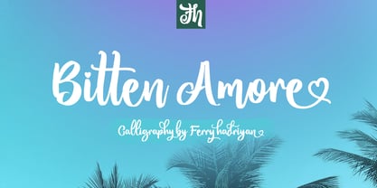 Bitten Amore is script font with hand-lettering brush style, and includes OpenType features. It is suitable for design, element design, weddings, events, t-shirts, logos, badges, sticker, and any other awesome work.
 - Selfie Neue Rounded by Lián Types,
$29.00 INTRODUCTION When I started the first Selfie back in 2014 I was aware that I was designing something innovative at some point, because at that time there were not too many, (if any) fonts which rescued so many calligraphy features being at the same time a monolinear sans. I took inspiration from the galerías’ neon signs of my home city, Buenos Aires, and incorporated the logic and ductus of the spencerian style. The result was a very versatile font with many ligatures, swashes and a friendly look. But… I wasn’t cognizant of how successful the font would become! Selfie is maybe the font of my library that I see the most when I finally go out, (type-designers tend to be their entire lives glued to a screen), when I travel, and also the font that I mostly get emails about, asking for little tweaks, new capitals, new swashes. Selfie was used by several renowned clients, became part of many ‘top fonts of the year’ lists and was published in many magazines and books about type-design. These recognitions were, at the same time, cuddles for me and my Selfie and functioned as a driving force in 2020 to start this project which I called Selfie Neue. THE FONT "Selfie for everything" Selfie Neue, because it’s totally new: All its glyphs were re-drawn, all the proportions changed for better, and the old and somehow naive forms of the first Selfie were redesigned. Selfie Neue is now a family of many members (you can choose between a Rounded or a Sharp look), from Thin to Black, and from Short to Tall (because I noticed the feel of the font changed notoriously when altering its proportions). It also includes swashy Caps, which will serve as a perfect match for the lowercase and some incredibly cute icons/dingbats (designed by the talented Melissa Cronenbold) which, as you see in the posters, make the font even more attractive and easy to use. You'll find tons of alternates per glyph. It's impossible to get tired with Selfie! Like it happened with the old Selfie, Selfie Neue Rounded was thought for a really wide range of uses. Magazines, Book-covers, digital media, restaurants, logos, clothing, etc. Hey! The font is also a VF (Variable Font)! So you can have fun with its two axes: x-height and weight, in applications that support them. Let me take a New Selfie! TECHNICAL If you plan to print Selfie Neue VF (Rounded or Sharp), please remember to convert it to outlines first. The majority of the posters above have the "contextual" alternates activated, and this makes the capitals a little smaller. I'd recommend deactivating it if you plan to use Selfie for just one word. Use the font always with the "fi" feature activated so everything ligatures properly. The slant of the font is 24,7 degrees, so if you plan to have its stems vertical, you may use Selfie with that rotation in mind. THANKS FOR READING
 - Times Eighteen by Linotype,
$29.00In 1931, The Times of London commissioned a new text type design from Stanley Morison and the Monotype Corporation, after Morison had written an article criticizing The Times for being badly printed and typographically behind the times. The new design was supervised by Stanley Morison and drawn by Victor Lardent, an artist from the advertising department of The Times. Morison used an older typeface, Plantin, as the basis for his design, but made revisions for legibility and economy of space (always important concerns for newspapers). As the old type used by the newspaper had been called Times Old Roman," Morison's revision became "Times New Roman." The Times of London debuted the new typeface in October 1932, and after one year the design was released for commercial sale. The Linotype version, called simply "Times," was optimized for line-casting technology, though the differences in the basic design are subtle. The typeface was very successful for the Times of London, which used a higher grade of newsprint than most newspapers. The better, whiter paper enhanced the new typeface's high degree of contrast and sharp serifs, and created a sparkling, modern look. In 1972, Walter Tracy designed Times Europa for The Times of London. This was a sturdier version, and it was needed to hold up to the newest demands of newspaper printing: faster presses and cheaper paper. In the United States, the Times font family has enjoyed popularity as a magazine and book type since the 1940s. Times continues to be very popular around the world because of its versatility and readability. And because it is a standard font on most computers and digital printers, it has become universally familiar as the office workhorse. Times™, Times™ Europa, and Times New Roman™ are sure bets for proposals, annual reports, office correspondence, magazines, and newspapers. Linotype offers many versions of this font: Times™ is the universal version of Times, used formerly as the matrices for the Linotype hot metal line-casting machines. The basic four weights of roman, italic, bold and bold italic are standard fonts on most printers. There are also small caps, Old style Figures, phonetic characters, and Central European characters. Times™ Ten is the version specially designed for smaller text (12 point and below); its characters are wider and the hairlines are a little stronger. Times Ten has many weights for Latin typography, as well as several weights for Central European, Cyrillic, and Greek typesetting. Times™ Eighteen is the headline version, ideal for point sizes of 18 and larger. The characters are subtly condensed and the hairlines are finer. Times™ Europa is the Walter Tracy re-design of 1972, its sturdier characters and open counterspaces maintain readability in rougher printing conditions. Times New Roman™ is the historic font version first drawn by Victor Lardent and Stanley Morison for the Monotype hot metal caster." - Times Europa LT by Linotype,
$29.99In 1931, The Times of London commissioned a new text type design from Stanley Morison and the Monotype Corporation, after Morison had written an article criticizing The Times for being badly printed and typographically behind the times. The new design was supervised by Stanley Morison and drawn by Victor Lardent, an artist from the advertising department of The Times. Morison used an older typeface, Plantin, as the basis for his design, but made revisions for legibility and economy of space (always important concerns for newspapers). As the old type used by the newspaper had been called Times Old Roman," Morison's revision became "Times New Roman." The Times of London debuted the new typeface in October 1932, and after one year the design was released for commercial sale. The Linotype version, called simply "Times," was optimized for line-casting technology, though the differences in the basic design are subtle. The typeface was very successful for the Times of London, which used a higher grade of newsprint than most newspapers. The better, whiter paper enhanced the new typeface's high degree of contrast and sharp serifs, and created a sparkling, modern look. In 1972, Walter Tracy designed Times Europa for The Times of London. This was a sturdier version, and it was needed to hold up to the newest demands of newspaper printing: faster presses and cheaper paper. In the United States, the Times font family has enjoyed popularity as a magazine and book type since the 1940s. Times continues to be very popular around the world because of its versatility and readability. And because it is a standard font on most computers and digital printers, it has become universally familiar as the office workhorse. Times™, Times™ Europa, and Times New Roman™ are sure bets for proposals, annual reports, office correspondence, magazines, and newspapers. Linotype offers many versions of this font: Times™ is the universal version of Times, used formerly as the matrices for the Linotype hot metal line-casting machines. The basic four weights of roman, italic, bold and bold italic are standard fonts on most printers. There are also small caps, Old style Figures, phonetic characters, and Central European characters. Times™ Ten is the version specially designed for smaller text (12 point and below); its characters are wider and the hairlines are a little stronger. Times Ten has many weights for Latin typography, as well as several weights for Central European, Cyrillic, and Greek typesetting. Times™ Eighteen is the headline version, ideal for point sizes of 18 and larger. The characters are subtly condensed and the hairlines are finer. Times™ Europa is the Walter Tracy re-design of 1972, its sturdier characters and open counterspaces maintain readability in rougher printing conditions. Times New Roman™ is the historic font version first drawn by Victor Lardent and Stanley Morison for the Monotype hot metal caster." - Times Ten by Linotype,
$40.99In 1931, The Times of London commissioned a new text type design from Stanley Morison and the Monotype Corporation, after Morison had written an article criticizing The Times for being badly printed and typographically behind the times. The new design was supervised by Stanley Morison and drawn by Victor Lardent, an artist from the advertising department of The Times. Morison used an older typeface, Plantin, as the basis for his design, but made revisions for legibility and economy of space (always important concerns for newspapers). As the old type used by the newspaper had been called Times Old Roman," Morison's revision became "Times New Roman." The Times of London debuted the new typeface in October 1932, and after one year the design was released for commercial sale. The Linotype version, called simply "Times," was optimized for line-casting technology, though the differences in the basic design are subtle. The typeface was very successful for the Times of London, which used a higher grade of newsprint than most newspapers. The better, whiter paper enhanced the new typeface's high degree of contrast and sharp serifs, and created a sparkling, modern look. In 1972, Walter Tracy designed Times Europa for The Times of London. This was a sturdier version, and it was needed to hold up to the newest demands of newspaper printing: faster presses and cheaper paper. In the United States, the Times font family has enjoyed popularity as a magazine and book type since the 1940s. Times continues to be very popular around the world because of its versatility and readability. And because it is a standard font on most computers and digital printers, it has become universally familiar as the office workhorse. Times™, Times™ Europa, and Times New Roman™ are sure bets for proposals, annual reports, office correspondence, magazines, and newspapers. Linotype offers many versions of this font: Times™ is the universal version of Times, used formerly as the matrices for the Linotype hot metal line-casting machines. The basic four weights of roman, italic, bold and bold italic are standard fonts on most printers. There are also small caps, Old style Figures, phonetic characters, and Central European characters. Times™ Ten is the version specially designed for smaller text (12 point and below); its characters are wider and the hairlines are a little stronger. Times Ten has many weights for Latin typography, as well as several weights for Central European, Cyrillic, and Greek typesetting. Times™ Eighteen is the headline version, ideal for point sizes of 18 and larger. The characters are subtly condensed and the hairlines are finer. Times™ Europa is the Walter Tracy re-design of 1972, its sturdier characters and open counterspaces maintain readability in rougher printing conditions. Times New Roman™ is the historic font version first drawn by Victor Lardent and Stanley Morison for the Monotype hot metal caster." - Times Ten Paneuropean by Linotype,
$92.99In 1931, The Times of London commissioned a new text type design from Stanley Morison and the Monotype Corporation, after Morison had written an article criticizing The Times for being badly printed and typographically behind the times. The new design was supervised by Stanley Morison and drawn by Victor Lardent, an artist from the advertising department of The Times. Morison used an older typeface, Plantin, as the basis for his design, but made revisions for legibility and economy of space (always important concerns for newspapers). As the old type used by the newspaper had been called Times Old Roman," Morison's revision became "Times New Roman." The Times of London debuted the new typeface in October 1932, and after one year the design was released for commercial sale. The Linotype version, called simply "Times," was optimized for line-casting technology, though the differences in the basic design are subtle. The typeface was very successful for the Times of London, which used a higher grade of newsprint than most newspapers. The better, whiter paper enhanced the new typeface's high degree of contrast and sharp serifs, and created a sparkling, modern look. In 1972, Walter Tracy designed Times Europa for The Times of London. This was a sturdier version, and it was needed to hold up to the newest demands of newspaper printing: faster presses and cheaper paper. In the United States, the Times font family has enjoyed popularity as a magazine and book type since the 1940s. Times continues to be very popular around the world because of its versatility and readability. And because it is a standard font on most computers and digital printers, it has become universally familiar as the office workhorse. Times™, Times™ Europa, and Times New Roman™ are sure bets for proposals, annual reports, office correspondence, magazines, and newspapers. Linotype offers many versions of this font: Times™ is the universal version of Times, used formerly as the matrices for the Linotype hot metal line-casting machines. The basic four weights of roman, italic, bold and bold italic are standard fonts on most printers. There are also small caps, Old style Figures, phonetic characters, and Central European characters. Times™ Ten is the version specially designed for smaller text (12 point and below); its characters are wider and the hairlines are a little stronger. Times Ten has many weights for Latin typography, as well as several weights for Central European, Cyrillic, and Greek typesetting. Times™ Eighteen is the headline version, ideal for point sizes of 18 and larger. The characters are subtly condensed and the hairlines are finer. Times™ Europa is the Walter Tracy re-design of 1972, its sturdier characters and open counterspaces maintain readability in rougher printing conditions. Times New Roman™ is the historic font version first drawn by Victor Lardent and Stanley Morison for the Monotype hot metal caster." - Times by Linotype,
$40.99In 1931, The Times of London commissioned a new text type design from Stanley Morison and the Monotype Corporation, after Morison had written an article criticizing The Times for being badly printed and typographically behind the times. The new design was supervised by Stanley Morison and drawn by Victor Lardent, an artist from the advertising department of The Times. Morison used an older typeface, Plantin, as the basis for his design, but made revisions for legibility and economy of space (always important concerns for newspapers). As the old type used by the newspaper had been called Times Old Roman," Morison's revision became "Times New Roman." The Times of London debuted the new typeface in October 1932, and after one year the design was released for commercial sale. The Linotype version, called simply "Times," was optimized for line-casting technology, though the differences in the basic design are subtle. The typeface was very successful for the Times of London, which used a higher grade of newsprint than most newspapers. The better, whiter paper enhanced the new typeface's high degree of contrast and sharp serifs, and created a sparkling, modern look. In 1972, Walter Tracy designed Times Europa for The Times of London. This was a sturdier version, and it was needed to hold up to the newest demands of newspaper printing: faster presses and cheaper paper. In the United States, the Times font family has enjoyed popularity as a magazine and book type since the 1940s. Times continues to be very popular around the world because of its versatility and readability. And because it is a standard font on most computers and digital printers, it has become universally familiar as the office workhorse. Times™, Times™ Europa, and Times New Roman™ are sure bets for proposals, annual reports, office correspondence, magazines, and newspapers. Linotype offers many versions of this font: Times™ is the universal version of Times, used formerly as the matrices for the Linotype hot metal line-casting machines. The basic four weights of roman, italic, bold and bold italic are standard fonts on most printers. There are also small caps, Old style Figures, phonetic characters, and Central European characters. Times™ Ten is the version specially designed for smaller text (12 point and below); its characters are wider and the hairlines are a little stronger. Times Ten has many weights for Latin typography, as well as several weights for Central European, Cyrillic, and Greek typesetting. Times™ Eighteen is the headline version, ideal for point sizes of 18 and larger. The characters are subtly condensed and the hairlines are finer. Times™ Europa is the Walter Tracy re-design of 1972, its sturdier characters and open counterspaces maintain readability in rougher printing conditions. Times New Roman™ is the historic font version first drawn by Victor Lardent and Stanley Morison for the Monotype hot metal caster." - Sandbrush by Typia Nesia,
$20.00 Sandbrush is a natural hand brushed font. Work great for any design needs : logo, branding, modern advertising design, logos, poster quote, book / cover Title, editorial design, website / blog, card, custom mug, pillow, t-shirts, and any hand-lettered needs.
 - Pial by Eurotypo,
$20.00 Pial fonts Family includes: Pial Regular that is totally hand-designed, casual and youthful, with lines that sometimes swell extremely, contain 546 glyphs with many stylistic variations, swashes and ligatures. Pial Sans Regular and Expanded, also hand-designed, and Pial Serif Regular and Condensed to add a little seriousness. We have added also, a font of ornaments, extras and catchwords in the family. Using this font you will achieve a very elegant and warm work. Pial Family is very versatile and ideal for logotype design, magazines and book covers, children's material, fashion, headlines, cards, posters, websites, packaging and, basically, anywhere you want.
 - Kingston by The Paper Town,
$20.00 Introducing Kingston an handwritten font with a high detailed dry brush texture. Kingston has been designed to fit a wide range of projects from urban style to classic branding with a full alternative characters set to completely change the look of your design. It also includes a set of 52 hand-drawn elements that will add a nice finishing touch to your text. You can use it for business branding, Instagram quotes, blog headers, fashion apparel, stationery and more... What's included: Kingston • A dry brush script font with uppercase and lowercase characters, alternative alphabet, ligatures, numerals and punctuation. Kingston Extras • A full set of brushed elements : 33 hand-drawn swashes, 4 doodles and 14 paint drips and splatters you can easily access by typing any letter from A-Z and a-z. Multilingual support • Kingston supports multilingual characters for western, central and south-east European languages.
 - Deft Brush by wearecolt,
$16.00 A beautiful brush font created directly from original drawn characters. Deft Brush features a number of ligature and alternative glyphs to add to the hand drawn look. A great front for bold headlines, titles and crafty logotypes. Available as both .otf and .woff
 - Printers Parts JNL by Jeff Levine,
$29.00 The thirty images contained in Printers Parts JNL are another assortment of wonderful dingbats from various vintage sources. Brackets, ornaments, end caps, arrows, pointing hands and advertising phrases are part of the wide and various choices and styles found within this font.
 - Notaris by Hanoded,
$15.00 Notaris ('Notary' in Dutch) is a hand-drawn, all caps didone-style typeface. It is a little rough, a little uneven, but lively and elegant as well. Comes with an abundance of diacritics and, lo and behold, some end-ligatures as well.
 - Pocket Swash Px by Letradora,
$18.00 Check out other members of the Pocket family: Pocket and Pocket Serif This hand drawn font has a subtle rough texture, and lots of alternate swash characters to start and end words. It is perfect to give an extravagant but whimsical look to your projects. It has support for most western and central European languages, and has alternates for most letterforms accessible through Opentype features, allowing for variations that make it look authentically hand-drawn. It also has extra ligatures, swashes, and catchwords.
 - Backbone by 38-lineart,
$17.00 Backbone is a unique blackletter font. It’s suitable for use in various projects such as gothic letters, tattoos, headlines, posters, magazines, newspapers, t-shirts, labels, and any other designs that you wish to create. Get inspired by Black metal and It will add an edgy feel to any crafting project! Bold and spooky, Ideal for any October project or Halloween party, this font will become your top choice in no time!
 - Weatpoint by Stringlabs Creative Studio,
$25.00 Weatpoint is a playful and beautiful handwritten font. It’s great for comics, cartoons, birthday invitations, and any creative project that needs a fun look! Weatpoint is a flowing and elegant handwritten font, created with the help of a brush pen. Get inspired by its unique and beautiful style and add it to your favorite designs!
 - Superfast by Studio&Story,
$19.00 Superfast is a hand-written, flowing, script that will add a fast and sharp movement style to your projects. It charms you right at the beginning. If you are looking for a sensitive font that can respond to the vibe of your design, Superfast is the right choice. On the one hand it is elegant and luxurious, and on the other hand, trendy and modern. Created for beautiful logos, branding projects, posters, blog posts, social media, campaigns, advertising, web design and more! Superfast contains upper and lowercase characters, numerals and a large range of punctuation. Its OpenType features include 41 Ligatures and a large number of alternates, which make everything you write authentic and flowing.
 - PKG Roman Capitals by Posterizer KG,
$19.00 PKG Roman Capitals is one more of Posterizer KG calligraphic fonts, based on Roman Square Capitals letterforms, also called Capitalis Monumentalis, Inscriptional Capitals, Elegant Capitals and Capitalis Quadrata from (about) 2nd century A.D. All graphemes are taken from calligraphic pages written with brush on traditional calligraphic stile, inspired by epigraphic monuments from the Roman Pantheon, Trajan’s Column, and the Arch of Titus. PKG Roman Capitals font is good guides for any who want to study the beautiful proportions of Roman Capitals. In practice, it can be useful for calligraphic sketches and imitation of Roman (European) historical manuscripts. Font contains good stylistic, morphological and metrical balanced Capitals, Small Caps and all the Latin and Cyrillic glyphs.
 - Mars Model by Kustomtype,
$25.00 Mars Model is a font that's originated from a concept for a rock band. With its 5 fun styles, Mars Model gives your graphic work a futuristic look that is reminiscent of the warm look and touch of Arts & Crafts. This style of type is instantly associated with advertising and design for high-end products. Mars Model is an entirely hand-drawn font, perfectly vectorized and meticulously digitized for quality and readability. Also, the font can be used for a refined vintage feeling or an industrial and futuristic atmosphere. Mars Model is great for display, logos, branding, packaging, advertising, food, sports, titles, film, TV, and much more. Doesn't that sound perfect to you?
 - Liveria by Subectype,
$17.00 Liveria is an urban font with natural hand-painted style. Suitable for any design needs, branding, urban design, modern advertising design, Book/Cover Title, special events, adventures, headlines, any brush lettering needs and more. Liveria comes with upper and lowercase Standard Characters, Punctuation, Numerals. And some glyphs variation of the OpenType features such as Standard Ligatures and Stylistic Set. Includes a range of multilingual support WHATS INCLUDED : Multilingual Support Ligatures and alternates font If you have any questions please don't hesitate to drop me a message :) Thank You, Subectype Studio
 - Kit Cloudkicker by Anastasia Kuznetsova,
$19.00 I present to you the universal everyday font 'Kit Cloudkicker'!! This font is very versatile and can be used in various styles of projects where a fast relaxed handwritten font is required. Filled with fun and energetic brush strokes, this font will undoubtedly add a touch of playfulness to your text - perfect for greeting cards, branding, merchandise, invitations and handmade quotes! The 'Kit Cloudkicker' font is so easy to use and create completely unique, hand-made words every time. It looks so great!! Font Features A-Z; a-z character set; 1 language (English); numbers and punctuation marks, symbols. A font containing uppercase and lowercase letters, numbers, and a wide range of punctuation marks. Fonts can be opened and used in any software that can read standard fonts, even in MS Word. No special software is required, and to get started. It is recommended to use it in Adobe Illustrator or Adobe Photoshop Made with love and magic ♡ Thanks for checking it out, and feel free to drop me a message if you had any queries! ~ Anastasia
 - Hello I Like You by Cultivated Mind,
$20.00 Hello I Like You was designed by Cindy Kinash. This is a hand-drawn font, light and tall. Hello I Like You is fun, casual and works great for any of your design needs.
 - Astronauts In Trouble by Comicraft,
$49.00 AiT/Planet Lar publisher and writer, Larry Young loves The Space Program. Next time you see him at a comic convention just ask him about any one of the Moon Landings and you'll see.
 - Farmhand by Adam Ladd,
$25.00 Farmhand is a textured, hand drawn family featuring serif, sans, inline, italic, and extras styles suited for display titling. An all-caps typeface with individually drawn small caps for lowercase. Experiment by mixing and matching the casing for titling effects. Great for packaging and branding. The sans adds a different look but still has the vintage appeal. Try the inline styles to add a little more distinction to your type or the matching catchwords and ornaments to add typographic interest.
 - Brewery No 2 Paneuropean by Linotype,
$103.99An entry in the Second Linotype Design Contest, Linotype Brewery, designed by Gustavs Andrejs Grinbergs, became part of the TakeType Collection in 1997. Brewery No 2 represents a significantly improved version of its precursor, and the typeface has been both extended and enhanced. When asked about prototypes, Grinbergs cites German typefaces of the early 20th century. It is thus not surprising that the characters of Brewery™ No 2 are based on geometrical forms. However, this is no mere synthetic Grotesque-derived typeface. It has significant contrasts in line thickness and triangular line terminals that are not unlike serifs, placing it in the middle ground somewhere between a Grotesque and serif font. The contrast between the features of a synthetic Grotesque and an Antiqua gives the characters of Brewery No 2 their distinctive charm and is the distinguishing attribute of this contemporary typeface. Additional vibrancy is provided by bevelled line endings (as in the case of the 'E' and the 'F'), the circular punctuation marks and the slight curve of the descending bar of the 'k'. Thanks to a generous x-height and its open counters, Brewery No 2 is also highly legible in small point sizes. Only in its bolder versions is another aspect of Brewery No 2 apparent; Grinbergs has here made the linking elements more rectangular and has emphasized the counters, so that the Bold variants of Brewery No 2 exhibit elements typical of a broken typeface. Brewery No 2 is available in seven finely graduated weights, ranging from Light to Black. Every variant has a corresponding, slightly narrower Italic version. In addition, the lowercase 'a' is given a closed form, the 'e' is more rounded and the 'f' has a descender. The character sets of Brewery No 2 leave nothing to be desired. In addition to small caps and ligatures, there are various numeral sets with old style and lining figures for setting proportional text and table columns. In its most extensive form (the Pan-European variant), Brewery No 2 can be used to set texts in many languages that employ the Latin alphabet and also texts in international languages that use Cyrillic or monotonic Greek orthography. Although some of the features of Brewery No 2, such as the tiny serifs, are only evident in the larger point sizes, this typeface is not just at home when used to set headlines. Brewery No 2 also cuts a good figure in short or medium length texts. This contemporary typeface with its formally elegant quality looks good, for example, on posters, in newspapers and promotional material. It can also be used for websites as it is also available as a web font.