10,000 search results
(0.336 seconds)
- My Aunt Celia by Quadrat,
$25.00 My Aunt Celia was designed as a quaint, quasi-elegant display face using caps and small caps. The family consists of two fonts: regular and alternate which, between them, provide many special swash characters, tall caps and ligatures for lively, quirky, mixed settings.
 - Oatlander by Almarkha Type,
$29.00 Introducing, Oatlander ! A bold script that will stands out from the crowd! Perfect to be used as logotype, badge and label! This has many opentype features like stylistic alternate,and support multi language. if you have any Question please Message Me. Thank You
 - Witchy Doodle by Ake,
$12.00 Elevate your designs with Witchy Doodle, a whimsically enchanting font that seamlessly marries the charm of hand-drawn doodles with the grace of handwritten script. Perfect for invitations, branding, and creative projects, it sprinkles a dash of magic onto your design canvas.
 - Taz by LucasFonts,
$49.00 Although the Taz family was designed for newspapers, it works equally well in many other contexts. The fonts have been used in glossy magazines, sales catalogues and corporate brochures, for instance. Taz is appreciated for its readability in longer texts at medium sizes.
 - Ensemble Inline JNL by Jeff Levine,
$29.00 A 1940s-era edition of the sheet music for the Marine Corps Hymn offered up the hand lettering which comprises Ensemble Inline JNL. Bold, condensed and attention-getting, this titling font commands attention. Available in Inline, Solid, Inline Oblique and Solid Oblique versions.
 - Personal Message JNL by Jeff Levine,
$29.00 Inspired by the calligraphic poster art of Santa Fe's Randall Hasson, Personal Message JNL is part calligraphic, part cartoon lettering. A light, casual and friendly design, Personal Message JNL can be applied to many different print or web projects with equally attractive results.
 - Dijon Stencil JNL by Jeff Levine,
$29.00 A vintage French metal marking stencil for Comandon and Company was the inspiration for the 1400th type design from Jeff Levine Fonts. Dijon Stencil JNL is a condensed serif design with thin stroke weights and is available in both regular and oblique versions.
 - Paleos by Scriptorium,
$12.00For Halloween season, we thought we'd better trundle out a nice, crude prehistoric font to meet the growing need. Paleos features many different versions of almost every character so you can give it the natural variety of lettering hand-carved by a troglodyte. - El Mayor by Typefactory,
$15.00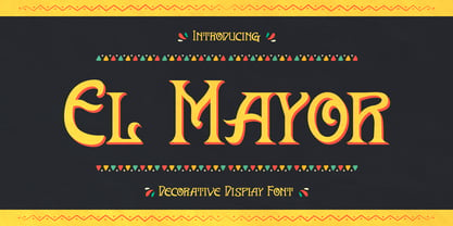 El Mayor is a decorative display font. The font has festival vibes. It will turn any design project into a stand out. El Mayor font is really great for a restaurant menu, business branding, clothing, quotes, headings, birthday invitations, posters, and many others.
 - Stenciling Cards JNL by Jeff Levine,
$29.00Stenciling Cards JNL is the digital equivalent of the individual letter and number stencils used to paint markings on walls, crates, boxes, etc. Use this type design when you want a reversed stencil look. Kern it super tight for a continous word stencil. - Revillia by Din Studio,
$29.00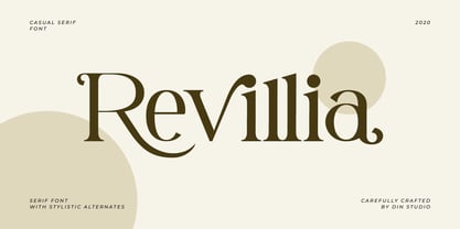 Revillia is modern serif font. Made for any professional project branding. It is the best for branding, printing, wedding and quotes. Every letter has a unique and beautiful touch. Features: Beautiful Ligatures Many Swashes Stylistic Sets PUA Encoded Multilingual Support Numerals and Punctuation
 - Vafthrudnir by Scriptorium,
$18.00Vafthrudnir is an original font design which draws on the tradition of Germanic uncial and early gothic calligraphy. It is designed to be extra bold and somewhat rough-hewn, for use in title design, and features variant versions of many of the characters. - Science Fair JNL by Jeff Levine,
$29.00 Science Fair JNL emulates the effect of connecting the broken lines of a stencil alphabet into a solid letter form, such as many students did for posters on their science project. In this case, the base font was Jeff Levine's Paramilitary JNL.
 - Konega by Haniefart,
$17.00 Konega is a handmade typeface with a unique and modern style, comes in two versions, namely regular and italic, and is available in uppercase, lowercase, ligature and alternate. Konega is suitable for business brands, magazines, comics, t-shirts, banners and many others.
 - Ovalie by Typefactory,
$14.00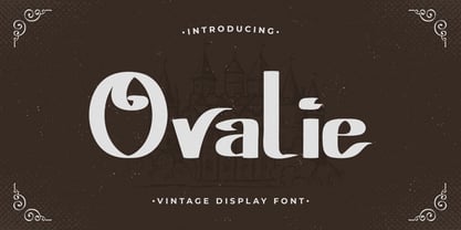 Ovalie is a vintage display font that was made by hand and inspired by classic posters. Ovalie comes with uppercase, lowercase, numerals, symbols & punctuations, alternate, ligature and multilingual support. Perfect to use for Logotype, Letterhead, Poster, Apparel Design, Labels, and many more designs.
 - Art Department JNL by Jeff Levine,
$29.00 Art Department JNL is a fun, casual serif typeface which fits perfectly with any number of visual projects. This is one of the many hand-lettered alphabets found in various Speedball® lettering textbooks that has been re-drawn digitally by Jeff Levine.
 - Rockybilly by Letterara,
$14.00 Rockybilly font is a super handwritten brush font bursting with energy. It features extra attention to quick strokes and sharp details. To stay up to date for my latest job, follow me and let’s be friends because there will be many promos.
 - Breland by Letrasupply Typefoundry,
$24.00 This new high-contrast serif display typeface comes along with so many alternate characters featured. Breland has both beauty and bold looks over the whimsy swash and firm curves, that it will be perfect for display purpose, branding, web, editorial and prints.
 - Herbal Medicine by Wildan Type,
$12.00 Introducing Herbal Medicine Font !! Herbal Medicine is a fun and quirky handwritten font with a unique style, playful look & feel! embodies fun. Use this gorgeous and unique font to bring any DIY. you also can enjoy many unic alternate style each character.
 - Astrospy JNL by Jeff Levine,
$29.00Astrospy JNL is a square-shaped, futuristic techno-style font from Jeff Levine. It is very well suited for short phrases, but caution should be used in setting too many words with it because of legibility issues. Best used in larger point sizes. - Born Strong by Rook Supply,
$16.00 Born Strong is built with athletics in mind. The goal was to make the perfect typeface for sports teams, college football, athletic wear and everything in between. The font family supports a wide range of languages and is available in many different weights.
 - River Terrace JNL by Jeff Levine,
$29.00 “Corbitt” is one of the many designs found within the pages of the 1907 Inland Type Foundry specimen book. A bold spurred serif with Art Nouveau influences, it is now available digitally as River Terrace JNL in both regular and oblique versions.
 - Zorro by Solotype,
$19.95A reasonably accurate rendering of an old favorite font from Victorian times. Quite readable in lowercase, and very eye-catching in all-caps. We got the proof for this in London many years ago, but neglected to learn the name. Zorro sounds good. - Beatles by Ronin Design,
$10.00 Beatles is an elegant and natural handwritten font style, with features ending and beginning alternate and some ligatures. Beatles have 2 font style, Regular style and Bold style, this font will look perfect for poster design, invitation card, advertisement and many more.
 - Dada Slab Pro by Dada Studio,
$20.00 Dada Slab Pro is simple in form but an elegant font with huge language support and open-type features like ligatures, stylistic alternates, fractions, four variations of numerals and many more... It is suitable for large headlines in applications like magazines or newspapers.
 - Dopamine by Luke Thompson,
$30.00 Dopamine is a friendly, flowing sans serif typeface. It works best for large headlines, particularly in packaging or editorial projects. Its most interesting feature is the flowing line across the top of many of the characters, creating smooth waves from one to another.
 - Blok by Studio Few,
$10.00 Built on a square grid, Blok's variable axis conforms to your canvas. With pre-defined weights ranging from 2x1, through to 1x16, Blok is as flexible as it is structured. Character Set: A-Z, Period & Exclamation Mark Weights: 6 Normal & 6 Rounded
 - Poipoi by Dharma Type,
$14.99 Extraordinary impact and visual conspicuousness. Poipoi is a super 3D sans family for posters, logos and all display. The basic idea is not a brand new. The Stacking type system has been used since before wood type age. As you imagined, colored wood type(woodcut), many other engravings and contemporary printer machine print many colors separately with different printing plates for each color. Poipoi uses the same system for 3d effect. Please use Photoshop or Illustrator, or your favorite graphic design apps that can handle layers. Layers are the printing plates of wood type. You should be able to change text color for each layer. Poipoi "Standard" style is the base of this font family. You can add effects by stacking Highlight and shadow layers. Stacked layers in different color make the text in 3D. Instruction 1. Type your text as you like. 2. Set font-name "Poipoi" and font-style "Standard" 3. Set color of "Standard" layer. 4. Duplicate the "Standard" layer twice (One for Highlight, one for Shadow). 4'. The layer order should be Highlight, Standard, and Shadow from top to bottom. 5. Set font-style and color of "Highlight" and "Shadow" layers. 6. Adjust tracking if you need. (Please use same tracking value for all 3 layers.) For further detail, https://www.dropbox.com/s/xymis7dh5hwxn9q/Poipoi.pdf Poipoi Standard, Highlighted, and shadowed style can be used solely. Rounded terminals add soft, cute, and casual impressions to your design. Spec: Over 400 glyphs! Basic Latin ✓ Western Europe ✓ Central Europe ✓ South Eastern Europe ✓ Mac Roman ✓ Windows 1252 ✓ Adobe Latin 1 ✓ Adobe Latin 2 ✓ Adobe Latin 3 ✓ Almost all Latins are covered.
 - Carolingian Majuscul by Kaer,
$28.00 I'm happy to present you my new Romanesque font from the Codex Gigas. The manuscript was created in the early 13th century in the Benedictine monastery of Podlažice in Bohemia. The codex was written in a handwriting atypical for the 13th century, which is actually a late version of the Carolingian minuscule. Texts about repentance and exorcism were written in large Majuscule (Square Capitals (Imperial Roman capitals written with a brush)). Majuscules first incised in stone more than two millennia ago, married to minuscule letterforms that evolved from manuscript hands of the eighth and ninth centuries. Majuscule font is the name given to a type of decorative upper-case letters used in inscriptions and, typically, at the start of a section of text in medieval manuscripts. They are characterized by their straight forms unlike rounded in Lombardic capitals with thick, curved stems. Majuscule capitals were also used to write words or entire phrases. The text is divided into words, punctuation marks are used consistently – periods indicate the end of a sentence and the middle of a phrase. You will get: * Uppercase glyphs * Numbers and symbols * Multilingual support * Ligatures * Free future updates Thank you!
 - Rameau by Linotype,
$29.99Rameau for classic elegance The type family Rameau™ was designed by Sarah Lazarevic She started with the italics; these she derived from the manuscript of the opera Les fêtes de l´hymen et de l´amour", the music for which was composed by Jean-Philippe Rameau in 1747. In the 18th century, musical compositions were published in the form of impressions from copper plates that had been hand-engraved in contrast with books and other texts, which were printed from moveable lead type. The italic letters of Rameau include many ligatures and are thus typical of the engraving style of the period. Rameau exhibits much of the harmonious rhythm associated with genuine manuscript. The marked Antiqua contrasts make the pages on which the font is used quite literally sparkle. This effect is enhanced by the excessively sharp terminals and the prominent serifs of the upper case letters. This highly legible and stylish type family can be used for printing high quality books, invitations, menus and all kinds of texts - anywhere the grace and elegance of France in the 18th century is to be invoked." - Strikt Sans by Nootype,
$40.00 The idea behind Strikt Sans was to made a grotesque family with exaggerated curves combined with low contrasted aspect. Letters such as G, S or C are completely closed in any styles. The italic has a very accentuated angle at 30°, which gives a stressed and interesting appearance. This family contains many OpenType features, such as Alternates, Proportional Figure, Tabular Figures, Old Styles Figures, Numerators, Superscript, Denominators, Scientific Inferiors, Subscript, Ordinals and Fractions, which make that typeface useful in various projects. Strikt Sans family supports Latin and Cyrillic, all these languages are covered: Latin language support: Afar, Afrikaans, Albanian, Asturian, Azeri, Basque, Bosnian, Breton, Bulgarian, Catalan, Cornish, Corsican, Croatian, Czech, Danish, Dutch, English, Esperanto, Estonian, Faroese, Filipino, Finnish, Flemish, French, Frisian, Friulian, Gaelic, Galician, German, Greenlandic, Hungarian, Icelandic, Indonesian, Irish, Italian, Kurdish, Latin, Latvian, Lithuanian, Luxembourgish, Malagasy, Malay, Maltese, Maori, Moldavian, Norwegian, Occitan, Polish, Portuguese, Provençal, Romanian, Romansch, Saami, Samoan, Scots, Scottish, Serbian, Slovak, Slovenian, Spanish, Swahili, Swedish, Tagalog, Turkish, Walloon, Welsh, Wolof Cyrillic language support: Adyghe, Avar, Belarusian, Bulgarian, Buryat, Chechen, Erzya, Ingush, Kabardian, Kalmyk, Karachay-Balkar, Karakalpak, Kazakh, Komi, Kyrgyz, Lak, Macedonian, Moldovan, Mongol, Permyak, Russian, Rusyn, Serbian, Tatar, Tofa, Tuvan, Ukrainian, Uzbek
 - Boister Black Pro by CheapProFonts,
$10.00 I loved the look of this font so much that I couldn't resist reworking it - although it probably had the most basic character set I've ever used as a starting point. But here it is in its complete, professional, multilingual state. I hope this wonderful swashbuckling font now finds many new users and uses. Celebrate! ALL fonts from CheapProFonts have very extensive language support: They contain some unusual diacritic letters (some of which are contained in the Latin Extended-B Unicode block) supporting: Cornish, Filipino (Tagalog), Guarani, Luxembourgian, Malagasy, Romanian, Ulithian and Welsh. They also contain all glyphs in the Latin Extended-A Unicode block (which among others cover the Central European and Baltic areas) supporting: Afrikaans, Belarusian (Lacinka), Bosnian, Catalan, Chichewa, Croatian, Czech, Dutch, Esperanto, Greenlandic, Hungarian, Kashubian, Kurdish (Kurmanji), Latvian, Lithuanian, Maltese, Maori, Polish, Saami (Inari), Saami (North), Serbian (latin), Slovak(ian), Slovene, Sorbian (Lower), Sorbian (Upper), Turkish and Turkmen. And they of course contain all the usual "western" glyphs supporting: Albanian, Basque, Breton, Chamorro, Danish, Estonian, Faroese, Finnish, French, Frisian, Galican, German, Icelandic, Indonesian, Irish (Gaelic), Italian, Northern Sotho, Norwegian, Occitan, Portuguese, Rhaeto-Romance, Sami (Lule), Sami (South), Scots (Gaelic), Spanish, Swedish, Tswana, Walloon and Yapese.
 - Fry Pro by omtype,
$37.00 The typeface Fry was developed in 2008 specially for the Sky-Fish company (fish and seafood dealer). This type is designed for small texts and has a friendly and a fairytale historic flavor. Fry takes the openness and dynamism of humanistic sans serif, the simple and softness of lubok’s letters (primitive style) and the fluidity of shallow marine fry. Despite its funny style, Fry works well even in the 5 point size. In large sizes Fry demonstrates its originality, vivacity and softness, in the small characteristics become less visible, and Fry’s readability becomes more important. This makes the typeface suitable for many tasks of typography. The typeface includes extended set of Latin, Cyrillic and Greek, old style and lining figures, historical alternates and special local features. The combination of lubok’s aesthetics and funny dynamic forms make a nature of Fry. Fry was exhibited on Svjato Cyrillic (Kharkov, Ukraine) festival in 2008. It was awarded for excellence in type and graphic design at Modern Cyrillic 2009 competition. Also it received the second prize in display category at Granshan 2011. Fry was selected among 50 typefaces for the Call for type exhibition in the Gutenberg museum (2013).
 - Bookable Sans by Stiggy & Sands,
$24.00 A Sans Serif Family with a few unique relatives Our Bookable Sans Family was inspired by a lettering specimen from “Letters and Lettering” by Carlyle & Oring, but you'll find the inspiration has come a long way, baby. From its original reference of displaying a standard width and weight, to the two words showing a light narrow and a heavy wide, this friendly utilitarian display text face has grown to include three width families, with six weights from light to black each. The outliers of the family are Bookable Mondo: an uber heavyweight wide style exuding all brute power in an all-caps form, and Bookable Noir: a lightweight and narrow style with many unique alternate letterforms and ligatures that spoof film noir titling, but also goes off the rails having fun. Opentype features for the traditional families include: - Full set of Inferiors and Superiors for limitless fractions. - A small collection of f-based Ligatures. - Tabular & Proportional figure sets. - Ordinals. - Approx. 419 characters. Opentype features for Bookable Mondo include: - Full set of Inferiors and Superiors for limitless fractions. - Ordinals. - Approx. 391 characters. Opentype features for Bookable Noir include: - Full set of Inferiors and Superiors for limitless fractions. - Five Stylistic Alternate Sets. - Sixty-six unique ligatures. - Ordinals. - Approx. 701 characters.
 - Armalite Rifle Pro by CheapProFonts,
$10.00 Military style stencil type, badly bruised by shotgun fire, wear and tear. Now ready for action in more languages! Vic Fieger says: "The original letterforms were not the famous military stencil, but were drawn freehand then scanned into Photoshop. Next, they were altered using a series of brushes before being imported into a font. This font has been used in the Flash games Pandemic and Artillery." ALL fonts from CheapProFonts have very extensive language support: They contain some unusual diacritic letters (some of which are contained in the Latin Extended-B Unicode block) supporting: Cornish, Filipino (Tagalog), Guarani, Luxembourgian, Malagasy, Romanian, Ulithian and Welsh. They also contain all glyphs in the Latin Extended-A Unicode block (which among others cover the Central European and Baltic areas) supporting: Afrikaans, Belarusian (Lacinka), Bosnian, Catalan, Chichewa, Croatian, Czech, Dutch, Esperanto, Greenlandic, Hungarian, Kashubian, Kurdish (Kurmanji), Latvian, Lithuanian, Maltese, Maori, Polish, Saami (Inari), Saami (North), Serbian (latin), Slovak(ian), Slovene, Sorbian (Lower), Sorbian (Upper), Turkish and Turkmen. And they of course contain all the usual "Western" glyphs supporting: Albanian, Basque, Breton, Chamorro, Danish, Estonian, Faroese, Finnish, French, Frisian, Galican, German, Icelandic, Indonesian, Irish (Gaelic), Italian, Northern Sotho, Norwegian, Occitan, Portuguese, Rhaeto-Romance, Sami (Lule), Sami (South), Scots (Gaelic), Spanish, Swedish, Tswana, Walloon and Yapese.
 - Raylig by Khaiuns,
$16.00 Raylig is a graceful serif but full of energy, Raylig is an experimental project full of selfishness in it, this project was designed by khaiuns in May 2021, he made it himself so it took about 4 months. Raylig is a desire to present the perfect font for your wide variety of projects so that this type of font can be selected for branding, especially in the UI / UX industry, also suitable for typographic layout for magazines, posters, books, etc. With hard work and spending a lot of time, comes the Raylig Serif font that has interesting things, such as: 10 styles: 5 Original, 5 Alternative 650 glyphs in each style Support for more than 190+ languages: Expanded Latin, and many other languages Each style has 33 really cool alternatives, and find something interesting Raylig also has classic characters, but it is also perfect for your modern design, you can see it on display, such as in thin body size (light), Raylig makes a neutral impression, but when the size is getting bigger (Bold), users are taken on a fun search to find interesting movements, graphic peculiarities, and unusual solutions. All letter patterns are perfectly adjusted. I hope you have a blast using Raylig. Thanks for use this font ~ Khaiuns X zelowtype
 - Guadalupe by Rodrigo Navarro Bolado,
$32.00 Article to appear on the font family page: According to the Catholic faith, a well known náhuatl story called "Nican Mopohua" (translated as "Here it's narrate") about the Marianas apparitions on the Tepeyac's hill, to the north of the actual Mexico City. After four apparitions, La Virgen de Guadalupe (LVG) told Juan Diego (JD) that he must introduce himself to the first Bishop of Mexico. JD took in his "ayate" some roses (that aren't natives to Mexico's barren territories) and when he dropped them in front of the bishop, the image of LVG appeared in front of him with indigenous features. I’ve worked a lot in this font that appears to came out of nowhere, just like the image of LVG itself, the fact is that I started first sketching some flowers, because I wanted to do something related to this mexican story, so, taking some features from this flowers I started sketching some letters, for example “r” and “i” and the counter forms for some letters like “a” and “o” (that I didn’t use by the way) and the punctuation marks, all inspired by this leaf forms. Lighter weight coming soon! Hope you like it. Any comments: rodrigonabo@gmail.com
 - TT Supermolot by TypeType,
$29.00 You are on the page of the old display version of the TT Supermolot font. In 2019, we released an entirely new, completely redesigned and significantly expanded version of the typeface called TT Supermolot Neue. In addition to 54 styles, TT Supermolot Neue has stylistic alternates, ligatures, old-style figures and many other useful OpenType features. Before you buy the old display version of the font, we suggest that you pay attention to the new superfamily TT Supermolot Neue and study it in more detail. - TT Supermolot Condensed is the narrow version of the TT Supermolot font family. Thanks to its open forms, TT Supermolot Condensed fits perfectly into any contemporary technological design and navigation systems. We've already seen this font family in the sports theme (as the main font for hockey teams branding), we've seen TT Supermolot as the main font inside the gameplay of a popular 3D-shooter. Information transfer in the high-tech areas is the ideal environment for this font family, also TT Supermolot Condensed fits well into army, space, and innovation themes. We've tried to create a maximum number of convenient weights (Thin, Light, Regular, Bold, Black) for you to be able to use this family anywhere, from mobile apps and web pages to big state fairs branding.
 - Berndal by Linotype,
$29.99Bo Berndal, the master Swedish typographer, is the eponymous designer of Berndal, a contemporary text family with five different styles. This family represents a new achievement for Bo Berndal, who has spent many years working to optimize text legibility in the printed media. Several small tricks make the Berndal family an interesting milestone in legibility. Berndal's letterforms contain large x-heights. Large x-heights open up the counterforms of letters, making text appear lighter on a page, but their correspondingly shorter ascenders and descenders can hinder legibility. This does not occur in Berndal at all! Coupled with this experiment, Berndal's various font weights display a certain softness and roundness. The letterforms themselves are relatively wide, with an overall consistency in width. The calligraphic nature of the strokes has been minimized, yet a contrast stroke-thickness is still to be noticed within the alphabet. Berndal's five styles offer almost everything that one could want from a good text family. The Regular weight may be paired with Small Caps, Italic, Bold, and Bold Italic. All styles ship in the OpenType format, and include tabular and old style figures. The two italic weights are made up of true italics, not obliques. The Berndal family is a part of the Take Type 5 collection from Linotype GmbH." - KOEEYA by Product Type,
$13.00 Koeeya is a font with a charming Display Graffiti theme. Created to give your projects a touch of freedom and uniqueness, Available in three different variations, Koeeya provides flexibility and the opportunity to express your creativity in limitless ways. You can choose between solid and plain styles, dramatic shadows, or interesting textures. With eccentric designs and beautifully handwritten characters, Koeeya gives each design a different and memorable impression. This font combines the boldness and creativity of graffiti writing with the amazing smoothness and clarity of handwriting. By using Koeeya, you can give a unique and stylish touch to your promotional materials, posters, merchandise designs, and much more. This font exudes energy and freedom, capturing the attention of potential customers in an instant. Now is the time to let your imagination run wild and express yourself through eye-catching designs. Choose Koeeya as your main font and watch how your project becomes unique, interesting, and unforgettable. What’s Included : - File font - All glyphs Iso Latin 1 - Ligature, Alternate - We highly recommend using a program that supports OpenType features and Glyphs panels like many Adobe apps and Corel Draw, so you can see and access all Glyph variations. - PUA Encoded Characters – Fully accessible without additional design software. - Fonts include Multilingual support