10,000 search results
(0.022 seconds)
- KR Steves Solo - Unknown license

- KR Caramel Apple - Unknown license

- KR Halloween Kitten - Unknown license

- KR Oh Man! - Unknown license

- Retrology by Letterhend,
$15.00 So classic, so retro... it's Retrology! Introducing, Retrology. This monoline typeface will bring you to the good ol' days with its classic touch!
 - Rectilinear Ornaments by Gerald Gallo,
$20.00 Rectilinear Ornaments are radiating geometric shapes composed of straight lines. There is an assortment of 47 ornaments located under the character set keys.
 - Happy-Go-Lucky by Jelloween,
$-The purpose of Happy-Go-Lucky is to bring joy to the world. These cheerful little dingbats will brighten your day right up! - XMattsAnimals by Ingrimayne Type,
$9.95 Most of the letter keys are from animal drawings done by a six or eight year old child who has now grown up.
 - Accord by Soneri Type,
$39.00 The main difference between Accord Alternate and Accord is in the way curved strokes join with vertical stems in letters such as "bpn".
 - Blooming Ornaments by Gerald Gallo,
$20.00 Blooming Ornaments was inspired by patterns of the Middle Ages. There is an assortment of 47 ornaments located under the character set keys.
 - Informational Sign JNL by Jeff Levine,
$29.00 A vintage metal sign saying "No Dogs Allowed" was the model for the ultra-bold Art Deco-influenced lettering comprising Informational Sign JNL.
 - Rawer by Gaslight,
$20.00 Another boring sans?! No way! Rawer - simple, strong, raw, robust sans with stencil and inline weights. And again it’s inspired by soviet typography.
 - Message Helpers JNL by Jeff Levine,
$29.00 More cartoon illustrations, sales builders, ornaments, embellishments and miscellany come your way with Message Helpers JNL; all re-drawn from vintage source material.
 - Diskus by URW Type Foundry,
$35.99 Diskus is a trademark of Linotype GmbH registered in the U.S. Patent and Trademark Office and may be registered in certain other jurisdictions.
 - Dark Theater - Unknown license

- Morphine Jack - Unknown license

- Rufina by TipoType,
$16.00 Rufina was as tall and thin as a reed. Elegant but with that distance that well-defined forms seem to impose. Her voice, however, was sweeter, closer, and when she spoke her name, like a slow whisper, one felt like what she had come to say could be read in her image. Rufina’s story can only be told through a detour because her origin does not coincide with her birth. Rufina was born on a Sunday afternoon while her father was drawing black letters on a white background, and her mother was trying to join those same letters to form words that could tell a story. But her origin goes much further back, and that is why she is pierced by a story that precedes her, even though it is not her own. Maybe her origin can be traced back to that autumn night in which that tall man with that distant demeanor ran into that woman with that sweet smile and elegant aspect. He looked at her in such a way that he was trapped by that gaze, even though they found no words to say to each other, and they stayed in silence. Somehow, some words leaked into that gaze because since that moment they were never apart again. Later, after they started talking, projects started coming up and then coexistence and arguments, routines and mismatches. But in that chaos of crossed words in their life together, something was stable through the silence of the gazes. In those gazes, the silent words sustained that indescribable love that they didn’t even try to understand. And in one of those silences, Rufina appeared, when that man told that woman that he needed a text to try out his new font, and she saw him look at her with that same fascination of the first time, and she started to write something with those forms that he was giving her as a gift. Rufina was as tall and thin as a reed, wrote her mother when Rufina was born. Photo (Fragilité): Karin Topolanski / Post: Raw (www.raw.com.uy) - María Pérez Gutiérrez
 - Boopee by Typodermic,
$11.95 Today, we’re here to talk about Boopee, a font that’s unique in every way. You may have noticed its flaws, but let us tell you, those imperfections are what make Boopee so charming. Boopee is a personable typeface that’s messy yet easy to read. Its quirky shapes and uneven lines give it a human touch that’s hard to find in other fonts. Despite its playful appearance, Boopee remains legible and functional, making it a versatile choice for various design applications. One of Boopee’s best features is its custom ligatures. With unique letter combinations that add a touch of personalization to your designs, you can truly make Boopee your own. Whether you’re creating logos, posters, or social media graphics, Boopee has got you covered. Plus, Boopee comes in both standard and bold versions, giving you even more flexibility in your designs. Use the standard version for a subtle, playful touch or go bold for a more impactful statement. In summary, Boopee may not be perfect, but its imperfections are what make it stand out. Its personable, messy yet legible style and unique custom ligatures make it a font worth exploring. Give Boopee a try and see how it can bring a touch of charm to your designs. Most Latin-based European writing systems are supported, including the following languages. Afaan Oromo, Afar, Afrikaans, Albanian, Alsatian, Aromanian, Aymara, Bashkir (Latin), Basque, Belarusian (Latin), Bemba, Bikol, Bosnian, Breton, Cape Verdean, Creole, Catalan, Cebuano, Chamorro, Chavacano, Chichewa, Crimean Tatar (Latin), Croatian, Czech, Danish, Dawan, Dholuo, Dutch, English, Estonian, Faroese, Fijian, Filipino, Finnish, French, Frisian, Friulian, Gagauz (Latin), Galician, Ganda, Genoese, German, Greenlandic, Guadeloupean Creole, Haitian Creole, Hawaiian, Hiligaynon, Hungarian, Icelandic, Ilocano, Indonesian, Irish, Italian, Jamaican, Kaqchikel, Karakalpak (Latin), Kashubian, Kikongo, Kinyarwanda, Kirundi, Kurdish (Latin), Latvian, Lithuanian, Lombard, Low Saxon, Luxembourgish, Maasai, Makhuwa, Malay, Maltese, Māori, Moldovan, Montenegrin, Ndebele, Neapolitan, Norwegian, Novial, Occitan, Ossetian (Latin), Papiamento, Piedmontese, Polish, Portuguese, Quechua, Rarotongan, Romanian, Romansh, Sami, Sango, Saramaccan, Sardinian, Scottish Gaelic, Serbian (Latin), Shona, Sicilian, Silesian, Slovak, Slovenian, Somali, Sorbian, Sotho, Spanish, Swahili, Swazi, Swedish, Tagalog, Tahitian, Tetum, Tongan, Tshiluba, Tsonga, Tswana, Tumbuka, Turkish, Turkmen (Latin), Tuvaluan, Uzbek (Latin), Venetian, Vepsian, Võro, Walloon, Waray-Waray, Wayuu, Welsh, Wolof, Xhosa, Yapese, Zapotec Zulu and Zuni.
 - Silken by Scholtz Fonts,
$19.92 Silken is a stylish and contemporary handwriting font that combines the elegance of fonts such as Zapfino with the immediacy of handwriting fonts such as Affable. There are many handwriting fonts out there, but many of them border on being grungy and irregular. This font combines beauty with individuality and spontaneity. Silken comes in a number of styles, the primary style of which is Silken Scarf. This style has a strength and sophistication that is particularly appropriate for headlines and short passages of text (such as invitations, certificates, greeting cards etc.) Silken Thread is a variant of the font family that is even more delicate and polished than Silken Scarf. The third style, Silken Book, with a greater x-height and less dramatic capitals, is more readable and less extreme than the other two styles. It should be used for longer passages or where readability is of primary importance. Suggestions for use: - wedding stationery - greeting cards - valentines day mediaa - beauty product media - lingerie tags - women's magazine pages - classical music media - award certificates The font is fully professional: carefully letterspaced and kerned. It contains over 235 characters - (upper and lower case characters, punctuation, numerals, symbols and accented characters are present). It includes all the accented characters used in the major European languages.
 - LeDrôle Lettering Pro by Ingo,
$40.00 The Comic-Script by ingoFonts In the past cartoons used to be lettered by hand. Hardly anyone does this today. The reason is, because hardly anyone has nice handwriting these days, so there are practical advantages in having a special font. However the font should still look like it’s been written by hand. Well, most script fonts don’t meet this requirement. The LeDrôle Lettering is a computer font, but closely resembles genuine handwriting. The model for the LeDrôle Lettering is my personal handwriting, as can be seen on the example of the Biró Script, which is also an ingoFont. The habit of capitalization comes from the Romanic and Anglo-Saxon countries. Depending on the purpose they are designed in three significantly bolder weights. In order for the typeface to actually look handwritten, it needs to have clearly visible irregularities. These are not found only in the shapes of the individual letters. Even though LeDrôle Lettering is all in capital letters, the characters of uppercase and lowercase letters are clearly different. Additionally, many alternative shapes are used, which are automatically applied when the OpenType “Ligatures” feature is activated. Thus, there are no identical double letters or numerals, and many character combinations are defined as ligatures with alternative forms.
 - Bird Script by Lián Types,
$24.95 Characterized by quickness, lightness, and ease of movement, Bird Script is a font which challenges many aspects of type-design: every single stroke, comes directly from the author’s hand and tries to reflect not only the tool used, but also his feelings at the moment of writing. Bird Script is a font filled up with the energic gestures of what it’s called gestural calligraphy, a not very explored field in typography, where hardly ever a letter comes the same way two times: When manipulating the pen, the letterer seeks for the beauty of the differences and the grace of a confident execution. Originally done with a flat speedball pen nib nº5 and retouched with pencil for the bolder elements, it turned into a very pleasant to the eyes font which dances between the formal rules of typography and the artistic look of calligraphy. Bird Script Pro and Bird Script Light Pro come with many ligatures, alternates and ornaments. Into the standard ligatures we find lots of pairs of two and three ligated letters so when they are activated the font seems alive. However if none of them are activated, the font gives a really particular text pattern, specially in smaller sizes. Get Bird Script, add rhythm to your work.
 - Sament by Product Type,
$15.00 Sament is a Japanese Style typeface that is ideal for projects that require a distinctly Japanese and Asian touch. This typeface will add uniqueness and creativity to your work with its exquisite style and eye-catching appearance. With appealing characters and inspiration from Japan’s rich culture, the Sament typeface combines a traditional touch with a modern vibe. Each figure is designed with care and refinement, creating an alluring environment and highlighting the richness of Japan’s cultural history. You may add an authentic and appealing vibe to your promotional materials, poster designs, websites, and many other projects by utilizing the Sament font. This font will leave a lasting impact and quickly capture the attention of potential customers. Make your project stand out by using Sament as the main typeface. With its rich richness and distinct style, this typeface provides a visually pleasing experience. With Sament, your designs will create an exceptional experience, instantly engaging potential buyers. What’s Included : - File font - All glyphs Iso Latin 1 - We highly recommend using a program that supports OpenType features and Glyphs panels like many Adobe apps and Corel Draw, so you can see and access all Glyph variations. - PUA Encoded Characters – Fully accessible without additional design software. - Fonts include Multilingual support
 - BF Konkret Grotesk Pro by BrassFonts,
$39.99 BF Konkret Grotesk Pro, designed by Guido Schneider, is a contemporary grotesque with a straightforward style – but a very individual touch. Inspired by classic grotesque typefaces, Konkret Grotesk Pro impresses with its unique character and rhythm: It’s elegant and edgy, flexible and forceful. The Pro family supports up to 220 Latin-based languages. Each of the 16 fonts contains more than 1500 glyphs, including small caps, 7 figure sets, fractions, many ligatures, currency symbols, alternates, special characters and other useful symbols. 11 style sets give you the option to individualize and adjust the typeface to the requirement of your design, without changing the general visual feeling. In this way you can also switch the simply slanted styled Italic into a “real Italic”. BF Konkret Grotesk Pro is a typeface family that can adapt to many requirements without losing its character and expression. The range of 8 weights provides all possibilities. Due to the lovingly designed details, Konkret Grotesk Pro works both in small sizes as well as in display applications. Thus, Konkret Grotesk Pro is ideally suited for contemporary and demanding typographic tasks, both in the fields of editorial design, branding, posters and advertising. (The new Pro edition is the extended and optimized version of the previous BF Konkret Grotesk.)
 - Amaranthine by SemutHitam,
$16.00 Introducing Amaranthine Script. Amaranthine Script is smooth and vintage font script. Comes with many opentype feature, upper and lower case standard character set, punctuation and numerals, multilingual characters, ligatures, stylistic alternates and many more glyph. Recommended for personal and commercial use your company logo, branding, poster, flyers, greetings, invitation, book cover, quotes, and many more. We hope you enjoy with Amaranthine Script. Feel free to comment and give any feedback to build more good font. Thanks for your purchasing, and Happy creating... :)
 - Ligotra by Prioritype,
$18.00 Ligotra font comes in a victorian style, looks simple and not too complicated, but still has character. What can be used in this font? Of course, there are so many and can be explored as needed because it contains many alternative characters. You can use it on digital or print media such as food and beverage products or labels, music festivals, labels, vinyl records, clothing & accessories, automotive and many more. For reference, see preview. Features: -Uppercase -Lowercase -Numeral -Punctuation -Multilingual -Alternate
 - Decalled script by SemutHitam,
$12.00 Introducing Decalled Script. Decalled Script is sharp and elegant font script. Comes with many opentype feature, upper and lower case standard character, punctuation and numerals, multilingual characters, ligatures, stylistic alternates, swash, and many more glyph. Perfect for personal and commercial use your company logo, branding, poster, flyers, greetings, invitation, book cover, quotes, and many more. We hope you enjoy with Decalled Script. Feel free to comment and give any feedback to build more good font. Thanks for your purchasing, and Happy creating... :)
 - Auberge Script by Sudtipos,
$79.00 It took me a long time, but I think I now understand why people of my generation and older feel the need to frame current events in an historical context or precedents, while most of the young couldn't care less about what happened ten years ago, let alone centuries back. After living for a few decades, you get to a point when time seems to be moving quite fast, and it’s humbling to see that your entire existence so far can be summed up in a paragraph or two which may or may not be useful to whoever ends up reading the stuff anyhow. I suppose one way to cope with the serenity of aging is trying to convince yourself that your life and work are really an extension of millenia of a species striving to accept, adapt to, and improve the human condition through advancing the many facets of civilization -- basically making things more understandable and comfortable for ourselves and each other while we go about doing whatever it is we are trying to do. And when you do finally convince yourself of that, history becomes a source of much solace and even a little premonition, so you end up spending more time there. Going far back into the history of what I do, one can easily see that for the most part it was ruled by the quill. Western civilization’s writing was done with quill pens for more than thirteen centuries and with newer instruments for about two. By the mid-18th century, the height of the quill experience, various calligraphy techniques could be discerned and writing styles were arranged in distinct categories. There are many old books that showcase the history of it all. I recommend looking at some whenever the urge comes calling and you have to get away from backlit worlds. Multiple sources usually help me get a better perspective on the range of a specific script genre, so many books served as reference to this quill font of mine. Late 17th century French and Spanish professional calligraphy guides were great aides in understanding the ornamental scope of what the scribes were doing back then. The French books, with their showings of the Ronde, Bâtarde and Coulée alphabets, were the ones I referenced the most. So I decided to name the font Auberge, a French word for hotel or inn, because I really felt like a guest in different French locales (and times) when I going through all that stuff. Because it is multi-sourced, Auberge does not strictly fit in a distinct quill pen category. Instead, it shows strong hints of both Bâtarde and Coulée alphabets. And like most of my fonts, it is an exercise in going overboard with alternates, swashes, and ornamental devices. Having worked with it for a while, I find it most suitable for display calligraphic setting in general, but it works especially well for things like wine labels and event invitations. It also shines in the original quill pen application purpose, which of course was stationery. Also, as it just occurred to me, if you find yourself in a situation where you have to describe your entire life in 50 words or less, you may as well make it look good and swashy, so Auberge would probably be a good fit there as well. This is one quill script that no large bird had to die for. A few technical notes The Auberge Script Pro version includes 1800 glyphs, everything is included there. Also latin language support. We recommend you to use the latest design application to have full access to alternates, swashes, small caps, ornaments, etc. The images from the gallery uses this version. For better results use the fonts with “liga” feature on. Awards During 2014 the early develop of Auberge Script was chosen to be part of Tipos Latinos, the most important type exhibition in South America.
 - High Castle by Par Défaut,
$40.00 High Castle is a serif family fonts with baroque aspects. Composed of more than 500 glyphs, inculing many Latin accents for as many languages. With also 9 OpenType Features (Fractions, Numerator, Denominator, OldStyle Figure, Ordinal, Case Sensitive, Contextual Alternate, Liguature, All Access Alternate) and arrows support.
 - Jumping Spider by Tigade Std,
$35.00 Jumping Spider. This font is cuteness overload. It is for everyone, for various design purposes. This font is suitable for happy themes, cute, parties, holidays, kids, and many more. It is also suitable for logos, Cards, Branding, Social Media, Youtube Thumbnail, advertisements, Posters, and many others.
 - Theyriad Script by FallenGraphic,
$20.00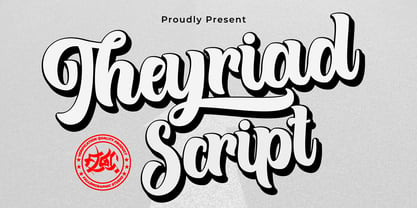 Theyriad Script is the great choice for watermarks on photography, logo designs, quotes, album covers, business cards, and many other design projects. Theyriad Script is here to elevate your work to the highest level. Features: -Accents (Multilingual Characters) -PUA encoded -Numerals and Punctuations (OpenType Standard) -Many alternates
 - Avenger by Larin Type Co,
$15.00 Avenger is a vintage screen font with many stylish alternative substitutes that will provide you with many options when working with your project. This font can be easier when using lowercase letters, as well as more playful, try using alternatives they will make your design unique.
 - Donatellia by Garisman Studio,
$20.00 Donatellia is perfect for logos, wedding invitations, posters, business cards, logos, headlines, Instagram stories, youtube stories, book cover, poster promotion and many more! Includes OTF files with many ligatures and opentype features, also Stylistic Sets with end & start love swashes. Get the best love with Donatellia.
 - Clarendon Semi by Wooden Type Fonts,
$15.00 One of the classic display types of the 19th century, an Egyptian with bracketed serifs. There are many variants of this face and its uses are many, this a modified version lacking the teardrop or ball terminals on a, c, f, g, j, r, f, y.
 - KR Back To School Dings - Unknown license

- KR Welcome 2002 Pt 1 - Unknown license

- Oregon - Unknown license

- KR Welcome 2002 Pt 2 - Unknown license

- KR Floral Color Me 2 - Unknown license

- KR Pick A Holiday 2 - Unknown license

- KR Down By The Sea - Unknown license


