10,000 search results
(0.196 seconds)
- Have a Nice Day by Cultivated Mind,
$20.00 Have A Nice Day is a handwritten font created by Cindy Kinash. This font features three font styles (Basic/Tall/Wide) and comes in three weights (Light/Regular/Bold). All three font styles can be used together as one unique and fun font! This font also includes a set of fun hand drawn ornaments like smiley faces, flowers, leaves, insects, frames, captions, desserts, food, clouds, and catchwords that will surely brighten your day! Enjoy!
 - Bay Area Nouveau JNL by Jeff Levine,
$29.00 Bay Area Nouveau JNL is an ultra bold, Art Nouveau headline font inspired by hand lettering on the cover of a piece of 1911 sheet music entitled "The Only Pal I Ever Had Came from 'Frisco Town'".
 - FF A Lazy Day by FontFont,
$30.99 German type designer Simone May created this display FontFont in 1995. The font is ideally suited for festive occasions and poster and billboard projects. FF A Lazy Day provides advanced typographical support with features such as ligatures and comes with tabular lining figures.
 - Play Day Stencil JNL by Jeff Levine,
$29.00 The typography on a 1964 children’s activity book published by Whitman entitled “Build with Stencils” was in a bold, condensed design. The only problem was that the ‘rails’ [the parts that divide a letter into stencil pieces] were too narrow and would disappear at smaller point sizes. Widening the ‘rails’ just a bit greatly improved the appearance of the stencil characters. Play Day Stencil JNL is now available in both regular and oblique versions. In its day, the Whitman Publishing Company of Racine, Wisconsin published dozens of activity books for children, including a number of them with stencils. The company was a division of Western Publishers from the early 1900s through the 1970s, but went through a number of sales and name changes. Currently [as Whitman once again] it is owned by Anderson Press, and is known for its line of coin folders and books on coin collecting.
 - M Ling Wai TC by Monotype HK,
$523.99 - Have A Great Day by Roland Hüse Design,
$10.00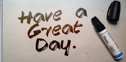
- Beautiful Day Script Duo by Letterfreshstudio,
$12.00 Beautiful Day Script Font DUO is a new modern script font with an irregular base line. Trendy and feminine style. Beautiful Day Script looks beautiful in wedding invitations, thank-you cards, quotes, greeting cards, logos, business cards, and more. Perfect for use in ink or watercolors. Including initial letters and terminals, alternatives and support for many languages. To activate the OpenType Stylistic alternative, you need a program that supports OpenType features such as Adobe Illustrator CS, Adobe Indesign & CorelDraw X6-X7, Microsoft Word 2010 or newer versions. There are additional ways to access alternatives / swash, using Character Map (Windows), Nexus Fonts (Windows), Font Books (Mac) or software programs such as PopChar (for Windows and Mac). How to access all alternative characters: https: //www.youtube.com/watch? v = Go9vacoYmBw https: //www.youtube.com/watch? v = XzwjMkbB-wQ Need help or have questions, let me know. I am happy to help :) Thank you & Congratulations on the Design!
 - M Ling Wai SC by Monotype HK,
$523.99 - American Way Of Life by Intellecta Design,
$19.90
- Mac Key Caps Pi by Linotype,
$29.00 - Celebrate The Day Pro by CheapProFonts,
$10.00 The freeflowing and quite feminine style of this script appealed to me, but it needed a bit of taming. Quite a few of the letterforms have been normalized - to better accommodate the diacritics. :) All fonts from CheapProFonts have very extensive language support: They contain some unusual diacritic letters (some of which are contained in the Latin Extended-B Unicode block) supporting: Cornish, Filipino (Tagalog), Guarani, Luxembourgian, Malagasy, Romanian, Ulithian and Welsh. They also contain all glyphs in the Latin Extended-A Unicode block (which among others cover the Central European and Baltic areas) supporting: Afrikaans, Belarusian (Lacinka), Bosnian, Catalan, Chichewa, Croatian, Czech, Dutch, Esperanto, Greenlandic, Hungarian, Kashubian, Kurdish (Kurmanji), Latvian, Lithuanian, Maltese, Maori, Polish, Saami (Inari), Saami (North), Serbian (latin), Slovak(ian), Slovene, Sorbian (Lower), Sorbian (Upper), Turkish and Turkmen. And they of course contain all the usual "western" glyphs supporting: Albanian, Basque, Breton, Chamorro, Danish, Estonian, Faroese, Finnish, French, Frisian, Galican, German, Icelandic, Indonesian, Irish (Gaelic), Italian, Northern Sotho, Norwegian, Occitan, Portuguese, Rhaeto-Romance, Sami (Lule), Sami (South), Scots (Gaelic), Spanish, Swedish, Tswana, Walloon and Yapese.
 - KR Valentine Dings 2002 - Unknown license

- KR Valentine Dings - Unknown license

- OCR-A AI by Apply Interactive,
$90.00OCR-A AI Text is the version for normal use when the text will be read by humans. OCR-A AI is the version to use for machine reading. - Kis Antiqua Pro by RMU,
$45.00 These Typoart fonts were redesigned and revived for modern use. The italic style got an entire set of swash caps, and both styles contain superior and inferior numerals as well as the historical long s.
 - Dawning of a New Day - Personal use only

- Just The Way You Are - Personal use only

- Kremlin Advisor Display Kaps Bo - Unknown license

- KR St Patricks Day Dings - Unknown license

- KR Careful What You Say! - Unknown license

- Three the Hard way shadowed - Unknown license

- ABTS Day Of The Dead by Albatross,
$19.95 ABTS day of the dead is a highly detailed and meticulously designed symbol font. It’s design is inspired by the Day of the Dead celebration, honoring the deceased. I think The Day of the Dead is one of the greatest reasons anyone should celebrate life, so I decided to make a font honoring that tradition. I'm not even sure If I got all of it right, (traditional symbols and such) but it was a joy to create. There are 2 fonts. The first is the Skulls. This includes uppercase and lowercase A-Z, a-z. There you will find the decorated skulls, blank skulls, and negatives. The second font is the symbols. If you wish to design your own Day of the Dead skull, you should purchase the symbols, as they are designed specifically for adorning the blanks. Purchasing both fonts will give you a discount. Please note, the symbol font will show up in your application of choice as “ABTS Day of the Dead Bold.” This is to avoid software problems with naming the font itself "Symbols." Skulls are awesome!!!
 - M Ling Wai F HK by Monotype HK,
$523.99 M Ling Wai is a humanistic script based on a real handwritten style. It has a feminine, urban and lively character filled with literate finesse. M Ling Wai was written with a thin ball pen by a young woman in a unique, personal, running writing style, such that it is real, natural and feminine. Contrast of strokes is low and the text is visible and eye-catching. Its light to medium stems (豎) make it suitable for small text and subheading with little conglutination. All strokes are highly irregular, inconsistent, irregularly oriented and tightly coupled or connected. Spatial distribution, positioning, size and relative proportion of radicals fully reflect a natural and personal favor. It is one of the first proportional width font in a full scale. It is best suited for casual lively text, illustrations, set upright (non-slanted), non-condensed.
 - 3 The Hard Way RMX by Fenotype,
$29.95
- M Ling Wai P HK by Monotype HK,
$523.99 M Ling Wai is a humanistic script based on a real handwritten style. It has a feminine, urban and lively character filled with literate finesse. M Ling Wai was written with a thin ball pen by a young woman in a unique, personal, running writing style, such that it is real, natural and feminine. Contrast of strokes is low and the text is visible and eye-catching. Its light to medium stems (豎) make it suitable for small text and subheading with little conglutination. All strokes are highly irregular, inconsistent, irregularly oriented and tightly coupled or connected. Spatial distribution, positioning, size and relative proportion of radicals fully reflect a natural and personal favor. It is one of the first proportional width font in a full scale. It is best suited for casual lively text, illustrations, set upright (non-slanted), non-condensed.
 - 3 The Hard Way Overrun by Fenotype,
$29.95
- A Day That Feels Better by Clevus,
$14.00 Proudly present A Day That Feels Better Typeface, created by ClevUs, A nostalgic serif & calligraphic italic that has own unique style & modern look. This typeface is perfect for an elegant & luxury logo, book or movie title design, fashion brand, magazine, clothes, lettering, quotes, and so much more. Font Features : Letters, numbers, symbols, and punctuation 101 alternates and ligatures No special software required they may be used even in Canva, any basic program /website apps that allows standard fonts That's it folks! Multilingual Support Language Support: Danish, English, Estonian, Filipino, Finnish, French, Friulian, Galician, German, Gusii, Indonesian, Irish, Italian, Luxembourgish, Norwegian Bokmål, Norwegian Nynorsk, Nyankole, Oromo, Portuguese, Romansh, Rombo, Spanish, Swedish, Swiss-German, Uzbek (Latin) Follow My Shop For Upcoming Updates Including Additional Glyphs And Language Support. And Please Message Me If You Want Your Language Included or If There Are Any Features or Glyph Requests, Feel Free to Send me A Message. Have a Good Day !
 - Recipe for a lovely day by PizzaDude.dk,
$16.00 Originally I planned to call this font “pegefinger” which is index finger in danish. Due to the obvious reason that I drew the letters using my “pegefinger” :) Most letters mimic a loose (perhaps even childish) handwriting, but the legibility is never out of hand. I’ve added 5 different versions of each lowercase letter, and they automatically changes as you type!
 - Sailor '87 - Unknown license

- KR Be Mine - Unknown license

- Born This Way FONT (lady gaga) - Unknown license

- Havent Slept in Two Days Shadow - Personal use only

- KR A Day At The Zoo - Unknown license

- KG What Does The Fox Say by Kimberly Geswein,
$5.00 Kid-friendly left-tilted ball and stick handwriting.
 - Kis Antiqua Now TB Pro by Elsner+Flake,
$99.00 In the course of the re-vitalization of its Typoart typeface inventory, Elsner+Flake decided in 2006 to offer the “Kis Antiqua” by Hildegard Korger, in a re-worked form and with an extended sortiment, as an OpenType Pro-version. After consultation with Hildegard Korger, Elsner+Flake tasked the Leipzig type designer Erhard Kaiser with the execution of the re-design and expansion of the sortiment. Detlef Schäfer writes in “Fotosatzschriften Type-Design+Schrifthersteller”, VEB Fachbuchverlag Leipzig, 1989: No other printing type has ever generated as far-reaching a controversy as this typeface which Jan Tschichold called the most beautiful of all the old Antiqua types. For a long time, it was thought to have been designed by Anton Janson. In 1720 a large number of the original types were displayed in the catalog of the „Ehrhardische Gycery“ (Ehrhardt Typefoundry) in Leipzig. Recently, thanks to the research performed by Beatrice Warde and especially György Haimann, it has been proven unambiguously that the originator of this typeface was Miklós (Nicholas) Tótfalusi Kis (pronounced „Kisch“) who was born in 1650 in the Hungarian town of Tótfal. His calvinistic church had sent him to the Netherlands to oversee the printing of a Hungarian language bible. He studied printing and punch cutting and earned special recognition for his Armenian and Hebrew types. Upon his return to Hungary, an emergency situation forced him to sell several of his matrice sets to the Ehrhardt Typefoundry in Leipzig. In Hungary he printed from his own typefaces, but religious tensions arose between him and one of his church elders. He died at an early age in 1702. The significant characteristics of the “Dutch Antiqua” by Kis are the larger body size, relatively small lower case letters and strong upper case letters, which show clearly defined contrasts in the stroke widths. The “Kis Antiqua” is less elegant than the Garamond, rather somewhat austere in a calvinistic way, but its expression is unique and full of tension. The upper and lower case serifs are only slightly concave, and the upper case O as well as the lower case o have, for the first time, a vertical axis. In the replica, sensitively and respectfully (responsibly) drawn by Hildegard Korger, these characteristics of this pleasantly readable and beautiful face have been well met. For Typoart it was clear that this typeface has to appear under its only true name “Kis Antiqua.” It will be used primarily in book design. Elsner+Flake added two headline weights, which are available as a separate font family Kis Antiqua Now TH Pro Designer: Miklós (Nicholas) Tótfalusi Kis, 1686 Hildegard Korger, 1986-1988 Erhard Kaiser, 2008
 - Kis Antiqua Now TH Pro by Elsner+Flake,
$99.00 In the course of the re-vitalization of its Typoart typeface inventory, Elsner+Flake decided in 2006 to offer the “Kis Antiqua” by Hildegard Korger, in a re-worked form and with an extended sortiment, as an OpenType Pro-version. After consultation with Hildegard Korger, Elsner+Flake tasked the Leipzig type designer Erhard Kaiser with the execution of the re-design and expansion of the sortiment. Detlef Schäfer writes in “Fotosatzschriften Type-Design+Schrifthersteller”, VEB Fachbuchverlag Leipzig, 1989: No other printing type has ever generated as far-reaching a controversy as this typeface which Jan Tschichold called the most beautiful of all the old Antiqua types. For a long time, it was thought to have been designed by Anton Janson. In 1720 a large number of the original types were displayed in the catalog of the „Ehrhardische Gycery“ (Ehrhardt Typefoundry) in Leipzig. Recently, thanks to the research performed by Beatrice Warde and especially György Haimann, it has been proven unambiguously that the originator of this typeface was Miklós (Nicholas) Tótfalusi Kis (pronounced Kisch) who was born in 1650 in the Hungarian town of Tótfal. His calvinistic church had sent him to the Netherlands to oversee the printing of a Hungarian language bible. He studied printing and punch cutting and earned special recognition for his Armenian and Hebrew types. Upon his return to Hungary, an emergency situation forced him to sell several of his matrice sets to the Ehrhardt Typefoundry in Leipzig. In Hungary he printed from his own typefaces, but religious tensions arose between him and one of his church elders. He died at an early age in 1702. The significant characteristics of the “Dutch Antiqua” by Kis are the larger body size, relatively small lower case letters and strong upper case letters, which show clearly defined contrasts in the stroke widths. The “Kis Antiqua” is less elegant than the Garamond, rather somewhat austere in a calvinistic way, but its expression is unique and full of tension. The upper and lower case serifs are only slightly concave, and the upper case O as well as the lower case o have, for the first time, a vertical axis. In the replica, sensitively and respectfully (responsibly) drawn by Hildegard Korger, these characteristics of this pleasantly readable and beautiful face have been well met. For Typoart it was clear that this typeface has to appear under its only true name “Kis Antiqua.” It will be used primarily in book design. Elsner+Flake added these two headline weights, which are available besides a separate font family Kis Antiqua Now TB Pro. Designer: Miklós (Nicholas) Tótfalusi Kis, 1686 Hildegard Korger, 1986-1988 Erhard Kaiser, 2008
 - Hearts And Swirls Too by Outside the Line,
$19.00 48 whimsical hearts and swirls, some solid, some line but lots of little graphics for your Valentine needs. Many ways to say "I Love You".
 - Mailbox Letters JNL by Jeff Levine,
$29.00Many items we use in our day-to-day lives offer wonderful source material for font designs. Mailbox Letters JNL was inspired by a set of self-stick adhesive letters used on mailboxes, doors and other areas of identification at home or in business. Each letter, number and punctuation mark is centered on a black rectangle - just as the actual model for this font. Use it as spaced, or hand set it tighter to form a ribbon with white-on-black text. To provide continuity for the ribbon effect, a blank rectangle is provided on the vertical bar key (the shift position of the backslash key). Limited character set. - JWX Western by Janworx,
$19.95 The term Old West conjures up memories of vintage movies and TV shows featuring saloons and dancehall girls. Old wanted posters and cowboys. Rowdy prospectors in the Goldrush, mountains and lots of wide open space. Many of the lettering styles of those days are still in use, reflecting the past, present, and probably the future here. Western style fonts appear in the signage of bars, restaurants, casinos and ski areas. It's a style that speaks of the way it once was in a nostalgic way. This family of three fonts pays tribute to the Old West and its colorful history, with a semi-plain style, a decorated style, and a really lively rendition of our gaudy and raucous history from a century or more ago.
 - Evening Edition JNL by Jeff Levine,
$29.00Evening Edition JNL pays tribute to the ever-decreasing line of daily newspapers in this country by emulating the "wood type" look of the headlines. Way before the Internet took over as a popular information source, it was the morning, afternoon or evening edition of a paper that presented the big story of the day.


