10,000 search results
(0.059 seconds)
- Pakenham Free - Unknown license

- Zekton Free - Unknown license

- Mufferaw Free - Unknown license

- Larabiefont Free - Unknown license

- Scottsdale Text NF by Nick's Fonts,
$10.00This elegant semicursive face is based on the works of J. M. Bergling from his 1914 classic Art Alphabets and Lettering. Suitable for announcements, awards and invitations, or for distinctive and unusual drop caps. Both versions of this font contain the Unicode 1252 (Latin) and Unicode 1250 (Central European) character sets, with localization for Romanian and Moldovan. - Brotherly by Creativework Studio,
$14.00 Brotherly is a modern san serif font that is very different from the standard san serief form in general, this font is more artistic so it is very flexible to use for various design project needs, both formal and non-formal, but this font is based on the basic san serief font. easy to read and clear.
 - Ryden by Graphicfresh,
$18.00 Ryden - A Handwriting Display Font In making this font, I spent a lot of time thinking about handwriting with a display style. Each letter is carefully made to look as natural as possible. This font is suitable for use in brands or logos with the theme of handwriting. I hope you like the font we made. Thanks
 - Katharine by Teweka,
$20.00 Katharine is a fresh new font, Made in Upright style, Katharine Has 417 glyphs with lots of swash options. This Katharine font is very easy for you to work with, because it has automatic letter and number combinations to change the swash inside the letters. This font is suitable for: Branding, Logotype, Poster, Social Media and others.
 - Fat Ink by High Peak,
$20.00 This handwritten font is as juicy as the strokes from a fat marker! Unpredictable but harmonious, the lines and shapes give this font a fun, funky vibe. Perfect for creating logos, charts, pricing, and more. Full uppercase and lowercase, it supports several languages, lots of discretionary ligatures, and alternatives that combine with each other. Have fun! High Peak
 - Fire Ladder by The Printers,
$20.00 Please read before purchasing! This font resembles one the of many traditional sign-writer styles used for fire and rescue vehicle lettering. Limited to English and entirely to capitals, numbers and select punctuation characters. The intended purpose for this font is for vehicle lettering and sign design. You may find it useful for other applications as well.
 - Parsifal Oldestyle NF by Nick's Fonts,
$10.00This timeless classic is patterned after the typeface Camelot, designed by Morris Fuller Benton for American Type Founders in 1926. Its elegant lines and pleasing color make it suitable for both headline and text use. Both versions of this font contain the Unicode 1252 (Latin) and Unicode 1250 (Central European) character sets, with localization for Romanian and Moldovan. - Christmas Chimney by Letterara,
$16.00 A simple Christmas Chimney font looks unique and classy. Its beautiful charm makes it look absolutely stunning, easy to read, and, ultimately, incredibly versatile. This will add a fun and friendly touch to any of your projects, especially for the Christmas theme! This font is PUA encoded which means you can access all the glyphs and sweeps easily.
 - RM Elegance by Ray Meadows,
$19.00 With an obvious nod to Art Deco, this font offers a stylish design with distinctively elongated ascenders and descenders. Includes: Western European, Central European, Baltic & Turkish sets. Due to the modular nature of this design there may be a slight lack of smoothness to the curves at very large point sizes (around 100 pt and above).
 - Road Work JNL by Jeff Levine,
$29.00 The October 5, 1935 issue of “Universal Weekly” (a publication detailing current film releases from Universal) was promoting the film “Remember Last Night”. Hand lettering used for this advertisement was an ultra-bold sans serif design with chamfered corners and some stylized characters. This is now available digitally as Road Work JNL in both regular and oblique versions.
 - Society Page NF by Nick's Fonts,
$10.00This elegant face with a few semi-script flourishes is based on Morris Fuller Benton’s Announcement Roman, designed for American Type Founders in 1917. It’s perfect for invitations, programs and all kinds of formal ballyhoo. All versions of this font include the Unicode 1250 Central European character set in addition to the standard Unicode 1252 Latin set. - Selauk by Twinletter,
$17.00 Selauk is a window into the futuristic world of typography’s future. With this theme, this font is the ideal answer for projects that need a touch of modern, sci-fi, and future atmosphere. What’s Included : File font All glyphs Iso Latin 1 Alternate, Ligature Simple installations PUA Encoded Characters – Fully accessible without additional design software. Fonts include Multilingual support
 - Natube by Dhan Studio,
$14.99 Natube is a font that is scratched with a brush pen, to get a natural texture, so this font will display the characteristics of the hand. This font is very suitable for a variety of places such as clothing, poster, tittle books, stationery designs, quotes, branding, logos, invitations, greeting cards, t-shirts, packaging designs and more.
 - Dreamy Summer by Letterara,
$14.00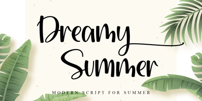 Dreamy Summer is a stylish and incredibly elegant handwritten font. This font was particularly crafted for those who need a beautiful and refreshing look to their designs. Add it confidently to your projects, and you will love the results. This font is PUA encoded which means you can access all of the glyphs and swashes with ease!
 - ND Kapitel by NeueDeutsche,
$17.50 Experience the evolution of the humanist sans-serif style with this contemporary and classic font. Designed with a modern sensibility and clean, spurless letterforms, this font offers a fresh take on a time-honored tradition. Its refined curves and harmonious proportions create a sophisticated look that is perfect for branding, editorial design, and other professional projects.
 - Tumbletype by Greater Albion Typefounders,
$6.95 Tumbletype offers two faces with a fun antique look. This is a rough and tumble Roman face with a hand-cast and much-used look, ideal for recreating early printed documents. Use it for headings and feature paragraphs. It's the irregularity of this face which makes it so special-give it a try and join in the fun!
 - Penmanship by Essqué Productions,
$9.00 This font was designed with scholastic visuals in mind. Whether advertising for a school event, or creating handwriting worksheets for young children, this font covers all the basics with Latin alphabet languages. Three fonts with identical spacing to make interchangeable. Spacebar adds a regular space between words/sentences. To connect words with ledger lines, use the underscore (_).
 - Fenggasta by Gatype,
$9.00 Fenggasta is a font that is scratched with a brush pen, to get a natural texture, so this font will display the characteristics of the hand. This font is very suitable for a variety of places such as clothing, poster, tittle books, stationery designs, quotes, branding, logos, invitations, greeting cards, t-shirts, packaging designs and more.
 - Tara Bulbous NF by Nick's Fonts,
$10.00This new and improved version of this chunky classic by Paul Carlyle and Gus Oring includes the lowercase letters not found in earlier versions. Use it to add a little—or a lot of—panoramic panache to your next project. Both versions of the font include 1252 Latin and 1250 CE (with localization for Romanian and Moldovan) character sets. - Gudytha by Hrz Studio,
$13.00 Gudytha is an elegant script font with a contemporary atmosphere and impeccable form, inspired by timeless classic calligraphy. Not too thin and not too thick, balanced and varied, this font was designed to enhance the beauty of your projects. This font is PUA encoded which means you can access all of the glyphs and swashes with ease!
 - Gromvies by ahweproject,
$10.00 Gromvies feels playfully nostalgic and delivers an incredible vintage retro aesthetic. Inspired by unique retro themes, this fun typeface is suitable for any vintage theme concept, Illustration posters, stickers, fun graphics, and more. Masterfully designed to become a true favorite, this font has the potential to bring each of your creative ideas to the highest level!
 - Balaghat by Dharma Type,
$19.99 Balaghat is a decorative but natural hand letter script. The distinctive feature of this font is its cursive shape and It’s like written with a brush with smooth strokes. We recommend this font for high-end logotypes and magazine headlines, let alone greeting cards, invitations, posters, book covers, ads and the various web and screen usages.
 - Loyola Soft by RodrigoTypo,
$25.00 The "Loyola Soft" typeface is a highly versatile and attractive option, as it presents a wide variety of 14 variants, making it a font with great potential for various projects and applications. By having support for the Cyrillic alphabet, this font becomes even more useful, allowing its use in multiple languages and regions where this writing system is used.
 - Samira by CastleType,
$29.00 I must admit that I am not a big fan of the Art Nouveau style. However, I found this particularly beautiful alphabet and decided to use it as the basis for this new font. Very graceful, elegant, and dare I say, organic. Includes some intertwined ligatures. Complete uppercase, numerals, basic punctuation. Supports most Western European languages.
 - PAG Syndicate by Prop-a-ganda,
$19.99Prop-a-ganda offers retro-flavored fonts inspired by lettering on retro propaganda posters, retro advertising posters, retro packages all the world over. This is perfect font for your retrospective project. PAG Syndicate is rectangle and rather narrow font. This font has squarish face designed only by straight line, it spices up even the short words. - Fluid Drive NF by Nick's Fonts,
$10.00 A playful Art Deco face from master penman Samuel Welo is combined with design elements used in 1930s signage to create this architectural face. End caps are created with {brackets} and spaces with the design elements are _underscores. Both versions of this font support the Latin 1252, Central European 1250, Turkish 1254 and Baltic 1257 codepages.
 - Bomber Urban by Nirmana Visual,
$22.00 Bomber Urban Inspired by Graffiti Street Art, Bomber Urban is a fun, urban-style display font. This font is suitable for designs like logos, advertising, apparel, jerseys, sportswear, skateboard designs, and more. Take your concepts to the next level with this stunning font! Make your designs stand out with the urban and edgy look of our Graffiti font.
 - Baket Fashion by Nirmana Visual,
$22.00 Introducing our exquisite elegant style font, designed to bring sophistication and grace to your designs. With its refined letterforms, delicate curves, and timeless beauty, this font is perfect for projects that require a touch of elegance and class. Inspired by the elegance of classic typography and the beauty of Serif, this font exudes a sense of refined aesthetics.
 - Norman by Resistenza,
$45.00 Get to know Norman, elegant and fashion forward. This new condensed and high contrast serif font is based on expansion giving a sense of self confidence. The oblique ax was specially added to get a contemporary and innovative sense. Norman is young and idealist, he has a distinctive sense of style. A complete set of ligatures and stylistic alternates is included, this will help the designer to customize and give a special look to any layout. We recommend to use it for big title, magazine, editorial purposes and display. Norman Family contains 2 styles, Regular and Italic, both fonts have another version a bit heavier called Regular 2 and Italic 2.
 - Buro by Corentin Noyer,
$34.00 The Buro is a text font, monospace, sans-serif with rounded endings. It is characterized by its monolinear outline (slight optical corrections) and its discontinuous Roman structure. He tries to reproduce the outline of a letter drawn with a pen. The design of the Buro is inspired by the cursive letters used in Olympia typewriters of the 1950s.
 - Zapf Essentials by Linotype,
$29.99Linotype Zapf Essentials is the modernized version of Zapf Dingbats and was also designed by Hermann Zapf himself. Over 372 characters and symbols are included within six fonts and make life a little more communicative, a little more informative, and a lot more interesting. The fonts contain symbols for both professional and everyday uses. With their markers, ornaments and arrows they are informative as well as versatile, timeless and lively. An interesting note to the story of Zapf Essentials: in 1977, Hermann Zapf created about 1000 sketches of signs and symbols. ITC chose those which became known around the world as Zapf Dingbats. For a typesetter, dingbats are the characters in the corner of the type box which can be used for just about anything. The last decade has seen the appearance of new symbols for e-mail, fax, mobile phones and other developments. These are now part of Linotype Zapf Essentials, just as they are now a part of everyday life. For a quick overview of the different Linotype Essentials variations, see the keyboard layout PDF in the Gallery section. It shows the keyboard layout of each font. A helpful hint from Hermann Zapf: Linotype Zapf Essentials should be used sparingly so that the characters retain their emphasis. - Le Monde Sans Std by Typofonderie,
$59.00 Humanist sans in 8 styles Designed by Jean François Porchez, Le Monde Sans is a sanserif based on Le Monde Journal — a practice that become commonplace from early nineties. Designed originally in 1994 for the Le Monde newspapers, it was expended over the years to the large family we know today. Le Monde Sans features a “traditional g” in addition to the usual 1994’s g. Le Monde Sans is offered in numerous weights — in roman, italic to meet all kinds of situations. It will help designers to select the best weights depending their needs, from glossy paper printing to high resolution screen. Superfamily The design of Le Monde Sans continues the basic common structure found in the members of the Le Monde family: its proportions, a relatively narrow width, a fairly oblique axis, etc. The typographer can, at all times, switch between Sans & Journal or Courrier without any disruption in the composition. The verticals metrics and proportions of Le Monde Sans are calibrated to match perfectly others Typofonderie families. This family was designed in 1994 as bespoke typeface family for the French newspaper Le Monde. The family is not used any more by this newspaper from November 2005. Type Directors Club .44 1998 European Design Awards 1998
 - Abelina by Sudtipos,
$69.00 «Abelina» is a typeface that can be used in display sizes for titles where part of the central premise is to emulate certain features of gestural handwriting. Concepts like spontaneity, speed and fluidity, associated with the use of certain calligraphic tools – in this case the pointed brush – led to a typographic result based on the pattern-like structure coming from the chancery and italic calligraphic models. «Abelina» - initially designed by Yanina Arabena (Calligrapher, Graphic Designer and Typographer) - is reborn to make way for “Abelina Pro” through the solid work of Guillermo Vizzari working together with Ale Paul from Sudtipos. Throughout its use, “Abelina Pro” maintains the structure of a firm style, integrating a dynamic rhythm in the composition of short texts and offering personality to each of the words it builds. It has over a thousand glyphs, including several alternates, ligatures combination, initials and miscellaneous to reinforce the idea of the author of merging a calligraphic project in the typographic world; allowing new ways to capture this great universe of italic faces. «Abelina» project was initially born as a typographic project developed by Yanina Arabena – tutored by Ale Paul and Ana Sanfelippo – under completion of the Specialization in Typography Design at University of Buenos Aires, Argentina, during the years 2011 and 2012.
 - Tempora LGC Uni - 100% free

- Kfontz by 066.FONT,
$9.99 Kfontz is a display font that simulates the appearance of typewritten text. Each letter in Kfontz has been carefully designed to resemble the effect you get with a typewriter. This effect adds a sense of nostalgia to the text, as if it were from a bygone era, adding an authentic charm to the designs. Kfontz retains its varied and extravagant style, giving the text a lightness and a certain nonchalance. Remastered in 2023.
 - Maga by DSType,
$40.00 Maga shares the skeleton with one of our first typefaces (Quaestor, from 2004), but we didn't want to simply expand an existent design, so we took a step forward—not just with improved features and new weights, but also making the italics more usable than its predecessor. The balance between the counters and the space between letters makes this a very space-saving typeface with plenty of legibility, yet stylish enough for contemporary magazine design.


